Assignment 4 portraits- the image remains 

Assignment 4

These are images made using photopolymer and copperplate etching techniques.

I wanted to use image and text, to make a statement about memory and the power of images.

This was a very frustrating exercise, as I was desperate to use photopolymer film, as a means of reproducing the photo I has decided to work with, but struggled to make it work. The text worked a bit better, but it was hard to get clear images using photopolymer alone, so I eventually etched using ferric chloride.

The slideshow is a record of trial and error:

This slideshow requires JavaScript.

Finally, I selected the most appropriate plate and text, a tw0-plate print in black and red oxide- both slightly unclear, which fits the meaning:

IMG_6608

Photopolymer print on paper, 20 X 16 cm

Good things about this image: the fading, though quite accidental, fits the mood and the sense of the text, and the purpose of the exercise, to capture rapidly disappearing memories of my mother, who is entering the shadows due to dementia. The image, now very flat, has become objectified, and is no longer a very personal image.  The person in the picture has become an everywoman, a generalised figure from the 1940s, and so more relatable to a wider audience than myself. The text itself is simple and thoughtprovoking, with a nice metaphorical sense. The font is classical- thinking of the typefaces used by Ian Hamilton Findlay- although that has issues in practice as the finer lines are often lost in the process.

Negatives; I feel the text is a bit “telling”, too direct, and I would next time choose something more elliptical.


Cyanotypes

Assignment 4, Uncategorized

This was a little bit of experimentation with creating different effects, using red wine to add subtle warm tones, washing soda to bleach- which also adds a yellowish tone on some materials, probably depending on sizing or something. Using a vinegar spray could add darker tone, and the amount of it controlled by using it before or during development. There’s a limit to the amount of control though, as the strength of UV comes into it, as well as the material used, how long the chemicals have been sitting, the chemicals themselves…

I like the last one best, but I like how all of them add some dynamism to the still life.

imageimageimage

Assignment 4: portraits

Assignment 4

I want to approach this assignment first by considering what we mean by a “portrait”.

In the past, people referred to their portrait as their “likeness”. With the development of photography, the phrase “taking one’s likeness” was used, and in certain cultures was considered a theft of part of the person, as if the likeness had a separate existence, a doppelgänger, or as if the camera was penetrating the soul and stealing it. The criterion for successful portraiture was the extent to which it resembled the outward appearance of the subject, until abstraction, specifically Cubism, fractured the image and suggested multiple viewpoints, while Fauves used non-natural colour to express emotional truths.

Photography is now almost a plague, with “likenesses” of everyone and every action they do, and every meal they eat proliferating on social media. Image making is replacing words, and official photographed portraits seem frankly pointless. How can a single image replace the multiplicity of snaps that can sum up the wholeness of the person? When we see a posed studio photo we are all aware of the artifice, the sense of being manicured, and we treat it with a degree of skepticism, even without considering the digital manipulative tools that could have been used.

I want to explore photographic portraiture in this unit, but from the point of view of the image as sign, as a cipher that encodes a relationship between the viewed person, and the viewer/image maker, separate from the means of image making, the process variables involved in photography and printing.

I mainly focus on two images, both of my mother, taken in the middle of last century. These of course have personal significance, so the challenge is to give them more general meaning. These also allow me to continue the theme of earlier units, but continuing to address the subject of dementia and the loss of self.

These are the photos, edited a bit for contrast.

First a sketch, layers of deconstruction of an image of my grandmother. iPad Sketch Born in the 1880s, she lived over 90 years, and was a sum of various parts, a bit of image making, and a fair number of secrets and lies, and Victorian hypocrisy. She had a good brain, underused, which eventually gave out on her and betrayed her. Otherwise we’d never have seen beneath the surface. The photographed image is often seen as truthful: the camera doesn’t lie. But the camera has trained us to see with its single lens, just as much as it confirms to us what we think we see. This sketch simply explored the image as pattern, composition and sculptural form, an entity that takes up space. At the same time, the words are metaphors for the process of modelling, but consider the individual, the space and place they inhabit in the world, and their impact.


Research

Uncategorized

Xu Bing and Contemporary Chinese Art: Cultural and Philosophical Reflections 

Ames, Roger T., Tsao Hsingyuan

2011

Bei Dao of Xu Bing’s characters in Book from the Sky and Square Word Calligraphy: “You are a nothing but a pictograph that has lost its sound.”

Historical context: pre-and post-1989, art operating inside, trying to influence a Chinese audience using western ideas, and post 1989, outside China, those who were of the avant-garde, and emigrating to US, responding to Western post-modern philosophy and welcomed by the West as signs of a “Chinese Spring”- who was their audience? Western/ external influences being brought to bear. (Art and many news outlets banned in PRC)

Cultural exile + exhibitions in western galleries.

Argument that Xu Bing has created a third cultural space.

Critical reflection Assignment 3

Assignment 3, Reflective Commentary

Stepping back a bit and trying to take this assignment as a whole, post-tutorial,  I can see themes and preoccupations emerging.

Art and Science

Firstly, the continuing association of art and science, through the use of chemical procedures, such as cyanotypes and photo polymers, and etching in different salts. There’s also the links to photography which are emerging more and more. 

These connections are coming out both in images and processes, with a key text being Kemp’s “Visualisations”, on the subject of the importance of and influence of analogies in understanding the unknown. The images I made of “moons” in the previous assignment morphed into Newton’s Apple, using the technique of chiaroscuro as created by lateral lighting, and inspired by 19th century photography of the moon, and of textured close up objects, a wrinkled hand and a wrinkled apple. These were photographic images as objects of scientific enquiry, whereby analogical thinking led to deductions about unknowable phenomena. (I’m thinking ahead to an enquiry into the appearance of a brain damaged by dementia as part of the “portrait” assignment, in which I plan to focus on my mother as a subject)

Image as object

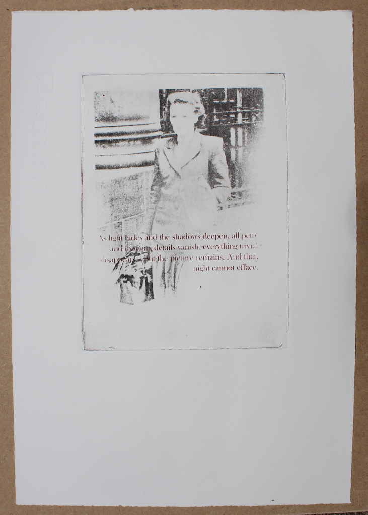
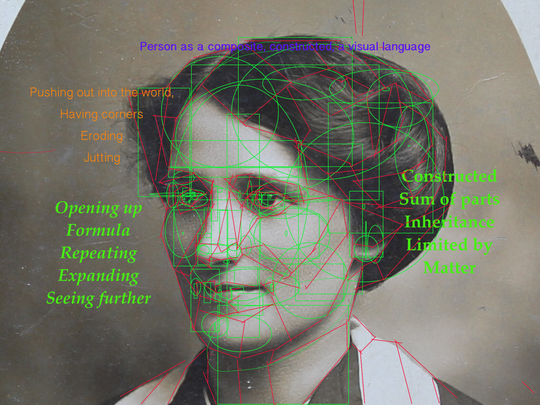
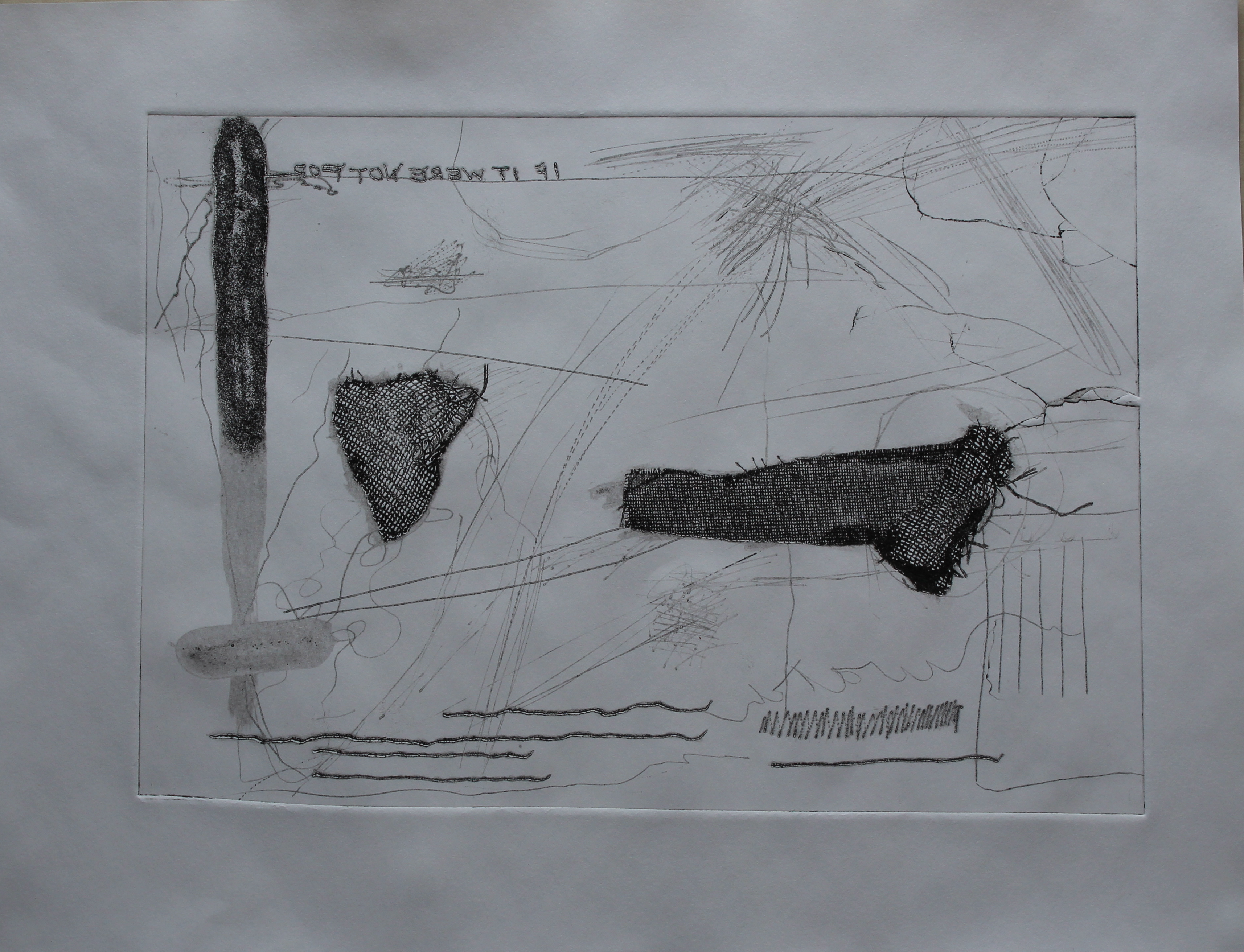
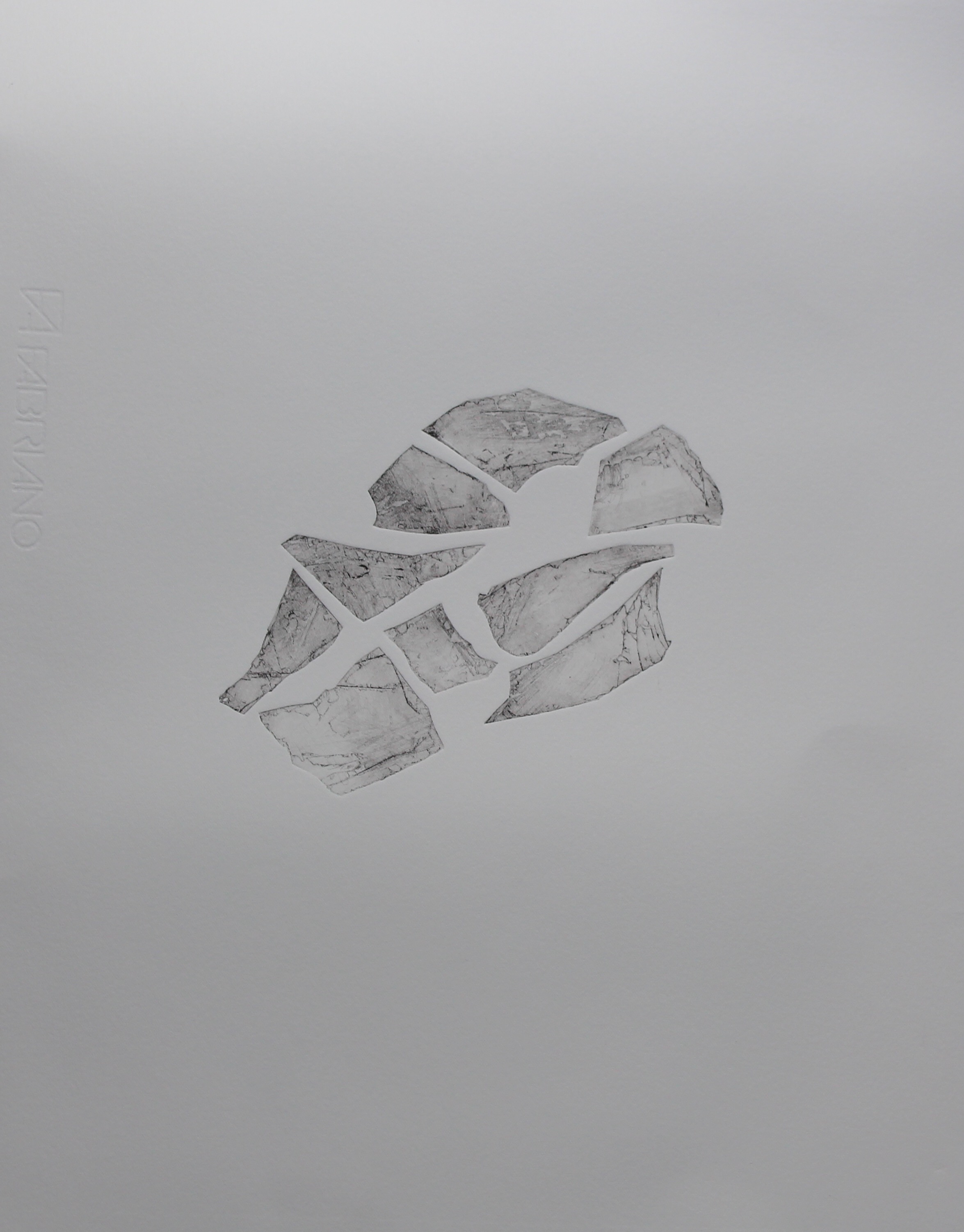
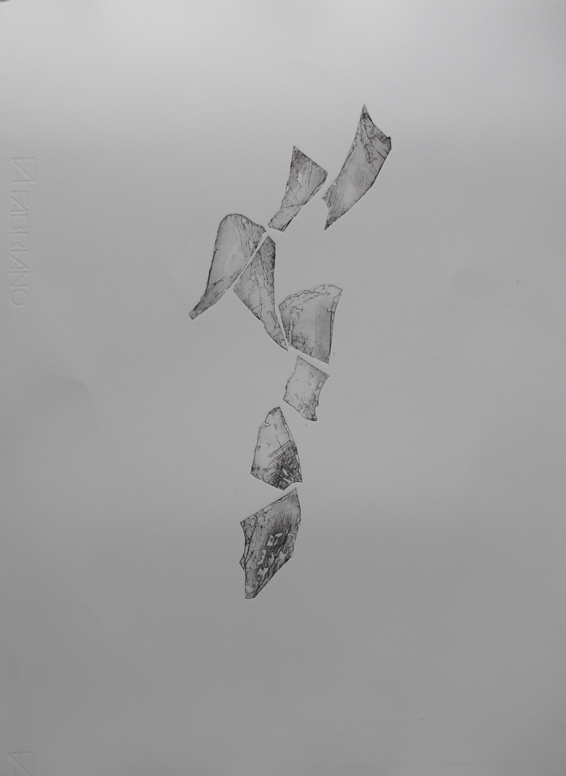
This has led to the beginnings of an exploration of the unreliability of images, of images as objects whose form and meaning is determined by the processes of seeing and producing. After going through a series of images of a historical/biblical story, the interpretation of which is so open to biased representation and contextual understandings, I made a small model of a sculptural image, “facets” which links together ideas of media representation, conflicting lenses, the idea of “the gaze”, with connotations of feminism, distortion and self-regard,  which I would like to develop further. After discussion with my tutor, I understand how scale, shape and form of the sculptural piece would invite a viewer to engage with it in a particular way- for example, if it were scaled up to the shape and size of a body, it would invite that type of engagement, whereas it could be a landscape, a feature of a landscape such as a cave, or if dropped on the floor, scrunched up newspaper, and if hanging, then other analogies would come into play. This comes back to the power and influence of analogical thinking when interpreting the Unknown, and emphasises the role of culture in perceiving messages, thus leading to a theoretical stance that an image is a cultural object.

Xu Bing Parallel Project

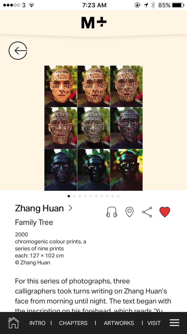
This brings me back to the work of Xu Bing, and his appropriation of objects, signs and materials as a commentary on and creation of new cultural objects in his works. Text as object as a key feature of his work, in his use of tobacco company logos for example, although he works on a grand scale, creating his own languages, and challenging the way we read cultural signs: in his square-word calligraphy, he is also taking a swipe at mainland Chinese suppression of ideas by making the texts (characters)  “meaningless” in that culture. 

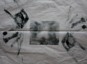
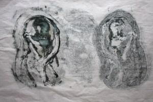
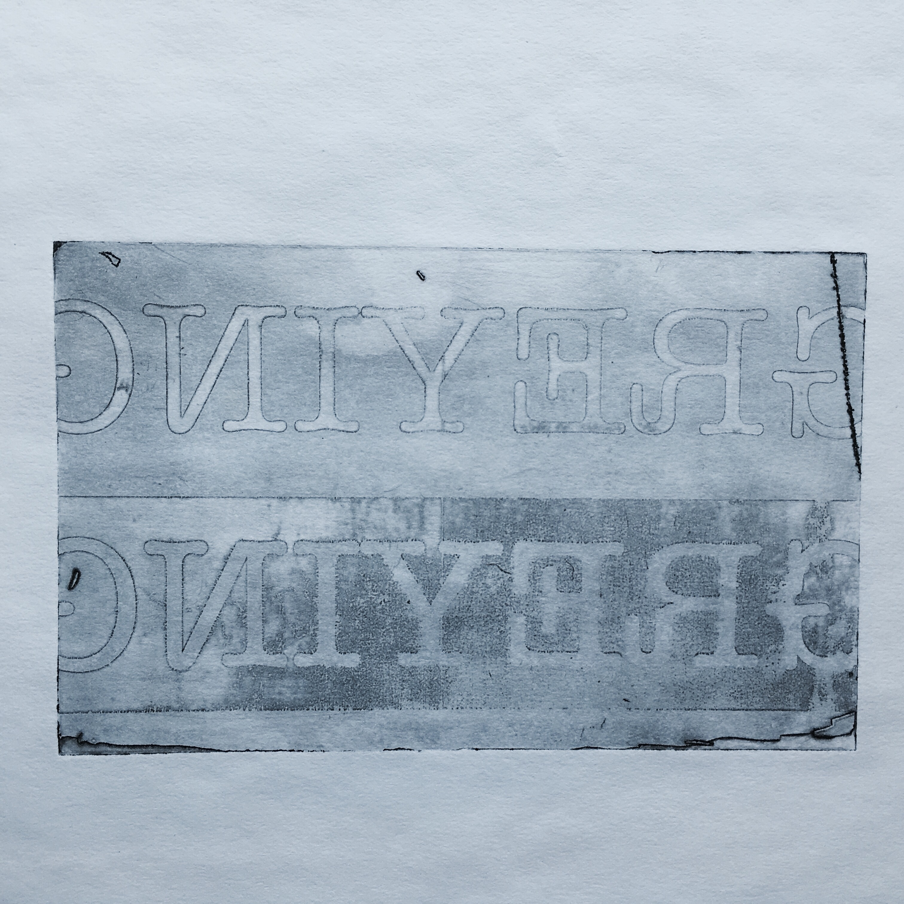
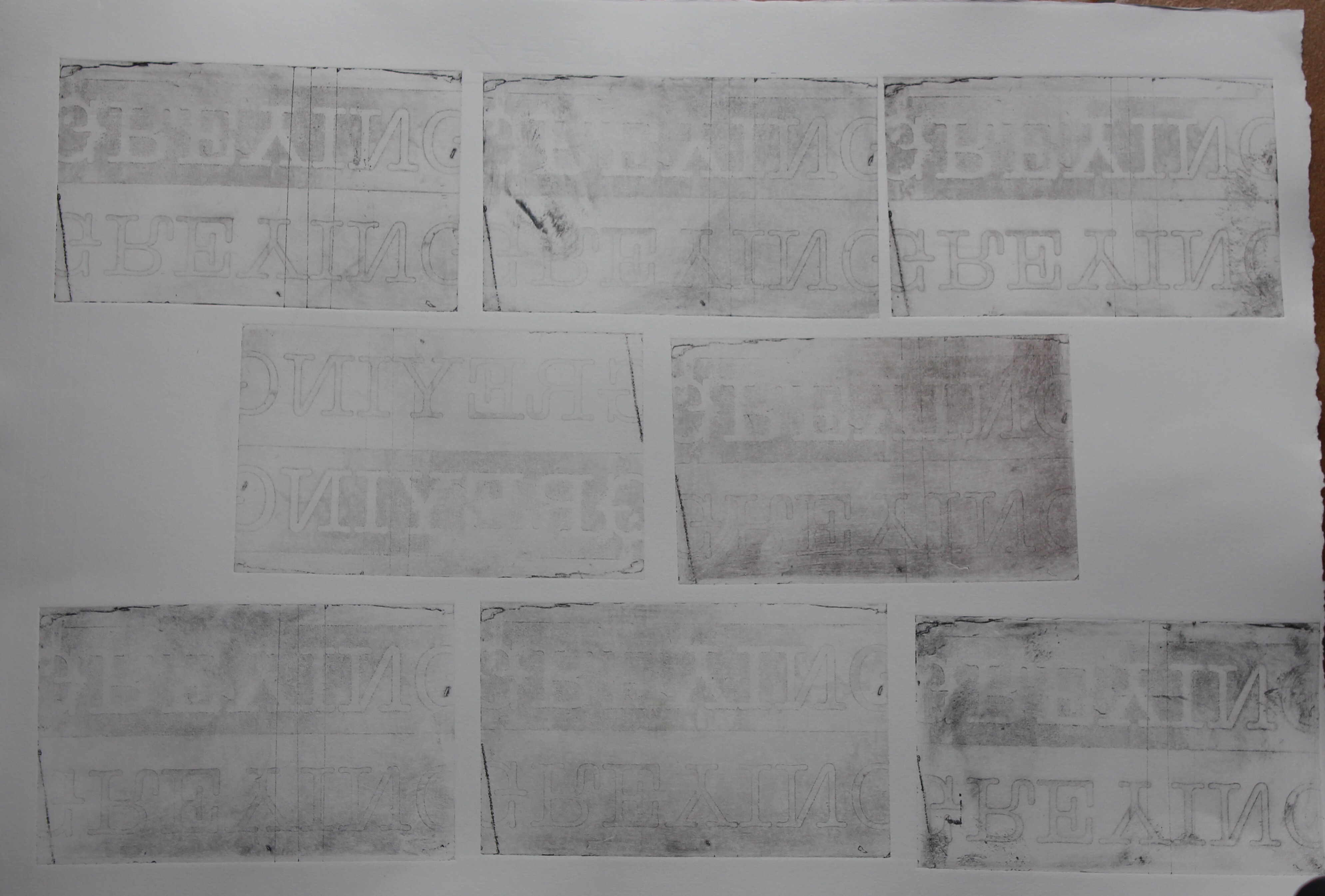
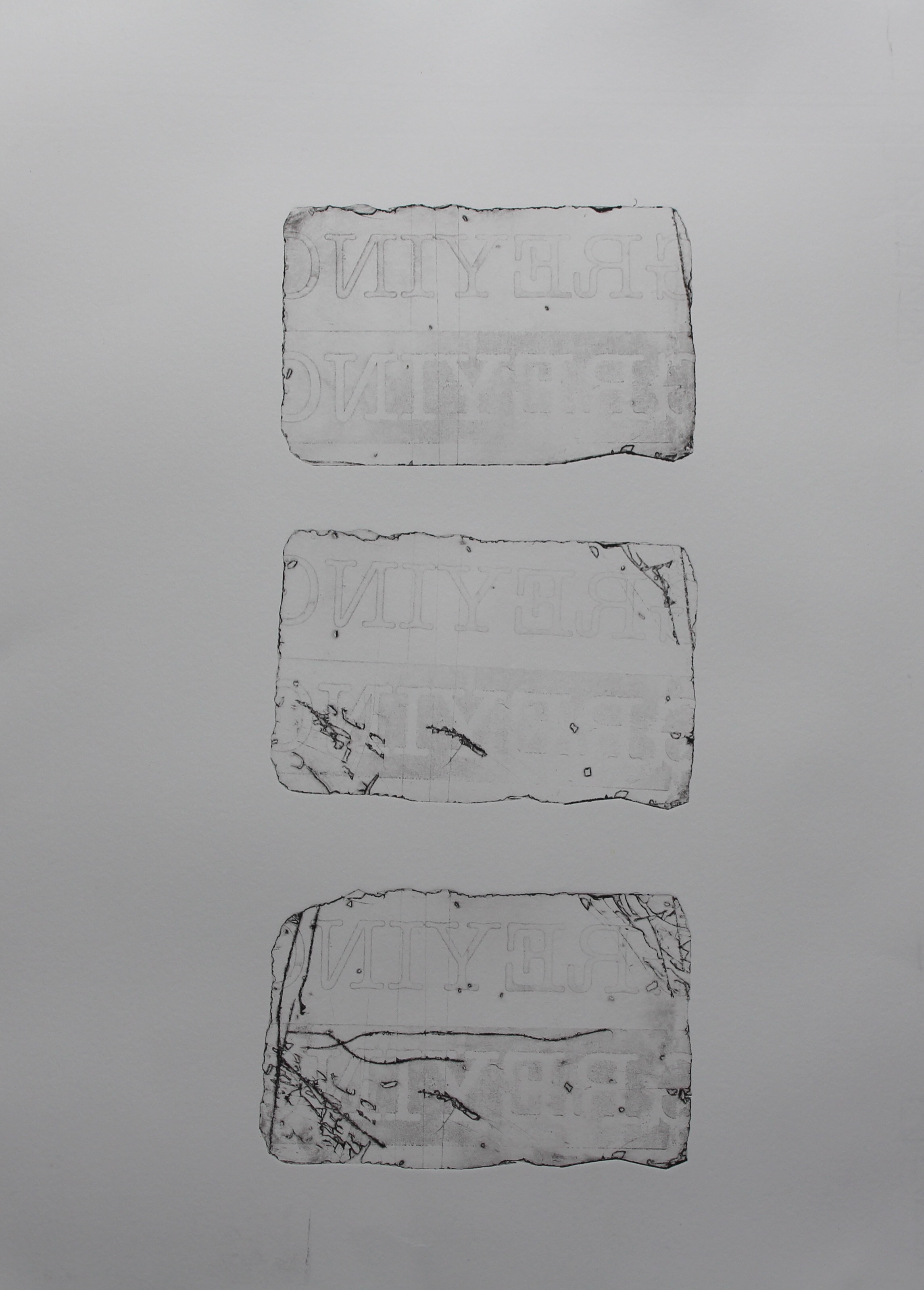
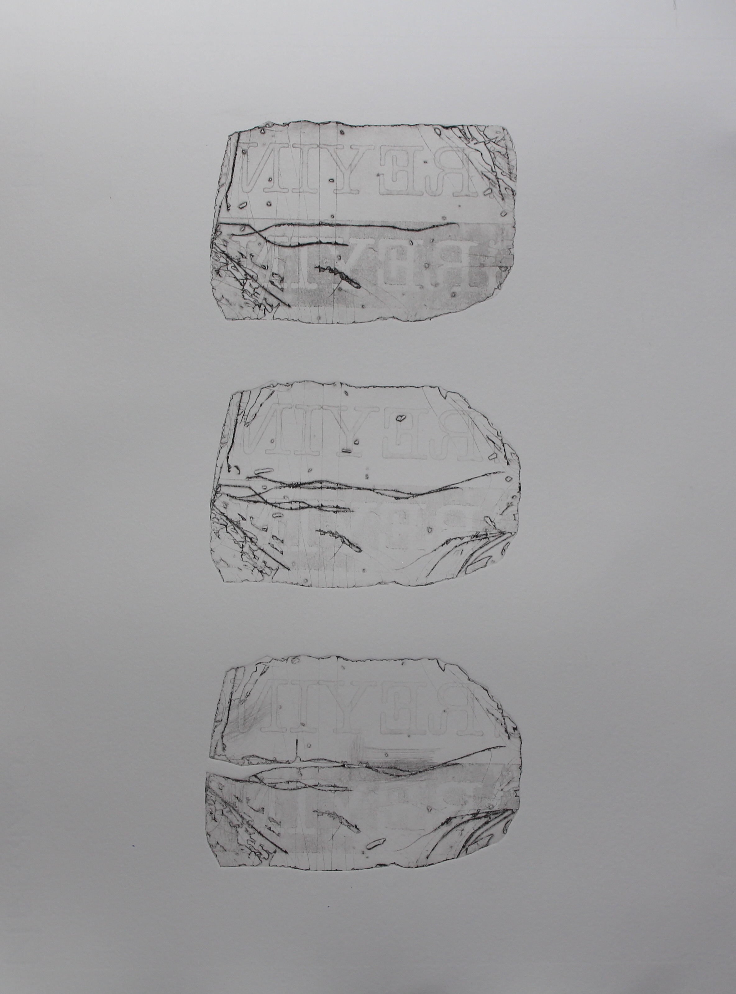
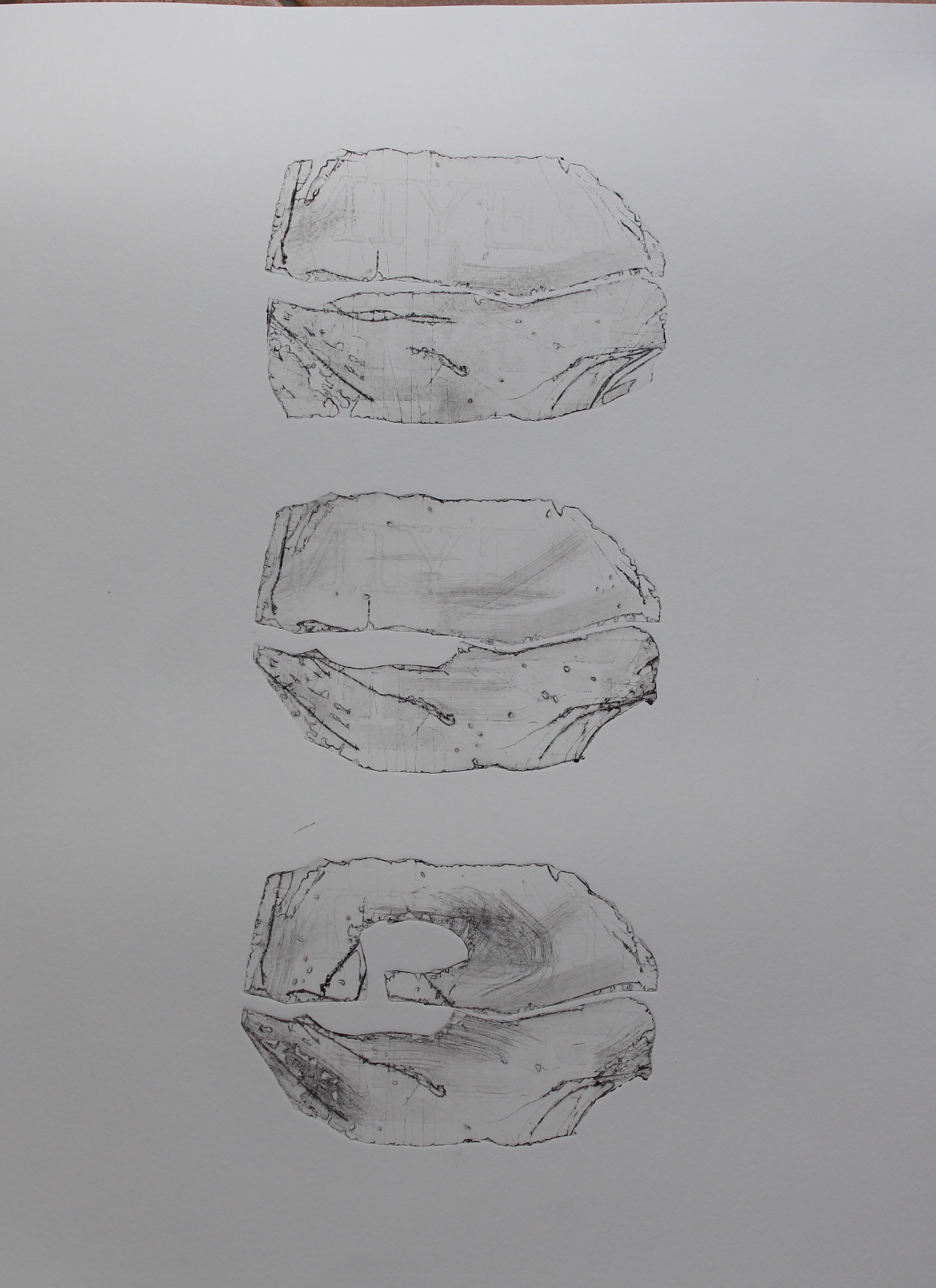
I continued the process of degrading materials, as I’d done earlier with copper, by creating a series of prints involving the staged destruction of a plate and the signs written on it, as a reflection and commentary on deterioration and loss, inspired by the work of Xu Bing, specifically the woodcut Series of Repetitions, but relating to the concept of metamorphosis, and the way that new objects and new signs and meanings emerge from the remnants of the older ones. The idea of process in these works would lend themselves to presentation in series, even, if I had enough images, as animation, although those are contrasting narratives. Xu Bing ‘s animation of the evolution of the Chinese character for “one” turned that into a history of the country and its politics, and could run on a loop, thus perhaps hopefully implying the “power of one”, whereas the Series of Repetition derives its pathos from the finality of the empty woodcut in plate 12. My own final image in the “greying” series is ambiguous, as it could be seen to have metamorphosed into a hopeful new sign. 

I’m contemplating whether I could make this sign a starting point in a portrait, linking birth and death in a cyclical progression: thinking of the Wordsworth quote from Intimations of Immortality:

Our birth is but a sleep and a forgetting:  

The Soul that rises with us, our life’s Star,

        Hath had elsewhere its setting,  

          And cometh from afar:  

        Not in entire forgetfulness,  

        And not in utter nakedness,  

But trailing clouds of glory do we come 

        From God, who is our home:

I’m also channeling TS Eliot’s Burnt Norton from The Four Quartets: “in our beginning is our end…” and the notion of linear time as an analogical construct, as a way of exploring portraiture as a mark made in time, and as a way of interpreting the world my mother now inhabits. 

Collaboration

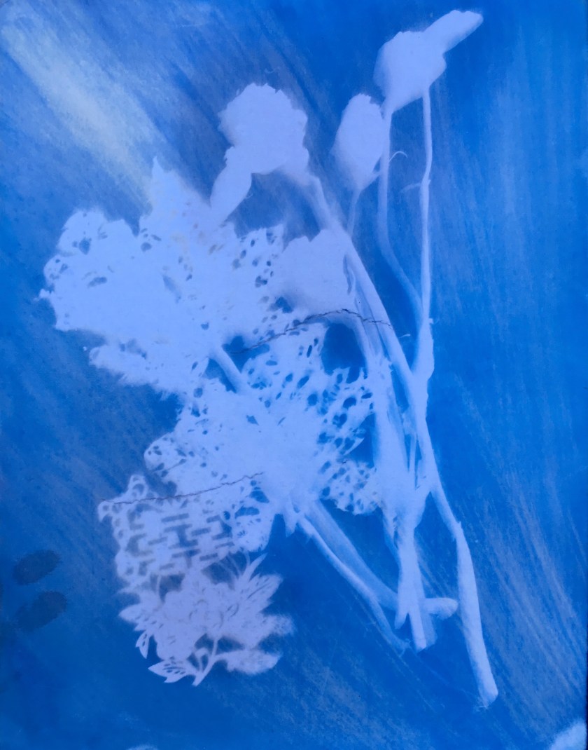
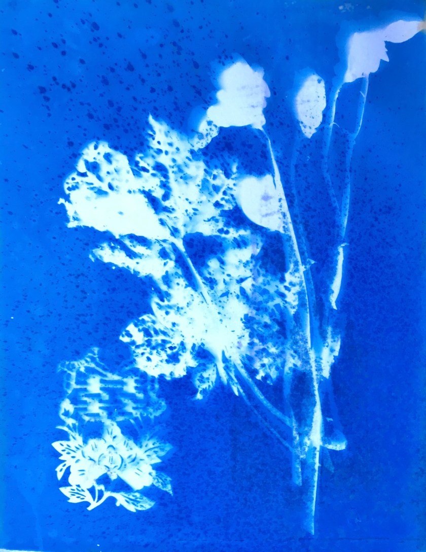
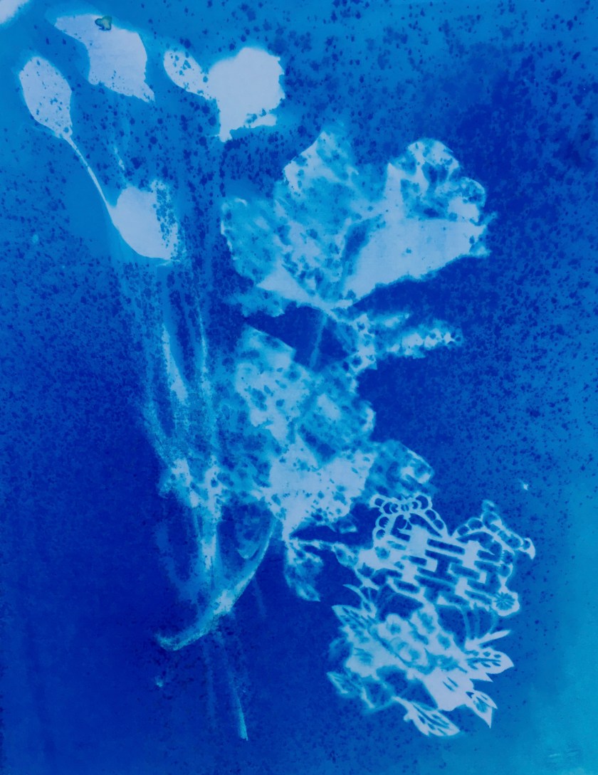
This was my first real experience of collaboration , when working with students on cyanotypes, in which they turned themselves into signs, using their bodies as objects, from the perspective of the sun, that block the light, and cast shadows. They are reduced to empty outlines, although movement can be “captured” through the manipulation of shadows. This is another way to explore portraits as a mark made in time, with the bodies as variants on sundials. 

Themes to develop

Destructive processes

Text and image- text as image

Cyanotypes bodies

Sundials- passing time

Ideas to develop- progressively evolving images- perhaps a film or animated series.

Reflection on Assignment 3

Assignment 3, Reflective Commentary

This has been very long and dragged out, and I have become quite obsessed with a few new techniques, to the extent that I’ve had little interest in cutting wood or Lino, or in making monoprints. I think it’s the relative sophistication- or so it seems to me- that can be achieved using these techniques- the possibility of layering in so many ways, and the use of photographs, always a bit of a thought to do, as they have to be justified and defended, even with their status as “ready-mades”.

That’s all very well, but they need a press to print, and that severely reduces the chances of working and experimenting.

I have been studying other people’s prints, and despite admiring their technical expertise, have at times felt bored with them… I really liked the work of Marc Quinn though, that I saw at Art Central in Hong Kong recently, and this was what made me want to experiment with photos, as I was doing recently, using portraits of my mother, but that’s for the next assignment as it falls under the title of portraits. I’d really like to nail the process of putting photos onto photopolymer plates, but without all the gear, it’s really hard. Even though you’re  not looking for technically high standards.

http://marcquinn.com

What interested me was Marc Quinn’s etchings from photos of meat- I believe he used laser printing from photos though. I also loved his etching of the frozen wave, made by embossing.

Anyway to get back to this unit- it was called chiaroscuro, and therefore invited exploration into light and dark, black and not-black in print, with all the practical technicalities and metaphorical imagery related to that. In terms of print-making I guess the “solid black” is the holy grail. I have managed it, using copper plate etching, with aquatint created using an air-brush, and a deep etch, which can create a velvety black.

What was interesting was to use my practice plates as a mezzotint layer and smooth them back into white. Photopolymer is much harder to get blacks with. They are so delicate, and I am still working on details such as whether to expose a plate in the sun after developing, or whether to clean with vinegar, as I have had disasters with both. Climate and other variables also make a difference. I’ve now got a bee in my bonnet about this process, and although I could probably get on with something else more successfully, I won’t until I’ve got somewhere with it.

I know I haven’t resolved the images of David and Goliath, and the idea of the truth and perception gaze. I’m just stuck, and have had to move on. There’s a worthwhile idea there somewhere, but it needs more work. I am reasonably happy with the “Facets” piece though, and think there is definitely something in this sculptural approach.

My earlier prints, the Newton’s apple and hand, were getting to know the materials and processes, and were much closer to a traditional interpretation of chiaroscuro. But even here, the connection to photography was latent.


Moving on from here

I am feeling very dissatisfied with myself at this stage, and feel I need a radical rethink of my ways of working. I have been far too obsessed with thinking and not involved in enough making. Everything is in my head, and part of that is the need to conceptualise what I’m doing, which is something mostly done in words, but it’s also because of embarked on techniques for which I don’t have the materials to hand. I am going to have to step back, sketch more, make more, find ways of making substitutes. I’ve signed up for a weekend workshop in Japanese woodcut printmaking- which has a focus on the printing process itself, including preparing paper for hand burnishing. At long last I hope to get to grips with what the paper is that’s for sale here, and what it’s good for, how it can be treated etc.

One of the more fun things I did as part of this was the Cyanotype project with students- the issue there being that it’s difficult to have control over the output, while still respecting their rights to self-expression… This is something I will have another go at in the coming autumn, as I’m planning another project week on the theme of printing with light… but it depends on whether the school is going to actually get an exposure unit, which would mean we could be more ambitious. Without one, it will still be sun exposures.


Greying

Assignment 3

The final project, as was, was supposed to bring together my practical experience and theoretical ideas about truth, perception and reality.

This one will be my final for “Chiaroscuro” as it’s the one that sums up how I feel, and also links back to Xu Bing, Series of repetitions, as well as being an echo to the image of David and Goliath. If that was the triumph of youth over age, this is really about aging and deterioration and loss. Thus it echoes the theme of Xu Bing’s woodcuts. Instead of woodcut, or copper, I used Perspex and photopolymer – the Perspex chosen as a brittle material, which I have already practiced with, using cracked lines to create patterns.

IMG_3859

This was a simple typed text, one white on black the other reversed, and it was printed backwards with the words partly cut off,  so as to take away some of the distraction of the semantics, while leaving it there to be found. Then lost again.

The grey colour evokes age, death, ashes, and the “ing” form reinforces the continuous day after day year after year nature of existence, with creeping decay. The later shapes echo skulls, primitive or animalistic ones, and the words are lost as language is. Towards the end of the series, negative space dominates.

The words were printed onto a transparency using a laser printer, so not dense blacks, and then exposed for an approximate length of time using aquatint. It didn’t really matter, all I wanted were shapes of grey and some outlines. Even the ragged edges of the photopolymer wouldn’t matter, as my intention would be to degrade it.

This is the single image.

Greying: photopolymer on perspex

I like these imperfect photo polymers, for the range of tones you get, for the juxtaposition of commercial typography or photographs with damaged surfaces, the fact that you have a “perfect” image that is pockmarked by errors and accidents. There is a hint here of weathered stone, of gravestones falling into neglect.

Before degrading the plate and losing it, I intended to print this multiple times, as first as a brick wall- a single sheet of damp paper, working quickly- this was hard to do- the plate slipped in the printer ( I should have stuck it down somehow) and the alignment didn’t work, making this an ineffective image. I tried using slight colour variations, and missing bricks, but it didn’t help.

another brick in the wall

So the next stage was to print my series. This is a series of prints showing degeneration from image to image, created by cracking, filing, scratching, cutting and breaking- both the photopolymer and the Perspex are very brittle and crack and split leaving interesting patterns. There is a top to bottom orientation as the images are progressively more broken. The images are made in three series of three, then a final one made of scattered pieces.


 The images reform themselves progressively as the geometric brick like structure gets eroded into a much more organic state, from factory made to animalistic, like a reversion from industrialism to nature. Towards the end they become skull-like, again referencing the grave. The last one could be hopeful or hopeless. I deliberately placed the pieces as if to suggest taking flight. But it could equally be randomly scattered.


Technically, I was kicking myself for using the wrong side of the Fabriano paper for the first pages. The range of marks is lovely, and the woven texture of the paper is just beautiful.

M+ Sigg Collection Exhibition | 23 Feb to 5 Apr, 2016 | ArtisTree

Uncategorized

http://www.westkowloon.hk/en/siggcollection

Excellent exhibition of recent Chinese art,  showing how Chinese artists responded to the opening up of the arts in the 1980s. 

It was highly educational, showing the movements that developed from the 1970s onwards, and the use of art as social and political criticism and satire, which could be seen as the signs of an increasingly healthy and open society. Till it all changed back again. Single party states cannot bear too much reality. 


 This image by Zhang Huan struck me particularly in terms of process, the accumulation of ink eventually covering the face, thus challenging ideas of heredity (clearly referenced in the title of the work “Family Tree”) and identity, in what seems to be a declaration of profound and shocking change taking place. (The racial overtones could be particularly telling in this cultural context.)

Art Central – Art Central Hong Kong

Research

http://artcentralhongkong.com/#

I was a little disappointed in this one, this year, as many of the exhibits were exactly the same as last year’s. It was nice to see some things again, such as Kate MccGwire’s feather sculptures, but I had been hoping for something new. As always in HK, it began with bling: a moving sculpture made of crystal, commissioned by Svarowski. It was much photographed.

The artist I cam across for the first time was Marc Quinn, and I was really interested in what kind of printmaking techniques he used. I liked his embossed works “The Frozen Wave”, and the combination of embossing with ink layers.

I was particularly interested in his photographic prints of raw meat, and wondered about trying to produce something in this style using photopolymer.