http://www.visualcapitalist.com/every-single-cognitive-bias/
Author: chrisocaprintingblog
Tutor Report Assignment 6
Tutor ReportsReflection and building the Portfolio
Portfolio, Reflective CommentaryI would like to present this work so that it reflects the coherence I personally feel, now that I’m coming to the end of it.
Landscape: change and process (Assignment 1: Landscape: Observation) (Not included in Portfolio)
I started off preoccupied with a theme of disintegration: this was reflected in my quite depressing study of landscape, based on the fact that construction work had led to the cutting down of all the woodlands surrounding me to be replaced with a concrete highway and series of junctions, all connected to a tunnel through to China. All negative connotations there, which I explored using words from the poetry of ST Coleridge, Frost at Midnight, a hymn to nature and an attack on life cut off from the natural world, “mid cloisters dim.” It is also of course a blessing on his new born child, that he will grow up in the natural world and will thus speak “God’s language”. As I was limited in terms of equipment, this work was done using monoprinting techniques. The visual language I started to develop involved the representation of process, by creating images in a series. This was inspired by the work of Xu Bing, specifically his woodblock “5 series of repetitions” which commented on the change in land use in rural China. I won’t include these images in the portfolio, as they were quite exploratory, even though I found them quite satisfying in themselves, combining representational patterns and shapes with abstraction.. I was pleased with the scale of these- much bigger than anything I’d tried before in printmaking, and achieved using multiple impressions.
Later I learned new techniques, very different ones:
Copper plate etching, essentially a corrosive process; and
Photopolymer etching, which uses light to create etched plates on different surfaces. Inspired by this, I went on the practice other techniques related to printing with light, and focused on Cyanotypes.
Abstraction and Chiaroscuro: time passes, things fall apart (Assignments 2 and 3)
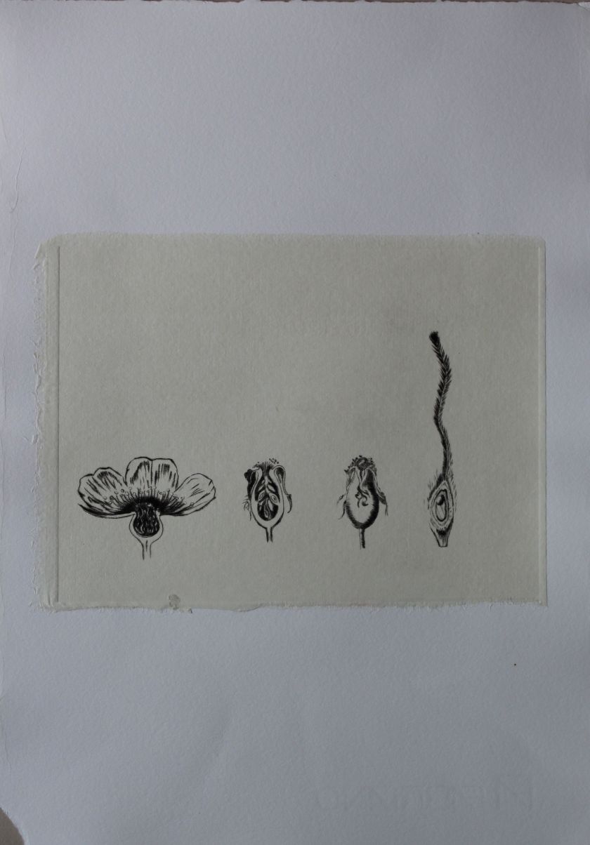
Portfolio piece 1: The enquiring mind (copperplate etching)

Portfolio piece 2: Forgetting (copperplate etching)

Close up

Forgetting: copperplate on Fabriano paper scroll.
Portfolio piece 3: Greying (intaglio and photopolymer etching: series of five)


These two topics merged for me, as I was using starting to use techniques of printing with light, and corrosive/ destructive techniques, around a particular motif of the moon, the brain and the theme of aging and degeneration. This also had personal significance related to my mother’s decline due to dementia.
The images I will choose to represent these ideas are made using copper plate etching- whereby the copper has been etched to the point of near disintegration. This creates interesting visual effects, linear, shaded, textured and embossed. I will also include the series “greying” which recapitulates the idea of a series as discussed, showing progressive decay and destruction. This was made using photopolymer etching on Perspex, a brittle material which lent itself to the process. The word “greying” in reverse, became the object in this series, and became obliterated as the images progressed. Again, the work of Xu Bing was inspirational, not only the “5 Series of repetitions”, but also the exhibition “Metamorphosis” which was constructed around a narrative of transformation. It also included a biographical piece referencing his father’s death from lung cancer, a collection of pieces including a book made of tobacco leaves, which were presented in glass cases, as newly constructed “museum” pieces.
Portrait of my mother: “a photograph is a certificate of presence” (Assignment 4: Portrait, segueing into Assignment 5 A print from memory)
Portfolio Piece 4: This is in two parts- a suitcase which serves as a museum object, and a print which serves as its label.
Contained: Suitcase containing photo and objects, quilts and pillow book (cyanotype, mixed media)
Only through time: cyanotype and photopolymer

With my mother moving further and further away from the present, I was beginning to search back history to remind her of who she was/had been. Photos were important for anchoring her to her own past. I was interested in photos in connection to the light-printing techniques I had been learning, but also philosophically in terms of how they “fix” the past. With image manipulation so rife now, this is not such a sure thing anymore, but at the time the old photos I was using were taken, this was the case. They were phenomenological to a degree that is no longer true. Again, I was using text and image and explored philosophical statements from TS Eliot’s poetry about the nature of time, and passing beyond time into a timeless “present”.
The techniques used here were photopolymer and Cyanotypes. I made images which combined the two, photopolymer printed over cyanotype, and explored printing on cloth, to go further into creating images as objects. Relating to my mother’s condition, I created multiple versions of her portrait from a photo, all exposed differently in my prints, and stitched them together. I made two of these collections and turned them into quilts. These are the kind of “heirloom” objects that evoke a connection with the past, but their size and texture also relate to a mother and child connection, to tactile links. At this stage I realized that as well as exploring a visual language, and considering the “truth” value of images such as photos, I was now using art as a kind of therapy too, as a way of dealing with what was happening and a way of responding to it. Still using cloth, as the soft tactile nature of these pieces were also resonating as “presences”, things to be interacted with, handled, used as comforting materials. The quilt with its set of images was also a reassurance of having been present. The other cloth piece to be included is a book, “the book of sleep and dreaming” which is also like a pillow, and again is meant to have a comforting quality. It is a book of images of space, distance, dissolving, release: letting go of the present.
Containment:
After listening to an artist’s talk by Kate MccGwire, in which she spoke about her collecting cases to contain her sculptures, I realized that the idea I had been playing with, to put the pieces related to the portrait of my mother into an antique suitcase, was the right one. It collects these items and makes them one piece, a container of emotions and memories, a repository for the past, and an invitation to participate in viewing. The case is labeled “baggage”, which is just stating the fact, but with overtones of “emotional baggage”, and a suggestion that opening it will release something. The case contains the quilt and the book, inviting them to be unfolded, opened, handled.
It also includes the still life photo I took in a frame, and the real life objects in this photo, including objects imprinted with my mother’s image. This draws attention to the relationship between the “real” and the photograph, the way the photo operates a “certificate” that these things really existed at some time. The packaging of all these objects also serves to illustrate the practice of curating the past, selecting and saving what fits our “nature morte” imagery, and the imprinted doily and handkerchief hint at fetishisation. Finally, there is a cyanotype print inside the case. It includes a quote from Eliot’s Four quartets, about a moment out of time, of being and not being, of an existence between the material and the non-material. I think it serves to “explain” the relationship between the objects in the case, and is included as the last piece to be found when unpacking it.
This suitcase then, is presented as a kind of miniature museum, and the portrait of my mother as something fragile, a material object needing to be preserved against loss. The acts of opening up the container, exploring, refolding, sorting, arranging and repacking act as metaphors for memorialising, and adds an edge of uncertainty to the process of selecting what memories to keep, and repackaging them.
Here is a video showing how the pieces could be unpacked.
Finally, the print with the text “Only through time, time is conquered” will sit outside the case, helping to introduce it as a kind of “time capsule”. This text has a double edge- it refers simultaneously to “baggage” that is hoarded like treasure, but is subject to decay as is all material, but also to “presence” as a non-material phenomenon, as the knowledge of “something having been” lives on.
The Rose Garden (Assignment 5)
Portfolio piece 5: The Rose Garden: images in a series: mixed techniques
This series of images was an exploration of image, word and symbol, relating to the poem “Four Quartets” by TS Eliot. Apart from the link via the poem, this was a thematic and philosophical development from the work on my mother’s portrait. That study had been about history and materiality. This one proposed demateriality, a spiritual sense that eludes representation in image or word, that exists outside time. I started off thinking if these images as a series, and put them in a linear order, to create a narrative. But I realized that they can interact with each other in various ways, that there are cyclical relationships between them (as is the case in the poem), and that putting them in order would limit that. Unlike the earlier series “greying”, which had a particular order, this one could be looked at in various ways, so I propose it be viewed in such a way that the images resonate with one another.
At first they were arranged in groups on cardboard mounts, in twos and threes, but I was unsure how best to lay them out. Each juxtaposition creates a different set of relationships, yet, if they are stuck to a card, they are fixed in their relationships.


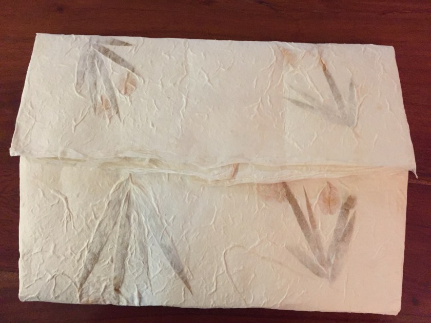
Finally, I decided to keep them as loose papers but package them inside an envelope. I used a handmade paper with dried leaves, to envelop the “leaves” of the prints. A quote from the opening section of the poem “Four Quartets” introduces the Rose Garden as a place that was undiscovered in the past but which now reveals itself, a foreshadowing of the theme of the poem and of this project, about new meanings being discovered from familiar texts.
Footfalls echo in the memory
Down the passage which we did not take
Towards the door we never opened
Into the rose-garden.
(T.S. Eliot, The Four Quartets, Burnt Norton, 11-14)
Emotionally, this is, to me, a quite satisfying piece, as it moves through the same emotional stages as in the earlier work, using some familiar visual language of disintegration, and fragmentation, the dissolution of language, and it moves into pure symbolism, abstraction and nonmateriality. This work was inspired by rereading and reinterpreting the poem by TS Eliot, and finding altogether different meanings from those I found in the past, when influenced by a Judeo-Christian culture. Reading it again, I was instead finding strong links to the Zen traditions evoked in the work of Xu Bing. Like the poem, I hope the collection of images “The Rose Garden” leaves the way open for a viewer to find symbolic sense.
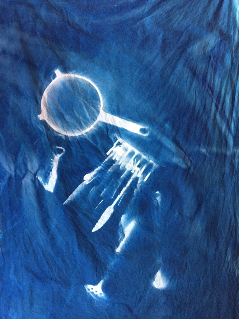
Moon Baby (Assignment 6)
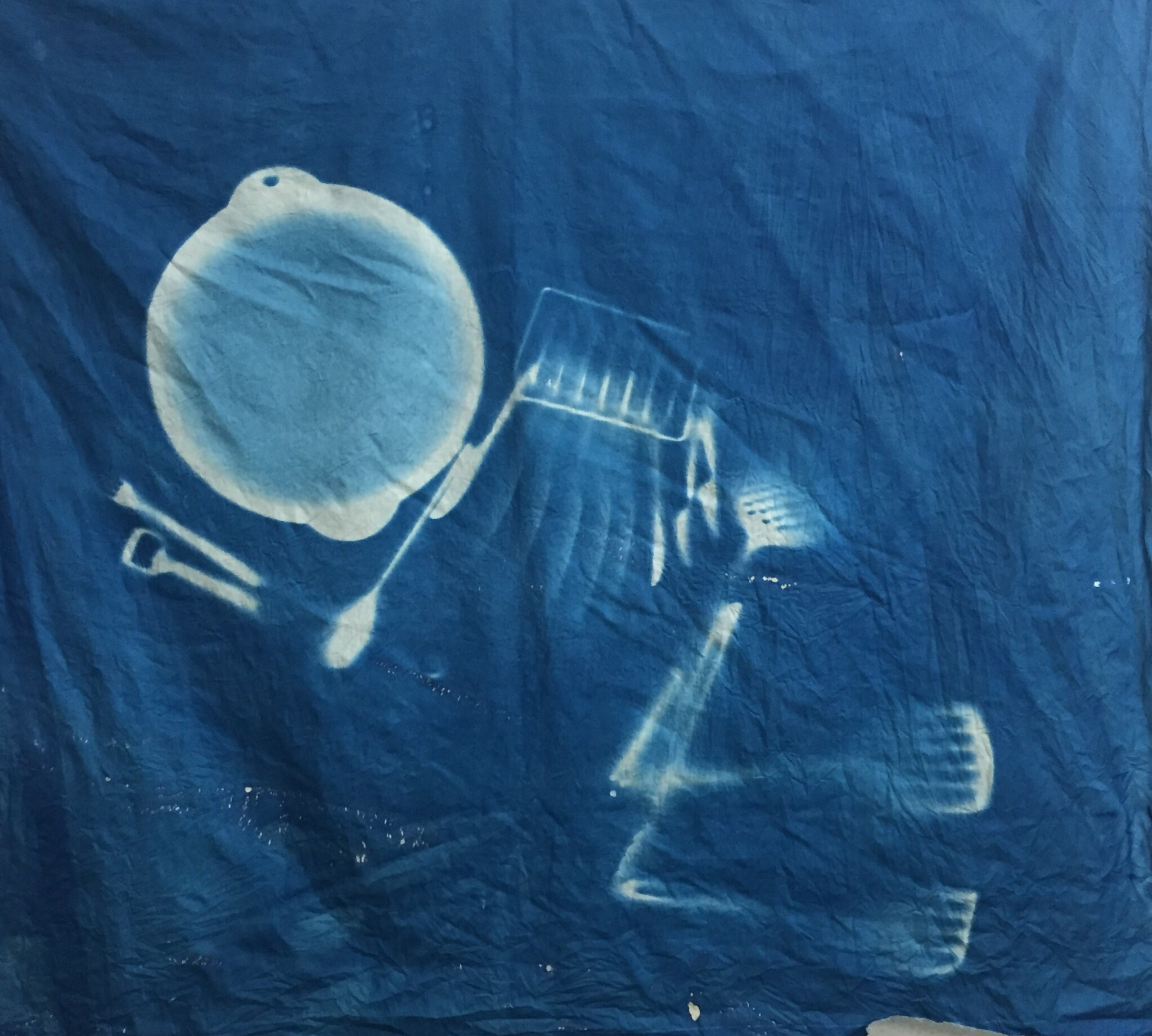
Portfolio piece 6: Moon baby: cyanotype on cloth

This final image is joyous, surreal, fun. It reverses the connotation of the earlier “moon” images, positing instead newness, perfection, blank slate, but in a lighthearted way. There’s an edge to it, though, literally, with the inclusion of kitchen utensils, which adds irony, or threat, slightly unnerving. I guess it’s like a cartoon, but I like it, and like the symbolism of something new emerging into the light, but with the acknowledgement of an “alien” presence too.
Going forward
I would like to explore alternative photography techniques, and develop my technical skills more in etching. I’m sure life is going to provide the thematic stimulus with lots of new beginnings coming up.
Assignment 6: Into the light
Assignment 6, UncategorizedThis final assignment is a recapitulation and a resolution, much more of a resolution than I had ever expected it to be.
It is supposed to reflect the subject of the parallel project. Well, as I have discussed, Xu Bing tells stories. The exhibition I saw, which influenced me, was cyclical, and told a story beginning with “metamorphosis”.
For this project, I returned to cyanotype printing, using direct images, or photocopying onto the light sensitive cloth.
My original idea was to create a series of images to represent ages of women. I planned to be the central image myself, which of course meant I would need help. After planning several possibilities, these were the ones I felt would work.
Image 1: Foetus: This was to start with a foetus shape- this was to be me curled up, with a tape/ paper line around my shape, and a pair of scissors, suggesting the idea of being cut to shape, or cut out, constructed. It would also reference domestic crafts, and dressmaking, which fit the use of cloth.
Image 2: Construction of identity: referencing the old “Bunty” comic we girls all used to get, which featured on its back page a cut-out doll with clothes that were to be cut out to dress her. The clothes had tabs to hold them onto the doll. Again, I was to be the model/ body shape, and I would fit tabs to clothes, which I would lay flat. Again, this would reference being cut to shape, constructed, and involve the use of dressmaking materials.
Image 3: Queen of Hearts: this one would be based again, on dressing up- this time as a fantasy powerful woman- a ridiculous one though. I decided this time to create the shape with cut paper or something artificial, and lay out the clothes in such a way as to be slightly surreal, misaligned, to create an unsettled tone, and reference the Alice story. Power dressing, as we did in the 80s. Mocking the idea of power as a constructed thing, a fake, and very short lived. Heartshapes would reference the Alice theme but also the fake adulation of the powerful.
Image 4: Shroud. For this one I thought I could soak cloth so it was stained on both sides, then wrap it around myself and expose to the sun. The result would be hard to predict, and I wasn’t sure if the shape would be recognisable at all. It would also be on both sides of the cloth.
Image 5: Earth: of this one I planned to create a skeleton shape, but using materials such as tools, or cutlery and kitchen appliances, to create the bones.
I can see how this series reflects my preoccupations over the past couple of years. Literally carving out a space amongst competing demands, and consciously entering a new phase of life myself. Being a member of that older generation, at the stage where you lose your parents, and becoming the “next to go”, being aware of keeping historical records, putting things down for posterity. Facing my mother’s condition, her impression on the world fading and her history being forgotten. Photography has interested me for this reason. It creates a record and a curatable object.
It was important to match the materials and the subject- hence the relationship to domestic objects and crafts, but the process too was important- the idea of imprinting a shape that is exactly the same size and dimensions as the real life body, or tool, creates a visceral connection between the subject and the image, as the subject and the ground have to touch. What is variable and serendipidous is the shadows cast – these can be controlled by the direction of the light, but are also highly dependent on environmental factors such as time of day, weather, location and UV strength. However, I had also noted the process used by Rauschenberg and Weil, and had a UV lamp to use as well- as the direct exposures of my own body would be very hard to arrange outdoors, without exposing the cloth too soon. That method would allow the exposure to be done inside, and the shapes arranged in a darkened room. I also realised that to an extent, double exposures could be arranged, and that errors could be fixed by re-applying cyanotype chemicals and re-exposing.
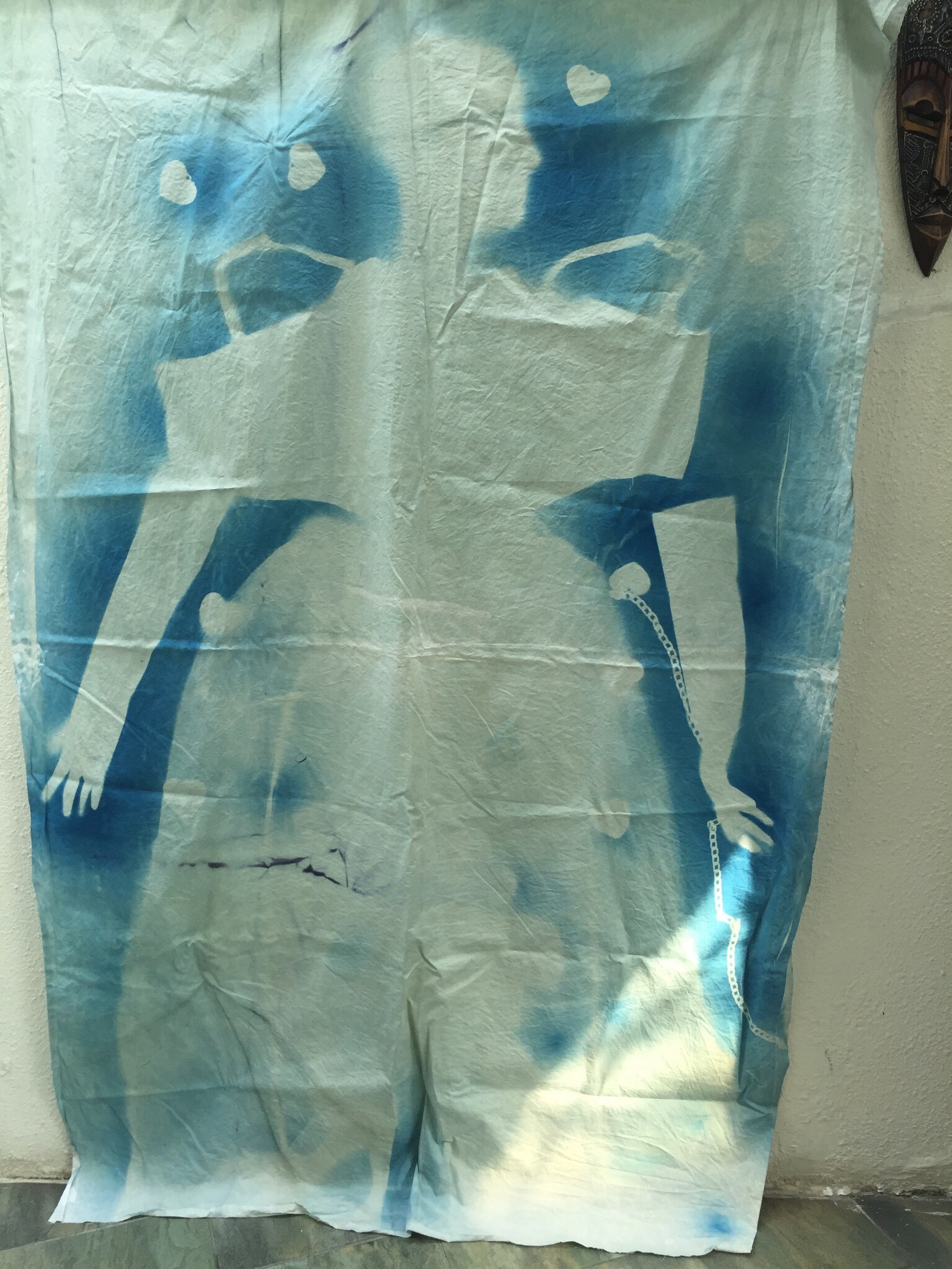
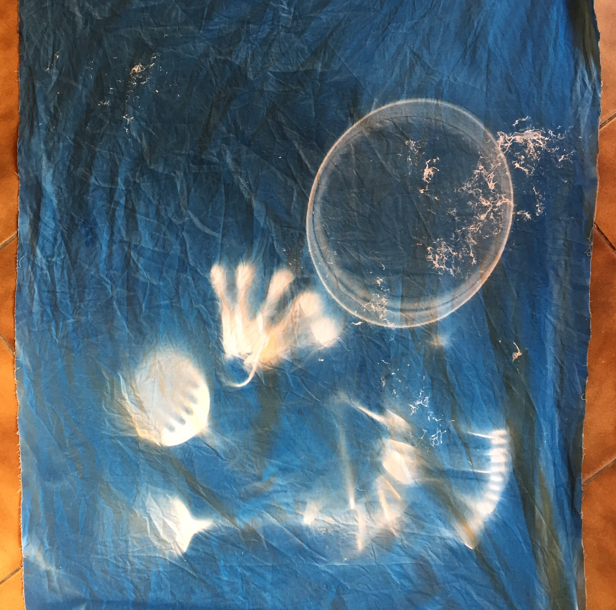
I started with the foetus shape- but changed my idea as I realised that making a curled up shape would not be very clear in silhouette. Instead tried to make an image of myself trying to cut out of the cloth, cutting along a dotted line- I cut the cloth to show this process.
This was done indoors, using a UV lamp, which of course I had to get help with. Making something this size meant the lamp had to be moved- this means that shadows are obliterated by the moving lamp, and in the end the image was not at all clear. There were also patches, which I think was to do with my rinsing in vinegar which had been previously used for this, and which still contained dye. The watery effect is not unpleasant, but on the whole this didn’t work. I felt that I should not pursue this method. It was too hard to be lying still giving instructions and unable to check what was happening. I need to involve another model and control the light myself.
I then tried using the lamp myself to create the “Queen of Hearts” image. This one worked a bit better, but it was clear that the UV lamp was much less effective than bright sun. it was hard to get details- for example there were lacy textures and mesh, but these did not come out- the movement of the lamp would have been to blame, whereas strong sun would fix the image clearly with a constant direction.
Then, everything changed, and I haven’t finished this series.
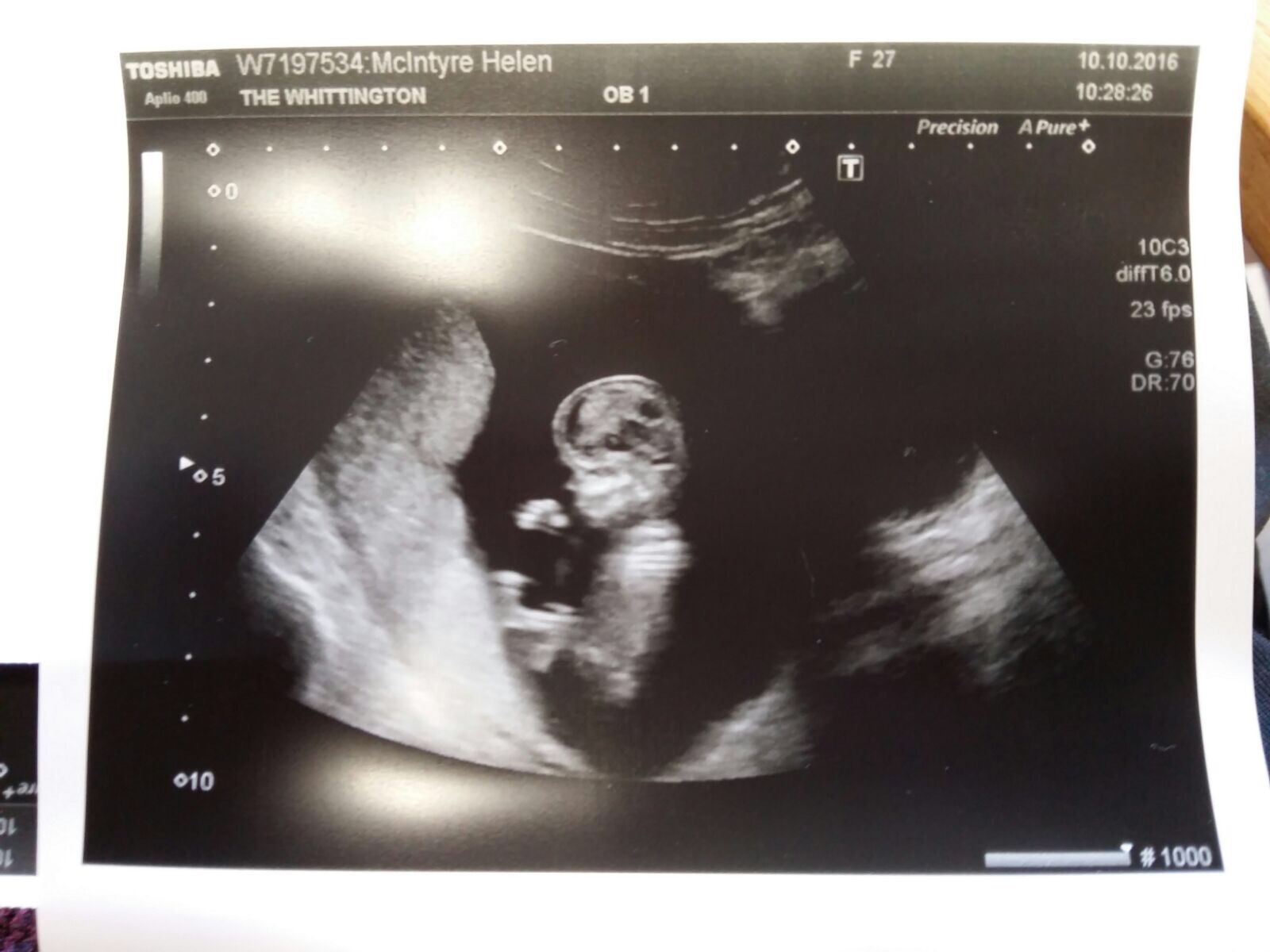
I got this image to play with- first grandchild.
And I got a job in Europe. And life felt very different.
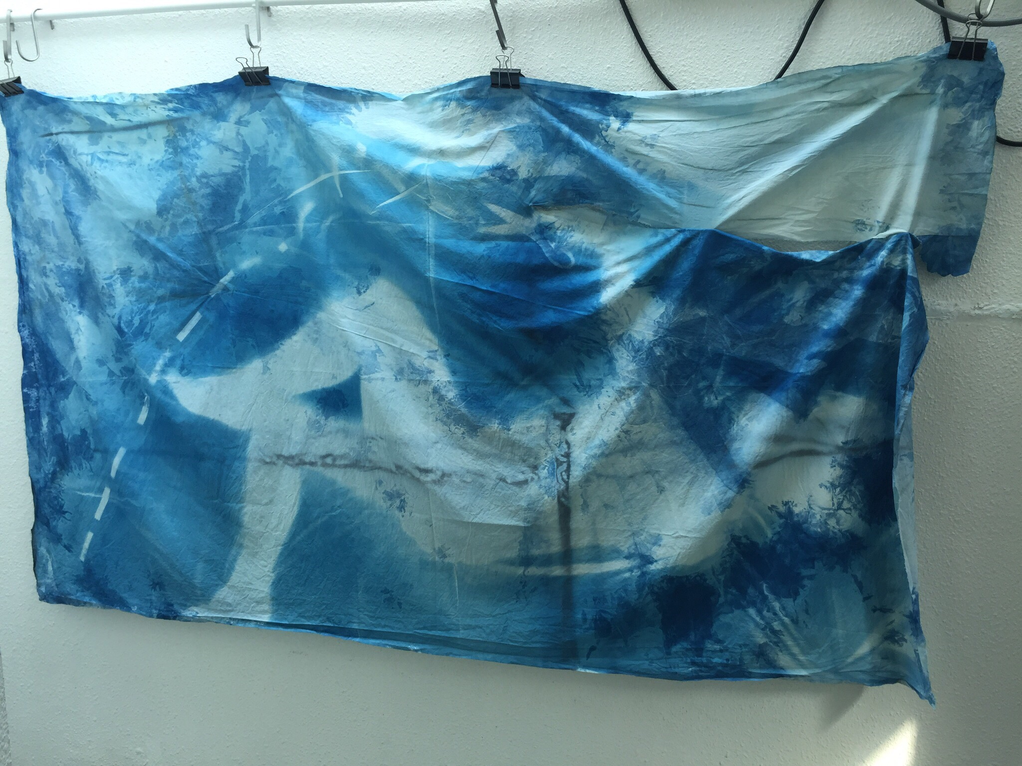
I combined my ideas of tools/cutlery, and the foetus shape, and tried various arrangements.The weak wintery sun now wasn’t quite up to it, and so I also tried the UV lamp again. Outcomes varied, and sometimes the chemicals just washed out completely. I wanted to bring back the “moon” theme from earlier- and used a crescent shape, and circles- now the shadows are not as powerful as earlier in the year though, so effects are very different.
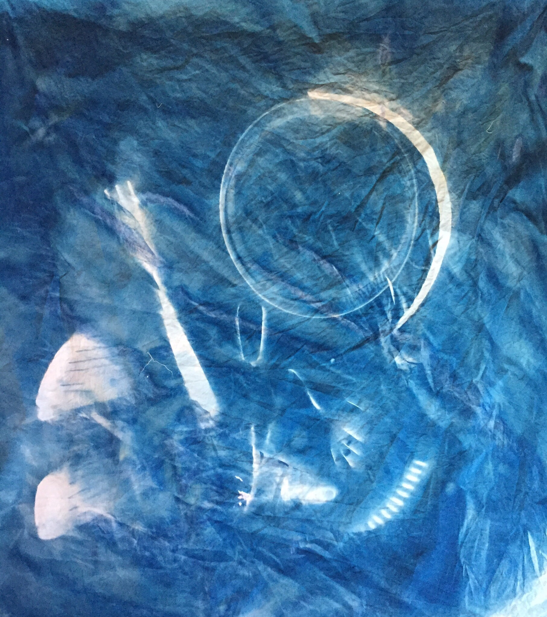
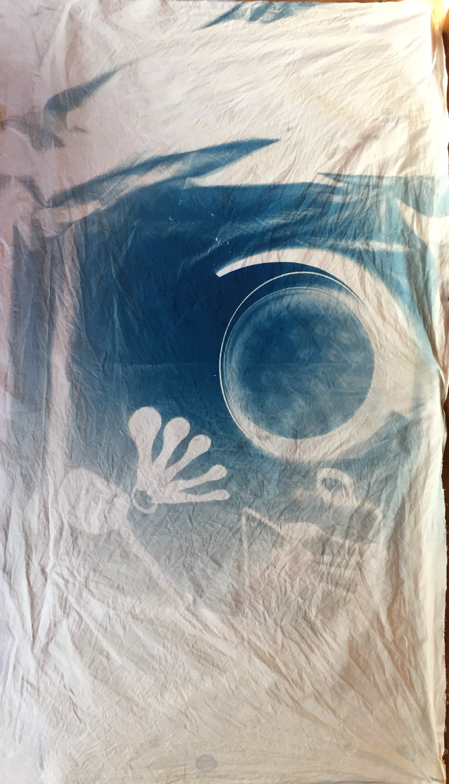
After a few poor attempts, I knew this was the one:
“Moon baby”.
I love it.
Now the “moon” is full, and perfect, unlike the corroded and degenerated forms I was making earlier, which reflected my mother’s condition. It’s outsize, like a real foetus. The use of a sieve is playful, making fun of the idea of a brain being “like a sieve”, but also reminds of my mother at the other end of the spectrum. The use of cutlery is meant to be playful, although a sense of threat might be felt too, but the pose is of a young child exploring- crawling. The “technique/ technology” involves blocking light to form an image, and the ultrasound works in a similar way but with sound waves. Both are testament to something “being there”, to presence. Both create positives out of negatives. Overall, it should be fun, joyful, new- positive in that sense too.
For me it marks a turning point , and a much needed relief from the thoughts and emotions that have been obsessing me for the past year. As this moon baby emerges “into the light”, I feel I am emerging from darkness too. And so this is a good place to end.
Assignment 5 Tutor Report
Assignment 5, Tutor ReportsPRESS RELEASE: Secrete — KATE MccGWIRE
Research, Uncategorizedhttp://katemccgwire.com/news-om/2016/10/24/press-release-secrete
Very small venue, and not at all like seeing the pieces in situ. Conscious of it being a commercial gallery and a sales promo. But the pieces are still impressive, eerie, unsettling., seeming to have a life force, but quite reptilian, capable of staying still for a long time, then moving.
Artist Talk: Kate MccGwire
Assignment 5, ResearchGood chance to get to hear Kate MccGwire today at Hong Kong Arts Centre: she was here to install her exhibition at a local commercial gallery, Galerie Huit, opening next week.
I’ve seen Kate’s work at Art Central and loved it: her feather sculptures are amazing, sinister, abstract, sinuous, violent- and her pictures (I don’t know what to call them) images made of lead lined with feathers, like bullet holes with teeth, rather scary, beside extremely peaceful landscapes constructed with overlapping feathers.
I was interested in hearing her talk about how and why she often presents her works in glass cases, as this was something that I am also considering regarding some of my pieces.
Her feather sculptures evoke organic forms, human bodies or knots. She said she collects glass cases- old pieces, that would probably have been used for stuffed natural specimens- by doing thus she creates context- gives them the air of being aged museum pieces, scientific objects even.
She also spoke of HOW she fits them into the cases- she makes her sculptures to fit the case as nearly as possible, so that sometimes they may appear to be close to bursting out. This gives the pieces an energy that adds to their constrained force that they get from being tense, knotted structures already.
She said that this idea of containment was important to her as it also suggested the containment if her idea inside her head, things that burst out into her work.
While she was talking, I thought about my own ideas of presenting the portrait work relating to my mother. I could see how the idea of putting it into an old suitcase was also relating to this idea of containment, of emotions. The link to “emotional baggage” is also there. But I also realised the way the old suitcase, like MccGwire’s antique cases, creates a historical context. There is also a sense of revelation, as a suitcase is something that can be opened, and that is also a potential threat, as it may may reveal things hidden or forgotten. But it also evokes a sense of preservation, of something stored because it is valuable, an heirloom. All in all, I feel convinced by this choice now, and am happy that listening to the artist talk helped me articulate the reasons.
Assignment 5: Rose Garden Reflective Commentary
Assignment 5, Reflective CommentaryThis was an experiment in making a series of images that narrate, and which also relate to a text. I felt I had to avoid the images being “illustrations”, which means, to me, that they should stand alone as a series. I’m not sure if this has been achieved or if they would work better accompanied by extracts from the poem “The Four Quartets” which is the inspiration.
Coming back to working on paper, after making images with a slightly more three-dimensional nature, using cloth, initially felt limited, and I was also undecided as to how the images would be arranged or shown- in a book, or in a series. I worked on the assumption that a book format would be best, and so took care to preserve the same page size and orientation.
What was unusual was that, for once, I had a good array of materials and equipment to hand, as I was working in my own space in France, and so could choose from a number of techniques.
I was aiming at creating a reflection on a rose, exploring it in terms of different meanings and associations, preserving a certain analytical distance. It was a conscious effort to mirror what Eliot was doing in The Four Quartets, i.e. constructing a narrative for life’s journey, based on an “objective correlative” of the rose. In Eliot’s poem, he is searching for meanings why seem to be inexpressible in language, even though poetry gives him the tools of metaphor and figurative expression. Similarly, I was trying to explore the representation of a rose, while also considering the impossibility of doing so. The first section “Air” is highly abstract, considering image-making, signs and symbols. Part 2, “Earth” is meant to relate to a pragmatic material aspect of life and decay. The third part “Fire”, should be a reconciliation of the two- the real and the symbolic, the abstract and the concrete. But I really have no idea if these images work without all the explanation and narration. I have shown them to people and they seem to get it.
The other thing that bothered me was the lack of stylistic coherence- using different techniques in every image seemed to be bitty. On the other hand, in order to explore different expressions of meaning, this seemed to be necessary- line drawings when delineation was the subject, calligraphic lines when text was referenced, solid shapes when positive and negative space was being considered. But they lack visual depth, as sometimes they are neither satisfactorily representative or sufficiently abstract, and I don’t think I achieved a coherent visual language overall.
This is no doubt due to a lack of detailed consideration of the visual quality of the images- I worked by intuition based on my thoughts on the poem. It’s all a bit “first draft”. My planning was more verbal than visual. I have difficulty sketching in pictures- I do it in words. But it seems to me that a great deal of the art that has been produced under the heading “conceptual” is like this. I went to the Conceptual Art exhibition in Tate Britain this summer, and got it, but found a lot of it tiresome and dull, and wouldn’t want to go far down that path. What bothers me is a lack of visual impact of a lot of that type of work.
So, to sum up, I feel the images lack power- except the copperplate “what is is what is not”, which is my favourite. I think the challenge is to get both the conceptual and the visual working better together, but this was probably too ambitious given the time I had to work on it.
Assignment 6: Out of the light, into the shadows | Tate
Assignment 6An inspiring article for Assignment 6, which is to be based on making images with light.
http://www.tate.org.uk/context-comment/articles/out-light-shadows
The idea of a “photogram” is back to basics, and perhaps an appropriate response to the “post-truth” era of digital manipulation of images. With a photogram, you get a life size version of the imprint an object makes on photographic paper. I hunted down some black and white paper, and chemicals to have a go at fixing them – I don’t know enough about the technicalities though and ended up overexposing all that I made, and so ending up with “dark” photos, which are nevertheless quite interesting.
I didn’t take photos during the exposure-well, you can’t when it’s light sensitive- so just have a couple of snaps of temporary images:
Lumen prints
 It’s something that would take a lot more time and study than I have at the moment, and I think I’d need to attend a workshop in alternative photography to find out more.
Assignment 5: The Rose Garden commentary: layers of meaning
Assignment 5Footfalls echo in the memory
Down the passage which we did not take
Towards the door we never opened
Into the rose-garden. My words echo
Thus, in your mind.
Burnt Norton ll. 11-15
The rose garden in Burnt Norton, in the poem “The Four Quartets” is at the same time an illusion, a mirage, and a transcendental vision. Eliot’s Rose garden is multi layered- a construct in which author and reader are participants- even the roses are conscious. In the poem, much is expressed in the negative. There is repetition, and circularity.
An actual rose garden, real, phenomenological, is a temporal thing. The constructed, philosophical “rose garden” is a linguistic entity that conjures up a visual image. It comes with a lot of cultural baggage, such as Shakespeare’s- “a rose by any other name”, and achieves poetic immortality, like a Grecian urn. Is it immortal? Language changes: if another culture constructs a rose as a dungheap, its effect will be lost on that audience, and can only be reconstructed through study of the culture in which it was made. Yet, a rose is a powerful symbol in my culture- from its associations with Christianity (the virgin Mary), the Rose windows in churches, its amorous and sexual associations, its exotic scent Attar of Roses, its Eastern origins in China Tea roses, its analogies in poetry (oh rose, thou art sick… William Blake), its strength and thorny fortifications, its resilience against frost, yet its ultimate transience.
Can we say that a rose IS all these things? Yes, if a glass of water is an oak tree. “Until such time as it isn’t”? The relationship between the object and its associations is not arbitrary, but a complex network of analogical thinking, emotion, sensory perception, and memory. And for some, faith- that which makes the glass of wine the body of Christ.
This project, a “print from memory”, starts with a rose.
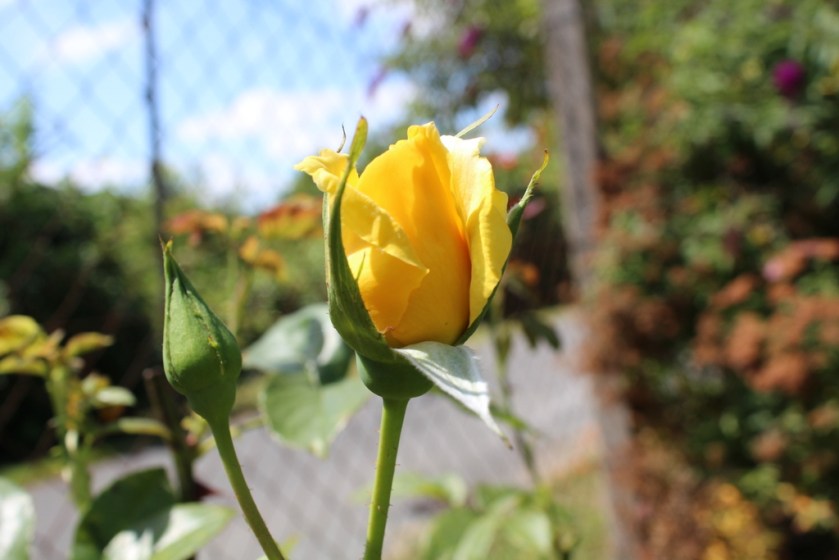 It is a rose I planted as a memorial.
The rose started to get sick, and as it has been tended, and as time has passed, it has seemed as if it has become the thing being memorialised: the two have fused, and the dead is in some sense still living. This is a personal experience, but can perhaps become my “objective correlative” for more philosophical thoughts and images that resonate as more than direct representations.
Experience- sketching. Sketching the rose from different angles at different stages revealed how it was constructed on a set of geometric principles but expressed itself in rounded, organic forms. It was both sharp and jutting, and curled and infolded. It suggested a linear construction, with branching structures, and flowing contours. Its bright yellow flowers also suggested pure colour and form.
There was movement, as the summer heat and sun was causing it to blossom and change almost visibly, turning itself out in a spiralling motion that recalled the recurring motif of the dance in Eliot’s poem. The dance in the poem becomes a motif of experience and creation, a microcosm of the turning world, which creates a still point. Spinning triangles. Whirling dervishes that achieve stillness.
The purpose of this piece, this set of prints, is to meditate on life and death, on aging, on meaning of words and symbols. To create a cycle of images that connect and narrate. To match technique/ process with ideas. To communicate a process of thought: a meditation on a rose.
AIR
This part references Eliot’s poem “The Four Quartets”, part 1, “Burnt Norton”, which begins with a description of the Rose Garden, where a transcendental moment out of time is experienced.

Into the Garden
- Into the Garden
Technique:
Copper plate etching, with chine colle.
The first image is of lines and indistinct form. The roses are emerging from among the lines: I see this as a metaphor for human experience and meaning-making, in which observation makes patterns emerge. Thorns or roses may dominate. Lines are suggesting, or obliterating, not revealing. Shape, colour, form, reveal themselves to the beholder. There is a relationship between expectation and the perceived image. Is the rose given or interpreted?
The design of this plate came almost directly from the sketches I did of a withered rose bush and its grey thorny stems. Sketching is a visible process of making meaning. Shapes and patterns emerge. The stems intertwined and created a dense and confused mass, hard to articulate, and through which it was difficult to perceive a clear sense of direction. This seemed to fit the opening idea of messy experience and gradual focus and illumination. The yellow of the chine colle paper, a soft organic tissue, contrasts with the grey thorns, soft and hard, blurry and sharp, background emerging into the foreground in a soft glow.
What I mean to say here is that the process of sketching and the use of line and form is akin to thinking and perceiving meaning.
Technically, this one could have been done using drypoint, and I’m not sure that the use of copper plate was justified, as I didn’t quite get the difference in line quality and density I was after- something resembling pencil lines. The inking was done using graphite and black to try to create a sketched effect.
2. Calling
Technique: woodcut, watercolour ink, chine colle

Calling
This print is made using the mokuhanga technique I learned, using watercolour and glue to make a paste for hand burnishing. The print is made on Japanese handmade paper, pasted onto the page. (And there are a couple of air bubbles which have formed)
This image is primitive, roughly cut in child-like writing, mimicking the cry of a bird with the words “quick, quick”. It is meant to evoke childhood, innocence, trust and acceptance. From a narrative point of view, it represents an invitation into the rose garden.
Woodcut has an association with simplicity and honesty through its links to folk art. I’m just hoping that the shift in style from the first image is acceptable- I’m not sure if this jumpiness works. It works in Eliot’s poetry, which is a kind of collage of references, styles and quotes- creating the effect of a patchwork of experiences which nevertheless illuminate a single idea.
I was aiming to avoid the use of actual text, but through the shapes and style, and the use of language to mimic sound, I think this is a text-object: it represents a literal calling.
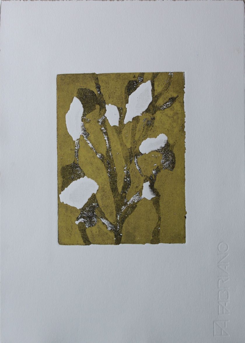
3. Summer
Technique: collograph on perspex, inked a la poupee

Summer
This image was made with gel, string and fibres, and an actual dragonfly wing. It is meant to evoke movement and life, stirrings- flight, lightness and airiness of plant and insect life. It may be reminiscent of Kandinsky’s abstracts, with their rhythmic lines and movements. Knotted string suggests seeds and growth. As a part of the narrative it is the stage of youth and fertility. But there are suggestions of dried seed husks too, and, as in a vanitas still life, the intimation of mortality. Dragonflies are short-lived, and herald a change in weather.
Stylistically, colour and line have now harmonised better than in the first image, and the colour is a background to the lines, so that in visual terms there is an evolution. There is a sense of here and now, of quickness and life.
4. The roses had the look of flowers that are looked at
Technique: drypoint and collograph on perspex
The roses had the look of flowers that are looked at
This is a fairly naturalistic sketch, using drypoint, of the rose bush. The image was then made into a collograph using gel and folded tissue paper, then drypoint etched again, to achieve the effect of a sketch with shading. The line “the roses had the look of flowers that are looked at” comes from The Four Quartets, Burnt Norton, and describes the scene in the rose garden, when the actual flowers glimpsed, before they become the “objective correlative” of a transcendent experience. It is a version of my observational drawing, and it describes what I thought I saw.
How has the print changed the image? The use of etched lines preserves the idea of drawing, while the addition of plate tone creates shadows. The use of a drypoint needle in a gestural manner after the contours of the collograph were in place dictated the movements of the lines so that they harmonised with the shapes. As a result, the scratched lines suggest movement, and the shapes start to take on a look of flames, with plate tone smudges suggesting smoke and ash, introducing the motif of fire, foreshadowing the resolution.
In the narrative sense then, this image moves forward from the last one by focusing in on the roses, giving them the look of flowers that are looked at, but also referencing their ending.
5. A Sign
Technique: combination, drypoint on perspex and linocut
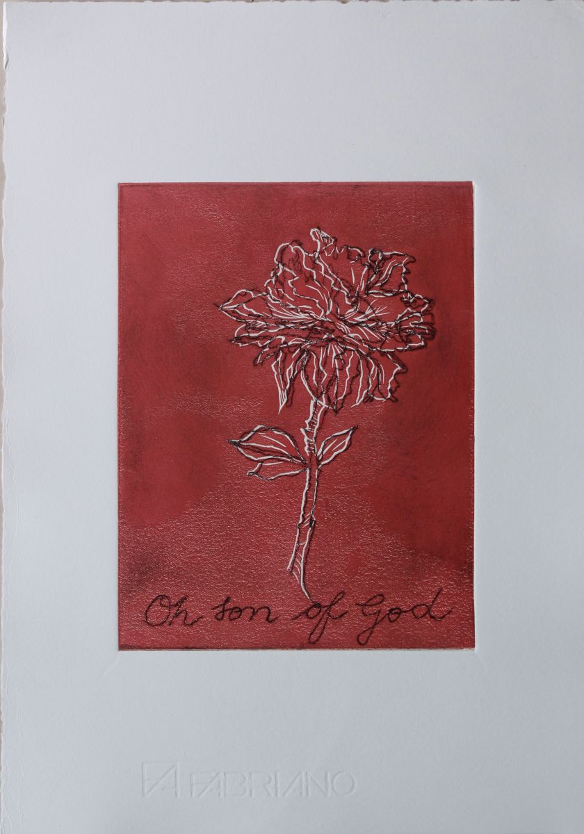
A Sign
This image is a drawing of a rose as a single line, cut into a Perspex plate using a Dremel tool. This is the black line part of the image. Somehow drawing in a continuous line made this a different image, more of an idea than the representation of the previous image, a unified concept, fluid. The words of the text “Oh son of God” references the religious symbolism of the rose, one thing becoming another. Likewise the text, oh son of God, references Magritte, “Ceci n’est pas une pipe”, using the same handwriting. It points to a lack of connection between image and text, and thus is purely a “sign”.
The lino cut, the red coloured background with cut white line, is a technically simple version of lino cutting. It is used here because it posits a cut line, a negative, as the delineation of the object, and so plays with the idea of the subtractive and the additive in image-making.
Together, the drypoint and the linocut become a combination of positive and negative, yet both are approximations: neither is an exact “fit”. The juxtaposition invites questions as to how they are related. (I was thinking of some of Ian Hamilton Findlay’s works involving image and text, where the text and the image seem to be disconnected, thus inviting the view to make a connection.) In my own mind, I am thinking about the slippages between language and visual representations which I have been discussing at some length in my essay on Xu Bing, the idea that when you understand the meaning you forget the words, that meaning resides somewhere in the interstices of thought.
Eliot’s lines “Words strain/Crack and sometimes break under the burden,/under the tension, slip, slide, perish,/ decay with imprecision, will not stay in place,/ Will not stay still.” (The Four Quartets Burnt Norton V ll. 13-17) are illustrative of his theme of the inadequacy of language to communicate thought.
From the narrative point of view, this print looks at the slippage between language and image, at the abstract nature of “the sign”, something that is invested with meaning in our society and culture in an arbitrary manner.
Technically, the lino printing is rather flawed, as there are marks of where the paper is pulled from the plate. To be honest I had never used a press for printing with lino before and possibly exerted too much pressure. Perhaps hand-burnishing would have worked better, but I’ve had poor results with solid blocks of colour.
6. Perfection
Technique: drypoint on perspex, chine colle
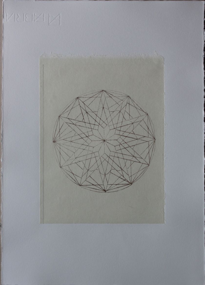
Perfection
“Words, after speech, reach/Into the silence” Burnt Norton V ll. 3-4
With words failing to capture “truth”, how is a sense of the numinous to be expressed? Eliot’s way of evoking the numinous, the transendent moment is, in the garden when, “..the lotos rose, quietly, quietly,/ The surface glittered out of heart of light,”
I wanted to re-present the rose in a way that made it silent, pure abstraction.
Therefore, this is an image of a church “Rose Window”: it represents the rose as pure geometry. It is exact, a representation of the idea of perfection, an analytical construct, referencing spirituality, and secret knowledge. It has lost all connection to a linguistic code. It is silent.
Here, the idea of “pure abstraction”, the pure language of the visual, as defined by early abstract artists such as Mondrian, is referenced in clean lines and measured shapes. The motif of the triangle is visible again, but now as a geometric statement, rather than the rough approximation of the first image “Into the garden” where the triangular shapes were sketches of observed reality, thorns on branches. Experience has become concept.
Technically, this image had to be clean- the lines drawn as accurately as possible, and the plate polished to a high degree. The Japanese paper was used because it was good for reproducing delicate lines.
In the narrative, then, this is the end of part 1, “Air”. This first section is named “Air” because of its movement from concrete to abstract, from the organic to the geometric, from the signified to the sign, to the symbol. The visual images portray a thought process.
EARTH
This section relates to the second part of Eliot’s poem, “East Coker”. This part of the poem focuses on the physical reality of life, nature, of the passage of seasons, decay and death. The images too are more literal, representational, concrete.
- Sick Rose
Technique: Photopolymer intaglio, copper plate etching
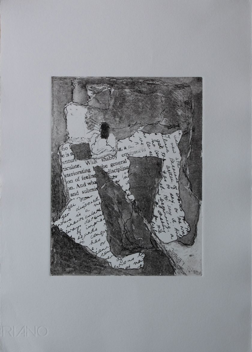
Sick Rose
This image started as a naturalistic sketch of the rose I planted, when it was diseased. I then abstracted the drooping petals into a more sculptural shape, and recreated the image using collaged text, somewhat in the style of a cubist painting, such as early collage works by Picasso or Braque.
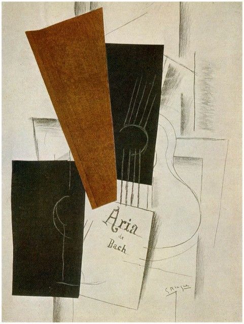
Enter a caption
Georges Braque Aria de Bach, 1913 Collage (black paper, imitation wood-grain paper) w/ charcoal and white chalk on paper
The text comes from Part 2 of The Four Quartets, and describes the process of aging, the sense of futility and powerlessness of the generation “between two wars”.
Here is the text:
East Coker, V ll. 1-18
V.

So here I am, in the middle way, having had twenty years—
Twenty years largely wasted, the years of l'entre deux guerres
Trying to learn to use words, and every attempt
Is a wholly new start, and a different kind of failure
Because one has only learnt to get the better of words
For the thing one no longer has to say, or the way in which
One is no longer disposed to say it. And so each venture
Is a new beginning, a raid on the inarticulate
With shabby equipment always deteriorating
In the general mess of imprecision of feeling,
Undisciplined squads of emotion. And what there is to conquer
By strength and submission, has already been discovered
Once or twice, or several times, by men whom one cannot hope
To emulate—but there is no competition—
There is only the fight to recover what has been lost
And found and lost again and again: and now, under conditions
That seem unpropitious. But perhaps neither gain nor loss.
For us, there is only the trying. The rest is not our business.
The extracts I chose refer to inarticulacy, to indiscipline, and to “shabby equipment” which is “deteriorating”. The collaged text was handwritten and typed, printed on transparency and etched on the plate using photopolymer film, followed by etching in ferric chloride. Some of it is open bitten, but that seems to fit. The grey layers were etched in stages, using stop out. An etching needle was used to create drawn lines. This is a quite complex, and quite messy, image. I was trying to achieve different depths, with the written texts at an angle, overlapping as if on a desk. Technically this was not entirely successful. I didn’t achieve the levels of grey that I had hope for, and need a lot more practice on the timing of the ferric chloride immersion, and must pay more attention to the difference in timings between my chemical mixtures in Hong Kong and in France. I had planned this to be a much clearer layering of blacks/ greys.
The shapes and layout evoke a map of the middle east, specifically the Gulf area, and so add significance to the reference to the poet being “entre deux guerres”. In the centre, there is a black spider-like shape, from which all emanates. It is both doom and the possibility of regeneration.
2. Ash on an old man’s sleeve
Technique: Photopolymer intaglio on perspex


Ash on an old man’s sleeve
This image was made by drawing onto a transparency and exposing it on photopolymer film that had been laminated onto perspex, then cracking and splitting the film to make a distressed image. Plate tone is left to give an impression of age.
I’m not sure which one I prefer so have both here. The title “ash on an old man’s sleeve” is part of a line:
“Ash on an old man’s sleeve/Is all the ash the burnt roses leave.”
which I chose to reflect the subject matter and style, evoking decay, death and dealing with remains. It references the roses of the image in Part 1, so is here for narrative coherence. Stylistically of course, it is similar to the series I did earlier “Greying”, which used the brittleness of perspex and exposed photopolymer film to evoke fragility and decomposition.
3. Aftermath
Technique: Collograph and etching on perspex
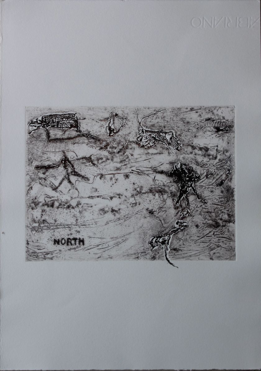
Aftermath
This image was made using torn cloth and string, as well as gel materials, on a perspex plate. It was done experimentally- I have not had too much practice at collographs, so this whole set was really an experiment with the technique, as I wanted to explore different kinds of mark-making using both raised and etched surfaces. It was meant to be abstract marks, but came out with quite a clear, to me, image of destruction, of a war-ravaged landscape, of survivors fleeing. When I look at it again though, I can also see something like a hunting scene. The animal/ human shapes may be interpreted as either in profile, alive, or as flat, dead. Either way, it evokes despair and hunger I think, and I added the word “North”for a couple of reasons- to suggest fleeing to less hospitable places, likely cold, and also as a piece of wordplay on “thorn”. As such it relates back to the images in air of roses, and thorns, and of summer- it is a contrasting image to “Summer” as the participants in this one seem to be ragged, bedraggled victims, fleeing- the colours, movements giving out contrasting messages to the earlier image.
I can’t really claim much in the way of planning in this one- it was intuitive. I really like the effects of the different lines though, and see a lot of potential for this type of collograph. Perspex works well for making marks , and the gel is very versatile. The only problem is that it has a limited life, and the gel peels off with too much washing and rubbing, so changing colours isn’t that easy.
4. I was with blood bedewed
Technique: Collograph with carborundum and etching on perspex
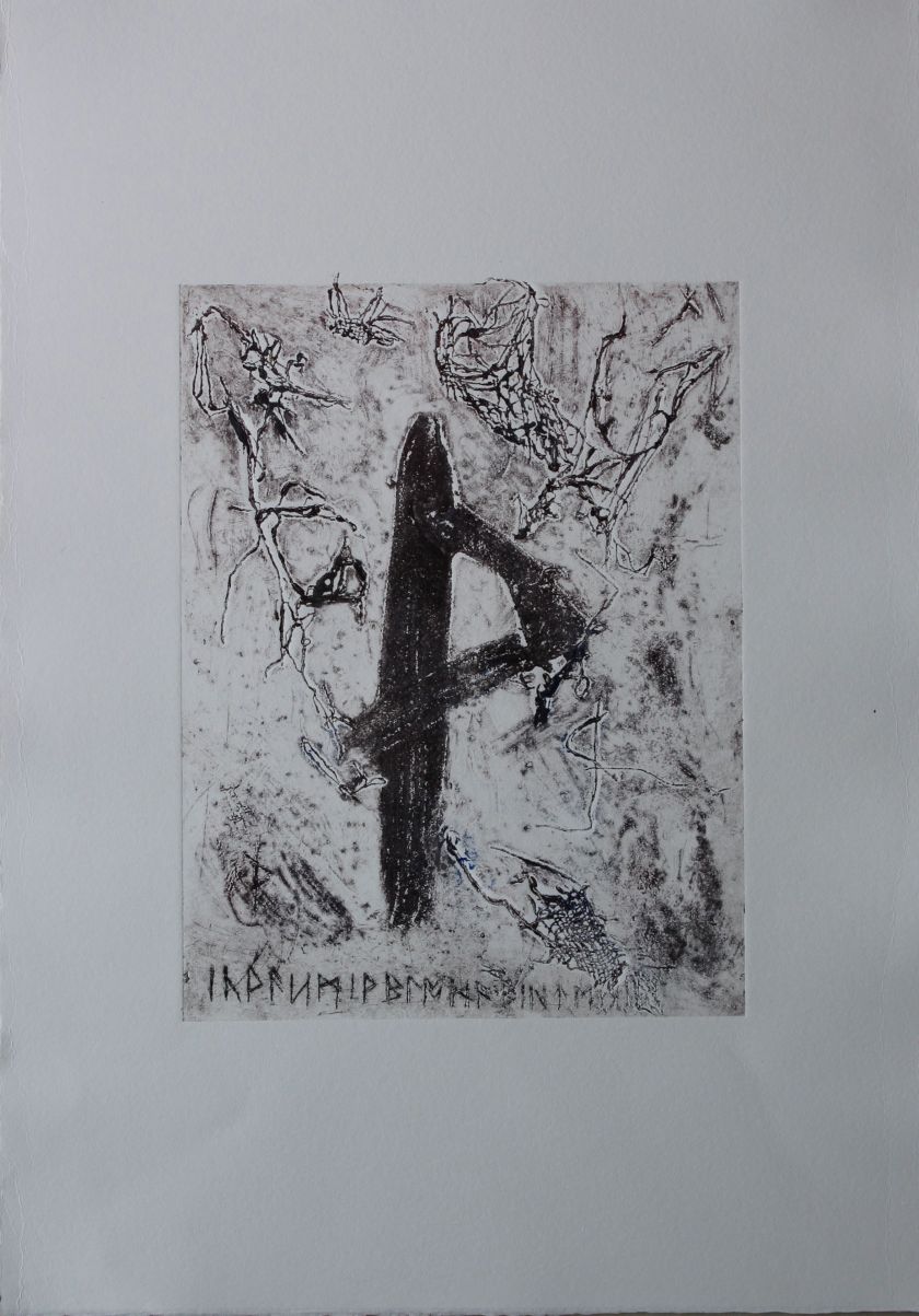
I was with blood bedewed
Thorn symbol on distressed background- runes- reference to passion of Christ- I was with blood bedewed.
I tried this one several times on copper, but decided to go with the collograph technique again. The torn up scsrim that I felt had been effective on the last one I reused, and this time I had an image in mind. The symbol in the middle, made with carborundum, is the runic symbol “Thorn”, and the runic writing etched at the bottom is translated as “I was with blood bedewed”. (This is a subject I have worked with before in my first Printmaking module.)
This is again, wordplay- the thorn obviously relates to the rose images in part 1, and to the rose theme in general, while relating this to a runic rendering of a poem about the “rood tree” and the crucifixion, makes intertextual links to the religious layers of meaning alluded to already, and to those in Eliot’s poem.
The notion of the “sign” is again referenced, with the fact that the symbol “thorn” looks like an actual thorn, and may be derived from that, much as Chinese characters in their earliest incarnations, were drawn form naturalistic forms.
The thorn in this image is also naturalistic as it seems to be snagging the materials around it- again these evoke insects or decaying vegetation.
The image in the middle might also be read as a primitive rendering of a human, a standing figure.
(I’m wondering if this should go in part 3 now, with its reference to the passion of Christ…)
5. What are the roots that clutch
Technique: Collograph and chine colle
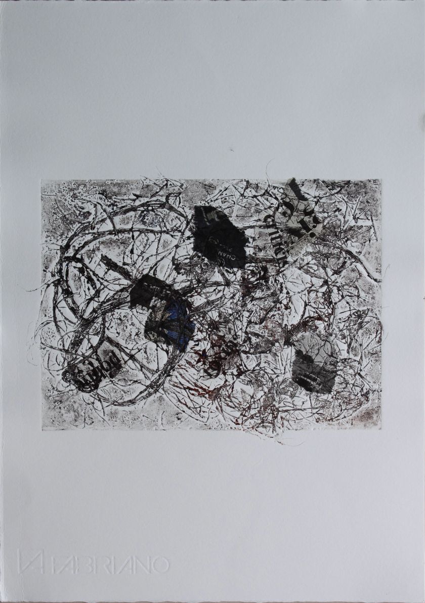
What are the roots that clutch
“What are the roots that clutch, what branches grow/ Out of this stony rubbish? Son of man,/ You cannot say, or guess, for you know only/ a heap of broken images”
Eliot, The Wasteland I The Burial of the Dead, ll 19-22
This image uses collograph, string, paper, gel, salt grains and earth, with torn newspaper, to represent a sense of a decaying civilisation, as suggested in the lines above from Eliot’s The Wasteland.
In the narrative, it follows from the previous image in that it transitions from the rood tree to the earth with its dead roots.
As a print, I like the linear quality and the texture created by the materials, while the chine colle newspaper is really embedded into the paper, as if trampled down. It is a quite literal represenation of “stony rubbish” except that the newspaper is a metaphor, implying a decadent civilisation as represented by its media.
6. My ruins
Technique: Photographic print, cyanotypes on stone/ tiles.
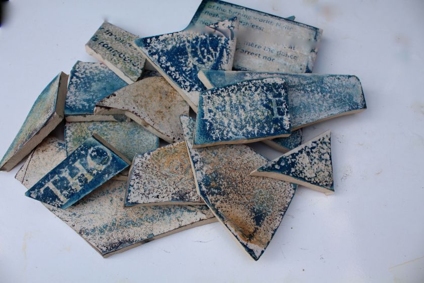
My ruins
This was an experiment in making cyanotypes on broken shards of tiles and flat stones. Sometimes they worked, sometimes they didn’t, but as a result I had a pile of legible, semi-legible and illegible shards, that nevertheless were unified in their colours and have the appearance of the same origin.
The marks on the tiles are drawings of roses, words and lines of the poem, The Four Quartets, including the words “Rose” and “Thorn”.
The link to the text and the narrative is clear: I was interested primarily in experimenting with making prints on different materials, and this seemed a good way to explore the idea of a ruined civilsation, while also echoing Eliot’s “words strain/Crack and sometimes break under the burden”.
7. Remains
Technique: Collograph
Remains
This was another use of the collograph plate, involving cutting it into shapes after it had been textured. This was planned and I had a clear idea of the composition I wanted, but I had overestimated the control I could have over how the plate would cut. In the event, it was quite brittle and snapped, so I couldn’t get the rounded shapes I was hoping for.
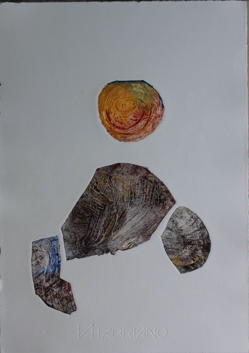
My plan here was to suggest a burial site- a shape that suggested a buried corpse- the bones suggested by the texture of the plate. It was curled up in a foetal position. I had to adjust this and instead combined three shapes which I felt still evoked fossils and buried remains, but arranged them in a way that might also suggest something crawling crab-like out of the earth. The sun shape suggests a setting, decline, as well as perhaps copper, brass, objects that might be placed in a burial.
That is the end of the section “Earth”. This should have been an evocation of the physical, the material- and their decay and corruption.
Part 3 FIRE
This part relates to Part 4 of “The Four Quartets” Little Gidding, which forms the resolution. It ends in pentecostal “fire”.
- In my end is my beginning
Technique: Combination collograph/ intaglio
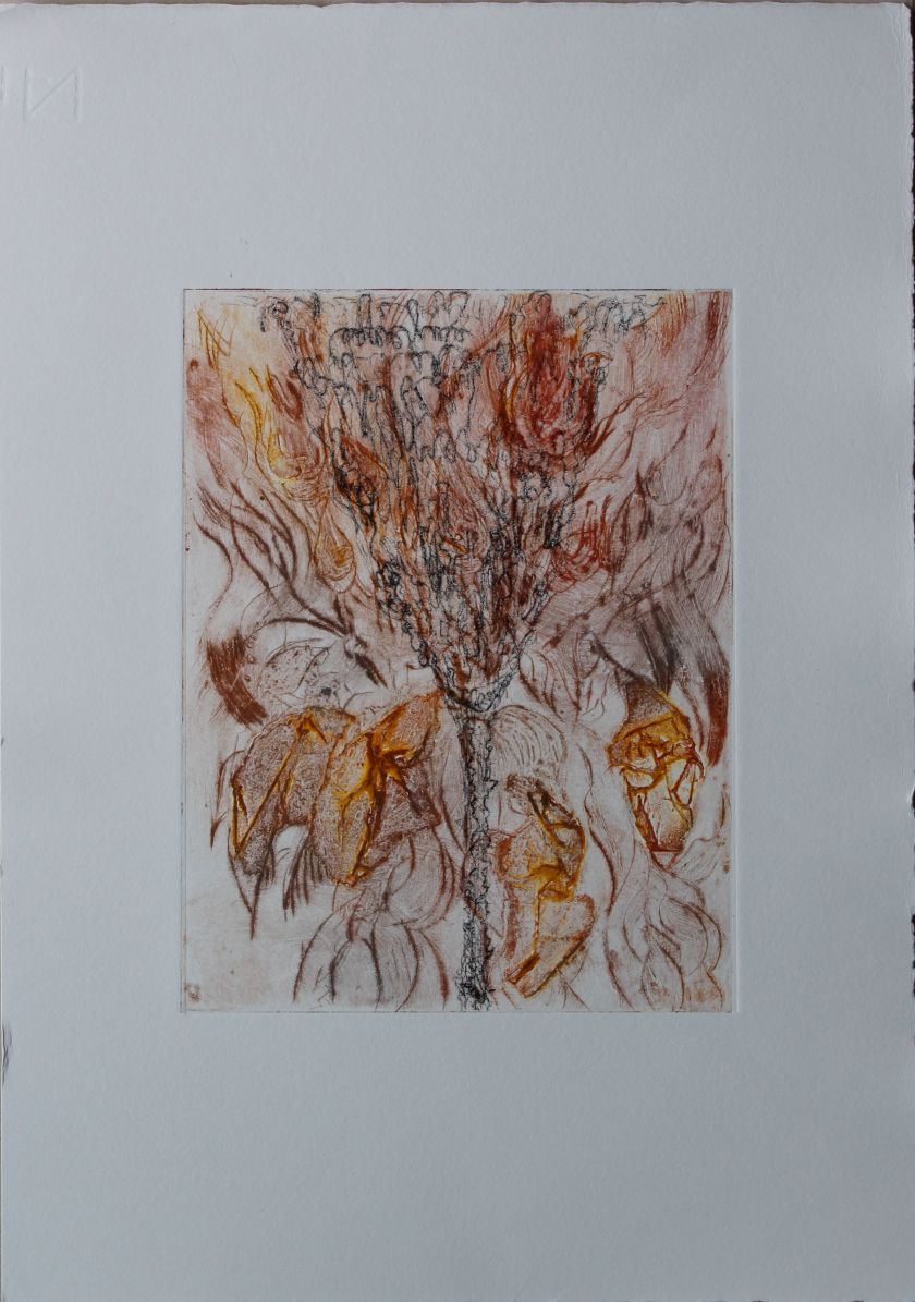
In my beginning is my end
The words “in my beginning is my end” repeat throughout the text, emphasising its circularity. These words evoke birth, death and inevitability, as well as summarising the journey the poet is on, which brings back to the beginning only to “know the place for the first time”.
This image is made by superimposing over the collograph from part one (The roses had the look of flowers that are looked at) an intaglio print made in the shape of a goblet, or grail, drawn with the repeated words from the poem “Ash on a old man’s sleeve is all the dust the burnt roses leave”.
The shape of the goblet mirrors the opening out composition of the flowers, marking them as equivalent- as they grow, they also decay: they accept their destiny. They seem to be sacrificing, making an offering. The image also evokes fire, as if the roses are burning from the single black drawn stem.
2. Smoke
Technique: Photopolymer etching
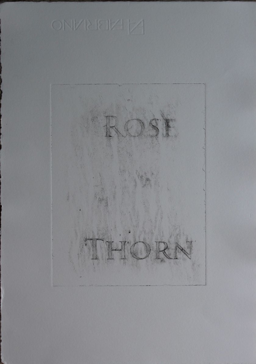
Smoke
Words again, the words, which are signs, ROSE and THORN, reappear. The texture of the print makes them seem to be formed of smoke or dust. Again, there is a reference to the funeral pyre or sacrifice. There is also the reference,again, through the connotations of roses and thorns, to the passion of Christ.
The image is indefinite, transient, formed of smoke. It is evocative of the “death of words”.
I will confess the effect here is due to the fact that my photopolymer film was damaged. I decided to use it anyway.
3. Cycle
Technique: Intaglio etching, chine colle
This is an image showing the life cycle of a rose. It is done in the detailed style of a botanical text, dissecting the stages. It is a scientific image and would entail destroying the rose. At the same time, although the image is of a dissection and portrays the view of rational analysis, it is also rather sexual. It points to sacrifice as a part of regeneration.
This was done on perspex with an etching needle, traced from a botanical illustration. It was meant to evoke an earlier style of understanding nature- scientific curiosity in the service of understanding nature.
It was printed on fine Japanese paper to capture the detail.
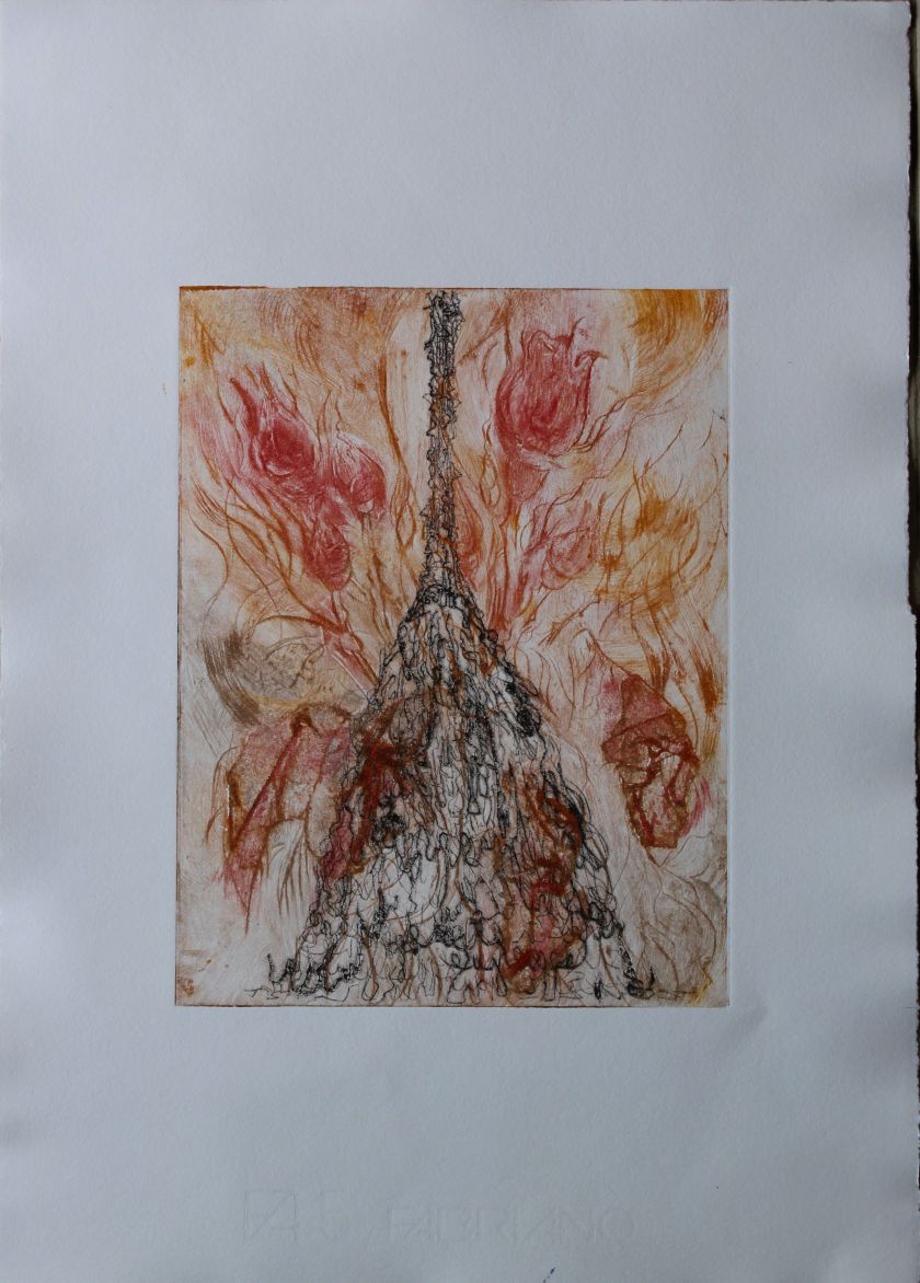
4. What is is what is not
Technique: Copperplate etching, aquatint
What is is what is not
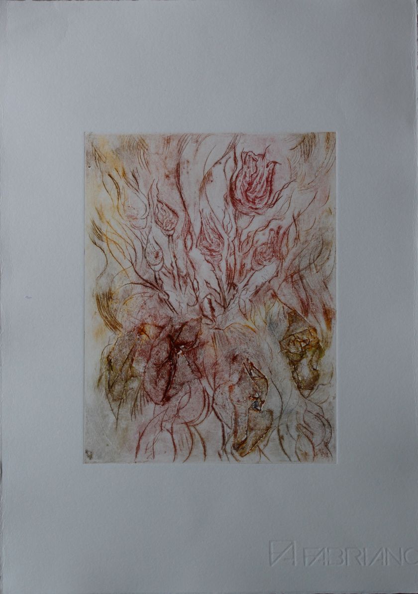
This is a copper plate immersed in ferric chloride in stages to create an aquatint of different blacks/ greys, then finally immersed to the point that the copper was eaten away to create negative shapes. The image was of growth, a rose bush, with blossoms, but had to be fairly simple to undergo this kind of process, where any detail would likely be lost. Therefore my sketch simple portrayed intertwining stems, using levels of dark/light to suggest overlap, and simple blossom shapes. The copper I was using was relatively thick at 1mm, and what resulted was layers of erosion, which means that there are some grey shadows on the white parts, where there is still a layer of copper.
The white of the paper suggests frost or snow, making this an opposition to the summer roses of the first part.
The negative shapes are embossed, thus creating another level of positive/ negative imagery. The roses then are the negative shapes: they emerge, but at the same time are nothing.
I chose the title to express this inversion of positive and negative, and it also echoes much of the tone of Eliot’s poem, in which he frequently uses negative statements, in search for what words cannot express, the idea of finding the meaning after the words are gone. Again, this is a thought process that echoes in Xu Bing’s work, and resonates with Zen Buddhist thinking as discussed in my parallel project.
This can speak of death and regeneration, but points to a place that is neither, as suggested in the final part of the poem:
“This is the spring time/ But not in time’s covenant. Now the hedgerow/ Is blanched for an hour with transitory blossom/ Of snow, a bloom more sudden/ Than that of summer, neither budding nor fading,/ Not in the scheme of generation./ Where is the summer, the unimaginable/ Zero summer?” Little Gidding ll 14-19
5. In my end is my beginning
Technique: Combination collograph, intaglio
in my end is my beginning
This is the same print as the first one but with the intaglio plate inverted to look like a funeral pyre, implying that the roses are transformed and “reborn” as flames from the pyre. This is quite close to the ending of the poem.
What we call the beginning is often the end
And to make and end is to make a beginning.
The end is where we start from.
Little Gidding V ll. 1-3
And all shall be well and
All manner of thing shall be well
When the tongues of flames are in-folded
Into the crowned knot of fire
And the fire and the rose are one.
Little Gidding V ll. 42-46
