Practice 3: Ferric chloride day 3: soft ground

Research

IMG_3693

This was an experiment with soft ground. I wanted to know how to achieve soft drawn lines, rather than hard0-bitten ones, and it seemed that a layer of soft ground and pencil could work.

This was now a cleaned plate, with all aquatint removed in Mystrol. A layer of an oil-based soft ground was rolled on with a soft roller. I was careful to try to make this a thin layer, but hadn’t used this before, so was unsure about how long it should sit before going into the ferric chloride. The (Lascaux) soft ground I used at Capileira would harden after a while, because it was not oil based. I couldn’t get hold of that one.  I used a piece of soft paper- tissue, and drew through it using:

charcoal crayon

Hartmuth progresson 4B

Pencil 6B

Litho crayon

Soft ground with pencil

Soft ground with pencil

As can be seen, not many of the marks came out in the end. It could be that my soft ground was too thick after all. Or that the blacks were never going to show against the black anyway.The litho was probably too soft, but the harder pencils worked, and the line quality is nice. It could be that this needs a longer etch. I gave it 20 minutes.

Practice 2: Ferric Chloride Day 2

Research

So, I printed that first plate. It was a bit blotchy. A total of 38 minutes was too much, but it was clear that the 5 minutes and thereabout etches got a nice shade of grey. I hadn’t been very systematic but it was a ball park figure. The stop-out pens worked well, gave clean lines. The airbrush sprayed on stop-out gave a lovely soft effect. The wax crayon was textured slightly. The litho pencil was a bit faint. So…

Made a plan for a test plate, wrote it down, had breakfast to think it over, trying not to make a stupid mistake.

Test Plate

Opened a new copper plate, and filed the edges. Took the Mylar off one side and spent ages trying to get it off the other side before deciding there wasn’t any. De-greased it in soya sauce. Sprayed it with airbrushed aquatint, but didn’t get a uniform layer. This bit is hard. Left it to dry.

Cut a backing sheet of sticky backed plastic, and 17 strips of one cm each. Planned to remove one strip each minute, so getting from 0- 18 minutes in intervals of one minute.

I started, and was surprised at how deeply bitten the plate was even after one minute, so decided to half the intervals. So ended up with 0- 9. 5 minutes.

Printed it, and observed that the  short times at the start were quite distinct- 30 seconds was quite different to one minute, and the stages up to about 3 minutes were clear to see. After that there was no clear boundary, and the colour just got gradually darker, though not absolutely black. Two or three possible reasons for that:

1. My ink was very thick- I added some aqua wash oil and it got blacker.

2. The aquatint layer wasn’t uniform- where it was thicker, the black was more dense.

3. Perhaps the immersion was too short this time, but I feel it shouldn’t be much longer.

Anyway, established that the intervals are more critical at the early stages.

Aquatinted copper plate 1 timing

Aquatinted copper plate 1 timing

IMG_3671 IMG_3670

Inked it again with Charbonnel inks and wash oil to see if the blacks would get more black. They did. It was looking like my ferric was strong, as I was getting blacks quite fast. The baumeter seemed to be telling me nothing.

IMG_3690

Made the following list of key times:

0

30 seconds

1 minute

2 minutes

3 minutes

6 minutes

10 minutes

More?

Also noted I should file the plate away from the front, as there was a decidedly hard edge.

Should have changed my intervals after about 6 minutes.

Should have stopped and had a coffee and thought it through….


Practice: Copper plate etching 1: Ferric chloride

Research

Now equipped with an etching press and gear for copper plate etching.  Very little time though. Leaving in a few days.

A quick update of today’s efforts;

Materials: Ferric Chloride, in tubs, 3 kg and a large vertical tank, and a Baumeter:

I followed the instructions to mix 1 part FC with 4 parts water, and ended up with something that measured only 20 Baume, instead of the desired 40-45. Then I should have sat down and though things through in terms of worst case scenario, instead of what I did which was to adopt the modify and let’s see approach. With hindsight, I should have:

a. Measured the Baume by taking a sample into a narrow plastic container that was capable of floating the baumeter, and so had an idea that it wasn’t working as per the instructions.

b. Having discovered it wasn’t working, should have somehow extracted some of the liquid from the tank – difficult given the shape- and mixed more Ferric chloride into the solution, instead of diluting more, albeit in a very reduced amount of water.

c. Considered that Inductive reasoning wouldn’t necessarily work, i.e. adding another 1 kg brought to from 20 Baume to 30 Baume, therefore adding another 1 Kg will bring it up to 40 plus, especially if I use less water this time.

d. Poured the dilute stuff into a container and started again.


Anyway what’s done is done, and all my FC is diluted, and I’ll now just have to experiment to see how it works on copper. When I get back to HK, I’m definitely trying to source ready mixed.

The trouble was there were so many dire warnings about mixing FC and water that I was completely obsessed with the hazards, and also was completely ignorant about the stuff and didn’t know what to expect.  I now see that my stuff was already a bit damp, i.e. hydrated, and therefore less explosive. But that also means that 1 kg of damp stuff was considerably less than a KG of powder/ crystals, and presumably the “recipe” I had was for that. Wish I’d done some Chem.

On the upside, I am now more acquainted with FC, and will know better how to deal with it next time. $$$. Hassle of sourcing it. AArgh.

Experiment with copper plate. This is the back of a small one that was my experimental plate in Capileira.

Just to try:

1. Used some different materials to stop out the etching: spray stop out brushed on (Lascaux)

2. Acrylic marker pens.

3. Litho pencils

4. Wax crayon.

These would all be whit-ish s they are stopping out prior to the aquatint layer.

Then I sprayed the plate with an aquatint layer, (acrylic ink with airbrush- also sprayed a dense area) and dipped it for 1 minute in the FC mix. (using vinegar/ salt solution to de-oxidize in between.)

5. Used a litho pencil to mark “1 minute more” and dipped for 2 minutes (3 mins total)

6. Used a couple of different acrylic markers to write  “5 minutes” and dipped for 5 minutes (total 8 minutes)

7. Acrylic marker ” 30 minutes” (total 38 minutes)

IMG_3699

What this taught e was the difference in edges- the acrylic pens are very effective. The airbrush spray is softer. The shades of grey are not very distinct and tend to merge with the aquatint speckled effect in the shorter exposures. Litho pencil – less so- and wax crayon gives a drawn line/ texture. I realise I need to work in shorter intervals but recognise the 5 minute mark as a clear grey.


Research: German Expressionism

Research

Max Pechstein “Das Vater Unser” series

Pechstein was one of the more “technical” of the Brücke group that emerged in Weimar Germany, a knowledgable printmaker amongst the other self-taught members, who were nevertheless united in their belief in a spontaneous and expressive, yet graphic style of printmaking.

This series, Das Vater Unser, was created after the First World War, in which Pechstein served, and marked his return to art making. Reinhold Heller (Milwaukee Art Museum, 2004) questions the sincerity of this particular series, implying that the addition of colour was commercially-minded, with an eye to investment potential, yet acknowledges it as a kind of primer for the ‘Expressionist vocabulary’.

What is this vocabulary?

Woodcut: the preferred medium of the German Expressionists, valued for its grain, and its splintering effect in response to chisels and tools of less precision than those used in traditional illustrative engraving.

Materiality: the artist, his materials and his handwork is visible in the print, whether in lithograph or woodblock. For example, the cut shapes in woodblocks, the white shapes, being cut with relatively flat tools, typically pick up the ink when rolled, and draw attention to process. We can see this effect quite clearly in Das Vater Unser VIII, below, where it creates flesh-like texture on the bodies of Adam and Eve.


Materiality also describes how the style is a response to the material. Unlike Cubist works in paint, the Expressionist angular style of woodcut is also a response to the texture of the wood and how it handles. In Das Vater Unser I, below, we can visualise very easily the process of how the marks have been made, sense the speed of the cut, the effort of stopping, the weight of the hand on the tool, the way the wood hasn’t always obeyed the strict geometry sought by the blade, for example in the ‘U’ of ‘Unser’.


Monotone: the prints are typically black on white or black on colour ground. This is very stark and emotive, used to powerful effect by Kathe Kollwitz.  The contrast between the black and the White in Pechstein’s series is achieved through solid blocks, inscribed line and hatching, as well as the “accidental” pick up of ink mentioned above. (I would agree with Heller that the addition of hand-painted colour to these prints is reductive.)

Stylisation: Form may be suggested by rough hatching. But this is often highly patterned in repetitive lines, and thus highlights the graphic style. In “Das Vater Unser X” below, the solid block that the figures are seated in is given solidity by the hatched lines around its edges, but these are also stylised and rhythmic. Thus the shape dissolves easily into flatness and morphs into a boundary between land and sea, changing the 3-D effect of the foreground into a completely graphical representation in the upper part of the image.


Angularity: related to how blocks are cut, the resulting angular representations of humans is also linked to influences of the primitive. This makes the images abstract, somewhat akin to Cubist works of the same era, and also elemental. In Das Vater Unser VI, below, some of the faces could be African masks, like those used in Picasso’s Desmoiselles d’Avignon.


Flatness: modernism tended to eschew the illusion of depth, instead constructing intersections of planes in a sculptural manner. Expressionist woodcuts use cut lines to suggest the direction of planes, again making a perfect marriage of medium and message. On the other hand, repeated lines create pleasing rhythms on the page and accentuate the flatness of the image despite the trompe l’oeil effect of receding lines.
Symbolism: Paul Gauguin’s Tahitian woodcuts used inscribed line and roughly cut shapes, often with text, to evoke a sense of the primitive/didactic/shamanistic. In the same way, Expressionist woodcuts use graphic shapes as context and story-telling devices, much as graphic artists (like Marjane Satrape) do today. Das Vater Unser VIII (Adam and Eve, above) includes a devil figure that could have come straight from a Gauguin woodcut, here accentuating the eclecticism of traditions within an avowedly Christian image.

Research: Coldwell, P 2010

Research

Reference:

Coldwell, P. 2010 Printmaking: A Contemporary Perspective. London, UK. Black Dog.


Doing a bit of revision:

RELIEF PRINTMAKING

The milestones in the history of relief printmaking according to Coldwell:

Beginnings:

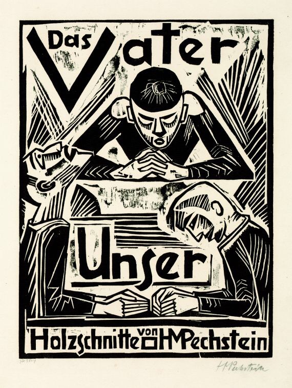
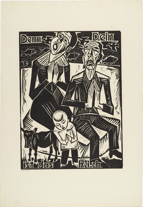
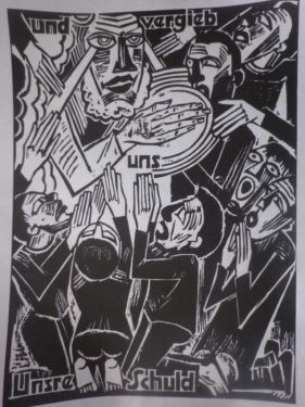
7th century Chinese woodblocks were printed as stamps, but later evolved into rubbed surfaces, and tended to focus on written text. In Europe, in the middle ages, early prints were crude black and white images to communicate religious stories to the illiterate. In Asia, the key development into an fine art form was via Japanese woodcuts: designed by artists and executed by craftsmen, these were delicately carved images with multiple layers of colour, and they reached their peak with “ukoyo-e” in the 17th century. In Europe, it is Albrecht Durer who is credited with developing the woodblock- his are single colour, using line to suggest depth and shade. This type of detailed woodcut (and even more so, engraving) is particularly suited to information-giving, and thus lends itself to scientific illustration. As for Japanese woodcut, Coldwell suggest that its legacy- particularly the graphic possibilities realised by Katsushika Hokusai in his “wave” series- is the modern day graphic novel. Meanwhile, in a political evolution from those crude early prints, the simple, folksy woodcut could a means of dissemination of posters and images inciting proletariat uprisings.

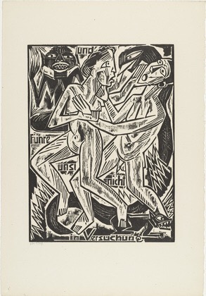
Practical considerations: end-grain or cross grain: end-grain is smooth, whereas cross grain adds wood texture to the print, and can be more expressive, if rougher-looking, which lends itself to expressionist images, for example by Gauguin, or Munch, or artists such as Kirchner working in the style of  “Die Brucke”.

Craft vs art: early woodcuts separated the work of the artist and the craftsmen, the woodcarvers. This is parallel to, today, the dilemma of whether to use e.g. laser cutting by machine.

20th century innovators:

Coldwell highlights Pablo Picasso, with his development of the “suicide” reduction lino print, Michel Rothenstein, who used all types of surfaces to create relief, Georg Baselitz, working in an expressionist style and a large format, Anselm Keifer, who made his prints into sculptures and Klipper, whose prints became installations, for example by being carved on a parquet floor.

INTAGLIO

Intaglio really lends itself to drawing, in detail, and thus historically is associated with book illustrations. Key distinctions:

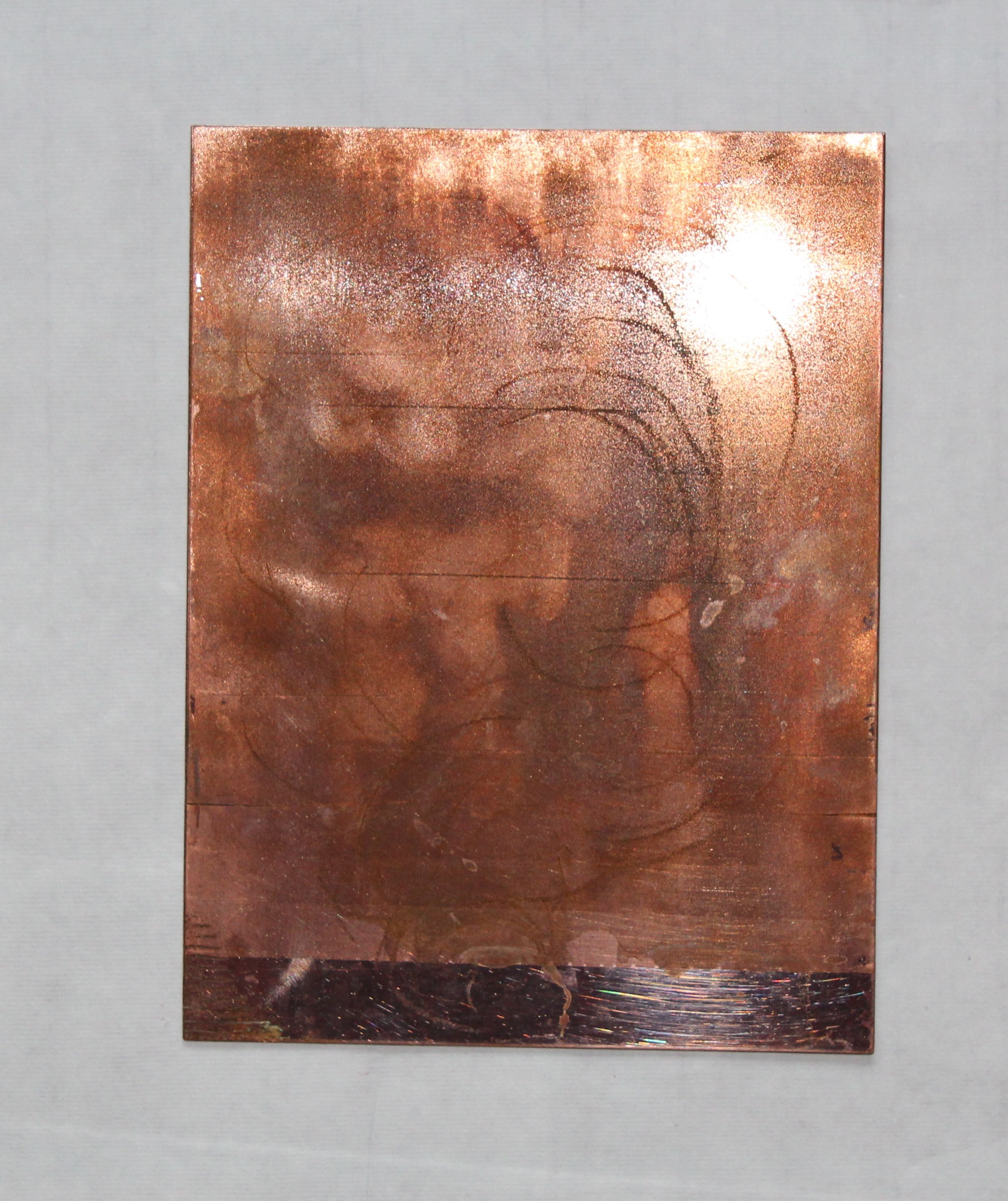
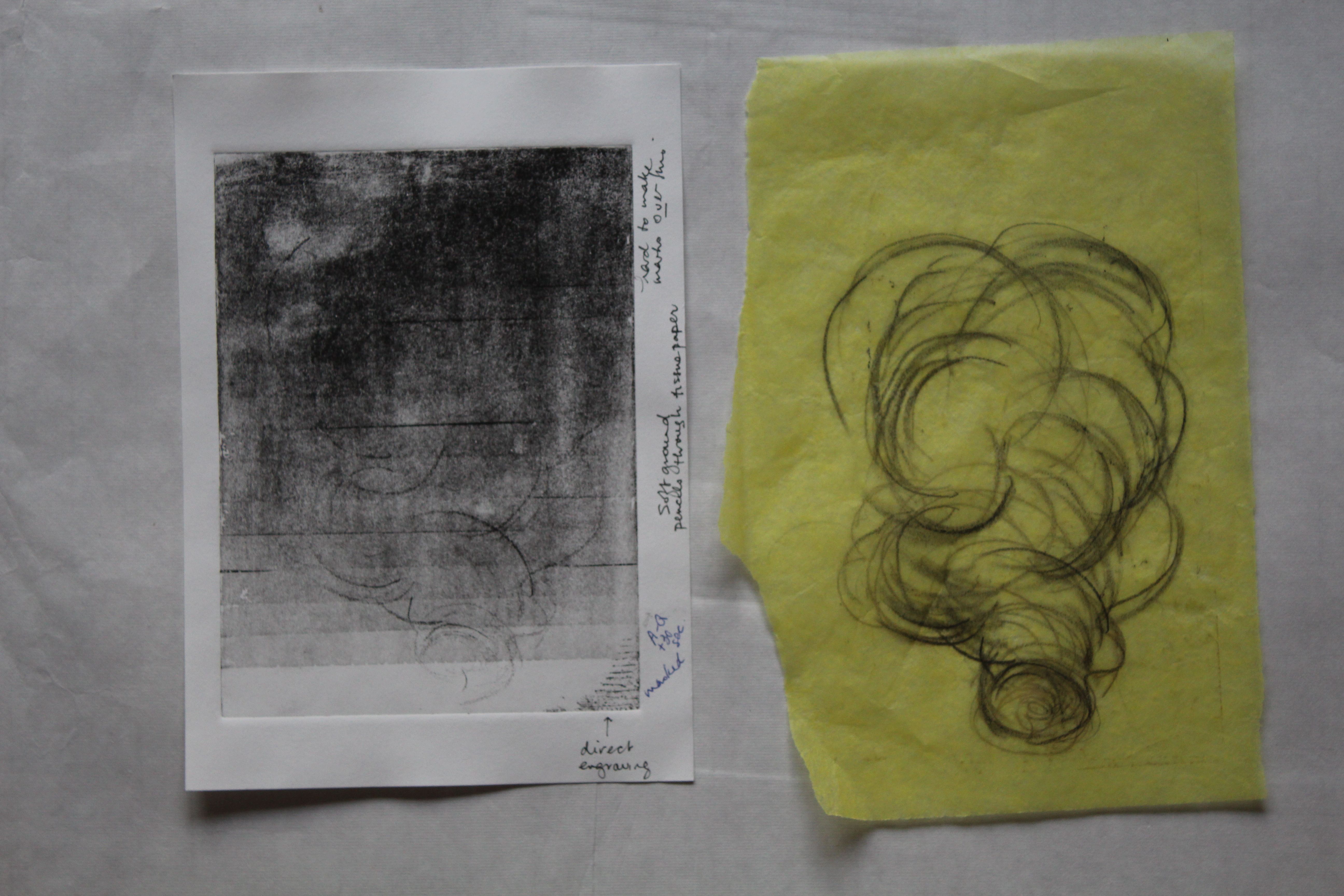
Engraving: scratched lines on a metal plate: used for publications but the contours wear down easily, so has limited life.

Etching: originating in armour and jewellery design, using acid to eat into the engraved lines, thus creating deeper incisions and a wider range of tones. In the 16th century, Seghers brought this technique into the realm of fine art by varying the inking of the plate, so that they became painterly and unique. Rembrandt drew directly onto the plate and established a wide range of marks, raising this to new artistic heights, a combination of painterliness and drawing. At the same time, the technique still allowed the possibility of mass production. Hogarth’s Rake’s progress. (18th c)

Mezzotint: the use of many lines to roughen a large surface of the plate and thus create dark darks, and a tonal range. Useful for creating photorealistic images. Developed to assist in creating reproductions of oil paintings, and worked dark to light.

Aquatint is similar but worked light to dark, with the unworked areas stopped out by a medium impervious to acid. Developed to reproduce watercolor paintings.

Picasso again, 20th c master of the technique, innovating and mixing approaches. Morandi also- skillful use of crosshatching.

Potential for lively drawn lines, spontaneity, fluidity, as in work of Anthony Gross (e.g. Arab Horse Bath, 1954) See also Stanley Hayter, Jim Dine, Hockney, Tapies. Female artists using etching: Louise Bourgeois, Kiki Smith, Paula Rego.

LITHOGRAPHY

This is the one you can’t do at home… Associated with Parisian night club posters, and Toulouse Lautrec, they evoke painterliness, bright colours, hand-drawn script. But also associated with 20th century commercial posters, advertisements for trains and petrol, the GPO, The London Underground, in an abstract/ modernist/constructivist style, propaganda posters in communist Russia, China, Cuba, characterised by a strong graphic style. Transformed in USA in the 1960s to a technique used in gestural printmaking, it’s good for drawn lines- I’ve seen some Hockney lithographs that were beautiful, looking like fresh pencil drawings- brush marks, and colour overlays.

SCREENPRINTING

Associated with the 60s, Pop art, Andy Warhol and highly fitting for the age of mass production, garish colours and use of more mechanical means of image production. Characterised by flat colour- often matt- and in large unbroken areas, it is prized for looking plastic, unnatural, but can also be a way of reproducing photos in detail. Patrick Caulfield, Julian Opie, Gary Hume produce large works of apparent simplicity. Warhol’s often act as commentaries on the act of reproduction, in the manner of Dada, with appropriated images, and deliberate mis-registrations.


DIGITAL PRINTS

A whole new ballgame, blurring boundaries between photography and art-making by hand. Artistic prints seem to be distinguished by what they are printed ON, rather than the process. I find the use of terminology at art fairs disconcerting. “C-print” just means colour print, same as it ever did, but there seems to be a deliberate attempt to mystify, which makes me suspicious that it’s all rather less than it tries to appear.


CONTEMPORARY PRINTMAKING

Trends, according to Coldwell:

  • Hybridisation, multiple techniques
  • Scale – ever larger projects
  • Putting printed images on products
  • Technical ambition using professional support
  • Involvement in all parts of the process, such as making paper
  • Artists books: limited editions
  • Print series
  • Screen animations
  • Back to basics: backdrawing (Tracy Emin), stencils (Banksy)


The chapter I find most interesting in this book is the one entitled “Painterly approaches”, and looks at a number of ways artists have combined techniques.

I like Anselm Keifer’s collaged prints, such as “Der Rhein” 1983, a black and white collage of woodcuts painted over with acrylic and shellac. , and Prunella Clough’s “Untitled” of 1964, a monotype and collage. Antoni Tapies use of gestural marks in lithographs are beautiful, especially when juxtaposed with a very different set of imprints, such as a copy of an ID card and fingerprint. I am interested in the way Tapies works with Printmaking/ markmaking as both technique and subject matter, and the tactile nature of the work: they work on all levels.


A SENSE OF PLACE

Coldwell represents very much a Western perspective on printmaking, after citing eastern influences as progenitors of the tradition. However, another area of scholarship focuses on Asian traditions, and how they are being reinterpreted in the 20th century. Some interesting material here:

http://oursenseofplace.squarespace.com/exhibition/


Japanese papers

Research

Japanese papers
I don’t know where I can buy them here, but I want to note different Japanese papers for reference, based on matching the numbers from trial pack from Lawrence’s in Hove.

Botan: (2343) 53gsm bamboo and wood pulp, smooth and shiny on one side, Ingres marking on the other. “Inexpensive”

Bamboo: (2342) 175 gsm- no grain- soft. Smaller sheets and double price of Botan.

Kizuki 4 Monme (2341): 24 gsm Very delicate, transparent, Ingres marking, visible fibres. Deckled edges.

Masa (2344): 86 gsm “Student” paper. Shiny and smooth on one side, soft on the other. Very white.

Sunome Senaka (2470): 72 gsm. Ingres marking on one side, smooth on other, pale cream coloured

Sekishu (2410): 34 gsm. Soft on both sides. deckled edges.hand-made. expensive.

Gampi Silk tissue (2402): 12 gsm. Incredibly delicate. Very smooth.

Kanoko: (2366) Smooth on one side, soft on other, deckeld edges.

Hosho (2340): 77 gsm “Ideal for woodblock printing” soft strong. Not too dear.

Hosho shi white (2391) 56 gsm, dearer than the above

Kozo shi (2315) 23 gsm Deckled edges, visible fibres.

In fact, when I go to the art shop here, there are two types of Chinese papers to choose from: a thin one, very like tissue paper, white, and a thicker one, quite soft with a grain, cream-coloured. Both called rice paper. Not identified by weight.

Good reference for Japanese papers and their Chinese equivalents: Paul Griffith’s blog: