Artist Talk: Kate MccGwire

Assignment 5, Research

Good chance to get to hear Kate MccGwire today at Hong Kong Arts Centre: she was here to install her exhibition at a local commercial gallery, Galerie Huit,  opening next week.

I’ve seen Kate’s work at Art Central and loved it: her feather sculptures are amazing, sinister, abstract, sinuous, violent- and her pictures (I don’t know what to call them) images made of lead lined with feathers, like bullet holes with teeth, rather scary, beside extremely peaceful landscapes constructed with overlapping feathers.

I was interested in hearing her talk about how and why she often presents her works in glass cases, as this was something that I am also considering regarding some of my pieces.

Her feather sculptures evoke organic forms, human bodies or knots. She said she collects glass cases- old pieces, that would probably have been used for stuffed natural specimens- by doing thus she creates context-  gives them the air of being aged museum pieces, scientific objects even.

She also spoke of HOW she fits them into the cases- she makes her sculptures to fit the case as nearly as possible, so that sometimes they may appear to be close to bursting out. This gives the pieces an energy that adds to their constrained force that they get from being tense, knotted structures already.

She said that this idea of containment was important to her as it also suggested the containment if her idea inside her head, things that burst out into her work.

While she was talking, I thought about my own ideas of presenting the portrait work relating to my mother. I could see how the idea of putting it into an old suitcase was also relating to this idea of containment, of emotions. The link to “emotional baggage” is also there. But I also realised the way the old suitcase, like MccGwire’s antique cases, creates a historical context. There is also a sense of revelation, as a suitcase is something that can be opened, and that is also a potential threat, as it may may reveal things hidden or forgotten. But it also evokes a sense of preservation, of something stored because it is valuable, an heirloom. All in all, I feel convinced by this choice now, and am happy that listening to the artist talk helped me articulate the reasons.

Primary research: It Begins with Metamorphosis: Xu Bing | Hong Kong | Asia Society

Parallel Project, Research

http://asiasociety.org/hong-kong/exhibitions/it-begins-metamorphosis-xu-bing

This was the exhibition that I saw in Hong Kong in October 2014, referenced in my parallel project.

The title “Metamorphosis” referenced the process of silk worms spinning cocoons to make silk, and the constructive/destructive  process was enacted in an installation of a mulberry tree populated with silkworms that evolved in the course of the exhibition, Meanwhile, at the end of the exhibition, there  was another  destructive/constructive exhibit that had the silkworms enclosed with a book which they proceeded to eat to fuel their metamorphosis, while at the same time leaving the characters on the pages to deform into moving “type”.

The exhibition explored meaning making through signs. Signs included Chinese characters, deconstructed and unevolved into their primitive imitative state, as representations of phenomena. The video on the evolution of the character for “one”, “The Character of Characters”, related history and culture, and the development of landscape, to the evolving meanings of the term “one” including clever animations that satirised mass production, and copyright piracy, as comments on contemporary China.

Xu’s on the tobacco industry was included- this has personal resonance due to his father’s death from lung cancer- a book made from pungent tobacco leaves, reconstructions of Chinese brands of cigarettes, and an installation of prints based on tobacco packaging stencils with their slogans turned into a poem/song made this section a multi-sensory experience.

Book from the Ground is a recent project that is a counterpoint to Book from the Sky- in this exhibition, Xu’s studio was recreated to give insight into the process of developing a new language of visual signs, based on the language of airports and streets, of new media such as emojis, as an exploration of modern iconography. Visual signs differ from oral ones in interesting ways, and work to the extent that we share global cultural capital. (This piece is not as profound as Book from the Sky though, and is in fact a bit gimmicky, I feel.. )

Xu is strong when dealing with the interplay of Chinese culture, text and meaning, which was evident in a work using the traditions of Chinese art- highly stylised and rule-bound- in a subversive recreation. As in Book from the Sky, with its appropriation of the ancient techniques of printing and bookmaking,  Xu has had to learn the rules of this type of art and display his mastery of the tradition in order to subvert it and free it up to be an expressive form.

In the atrium were examples of Xu’s famous square word calligraphy,  hanging as scroll paintings, and also cleverly worked into the design of wire birdcages which contained mechanical birds that responded to external sounds such as a hand clap. Square word calligraphy is Xu’s form of writing which has the appearance of being Chinese but has no meaning in that language, instead being a subversion of Roman script. People look at it and find no meaning, until at last they break the code, at which point they are swept along by cultural familiarity, as the texts are usually nursery rhymes, as if they suddenly find a childs voice from the past breaking out from the patterns, in what might be a rediscovery of learning to read for the first time. The birds cages, familiar cultural icons here, also respond to the audience’s interaction.  The use of cultural appropriation here to play with ideas of language and voicelessness, and the idea of speaking only when bidden, while being caged, had obvious political connotations.

This exhibition was on a small scale but focussed a lot on materials, their associations, and processes of change and transformation, while text and culture were challenged, and Xu’s fascination with how language operates in the struggle to make meaning was clearly evident. For me, the most satisfying pieces were the video and the silkworms/mulberry tree/Book, which embodied a process of dematerialisation, and recreation, in a cyclical pattern that spoke of the continuous flow of life, death and rebirth transformed. The silkworms literally ate the text of the book as part of the process, but created unreadable moving signs as they went about their silent work of recreation.

Les Messagers, Chefs-d’œuvre de la Fondation Maeght, Expositions – Fondation Marguerite et Aimé Maeght | Art Moderne et Contemporain

Research

http://www.fondation-maeght.com/fr/exposition/197/les-messagers-chefs-d-oeuvre-de-la-fondation-maeght

img_0323

An inspiring collection that was exhibited nearby when I was still in France, it included sculptural works, paintings and drawings by some familiar and some new artists to me. I was particularly attracted to the quality of lines, gestural, geometric, impressionistic and calligraphic as I was working on drypoint plates at the time. It was interesting to see works by Henri Michaux, who uses and deconstructs text in his art, Pierre Alechinsky sketch-like works and Miro’s mark making.

Stand out pieces for me were Anne Treal-Bresson, “Le Cri” intricately drawn in ink, using hatching in a distorted face that references “The Scream”. Hans Hartung, for the variety of marks and evidence of relating with the canvas. Alexander Calder for composition and balance. Eva Bergman for her minimalism.

Mona Hatoum – Exhibition at Tate Modern | Tate

Research

http://www.tate.org.uk/whats-on/tate-modern/exhibition/mona-hatoum

I spent time in London and got a chance to visit some galleries, and this was my favourite exhibition.

I loved the visceral, tactile nature of Hatoum’s work, the way everyday domestic objects were repurposed to create visual effects of patterns and geometries, and to evoke powerful emotions, often fear and threat. The best though were the most abstract. The black cube first encountered on entering the gallery was just demanding to be touched, as it seemed to be made of hair, or something soft and organic,  but was actually iron filings. It was mysterious, other worldly, and looked like a scale model of the Kaaba.

My favourite piece of all though was + and -, a large circle of sand with a mechanical rotating arm, one side of which raked the sand, the other smoothed it. It was a paradox in motion, marking and erasing, doing and undoing,  a continuous cycle, and hypnotic in its effect.

  
Edited:

Kate MccGwire mentioned Hatoum as an influence, as she relates to the “intricate and repetitive” nature of the process of making. I found that this resonated with me, and describes a lot of the work that I admire, such as Xu Bing, Agnes Martin.

Bankside Gallery: Sally McLaren: In Search of Stillness

Research

http://www.banksidegallery.com/exhibitions/144

This was a lovely exhibition, including prints which have really inspired me to go and try collographs. I particularly liked the prints that featured collographs that had been cut into separate shapes, something I tried with my “Greying” series. McLaren’s images are semi-abstract landscapes, and the collograph technique gives them unique textures. McLaren studied printmaking under Stanley Hayter.

img_0324

There was no information on the techniques, but this looks like a combination of collograph, drypoint  or perhaps lithograph… I think I can try it with gel and drypoint on Perspex.

Her painted landscapes remind me a little of Richard Diebenkorn’s, but they’re softer, more lyrical, with their glowing colours and painterly marks. She also uses mono printing and drypoint techniques in a minimalist way, on a large scale.

Besides that, the colours and the subject matter were calming and meditative. I enjoyed this one very much  (and appreciated the gallery shop too, which had a brilliant selection of books on printmaking).


Art Central – Art Central Hong Kong

Research

http://artcentralhongkong.com/#

I was a little disappointed in this one, this year, as many of the exhibits were exactly the same as last year’s. It was nice to see some things again, such as Kate MccGwire’s feather sculptures, but I had been hoping for something new. As always in HK, it began with bling: a moving sculpture made of crystal, commissioned by Svarowski. It was much photographed.

The artist I cam across for the first time was Marc Quinn, and I was really interested in what kind of printmaking techniques he used. I liked his embossed works “The Frozen Wave”, and the combination of embossing with ink layers.

I was particularly interested in his photographic prints of raw meat, and wondered about trying to produce something in this style using photopolymer.


Event Horizon by Antony Gormley | Event Horizon

Research

http://www.eventhorizon.hk/en

This installation, unusual in Hong Kong in that the art is not for sale, was a brilliant idea. Asking Hong Kong people to look up is in itself fantastic, and making people consider their place in space and time, even better.

This type of art draws my attention to the importance of the site, of the way it interacts with people and place, and the way it forces engagement. There were two statues at ground level, one in a very busy location, right in the middle of a pavement, and it must have been collided with countless times by people on mobile phones. Many probably mumbled “excuse me”  and moved on, making a point, despite their not perceiving it, of how  we in a busy city make other people objects, obstacles. The single most annoying thing for most of us in this city is a person walking at the wrong pace on a pavement, as our lives are all about movement, doing, going. This installation invited us, in fact challenged us instead to be.

img_4524

Practice: Photopolymer printing

Assignment 3, Research

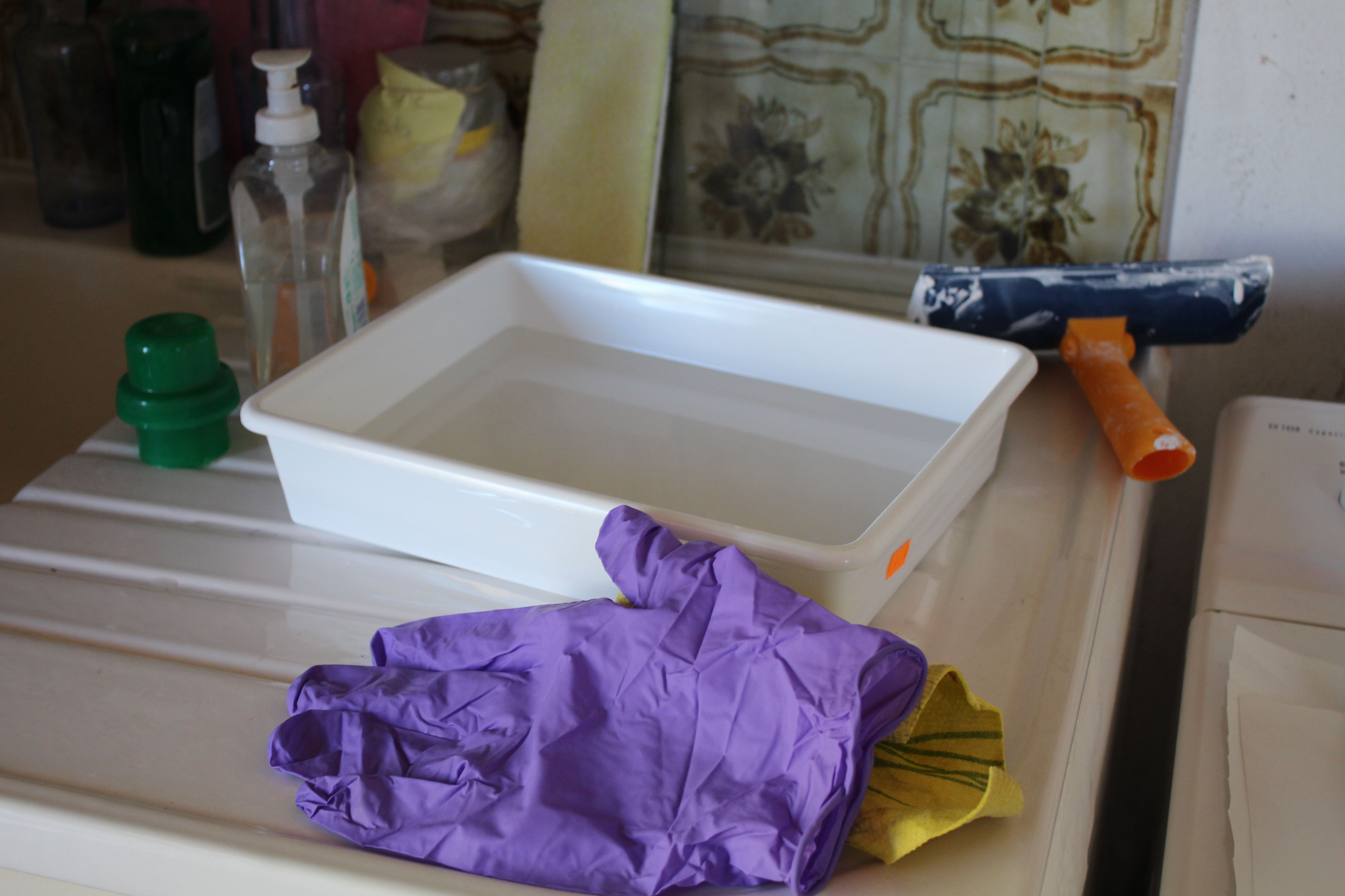
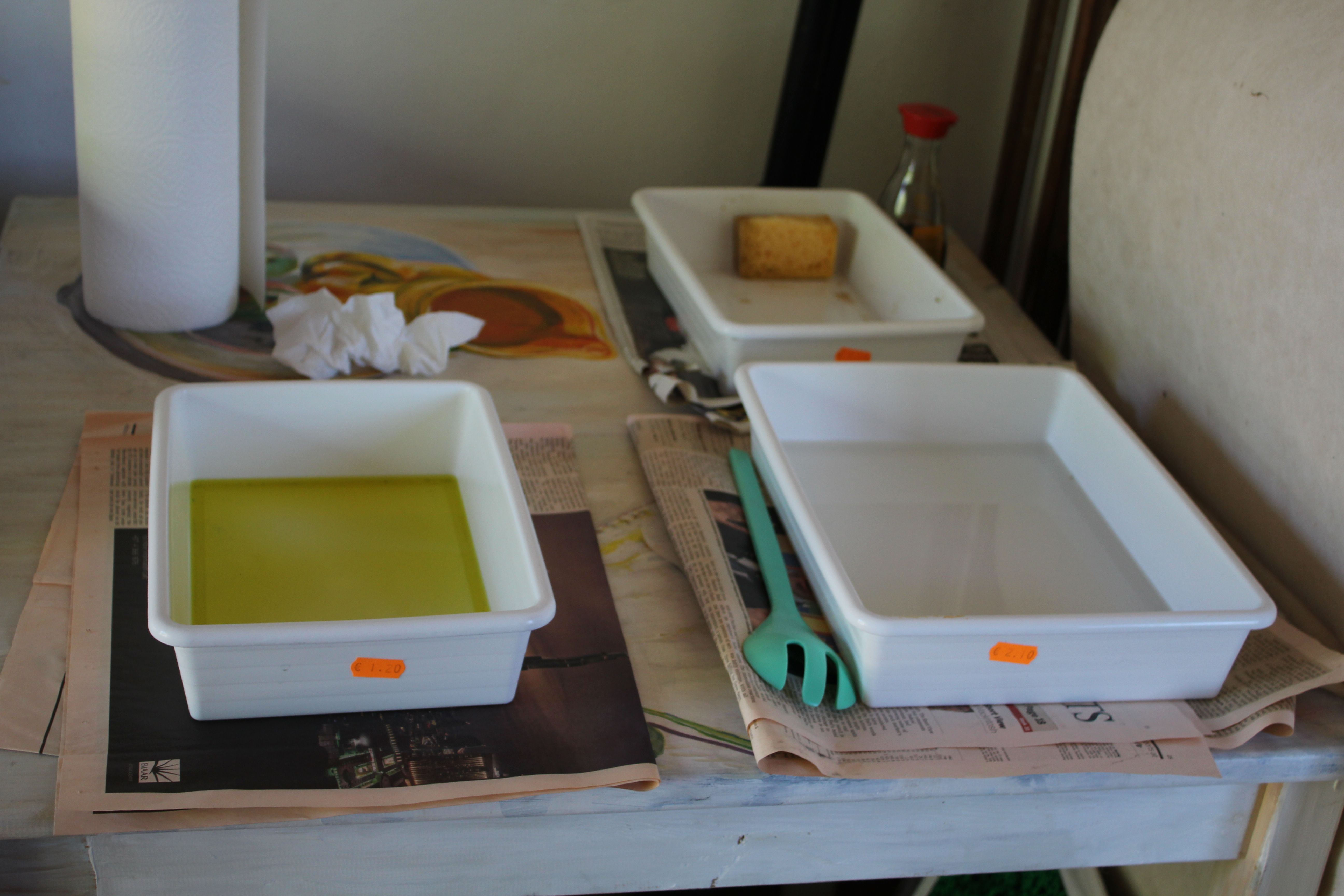
This is a highly sustainable practice which uses no dangerous chemicals, and leaves the printing plates reusable. In Capileira, we used copper plates, which had to be cleaned- wet/dry sandpapered to remove any scratches- then deoxidised in a bath of salt and vinegar solution- then degreased (in soya sauce). Finally washed and dried.

The laminating process could be done wet or dry, and the important thing was to avoid exposure to UV light, as this is photosensitive film. The film could be cut larger than the plate, then floated in a shallow bath of water, where the underside of the film could be stripped of its Mylar coating (hold onto this Mylar for other uses). The film is them squeegeed to remove air pockets, then dried with a soft cloth on a dry surface, and all remaining air pockets removed.

The plate is then dried flat in a drying cupboard for 2 minutes. Then it needs to be stored in a box until ready to use. This is perhaps better done the day before exposing.

The image that will be printed is exposed onto the photosensitive film by means of a UV lamp and a stencil made on transparent or semi-transparent film. Timings are precise- seconds- and have to be calibrated using a test plate.

The first decision is whether this is an image that can be exposed directly, or whether it needs to be exposed through an aquatint screen.

For the first- direct exposure- the image must be a line drawing or a purely black and white image. It may be made up of hatching, but there are no half-tones.

For images with continuous tones, such as ink wash, gouache- then an aquatint screen- a layer of tiny irregular sized black dots- must be used first.

The image is developed in a washing soda solution, then dried in a drying cupboard. It can then be hardened in the sun before inking and printing.

The film is removed in caustic soda, leaving the plate ready to re-use.

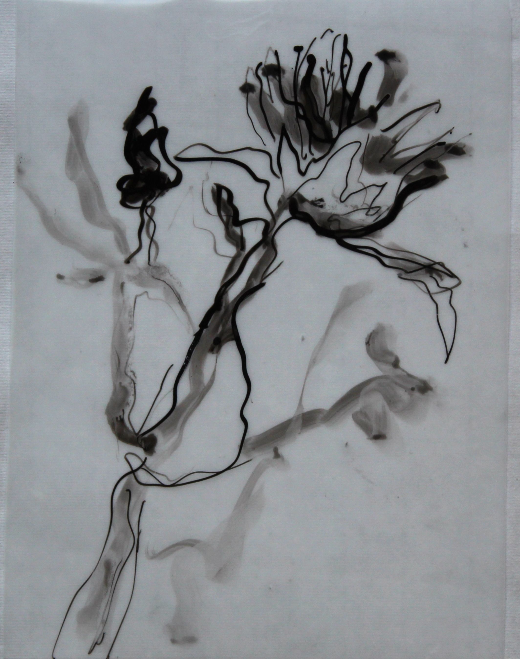
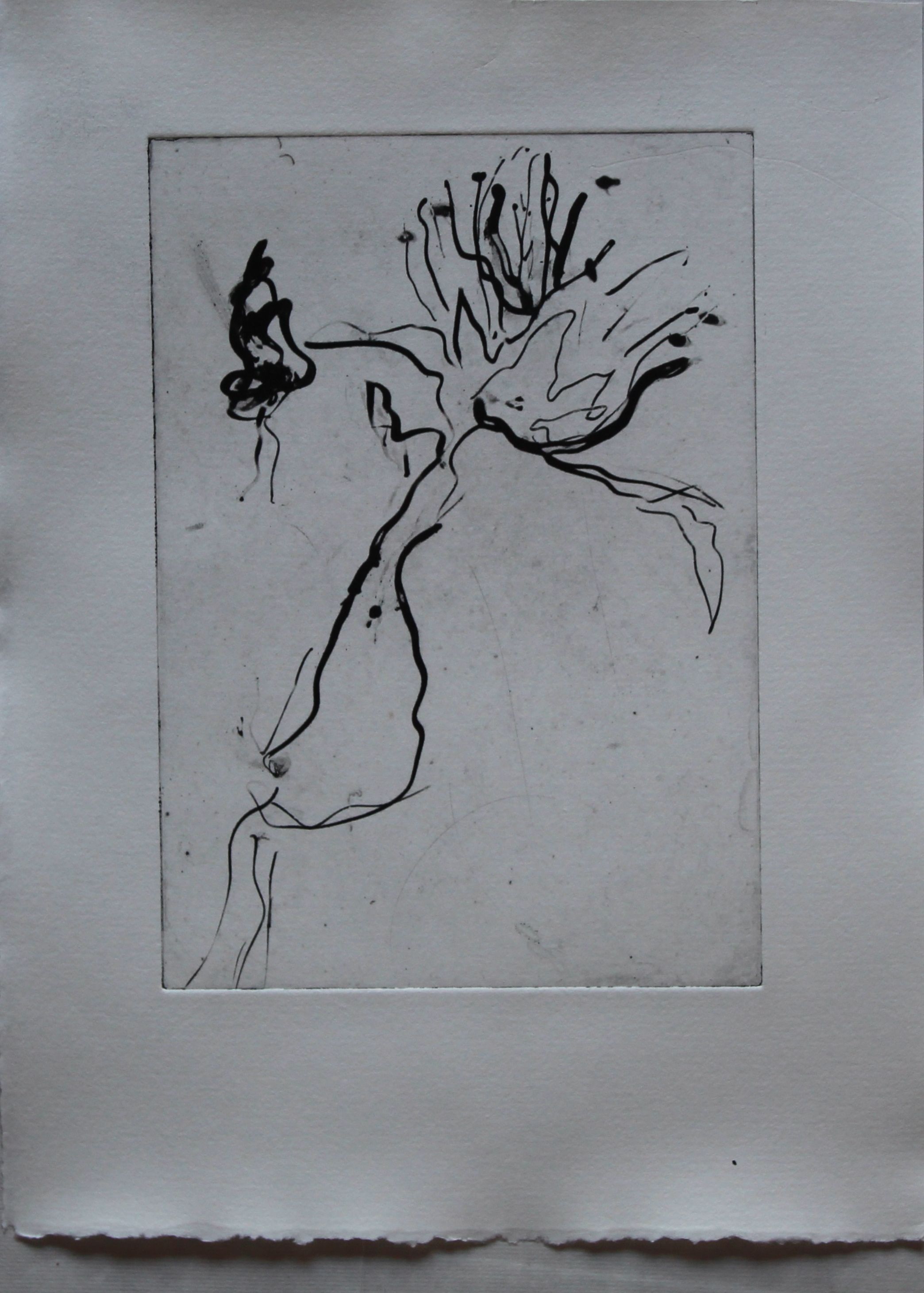
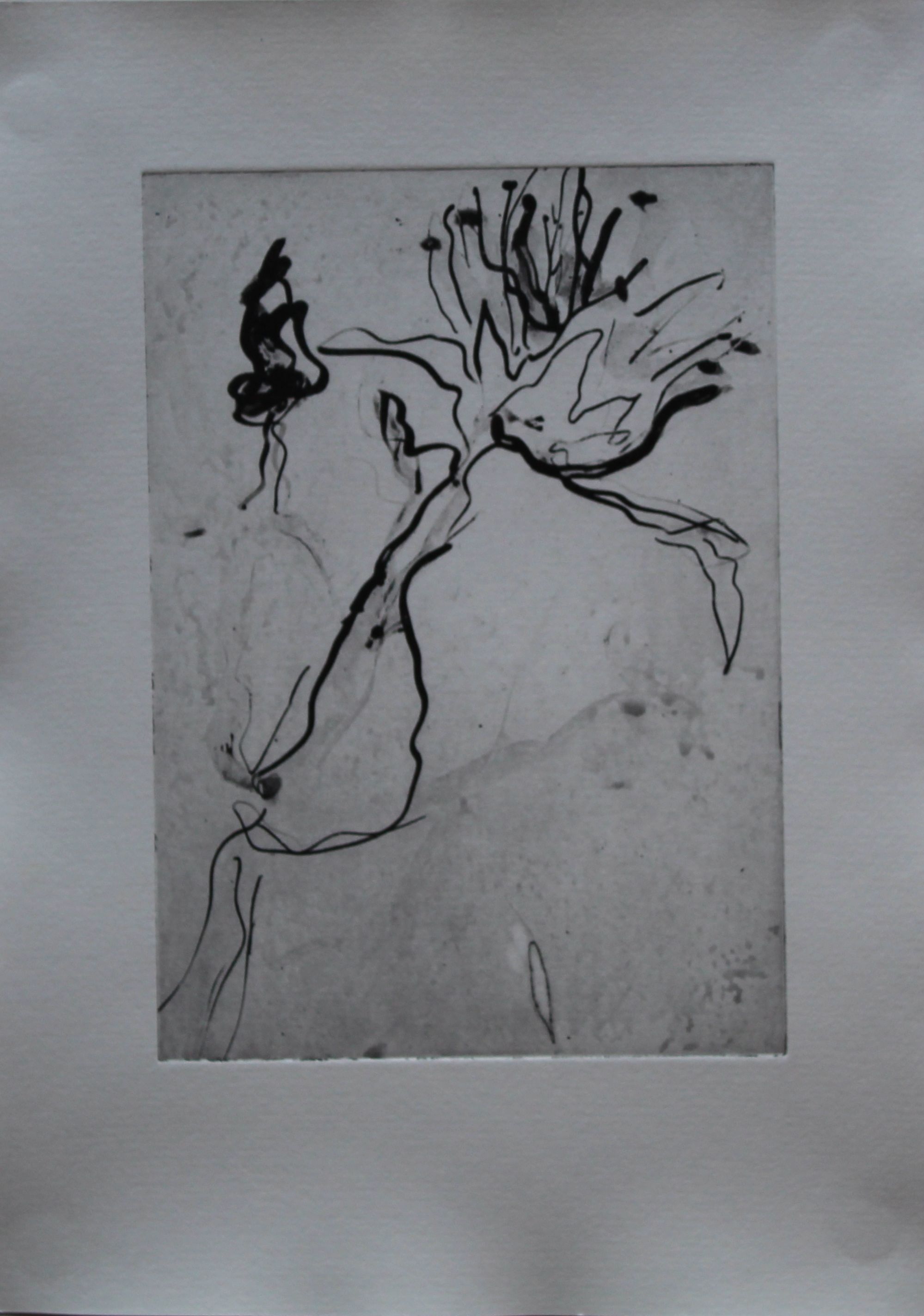
This was my first attempt: an image on film, made with marker pen, chinese ink and wash.

IMG_3763

It didn’t come out well, because at this stage I didn’t know about the aquatint layer, so only the black lines came out, not the continuous grey tone.

IMG_3776

With an aquatint layer though, it still wasn’t great, and I tried selective developing, i.e. focussing on the grey areas when developing the film in washing soda.

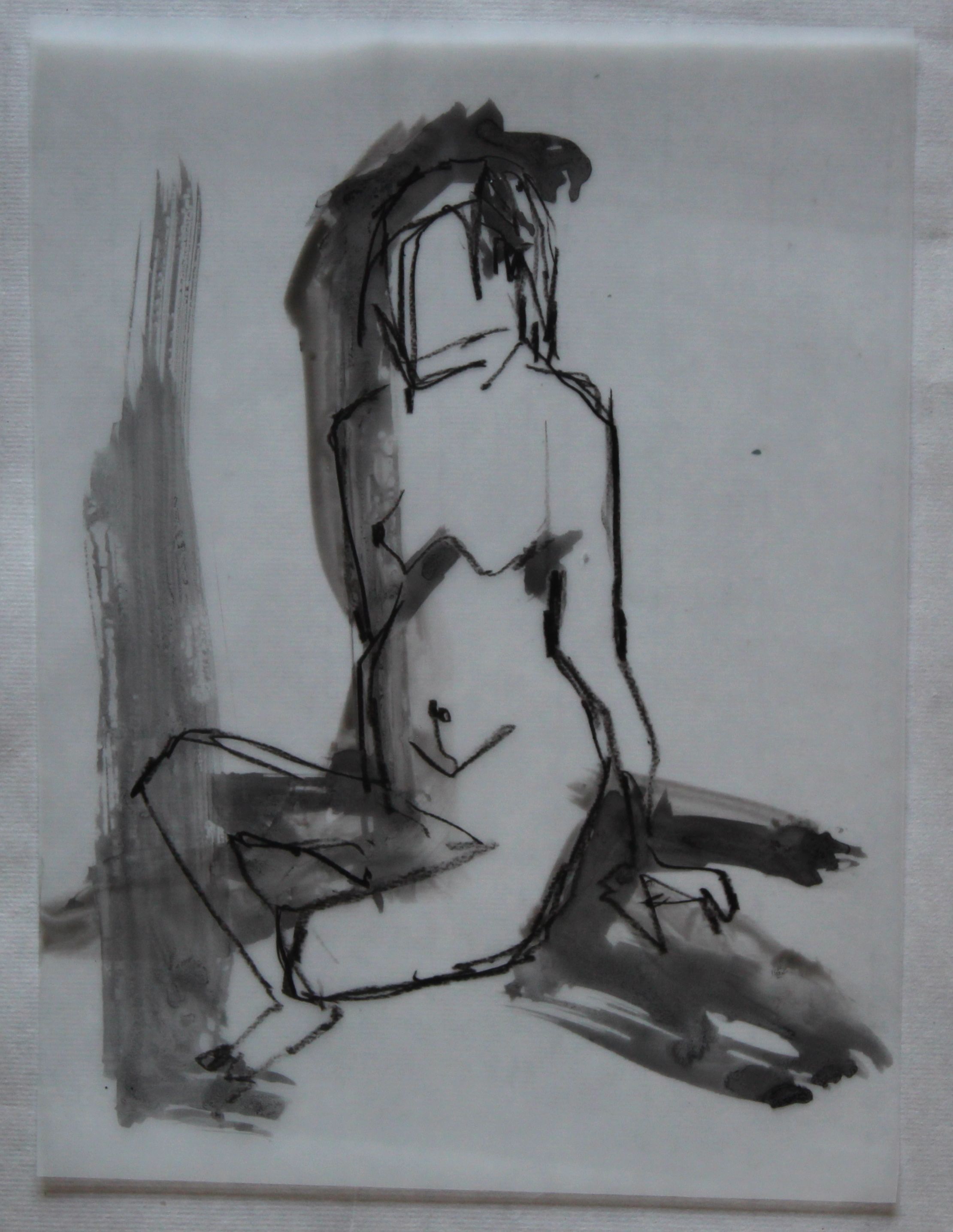
I wanted to try getting pencil type lines, so used a litho pencil- an actual pencil would not be black enough. This is the image on film; litho pencil with ink wash, so again a continuous tone.

IMG_3764

The image was ok- I tried it a few times, and mixed it with a monoprint layer and mask, but still not getting real black blacks.

IMG_3779 IMG_3774 IMG_3769 IMG_3768

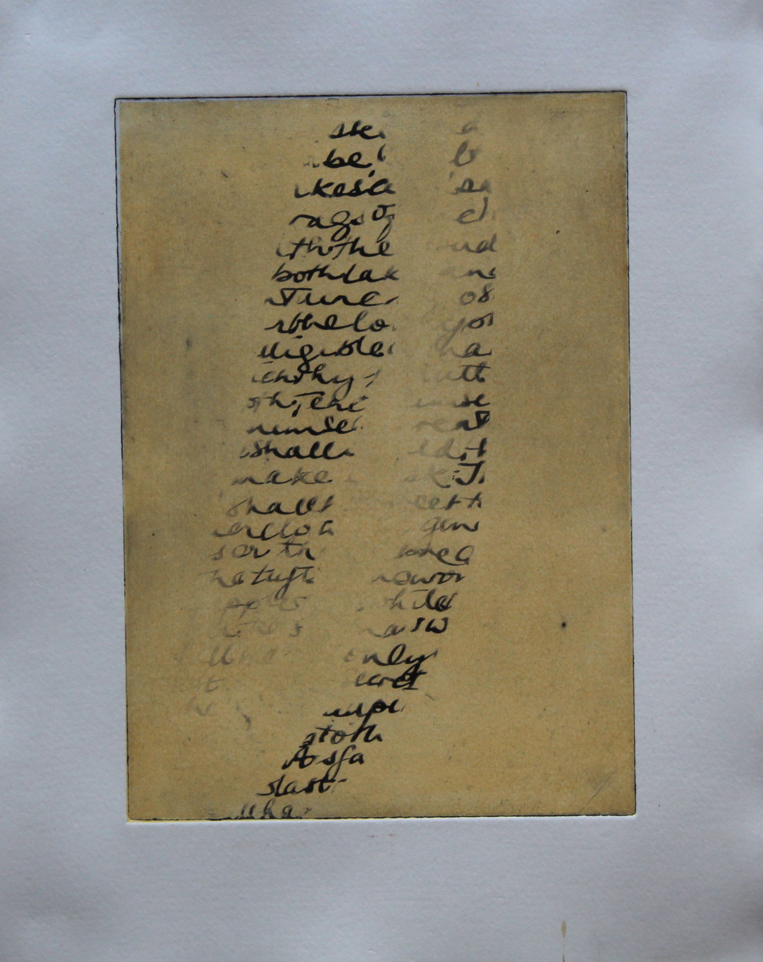
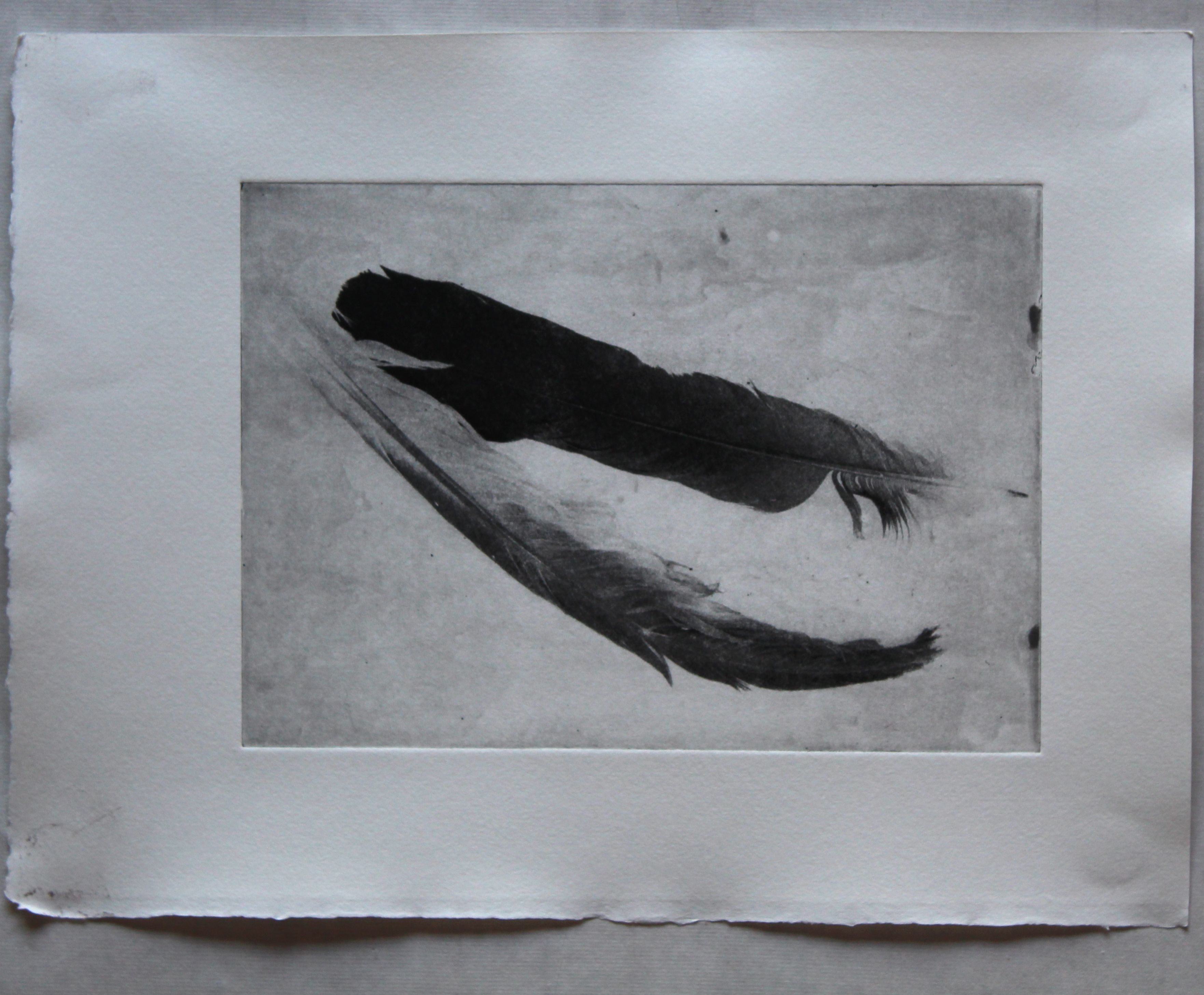
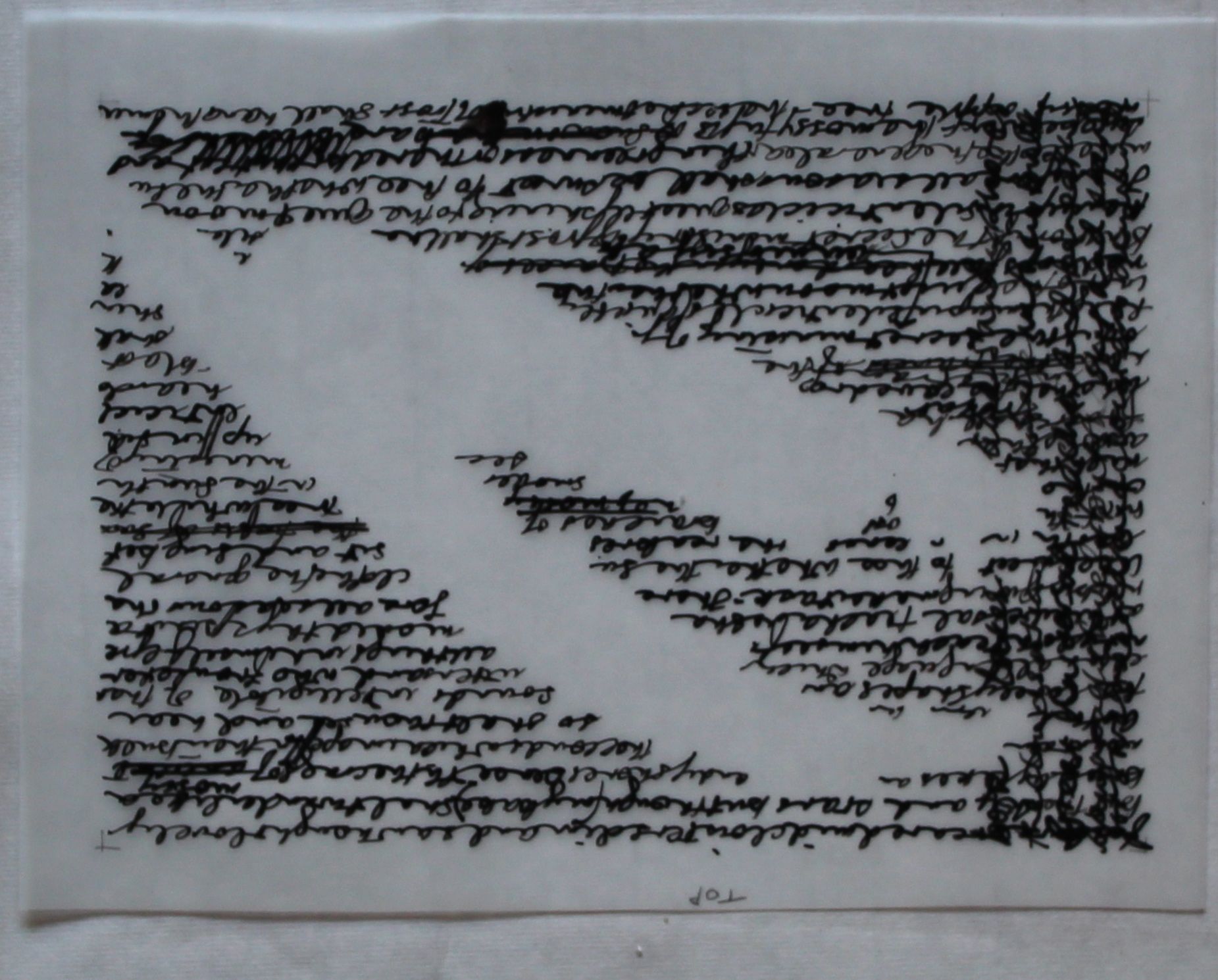
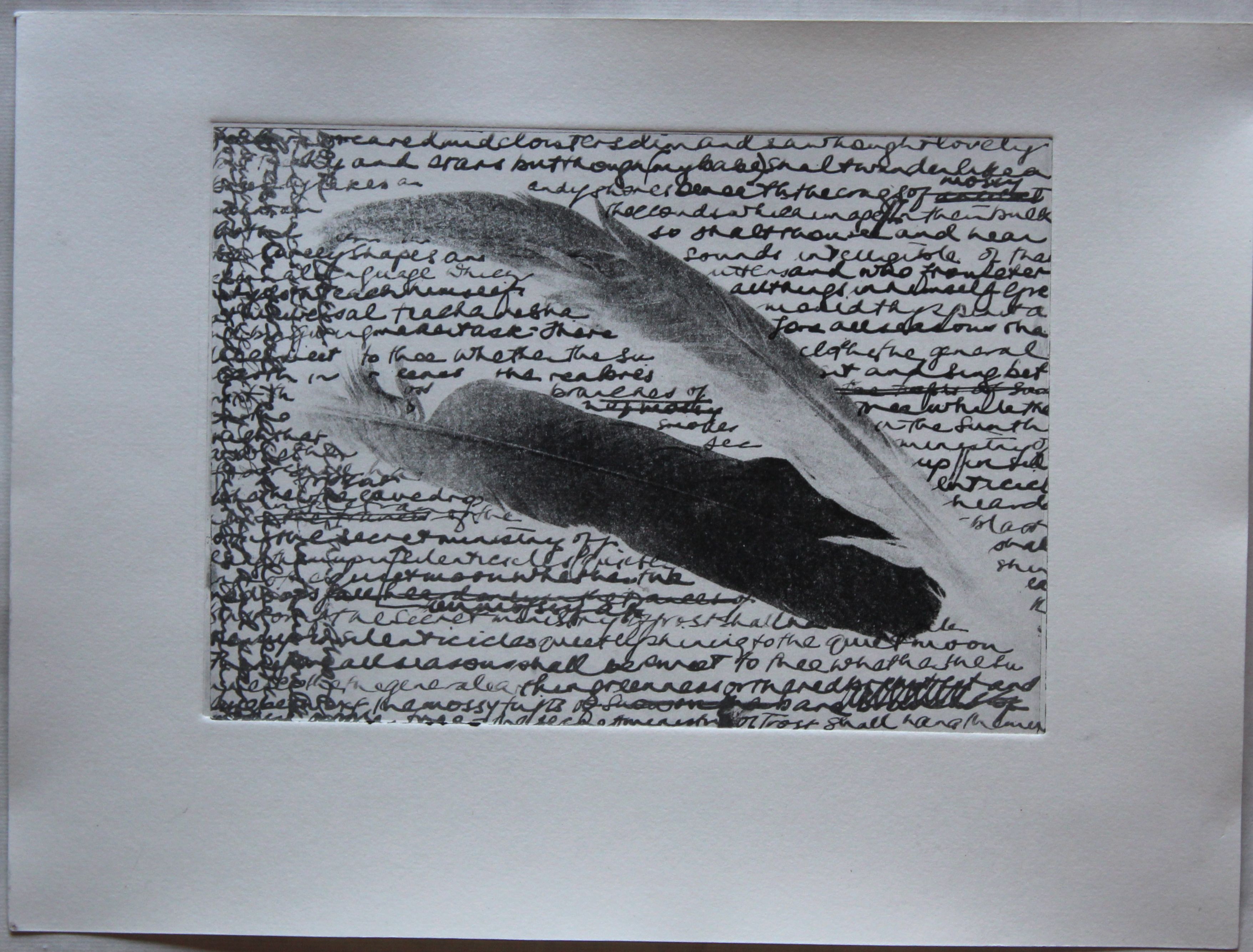
Then I experimented with masks and using photographs- this involved using photoshop to manipulate the image, which I am not good at at all, so is probably not something I will repeat, although the feather photo did come out well. There are other ways of using photos, with photocopies or scans- and even using oil to make a photocopy transparent- these things I have not yet tried. This image was a return to my favourite poem, as I made a couple of transparencies as masks, writing the words of the poem as I remembered them, repeating, crossing out, over-writing in a palimpsest.

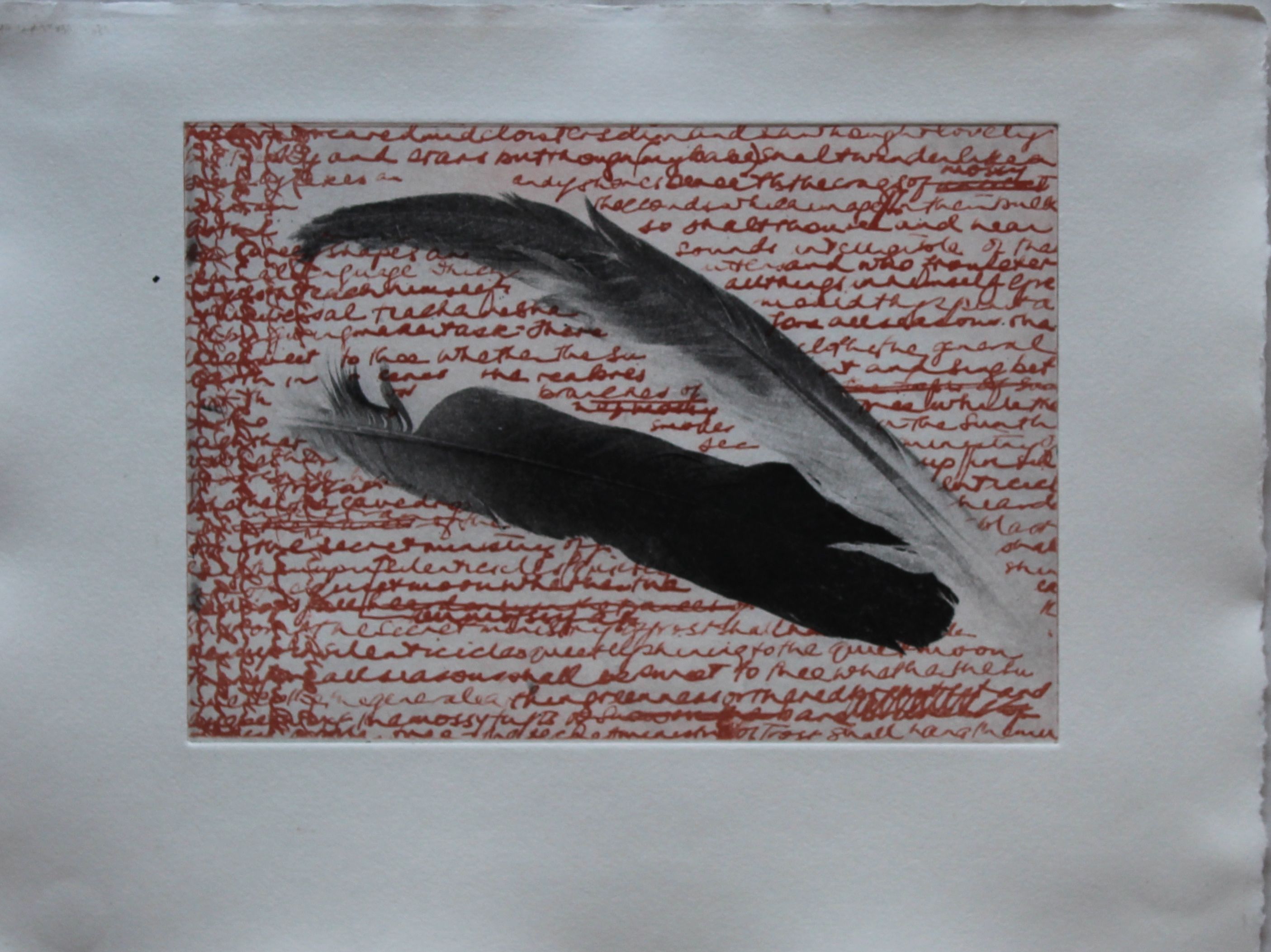
This one was unsuccessful because the mask was not sharp- it was a pair of  actual feathers – but I could not put them under glass in case particles were sucked off in the vacuum unit, so just had to lay them on top. then a sheet with writing all over was exposed, but only the masked section would now be able to pick up the image.

IMG_3766

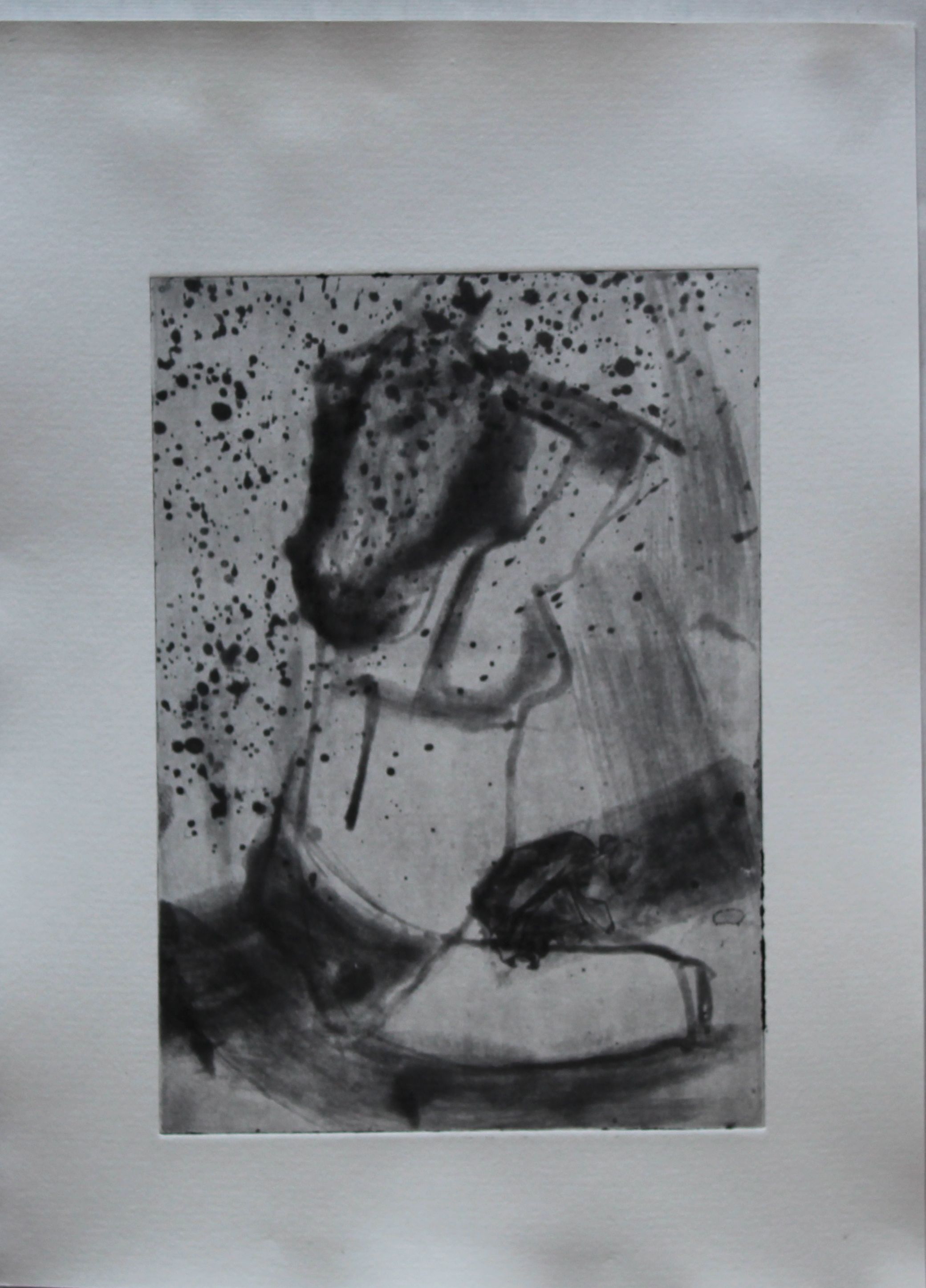
This was an actual photograph, which could then be used to produce a highly detailed print. This involved two layers as well, but reversed this time.

Photo printed on film

Photo printed on film

Mask - script on film

Mask – script on film

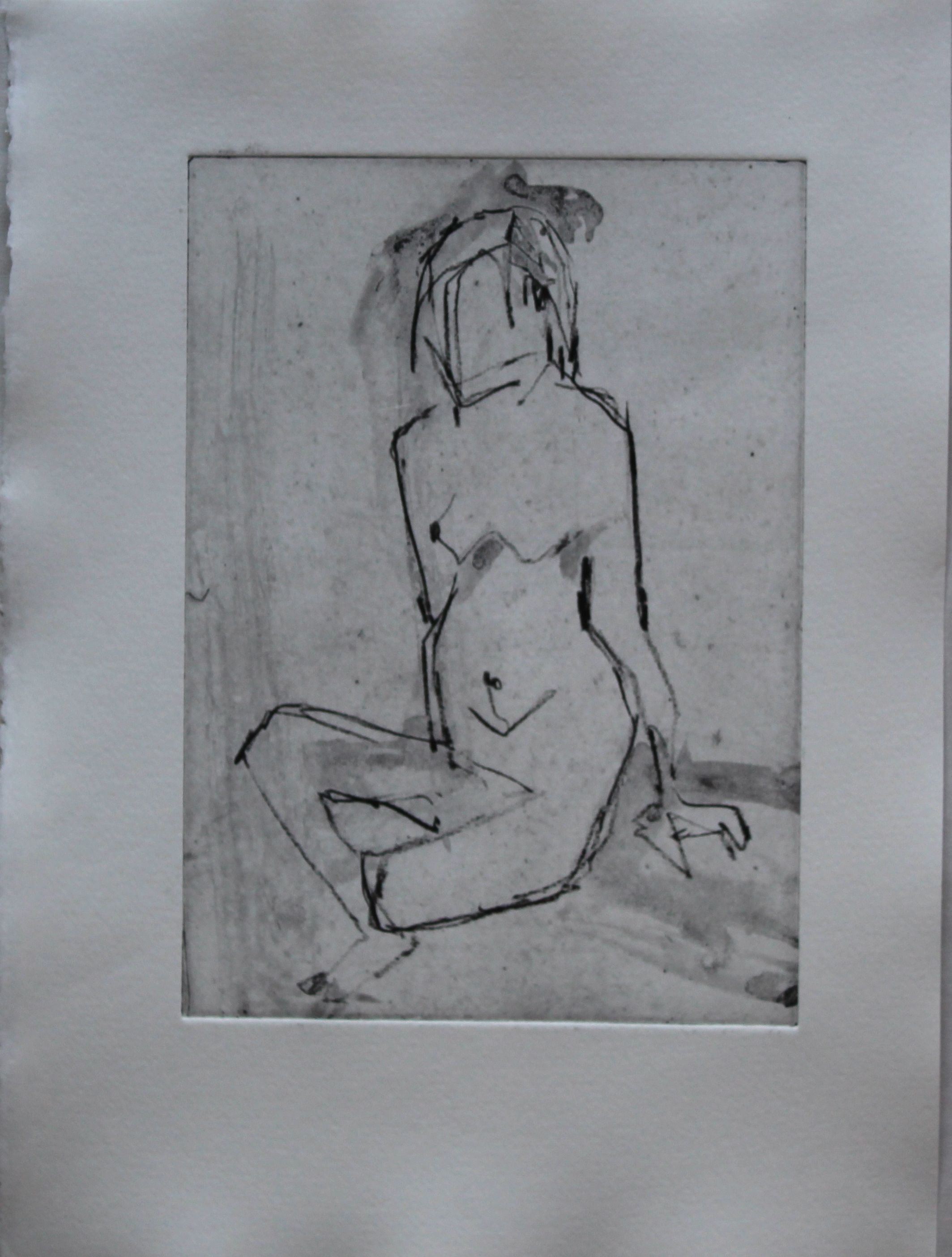
Black and white printed image with registration not quite right- I should have had a guide on my photo, but it was taken on a white background, which made registration difficult. At least here though, blacks are black and whites are white.

Black and white print

Black and white print

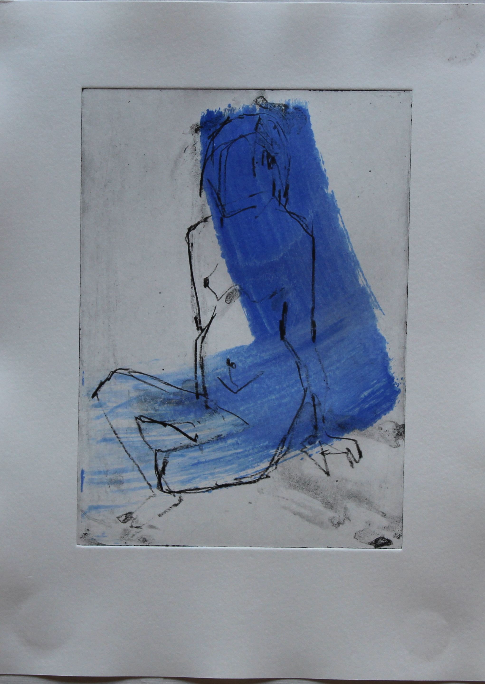
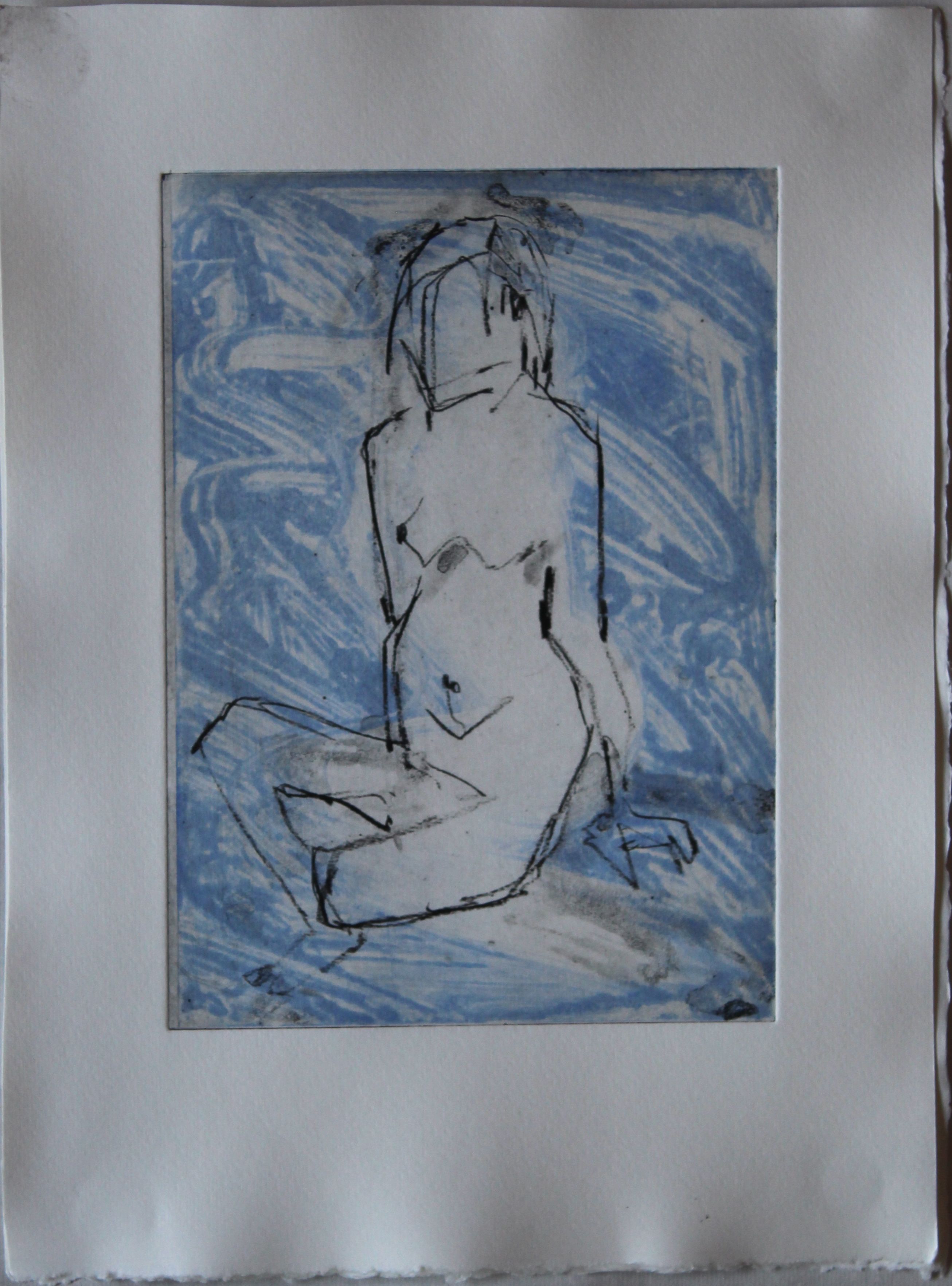
This is a colour version, my favourite image of the week:
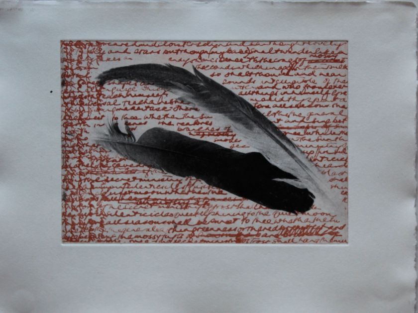
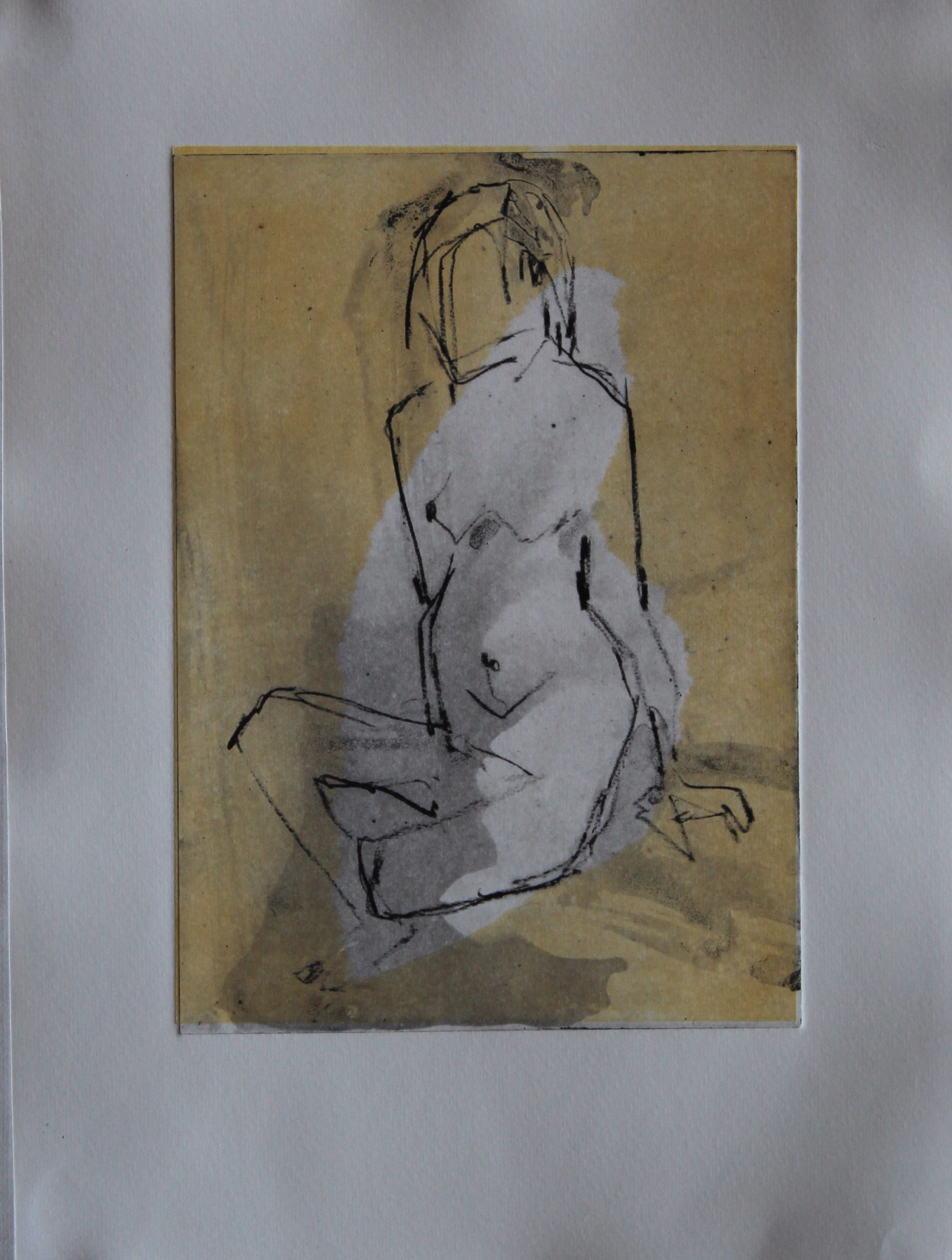
Black and sanguine

Black and sanguine

This was one that didn’t work well as an image, but is a technique for painting on developer directly onto the aquatinted screen. You need to work in low light, quite quickly. It would work better at home I think- the washing soda developer was mixed at different strengths, but was getting mixed with several people using it.

IMG_3773

After returning from the course, I set about getting equipment for this- it’s not straightforward though. The film is specialist, as is the aquatint screen, and a UV lamp is expensive, although the sun can also be used. The materials are “everyday” yet it’s surprising how hard those “everyday” items like washing soda are to get hold of. I managed and had a good set up. In France. But too little time to use it. I succeeded in laminating plates and making masks while there, but didn’t have an aquatint screen for greys. (I forgot that I could still do line drawings!)

IMG_3668

IMG_3667


Postscript:

I brought back the film to Hong Kong, as well as washing soda crystals and other items such as the copper plates. But for some reason, the film will not adhere to the plates. All the materials are the same, and the film was kept cool. Frustrating, as I now have the aquatint screen too.


Practice 4: Ferric Chloride: Hard ground

Research

IMG_3694

This was the same plate again, this time coated with two layers of Johnson’s floor polish, then engraved with an engraving needle into the white areas of the plate that had been stopped out first time, as well as lines crossing both etched and sopped areas.. The plate was etched for 15 minutes. The engraving came out ok, but now I don’t seem to be getting a good ink layer, maybe to do with inks or wetness of paper. But, anyway, established that the engraving using a needle gives lovely sharp lines, both in the masked and the etched parts of the plate.