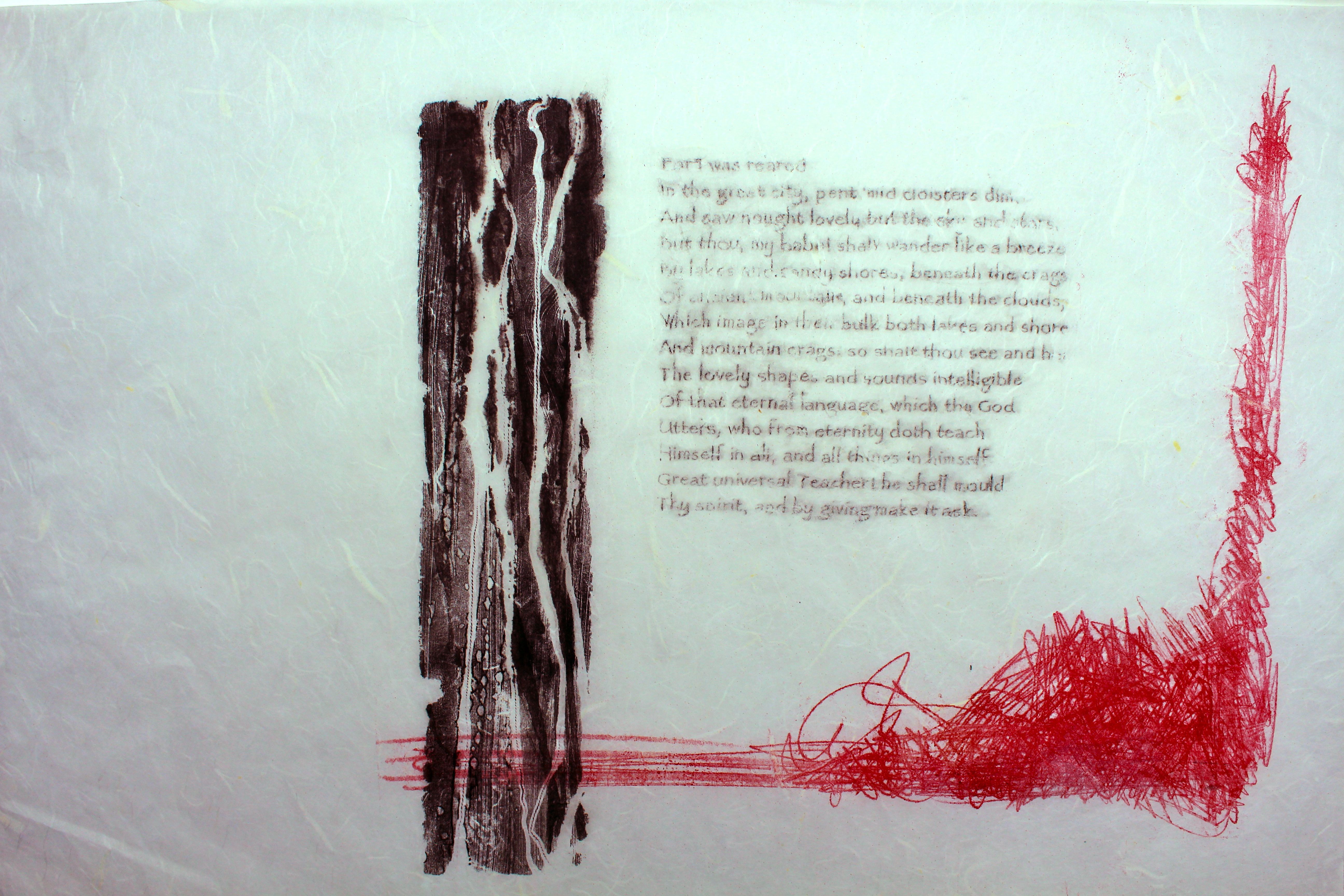
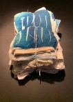
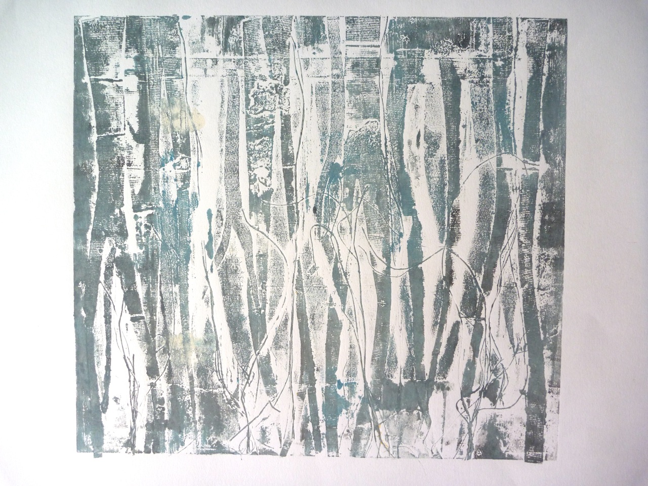
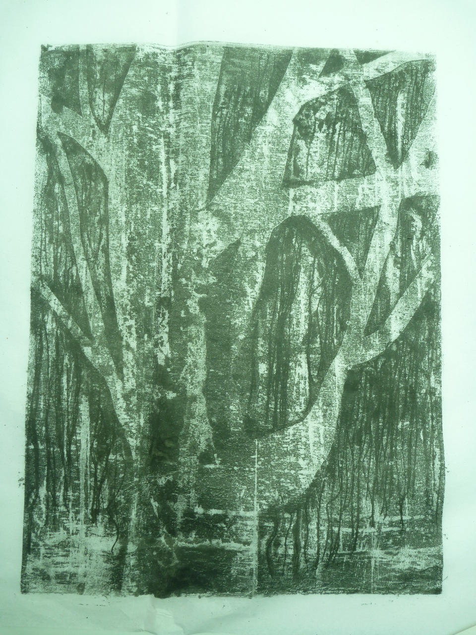
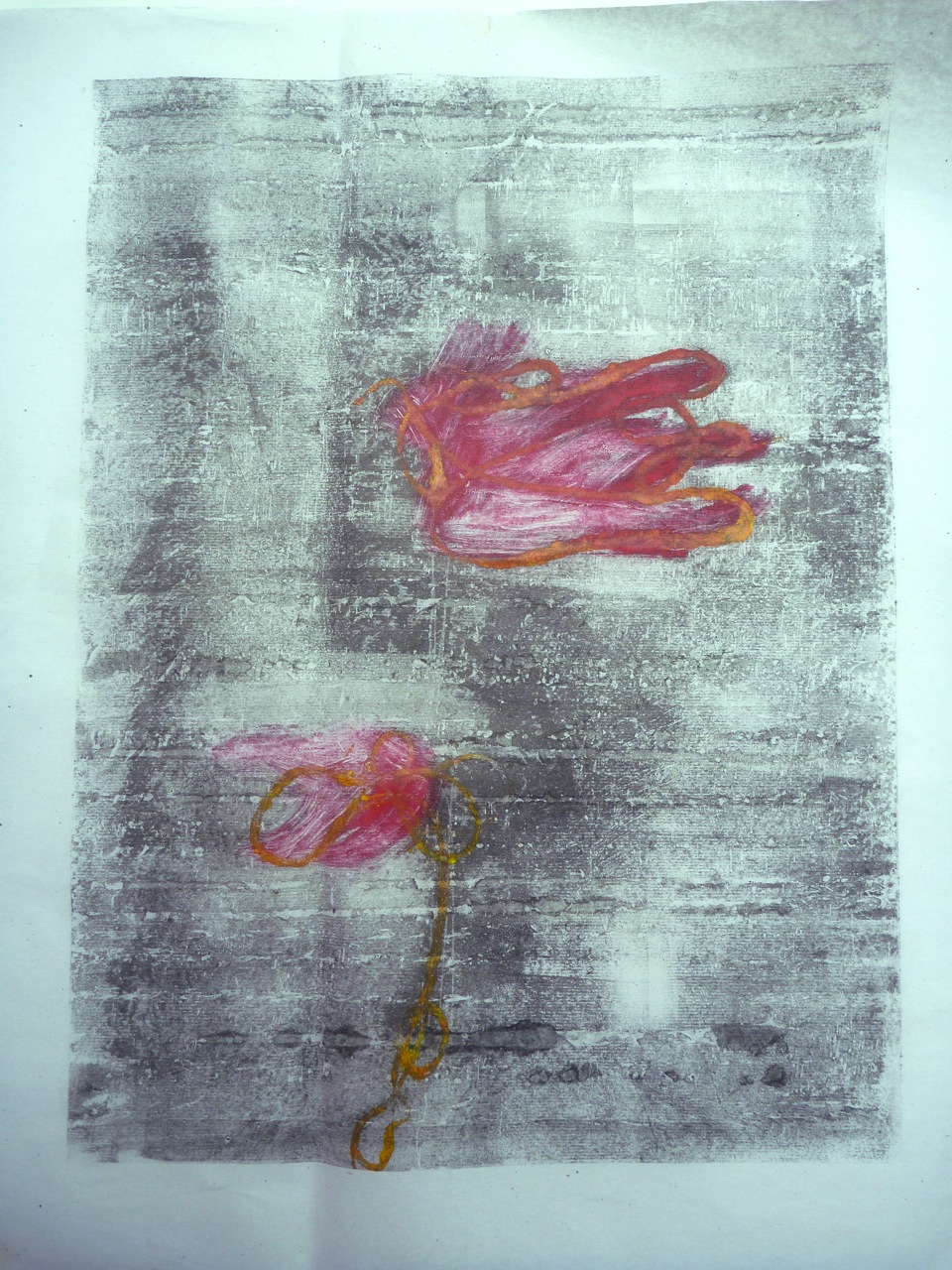
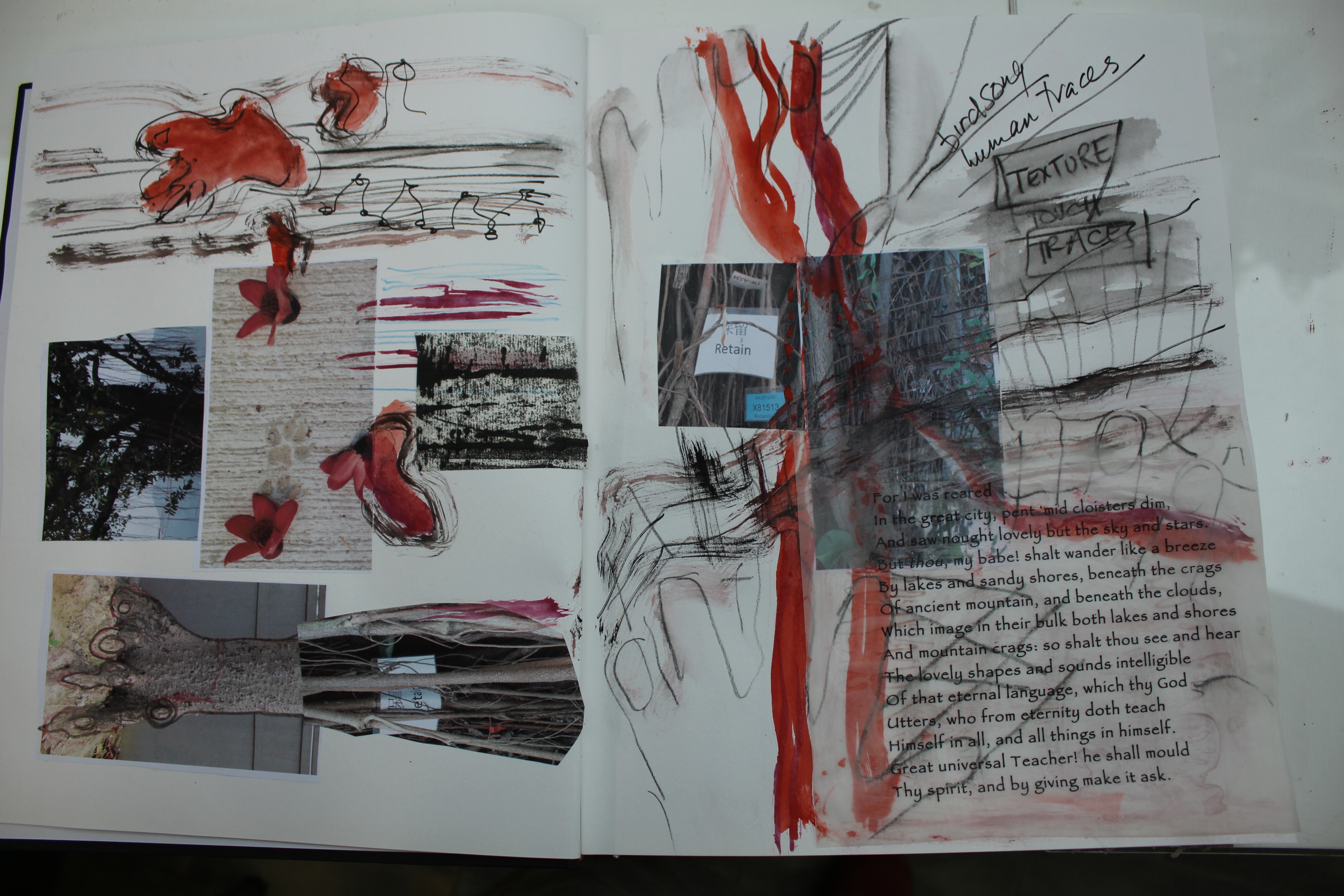
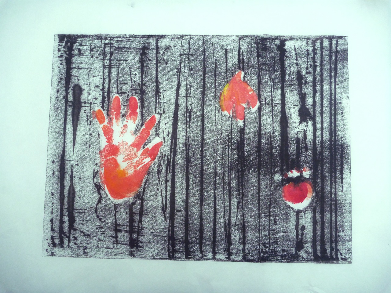
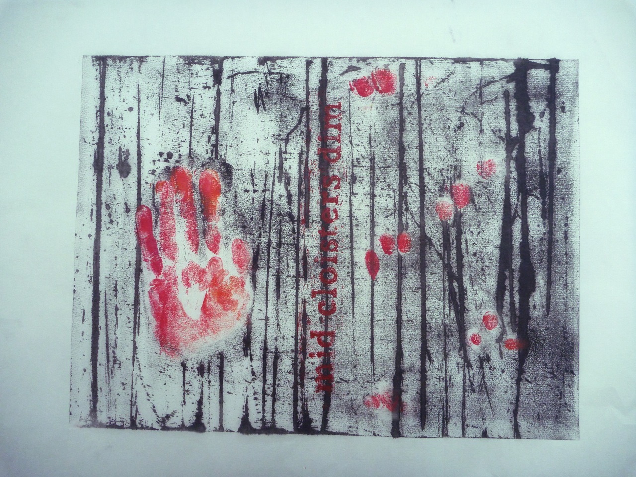
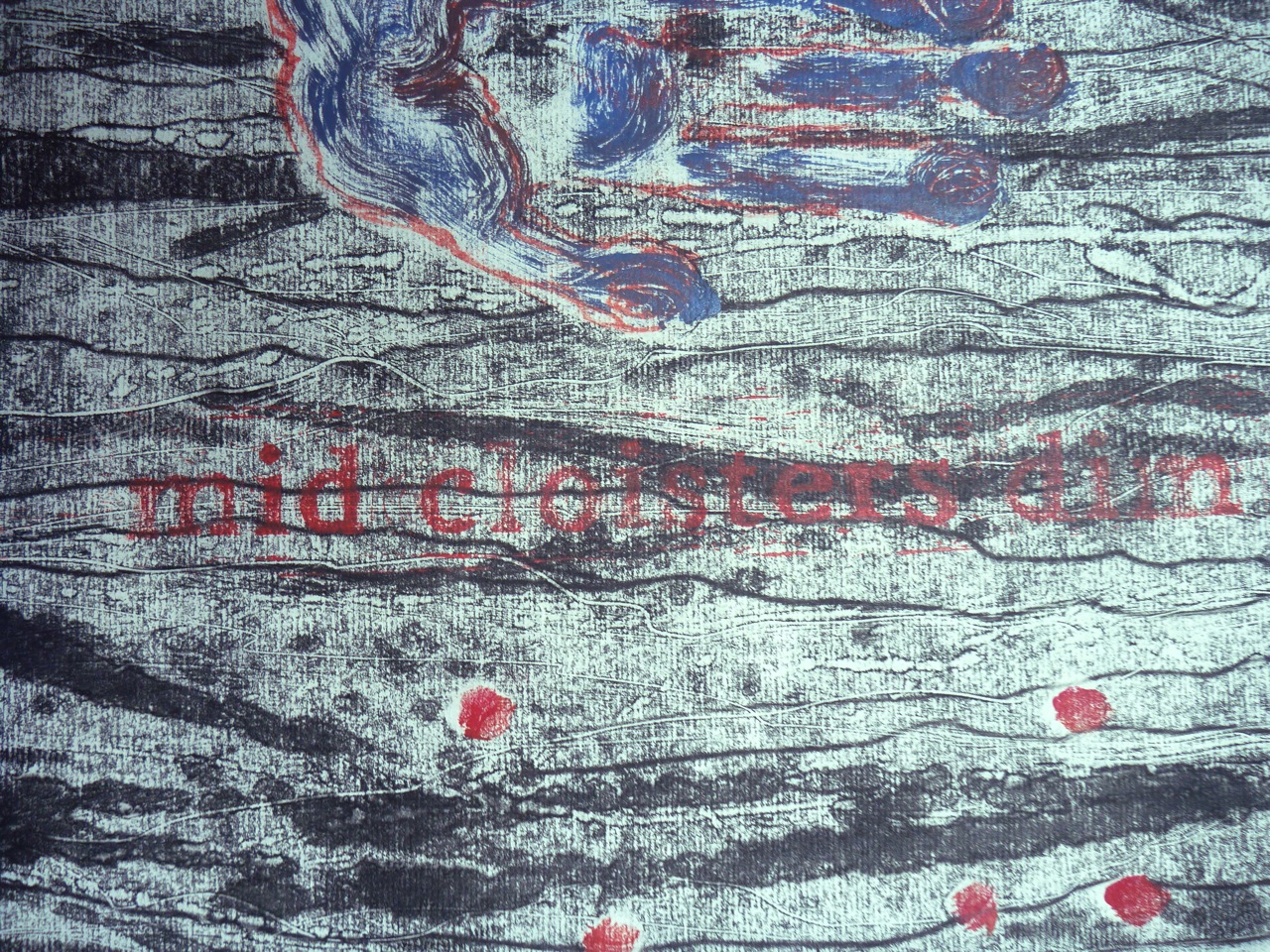
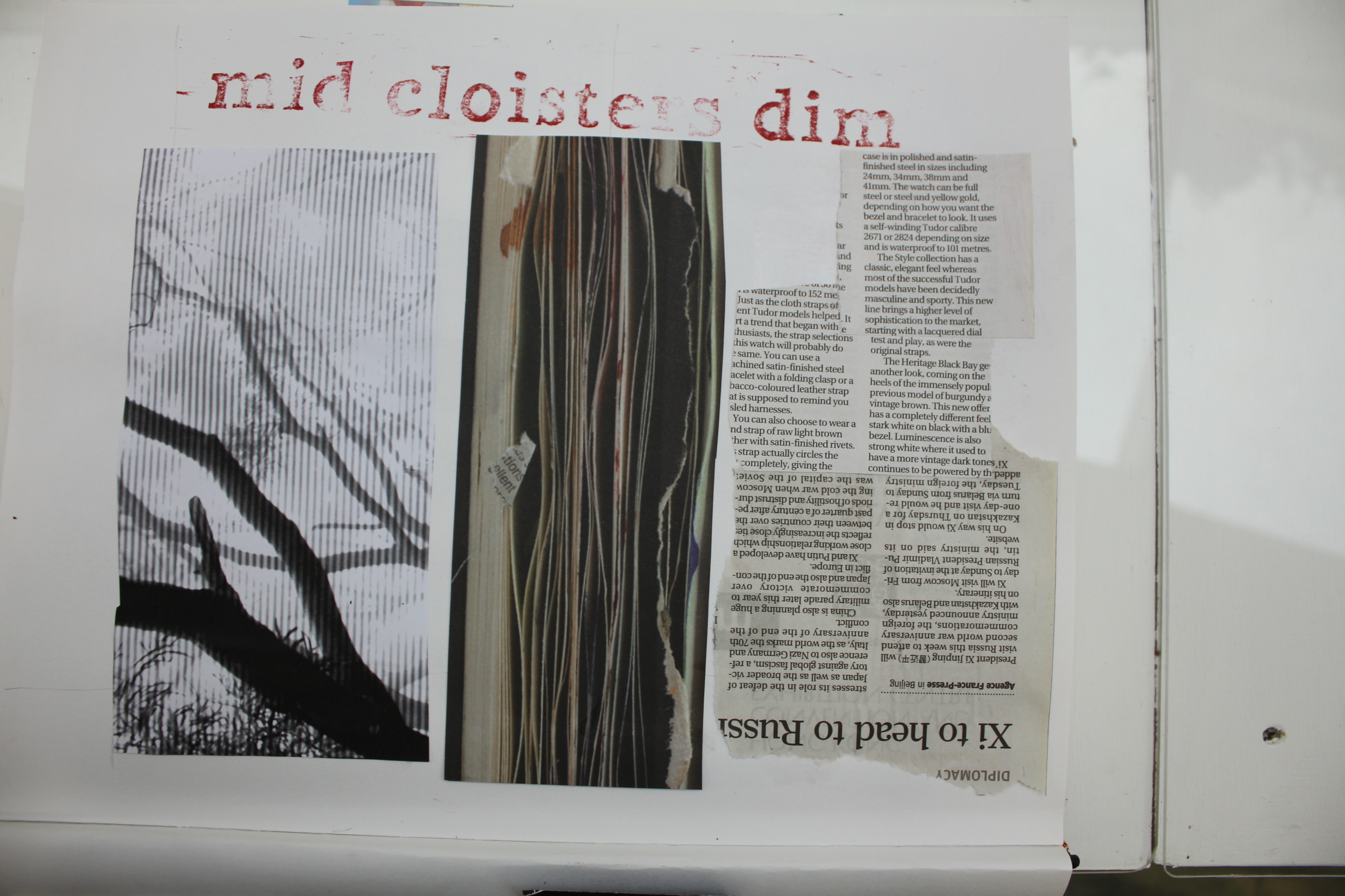
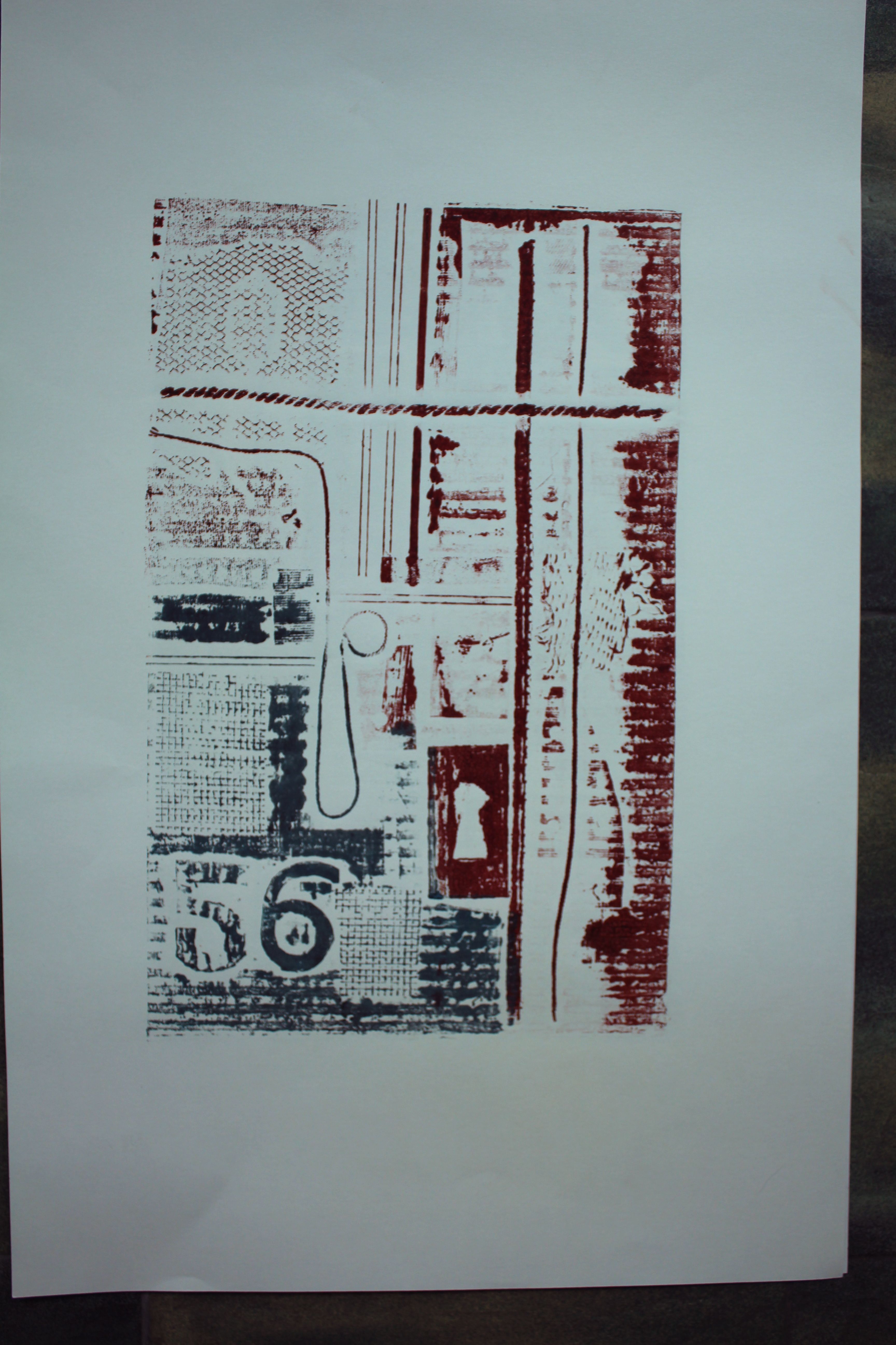
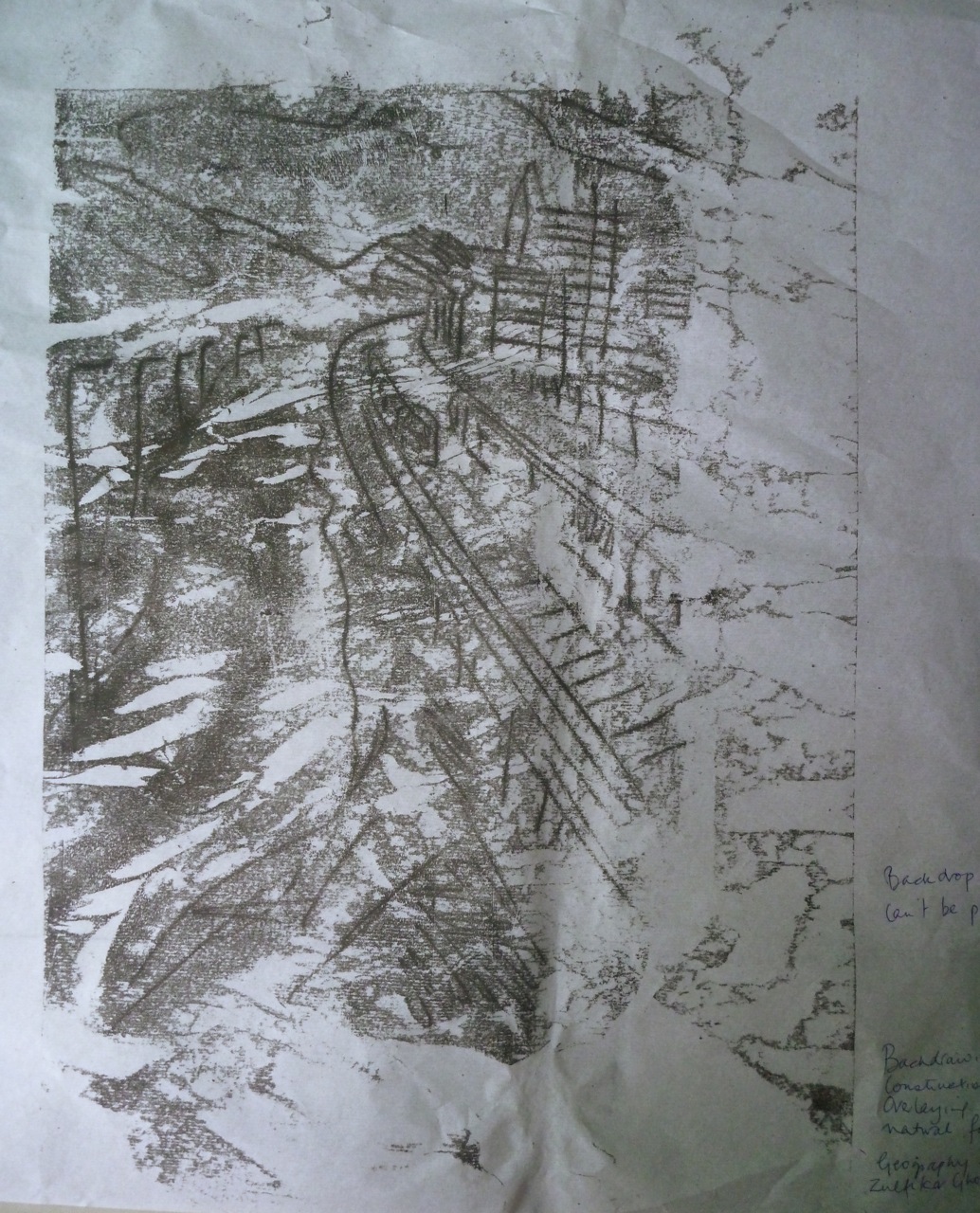
And so.. I finally came up with a couple of ideas that I liked. This one is the intaglio print of the poem, plus a panel created using thread, turpentine and oil, with a backdrawn roughly scribbled motif on the corner. It’s printed on a piece of mulberry paper with visible fibres. The whole thing has become a meditation on trees- the shapes, the products (paper), the connotation in the poem, the reference to cloisters and monkish scribes…
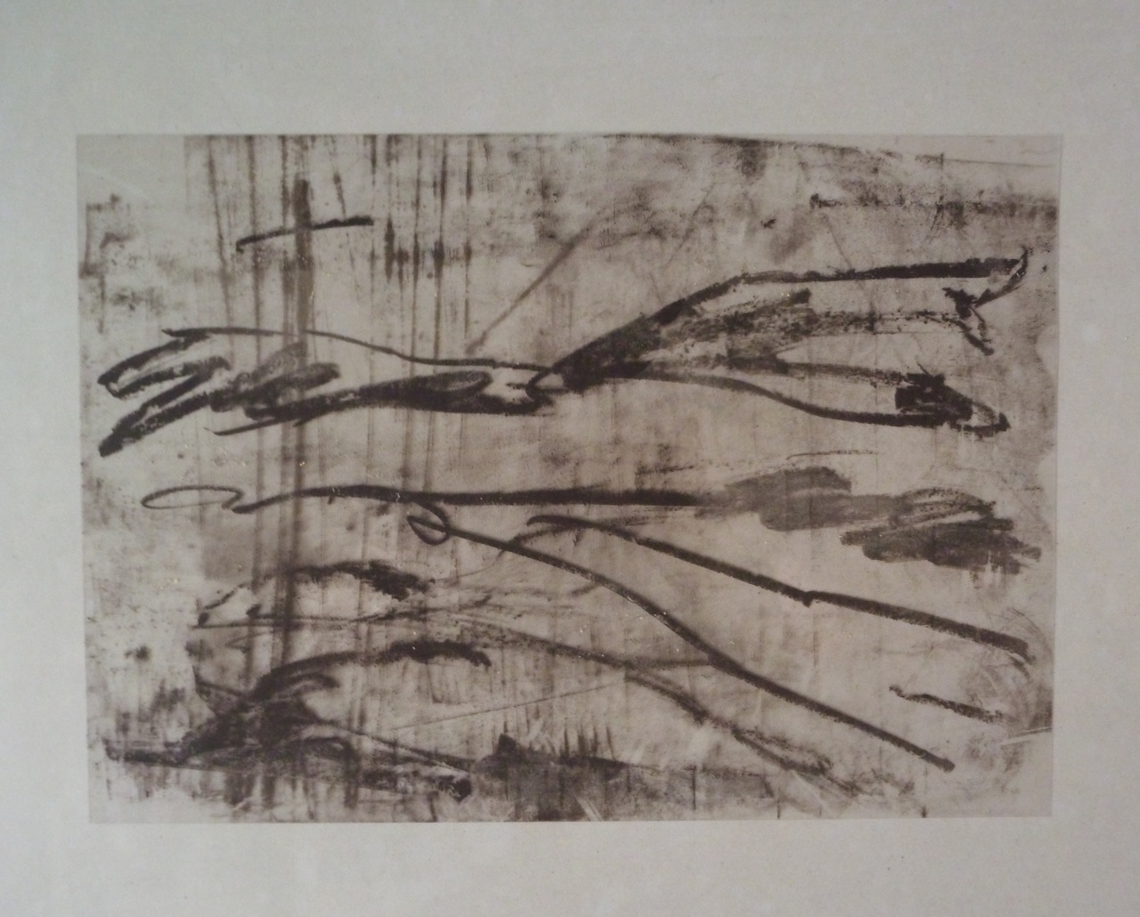
Mid Cloisters Dim: Intaglio, monoprint on mulberry paper 32 x 45 cm
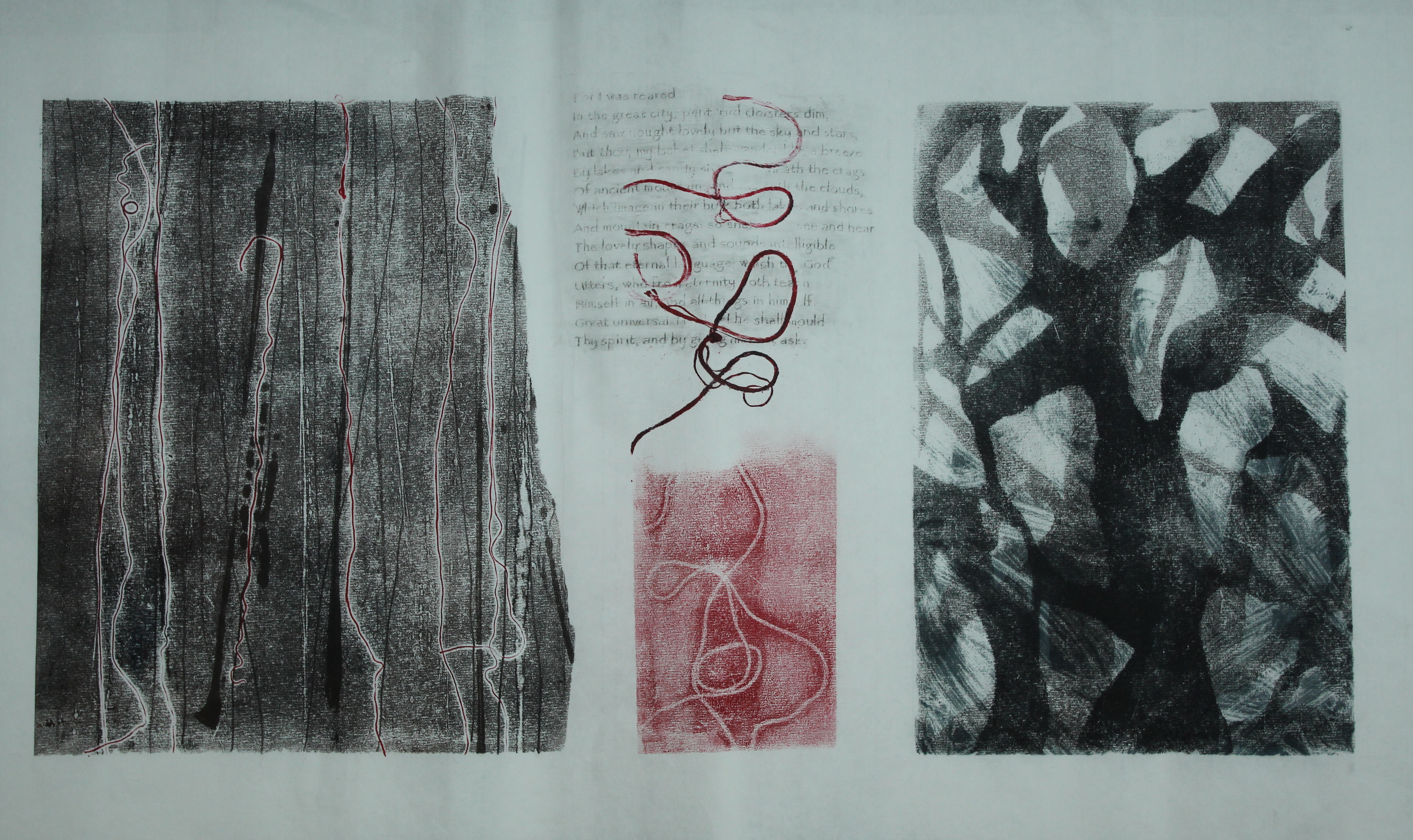
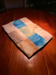
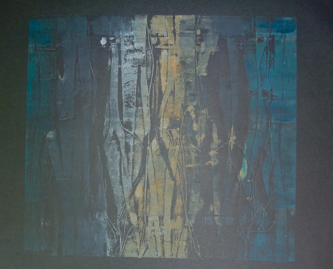
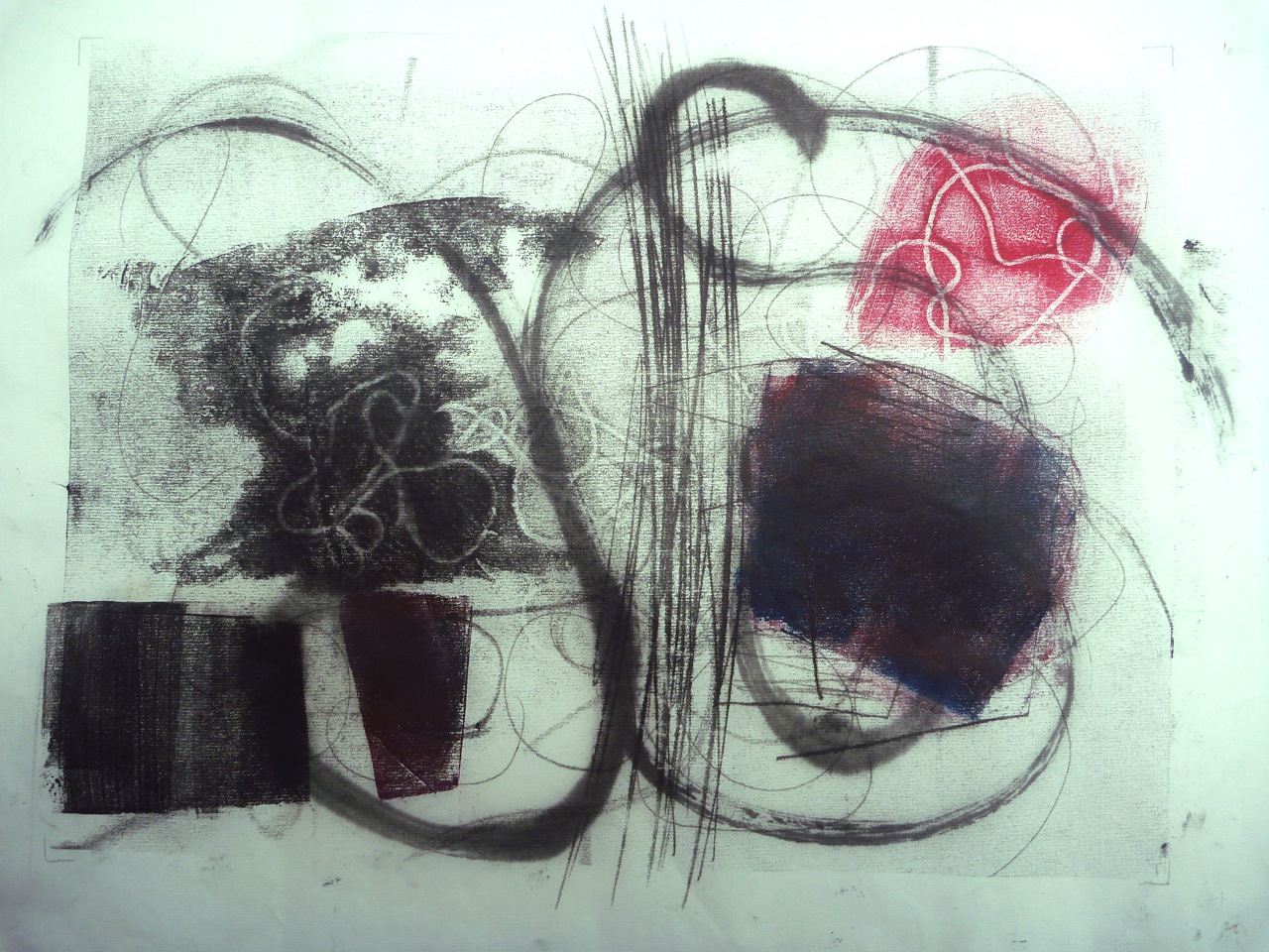
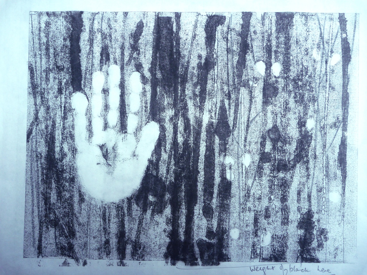
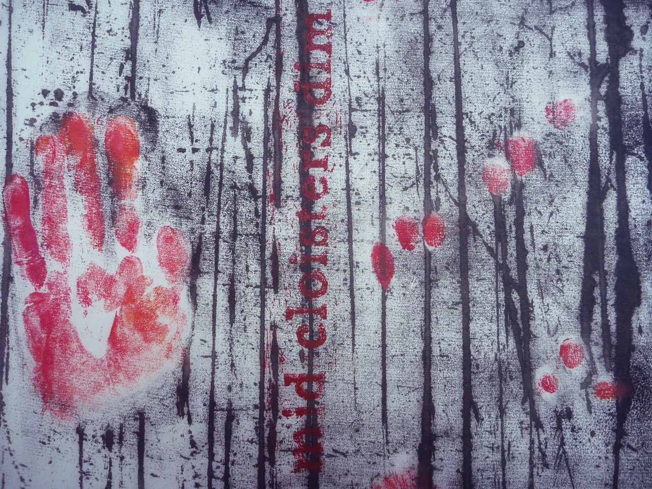
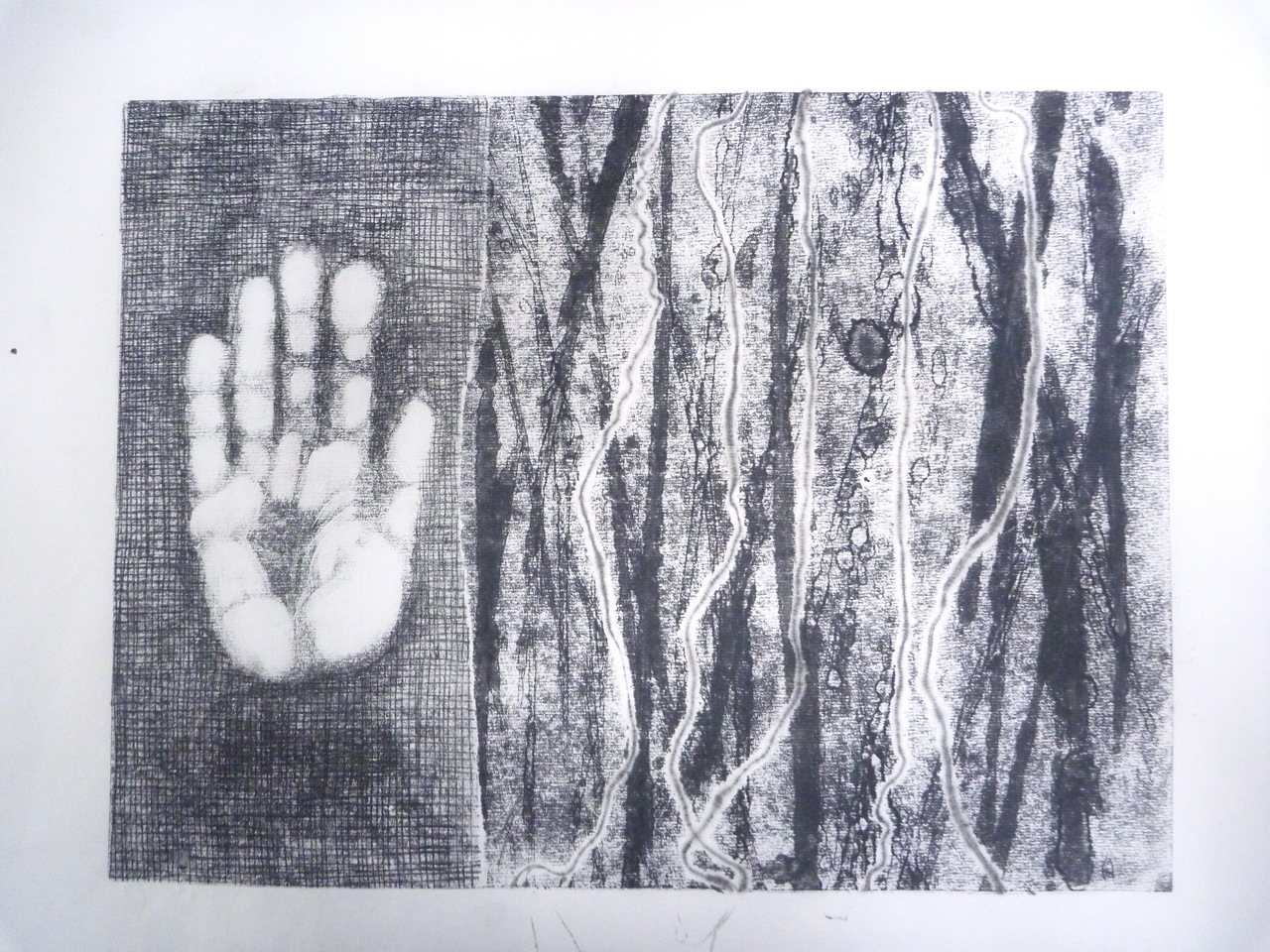
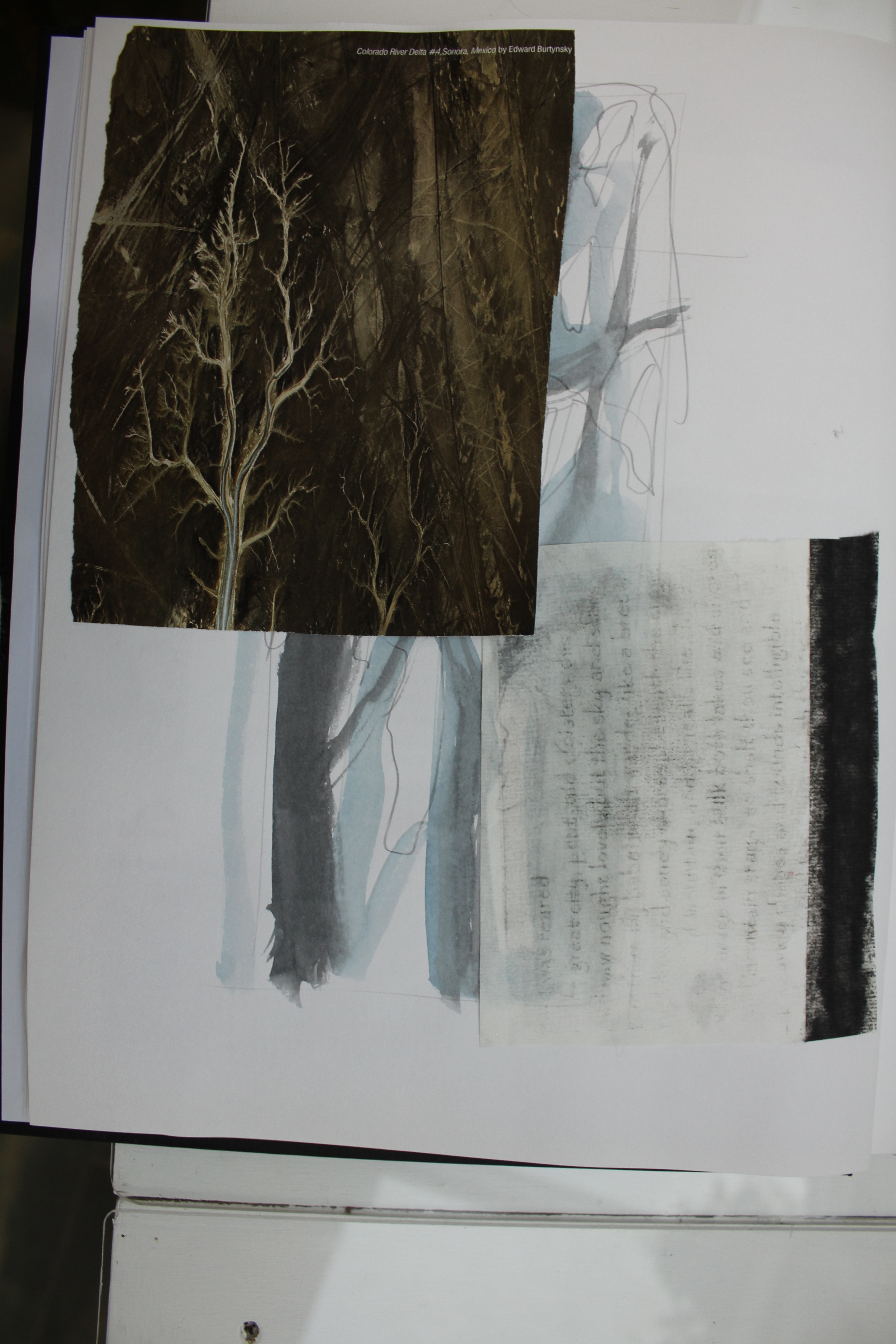
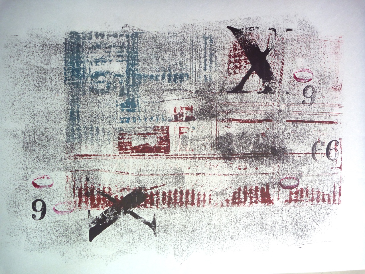
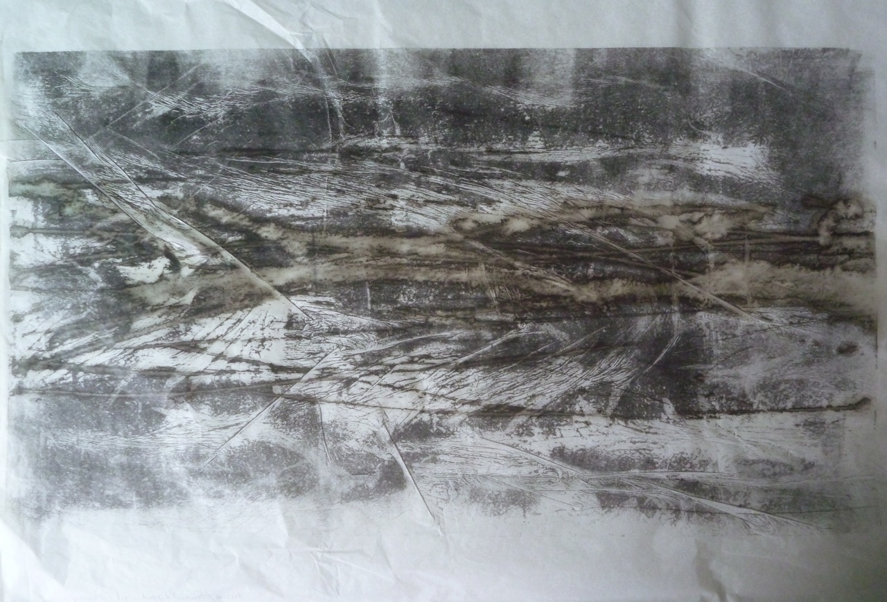
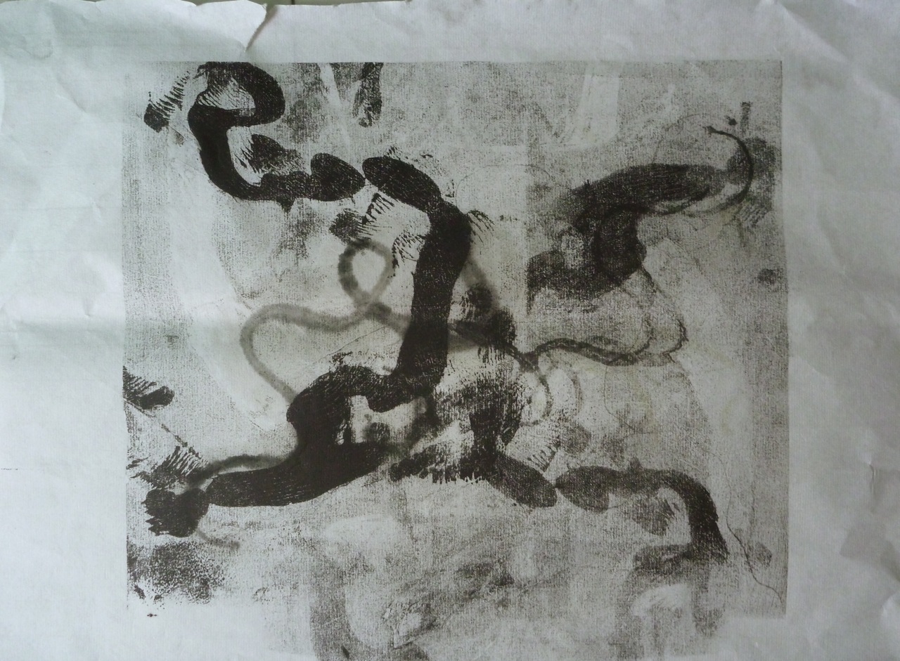
And this one, on a scroll of “rice” paper has the intaglio print in the middle, with thread and ghost prints. The trees image on the right is done in three layers, using a kind of “pochoir” technique where I inked and turned lozenge shapes of paper as the negative shapes which became the patches of light. The panel on the right is using the same technique as before- oil, turpentine and this time, thread inked in red.
Mid Cloisters Dim 2: Intaglio, monoprint on rice paper scroll 40 X 80 cm
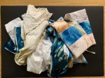
I have to say I like these. I like the composition of longer panel especially, and the mixed techniques- intaglio for the text, masked monoprint and painting texture to create depth in the trees image, contrasting with the flat textural abstract image on the left. The thread operates as a link on both a visual and a metaphorical level, and worked as a “cleaner” version of the scribble above. In both of these the white paper plays a big part, and the torn edge of the image on the right is important as a variant, which also links back to paper as a subject. I tend to enjoy this convoluted cross-referencing.
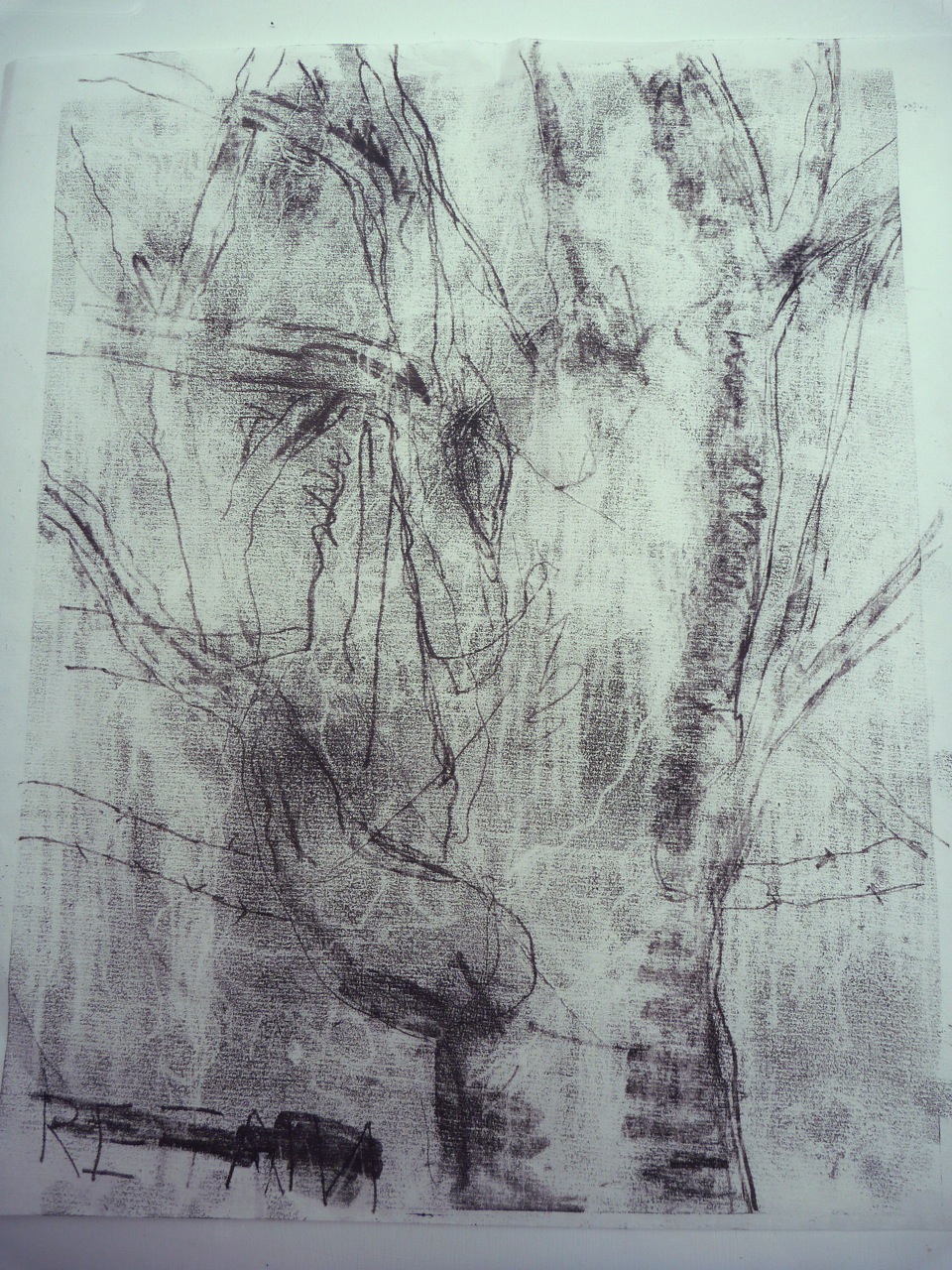
So, a couple of practice sessions. That felt a bit better. Meanwhile there was the fact of my village “landscape”, dirty, dug up, with nearly all the trees cut down. Those that were to be saved- a handful, with a laminated label reading “retain” on them.
These are the photos that inspired this series of prints. A rubber plant grown into a giant tree that is to be “retained”, iron mesh eating into its bark. Kapok flowers, heavy and fleshy, fallen on the road, look like hands, like the workman’s glove. These flowers decompose into a thick brown mush, like a dead animal. A trunk like a claw, clinging on, but it has no “retain”sign. Marks of dog’s paws in the scraped concrete, the marks in the cement the human traces. Rough, careless, like the dropped glove. Well, the whole series is a kind of horror story if you care about nature.
Cyanotype and etching on fabric, found objects
Scratching around
Collograph
I thought I’d revisit some old techniques, in fact revisited an old collagraph which was still lying around. This was my first collagraph plate, made on corrugated cardboard, as can be seen, and featuring plants and leaves picked up around the roadside in France. It was still in good nick, so I thought I’d add to it, a layer of colour, wet paint rolled on. This changed it from an encyclopedic entry type array of plant life, to a squashed flat, rolled over by trucks view of flattened nature, much more fitting to my landscape here.
Painted collograph 30 X 40 cm
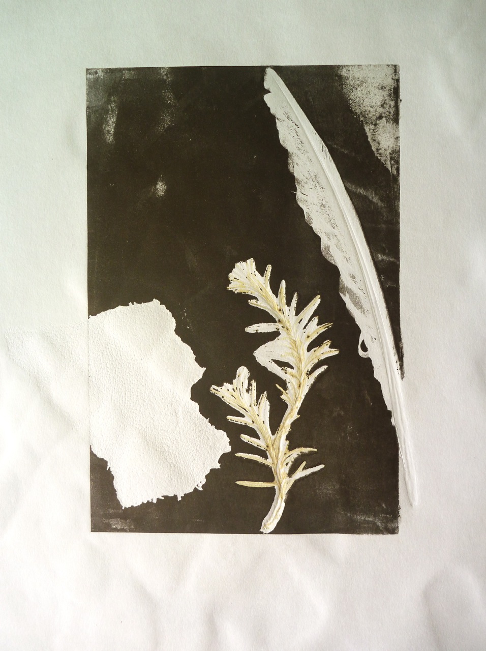
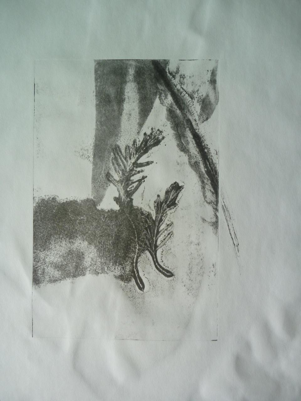
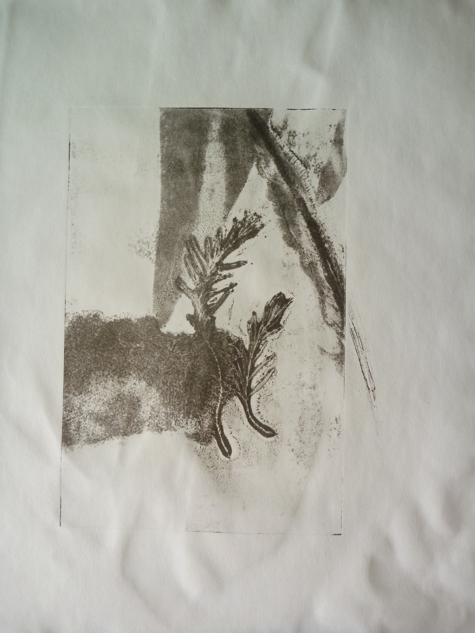
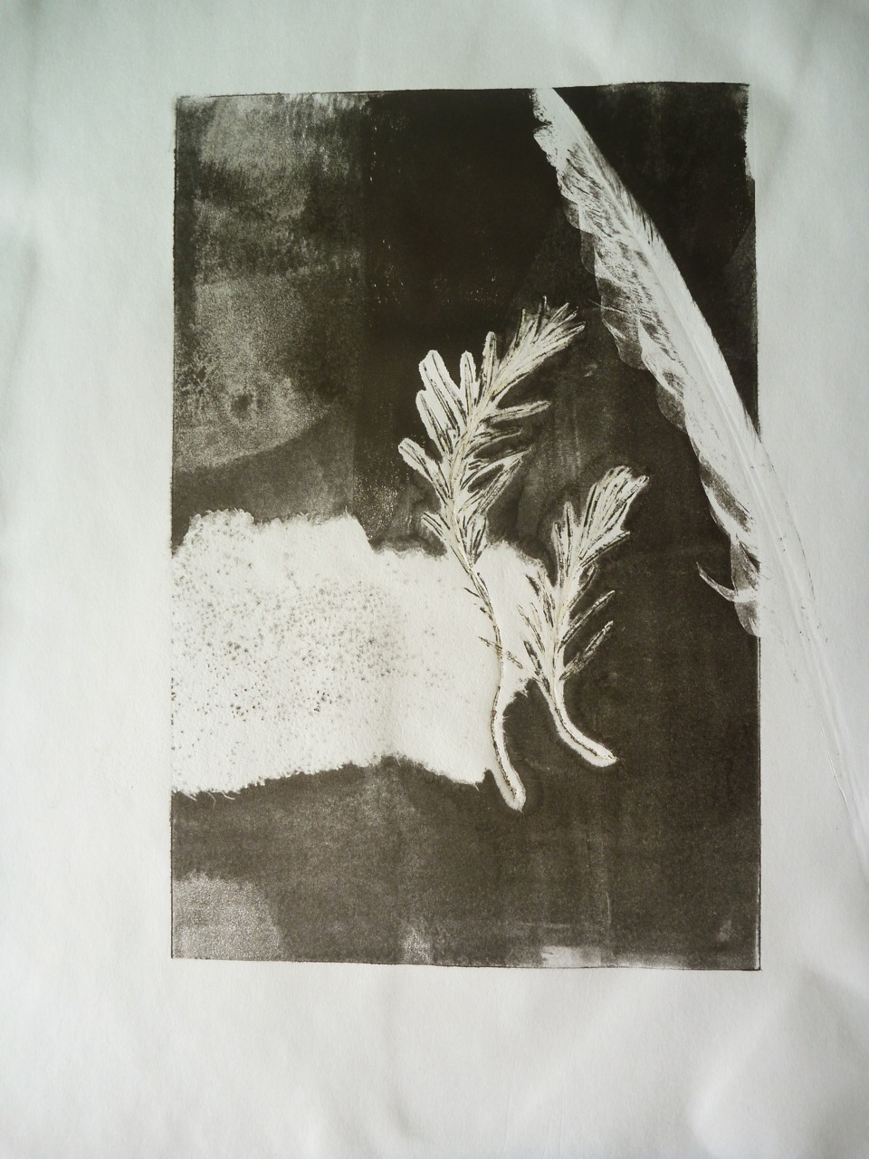
I had a quick go with the school press one day, and ran some real objects through on an inked plate: a piece of bandage, a feather, and a couple of sprigs of rosemary. Nice ghostly images from where the real objects block the ink, and then the ghost prints of the impressed sheet of perspex. I like the embossing it creates. Need to use better quality paper, and experiment with pressure of the press. What technique is this?? Just monoprint I guess.
Materials: Sakura water-based inks, perspex sheet (A5), cartridge paper
Masked Monoprint Image size A5
Ghost print Image size A5
Ghost print Image size A5
Masked Monoprint Image size A5
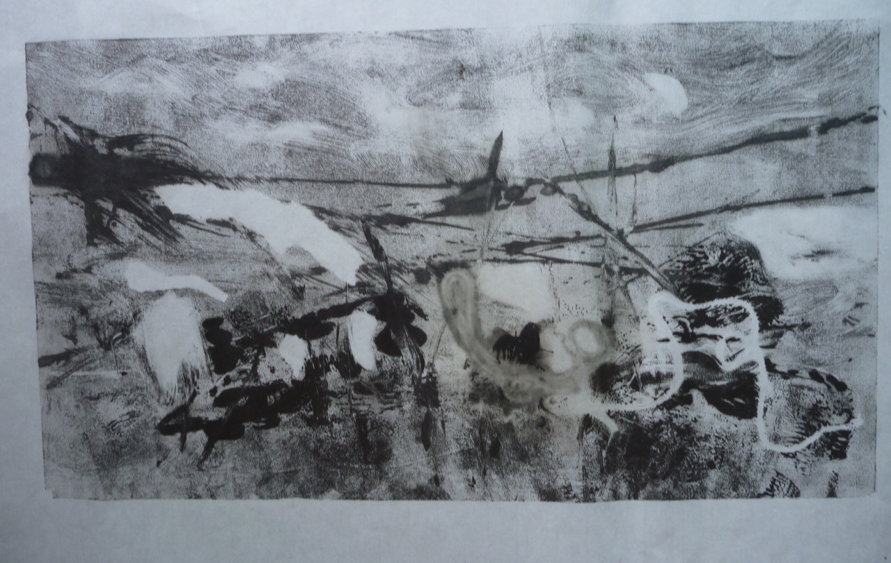
Ghost Trees
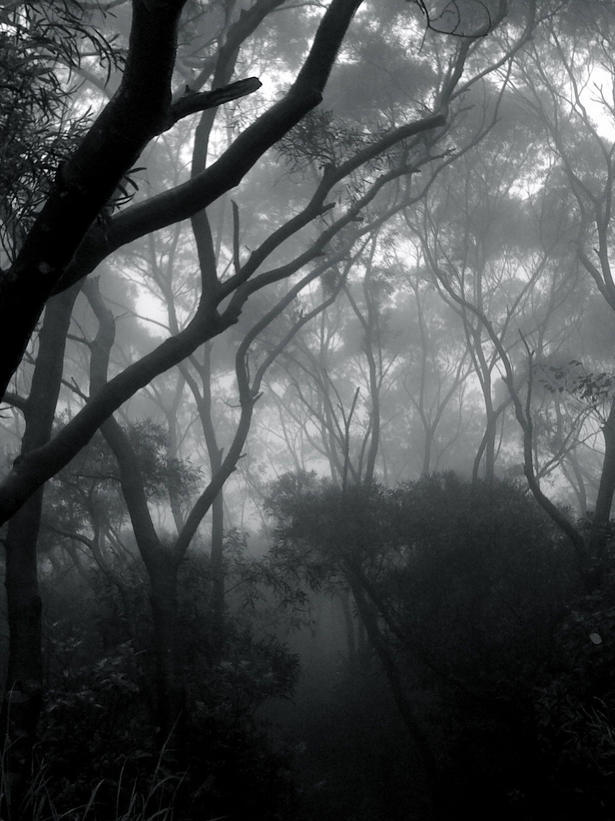
This is another picture that inspired me in this project- it was taken here, and is photoshopped to heighten the ghostly effect. Well, they are all ghosts now.
Ghost trees Digital photo
A Romantic View of Nature
Another influence on me tends to be poetry. I couldn’t consider nature without referencing the Romantic poets, specially Coleridge, my personal favourite. Once more, I am referencing “Frost at Midnight” and in particular the passage where he talks about the beneficence of nature and how he missed it when he was growing up, as he lived in the city “mid cloisters dim”.
For I was reared
In the great city, pent ‘mid cloisters dim,
And saw nought lovely but the sky and stars.
But thou, my babe! shalt wander like a breeze
By lakes and sandy shores, beneath the crags
Of ancient mountain, and beneath the clouds,
Which image in their bulk both lakes and shores
And mountain crags: so shalt thou see and hear
The lovely shapes and sounds intelligible
Of that eternal language, which thy God
Utters, who from eternity doth teach
Himself in all, and all things in himself.
Great universal Teacher! he shall mould
Thy spirit, and by giving make it ask.
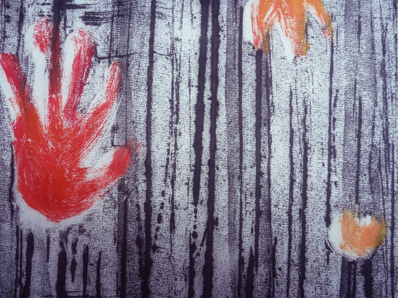
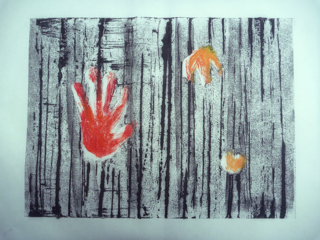
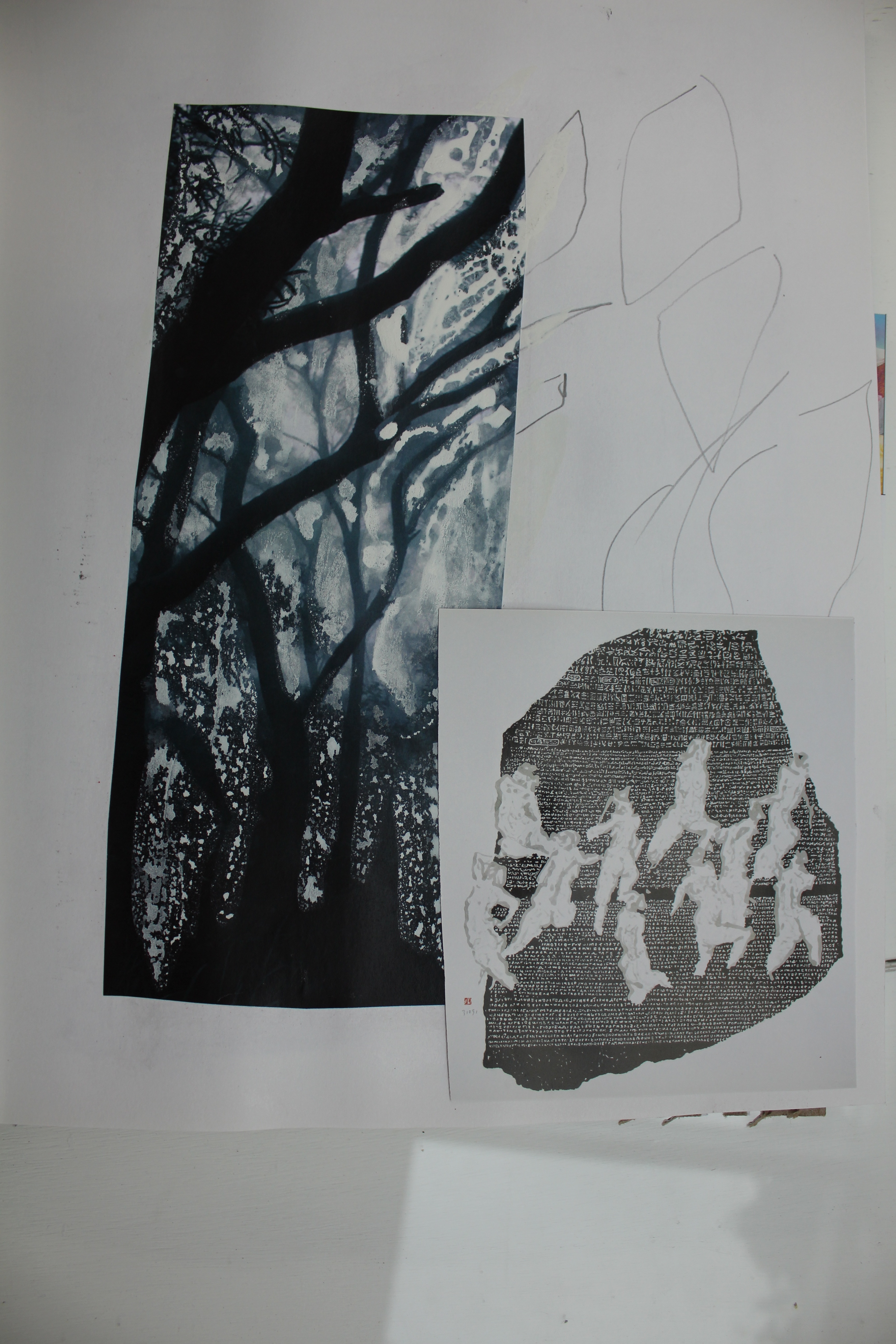
Trees: collograph
Evoking the romantic ghostly image of trees, this print also required the use of a press. Made from cut strips of a carrier bag with a ribbed texture, plus string, this was meant to evoke a forest of silver birch trees. Blotches were caused by me rushing and inking too heavily to get into the ridges.
I decided to go with monoprinting for this project, and to do it at home, without the press, so I could use oil inks and not worry about drying time or having to rush to let the janitors leave after work.
I started by monoprinting trees, focussing on lines and texture, and liking the smudged effects of ghost prints:
Retain Backdrawing on monoprint 30 X 40 cm
Trunk in barbed wire Monoprint and backdrawing on ghost print 30 X 40 cm
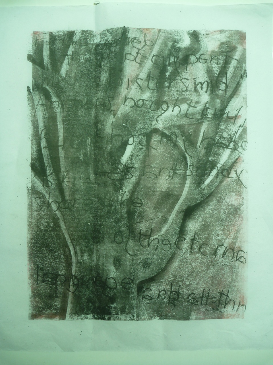
This was an attempt to use text, part of the poem, written backwards: less successful:
the eternal language Masked monoprint and backwriting 30 X 40 cm
This was better, with a cement-like texture:
Aerial roots Masked monoprint and backdrawing 30 X 40 cm
So, what I wanted to do was use the earlier techniques (1.1) of brushing and oil dipped string to create a bark-like texture, which would also echo the cement ridges left by construction. I was also keen on representing the fallen kapok flowers, which I did with inked thread and shapes painted into masked areas:
Kapok on road Detail
Kapok on road detail
Kapok on Road Masked monoprint 30 X 40 cm
Kapok on Road ghost print 30 X 40 cm
All images are 30 X 40 cm.
The thread and the oil made some good effects, although when using tissue, it did leave a very shiny residue.
I was starting to bring together ideas of flowers/ hands/ traces/ prints/ print… conceptual links:
Sketchbook:
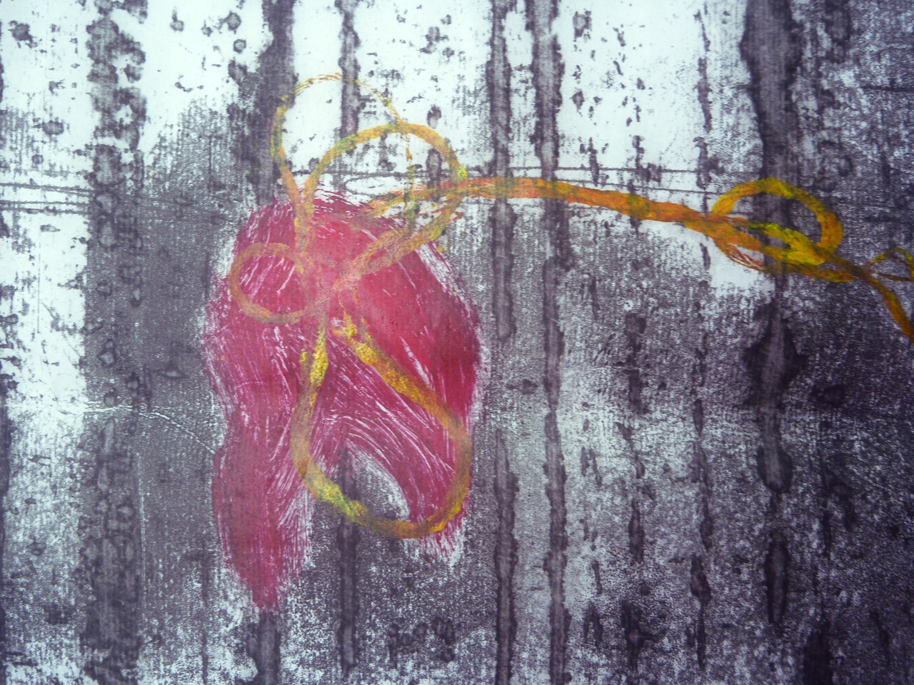
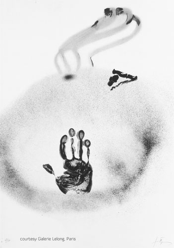
I decided to morph the flower into a hand, and to use an actual hand print to create a mask. I was thinking of Tapies’ prints, and of the exhibition I saw a while ago: Rupestres
I did this several times, starting with ambiguous hand/ flower/ paw/ claw shapes:
Masked monoprint detail 30 X 40 cm
Masked Monoprint 30 X 40 cm
Masked monoprint 30 X 40 cm
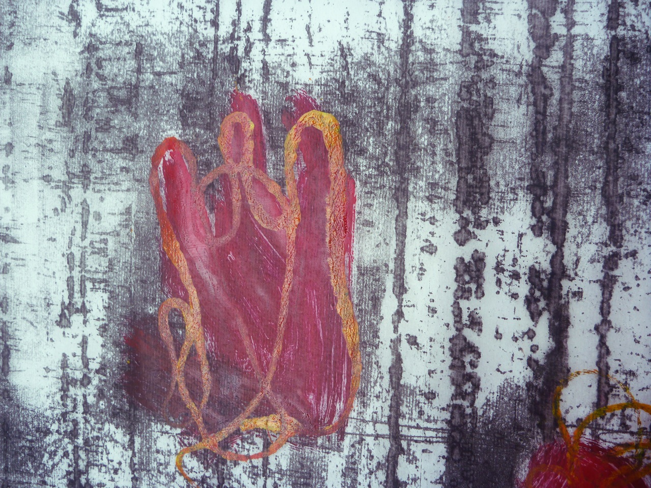
These morphed into realistic hands and flowers, so there were two panels, suggesting both an imprint in cement and growth on a tree. I started using turpentine dropped onto the plate to life the ink off and create vein-like patterns, as well as backdrawn and scratched-off lines. The masked parts were then printed into by using a ghost print as a template under the perspex printing plate. The Ingres pattern on the paper was effective too.
Masked monoprint
Detail of hand and flower monoprint
Hand and Flower Rice paper, oil and turpentine, backdrawing, masking, painting 30 X 40 cm
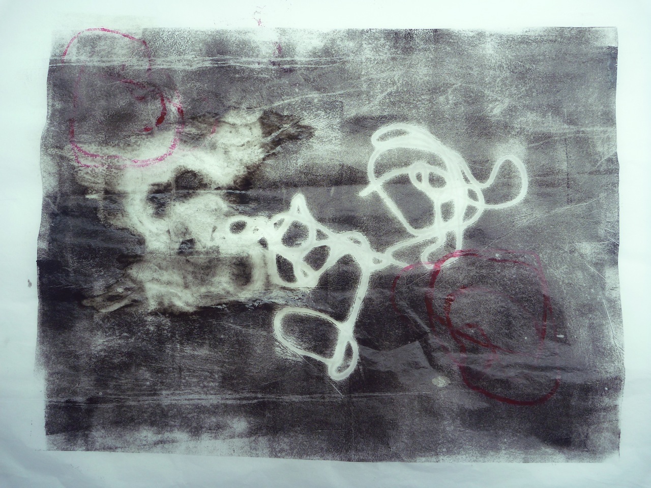
From this I started to have the idea of adding text. I carved the quotation “mid cloisters dim” in lino. (I liked the palindromic look of this, as well as thinking it fit the context of nature spoiled by human hand). The semi-transparent paper was a help in registering the hand and finger-prints: they were printed onto the plate then lifted off, using a ghost print in reverse as the template.
Imprint Masked monoprint and linocut 30 X 40 cm
Imprint: detail
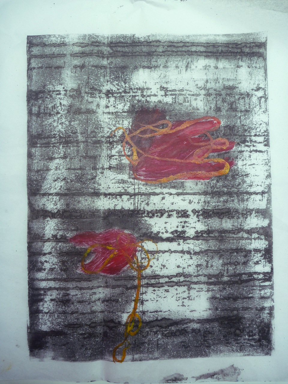
Hand and Flower: detail
Hand and Flower Monoprint, lino print, with backdrawing 30 x 40 cm
Hand and Flower: detail
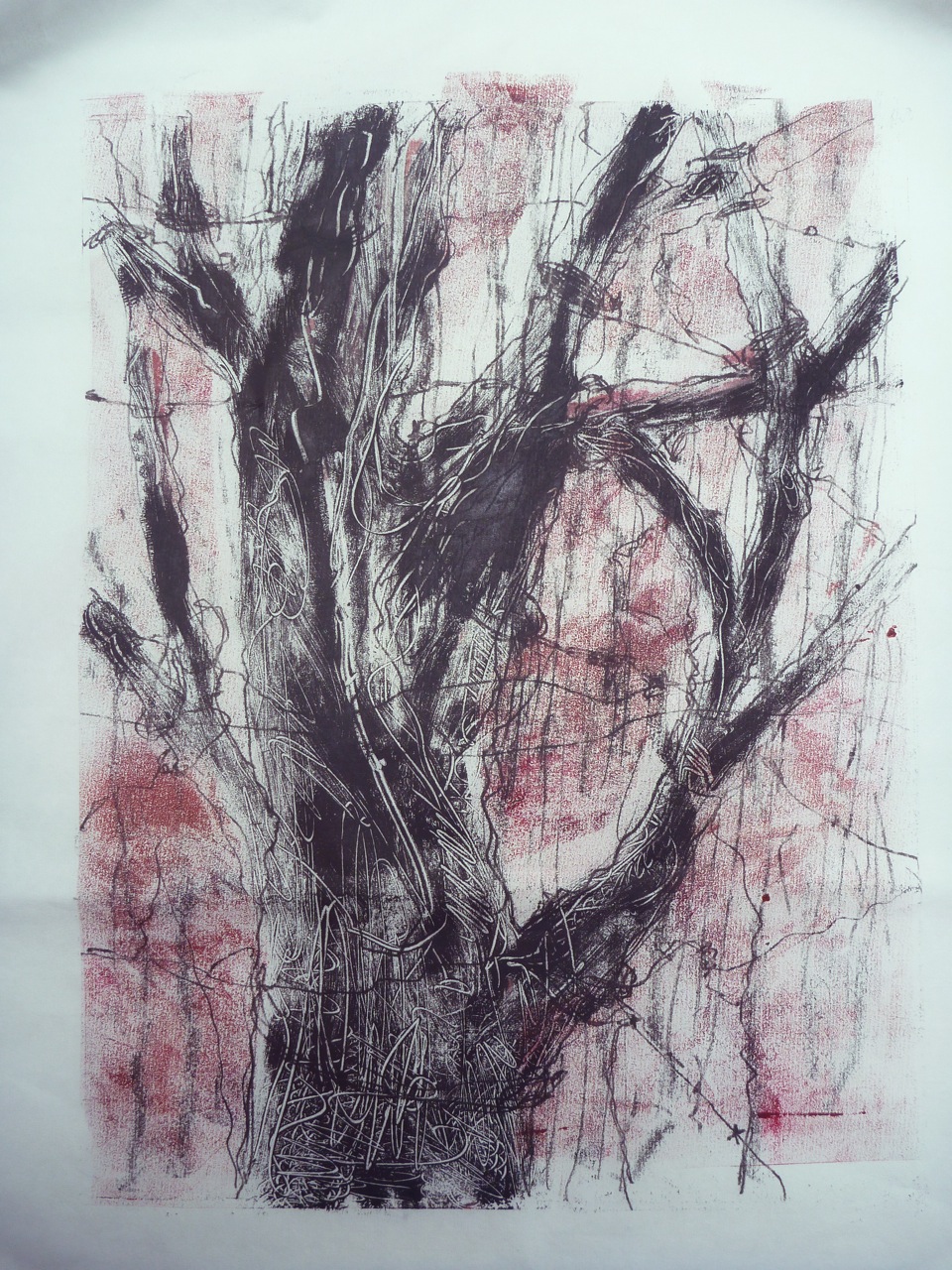
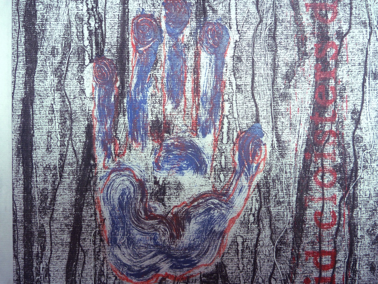
This as all getting a bit dark though, with the hand shape losing distinction, even with the backdrawing in a contrasting colour, and so I thought of creating panels. I tried to create the effect of the hand pressing against the surface, as if trying to get out, or trying to stop something. The mesh is a good contrast to the more organic shapes on the right, and i could have created more drama by distorting the mesh to suggest pressure. I was quite pleased with this, apart from the accidentally large blob caused by dripping too much turps. I particularly like the ghost print of the lifted threads.
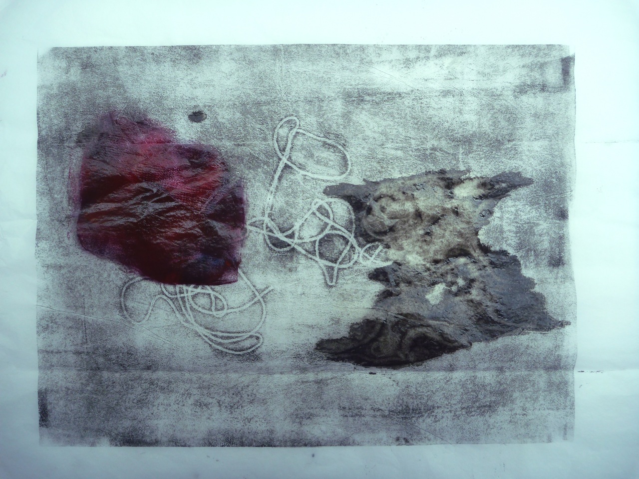
Mesh and tree: Oil, turpentine and thread, masking and backdrawing 30 X 40 cm
Mesh and Tree: Ghost print
The panel idea was interesting though- getting back to the idea of a “series” of prints, as inspired by Xu Bing’s Series of Repetitions. I liked the idea of three panels, each with a contrasting texture and style- from straight line text layout, to fluid, to linear/ organic. I made an intaglio print with the text of the extract from Frost at Midnight, as above.
Ideas in the sketchbook: to be continued in the next post…
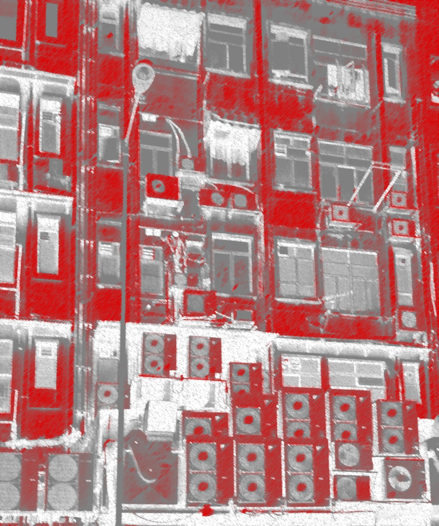
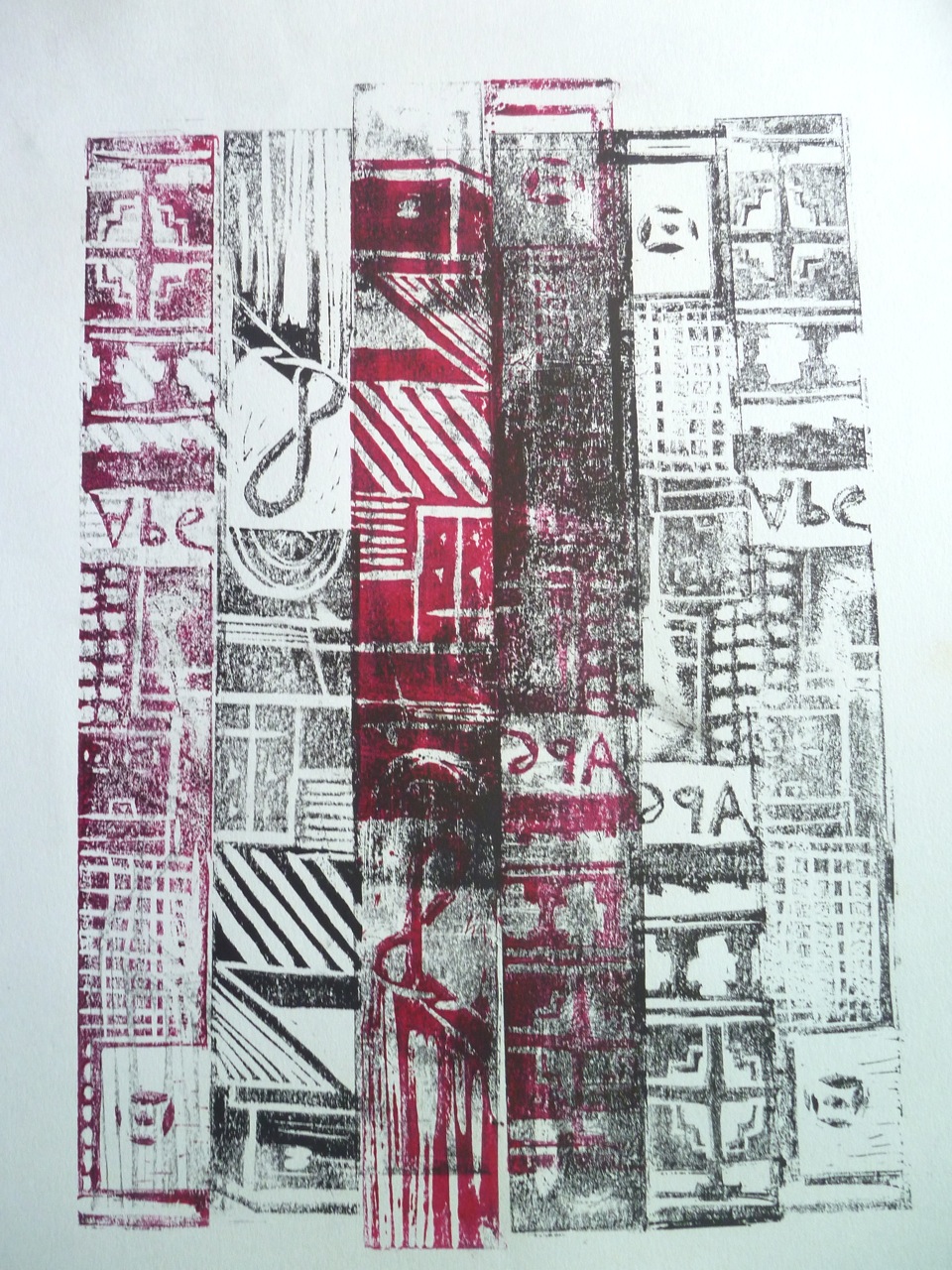
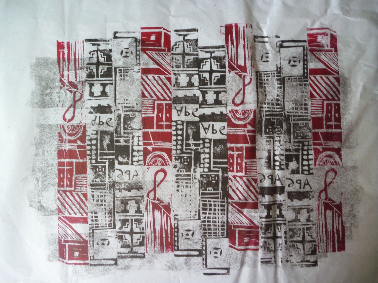
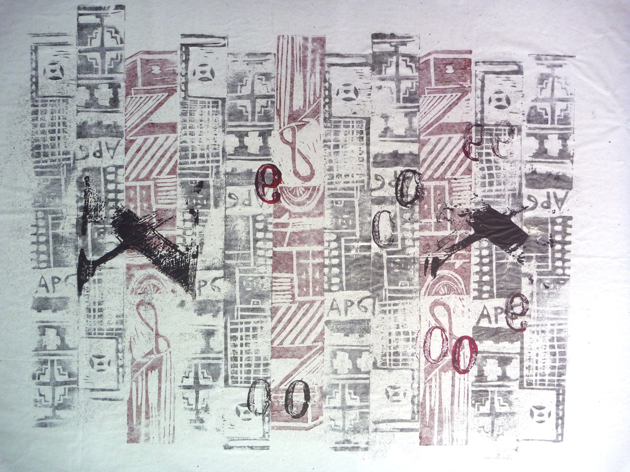
Well, not the stereotypical Hong Kong skyline or the neon-lit streets, but this photo was snapped in the busy town of Sai Kung. It seemed to say a lot about the HK infrastructure.
The photoshopped version on the right could be a nice screenprint.
In fact I decided to use relief printing here as well as monoprinting, quite simply lino cut into strips with carvings on them to create a higgledy piggledy grid. The other technique used here is printing on the back of the semi-transparent paper to get a lighter print. I kept to the colour scheme of the photo, using red and black ink, but because of using both sides of the paper, get grey and light red too.
Again, I’ll just document the various prints:
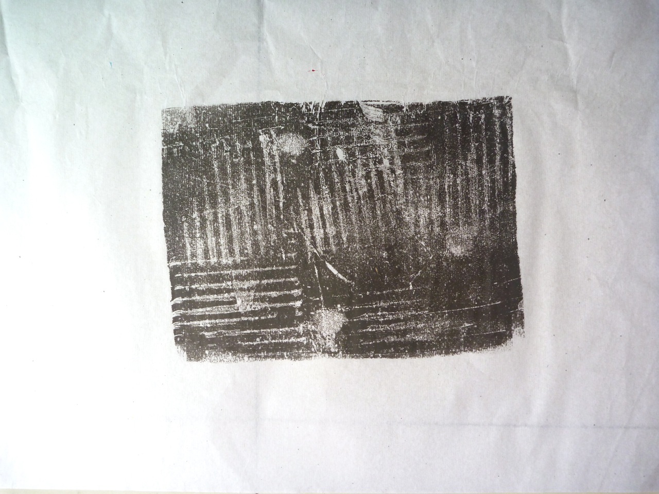
I started with simple markmaking, using corrugated cardboard, which looks pretty representational of grey corrugated iron too:
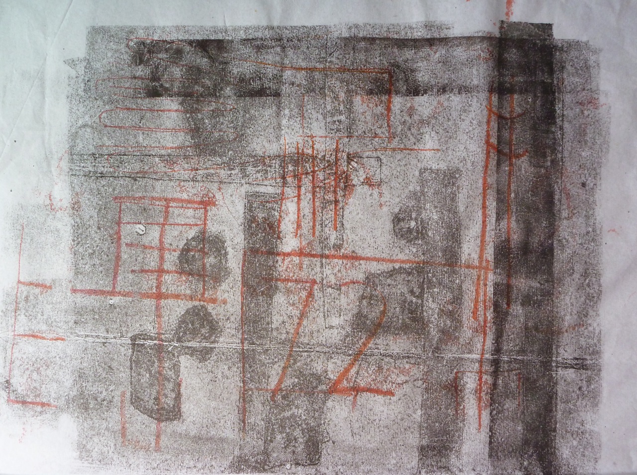
Then started playing around with the horizontals and verticals of doors and windows, building numbers, bars, printing on both sides of the semi-transparent paper, and backdrawing in a contrasting colour.
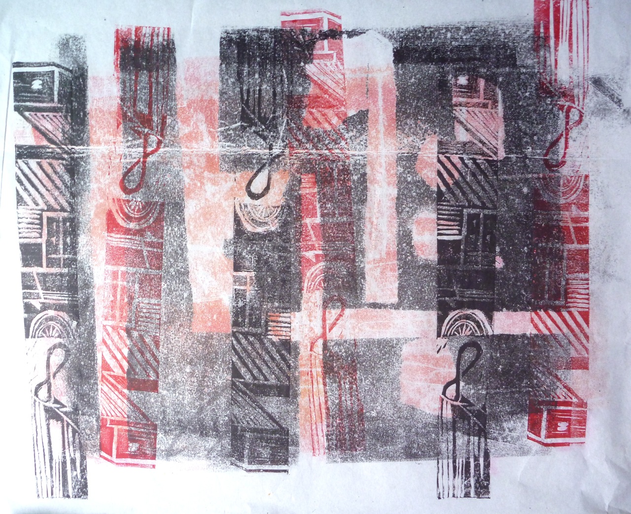
I then decided to cut strips of lino, making assorted marks on them (aircons, letter boxes, pipes, windows, door frames, door numbers) which could be arranged in different colours and densities, to suggest the erratic grids of the buildings. Some were cut with lino-cutting tools, some carved with scissors, scrubbed with sandpaper.
I then made a collograph with corrugated card, plastic ties and mesh, and cut number shapes, keyholes, and stamped with cut-out wooden letters and numbers:
Doors: Collograph A2 paper
Collograph with ghost print and stamping
More experiments with panels:
The one I liked best was the grid patterns printed on the back of the paper, then over stamped with numbers on the front:
This kind of image is easy, as it involves stamping only, little in the way of registration. Like the places it is inspired by.
Overall though, these exercises are perhaps too much a matter of transposing images, patterns and motifs a bit too literally, so I think I’d like to get back to more abstract ideas and more organic shapes and patterns.
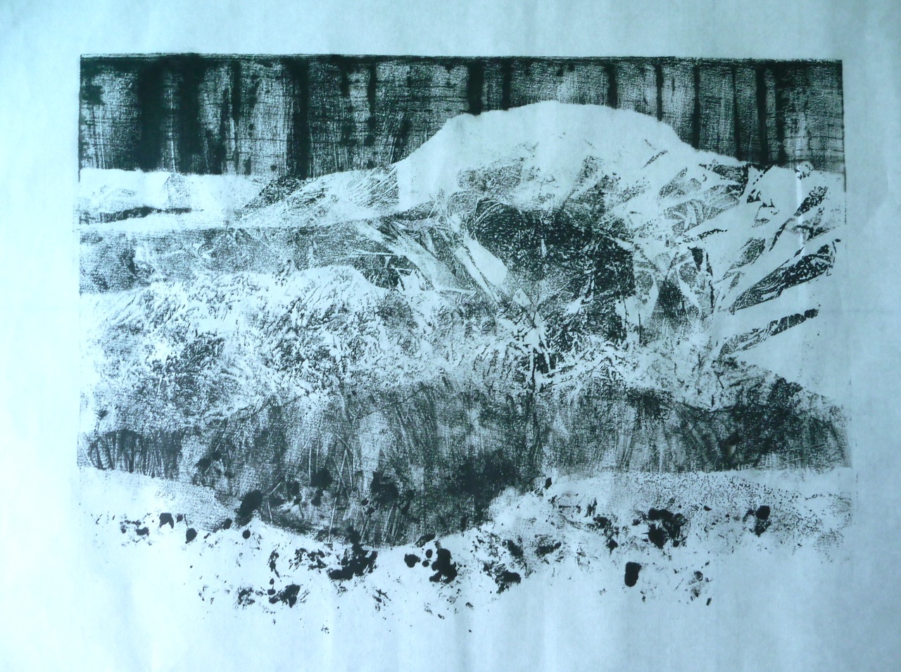
Snowy landscape Image 30 X 40 cm Ink and oil masked monoprint
It has been a struggle to get going. To be honest, I felt the assessment results from my last module were disappointing and the assessment comments rather different to the tutor comments I had received. It made me doubt everything, and I lost the confidence I had been feeling. I still feel I have no way of judging quality.
But anyway, here goes.
The first topic: landscape.
I approached it by sketching, but wasn’t inspired. I thought, and planned and made notes. I eventually and worked though some imagined landscapes. I eventually played with textures, took photos, and just printed stuff. The final piece, to the extent it is one, evolved by just printing stuff. Otherwise I over-think and do nothing but produce words.
This set of experiments was mainly inspired by photos taken around the New Territories village where I live. Two things to observe here: first, it’s a complete mess, as there’s huge construction project going on, building a motorway extension, several flyovers and a tunnel. Second, all the trees, hundreds of them, beautiful flowering ones of many varieties, have been cut down. That’s the subject matter.
Another point is that I was inspired by the prints of Xu Bing, particularly his early set that show the serial loss of agricultural land: a reduction woodcut print becomes a series of images of loss.
I’ll now document the process of doing this first assignment.
Chine colle and perspex layers
This is something I made last year, and liked: it’s made of layers, rough rollered ink, on different pieces of paper, some coloured, some creased, some back written text on creased paper, and a layer of thin perspex with ink on both sides. It’s all about contrasting textures, abstract shapes, transparency.
I decided to start with monoprints.
Materials: Sakura (student quality) oil-based ink
Printing Plate: Perspex plates (40 x 30 cm, 25 x 50cm)
Paper: Chinese rice papers of different thickness and absorbency, tissue paper – large sheets, scrolls, from which I’m cutting sheets of around A2 size.
Just played about with tissue paper to try to get used to printing again, and stuck to black.
Back drawing village landscapes:
Experimenting with creasing, folding, rubbing, pulling off the inked plate:
Heavily inked plate, pulled
Less ink
creased paper
ghost print after pulling creased paper
Experimented with using oil/ water to smudge lines, and liked the atmosphere created by soft, dark lines.
Oil and creases, creating landscape
Mountains, oiled brush backdrawing
ghost print, picking up oil soaked ink: nice lines.
Finally, I combined techniques to produce semi-abstract landscapes with texture and line, wet and dry, string masks, brush marks, backdrawing with hard and soft instruments.
This one has a sky with brushed ink, lines made with wet ink (ink plus oil- vegetable oil at this point, probably not a good idea) and squeezed lines of inky straight on the plate, then leaving a pattern where it is lifted off. Torn paper masks. String as mask- clean string and oil-dipped.Some areas are wiped clean.Effect of gestural lines is movement- weather?
Landscape with barbed wire 25 x 50 cm
Landscape with dark sun 25 X 50 cm
Here the page was lifted a couple of times, and not put back carefully (Registration!) but there is a lightly textured background that was residue, i.e. the ghost print of the one above, and softish lines made by backdrawing using rubber, finger, brush handle, and pencil point.
From here I experimented with making multiple layers of different textures, using torn paper masks, to create an imagined (remembered) landscape.
This uses oil, brushing, scratching, wiping, masks, ghostprinting repetitions, and ink squeezed directly onto the plate, to create what I see as a woodland scene.
Masked Monoprint 30 X 40 cm
Then, finally, this one I like:
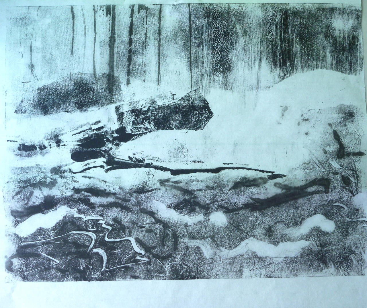
Snowy Landscape Masked Monoprint 30 X 40 cm
Using oil, and thread to drag it into a pattern for the sky, paper masks create the effect of receding hills. The textures are created by using clingfilm and other types of plastic to texture the ink on the plate prior to masking and printing. Backdrawing and scratching has been used for the darker layer, to suggest grasses, and finally ink pressed directly onto the plate for the close-up plants in the foreground.
Japanese papers
I don’t know where I can buy them here, but I want to note different Japanese papers for reference, based on matching the numbers from trial pack from Lawrence’s in Hove.
Botan: (2343) 53gsm bamboo and wood pulp, smooth and shiny on one side, Ingres marking on the other. “Inexpensive”
Bamboo: (2342) 175 gsm- no grain- soft. Smaller sheets and double price of Botan.
Masa (2344): 86 gsm “Student” paper. Shiny and smooth on one side, soft on the other. Very white.
Sunome Senaka (2470): 72 gsm. Ingres marking on one side, smooth on other, pale cream coloured
Sekishu (2410): 34 gsm. Soft on both sides. deckled edges.hand-made. expensive.
Gampi Silk tissue (2402): 12 gsm. Incredibly delicate. Very smooth.
Kanoko: (2366) Smooth on one side, soft on other, deckeld edges.
Hosho (2340): 77 gsm “Ideal for woodblock printing” soft strong. Not too dear.
Hosho shi white (2391) 56 gsm, dearer than the above
Kozo shi (2315) 23 gsm Deckled edges, visible fibres.
In fact, when I go to the art shop here, there are two types of Chinese papers to choose from: a thin one, very like tissue paper, white, and a thicker one, quite soft with a grain, cream-coloured. Both called rice paper. Not identified by weight.
Good reference for Japanese papers and their Chinese equivalents: Paul Griffith’s blog: