The course designer suggests approaching abstraction in two ways: geometric and gestural.
The thing about being “gestural ” with printmaking is that the marks you make are indirect, so there’s not the same immediacy as there is, say, with a Jackson Pollock splatter painting, where the movements and the momentum, and the gravity are directly influencing the marks made. When it’s a transferred image, you can splatter, drop, splash, but the mark you get will reflect the fact that the paper has been pressed on to the paint. That’s to say, that in printmaking, materials and processes determine the marks you get, as much as the way you design your plate.
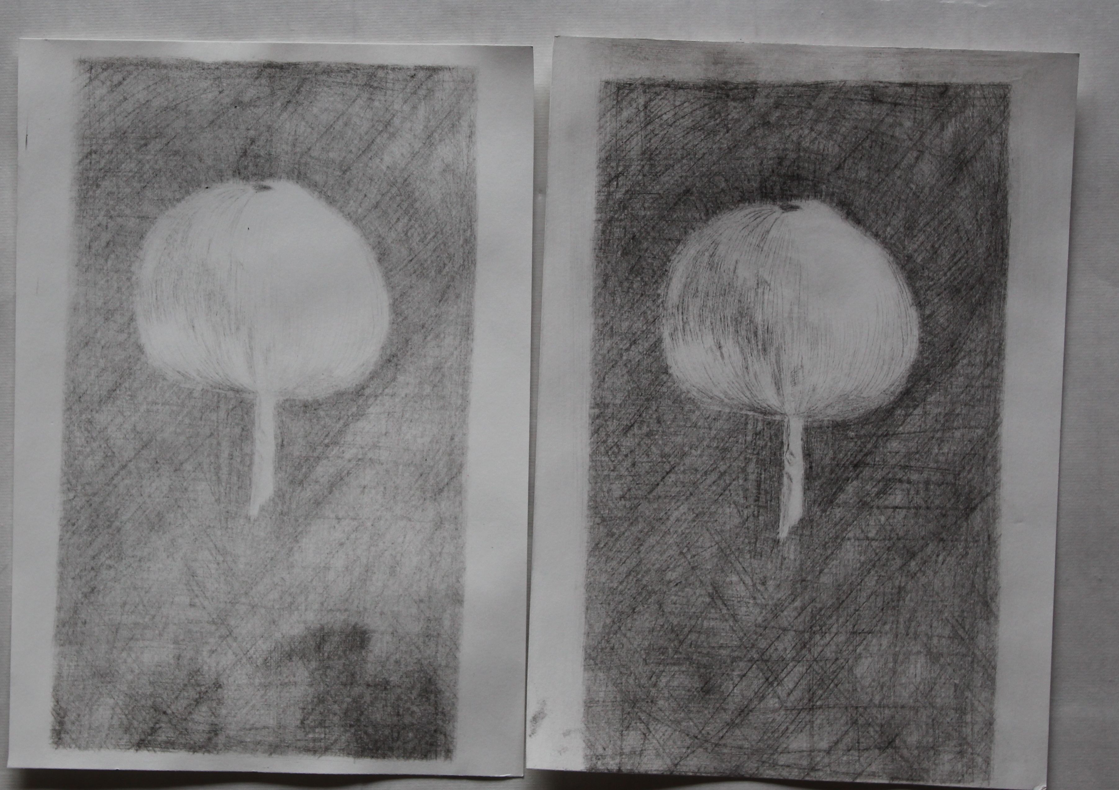
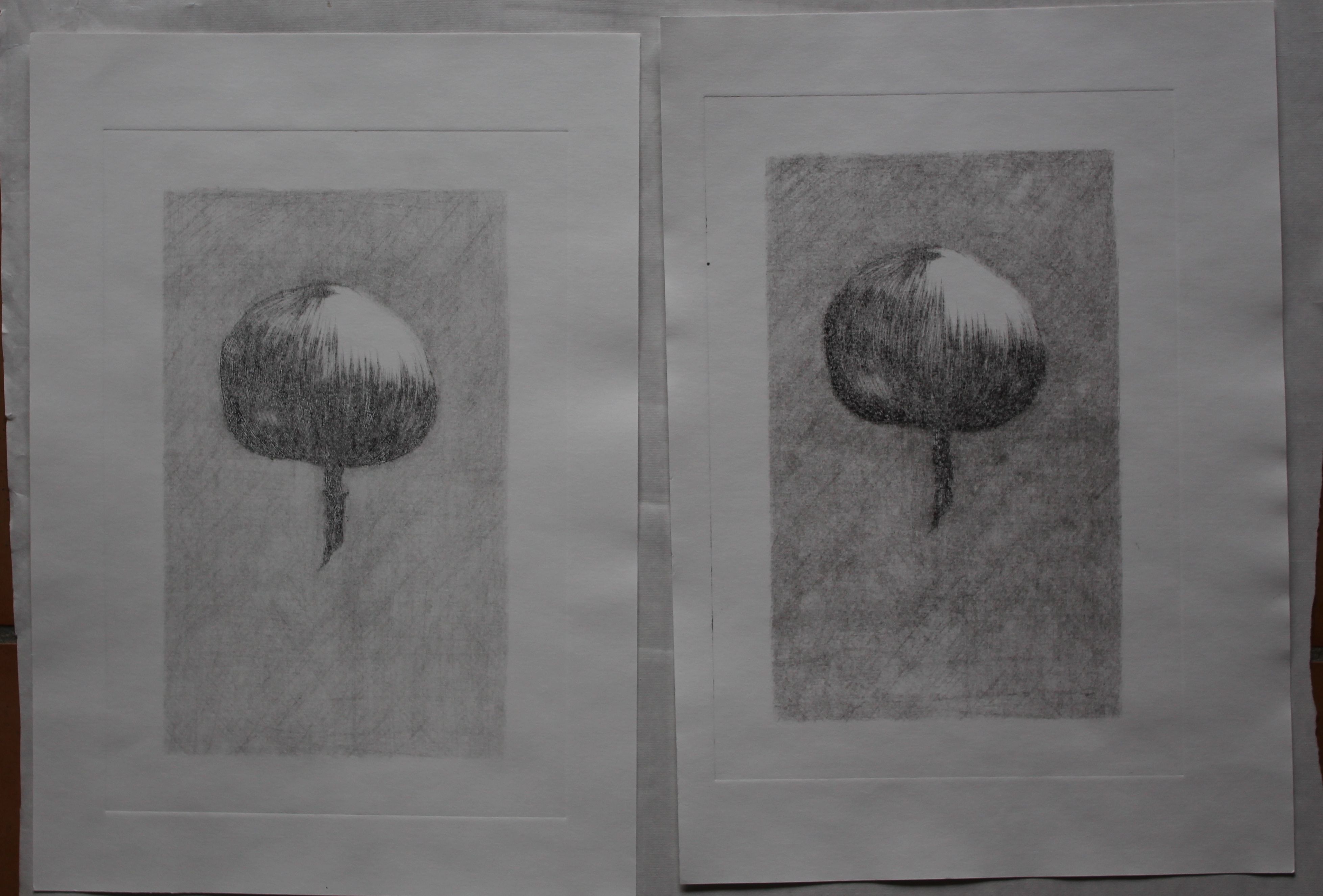
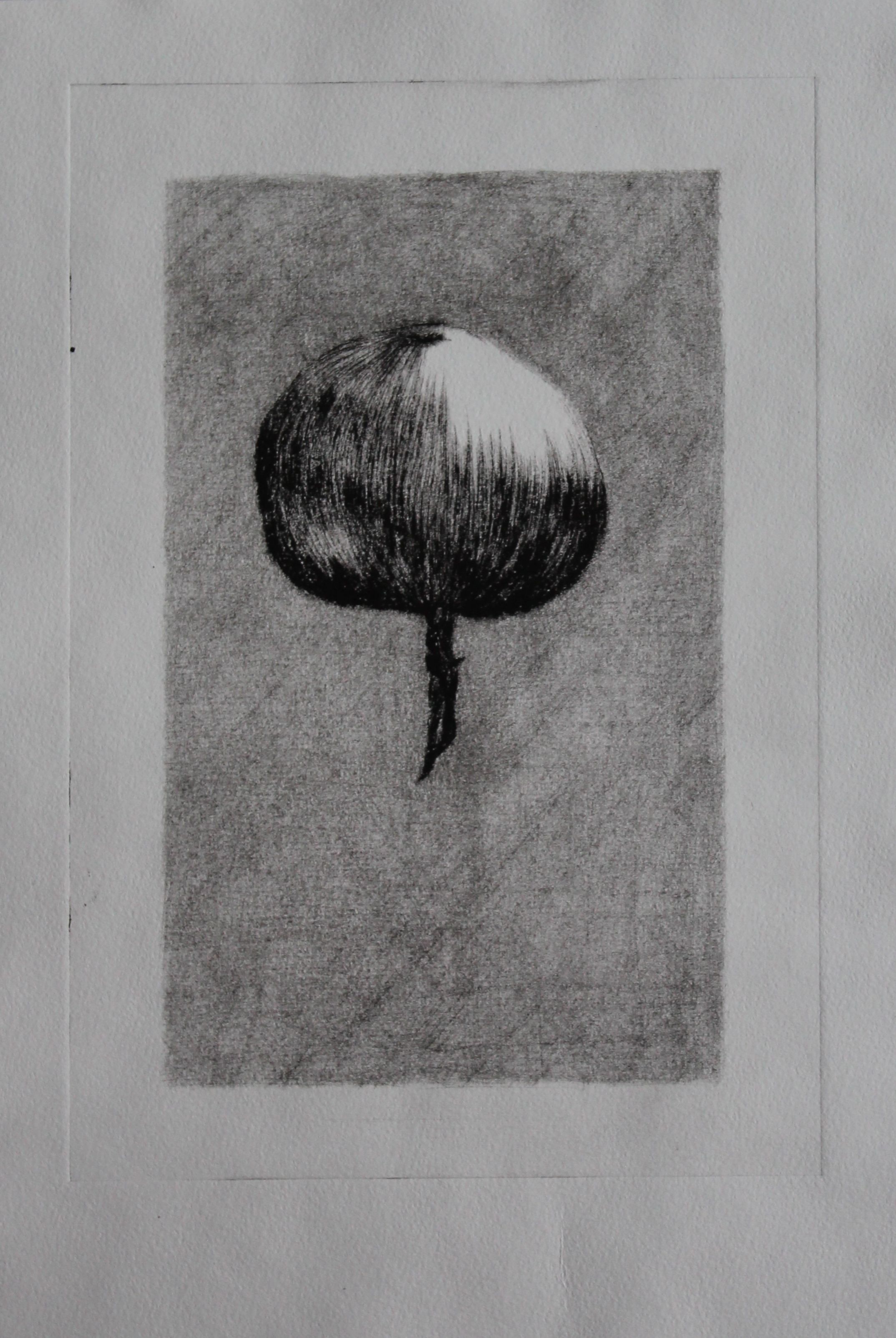
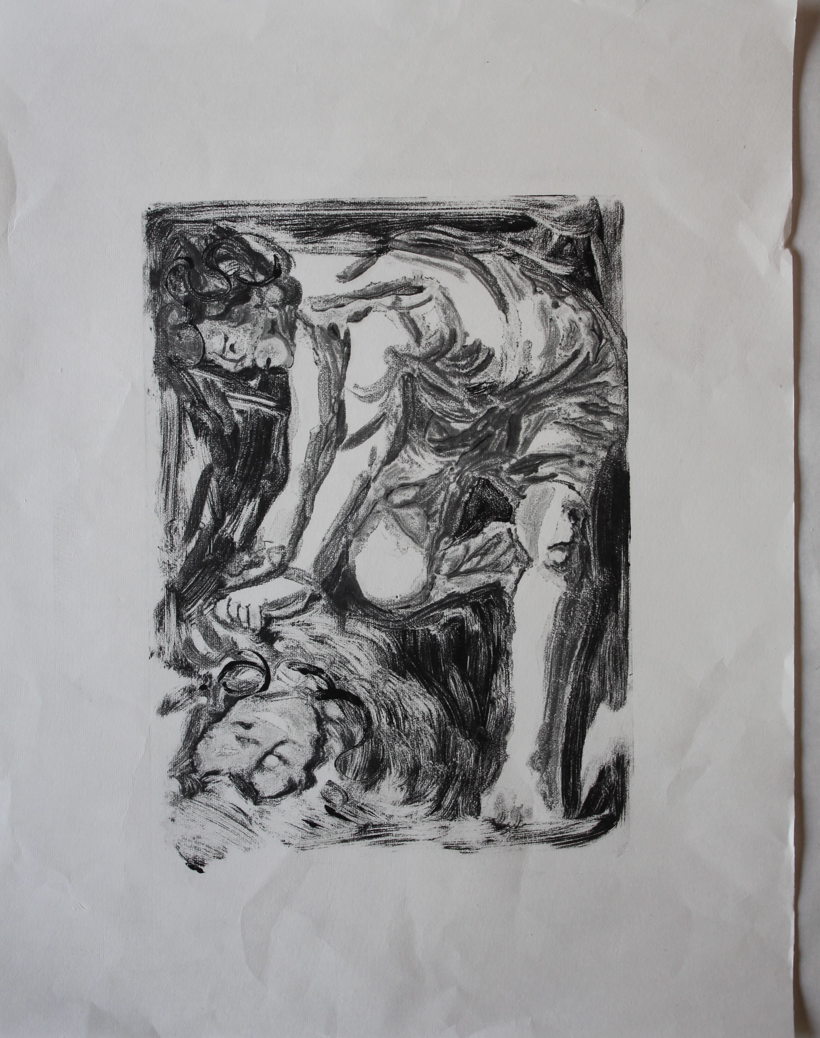
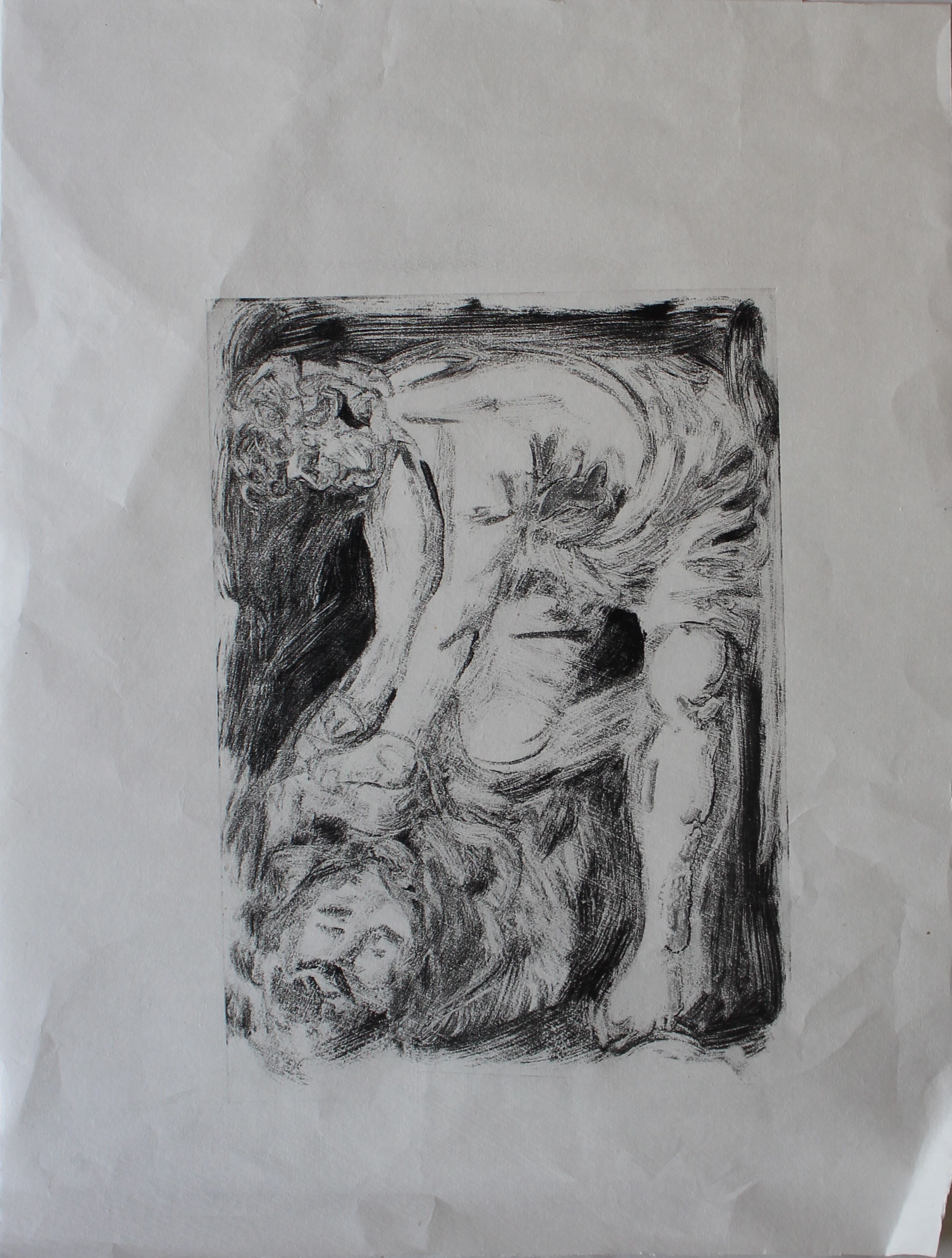
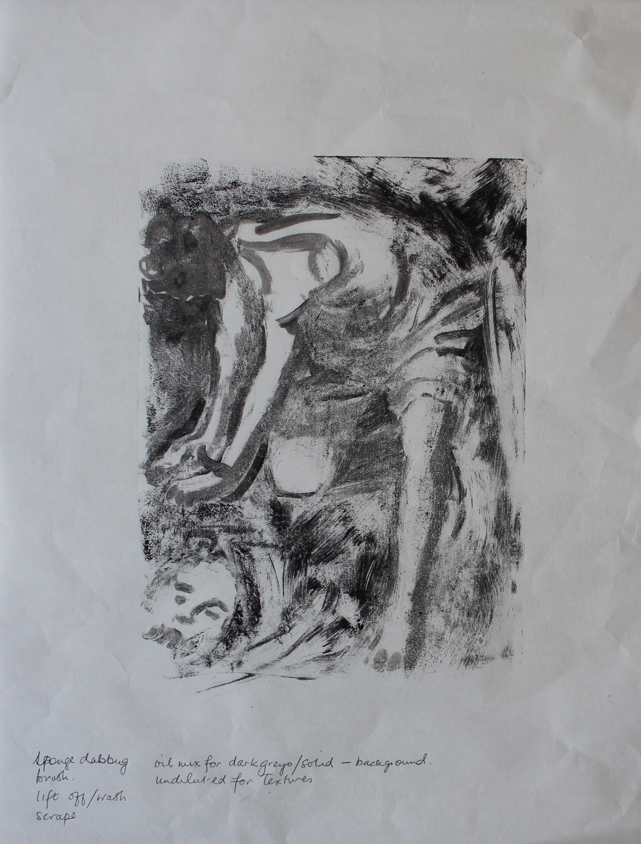
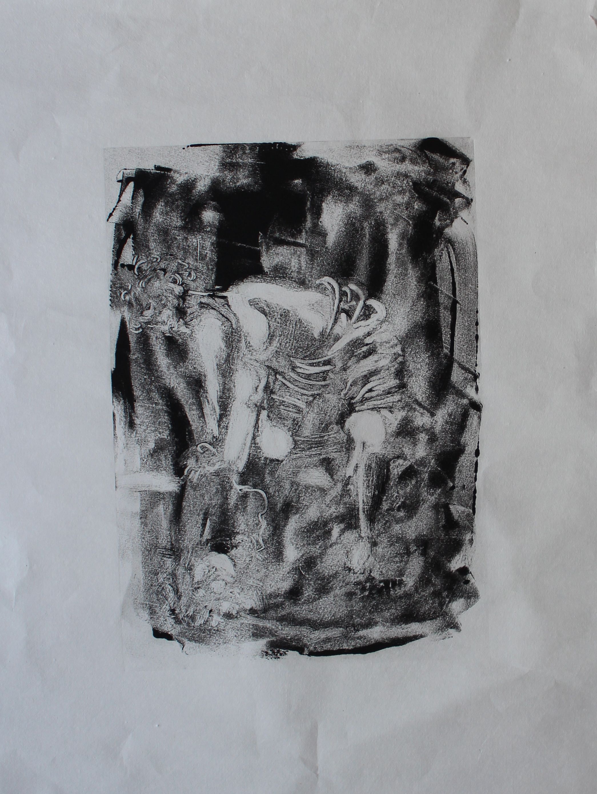
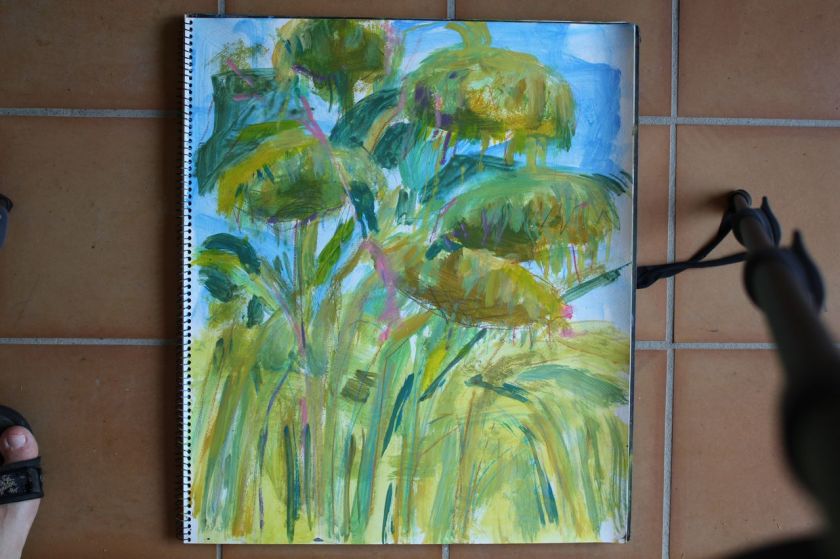
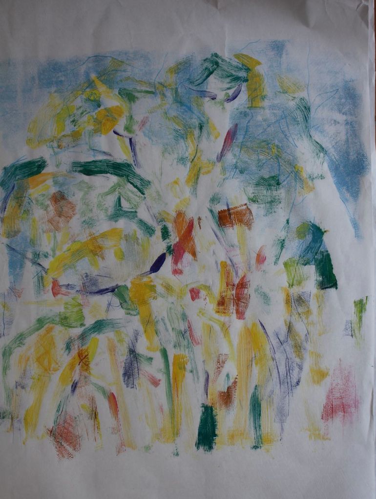
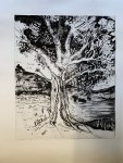
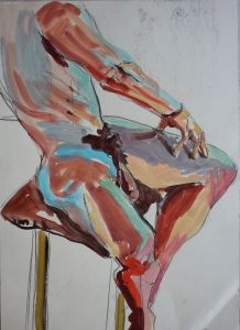
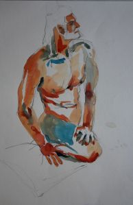
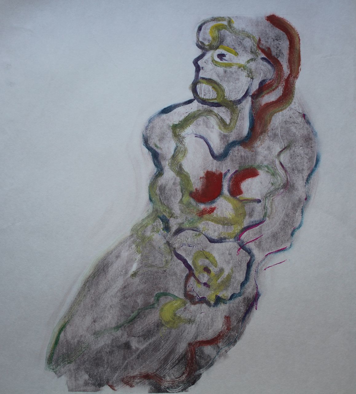
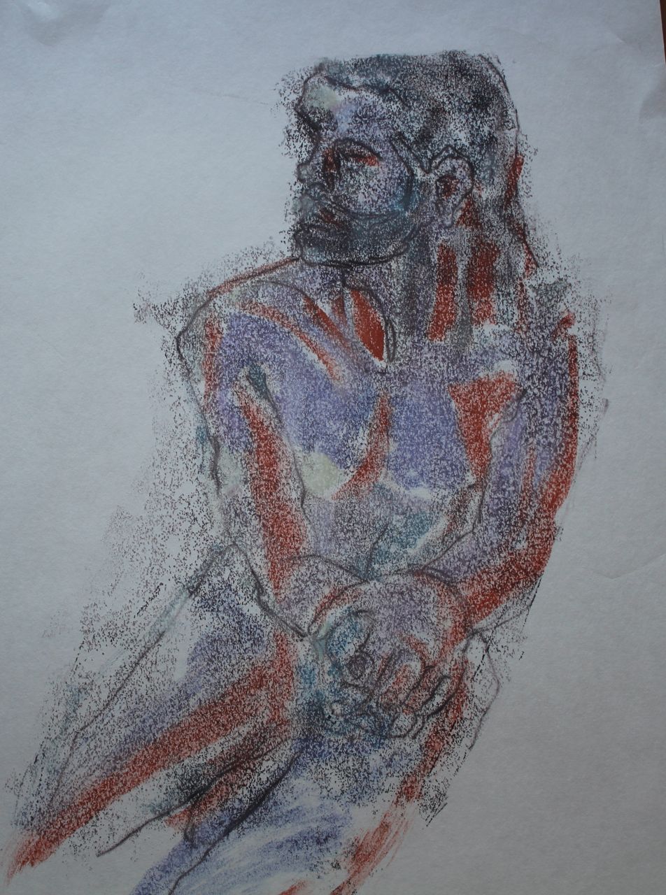
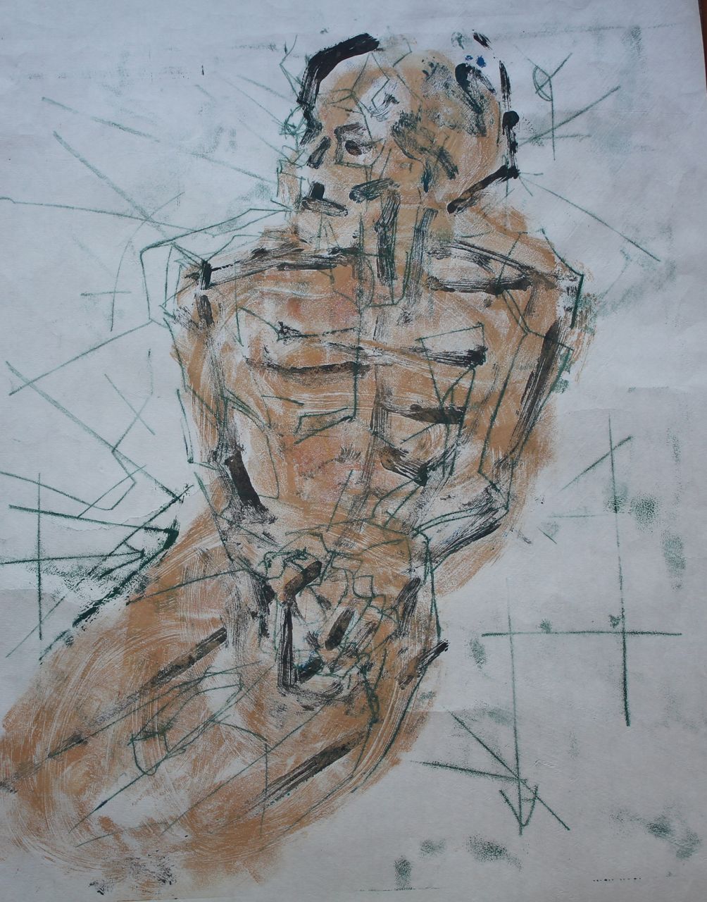
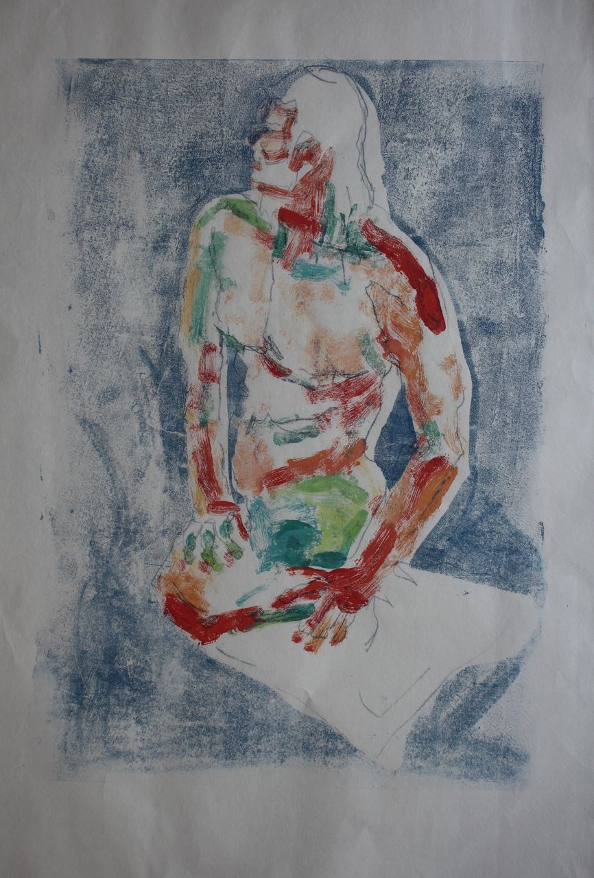
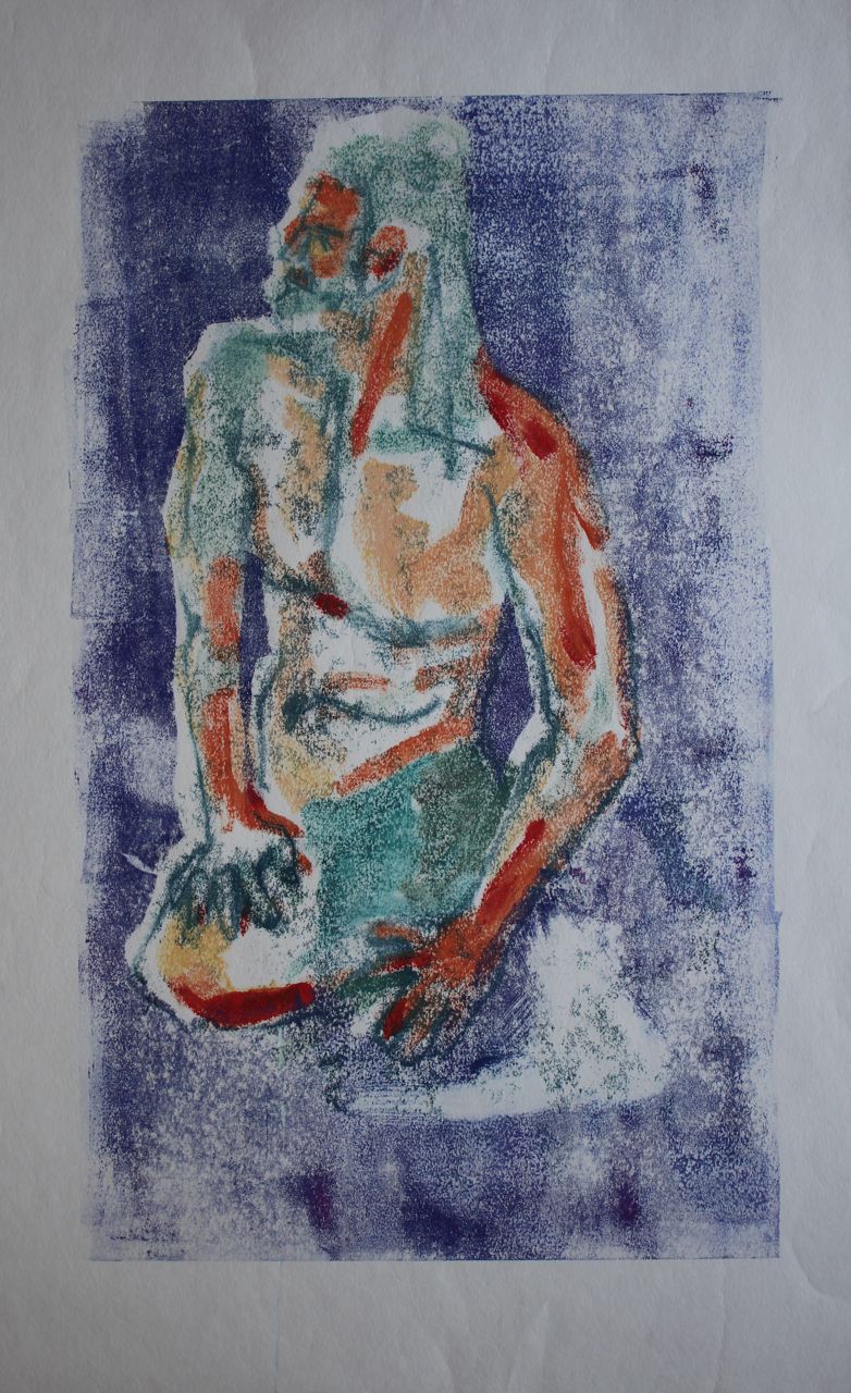
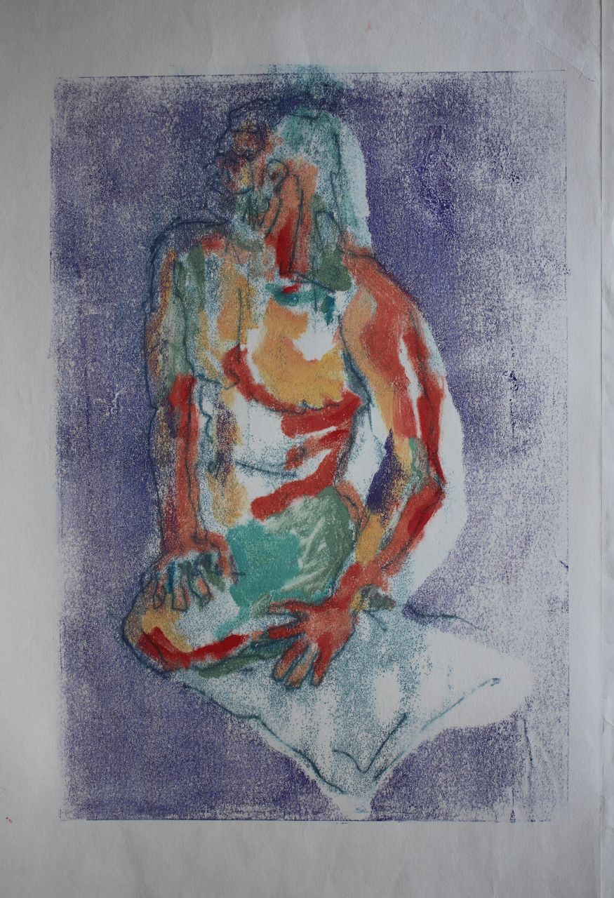
I wasn’t keen on just splattering because it’s likely I’d just get squished blobs. So I painted quickly, using a painting I’d done as inspiration. This kind of image is determined by materials and, if the ink is water-based, as mine was, by speed. I’m not sure this monoprint interpretation adds much. The range of marks is limited, even using brush marks and backdrawing, but it has to be done very quickly.
Monoprinting
Basically, with mono printing, if you want control of the finished product, you have to use materials, namely the inks, with a degree of viscosity that means they are going to remain the same when transferred. There are many examples of these “painterly” mono prints in the well known book by Jackie Newell. You have to be very convinced of the point of this.
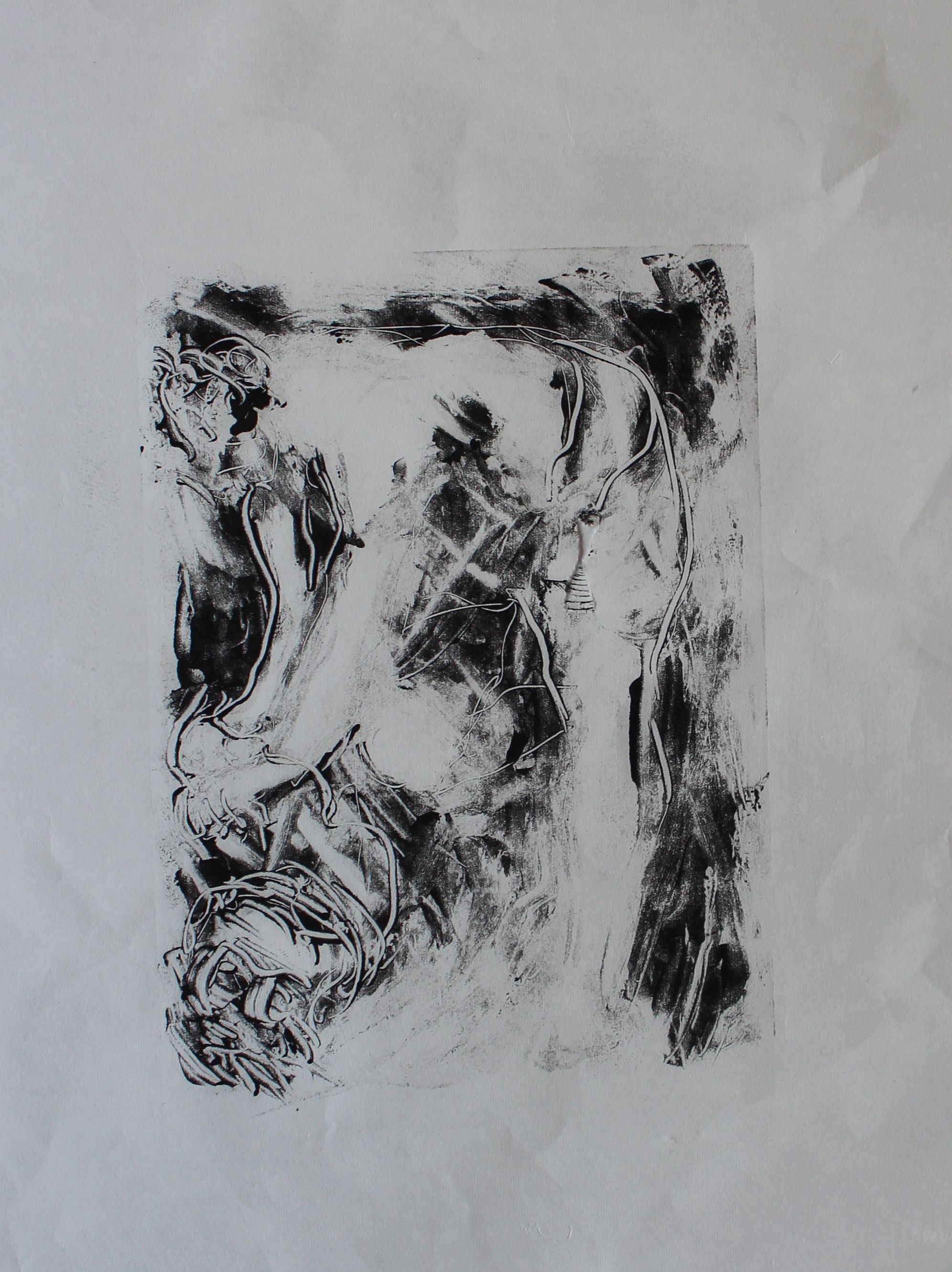
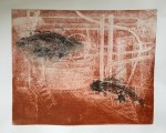
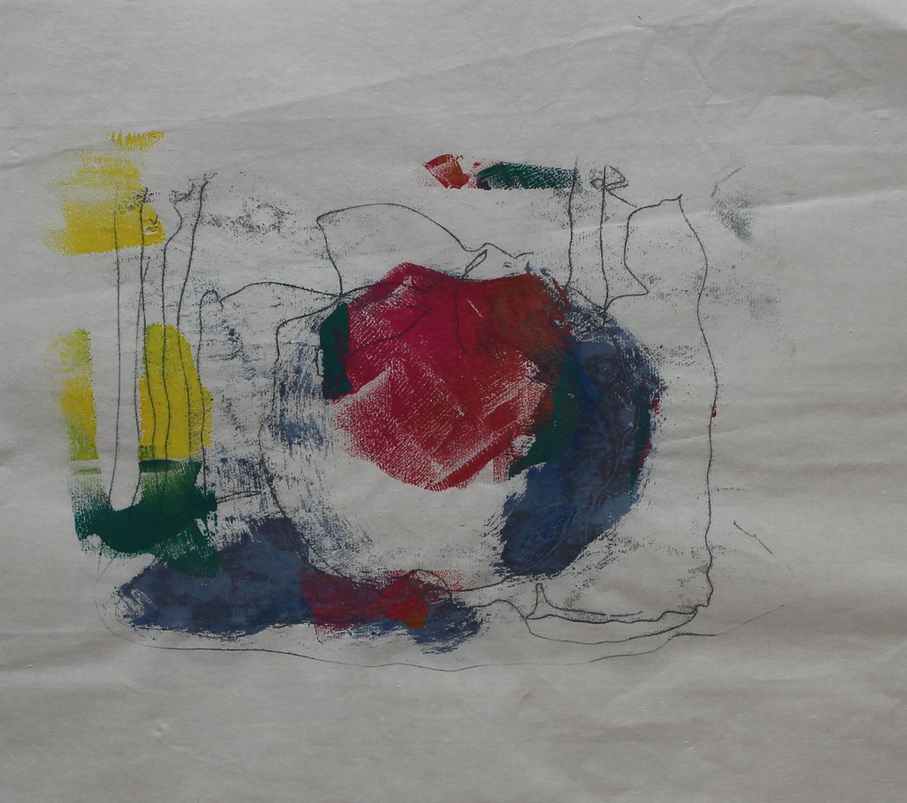
I am more drawn to those techniques which create automatic effects through the printmaking process. Maybe I am lazy. This was a pochoir technique – using torn shapes which were reversed in order to create interlocking and overlapping colours and shapes. This works better and is “gestural” in the sense that the paper masks are torn roughly, and are positioned at random, then repositioned at random, and thus it is an action process that determines the outcome, not composition.

So, to return to the materials and processes- what processes could be carried out with particular materials to create marks automatically? I have seen a YouTube video showing a print being made by burning paper and then quickly smothering it in a press, so that the resulting image is a burn mark, and each time it’s different. That’s surely an example of “gestural” printmaking.
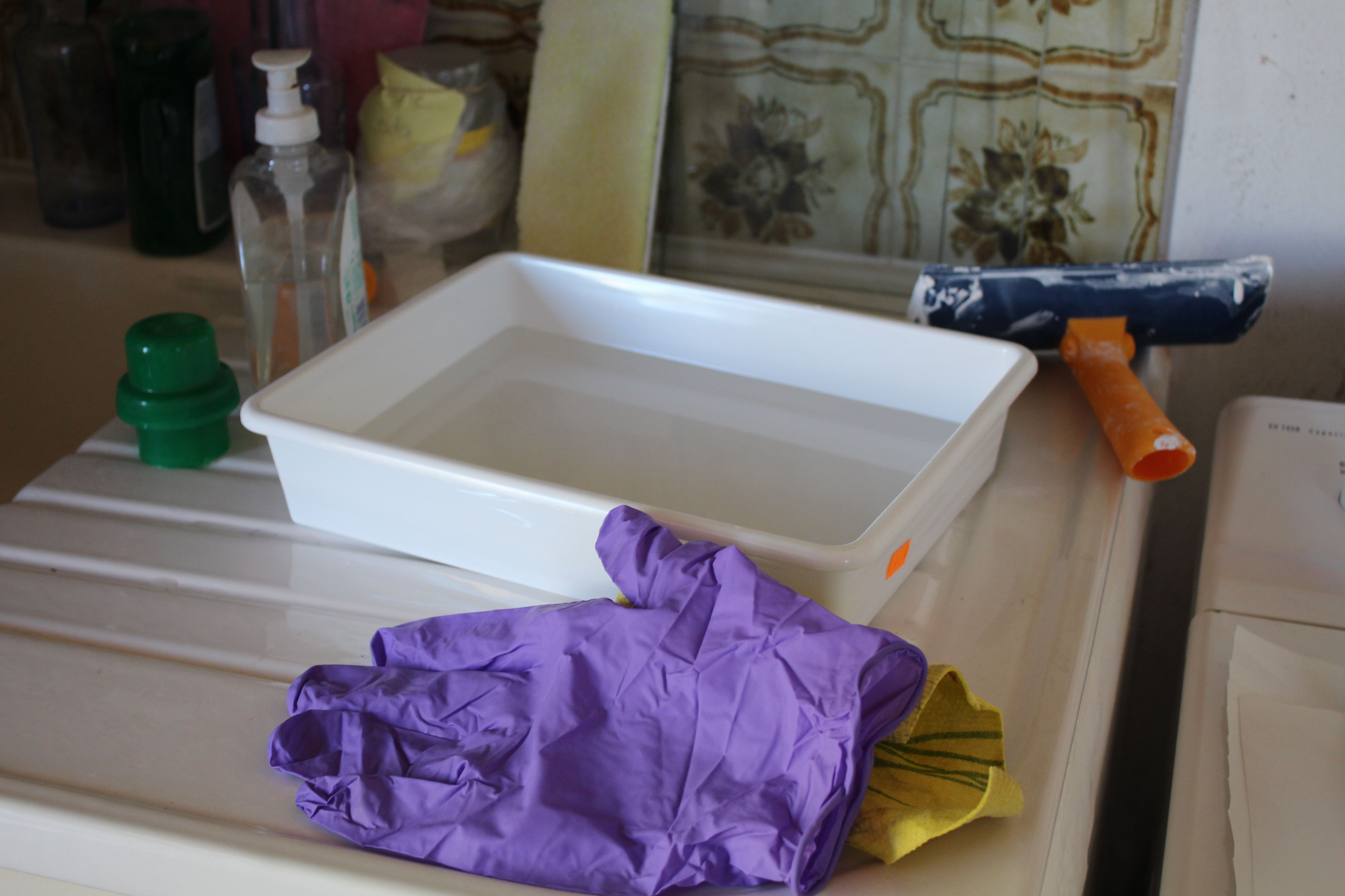
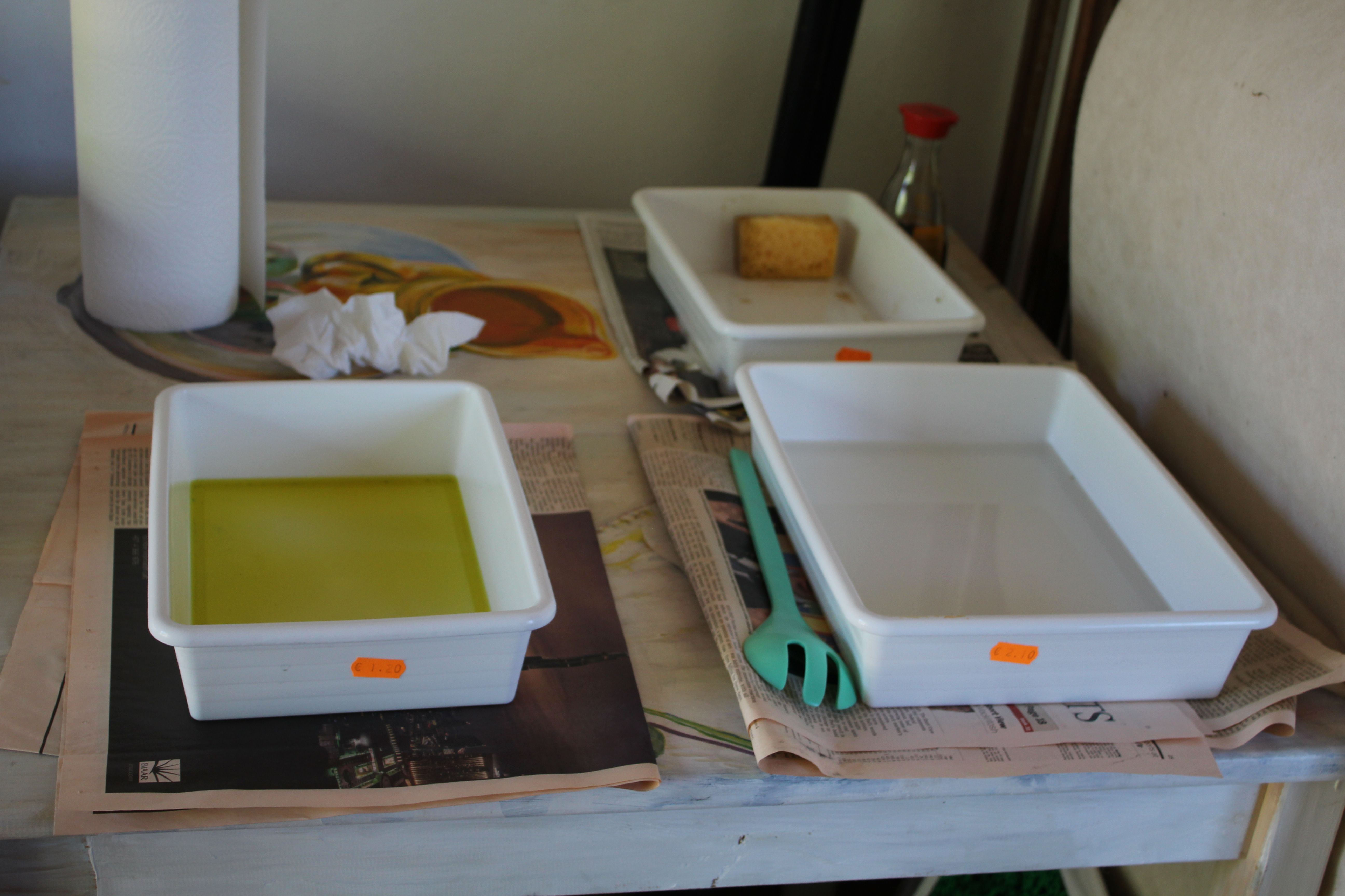
With paper: folding, scrunching, soaking and spraying with water, oil and alcohol products:
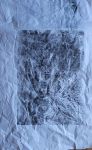
These are vaguely suggestive of wood, water, trees, or rain streaking down a window.
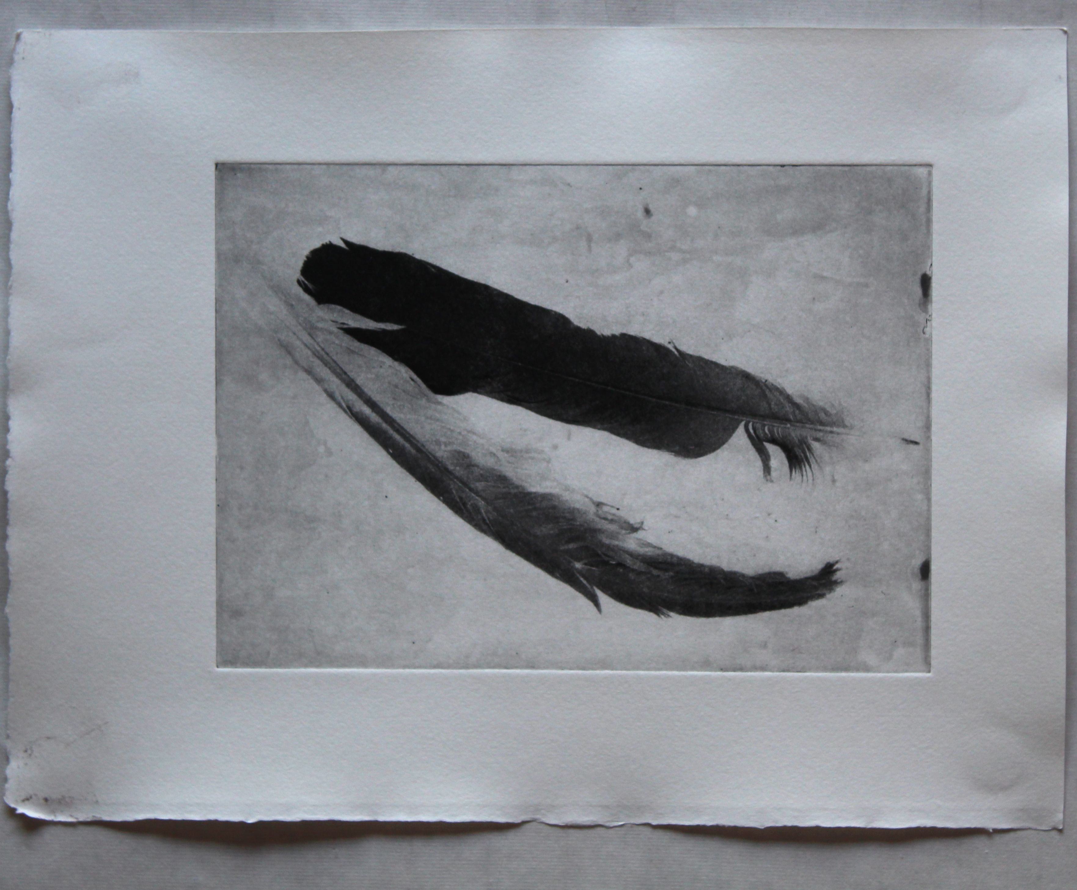
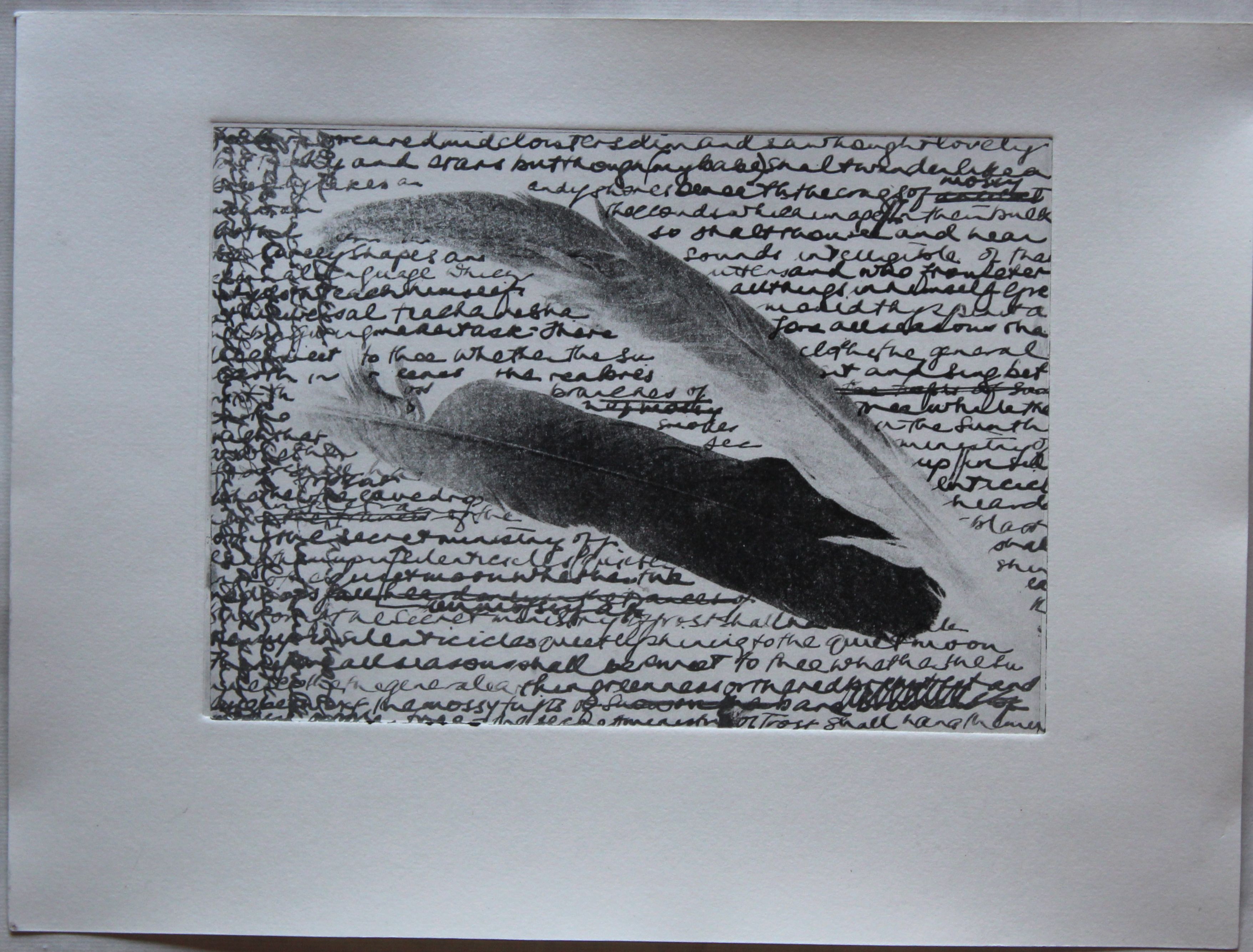
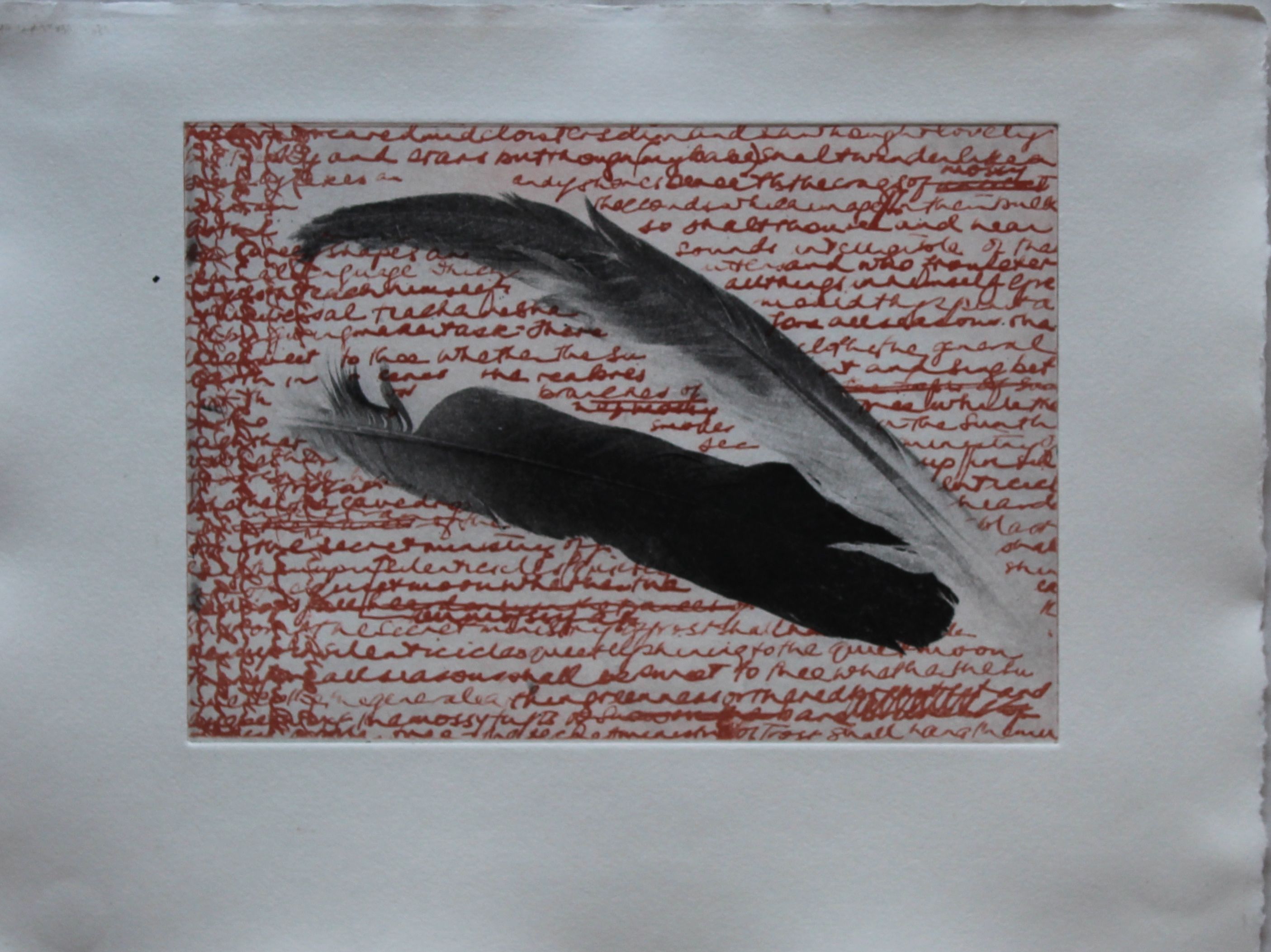
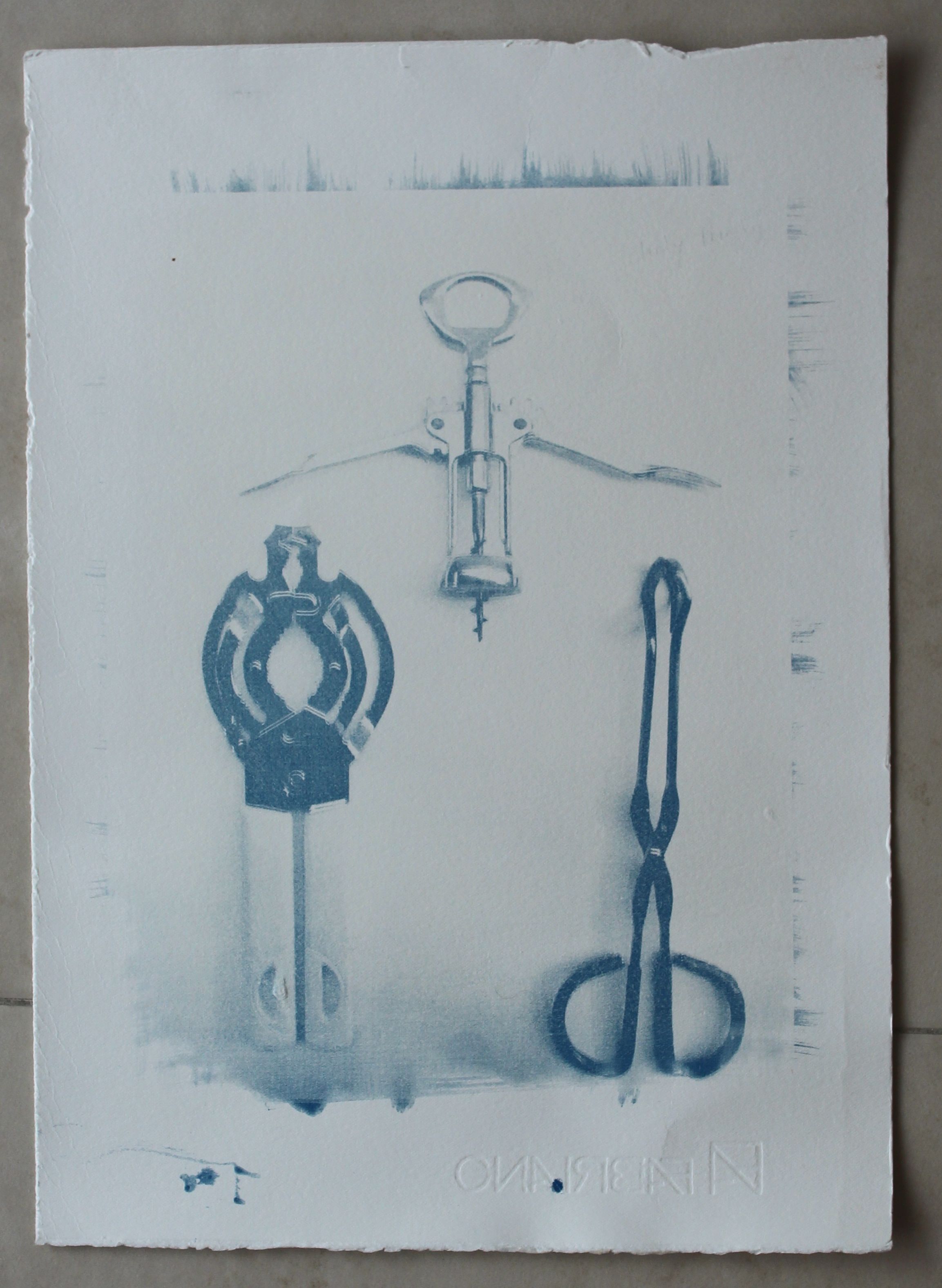
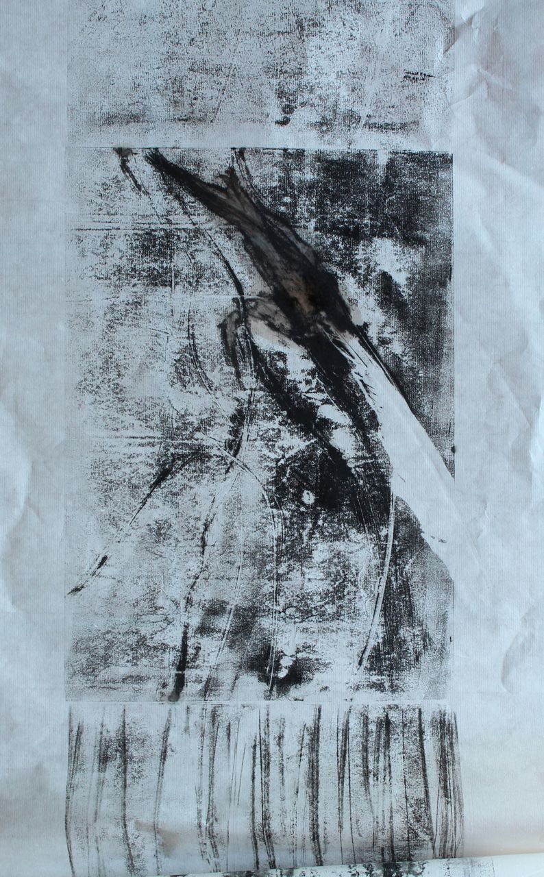
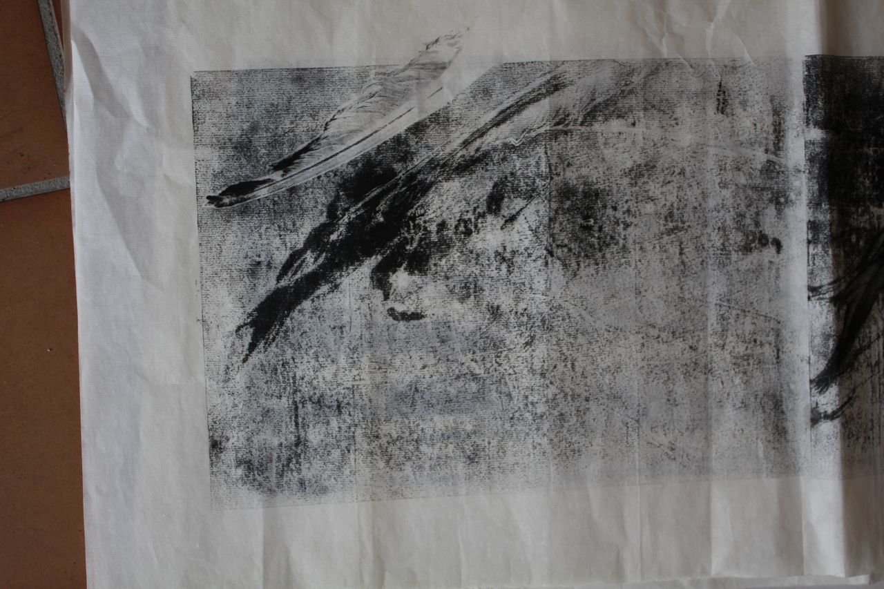
A feather laid into the ink above made interesting marks.


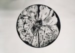
These images were made by just making intuitive childish scribbles- and also using the effects of letting turpentine and stand oil react to one another to make a bubble pattern, which is quite attractive.


I feel I am not moving on much here though.
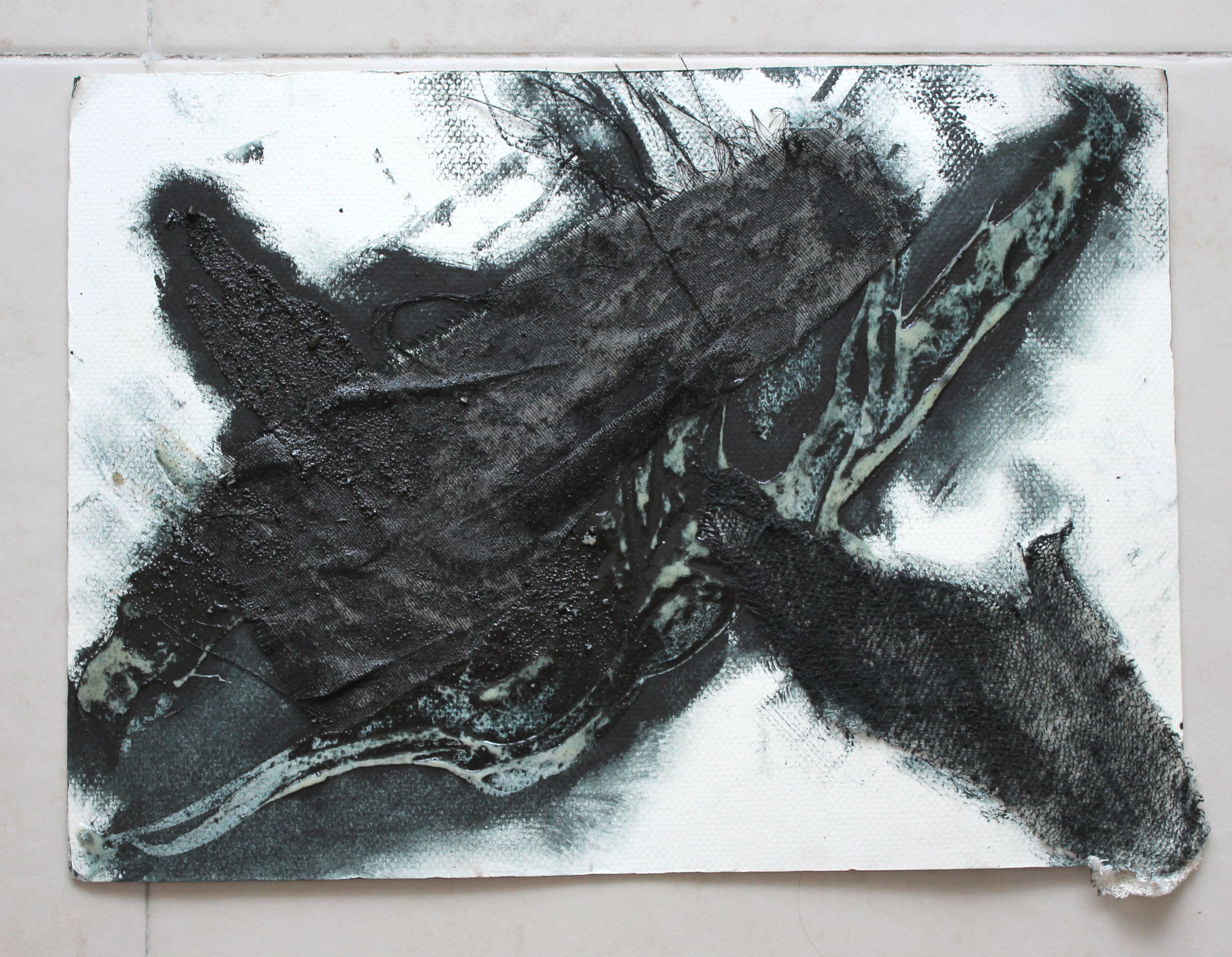
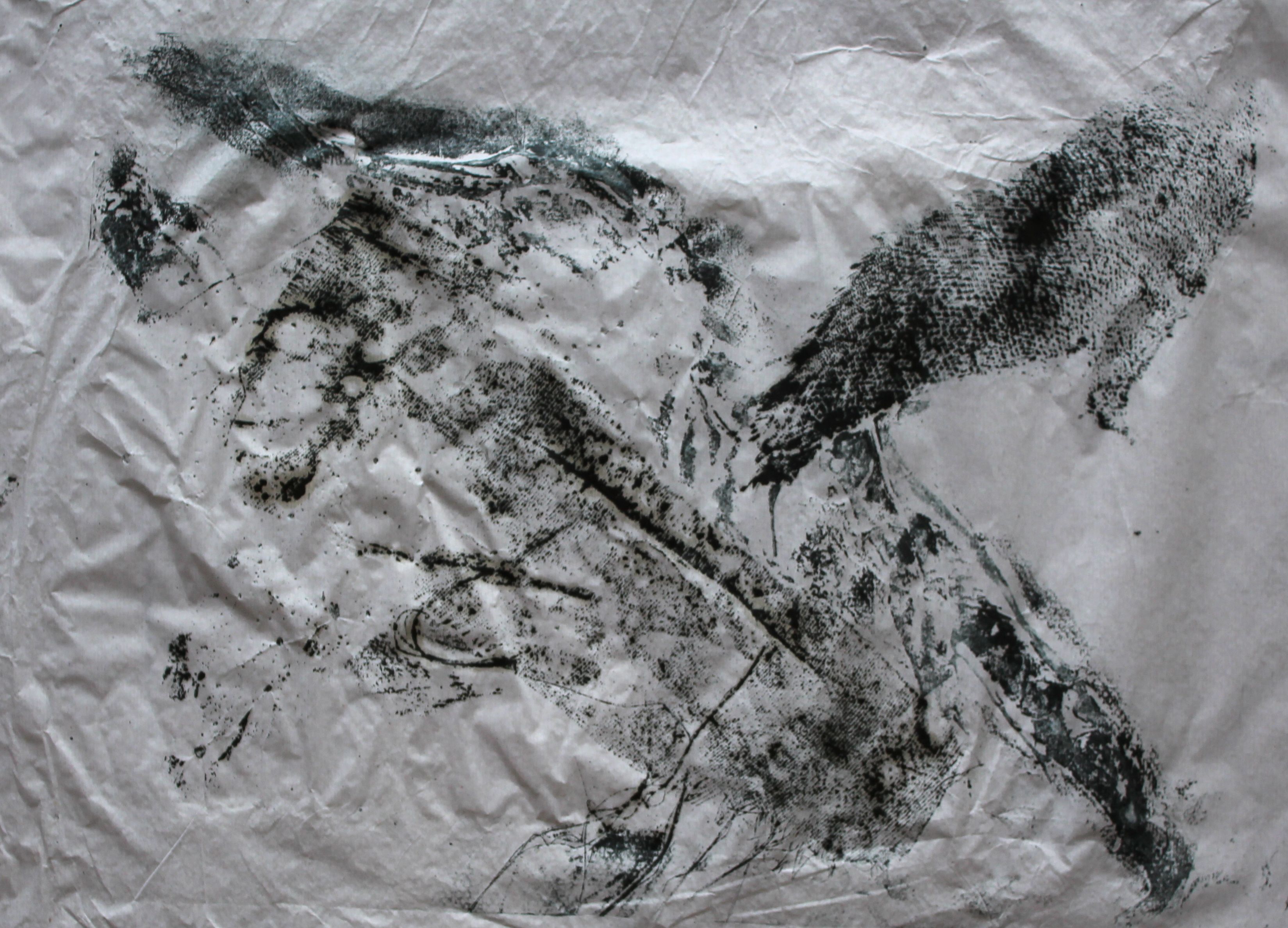
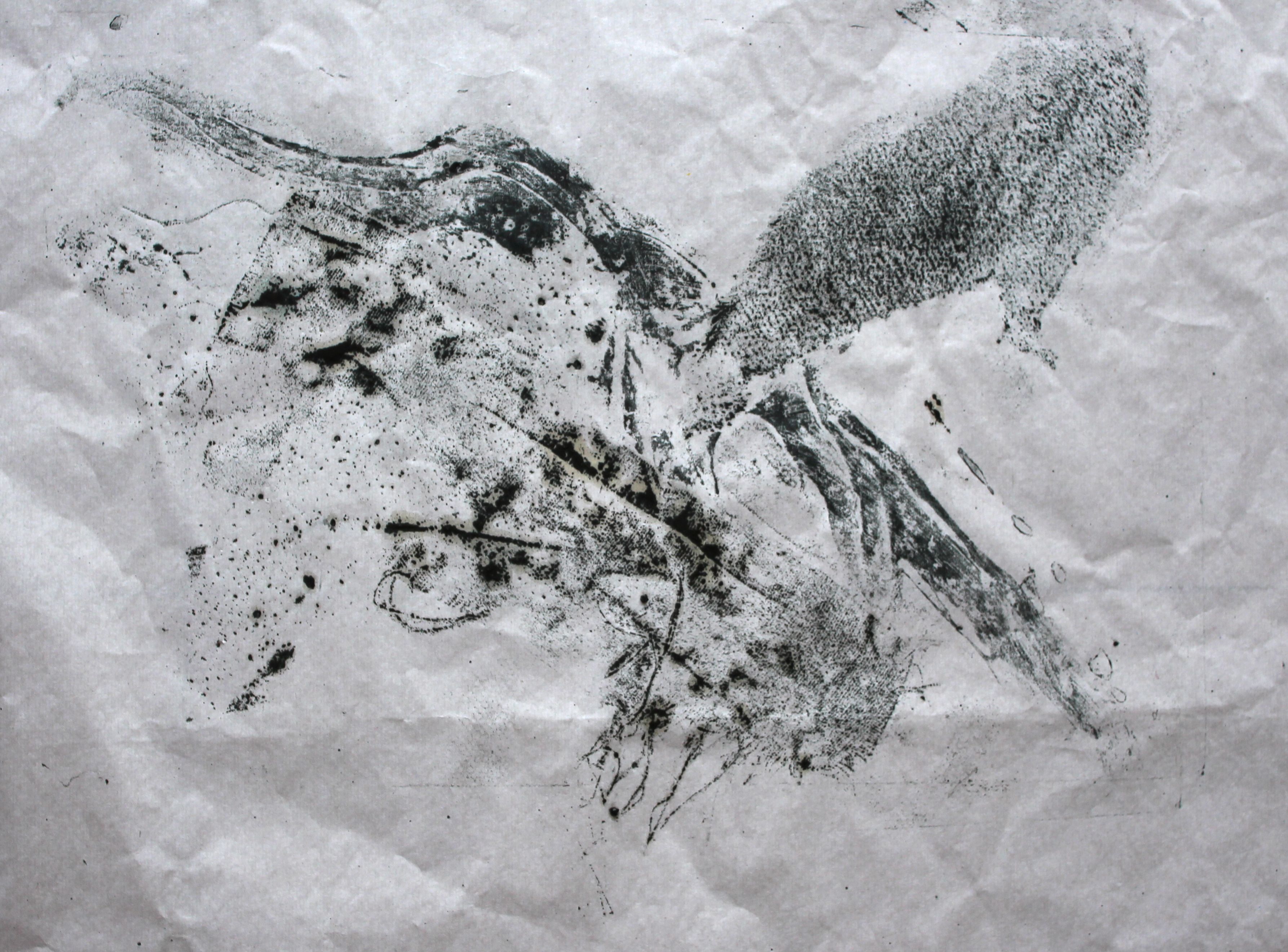
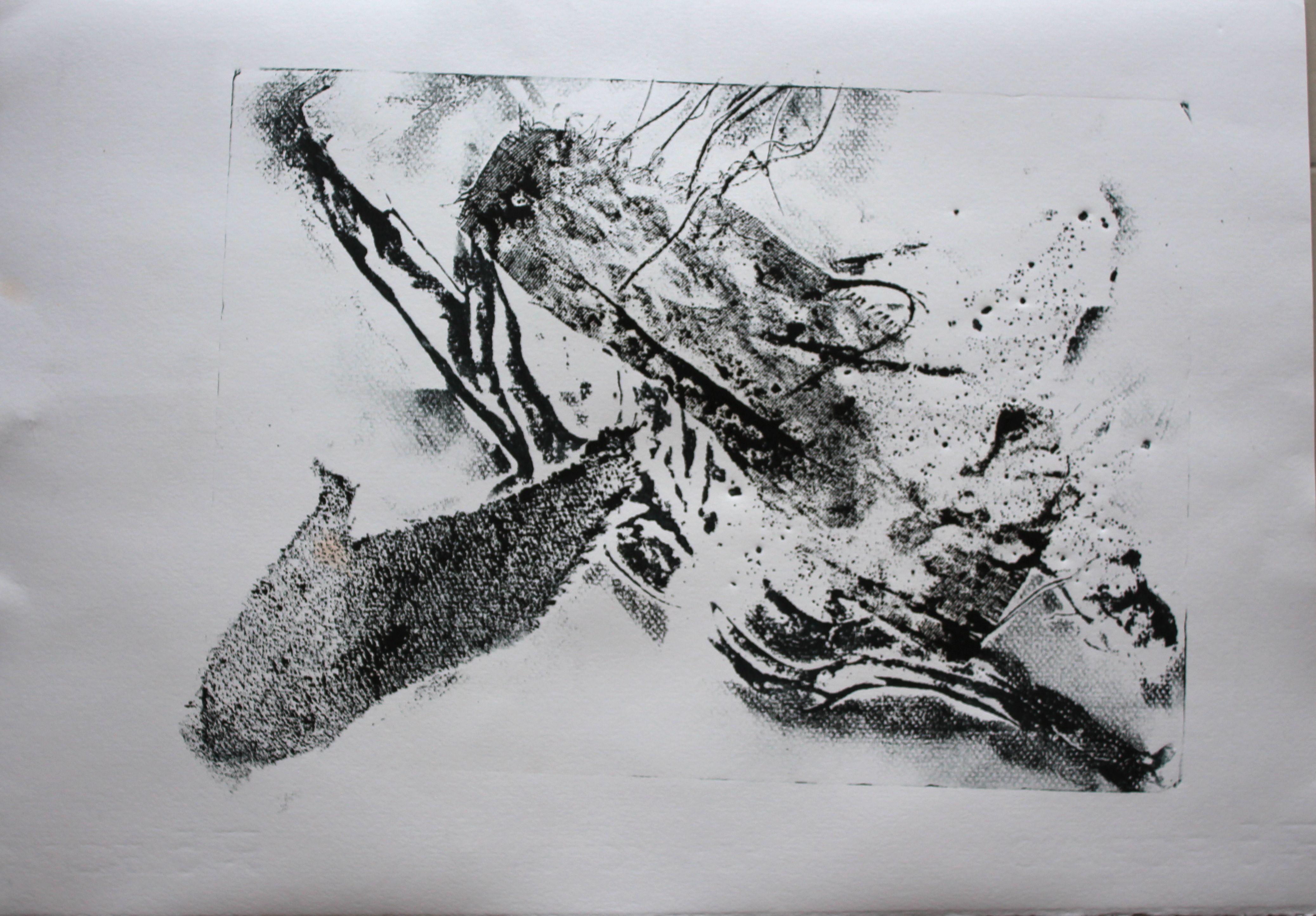
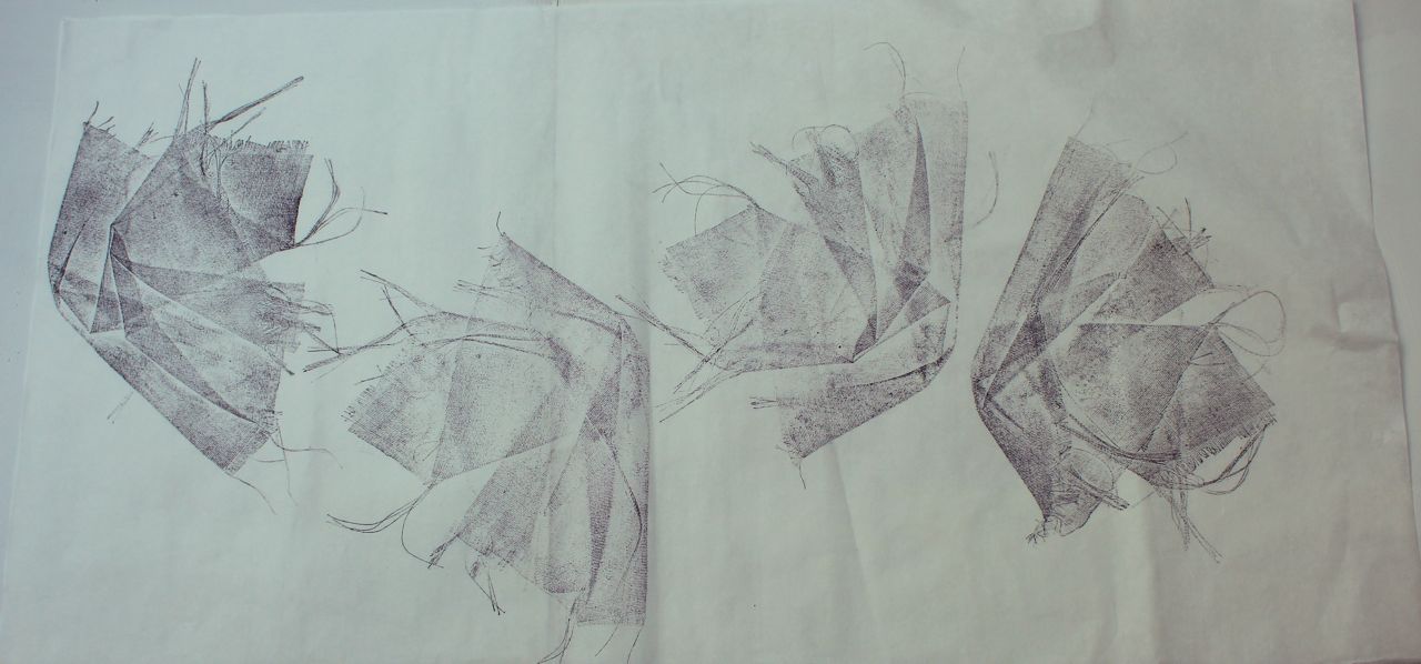
Collagraph
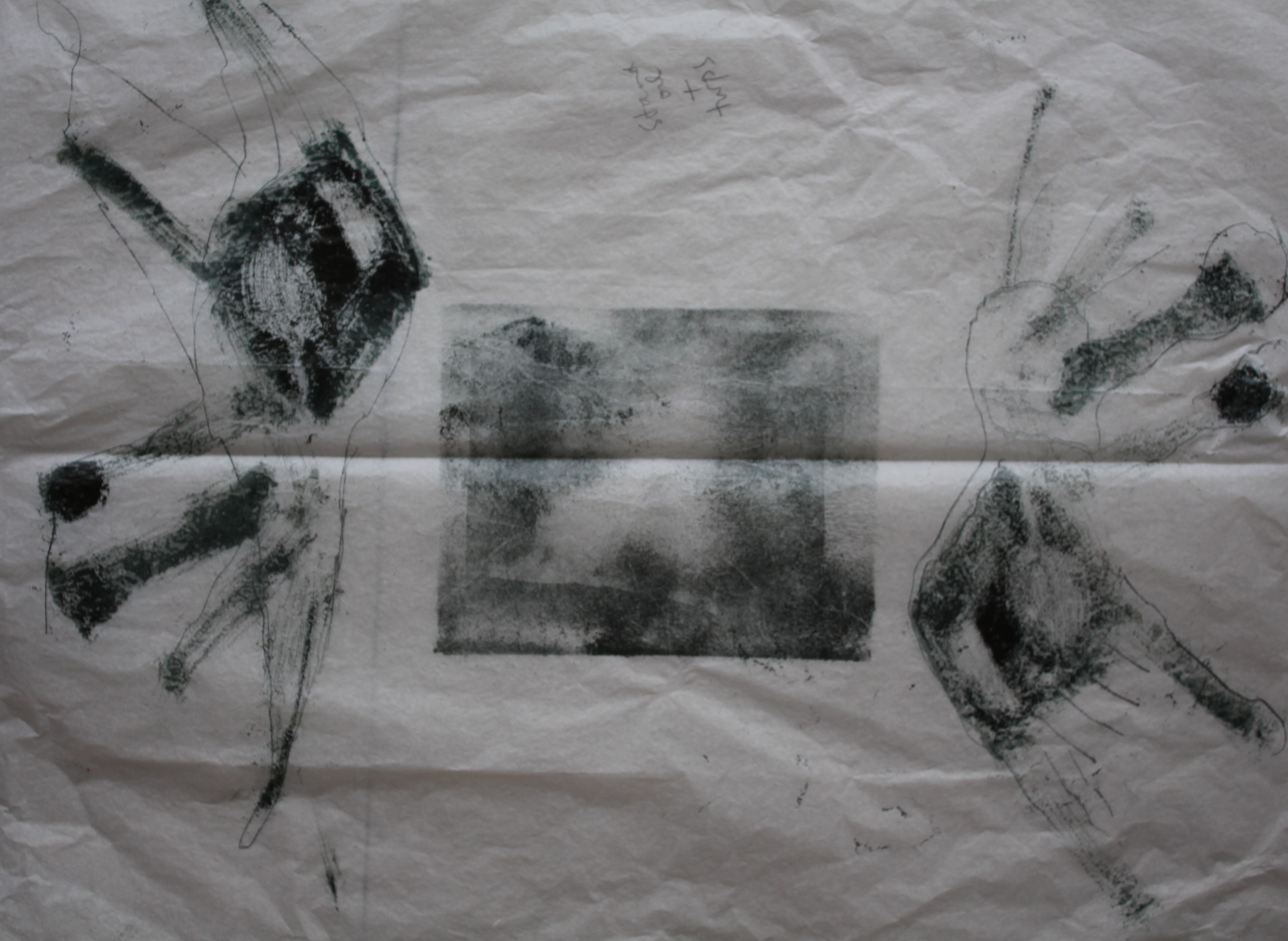
Collagraph is all about textures- the most elemental being soft and hard. I made a plate using a bandage- silkscreen fabric and sand- (I had no carborundum), with thick glue as an in between “fluid” texture: I just placed the pieces more or less randomly, trying to balance them, with a basic diagonal composition.
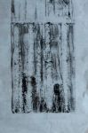
This is the inked up plate:

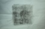
Without a press this had to be printed on thin paper, or on wet paper pressed between weights.
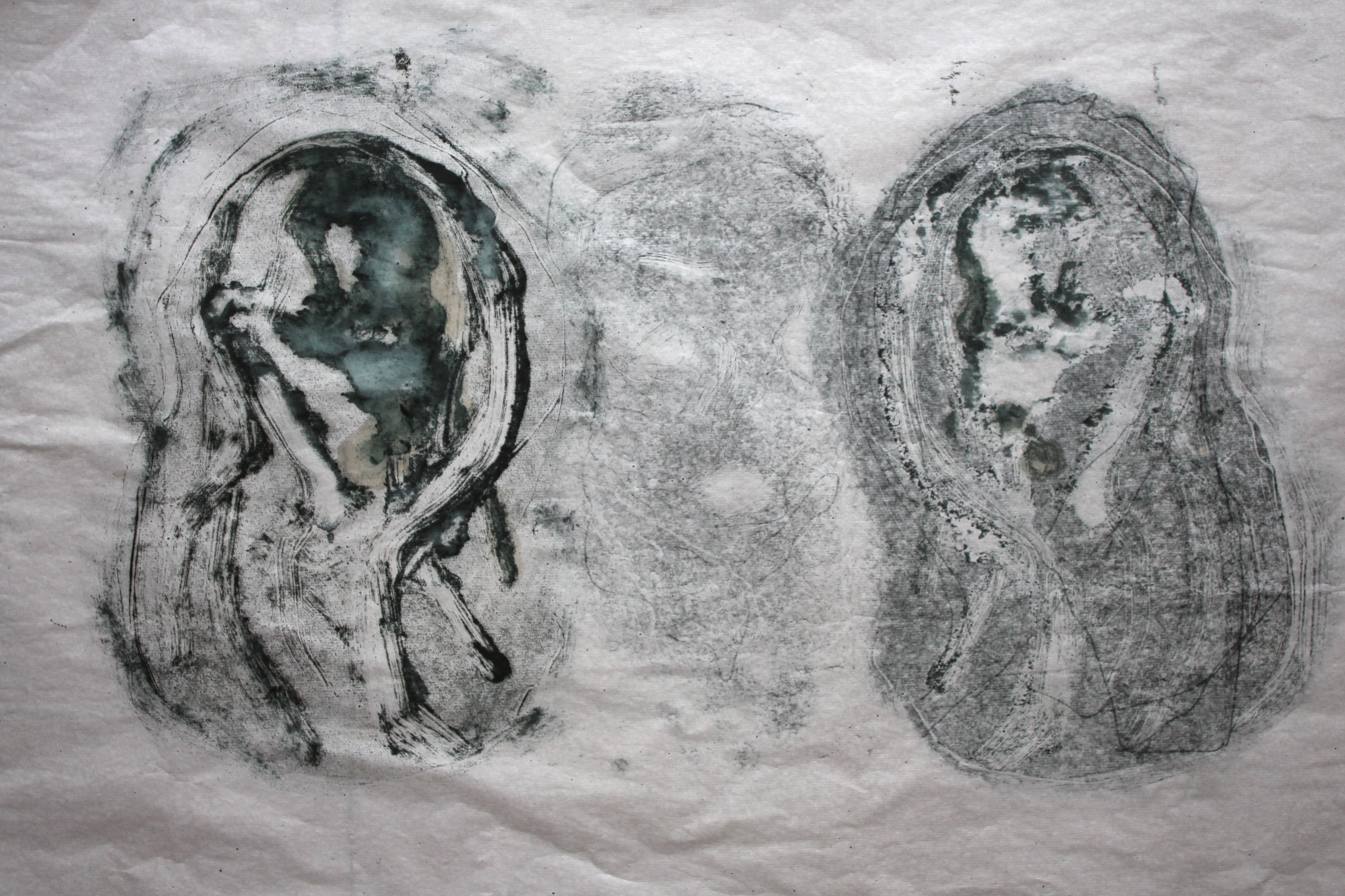
On thin paper, the sand was a bit destructive, but I like the shapes and textures on the right hand one.


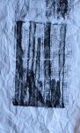
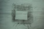
On thick paper the textures are quite sharp:
Abstract collagraph
I should probably have used sandpaper instead of actual sand, so as not to indent the paper quite so much, but the dotted patterns are interesting, and they create a lot of space. I’m still unsure what I am trying to achieve here though.
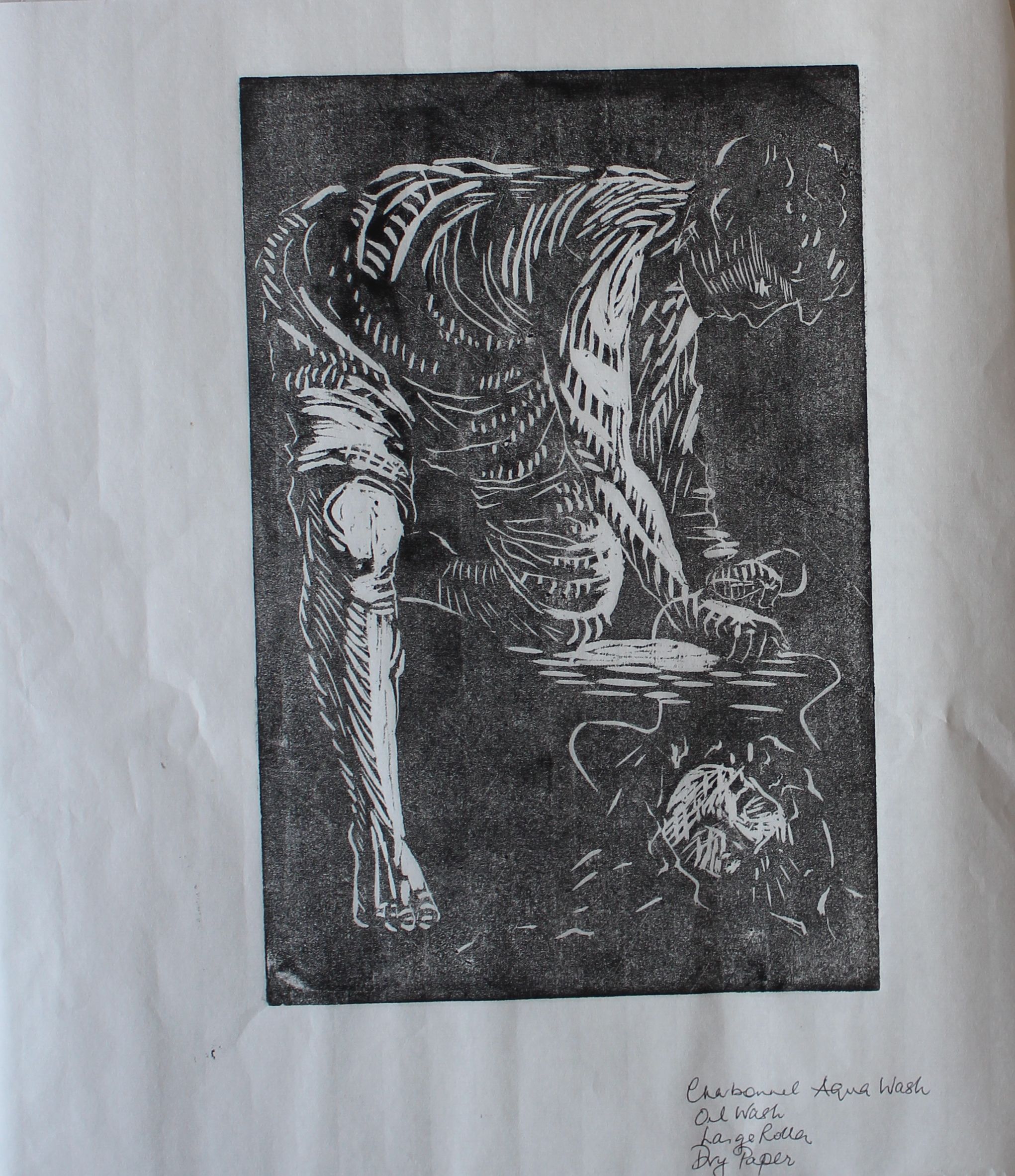
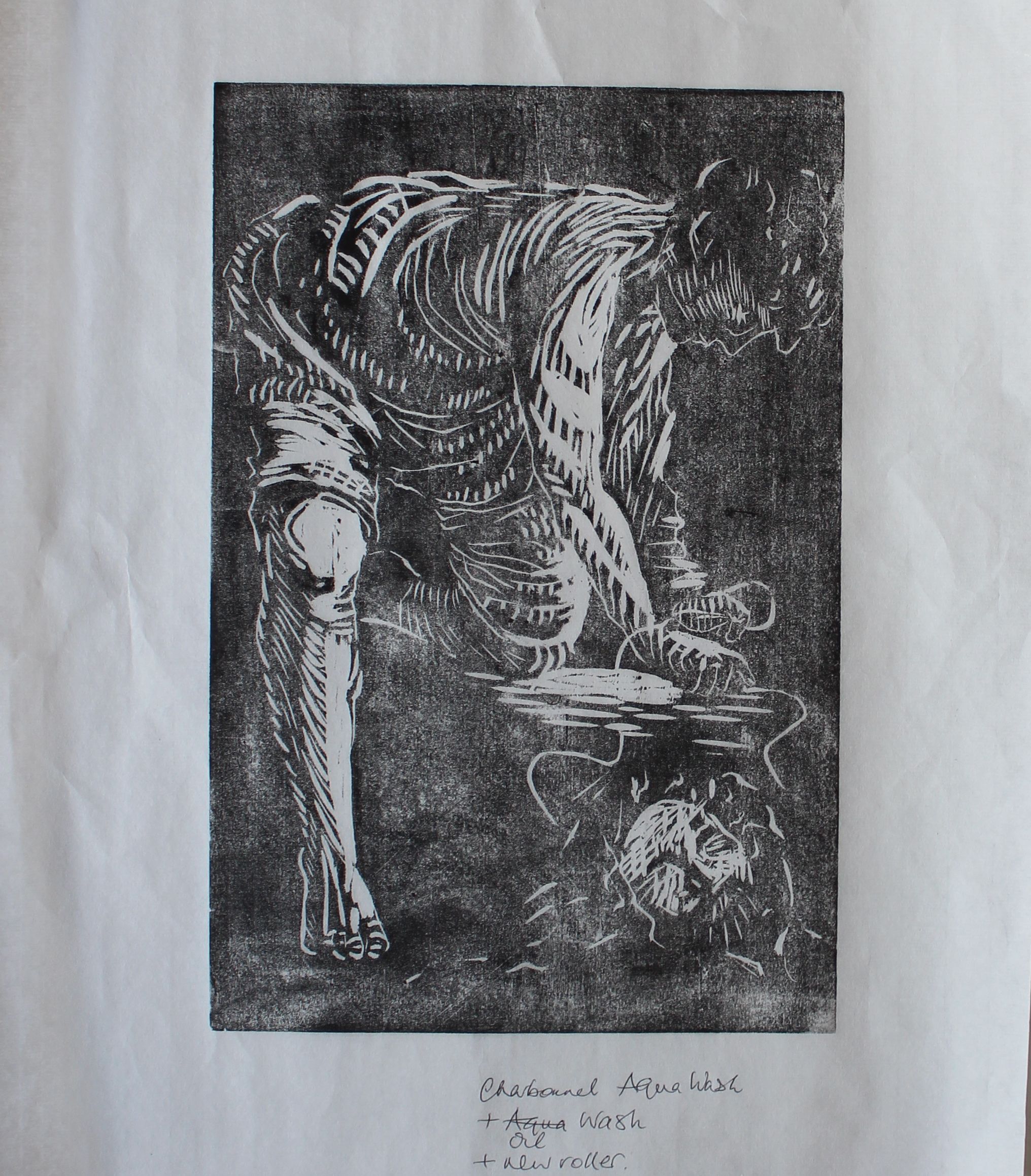
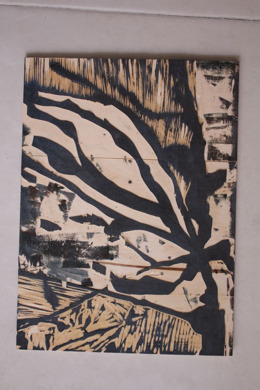
Woodcut
With wood: burning, splitting, splintering:
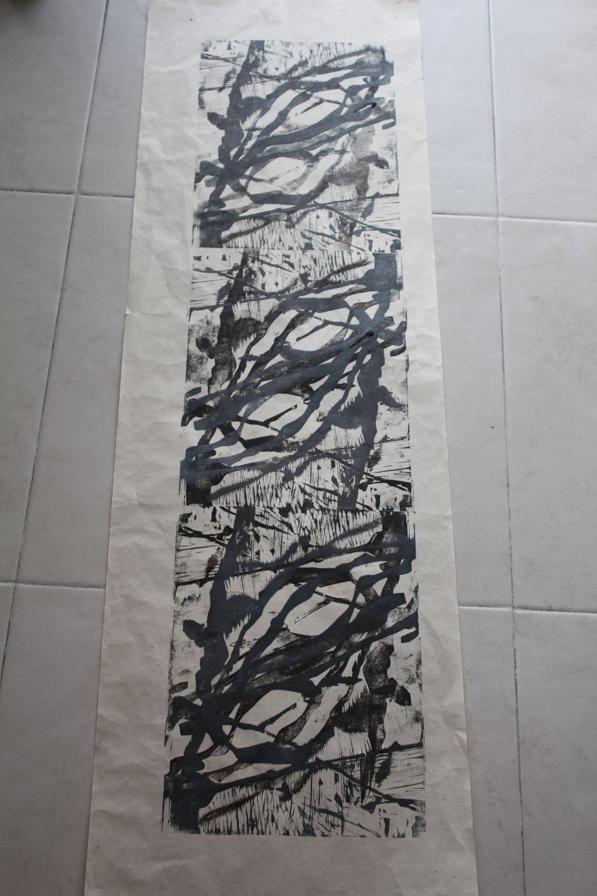
This piece of wood was set alight after having lighter fluid poured on it, but I didn’t get much of a relief pattern as a result- the fluid burnt out too quickly. (Need to use different wood? petrol?) I then used a screwdriver and a knife, cut quickly, and let the plywood layers split. It’s been printed four times to make a continuous pattern, then overprinted in a second analogous colour, which again, is a technique to create a random and not representational design. This could have been planned so that the edges met up as a repeat pattern.

Plywood block

Lino: I could make random marks with caustic soda. (But I’m not going to- I don’t have much of the real stuff, mainly vinyl, which is impervious to most random markmaking stuff.)
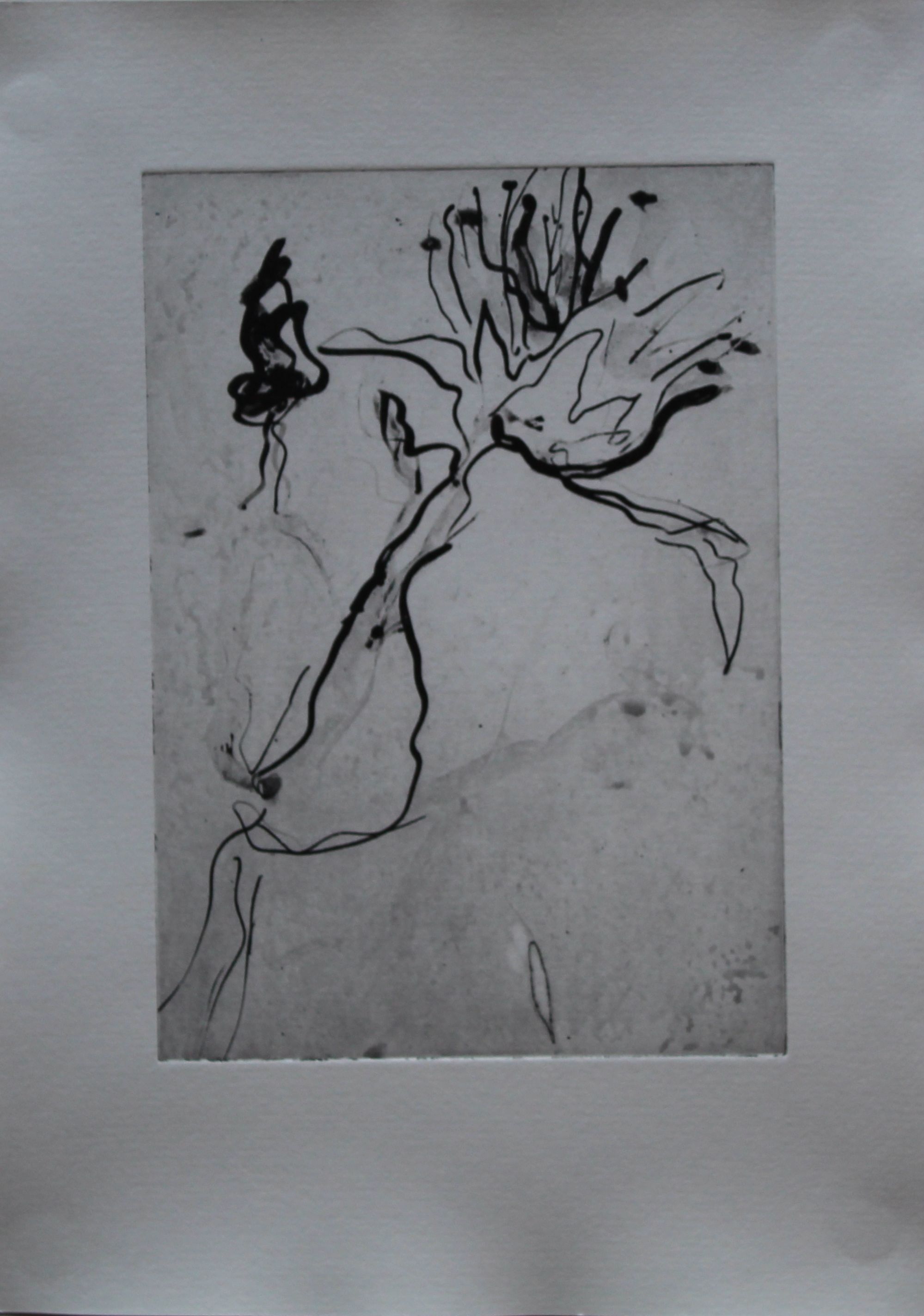
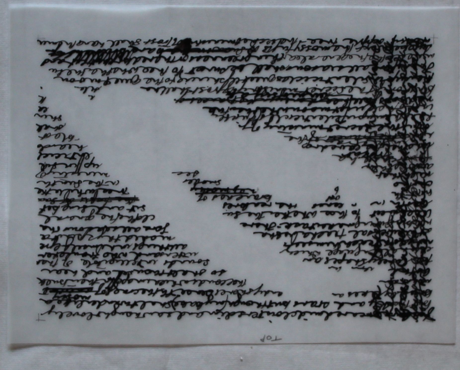
But when I think of “gestural” marks, I think of drawing and writing, marks made by spontaneous movement. The most direct technique I know for achieving that is intaglio, where the scratched line you make is pretty nearly the mark you get.
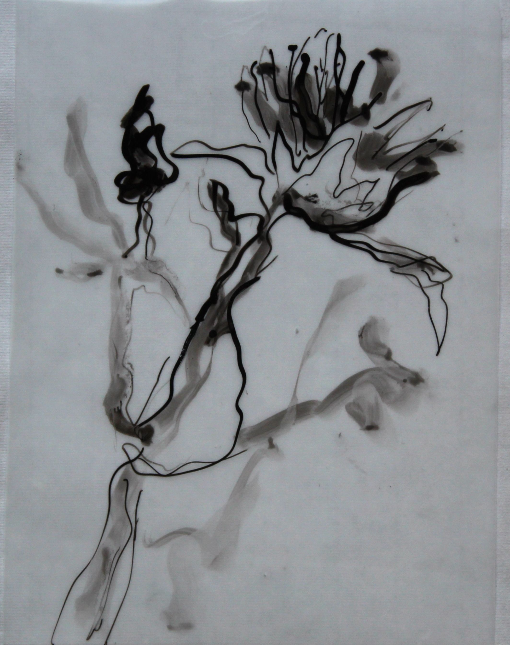
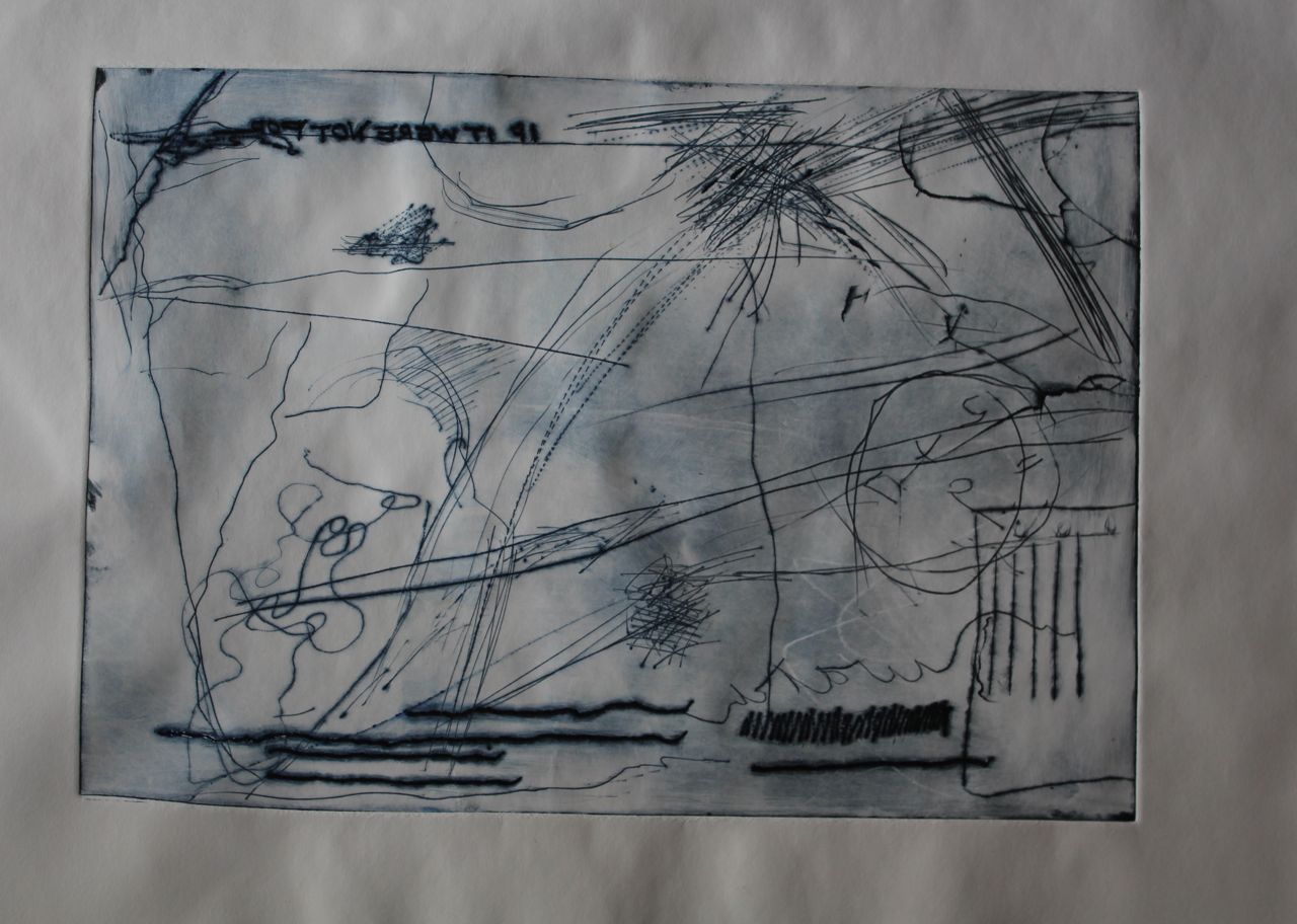
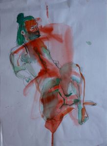
Intaglio
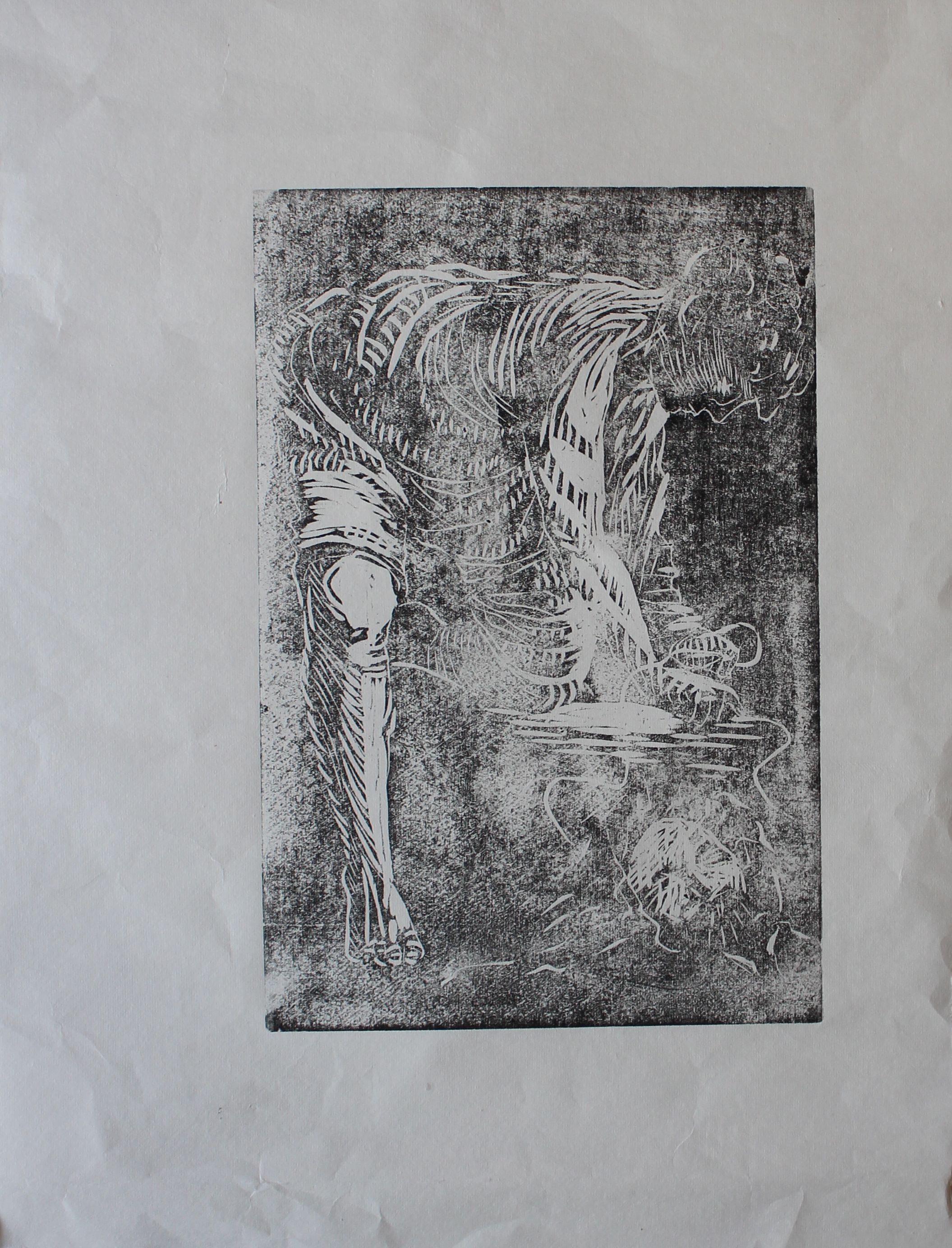
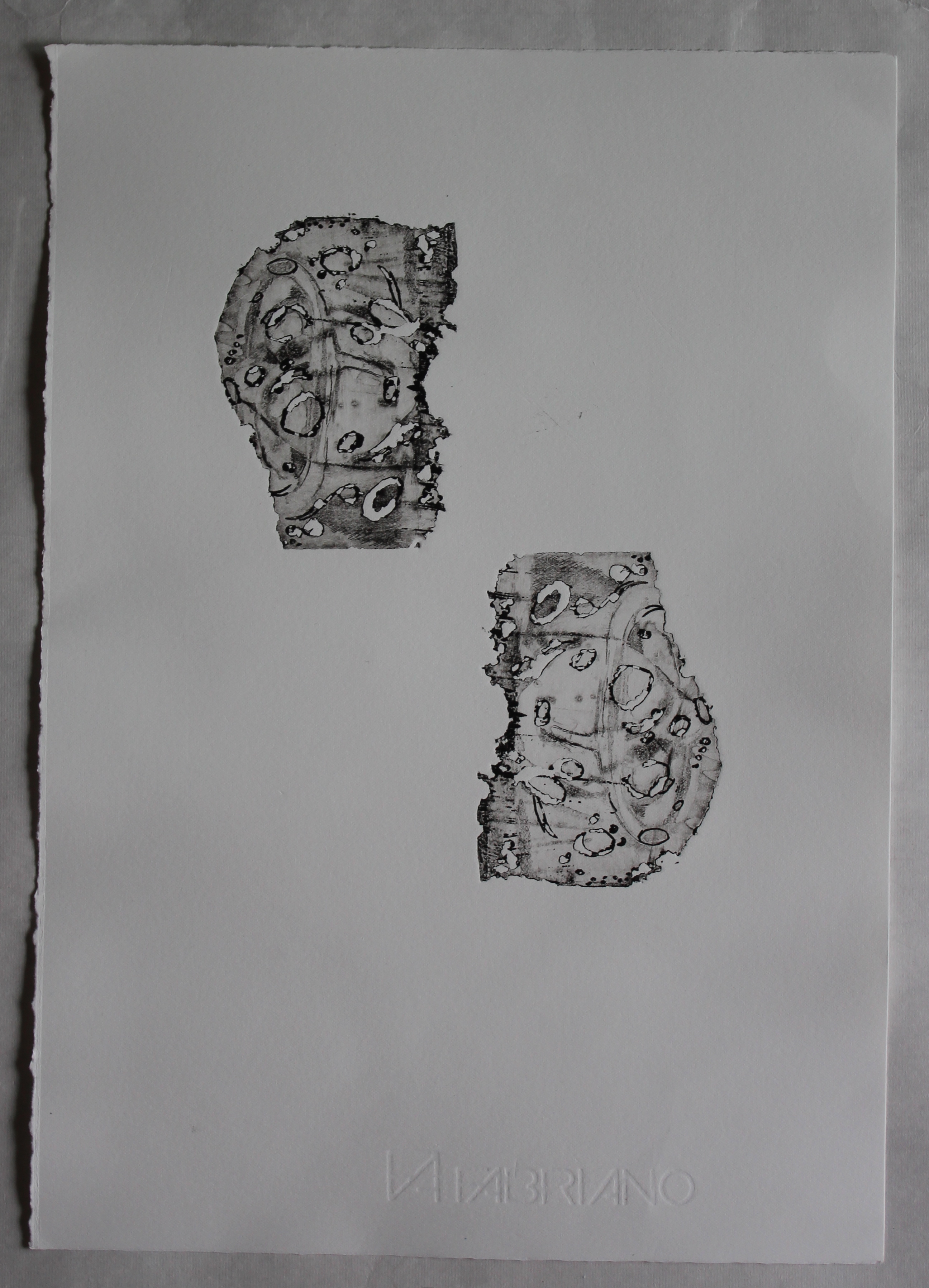
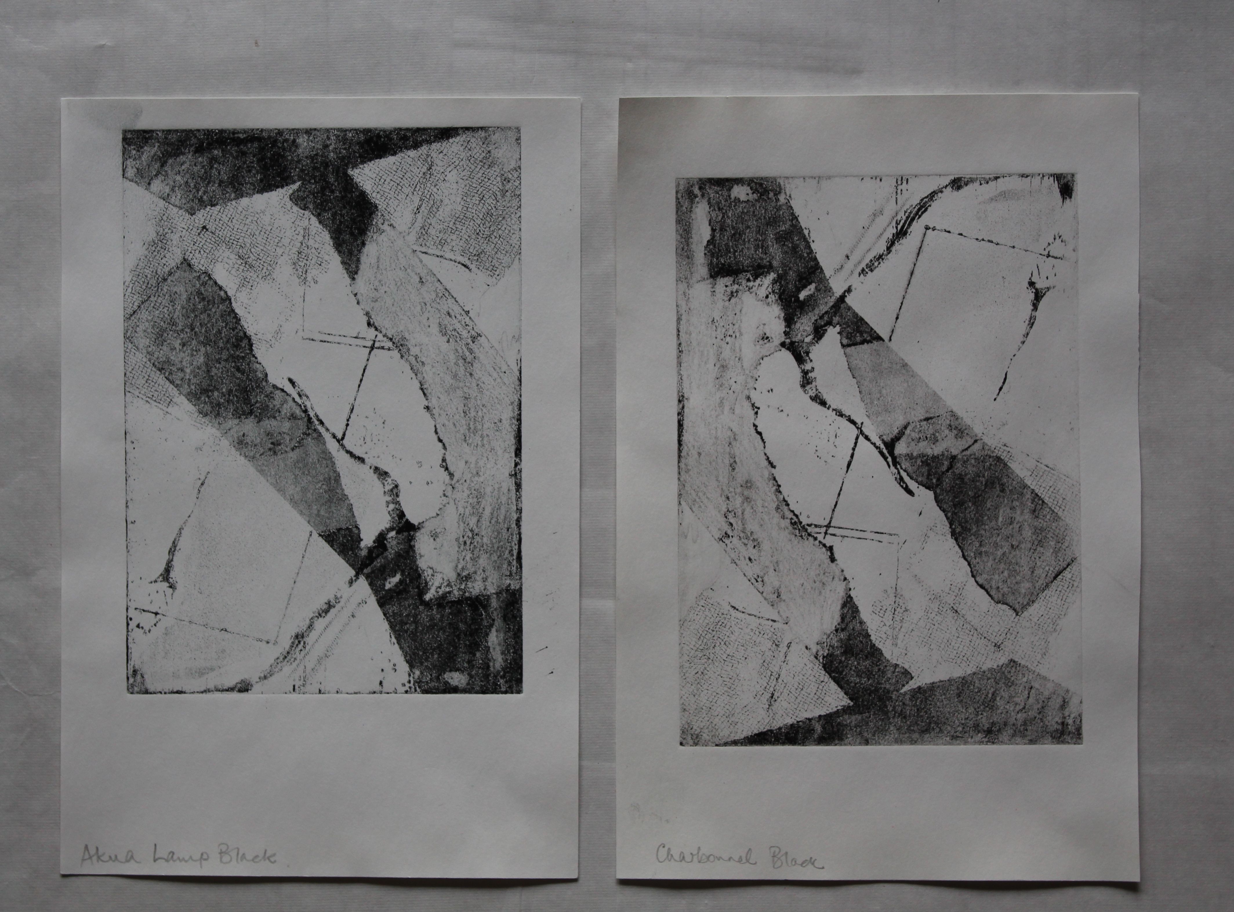
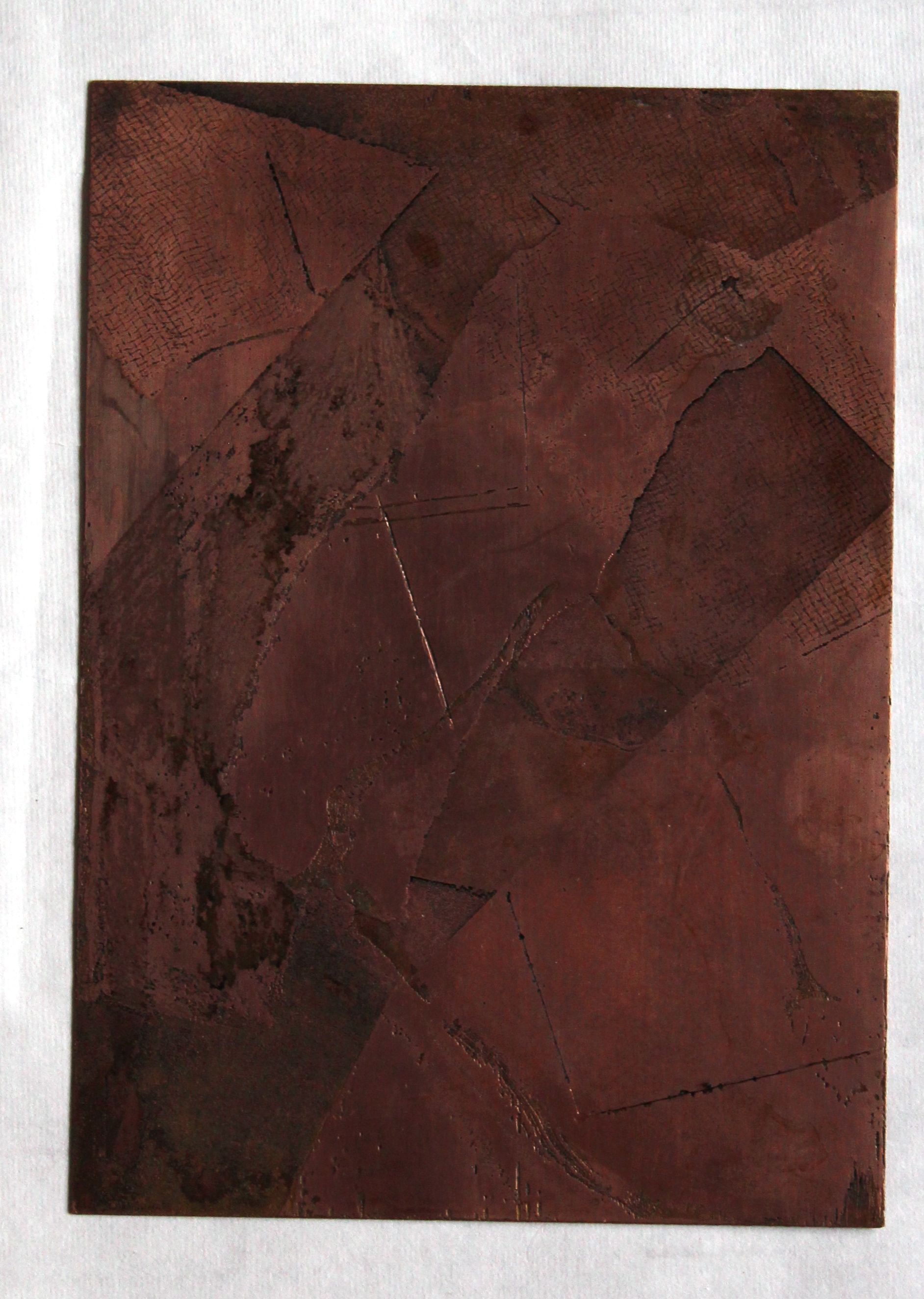
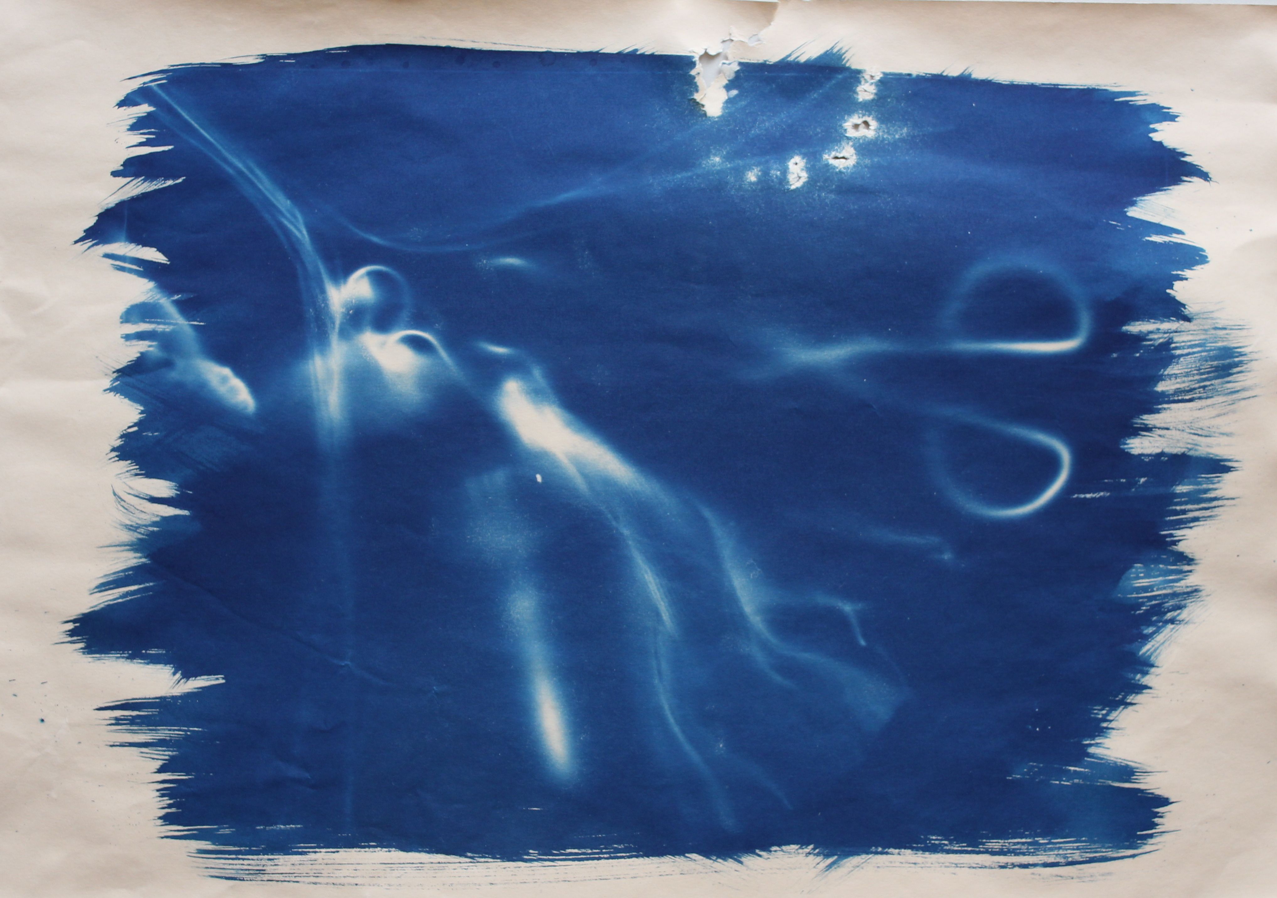
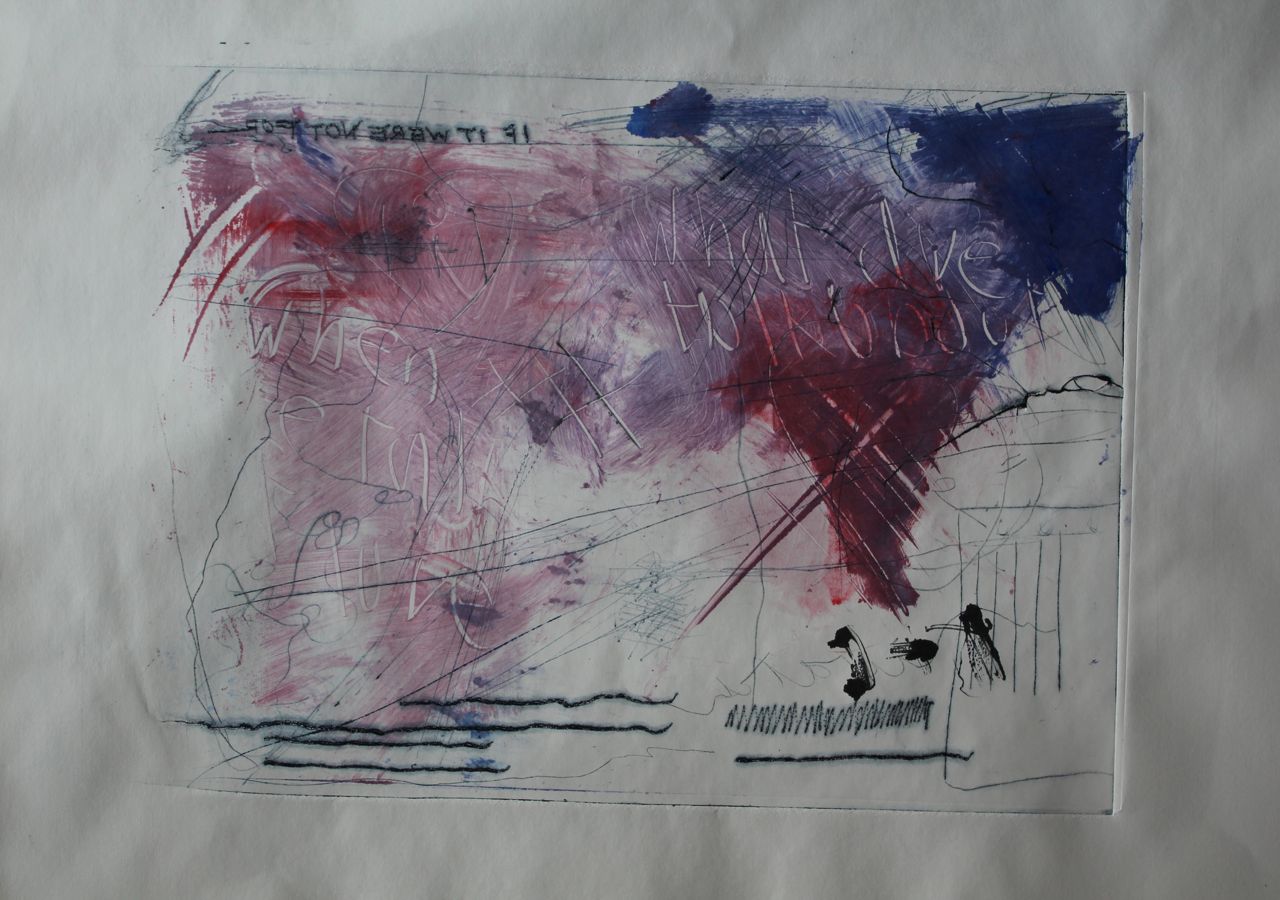
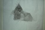
These images are made on A4 pieces of 2mm plexiglass, and have been gouged with a variety of sharp objects, including knives, etching needles, sandpaper, a screwdriver and a Dremel. Then the plexiglass was cracked with a hammer and other sharp tools. Before that, a sheet of contact plastic was affixed to the back to hold the pieces together.
I like the variety of marks I’ve got here. The sharp engraving needles have been used quite violently in places to scratch, as have lino carving tools and knives to peel off some surface plastic. The use of a rocker engraving tool has made dotted and hatched lines, as has the Dremel used at different speeds. The Dremel is nice for the curly lines, and the engraving needle is also relatively easy to write with. The marks are made quickly, and deliberately artlessly; scribbles, random words, scratchings out, phrases that come into my head, symbols. I painted some caustic soda and left it overnight to see if the lines would get etched by that, thinking that some of the plastic in the sheet might be affected by it, but no- it looked exciting for a moment- with bits of crystal shapes forming- but it was just the dried soda on the surface and it washed off.

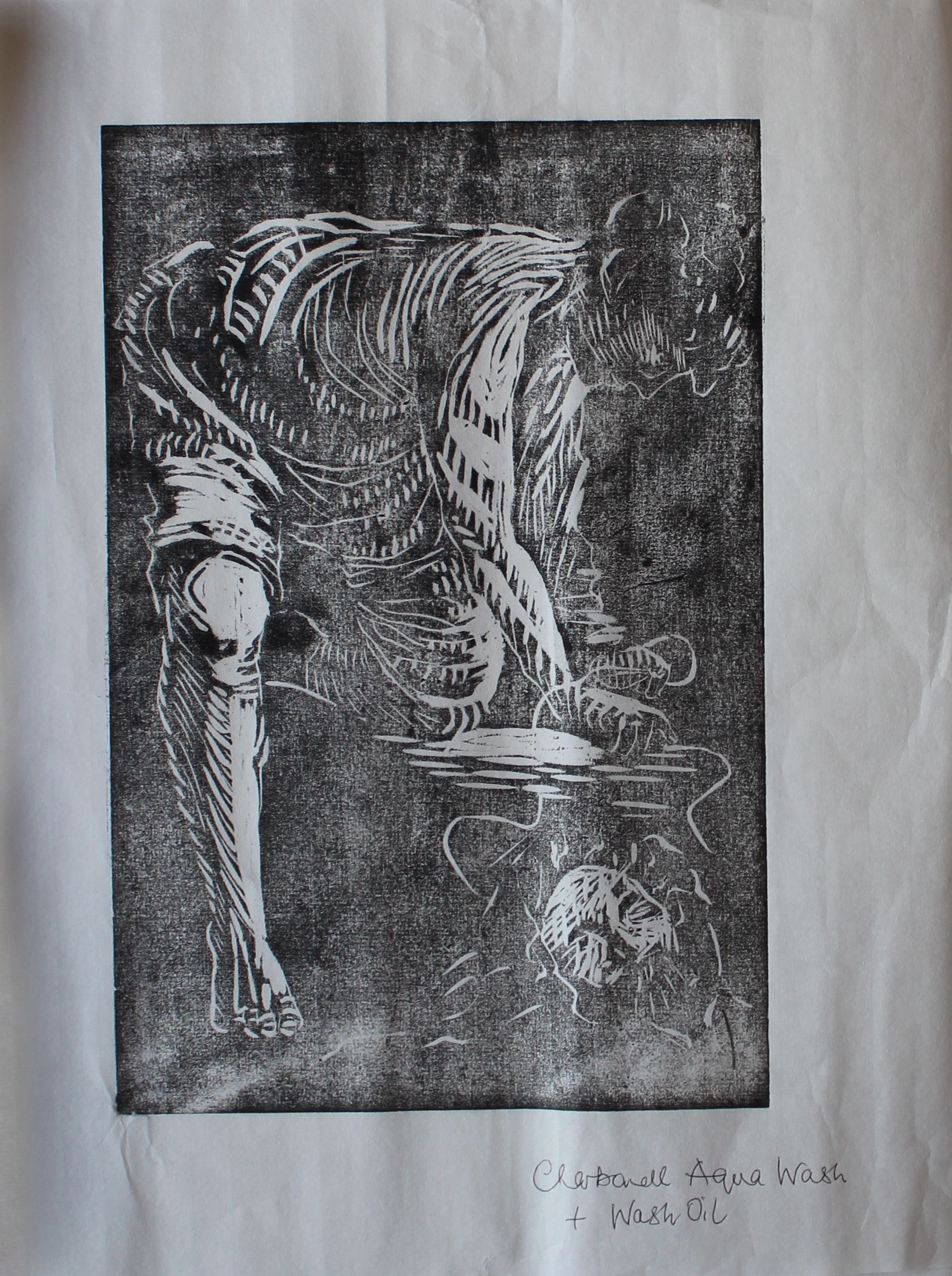
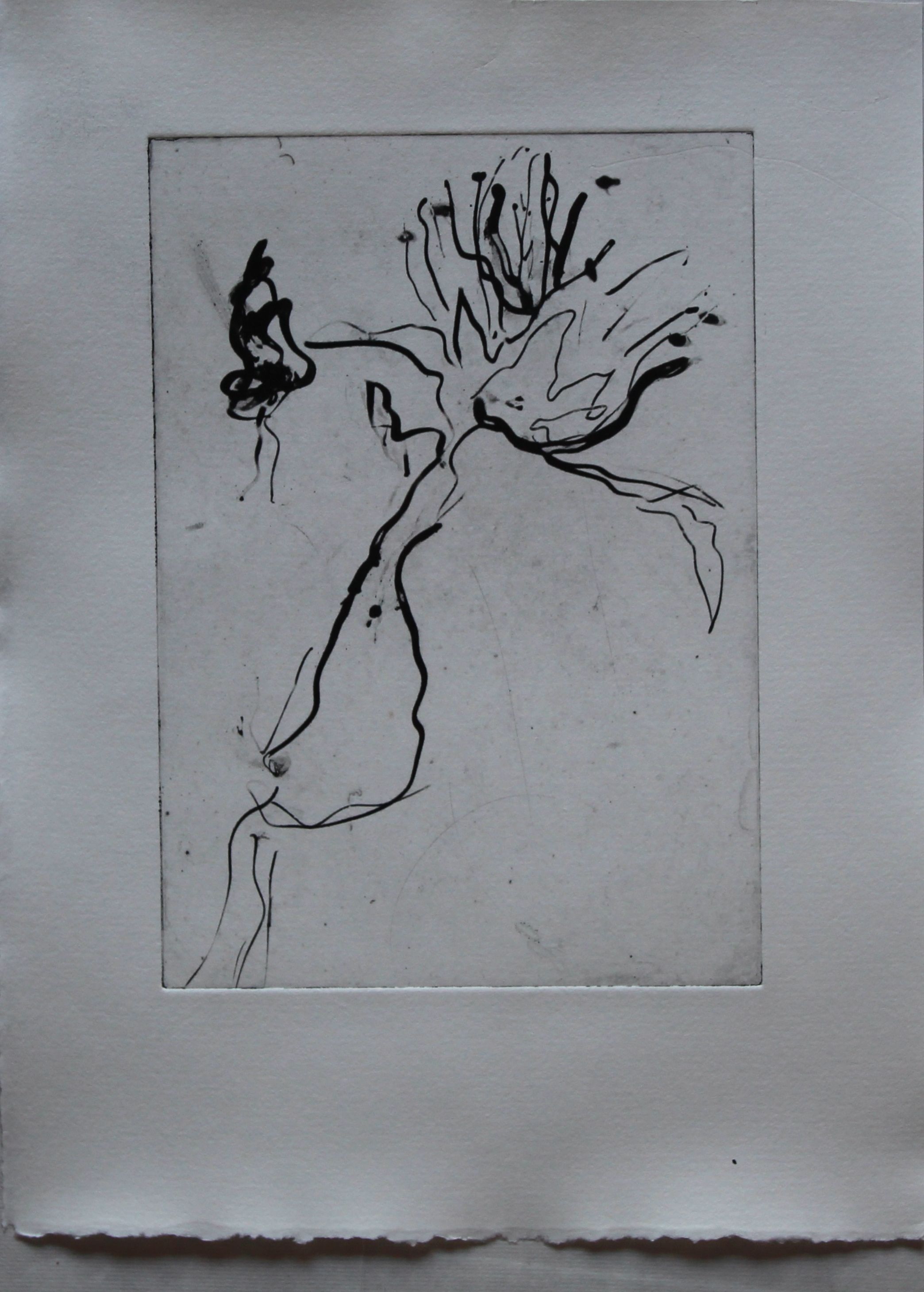
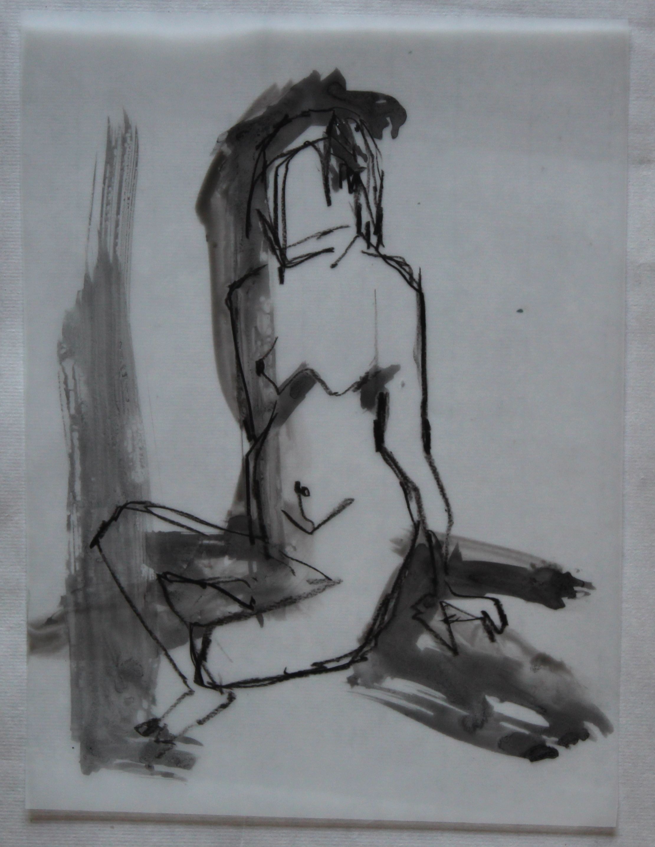
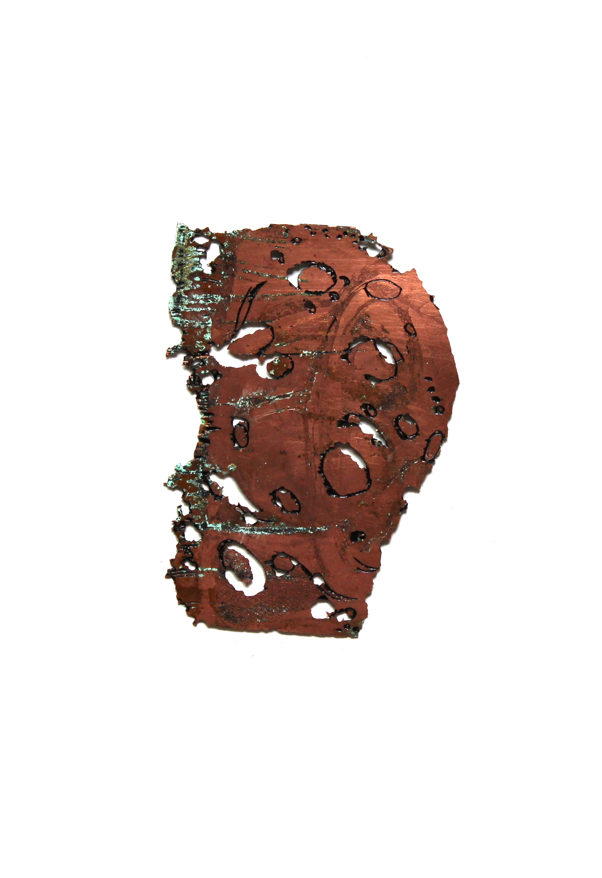
Intaglio on plexiglass
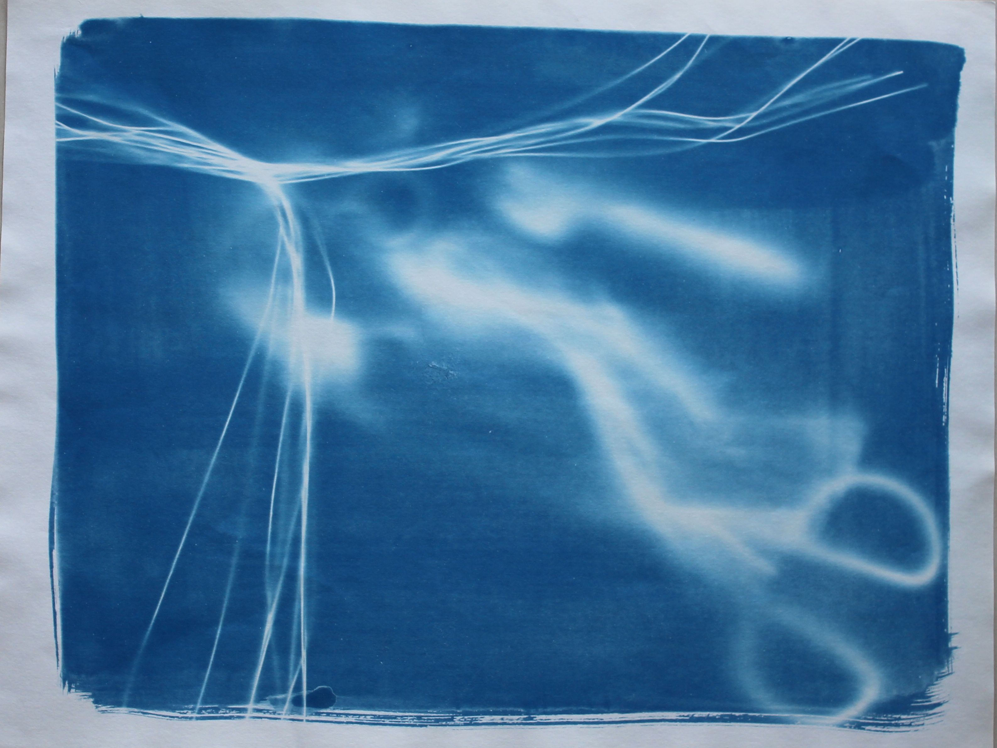
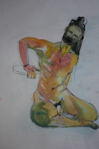
By leaving some ink on the plate, that too can be marked, written into. Wet paper soften the deeply etched Dremel lines, and makes a contrast with the sharper ones. Where the Dremel has bitten deeply, there’s an open bite effect where a thin line is left uninked as the pigment is held by the edges of the gouged line. The cracks though, create all sorts of different effects- they are organic in a way, that is, they make sense, as they have happened naturally as a response to pressure on the material. The ink sits in them in different ways, depending on how deep the break is and whether the plate bends at that point.
This is quite interesting.
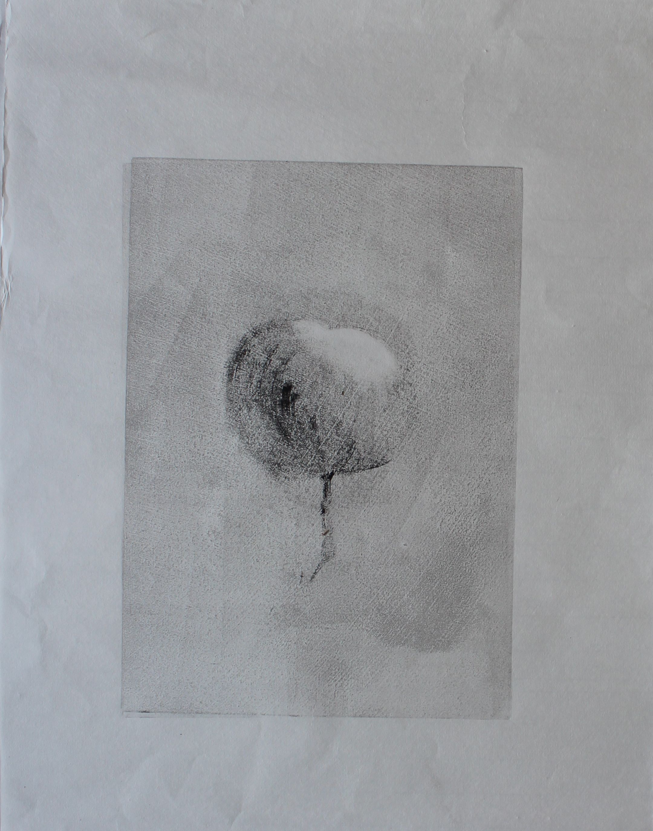
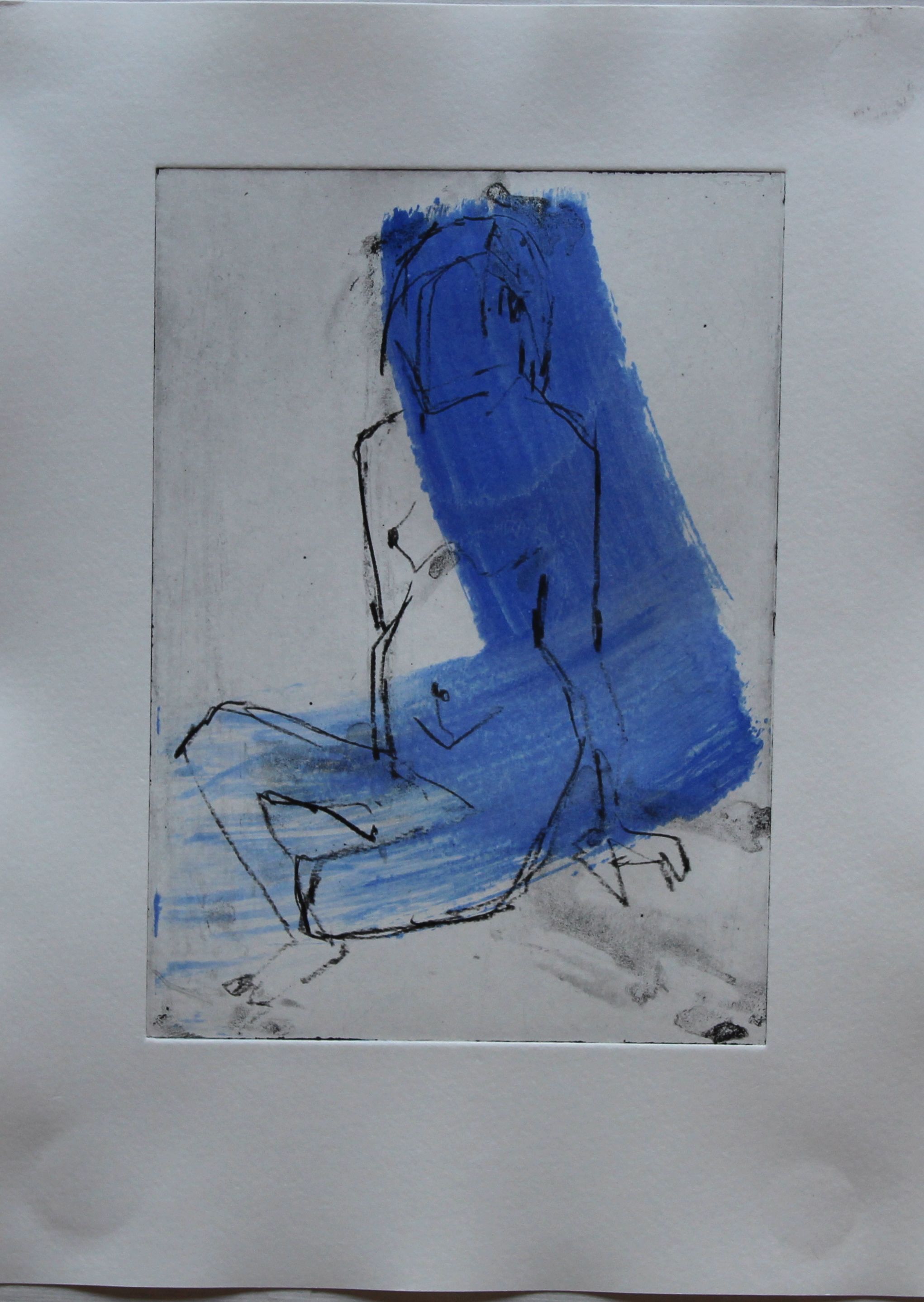
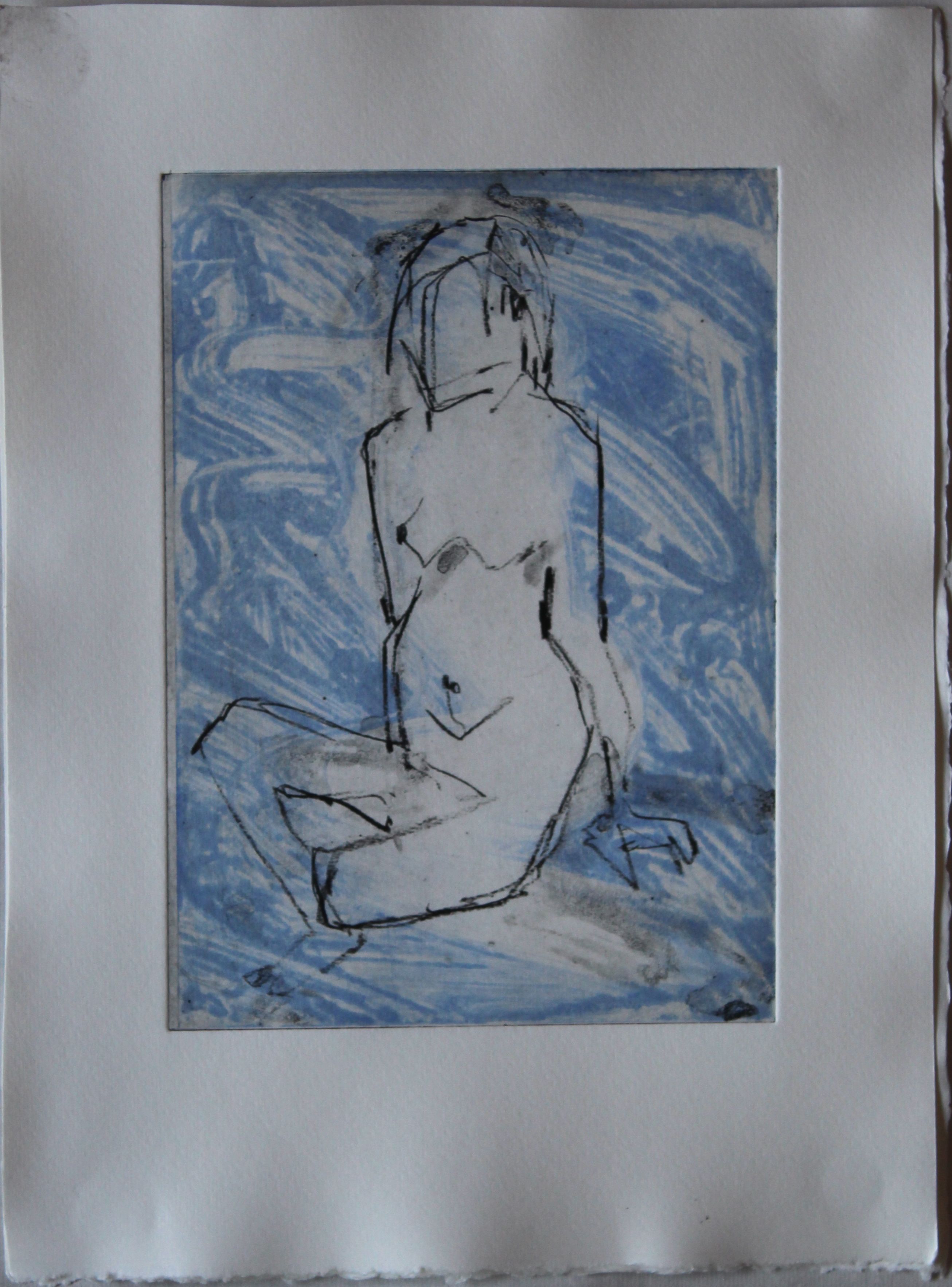
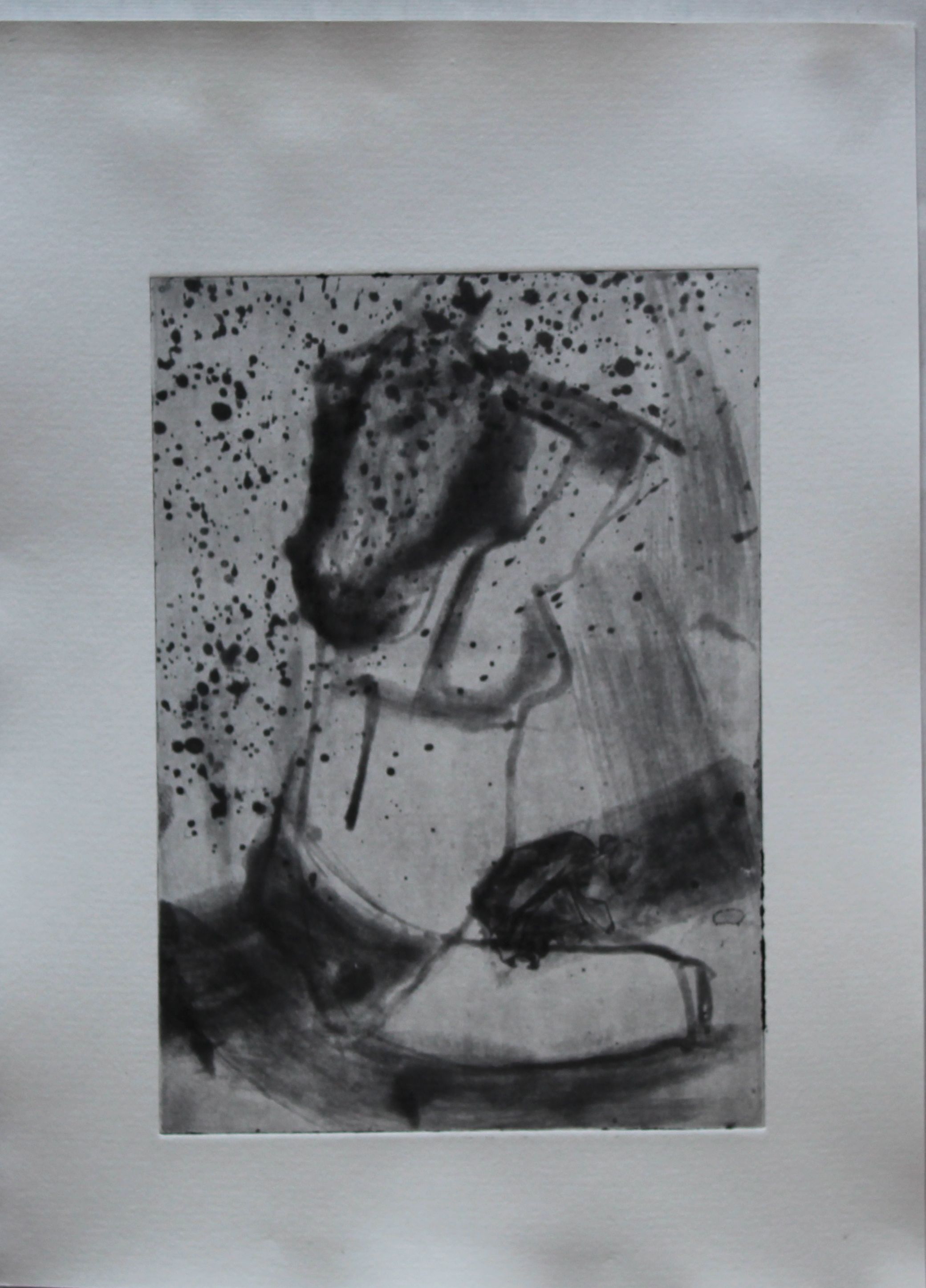
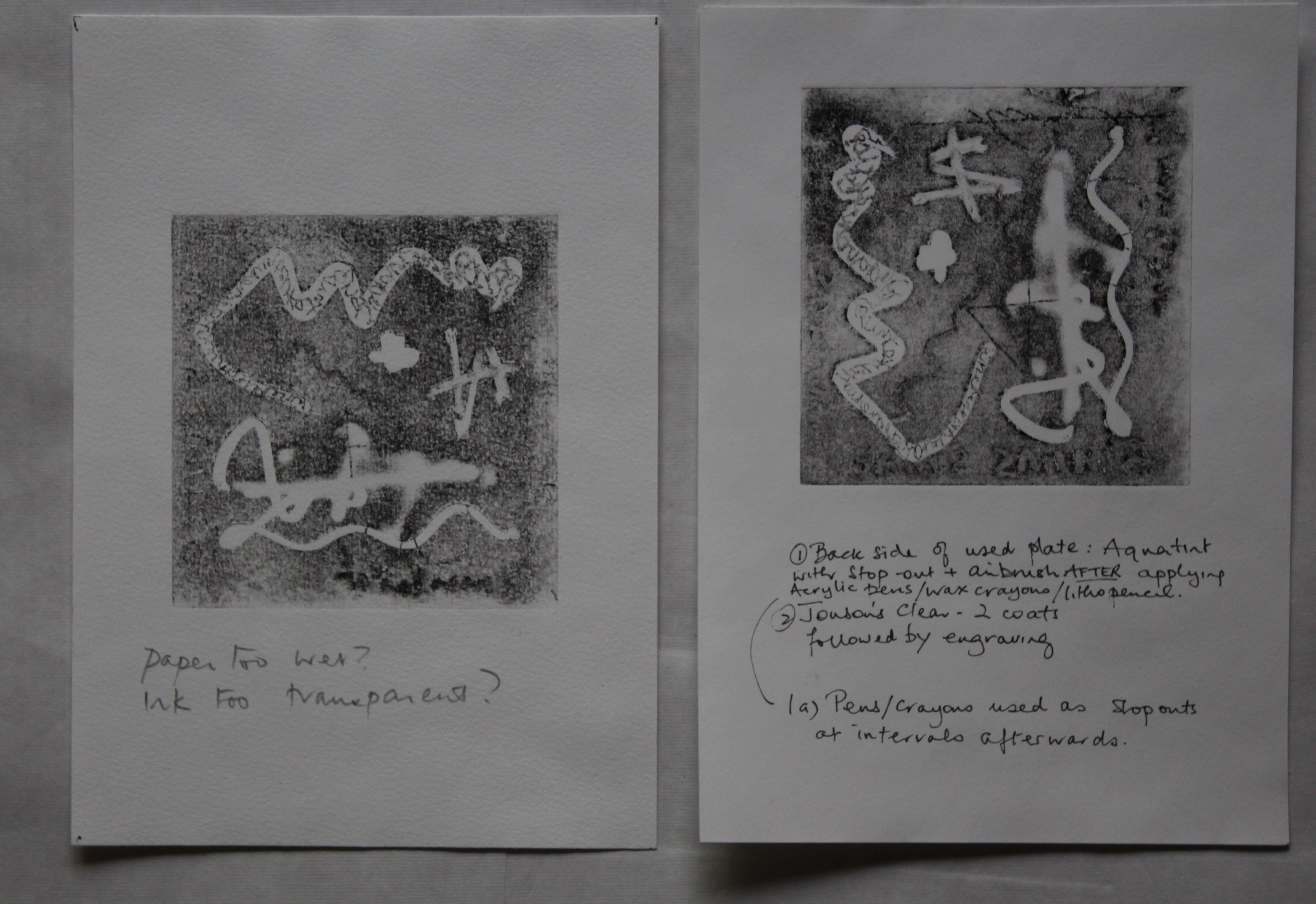
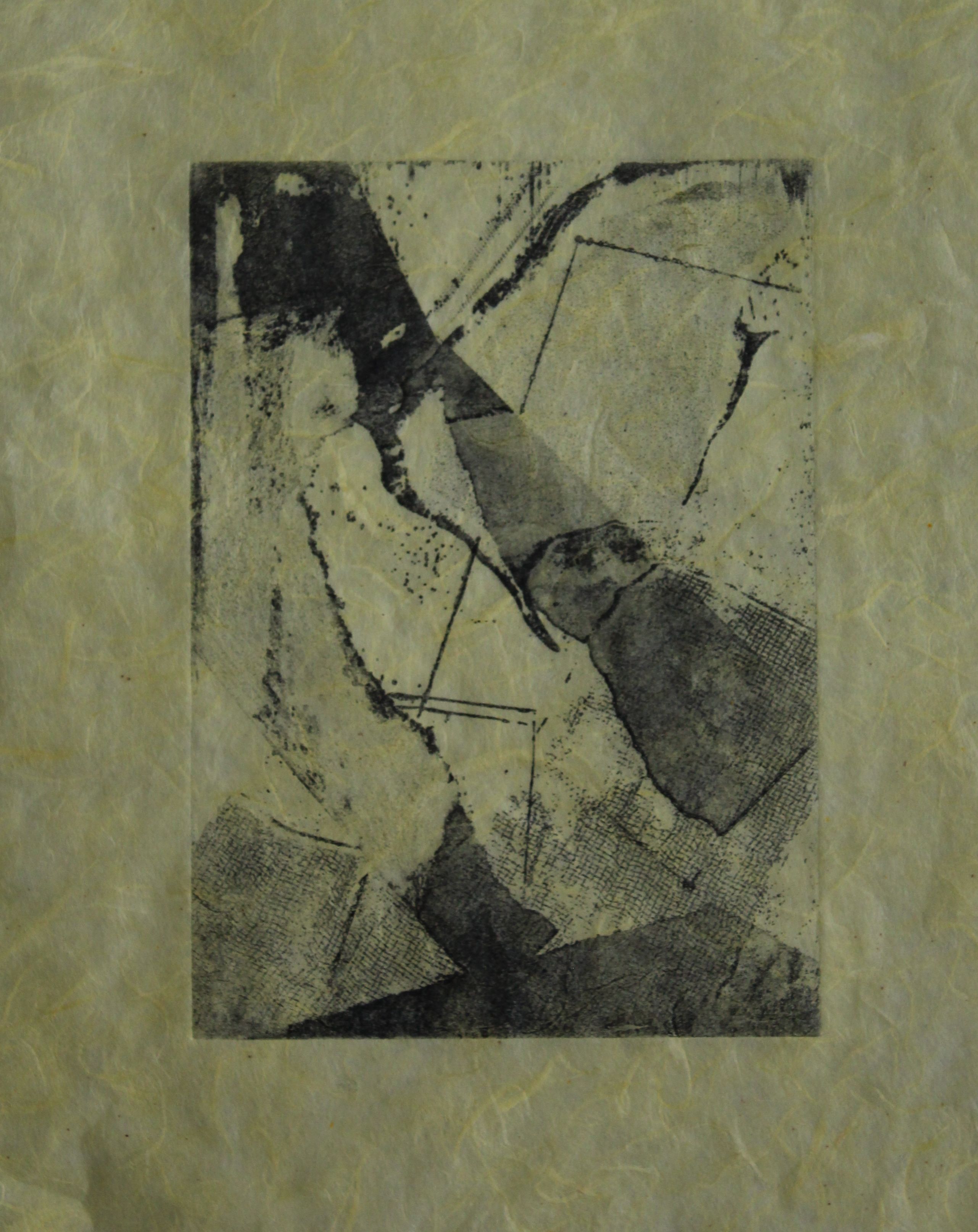
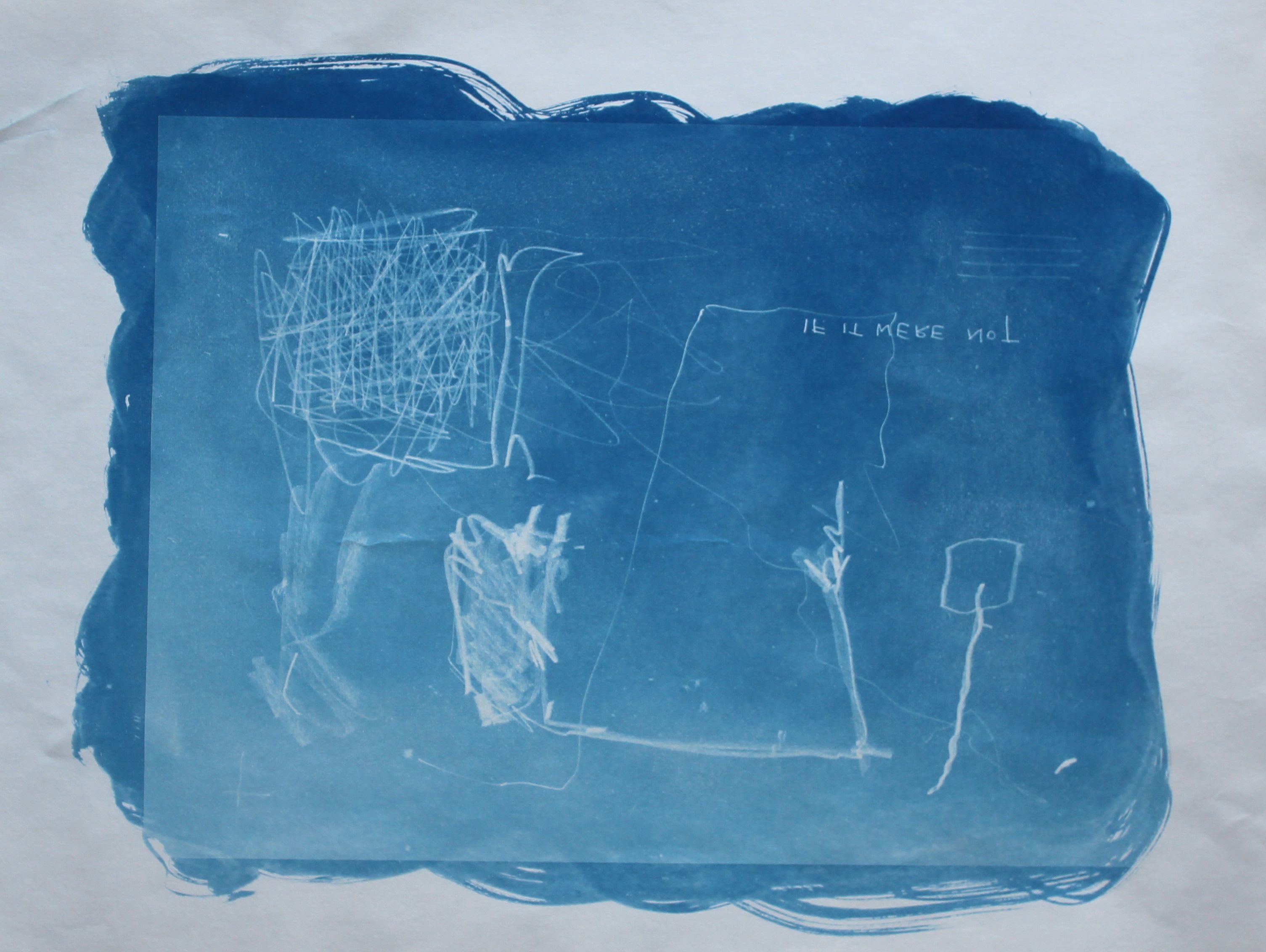
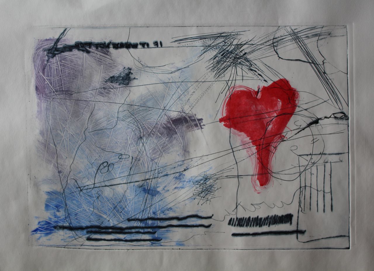
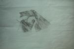
Another sheet of plexiglass (annoyingly not cut to the same size) as a colour layer, quickly painted with inks, scrubbed, scratched into with a fingernail. Heart symbol painted, edges wiped and wetted slightly. It feels like conflict, miscommunication, love letters getting lost on the post, poignant.
I was wearing a Jean Michel Basquiat t-shirt, and may have been channelling that style: the primitive markmaking, childlike images. It could be interesting to match the layers and colour in the outlines.

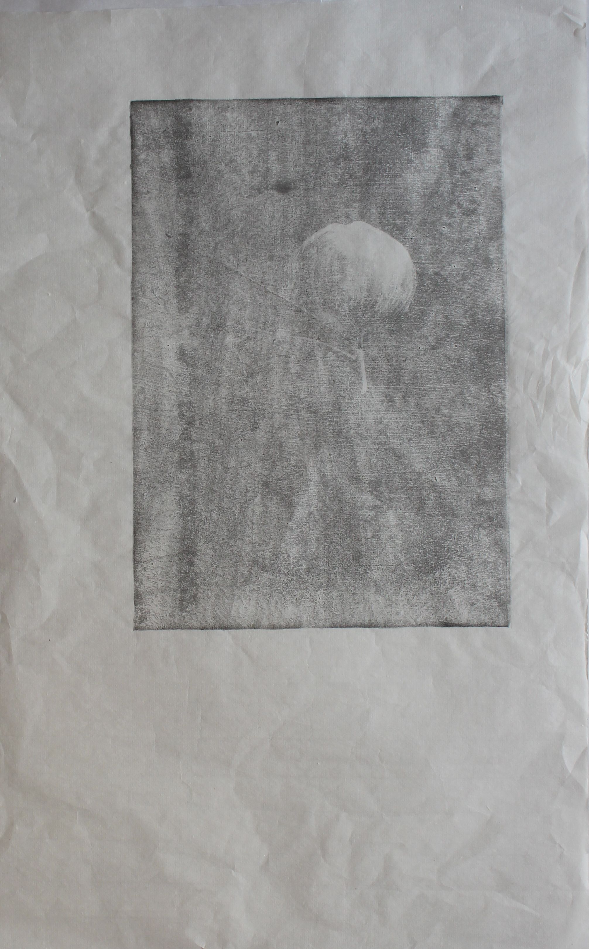
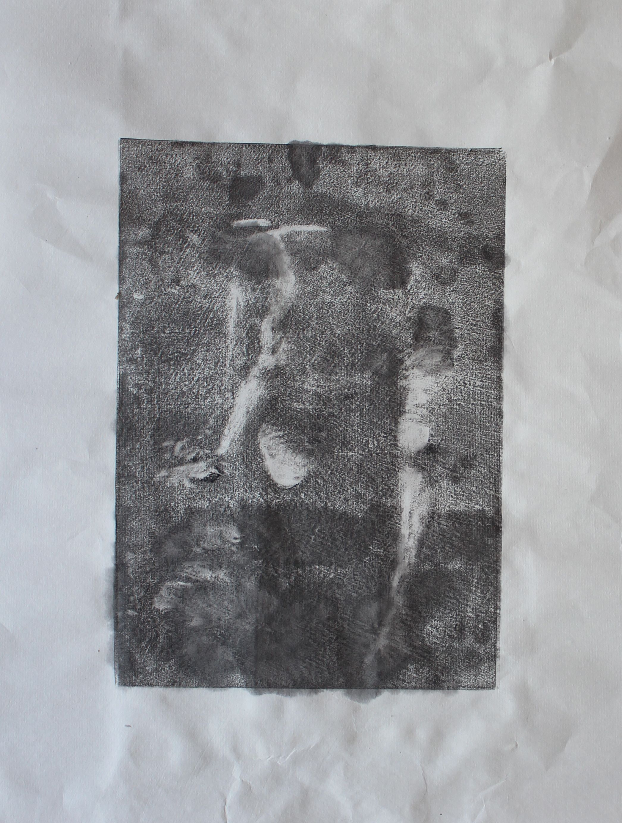
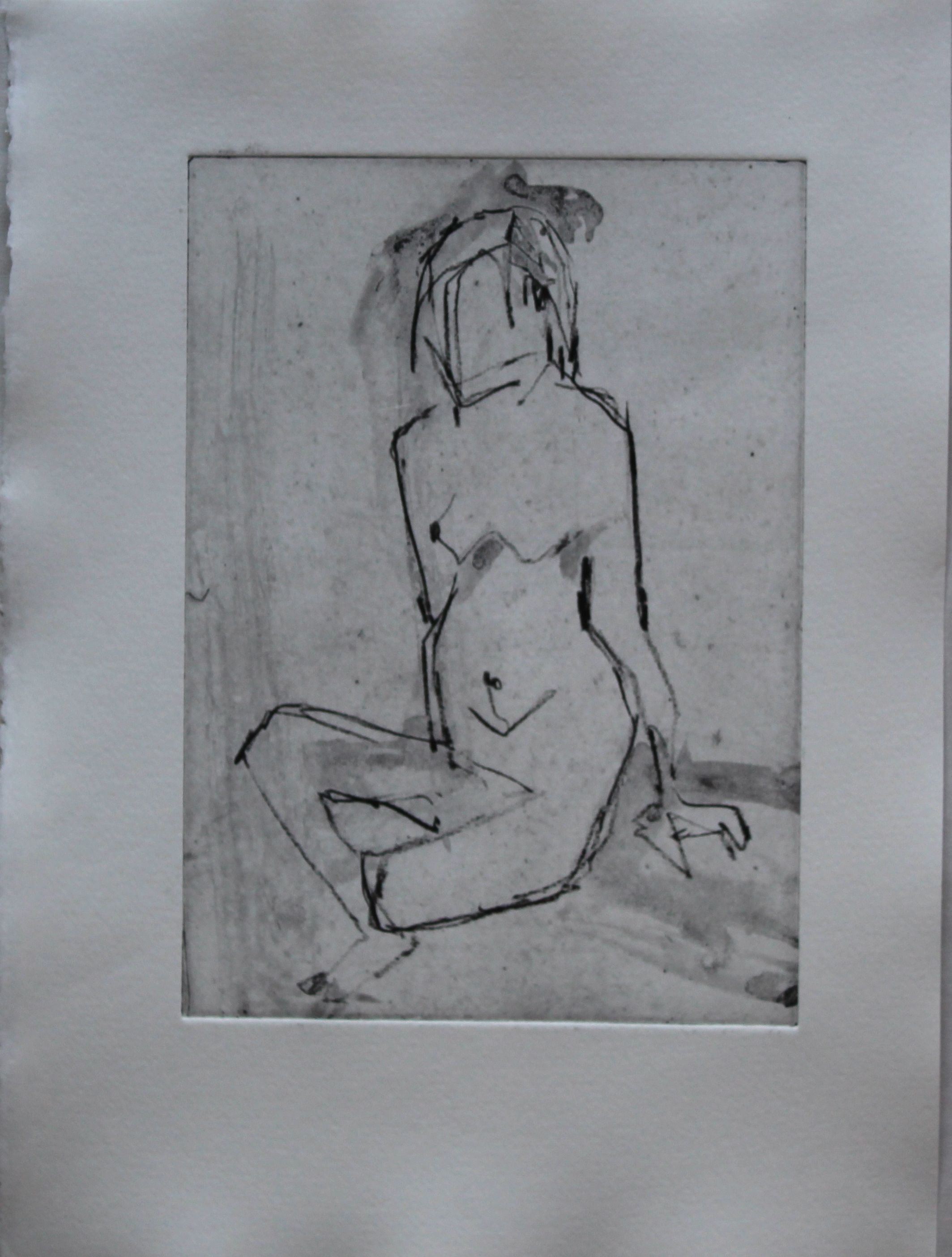
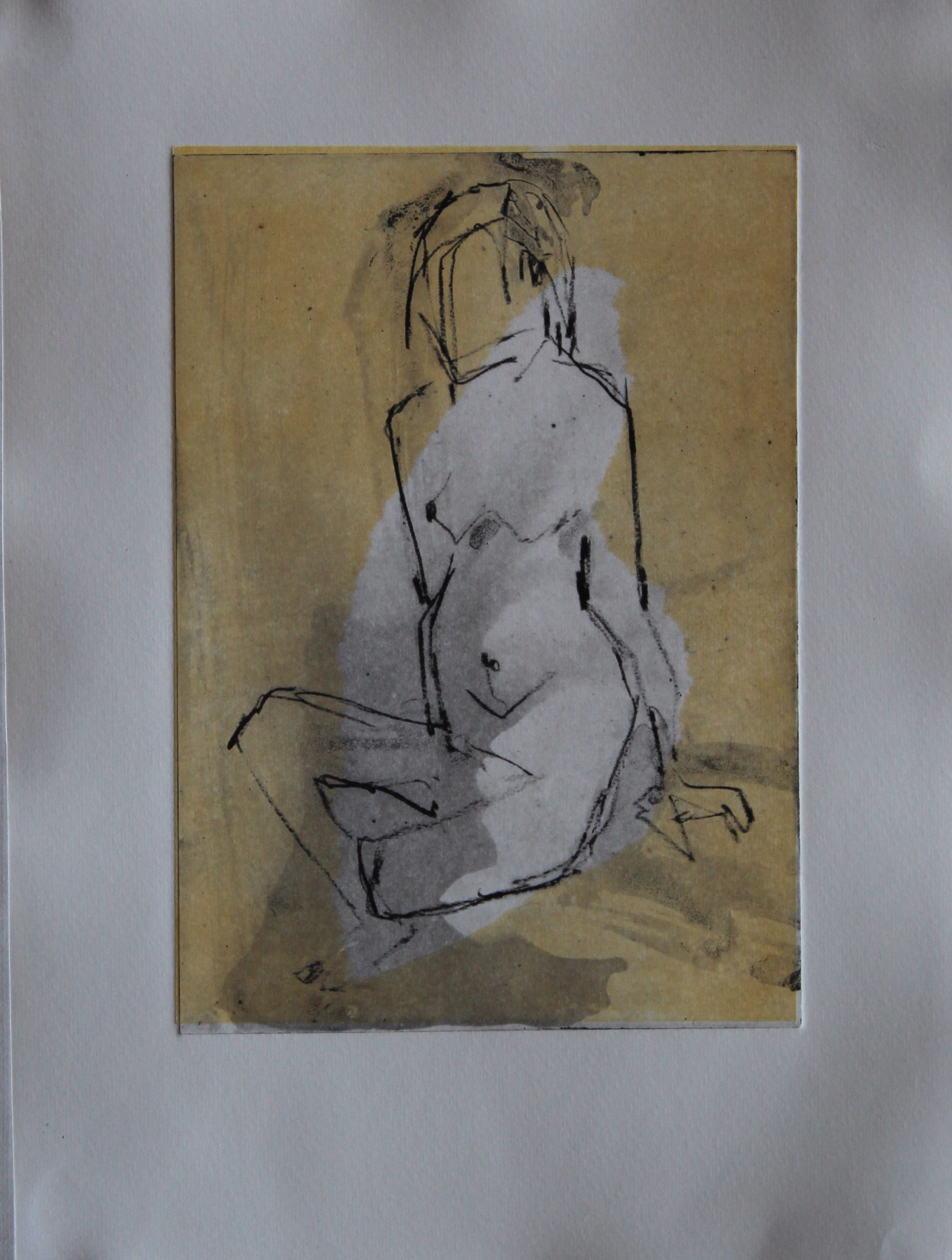
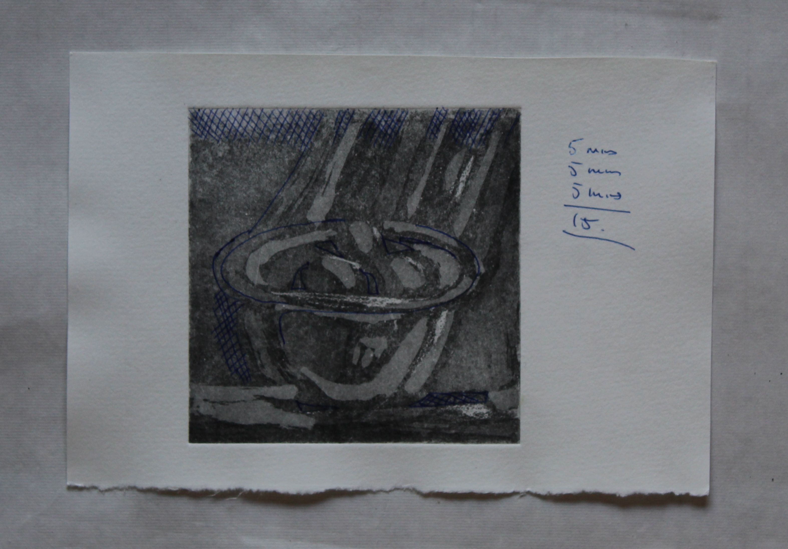
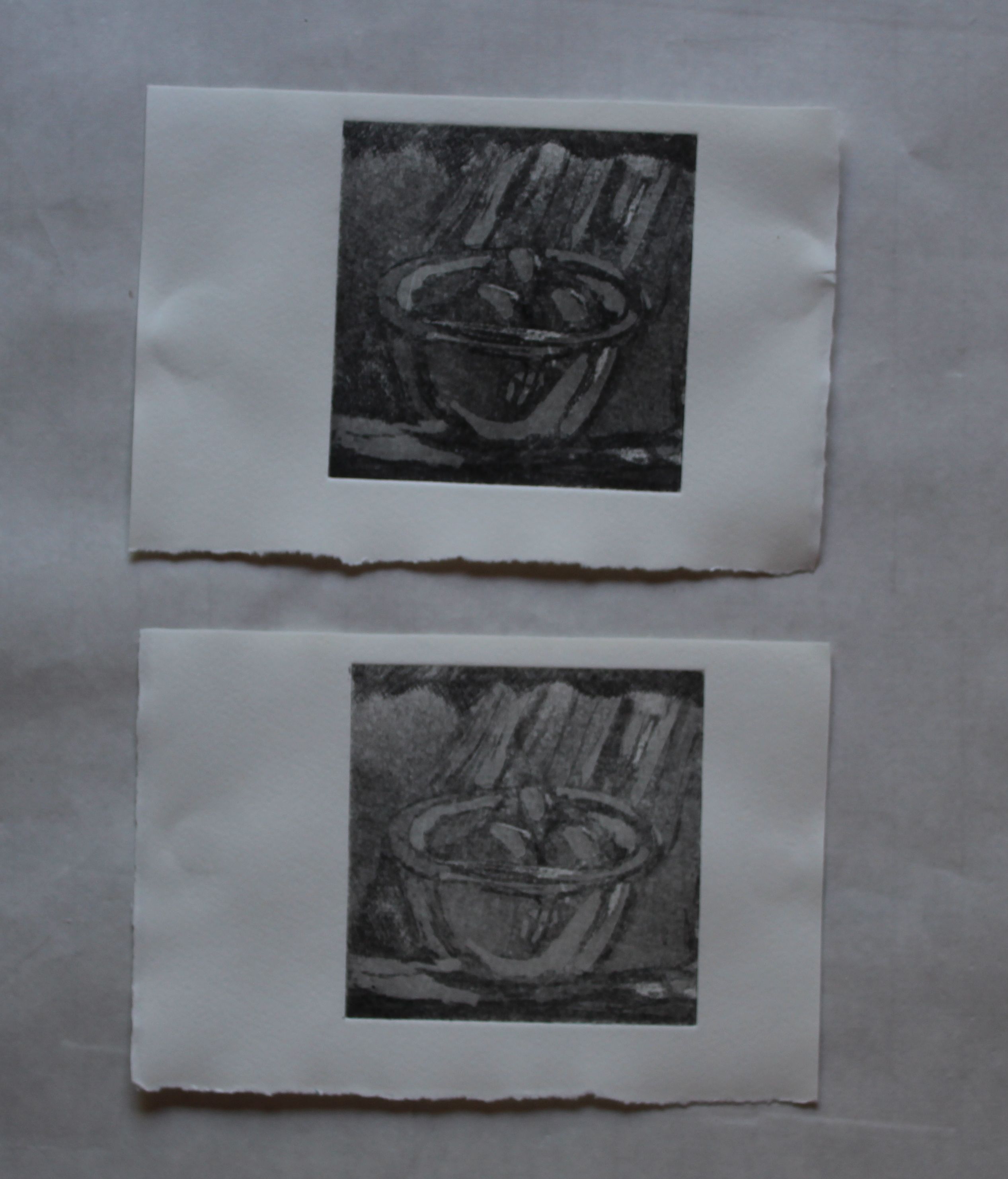
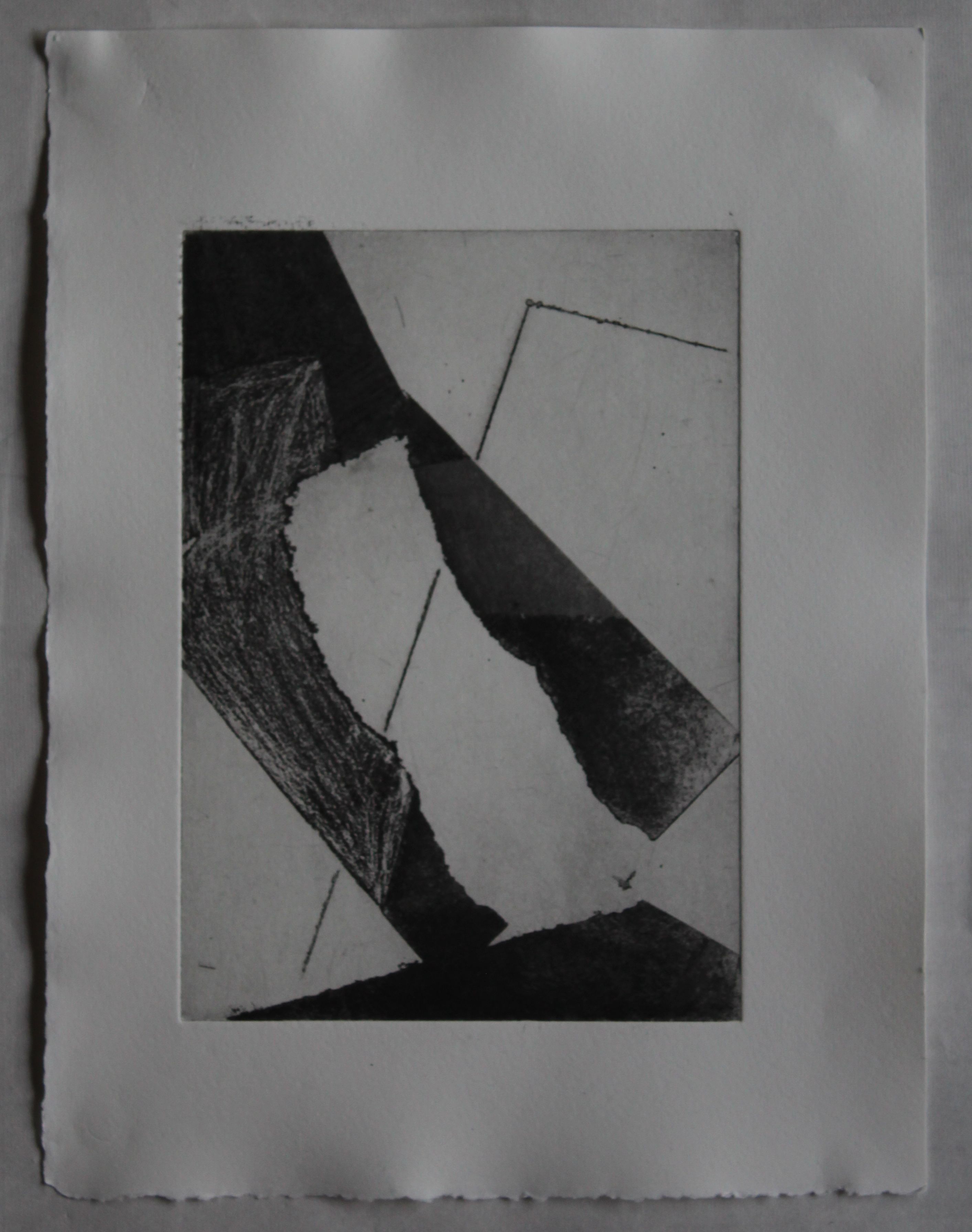
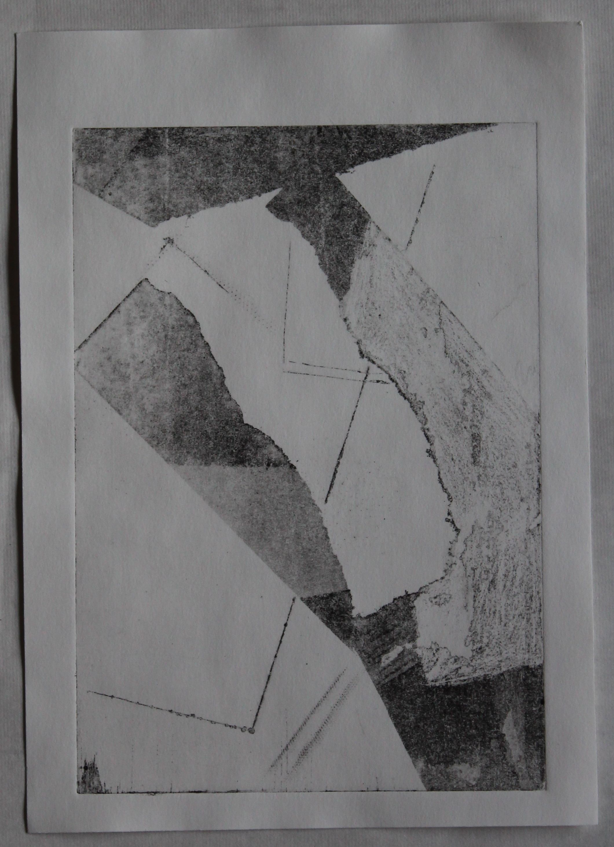
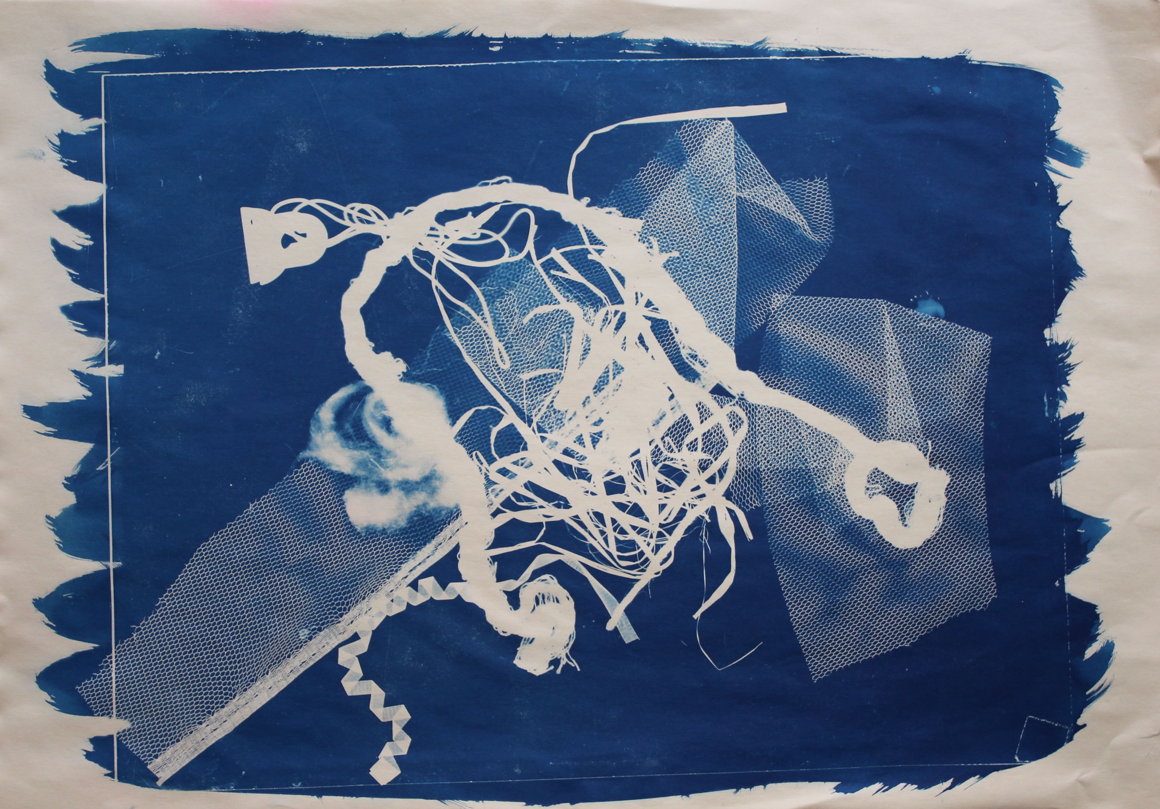
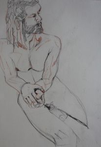
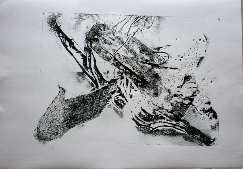
Intaglio and monoprint
This is the ghost print of the intaglio, and the lines are finer. The monoprint layer has accidentally- or not, depending on one’s view of what random marks reveal- turned into a map of the world.

This is something to come back to.