This is going to be my final piece for this assignment, as I feel it is getting to a point where it is segueing into another theme, one I want to explore in the final assignment.
This is still based on the photograph of my mother walking down the street- this is definitely my “Winter Garden” photo (Barthes, Camera Lucida, 1981). And I think I have come closer to understanding what it is about the image that appeals to me, apart from the space it has left to ponder the nature of photos and portraits, the viewer, the photographer, and the subject.
As I’ve discussed, the photo is a moment both in time and out of it, of a subject both dead and alive, a little time capsule, a museum object, yet in Barthes’ strangely phenomenological terms it is “authentic”, a guarantee of the existence of the subject, and as such it makes the past certain. It is both a product of and a testimony to time. I have been considering these ideas in relation to Zen Buddhist concepts, which often express their opposition to Western dualism in paradoxical phrases which attempt to conjure up flux and singularity, and to deny the importance of space and time. They seem to be very different ways of thinking, but I was rereading TS Eliot’s “Four Quartets” and was struck by the similarity of language, in fact the way that Eliot seems to travel via Eastern religion and philosophy to arrive back at the Judeo-Christian tradition, “and know it for the first time”.
Eliot describes “the moment in the rose garden”, when enlightenment occurs, when past present and future coalesce, when we attain a “little consciousness”: it happens in time, and becomes a memory, although it seems to be a moment out of time. “Only through time time is conquered.” Wordsworth also wrote about “moments in time”, the Romantic experience of the Sublime which transcended time and place, the memory of which sustains and inspires. Eliot’s line is open to multiple interpretations, including the idea that by moving beyond time, time becomes unimportant, a more eastern perspective, or a more pragmatic reading, only by living, i.e. passing through time, and taking what it throws at us, are we undefeated by life.
I chose this quotation to go with the photograph, as it expresses the paradoxical nature of the image. It plays well with the content too- what gives the photo a narrative feel are the converging lines of the paving stones, which create a forward impetus, echoing the motion of the subject. The face is set ahead, clearly going somewhere. There is irony in the verb “conquering”, as my mother holds her brown paper parcel like a shield as if defending herself against the onset of the future.
But the image is of a moment, a brief one when a stranger noticed another stranger in the street- I feel as if the photographer is like the creator of the girl with the red dress in The Matrix, timing the click of the shutter, constructing this moment in the sun of my mother, and making a timeless object.
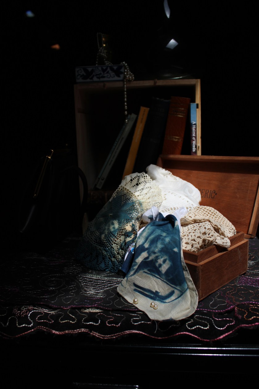
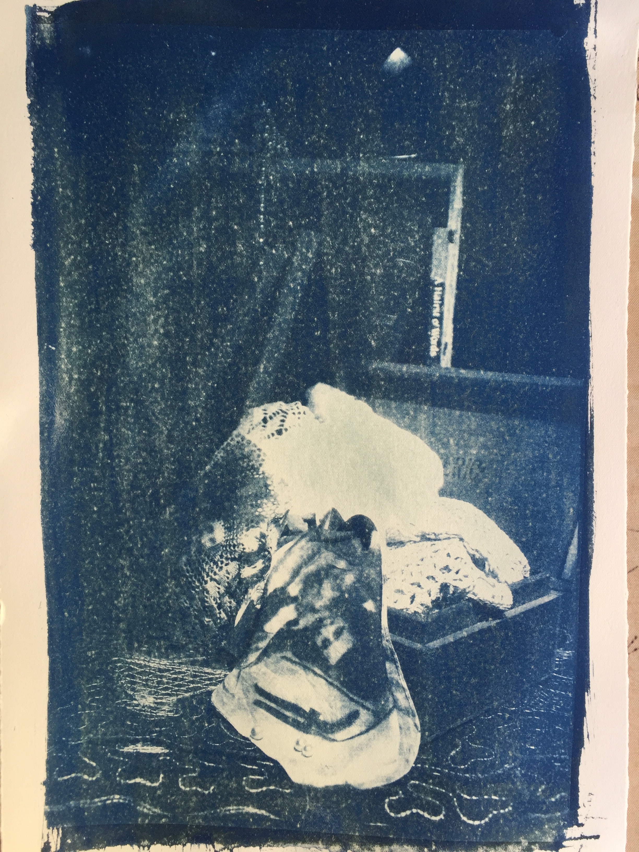
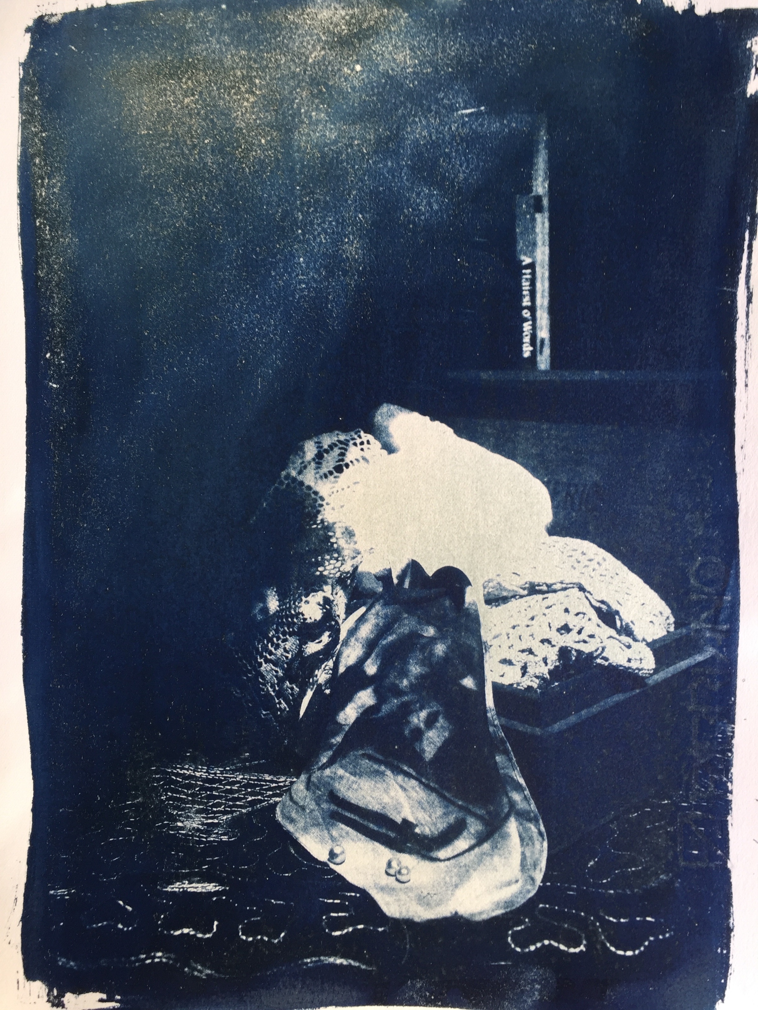
As befits a moment in the sun, a cyanotype seems a good choice, and so I made a double negative of the image and the text, but left it in the sun for a long time so the the blue would be intense. There may be some reaction to sizing in the paper (Fabriano Rosaspina) which is giving the browned effect.
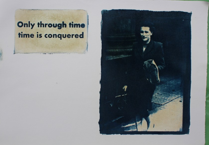
Only through time; cyanotype on paper, A4
The text is there for its meaning, but it also attains object-status through being “photographed” in the sun, a captured idea, an insight. Poetry is text as object, but the best goes far beyond that. The shape of the text, its font, are meant to evoke a memorial, a plaque, or inscribed stone, which fits the subject. The repetition of the word “time” has a nice parallelism and a sense of the paradoxical.
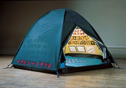
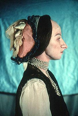
It could be said that there is an element of the internet meme in it, the picture plus the pithy text, but I’m not sure of that adds or takes away. I am more inspired by the work of Ian Hamilton Finlay though, the memorialising effect of his writing in stone, and his elliptical texts. His allusions are not obvious, for example making reference to the French Revolution, or to his local council. On the other hand, his images of boats, and use of the registration numbers of fishing vessels resonates with me, as I was brought up in that community, so there is a nice feel of both the familiar and strange, which I am also trying to create here. In this example, “Sea Poppy”, the registration numbers, unemotive, bureaucratic factual things, become juxtaposed with the idea of a flower, a poppy, associated with loss, and memory. The circular layout is reminiscent of the boat’s wheel too, so that it becomes a kind of concrete poetry. The fonts here are mixed, serif and sans serif, bold and simple, which creates the undulating effect of a flower and its petals.
The font I chose was solid- partly to do with the practical limitations- it had to be clear. Hamilton Finlay often uses “Trajan”, a classically beautiful font which is favoured by stonemasons, and which is appropriate for his stone carvings, but his screenprinted images use a variety of styles.
Anyway I was delighted with this image, I must say.. Maybe because it has a note of triumph which feeds my emotional needs, but I also think the combination of subject and medium are in harmony, and the feeling of memorialisation is appropriate.
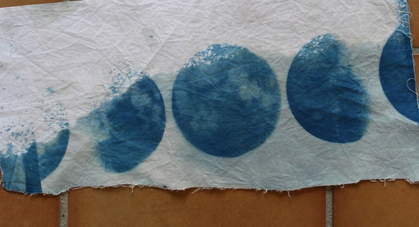
I did of course play around with variants, using different washes, bleach etc.
I also tried out another quote from The Four Quartets (a bit spoilt for choice), and used one which contains paradoxes and dualism to suggest a state beyond language, and a place beyond normal experience, “the still point of the turning world”; I started this quote in mid phrase to imply the break in the flow of experience, the moment out of time.
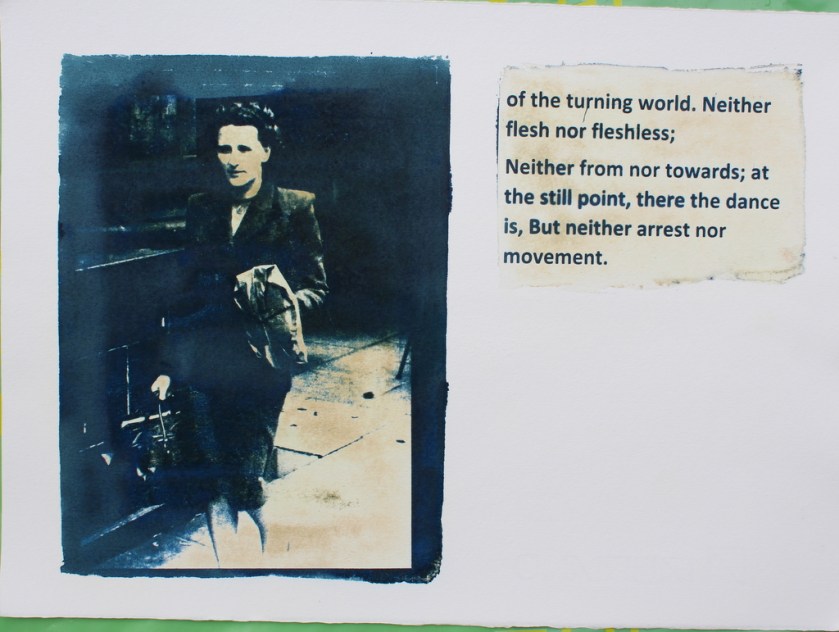
The still point, cyanotype on paper, A4
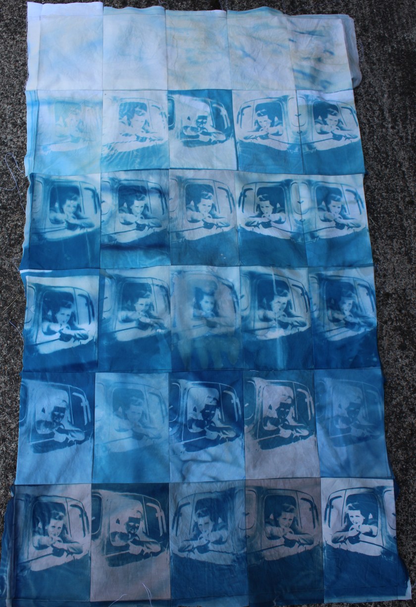
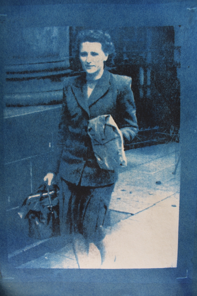
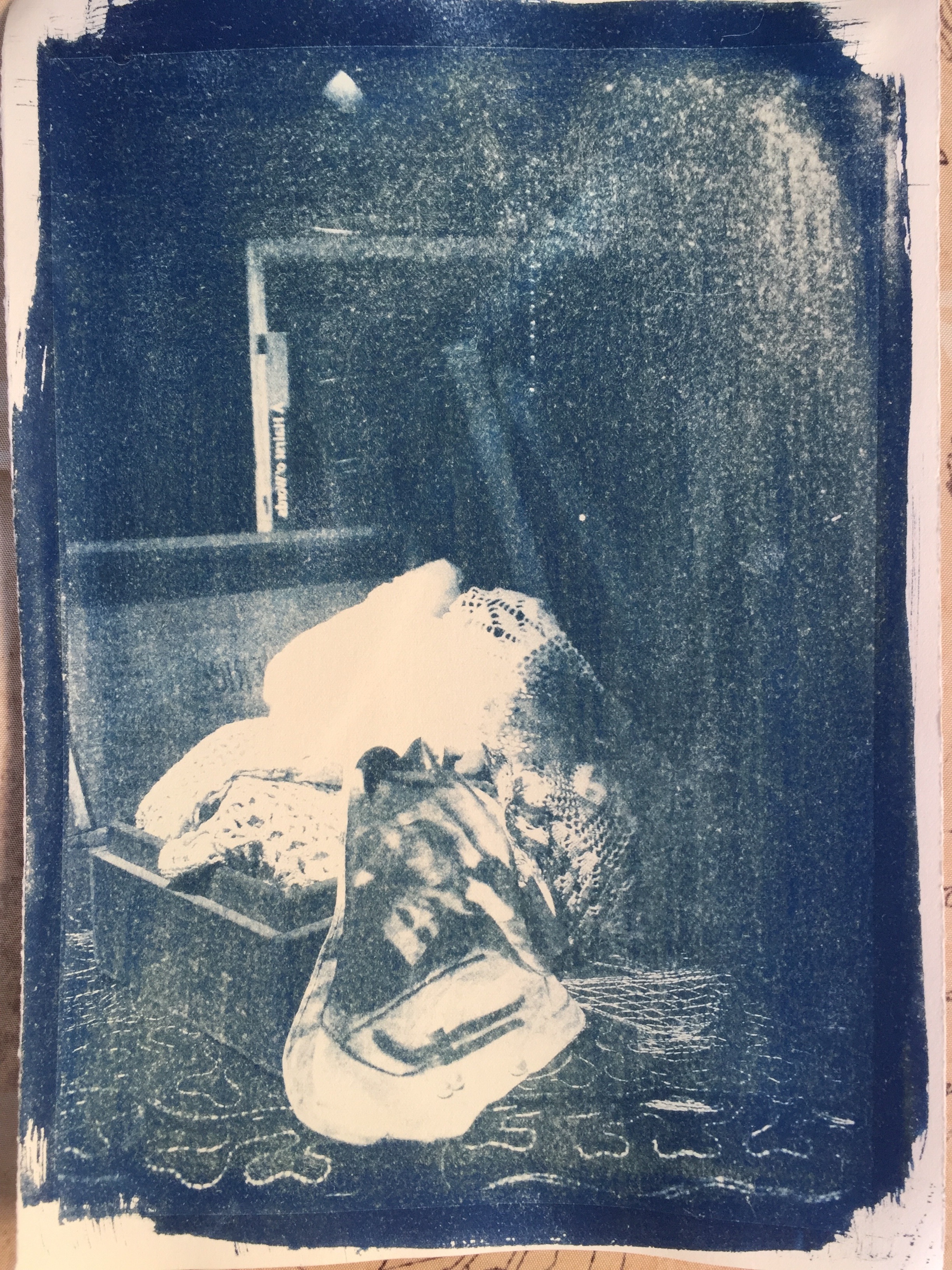
Also, I decided to try adding a second “moment in the sun” by overprinting a photopolymer positive, to enhance the cyanotype (based on a negative). This was difficult to register, despite my adding registration marks to the cyanotypes, but I thought it was a good development, adding depth and solidity to the image. The one below was the only absolutely perfectly registered one I managed- to do this correctly I would need to make sure my original image on the plate had a naturally occurring border, or an image that goes to the edge of the plate. My solution, making registration marks, is ok, but needs the cyanotype area to be big enough to make the registration marks visible, which they then are…
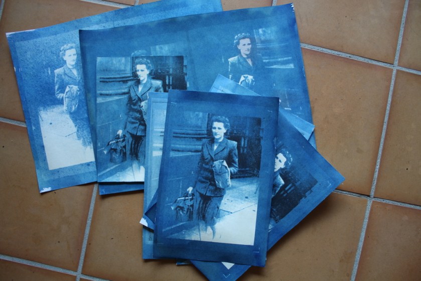

Using bleach to create different colours

Less exposure to sun for lighter colour

Red wine development- but the paper stained

Only through time; cyanotype on paper, A4
Finally, this one worked best. Because it combines positive and negative images in two printing techniques, it brings out a 3-D effect. The image, from having been flattened, and objectified, now gets a new life. I like the sense of circularity it creates for me, too. I have made my more more “present” in this image. Technically it is an improvement on the simpler version, and the note of triumph in the text is an appropriate emotional conclusion.

Only through time 2, cyanotype and photopolymer print on paper, A4
![Sea Poppy I [collaboration with Alistair Cant] 1966 by Ian Hamilton Finlay 1925-2006](https://christine-bruce.com/wp-content/uploads/2026/03/4a980-ian-hamilton-finlay-1966-sea-poppy.jpg?w=840)