These are images made using photopolymer and copperplate etching techniques.
I wanted to use image and text, to make a statement about memory and the power of images.
This was a very frustrating exercise, as I was desperate to use photopolymer film, as a means of reproducing the photo I has decided to work with, but struggled to make it work. The text worked a bit better, but it was hard to get clear images using photopolymer alone, so I eventually etched using ferric chloride.
The slideshow is a record of trial and error:
Finally, I selected the most appropriate plate and text, a tw0-plate print in black and red oxide- both slightly unclear, which fits the meaning:
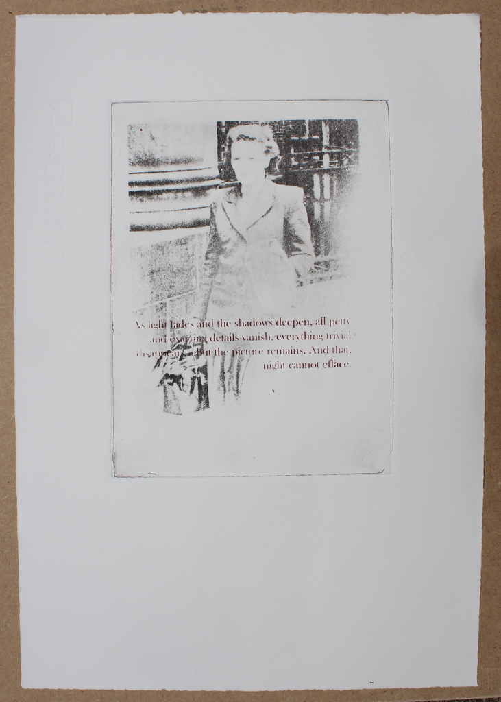
Photopolymer print on paper, 20 X 16 cm
Good things about this image: the fading, though quite accidental, fits the mood and the sense of the text, and the purpose of the exercise, to capture rapidly disappearing memories of my mother, who is entering the shadows due to dementia. The image, now very flat, has become objectified, and is no longer a very personal image. The person in the picture has become an everywoman, a generalised figure from the 1940s, and so more relatable to a wider audience than myself. The text itself is simple and thoughtprovoking, with a nice metaphorical sense. The font is classical- thinking of the typefaces used by Ian Hamilton Findlay- although that has issues in practice as the finer lines are often lost in the process.
Negatives; I feel the text is a bit “telling”, too direct, and I would next time choose something more elliptical.
