At one stride comes the dark.
Well, this topic is all about avoiding that happening, about graduating tones to make the dark creep in, allow light to create form by moulding itself to the contours of what it meets.
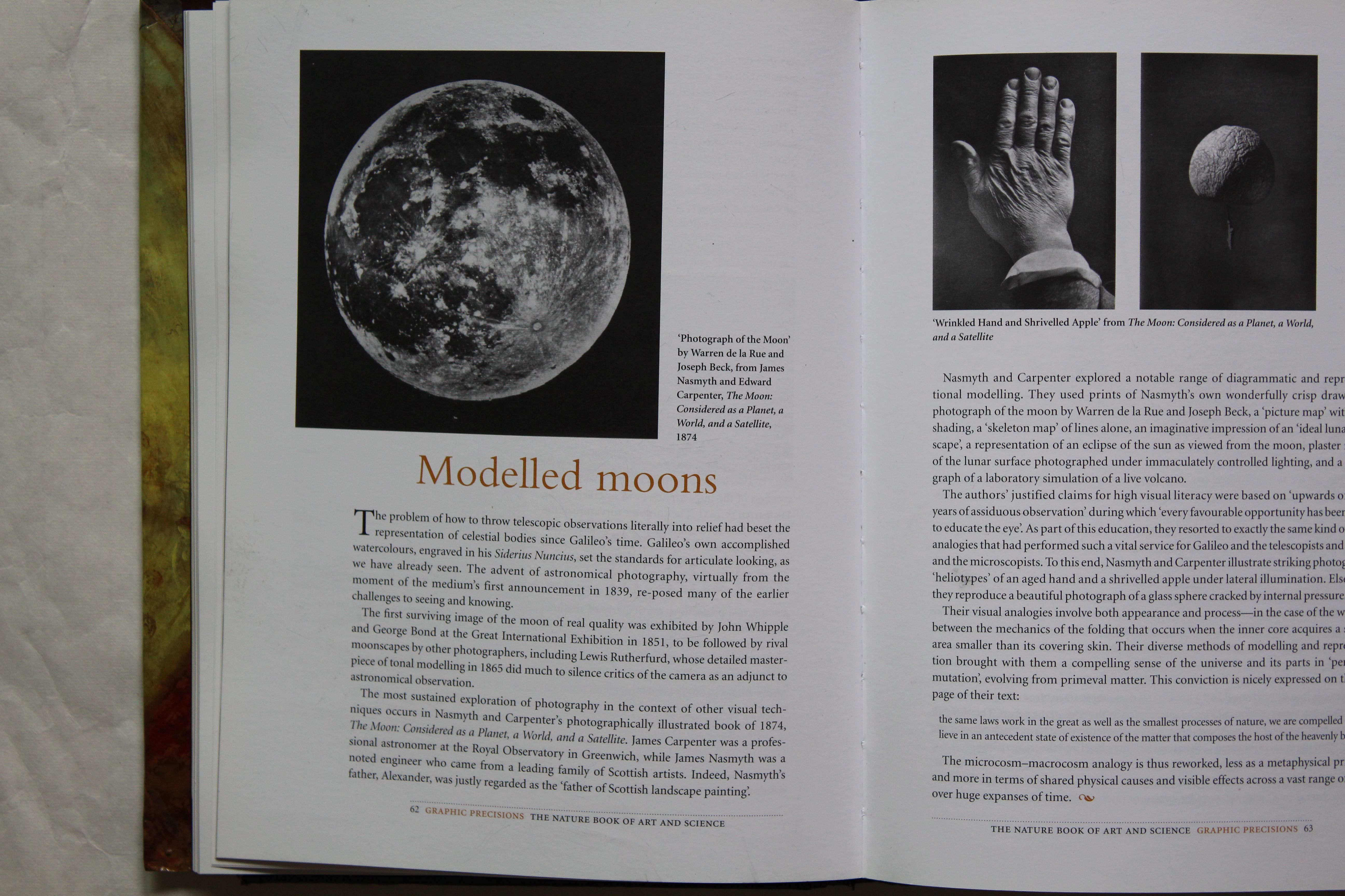
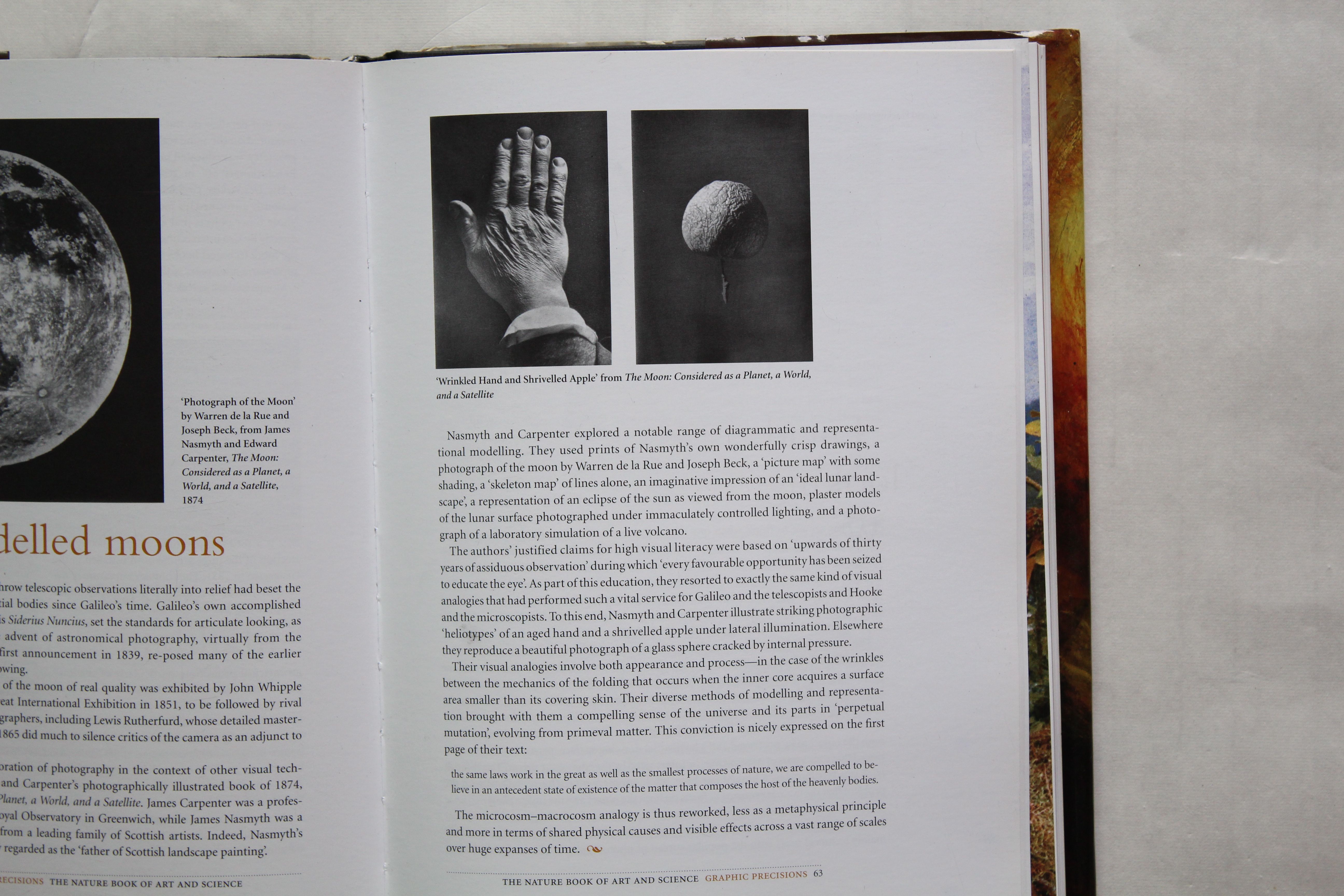
The inspiration for this series of prints was a book on Science and Art- “Visualisations” by Martin Kemp, which explores the use of analogical thinking in the development of Science. The particular chapter was one in which the use of lateral lighting in 19th century photography was used to create analogies with the moon, and thus to try to understand how its surface had been formed. The three images which illustrated this were very striking- an early, very clear photograph of a wrinkled apple, floating against a grey background, and a side-lit image of a wrinkled hand, and a stunningly clear image of the moon itself from 1874.
(There is more info on these images and the book they come from here: interesting!
The Moon considered as a Planet, a World and a Satellite
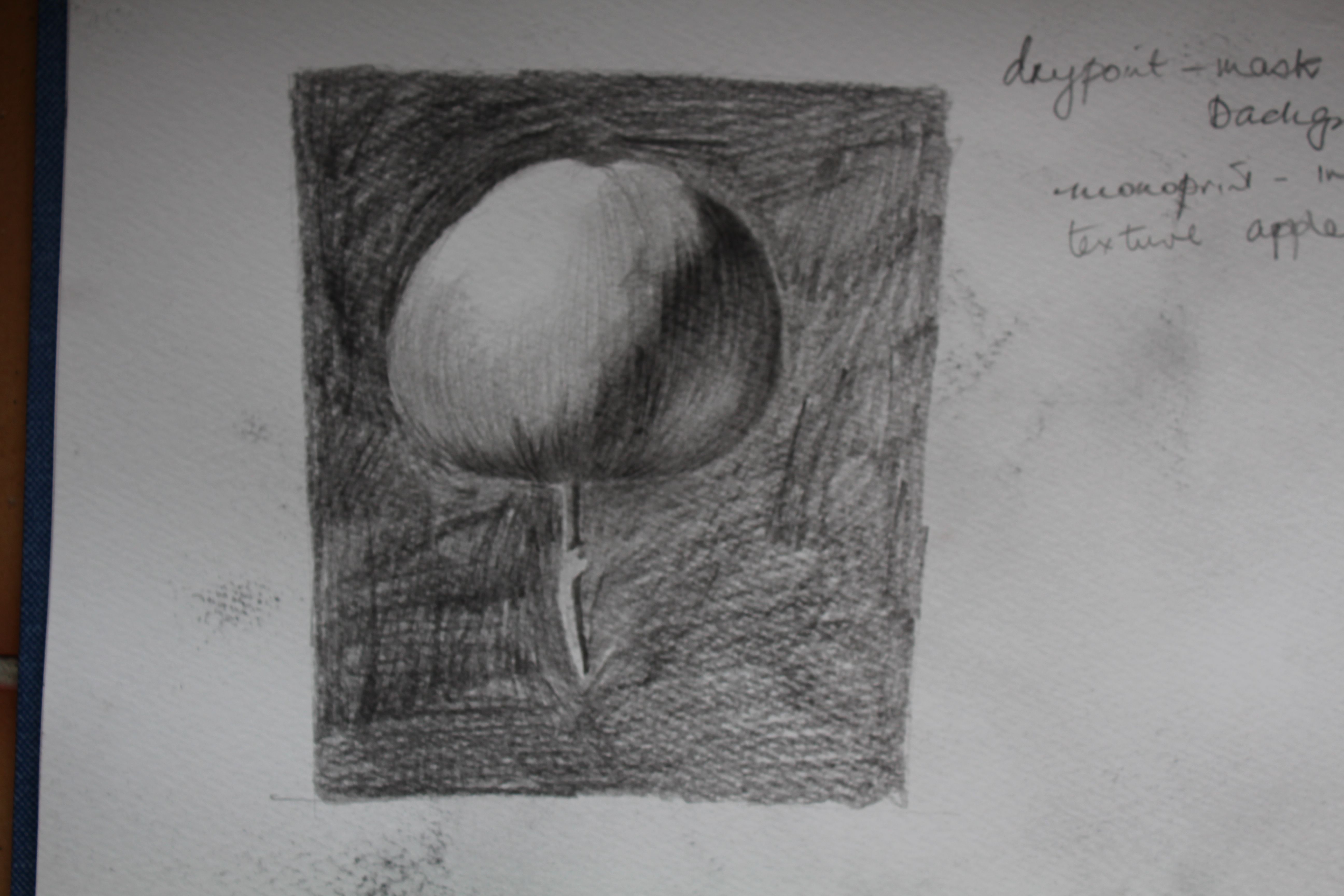
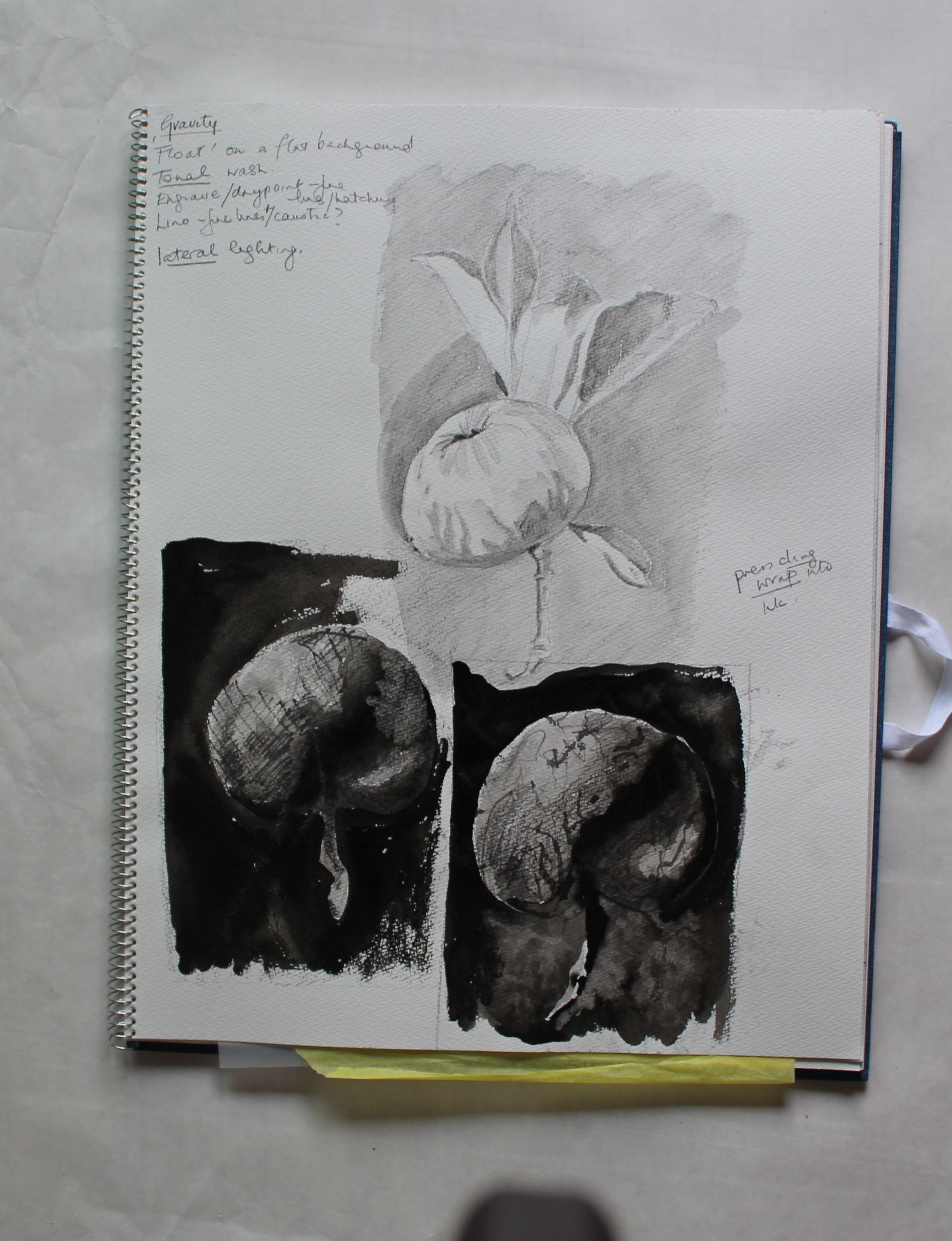
Newton’s apple
That impossible floating apple is very striking, and makes me think of Newton’s apple, and the apple of the Bible, and the idea of falling, and degenerating. And the coming of the dark. It’s a potent symbol.
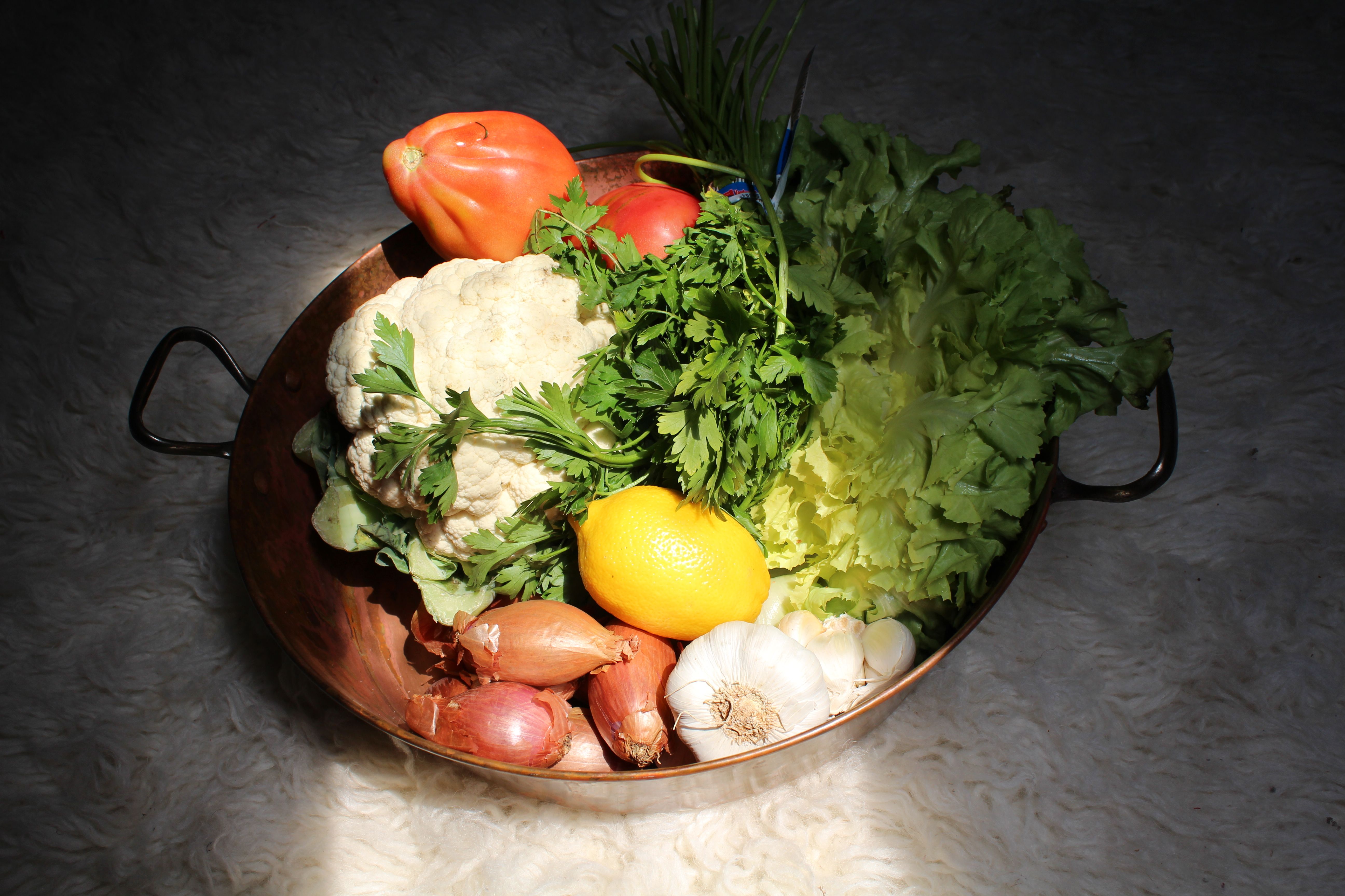
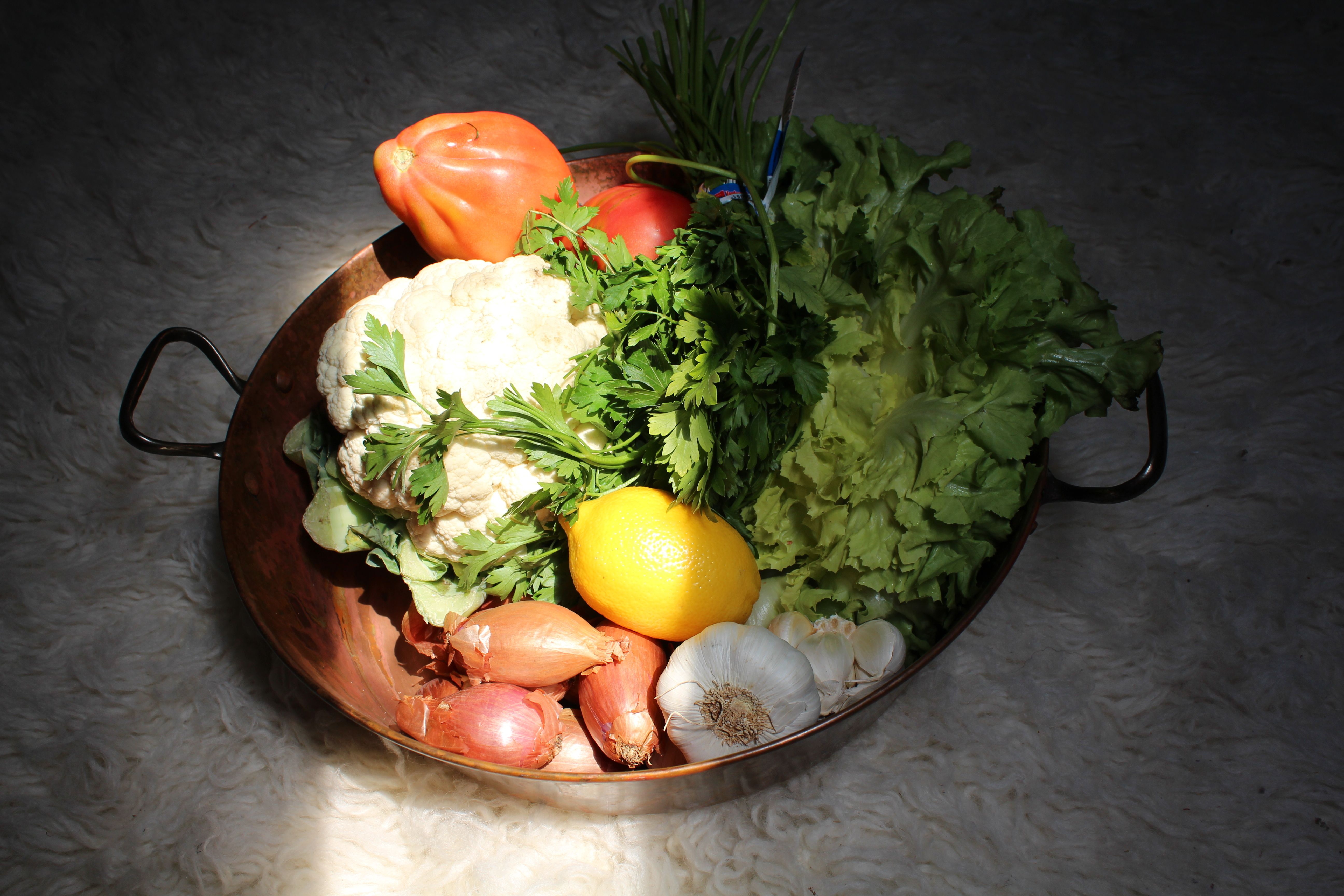
There’s also the fact that that’s a fabulous photo that would take some improving on. I started by recreating it with pencil, then sketching some real apples from my tree, and starting to think of ways to handle the subject matter.
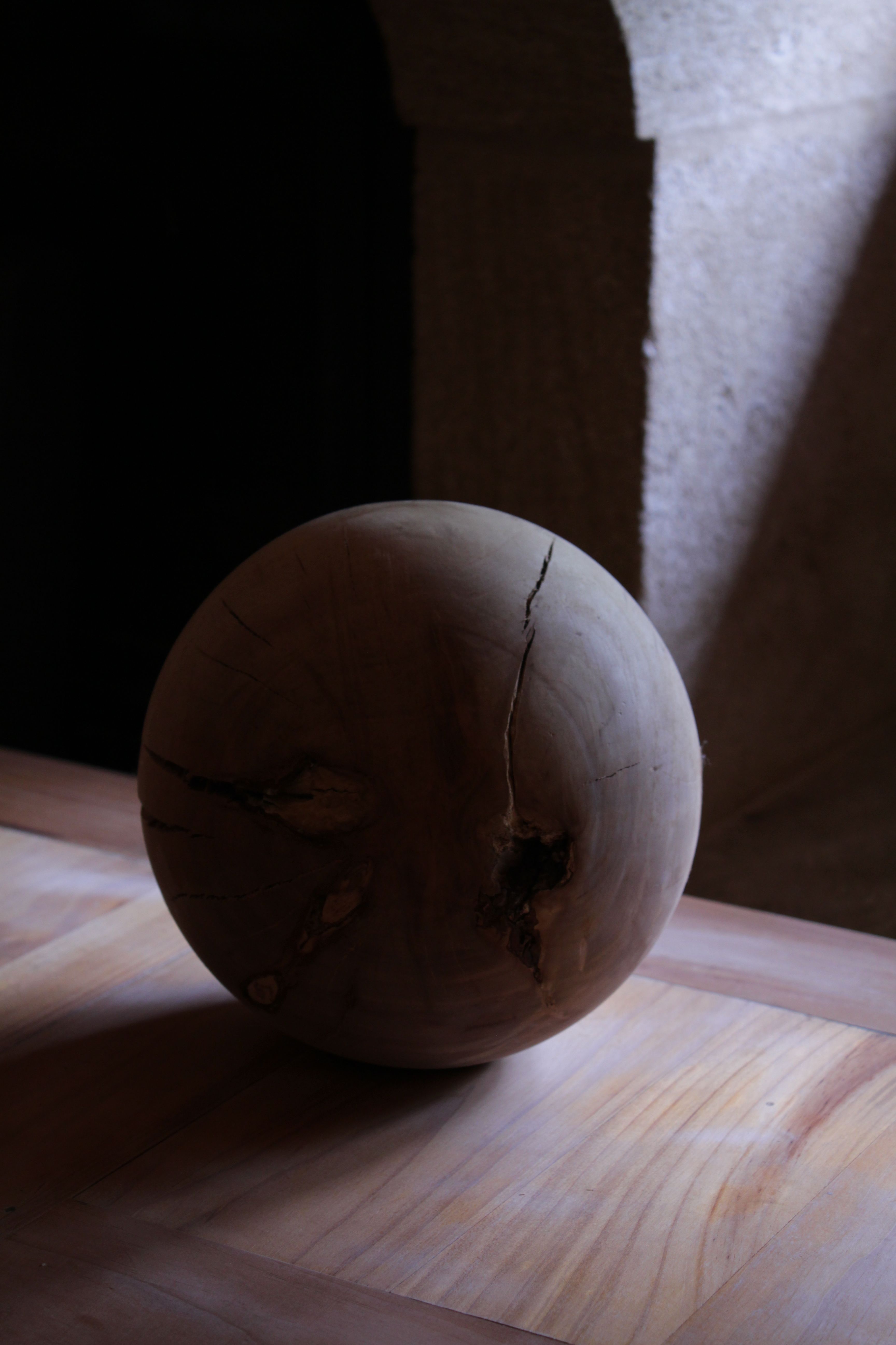
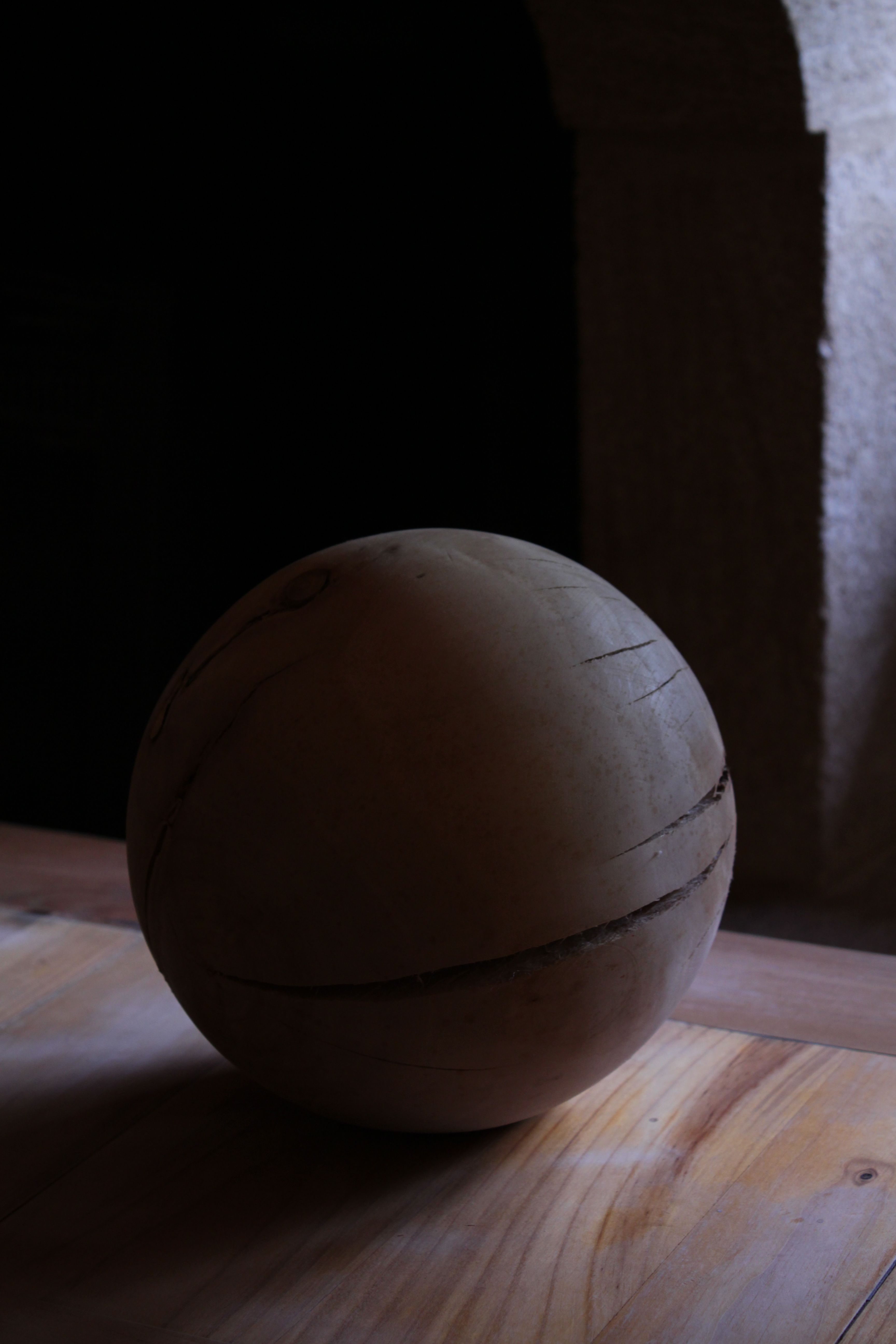
I also took some photos with directional light sources:


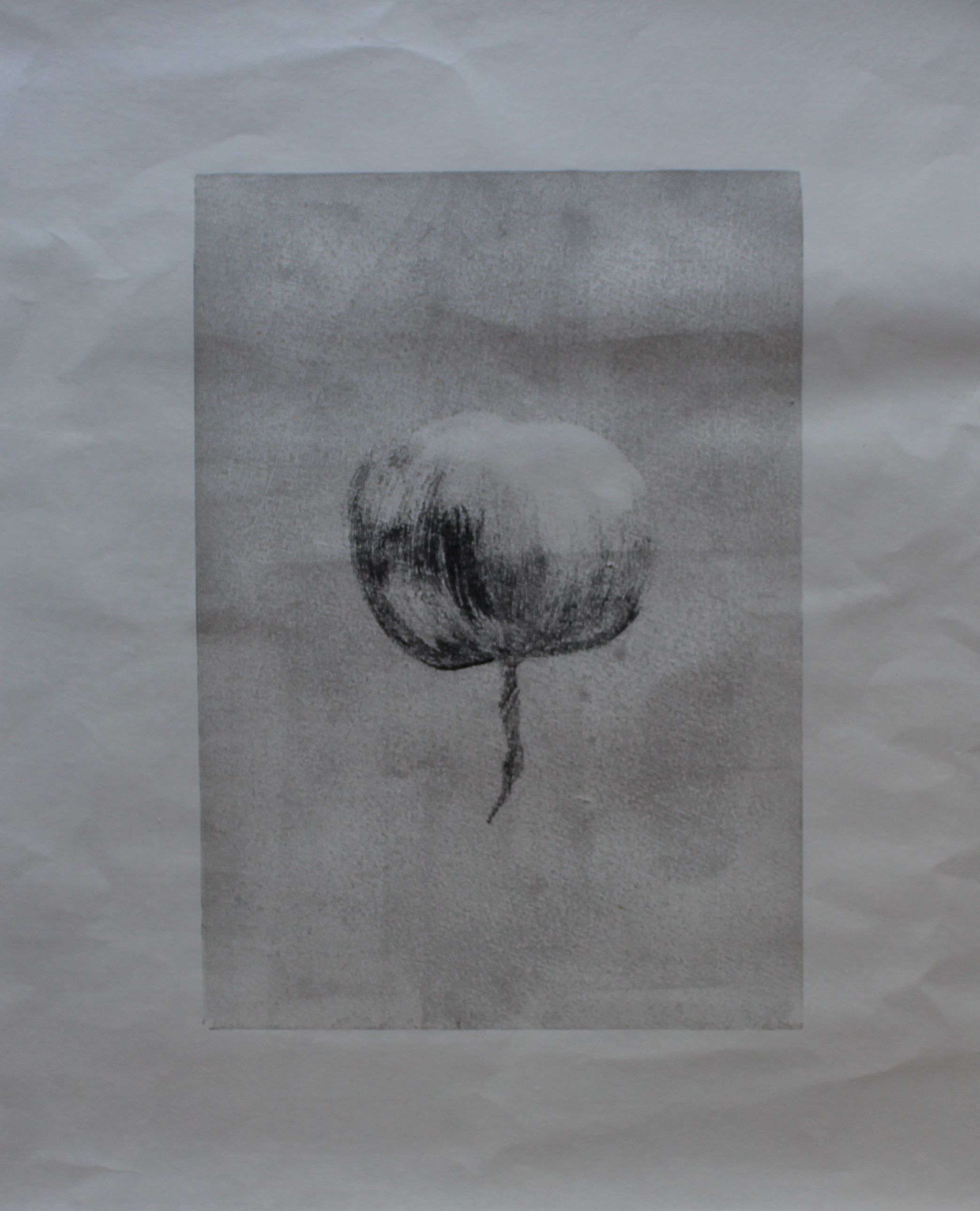
Monoprint
Still my first response, monoprint, , and felt that, with a mask, I should be able to get sharp edges that would make that lateral lighting work. Starting with a delicate wiping off, and trying to create more contrast:
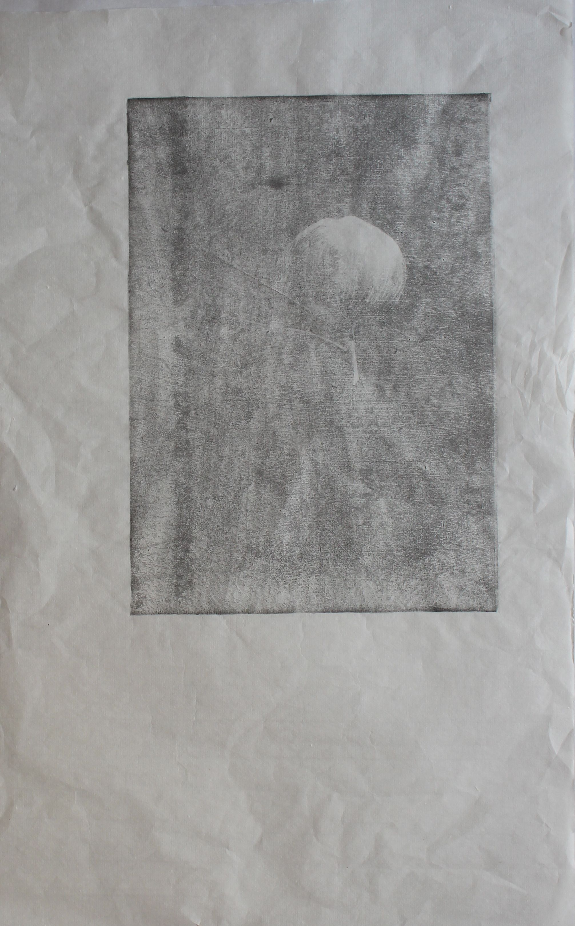
subtraction
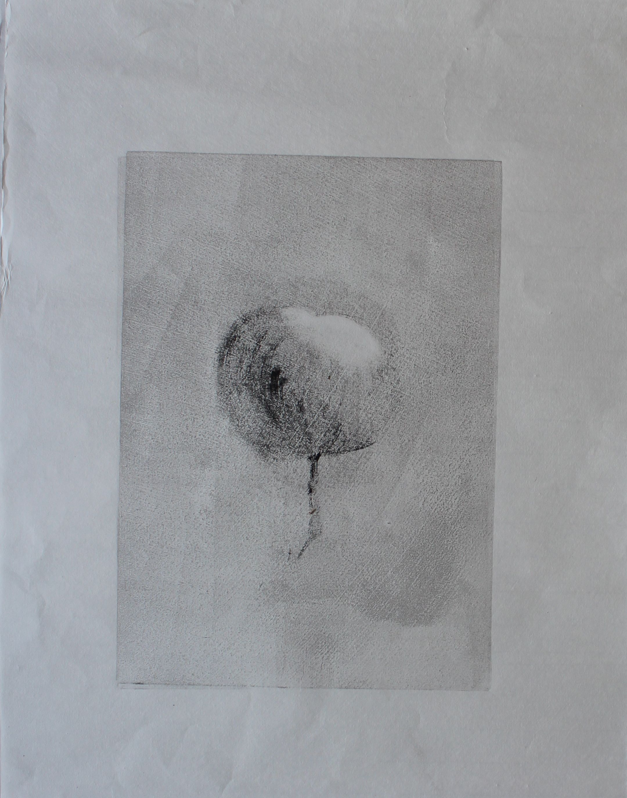
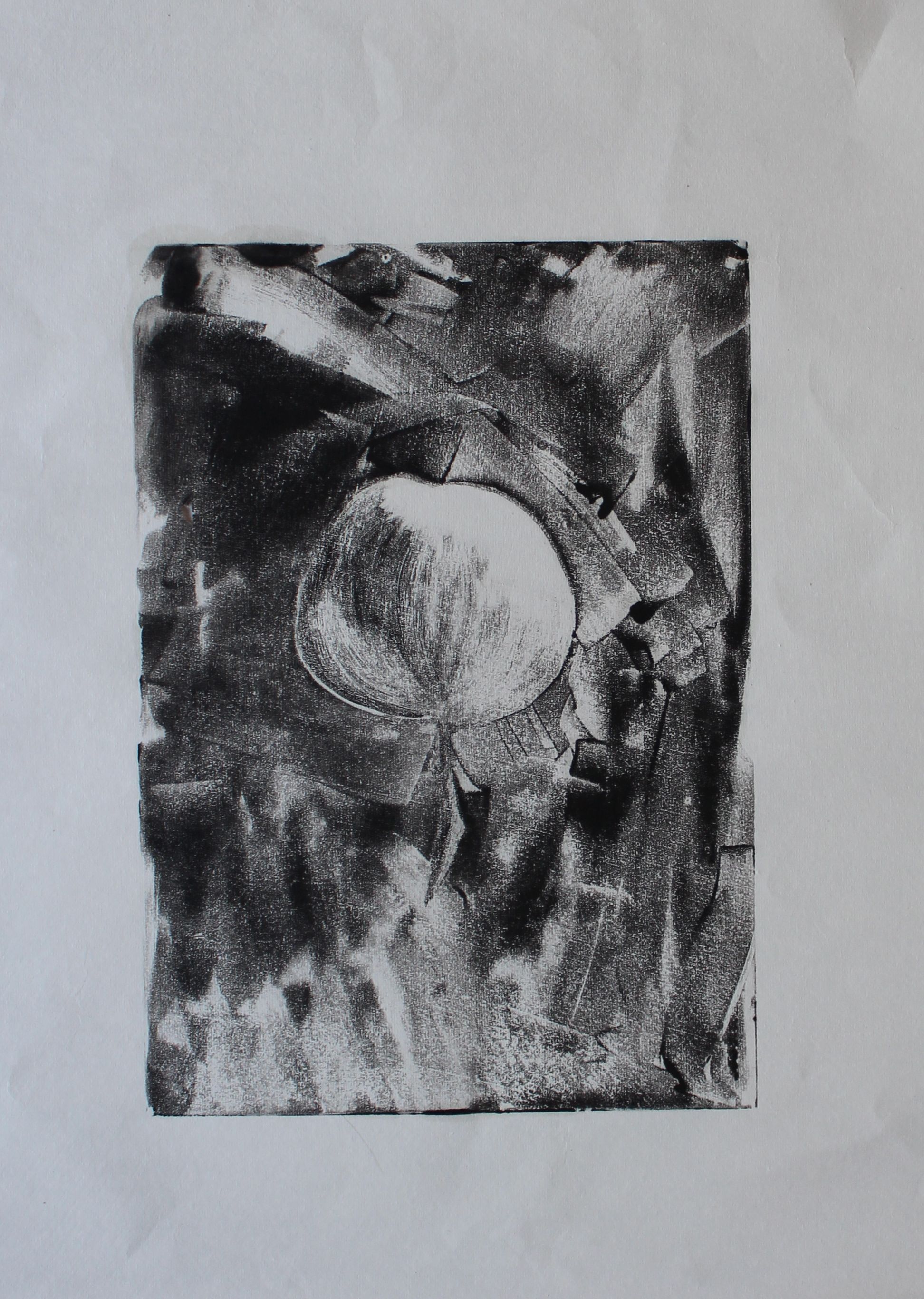
Then I tied making texture using brush strokes, the trick with this being to get the same degree of dryness for all the tones. I used a mask to create an even background. I thought this one worked quite well.
This one was bolder- but using delicate paper resulted in a tear.
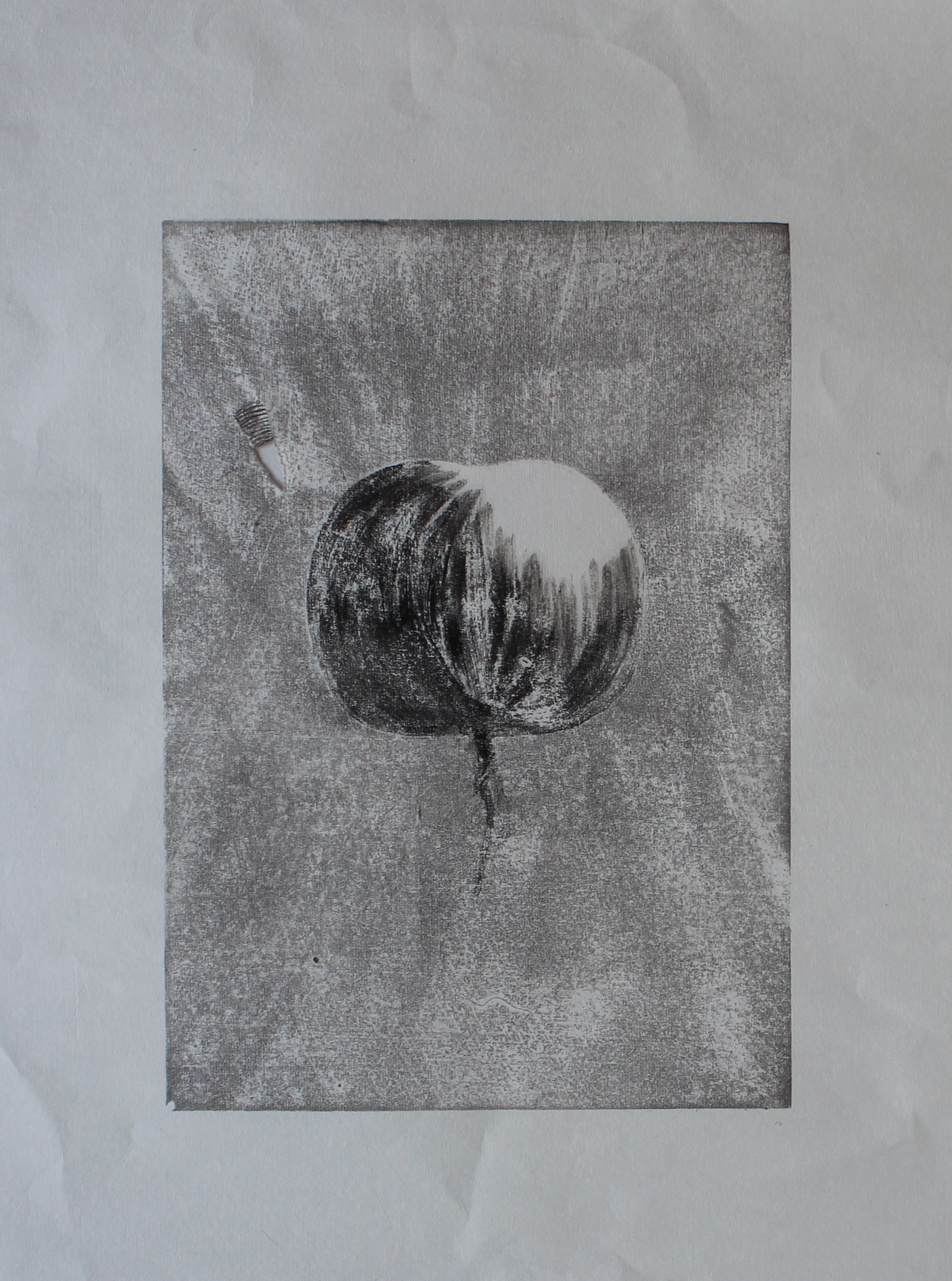
Finally a much bolder one, using a knife to apply the ink: the use of a mask made a very hard edge.
Intaglio: Drypoint
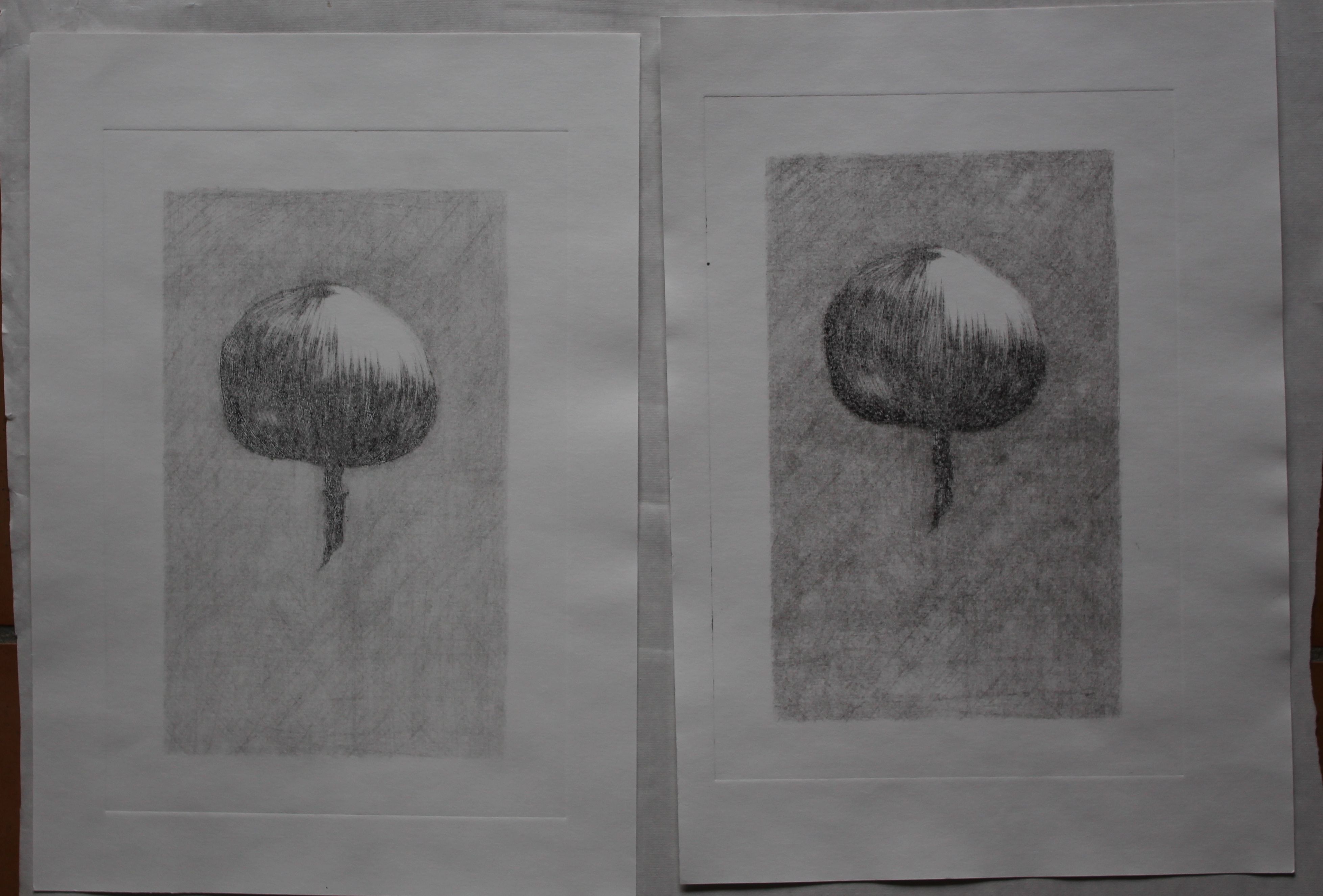
Still focussing on pencil type- lines, I decided to try intaglio on perspex. The first version of this was done with a wobbly needle stuck in a cork, and wasn’t very dynamic. It had cross-hatching for the background, and contour lines on the apple shape.
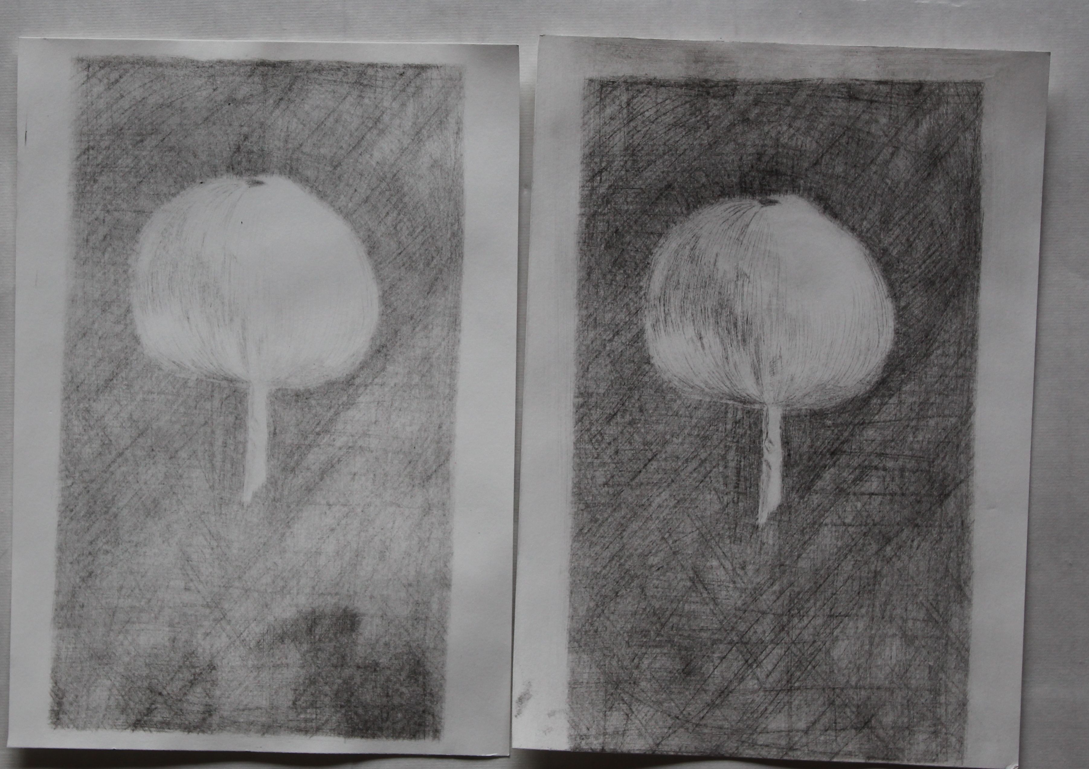
Now I had some tools, and a press, so etched it better, and inked it up. Again I found that adding oil to the ink helped to get darker colours.
I was quite pleased with the results: Newton’s apple.
I made some more marks to get a more dramatic black: it may have lost some of the line definition, but I also was a bit more selective in rubbing off.
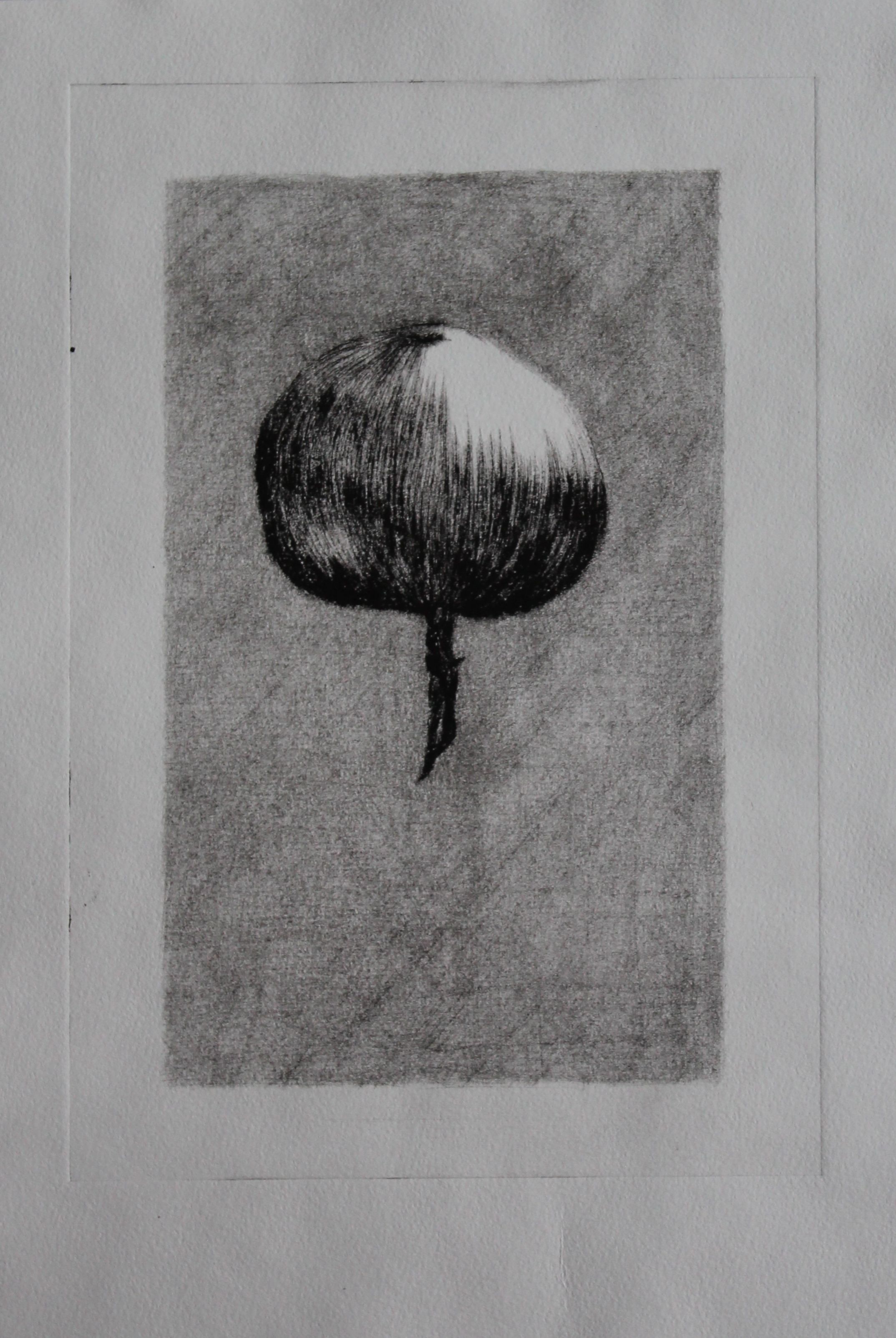
This felt quite successful, and a good use of drypoint etching to create a quite dramatic result.
