As I said, I spent a day in the Prado this summer, and felt that I had to use the experience to start thinking about the topic of Chiaroscuro. There is something, to my mind, very European about it, not just because it was a Renaissance technique, but also because the whole phenomenon of lateral lighting, long sunrises and sunsets, are associated with Europe for me. Here in Hong Kong, “at one stride comes the dark”; dusk does not linger.
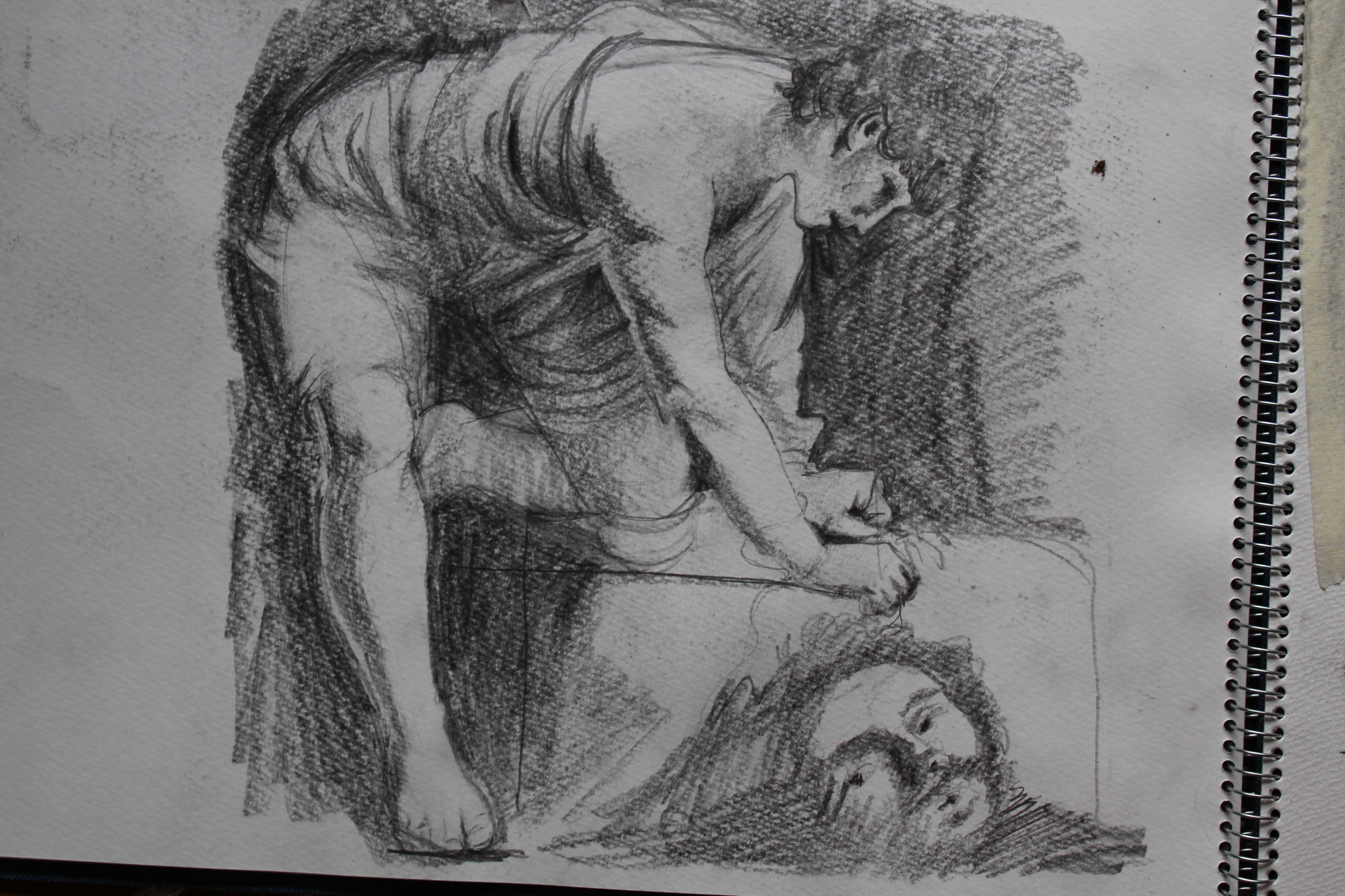
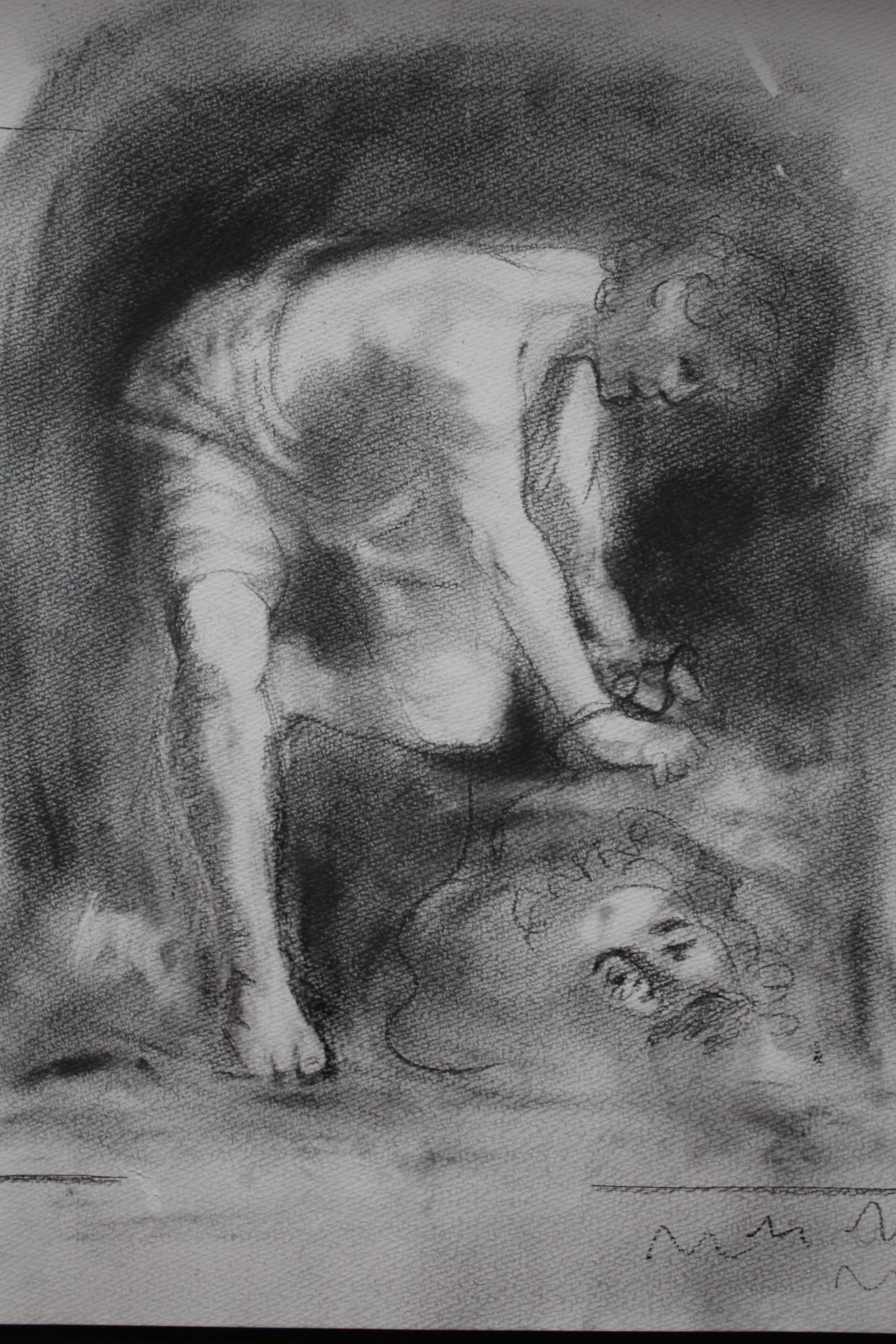
The image that inspired me was Caravaggio’s David and Goliath, and I set about trying to achieve a similar image using different media.
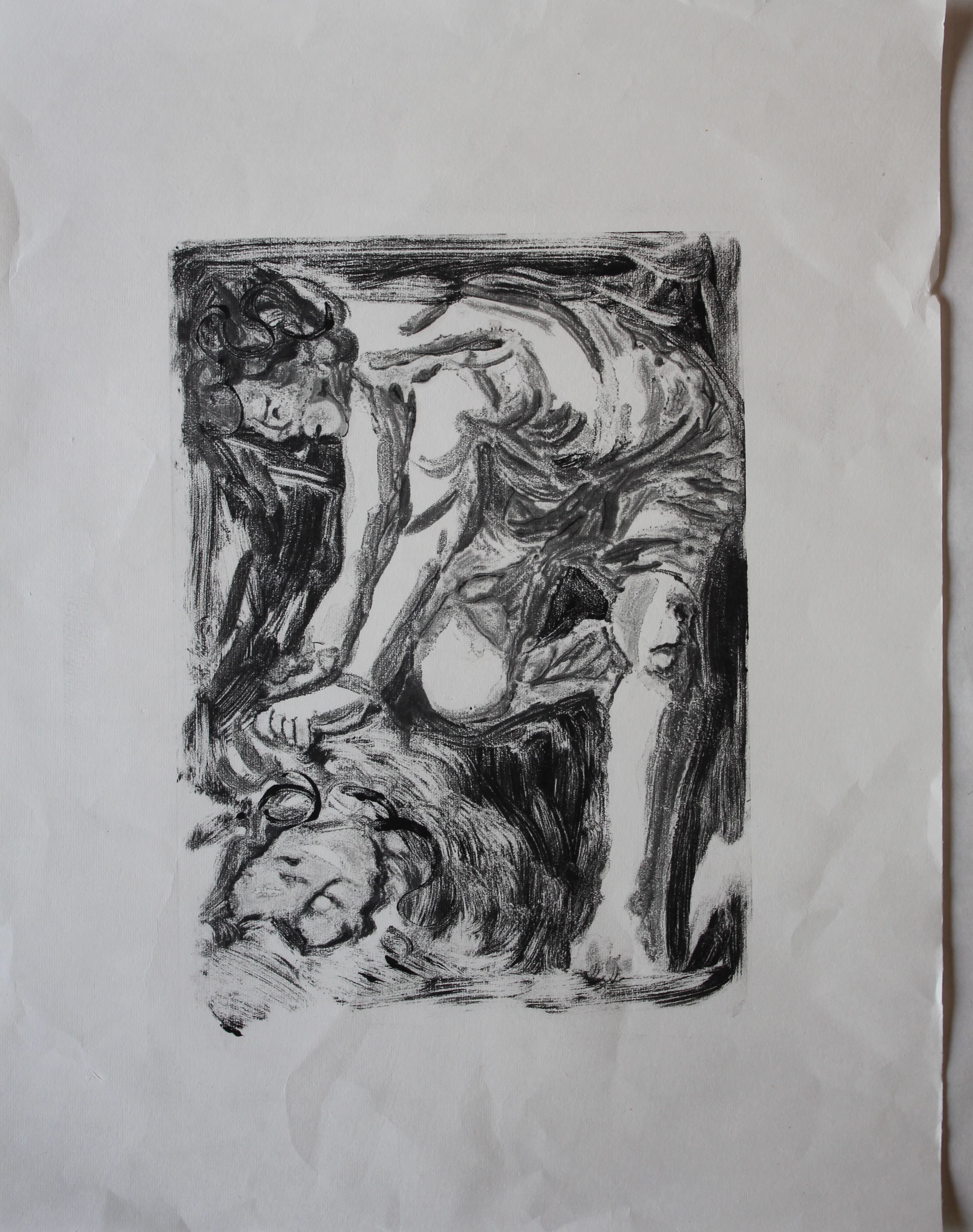
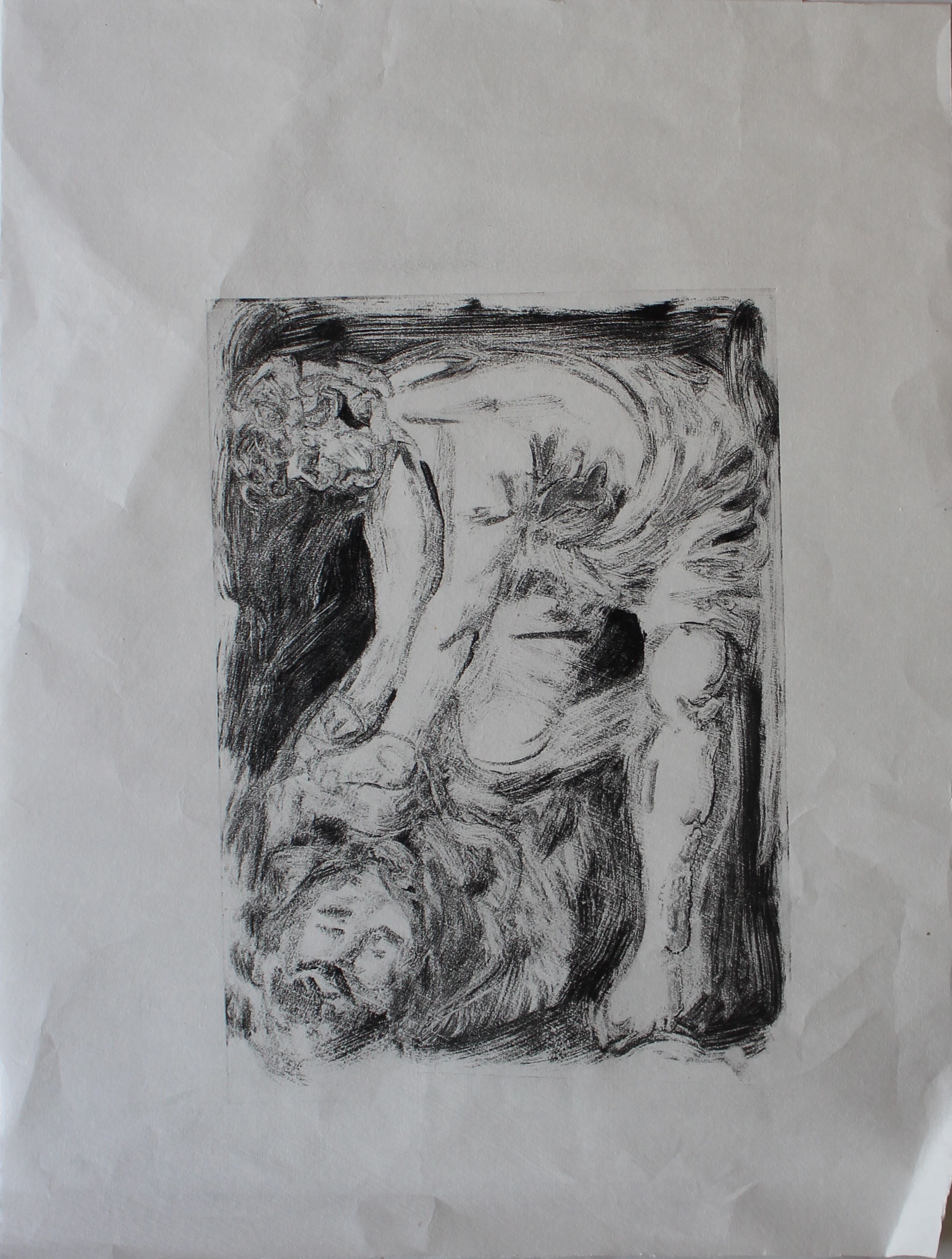
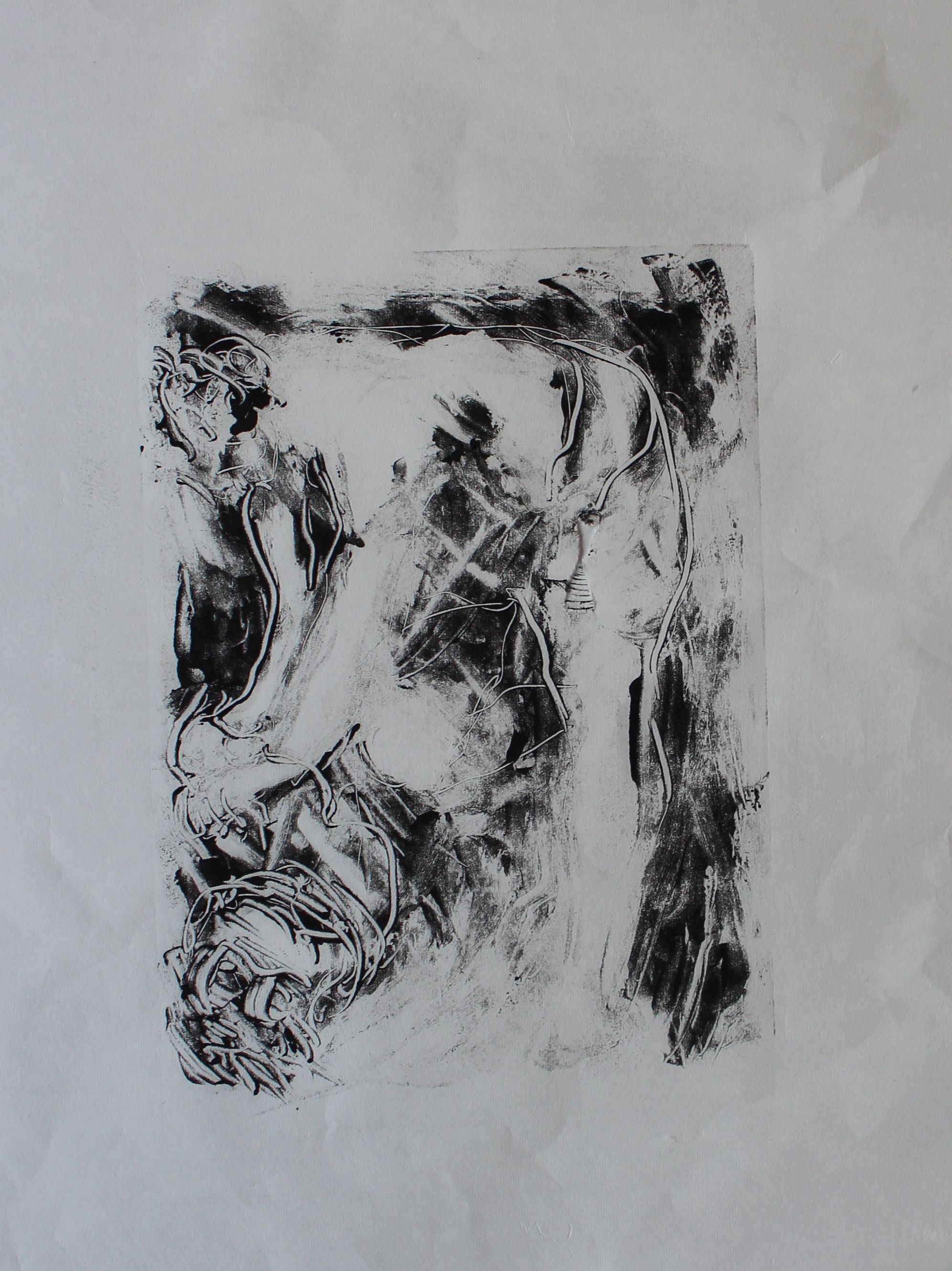
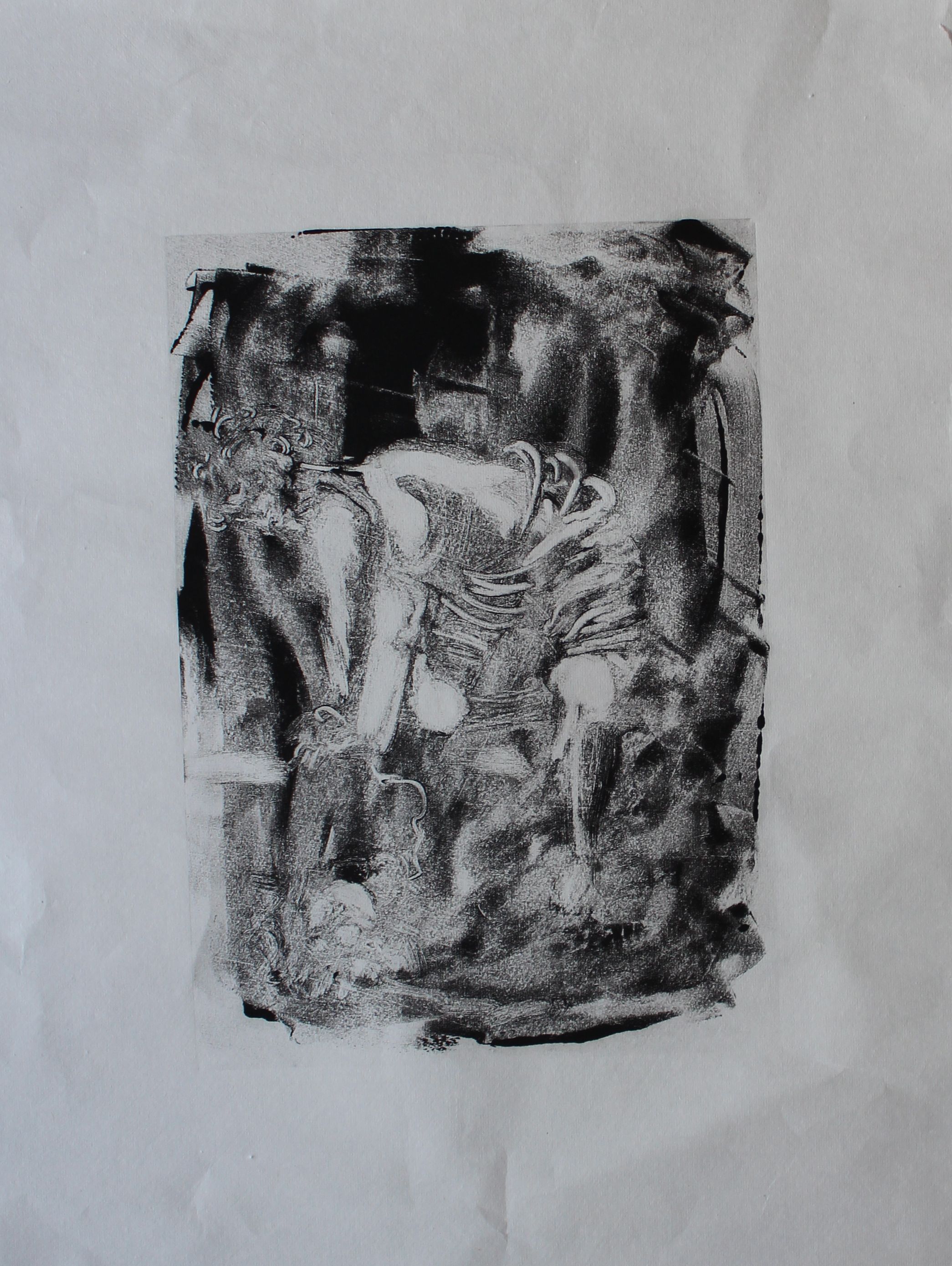
Here are the sketchbook pages- the softer image was done by using ground charcoal. The challenge would be to achieve anything like this kind of softness using printmaking techniques. Approaching it in a reductive manner was easier- lifting off where light struck the body.
At this stage, I had no new materials, as they were still en route from Valencia, so it was back to monoprinting.
I tried various techniques- additive and subtractive, using different tools, brushes, sponges, knives, cotton, using stand oil and solvents to thin the inks, and add various degrees of viscosity and painterliness.
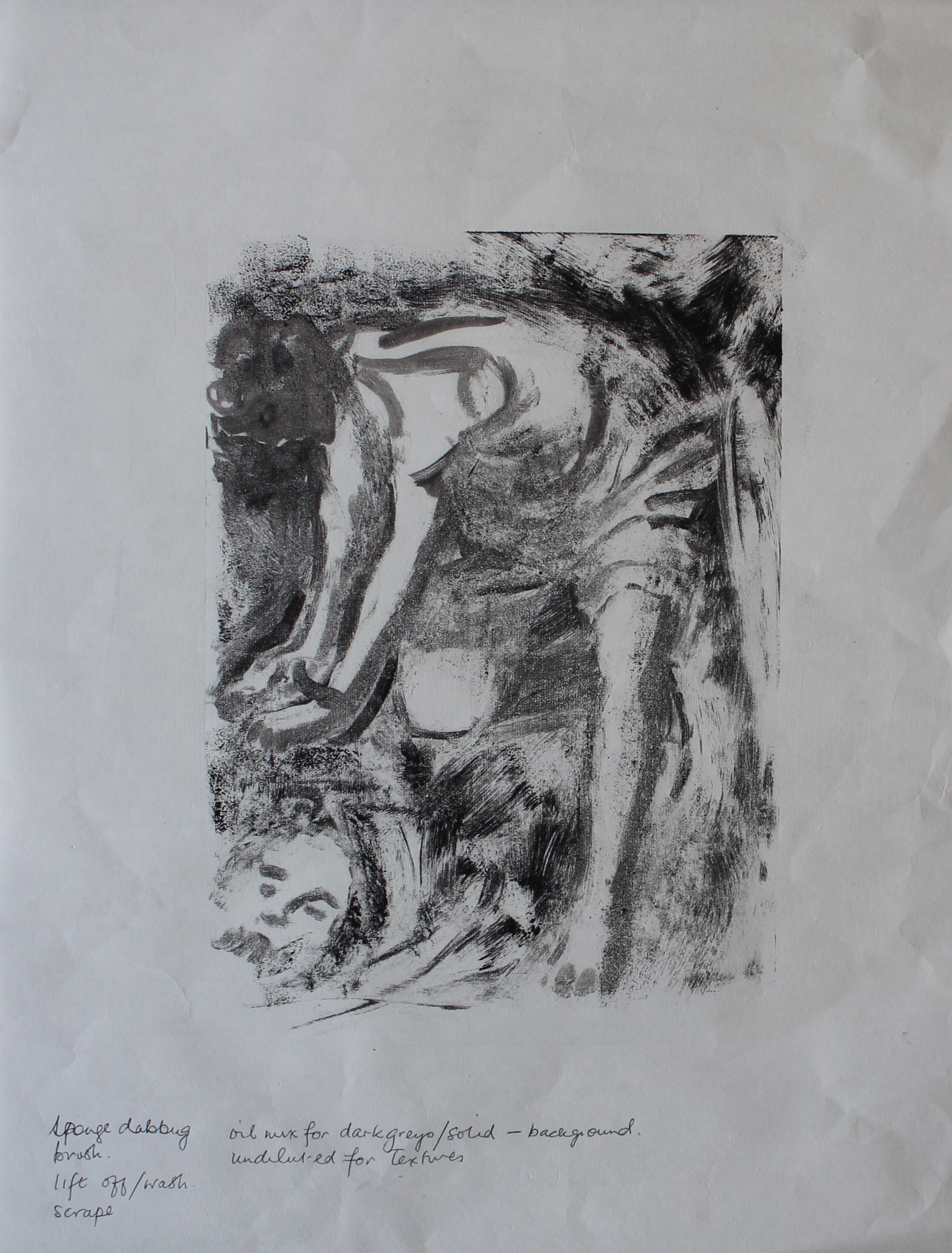
Sometimes the oil stained the lightweight paper.
subtractive
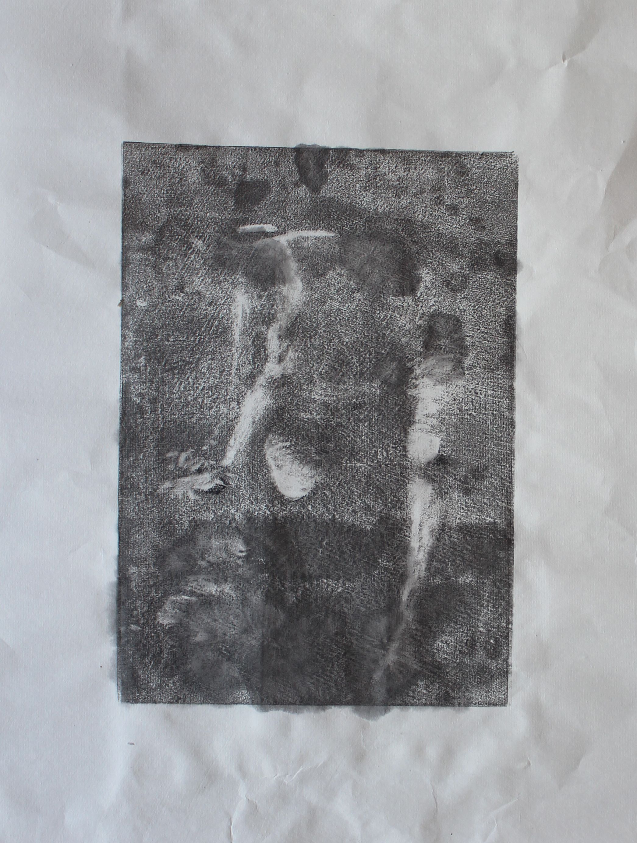
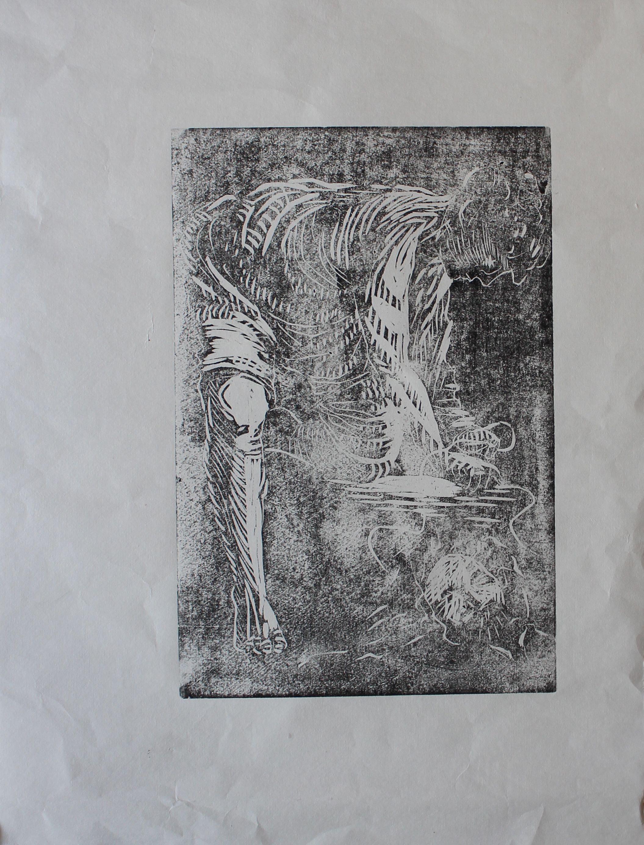
Woodblock
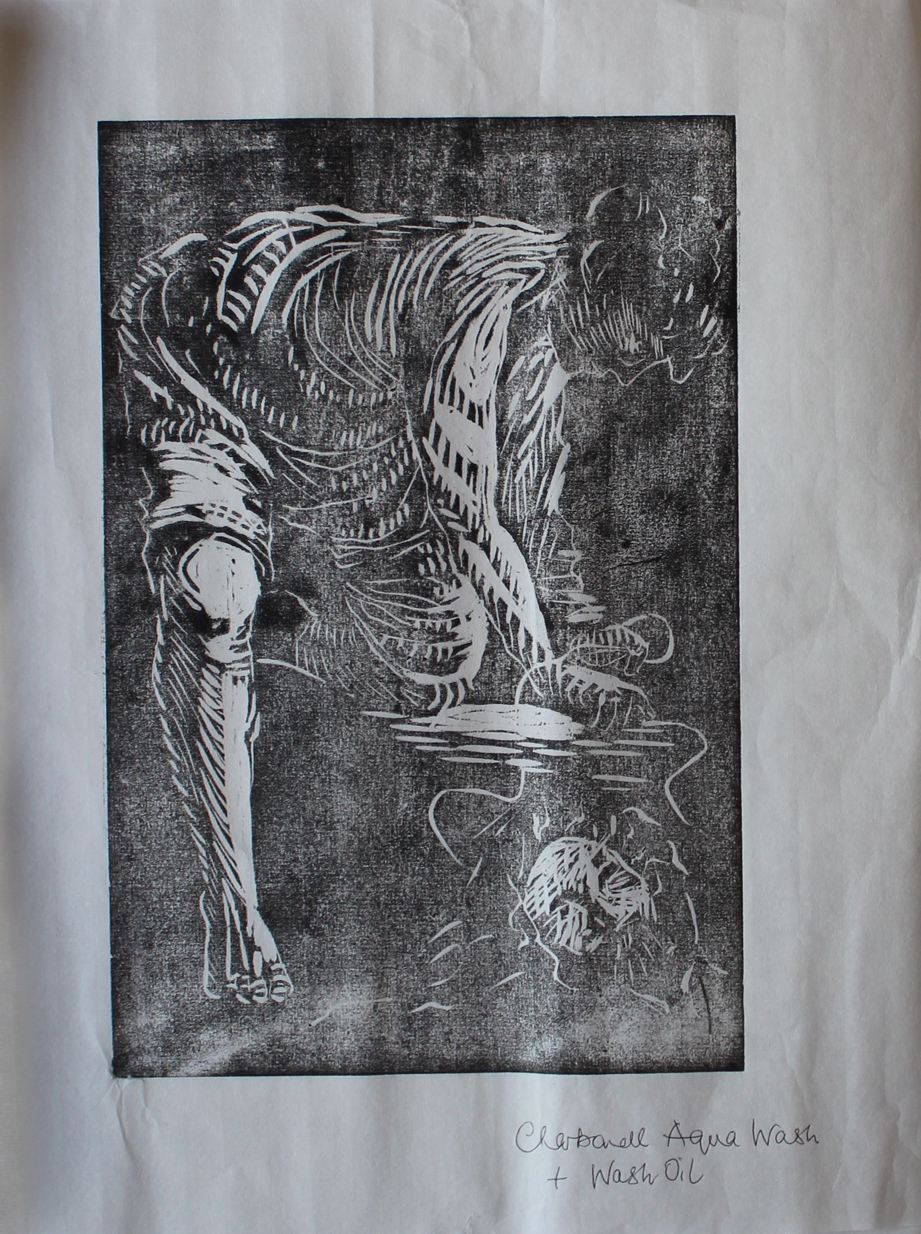
Then I decided to try a woodblock. At first this printed very faintly, but I had bought new inks and a new roller and found that these made a big difference. The old inks/ roller:
New inks and large roller. Inks diluted with oil wash.
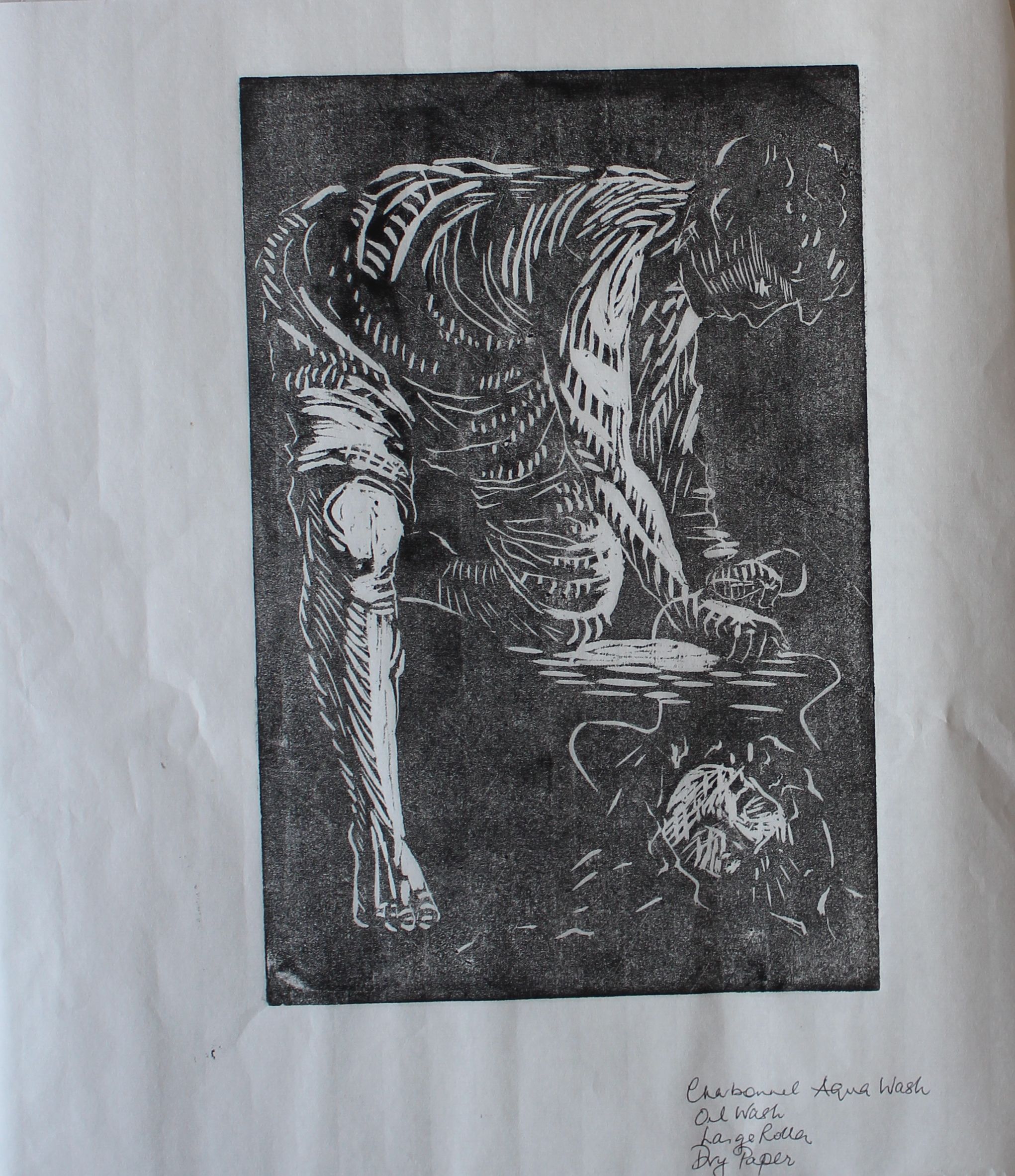
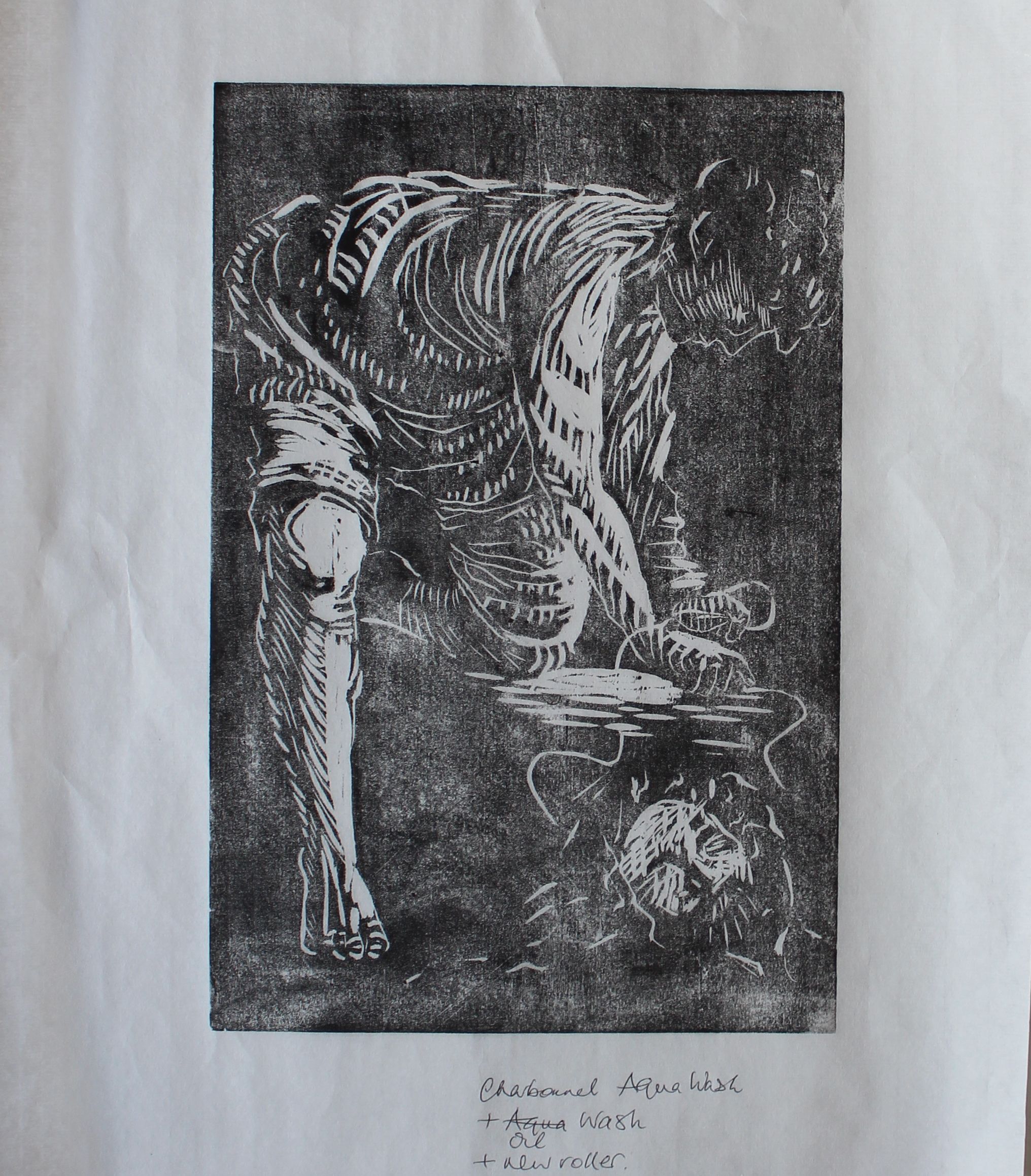
I’m not too happy with my cut marks here though- they are rather crude. I was waiting for a Dremel to arrive amongst the new materials.
Lino
I started a square print, planning a reductive print using caustic soda on lino, in order to avoid these harsh cut lines. I haven’t got back to it yet.
