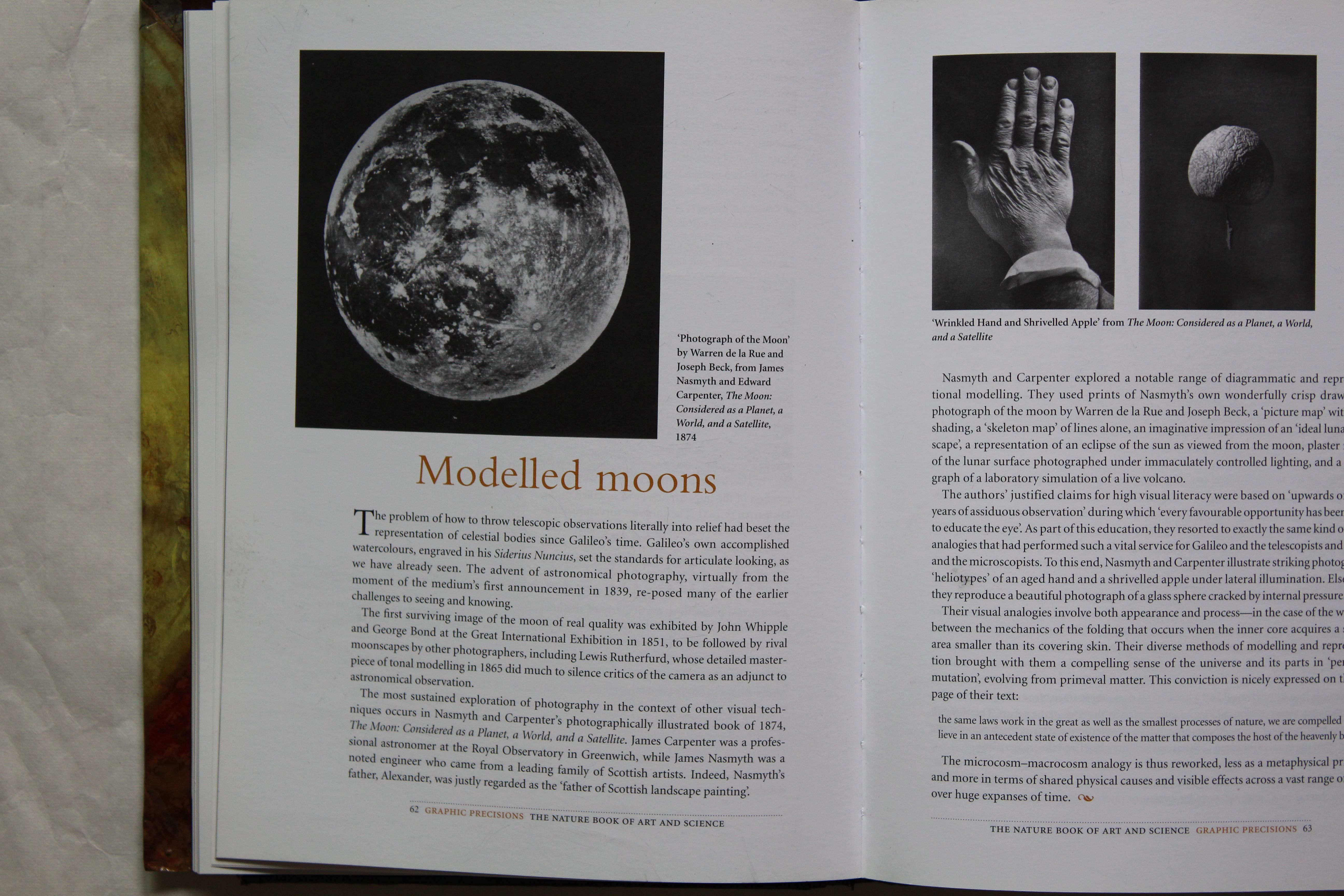
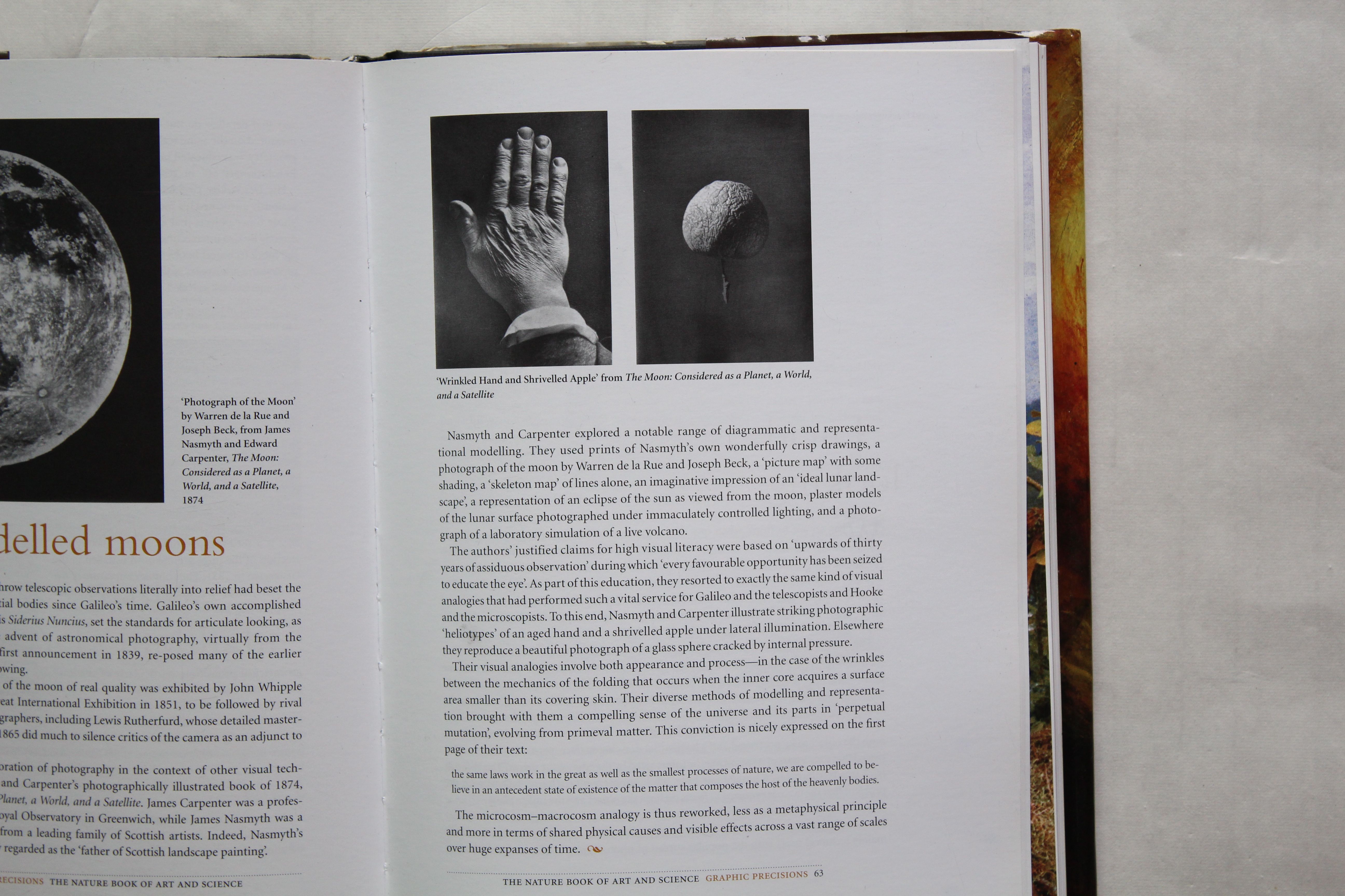
Moon. Topical, symbolic, geometric, poetic, totemic.
My plan for my final piece is to create three images relating to the Moon. At the time of posting it is Mid Autumn, or moon festival, and there is an an eclipse and a large harvest moon. This was the same time of year last year that I worked on Mixed Media projects using light, Blue Moon. This links also to the work I’ve been doing a bit ahead of myself, in the Chiaroscuro unit, looking at 19th century photography.
I also reference Coleridge – Frost at Midnight- again, with that exquisite final line:
Quietly shining to the quiet moon.
Thirdly, I have been reading Murakami’s 1Q84 and was inspired by the notion of the two moons in that story, the appearance of the moons seeming to signal that the characters have entered an alternative or parallel inverse. But these moons are like Coleridge’s, quietly shining, and it takes some time for the protagonists to notice them.
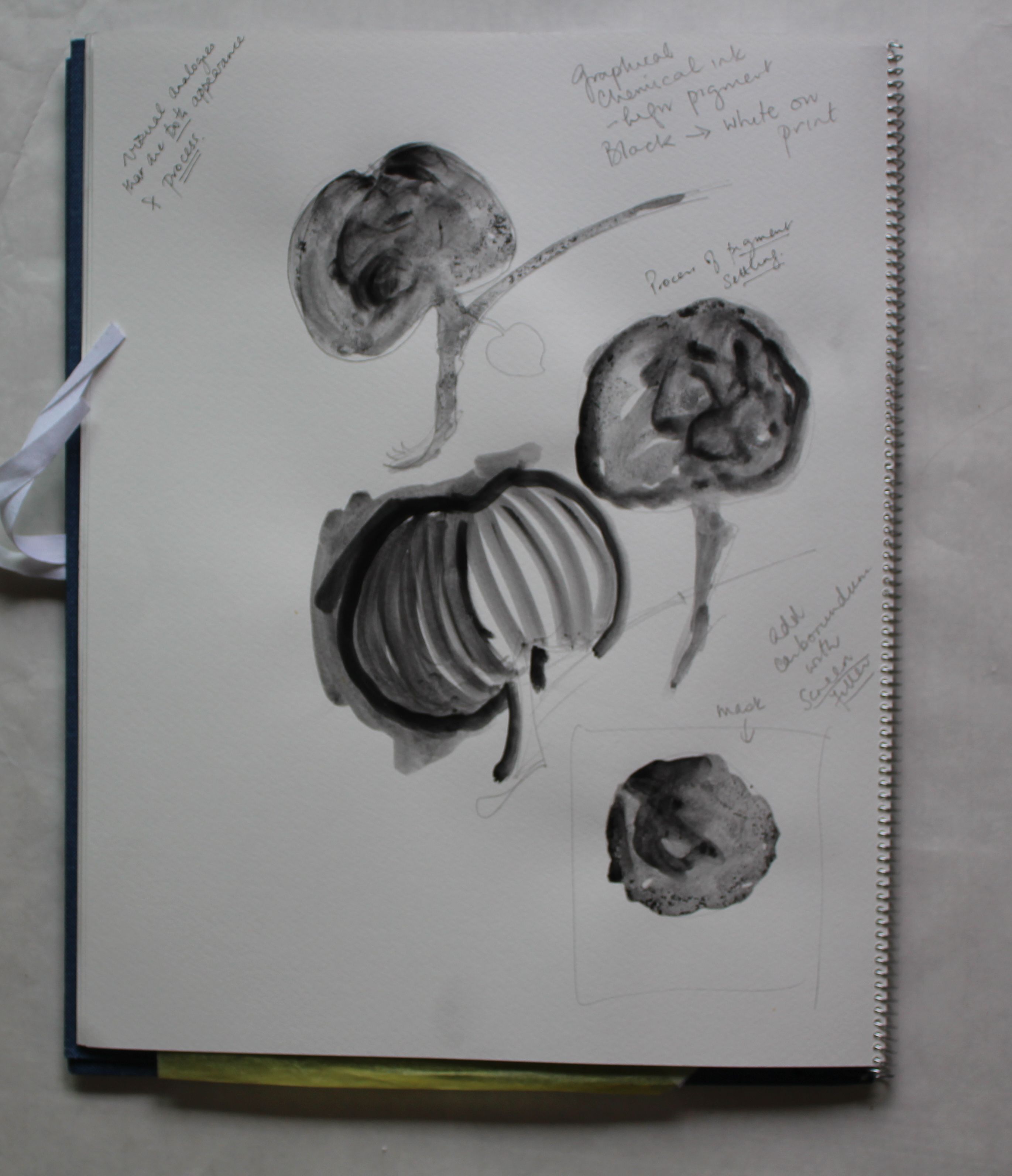
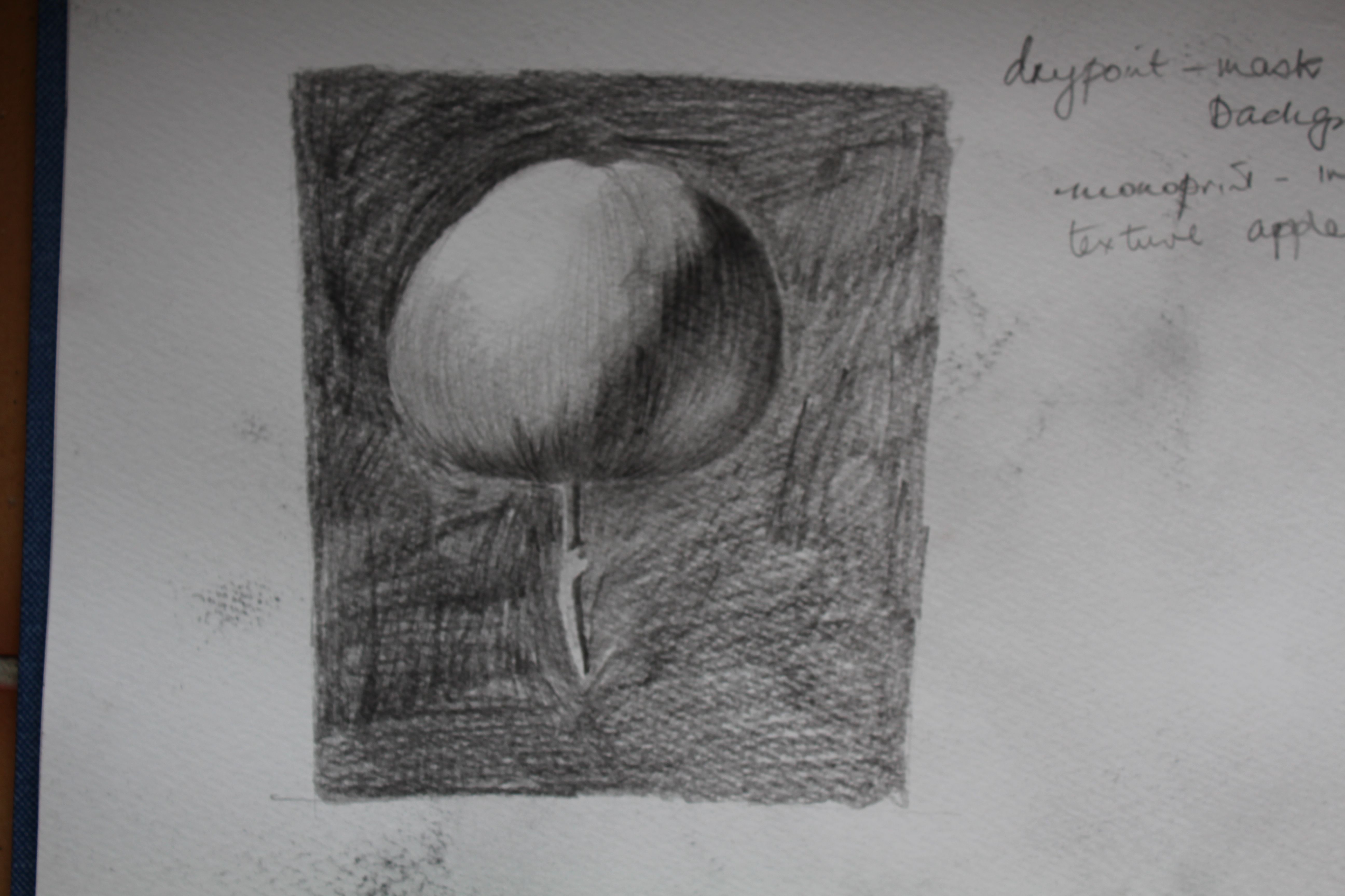
At a basic level though, this permits me to work with simple spiral or circular shapes, to use textures, line and movement to explore the narrative and pictorial possibilities.
Photopolymer
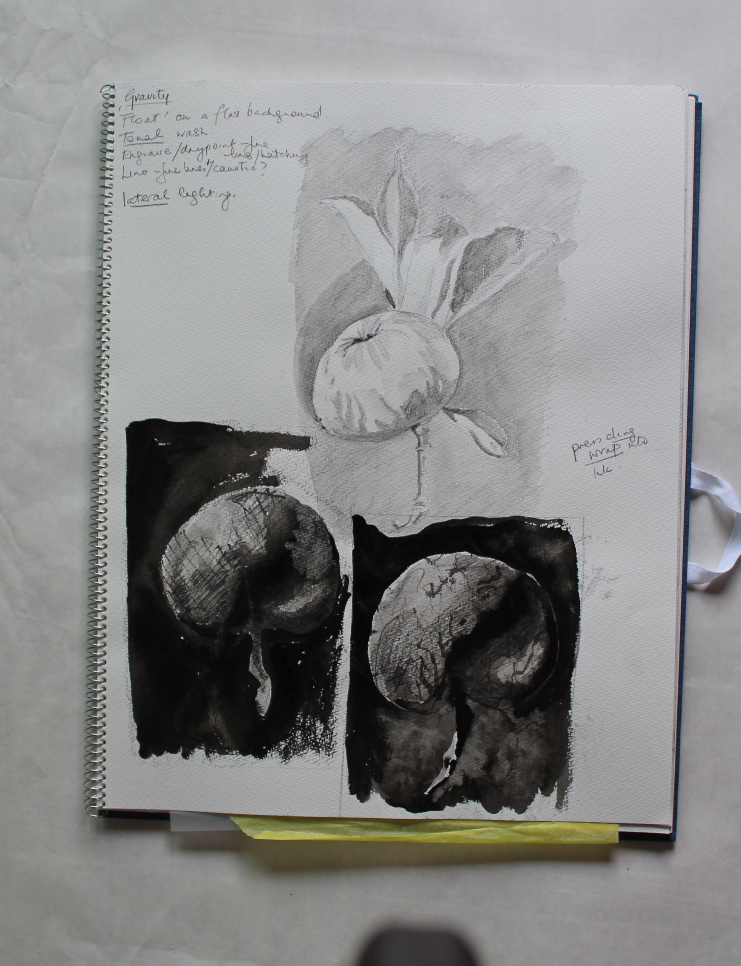
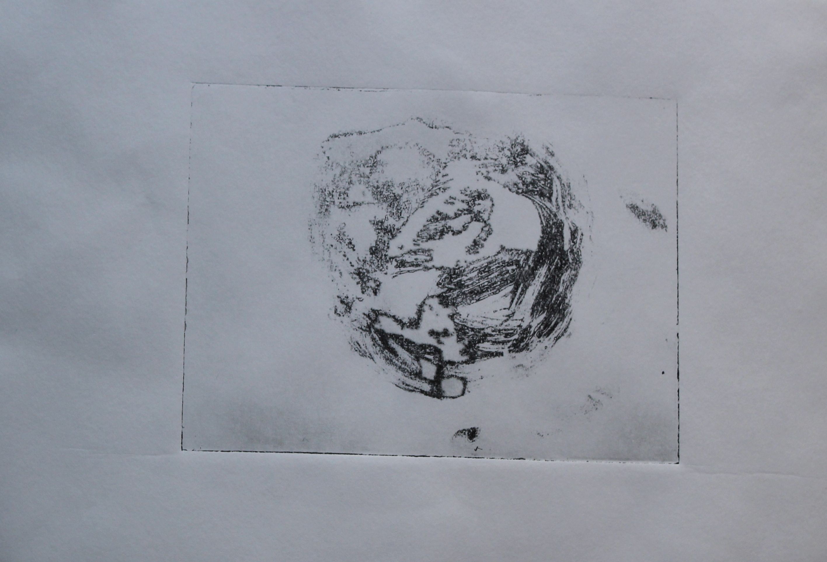
I was going to try to produce a tonal, painterly image using photopolymer- using the aquatint screen that I just got. There seems to be a problem though- maybe my timings are way out using the sun, rather than an exposure unit, or maybe it’s the photopolymer film that’s reacting to the climate- but the film won’t stick- I have tried several times, and this was the best, but when developing, it just peeled off altogether in one part of this image- and the rest is not exposed enough anyway.
Cyanotype
When I couldn’t get the photopolymer to work, I turned to a simpler way of using sun exposure: cyanotype. There’s already a nice link to the “Blue Moon” theme.
The Alternative Photography website is a great source of info for this.
Now that I have found a source of chemicals, am all set to go with this and ferric chloride etching.
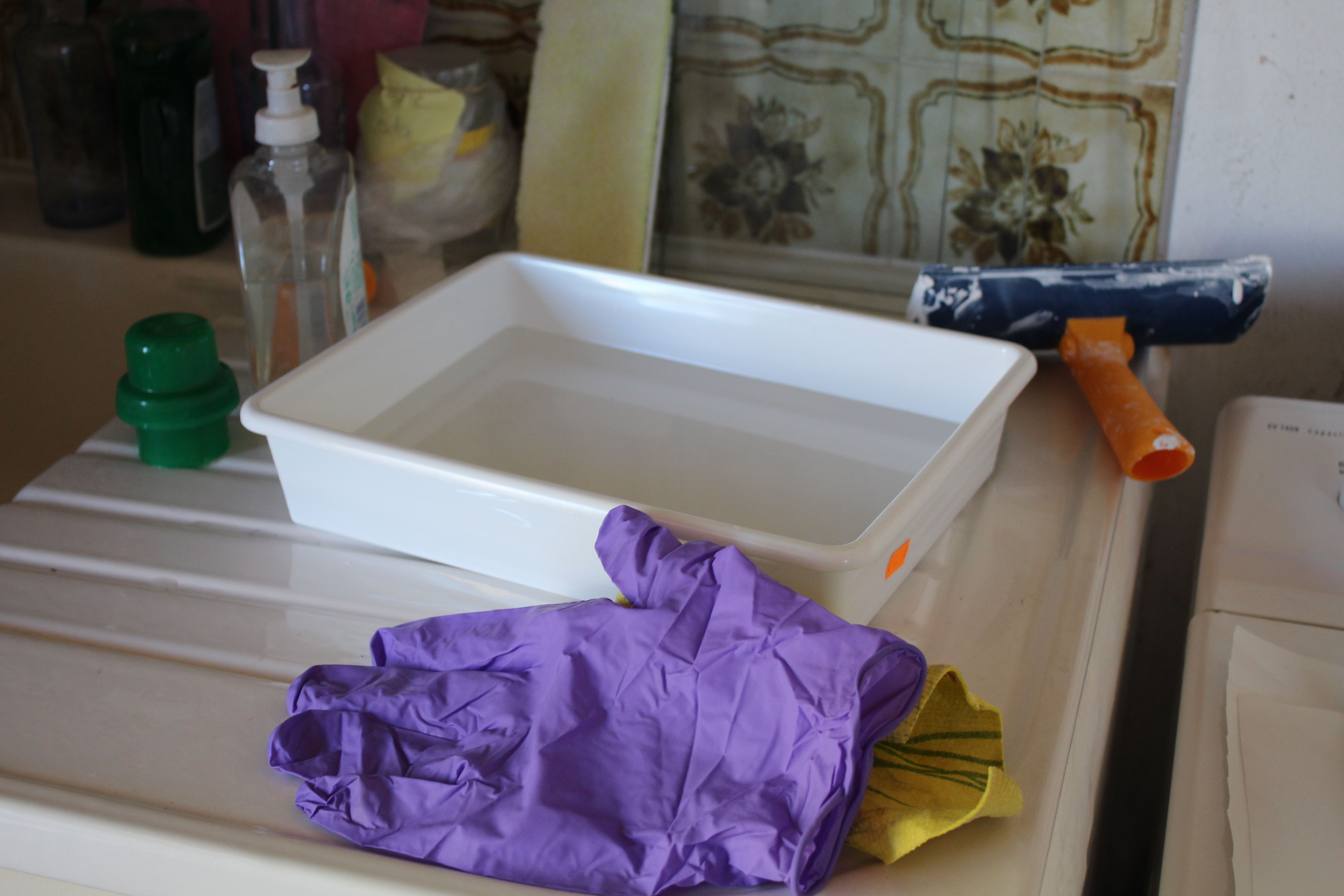
The first practical problem was the lack of anywhere lightproof in my house- this was also the difficulty with the photopolymer – we have too many windows, and all the wrong kind of lightbulbs, but I managed to black out a bit of space to dry the papers.
I soon found that the UV fluctuated a lot, and that the best images were from the really bright sun- and interesting effects when the sun was bright but slanting and casting sideways shadows.
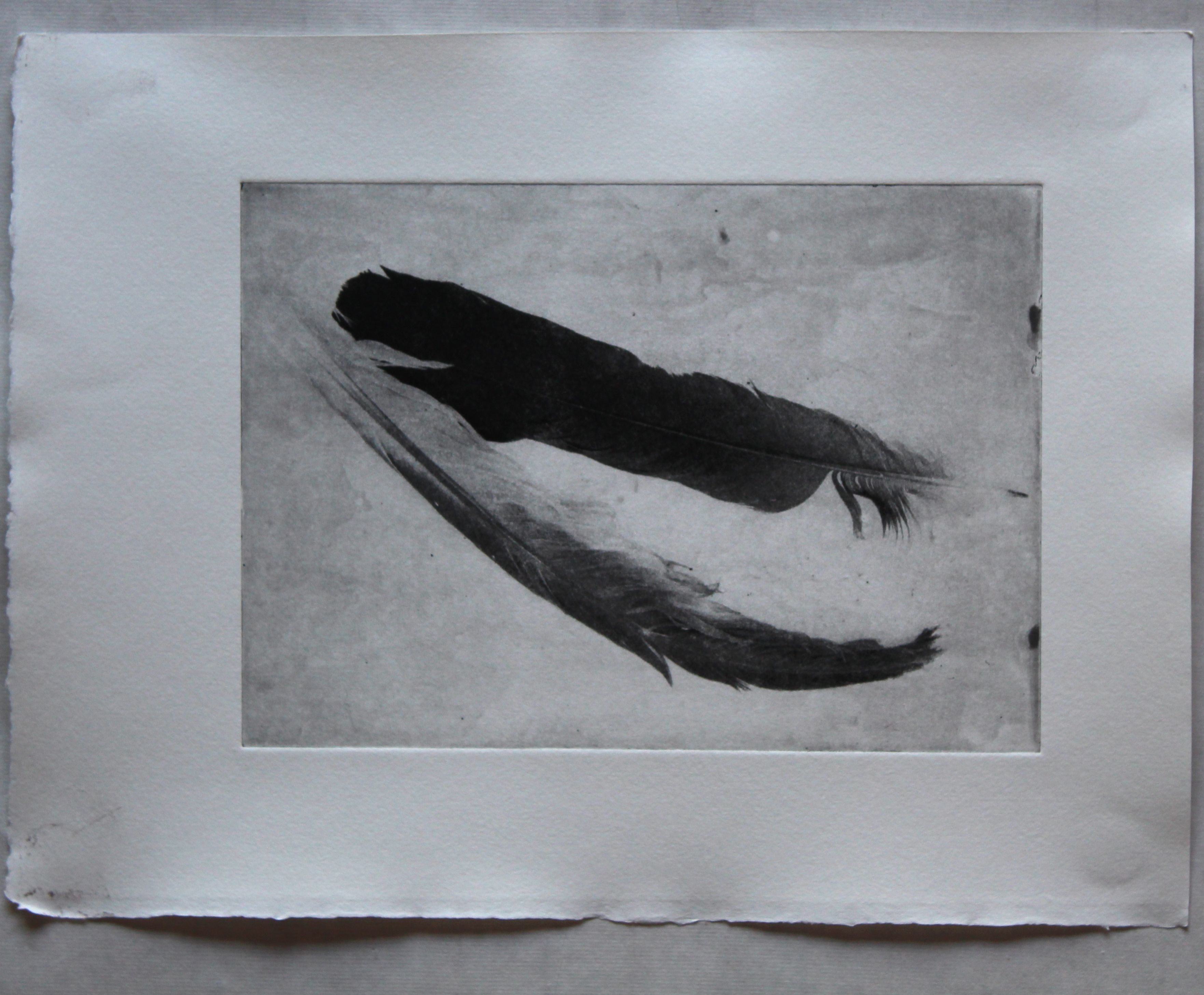
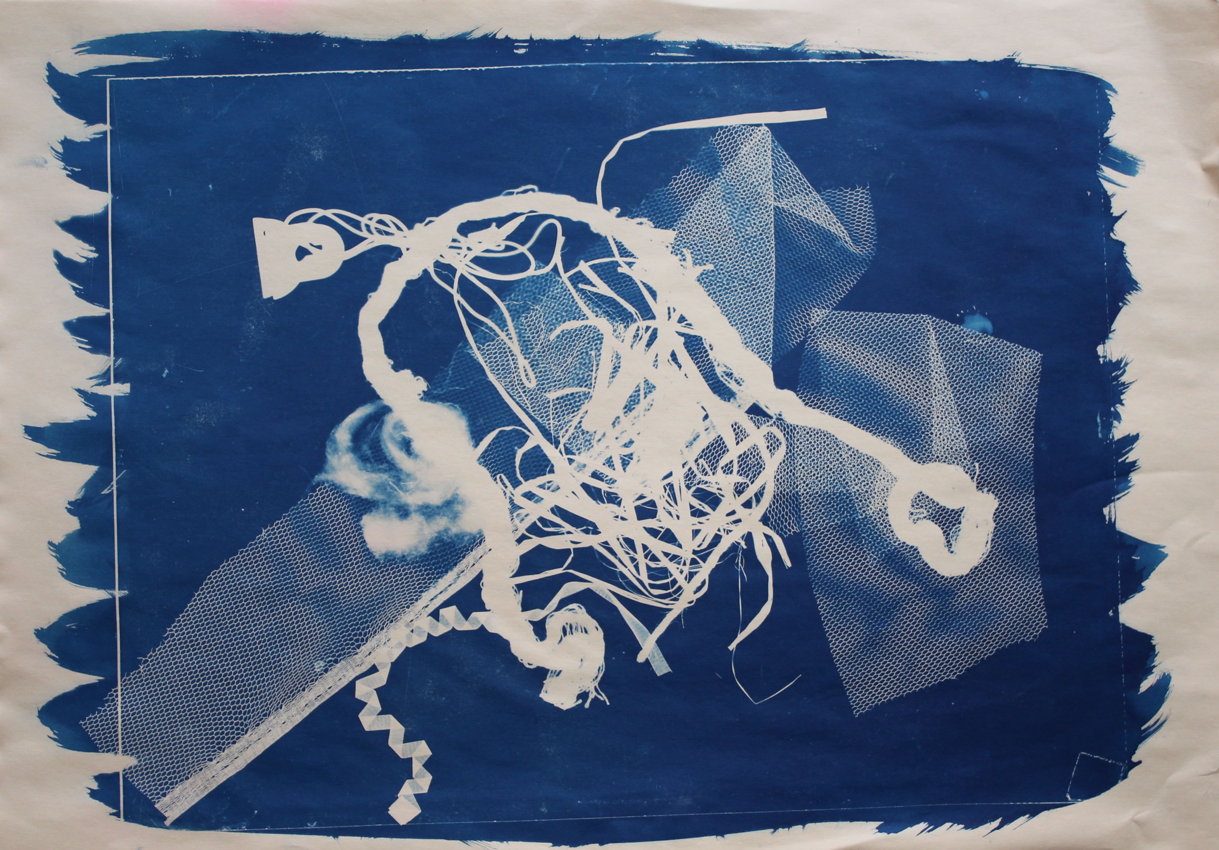
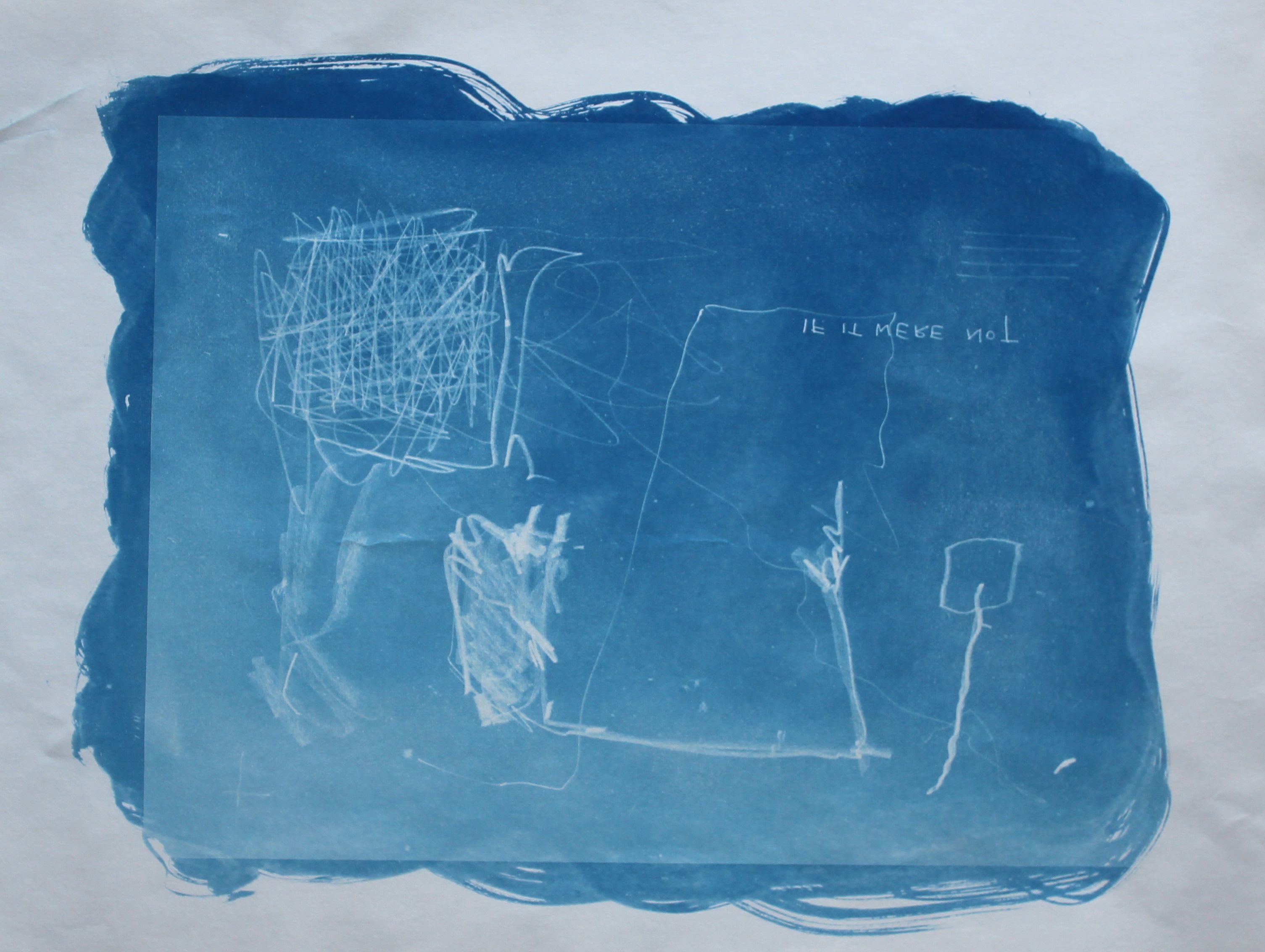
I experimented with real objects: flat, and standing, painterly marks (using film), writing on tracing paper (it develops and then disappears again, but reappears when developed again, and pressed objects in glass.
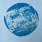
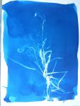
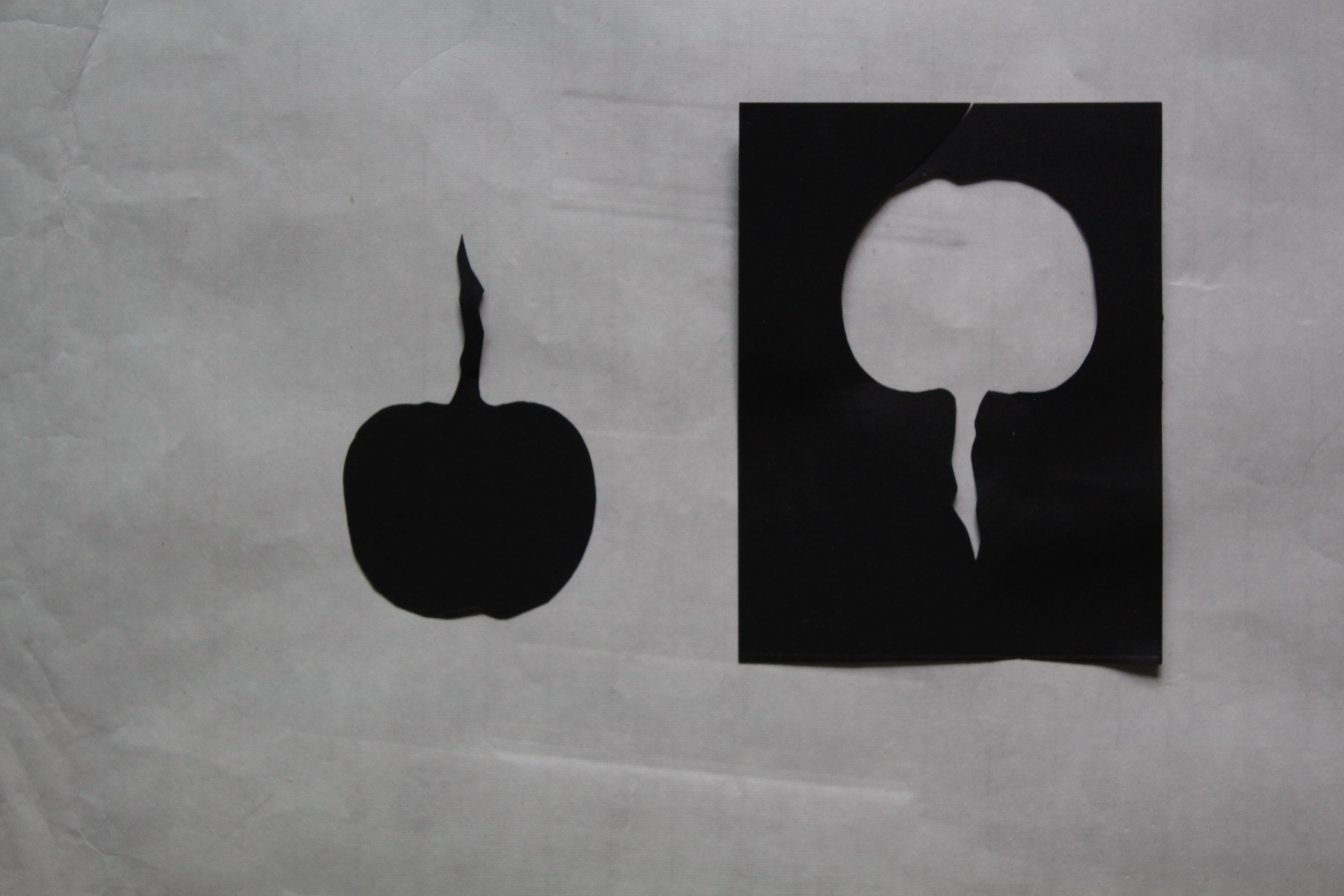
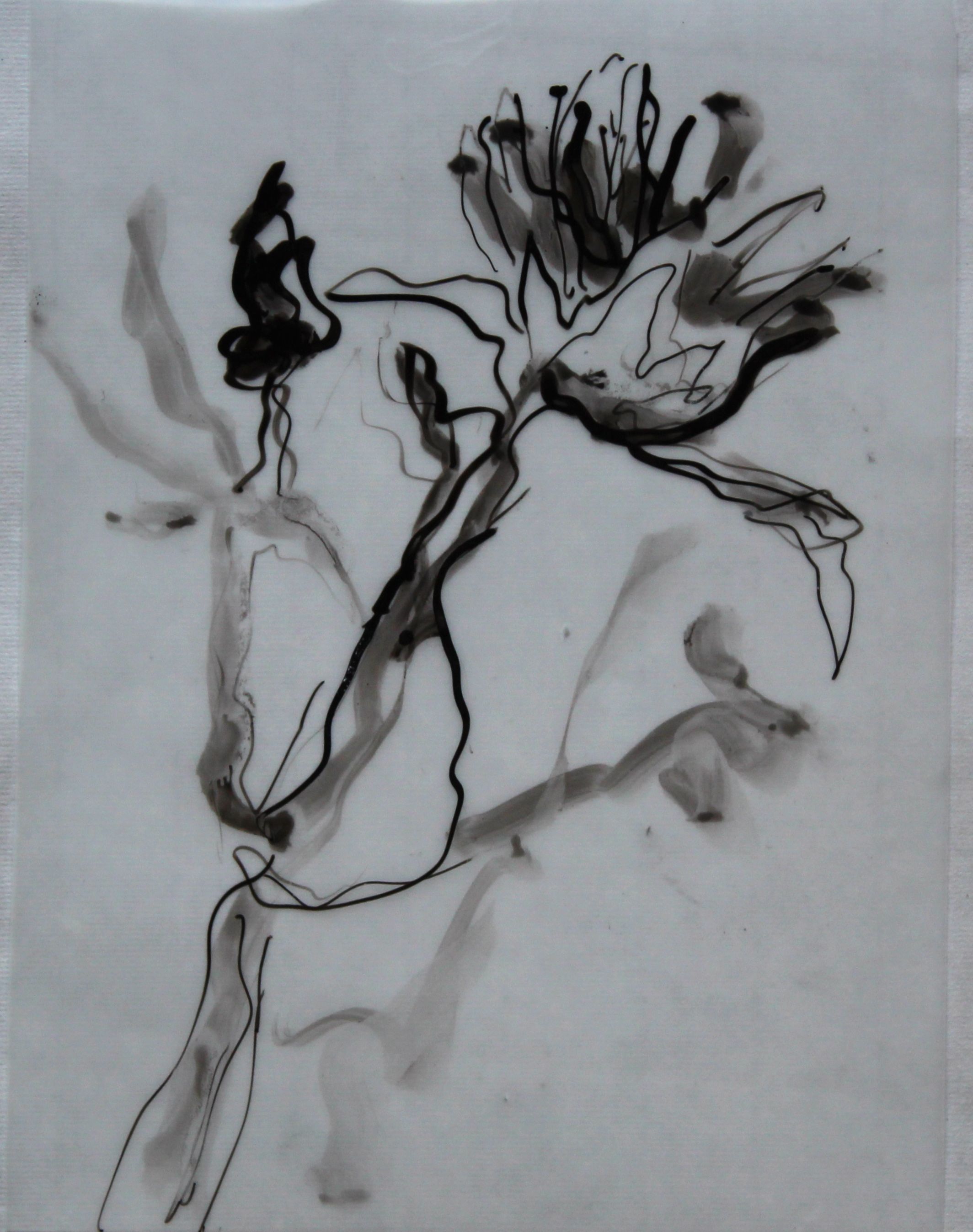
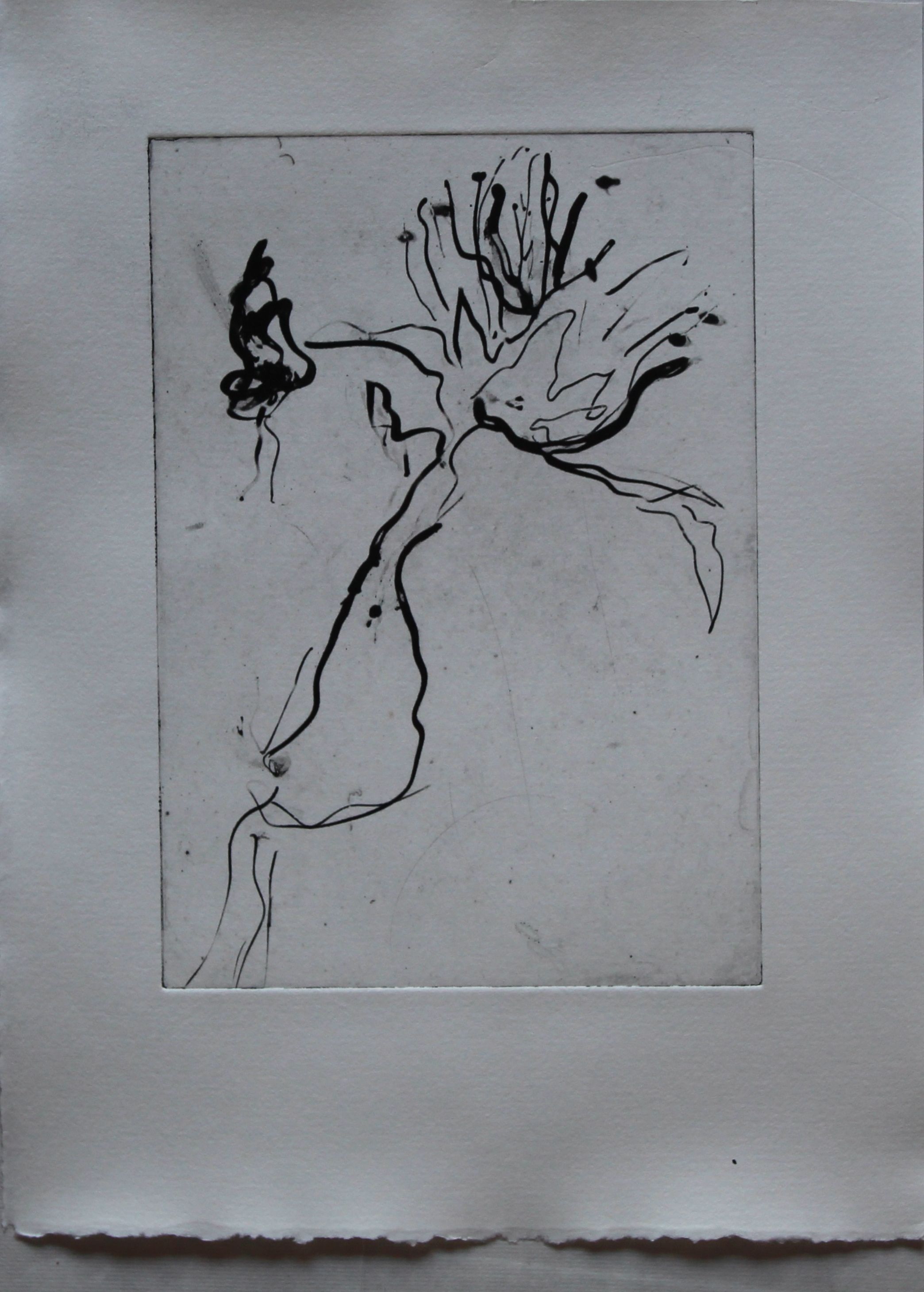
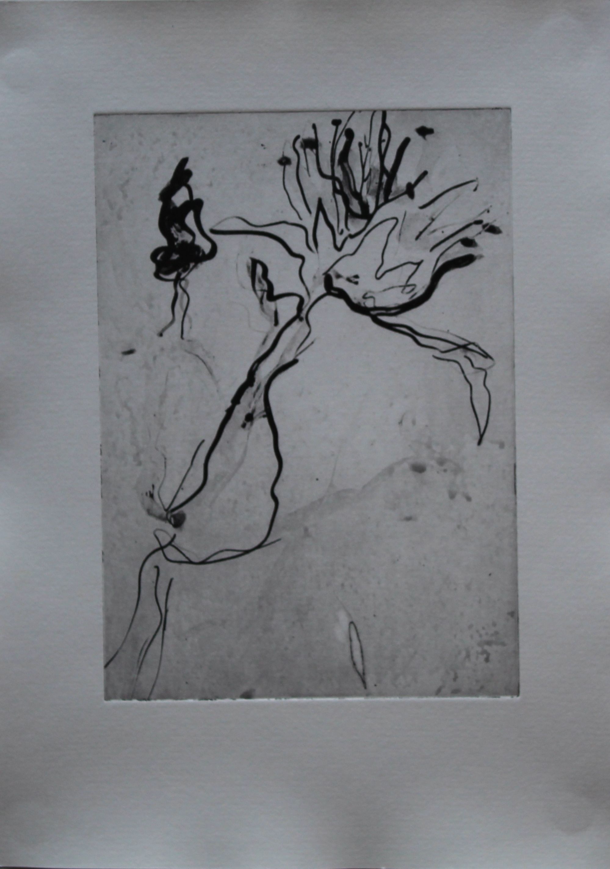
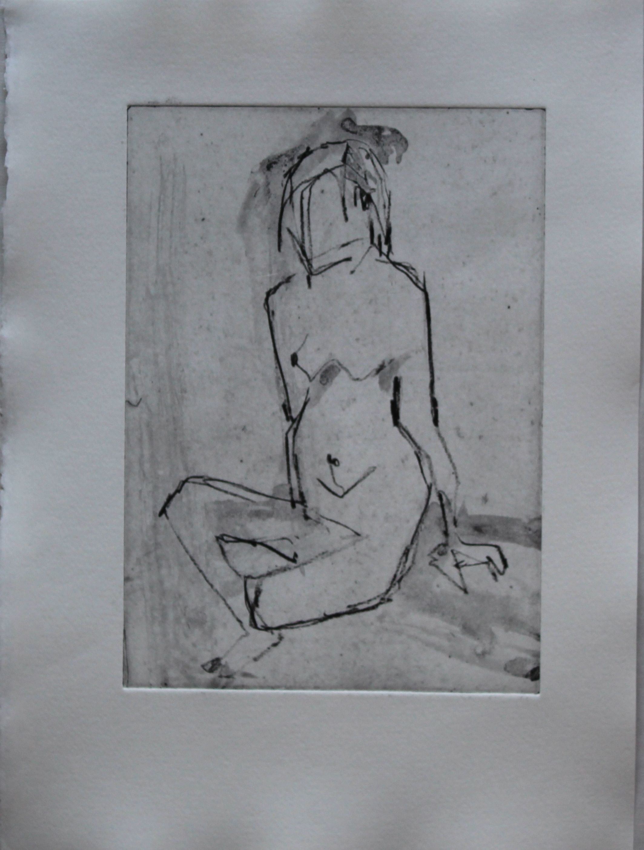
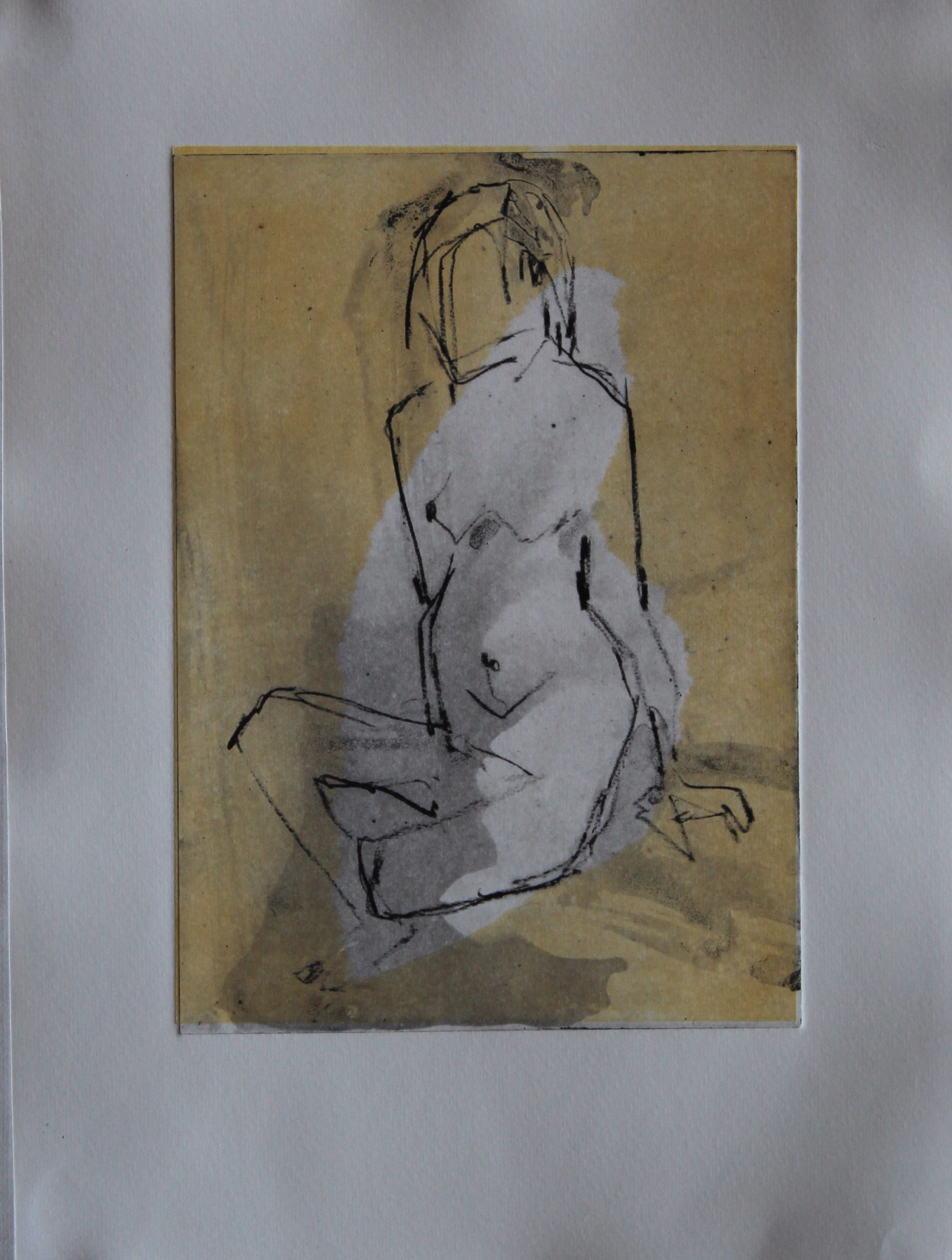
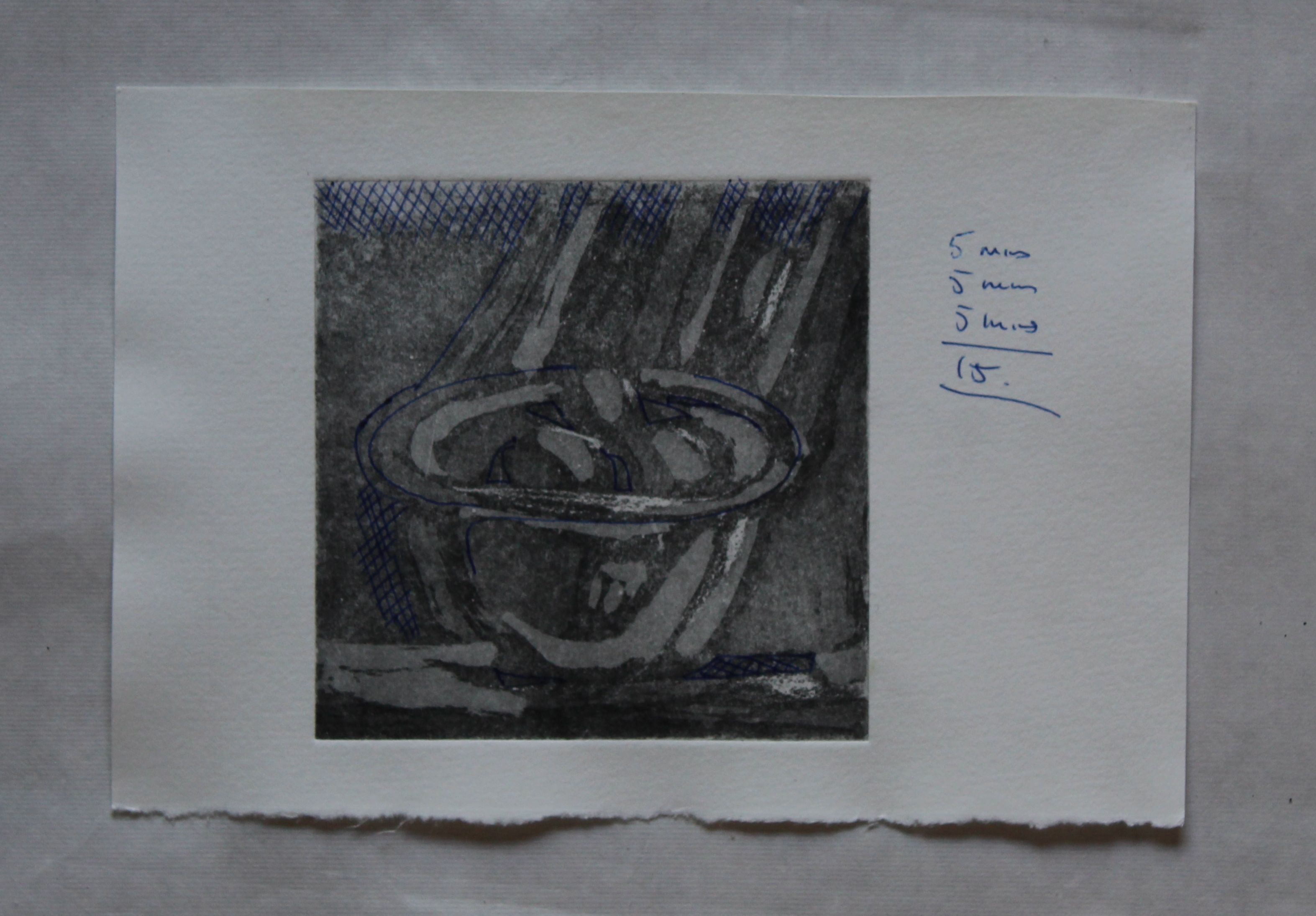
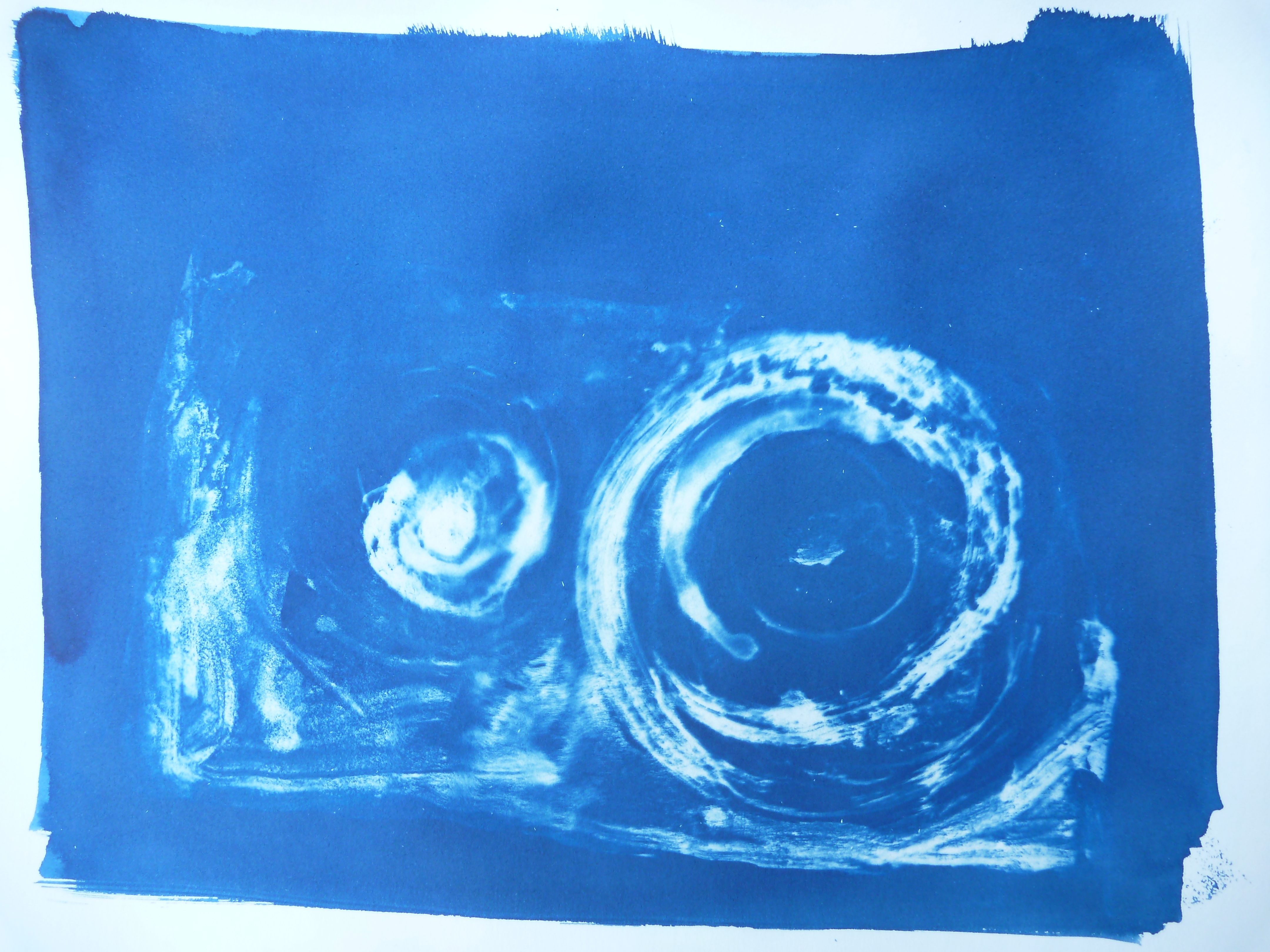
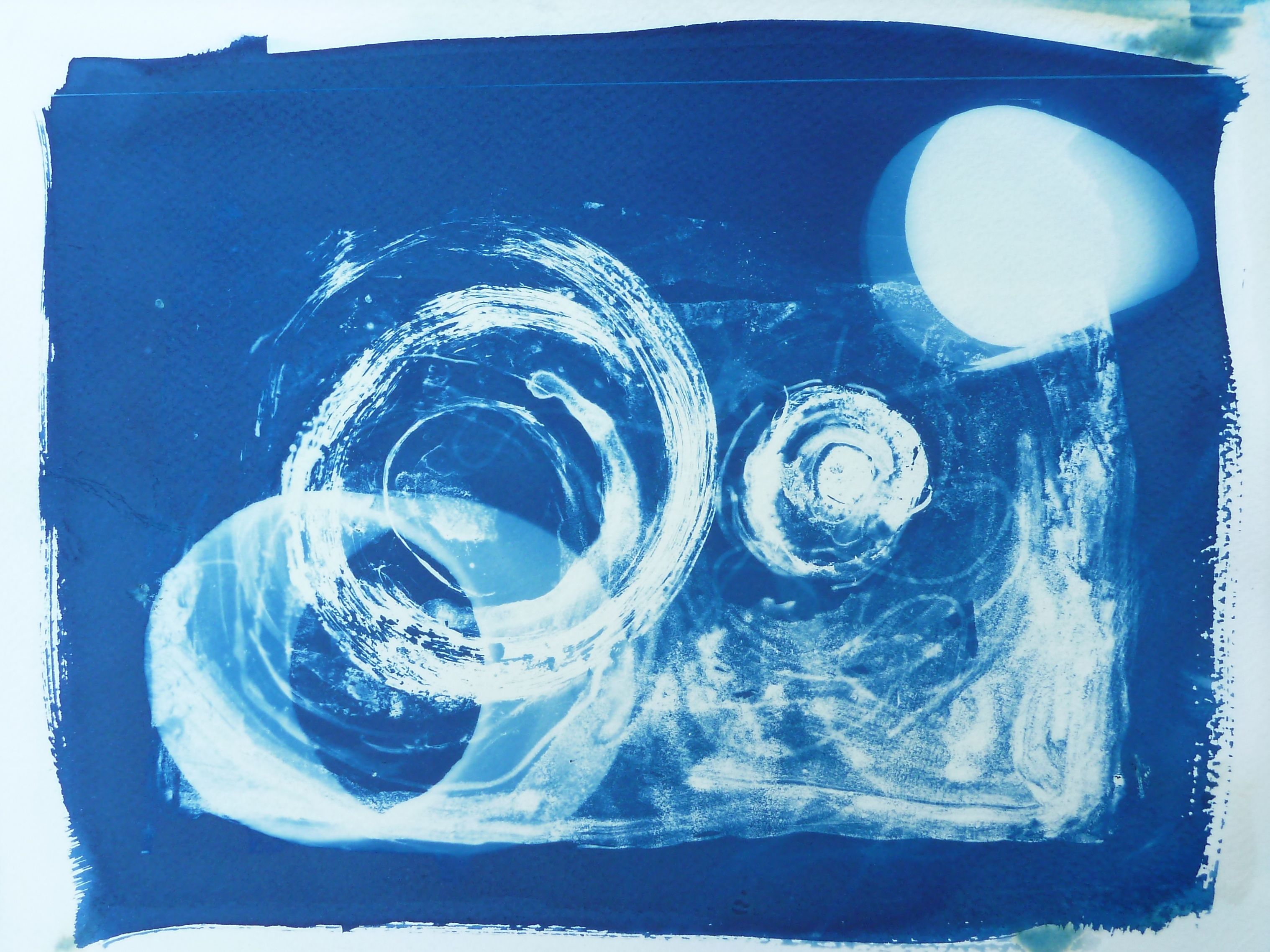
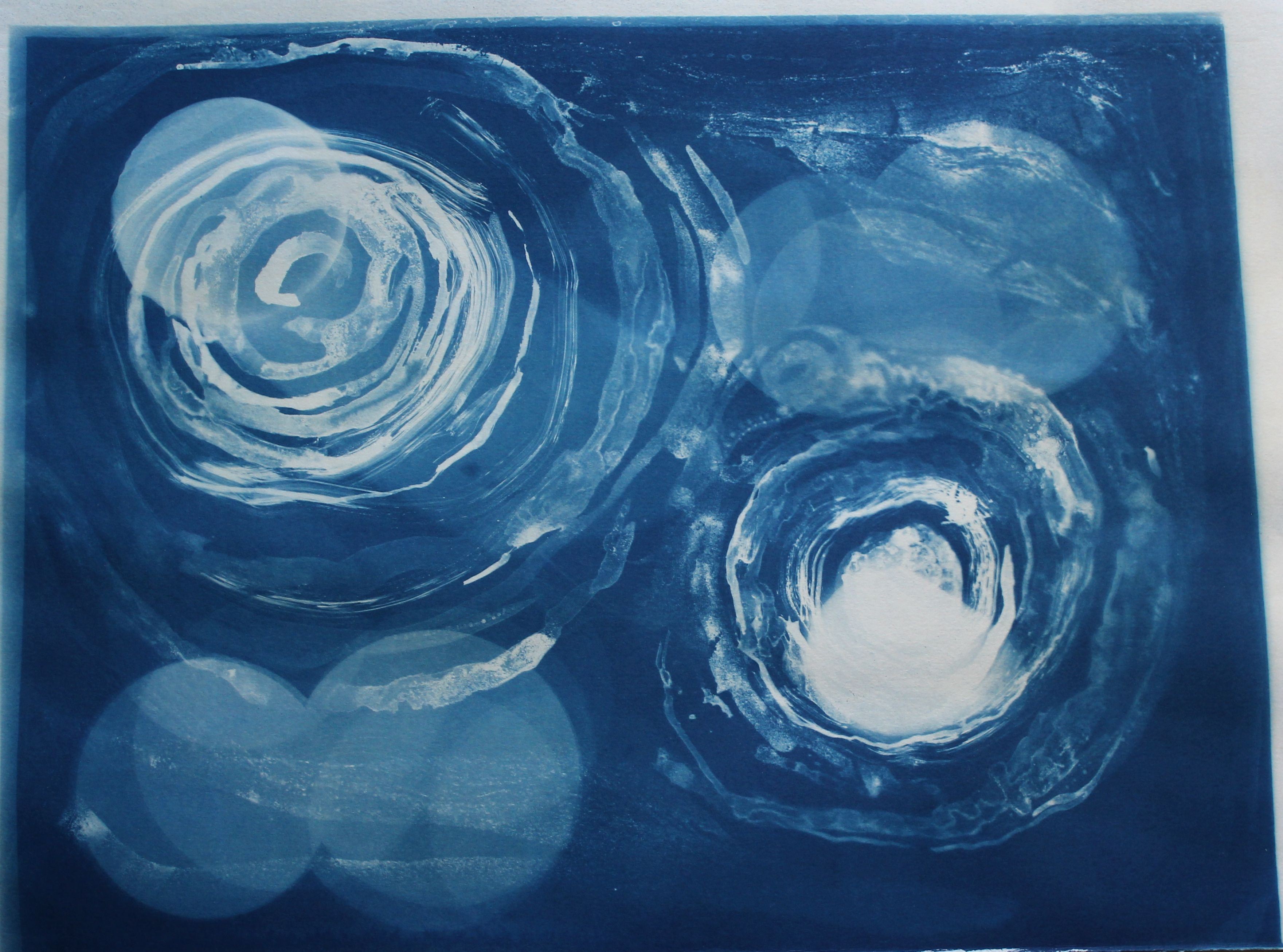
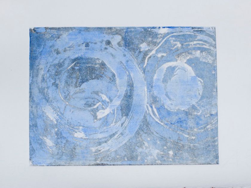
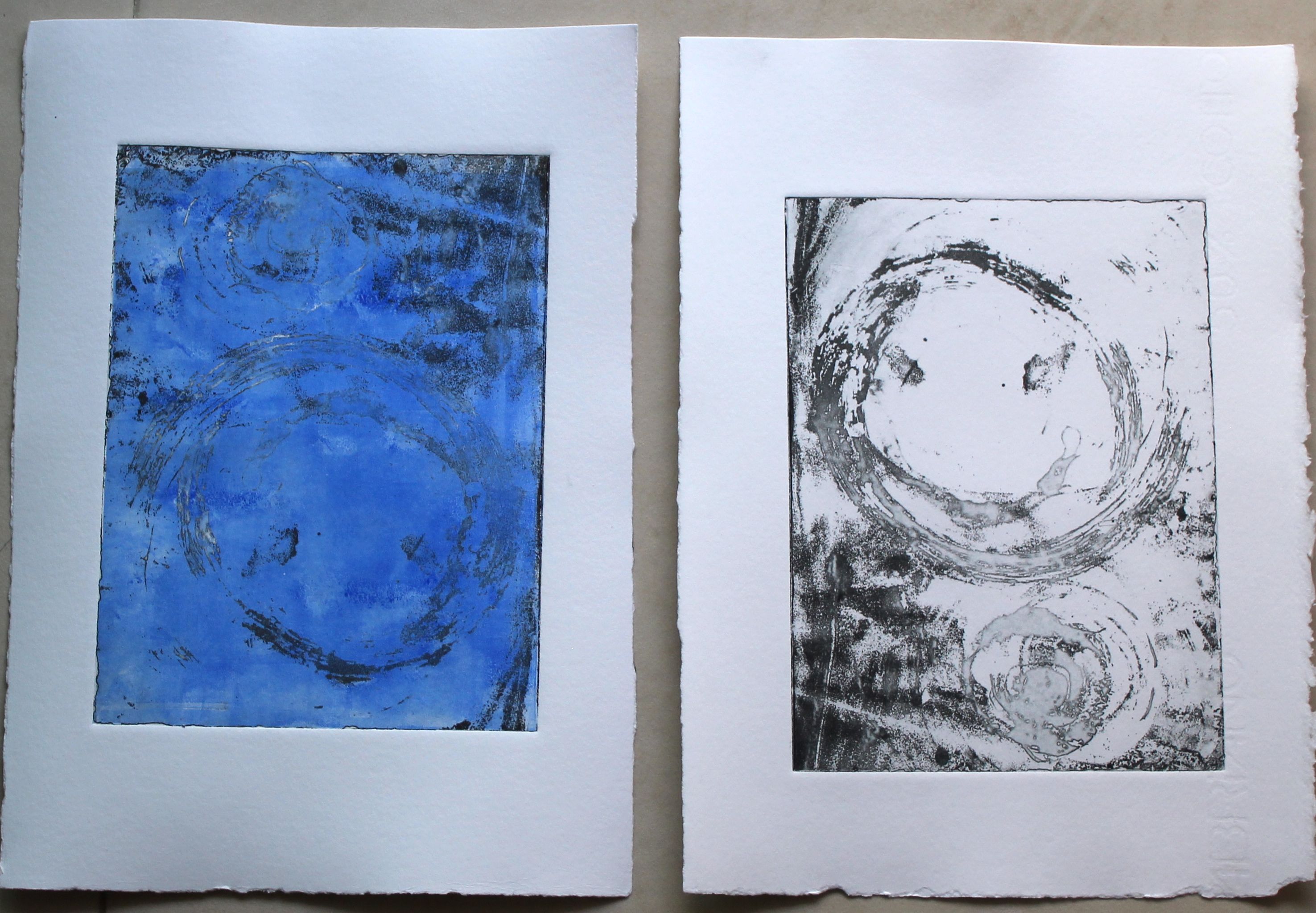
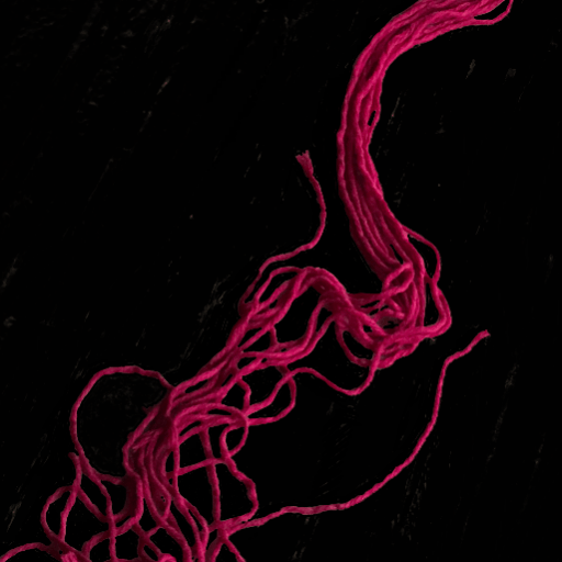
I used the same negative- an ink wash on film- that I had tried to expose on the photopolymer film: the two moons image.
Two moons: ink and wash on film
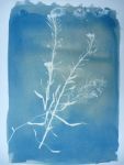
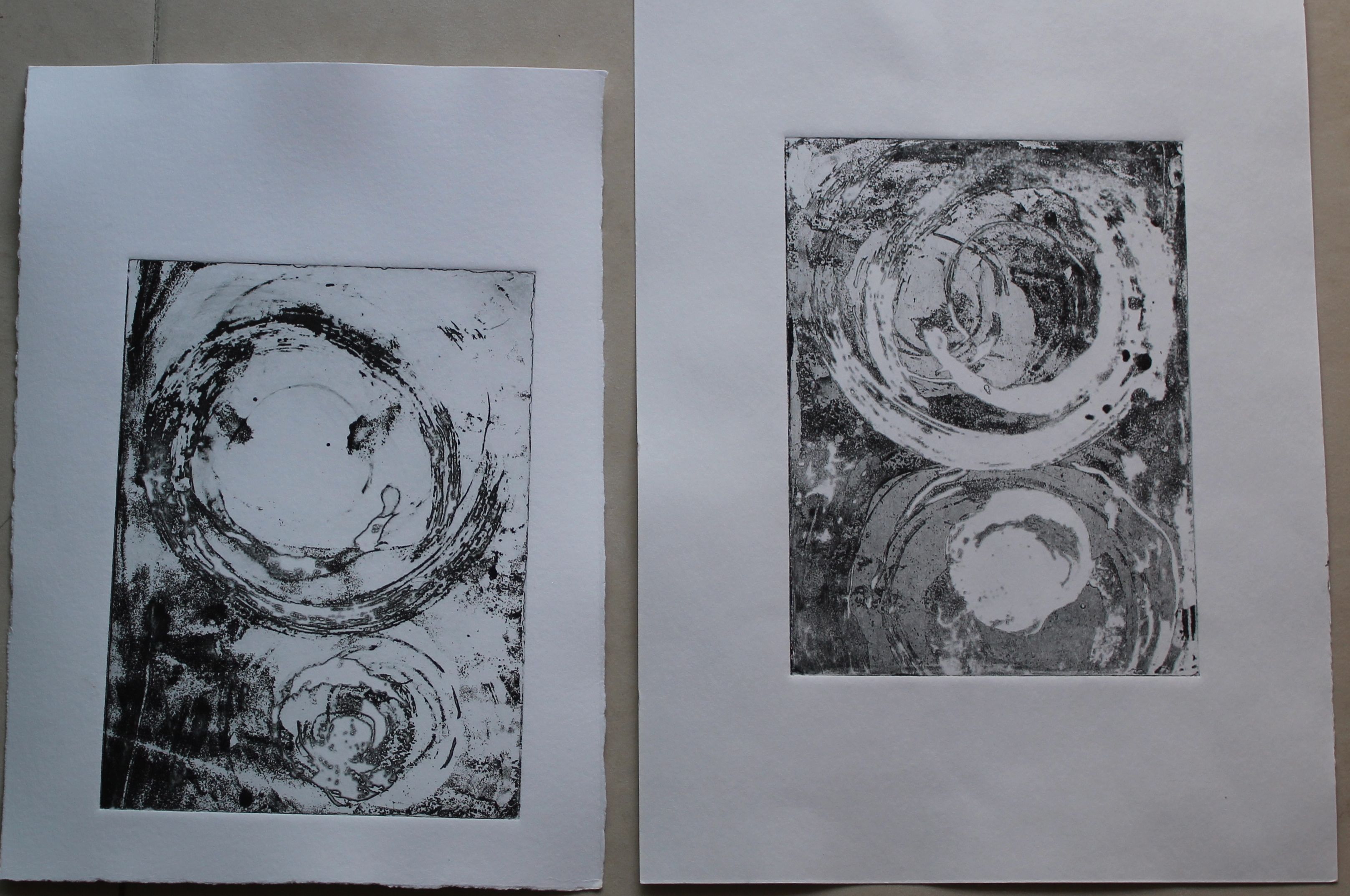
Two moons: ink and wash on plastic, with carborundum powder
three moons with carborundum
two moons and moving objects
Finally these are the ones I want to develop into a slightly larger piece:
two moons; Combination ink wash and 3-d objects
two moons: combination wash and 3-d objects
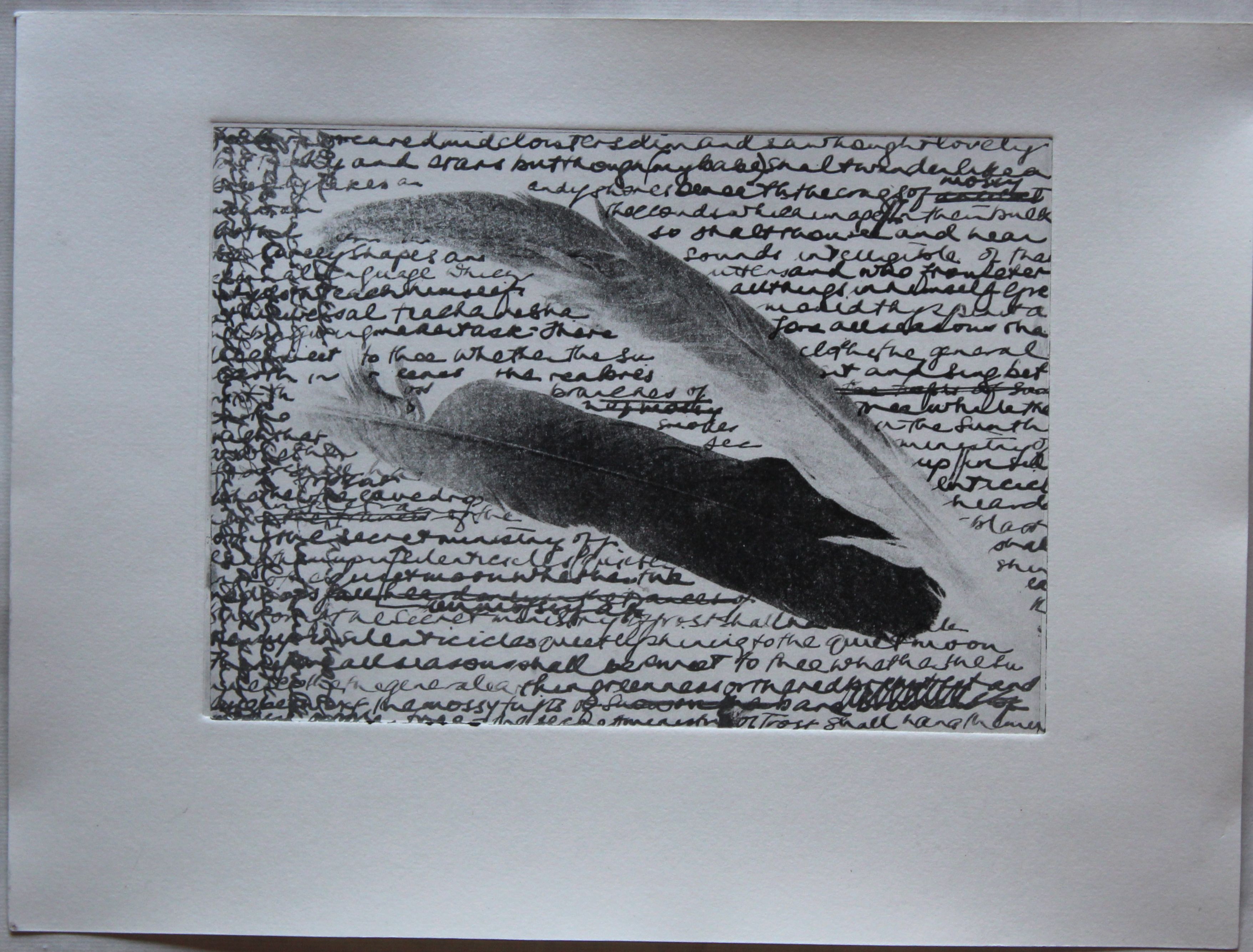
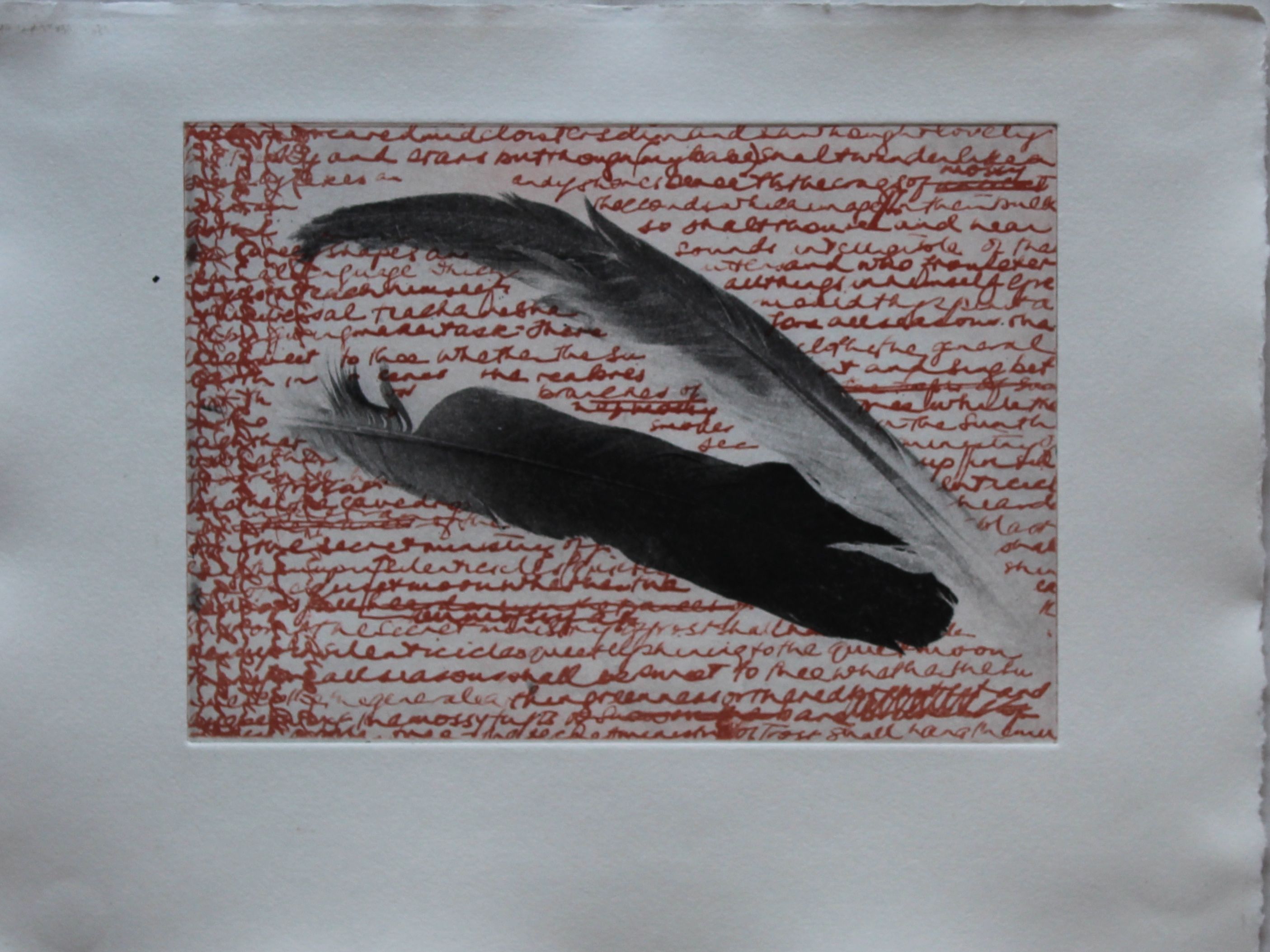
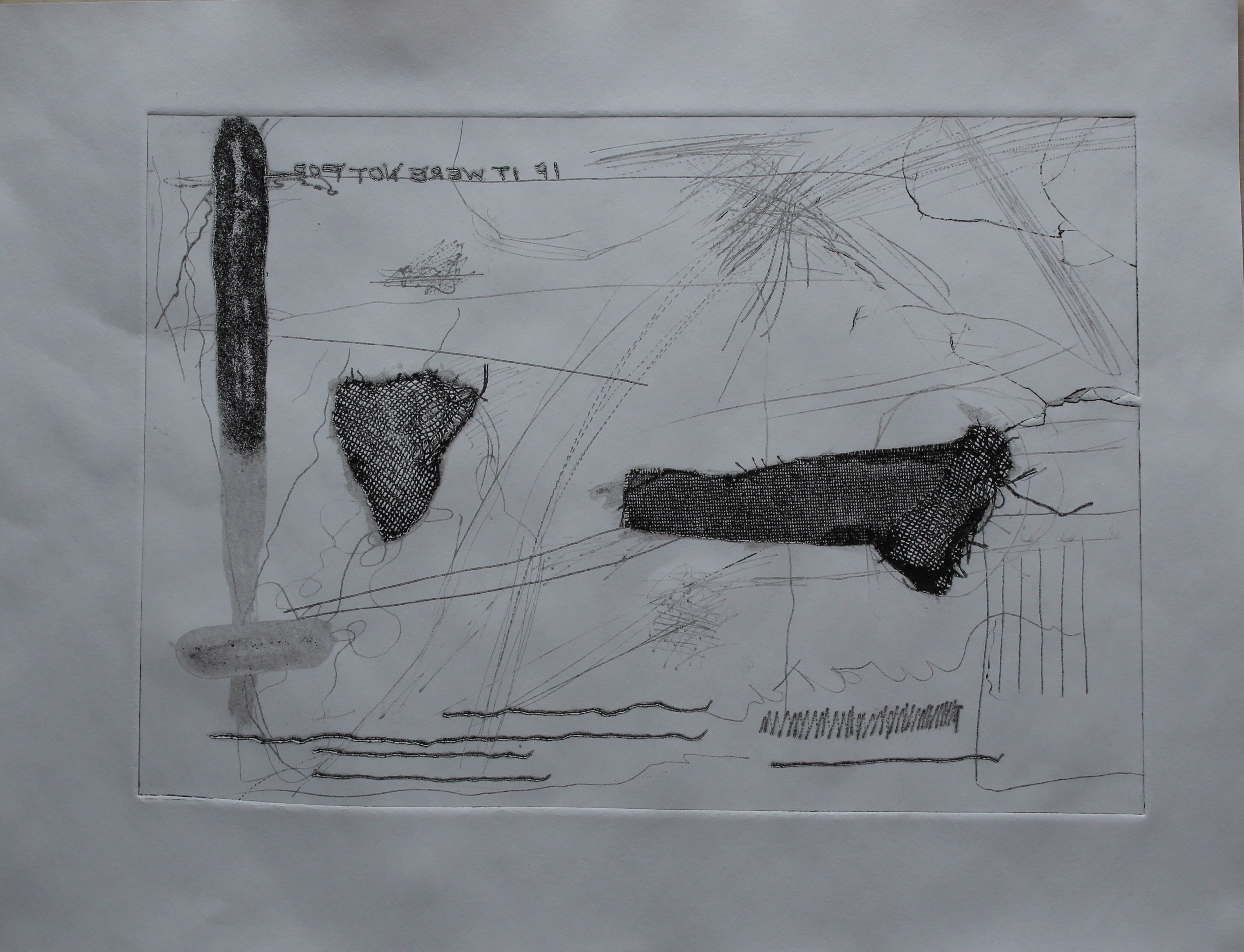
I like the mixture of soft and hard lines, drawn, textured and geometric, with a suggestion of perspectival and telescopic views made by the fact that there was a shadow cast by the 3-D objects, and movement caused by the breeze. The angled cylinder shape will have to be made taking account of the direction of the shadows, so will need strong sun.The image I plan to make will reflect those 18th and 19th century astronomers, working with self made tools, who discovered the age of the universe and had to try to explain to themselves as well as to others, how God still fit into the scheme of things. The confusion that the image cause to the eye is reminiscent of the shifts in perspective from believing that the stars were fixed on a crystal sphere to realising that they were floating in space. I think it’s appropriate and slightly ironic to be using the sun to make the image.
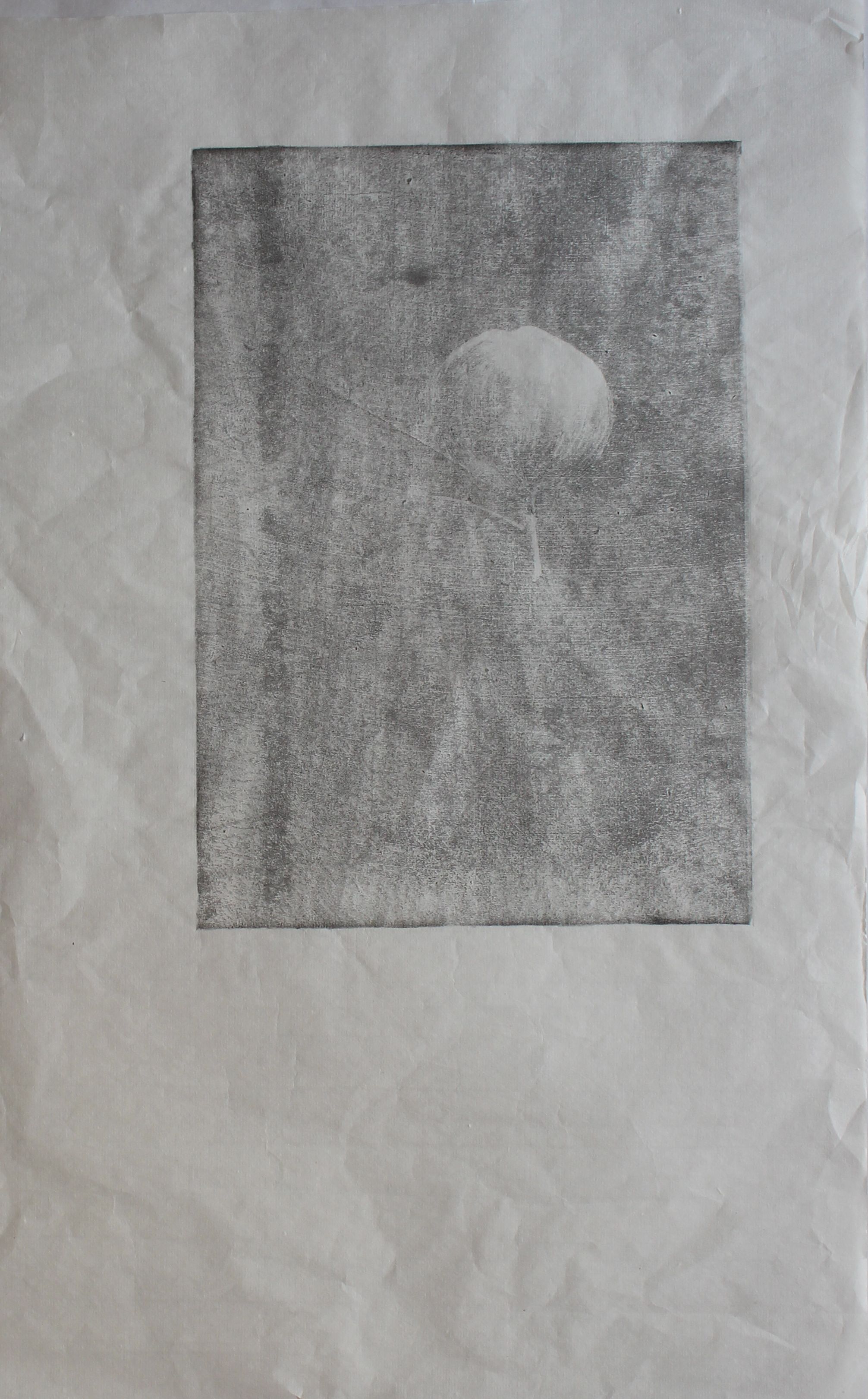
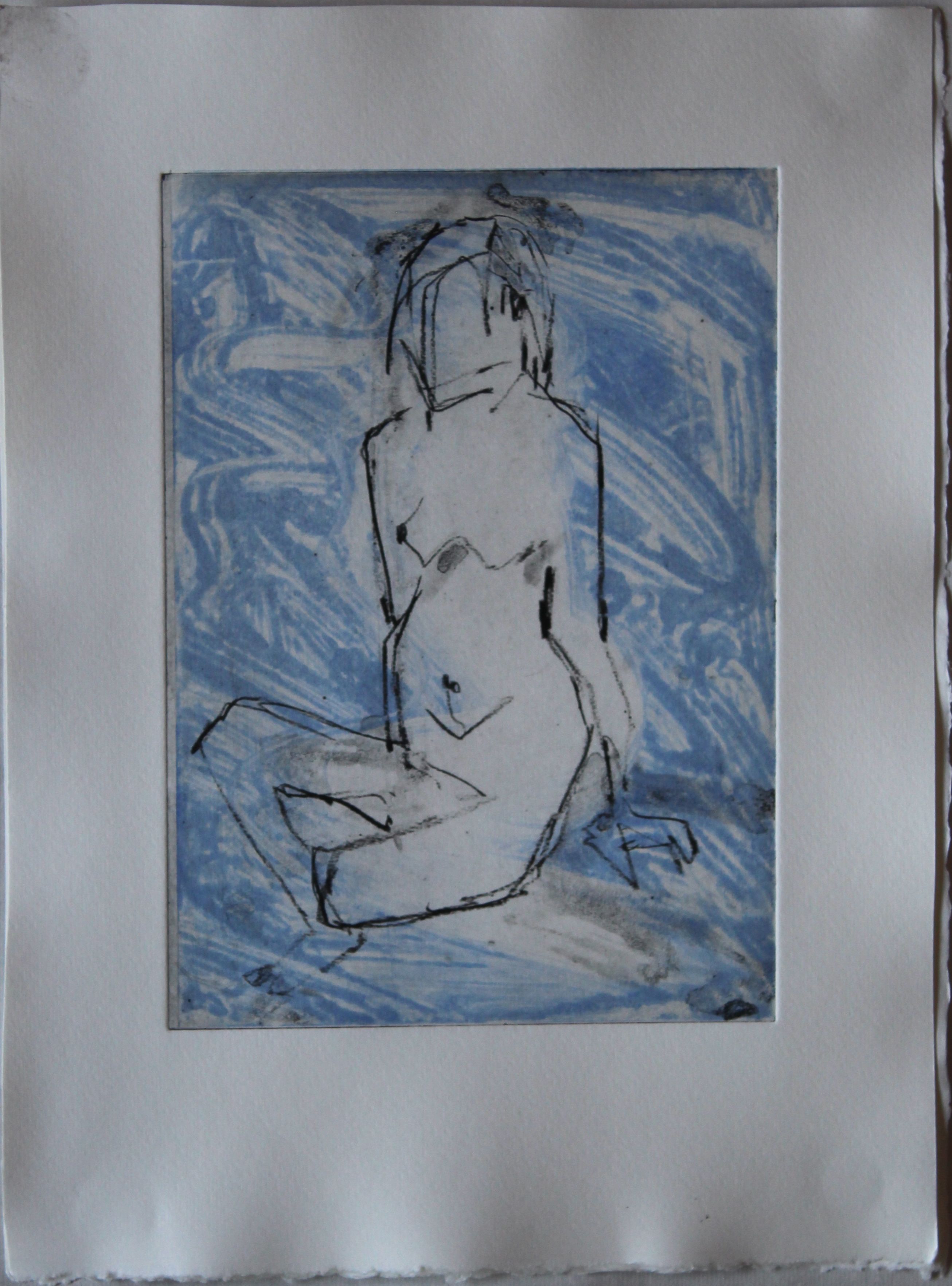
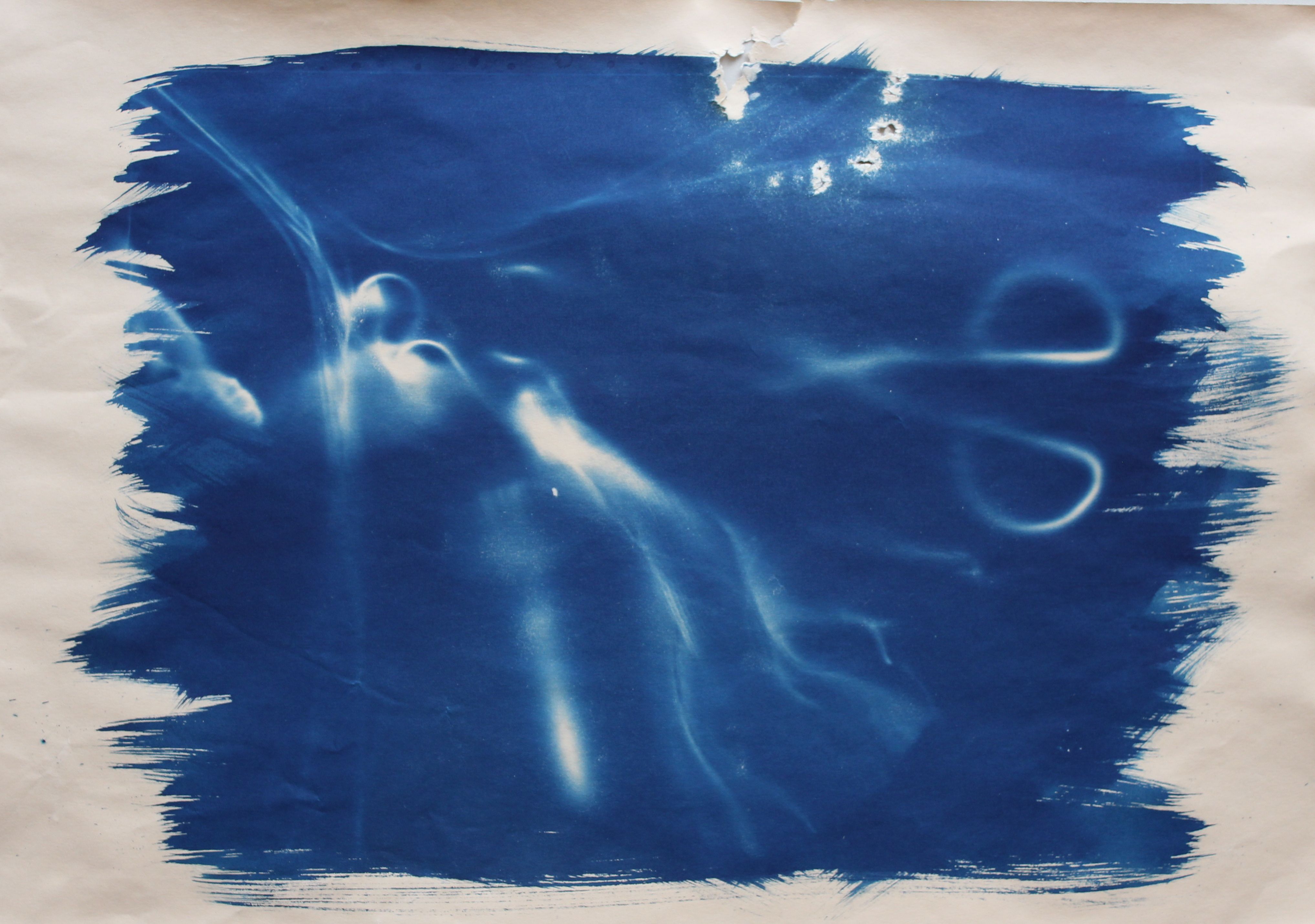
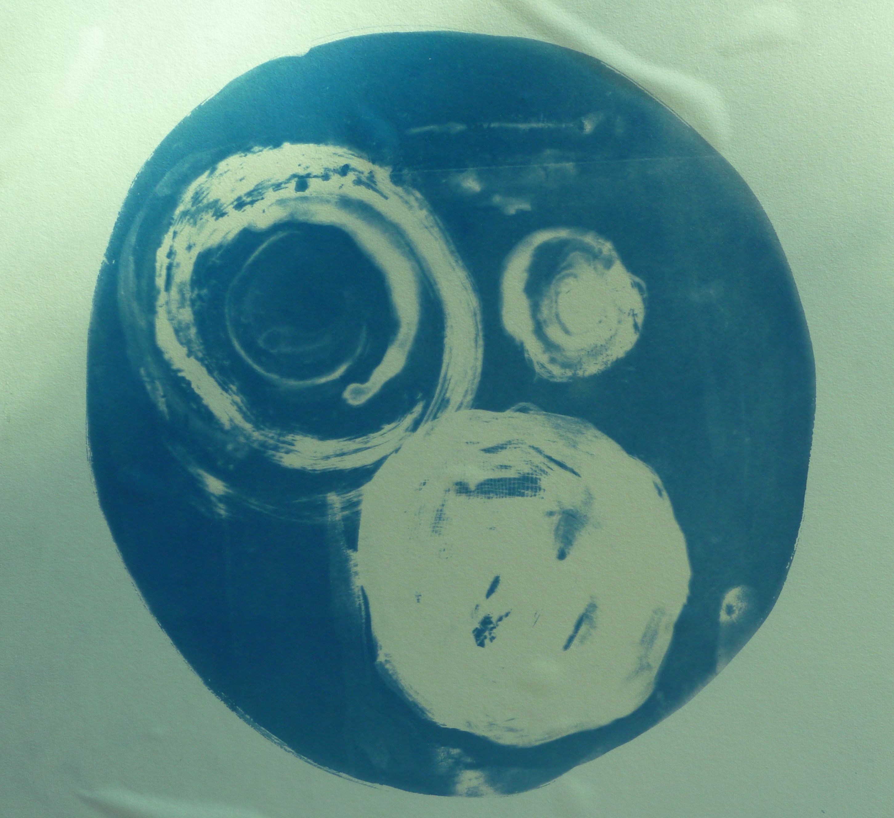
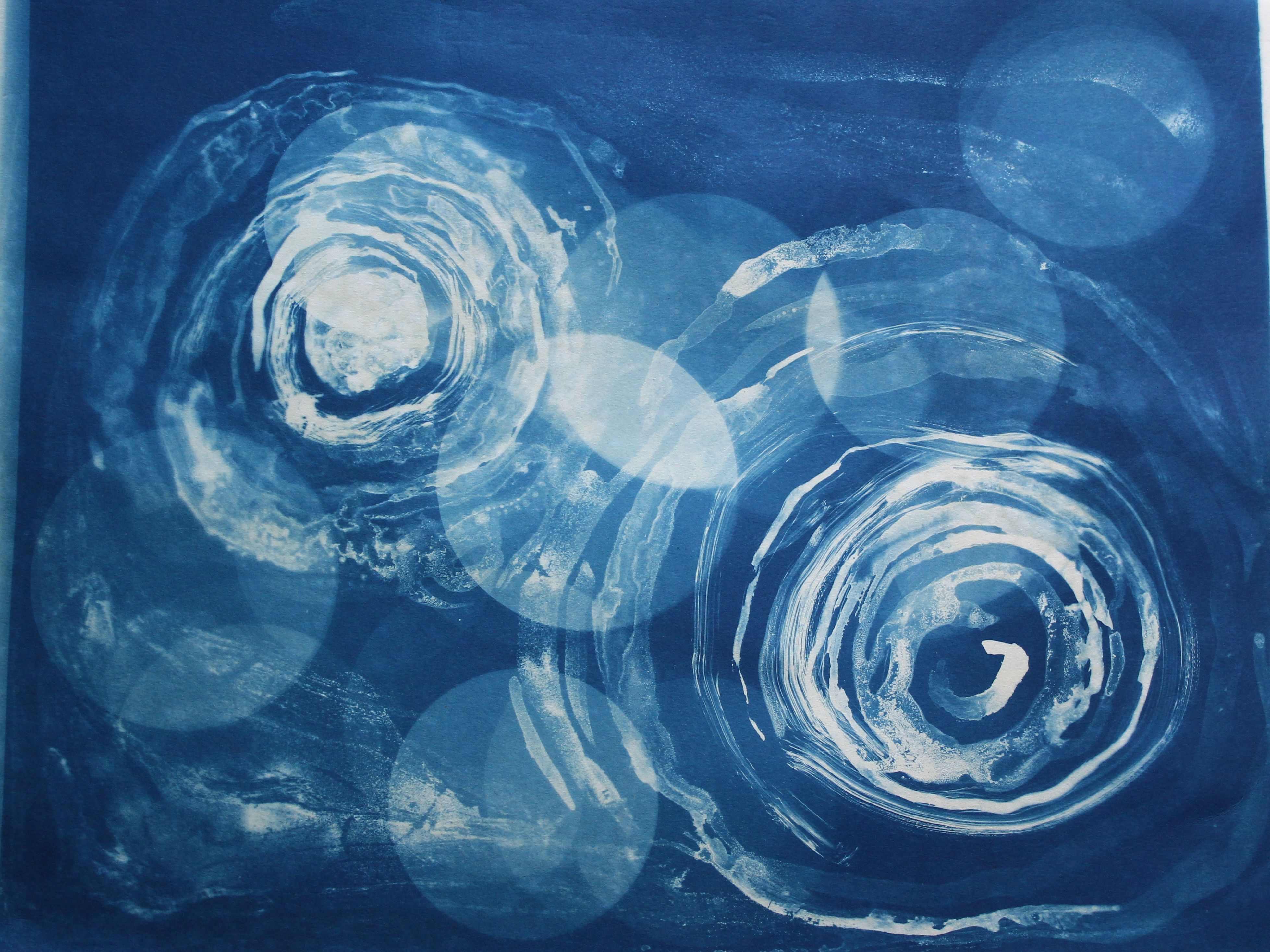
I also find this minimalist one attractive- the two simple shapes, one a bit like a balloon, the other a solid looking object that is actually a mere shadow: lots of play on presence and absence, and the ambiguous relationship between the two shapes, flat or 3-d, moving or still: one shape looks like a pendulum, and the other seems to recede, so I have called it “Space and Time”.
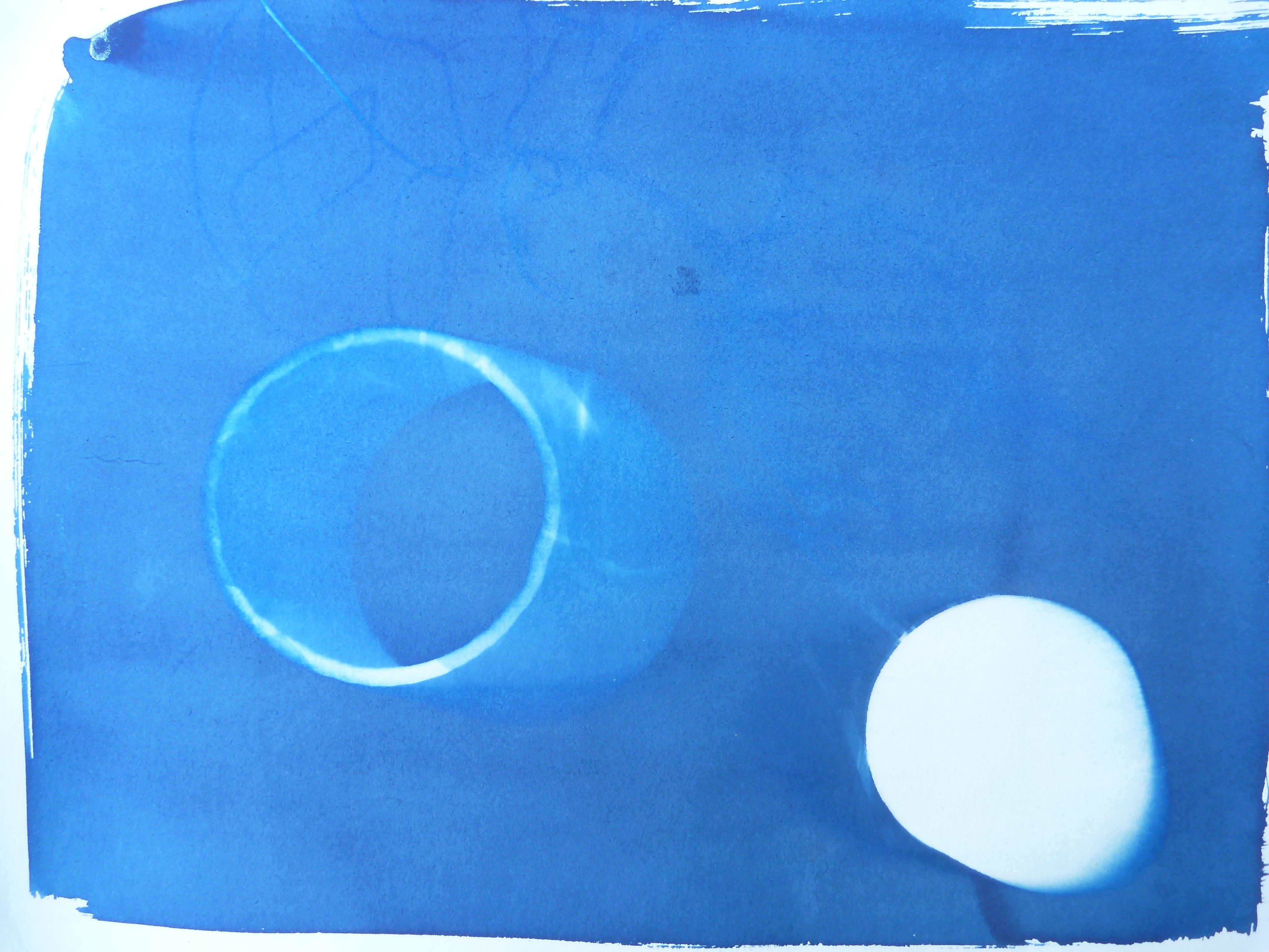
Space and time
I’m torn between the two- last feedback I got was to avoid doing too much. Is this personal taste? When I show these images to other people, they immediately appreciate the ones with the richest texture. In many ways, I find more to contemplate in the simpler one.
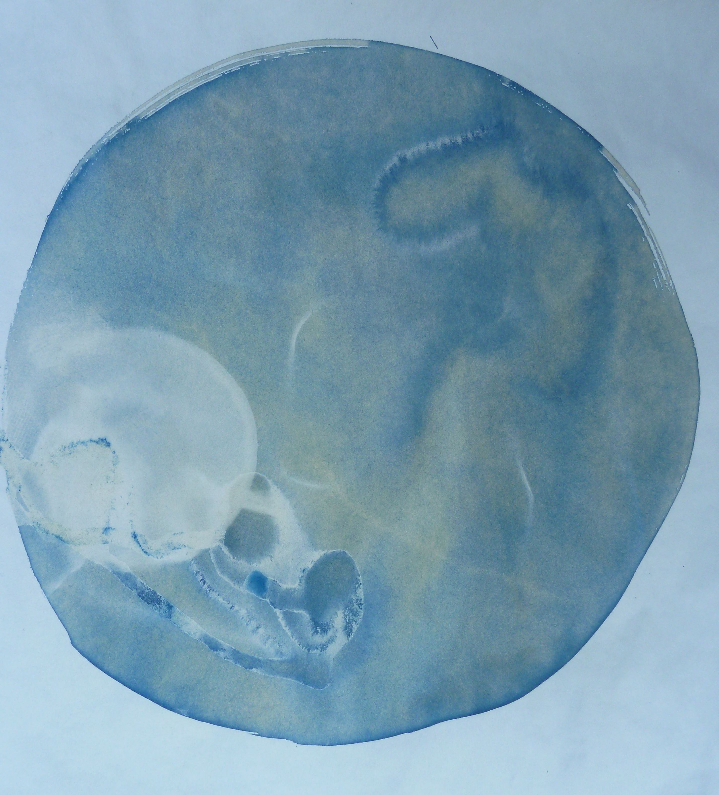
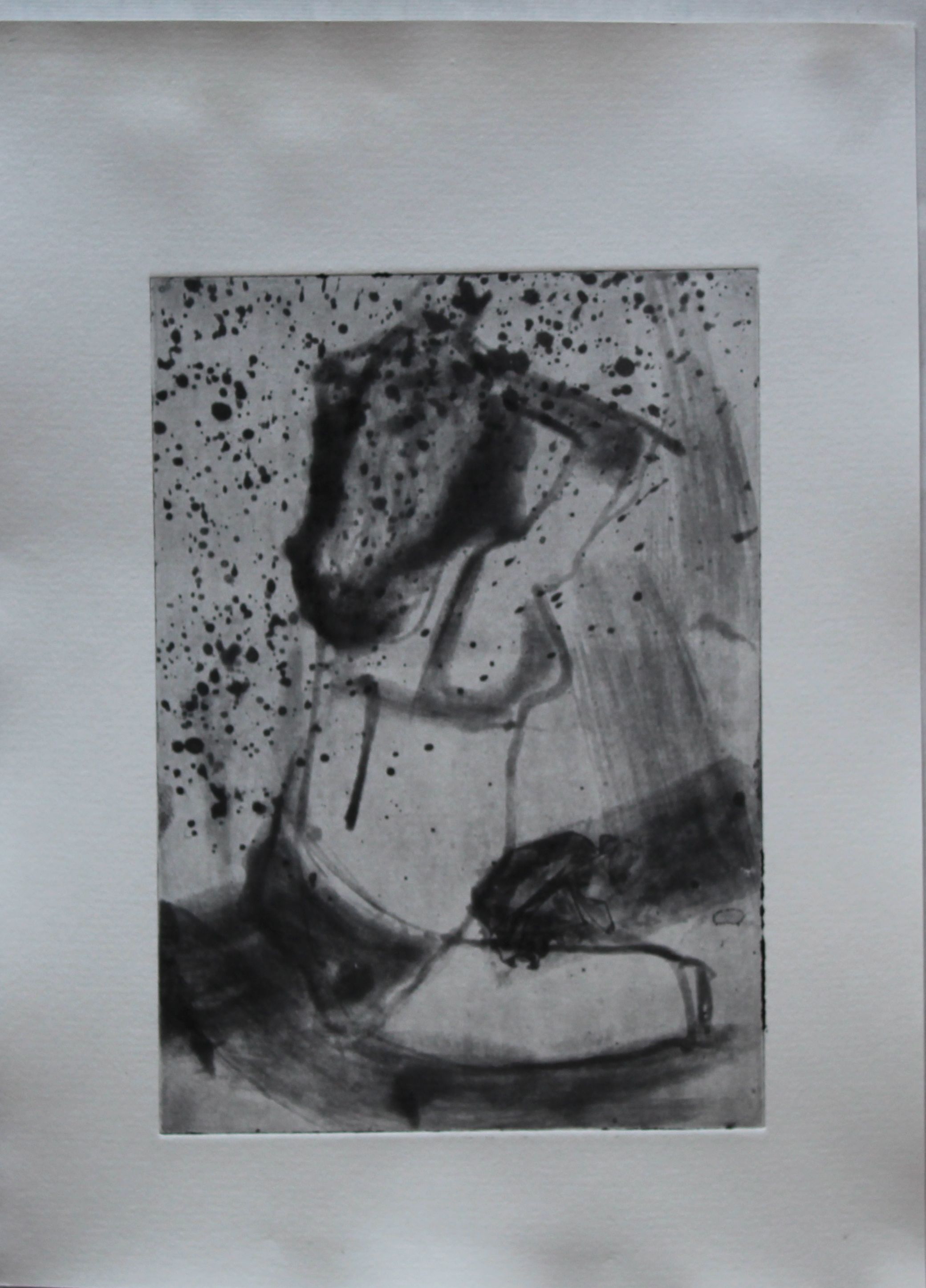
This one’s also interesting to look at- the product of accident- the liquid didn’t dry evenly, the UV wasn’t powerful enough, and in the end I abandoned it overnight, under the full moon as it happened, not that that will have done anything. But in the morning it looked like an embryo.
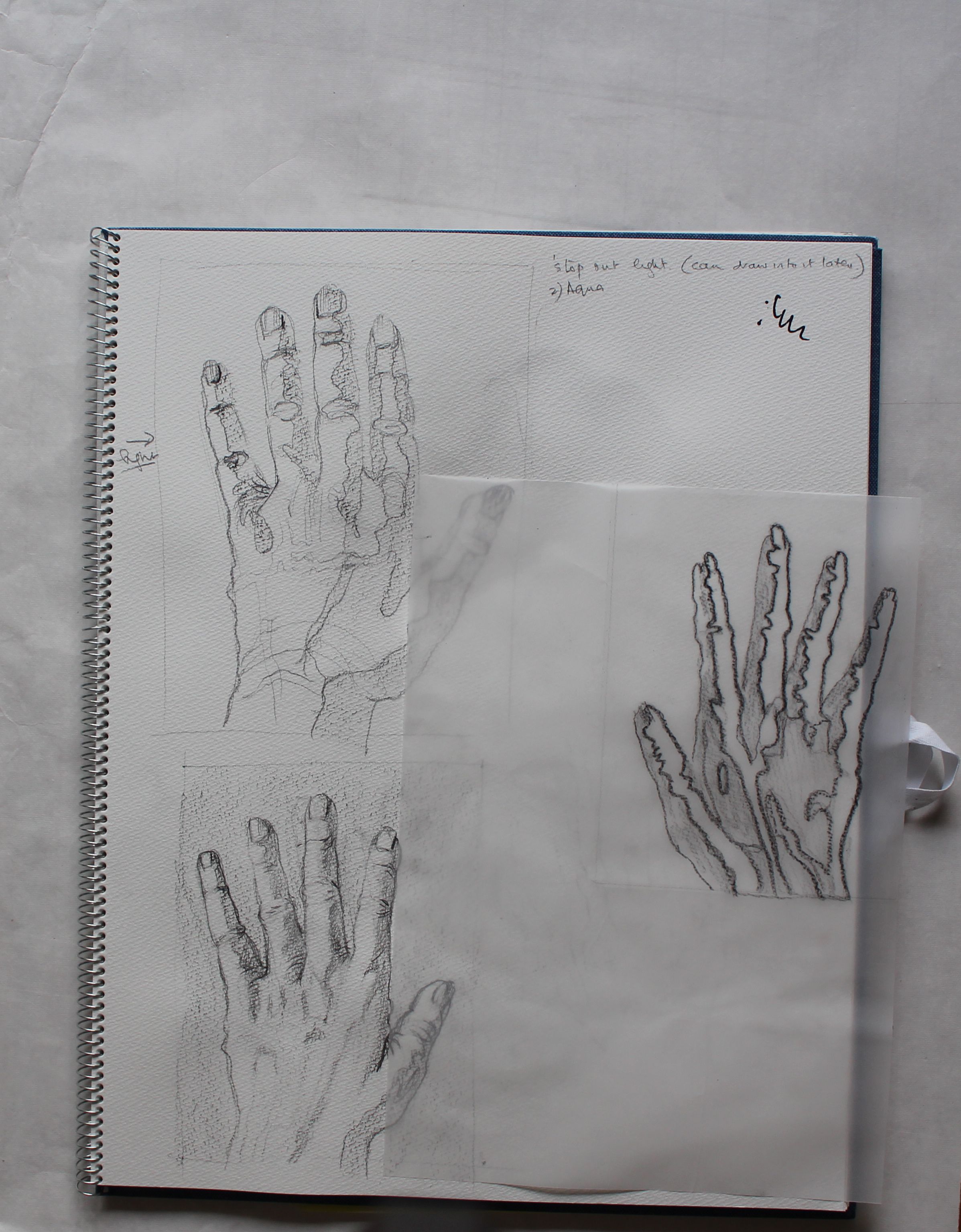
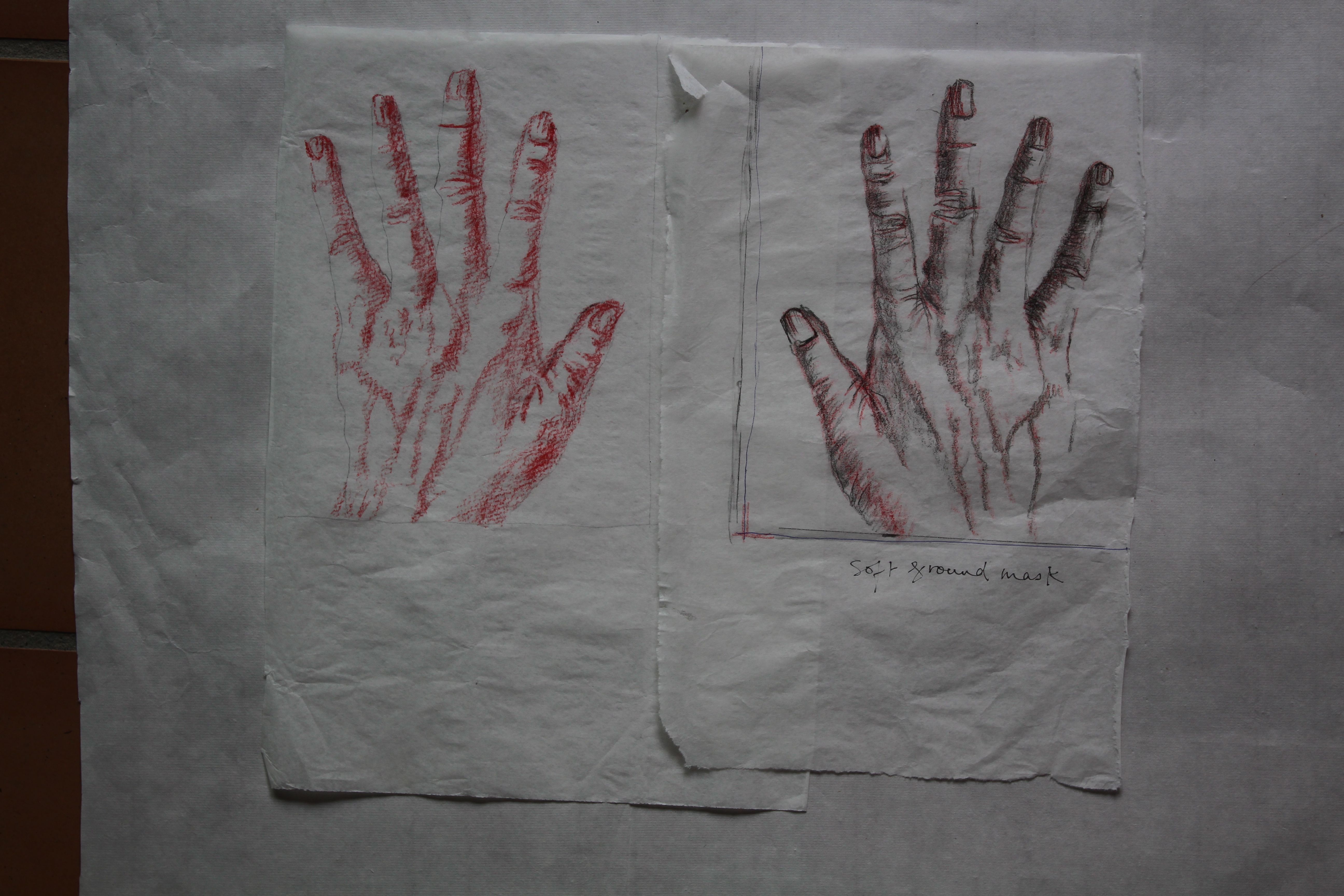
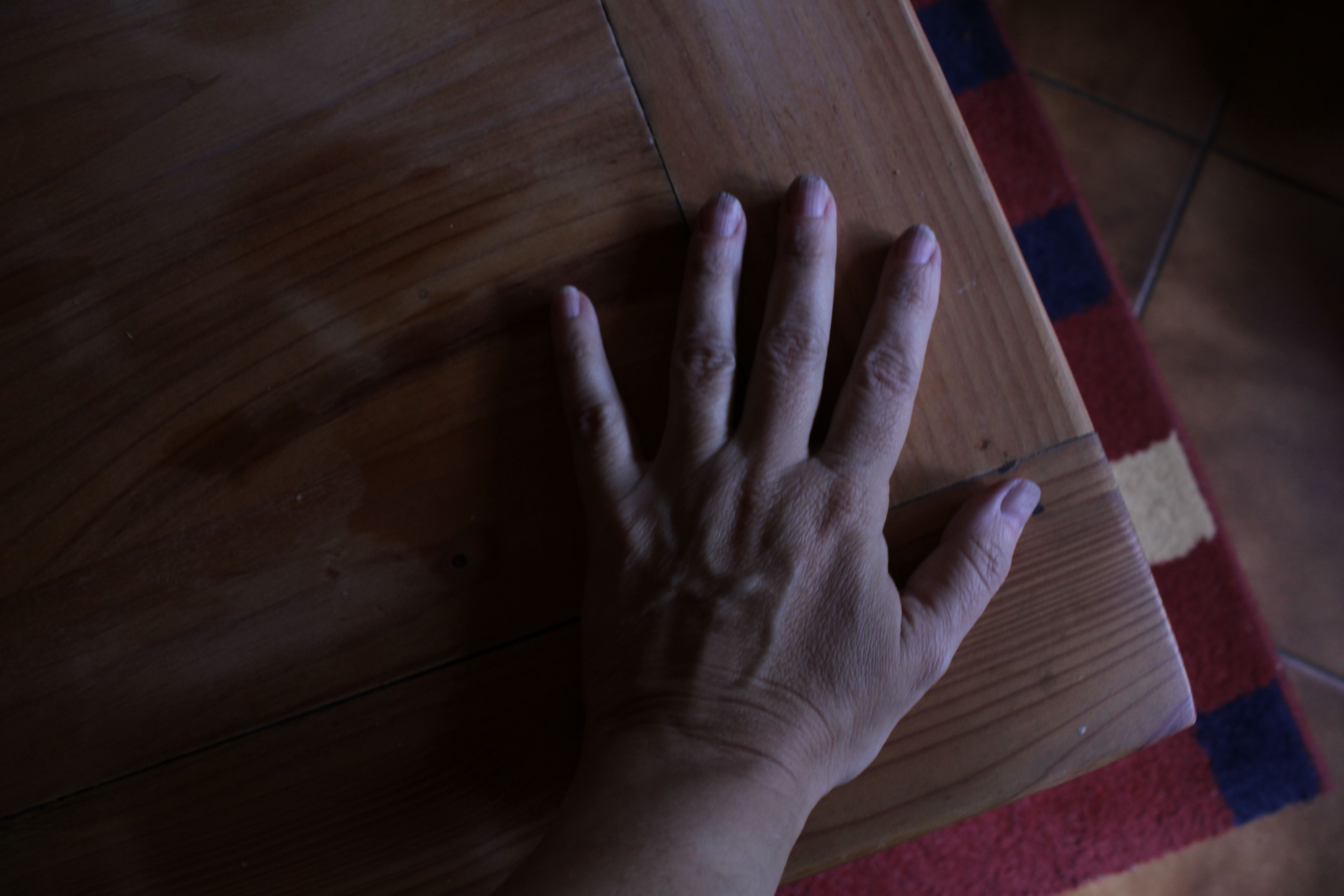
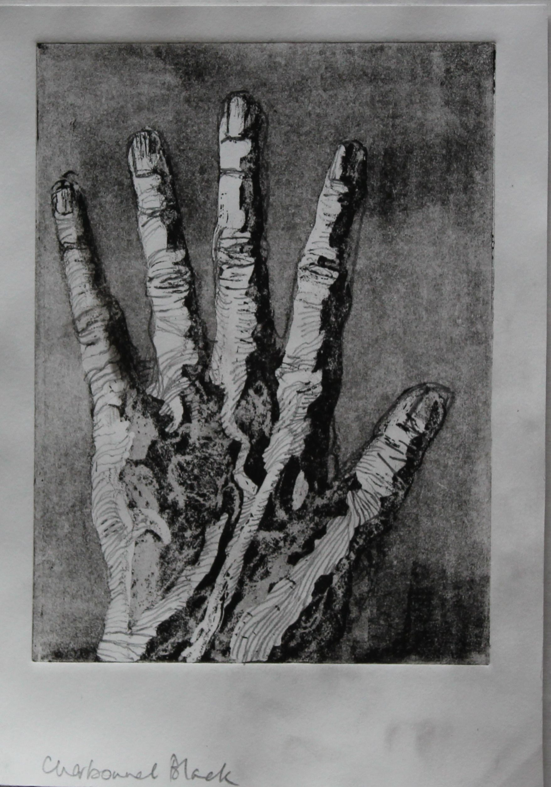
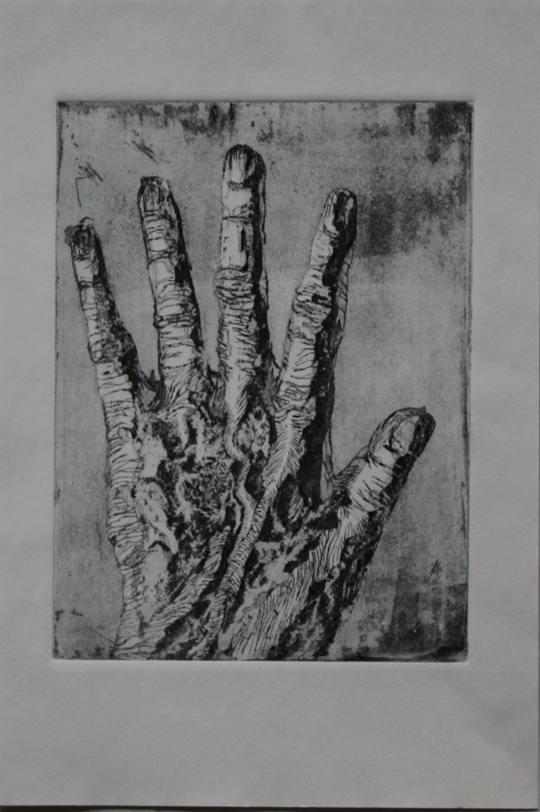
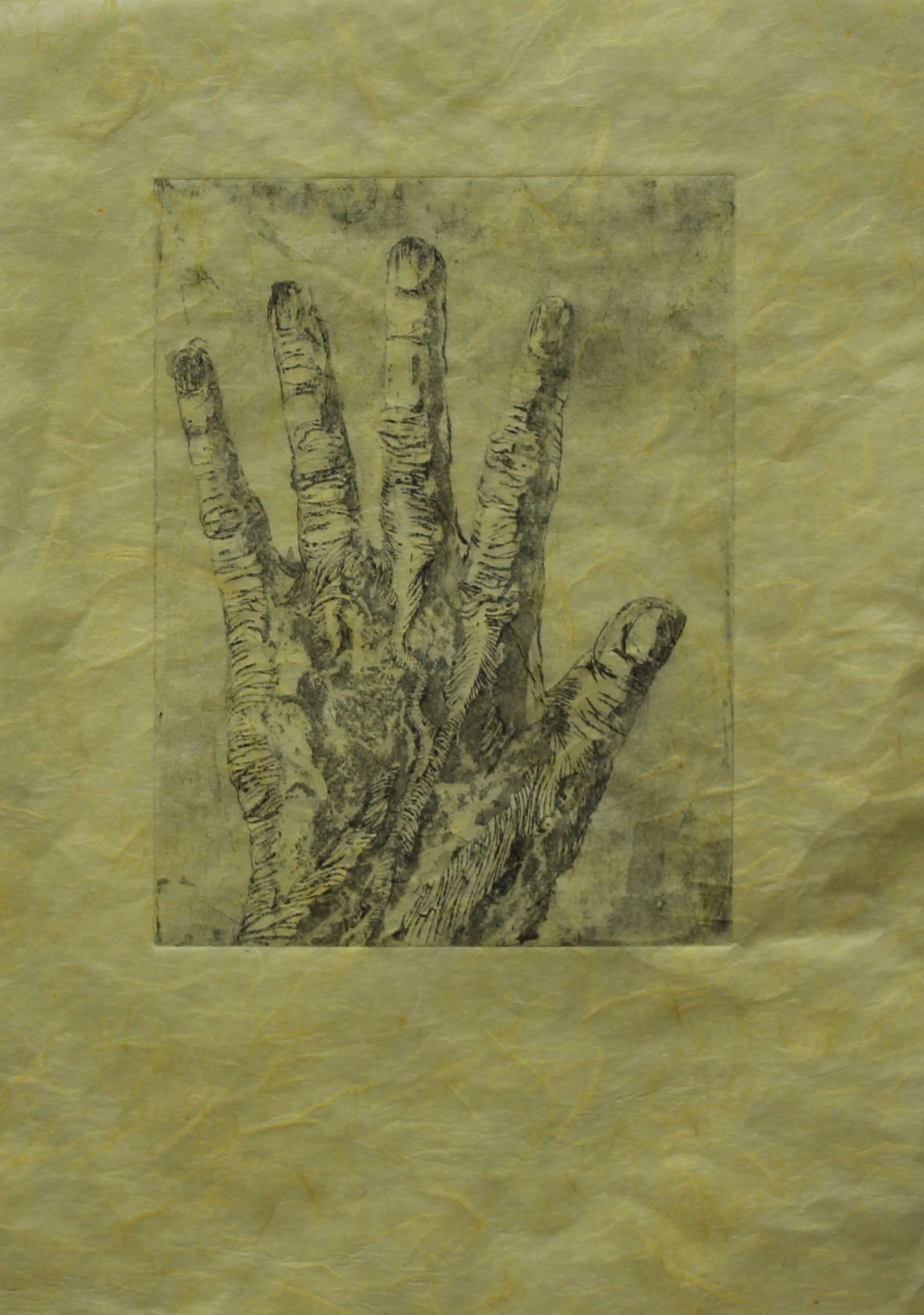
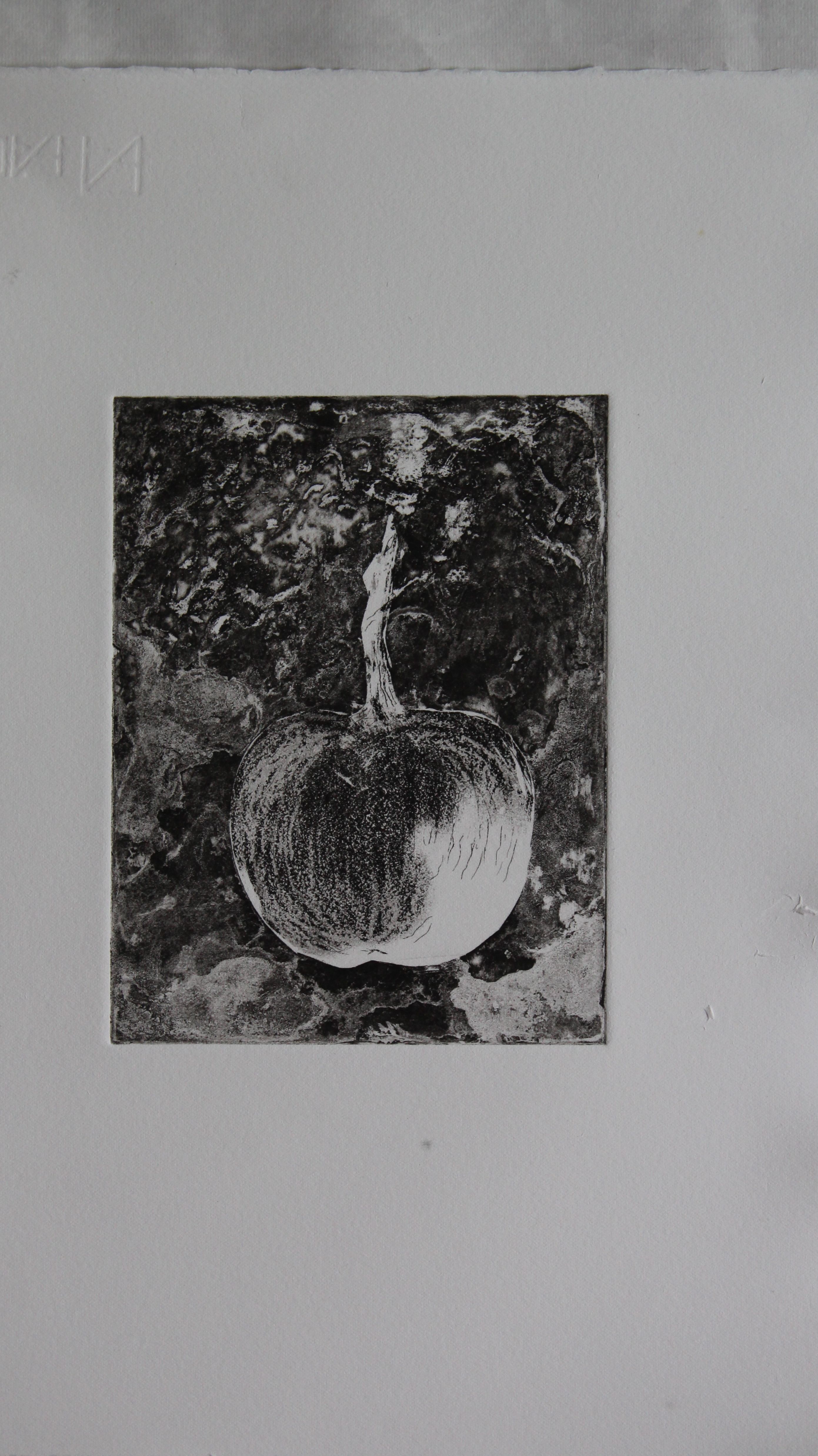
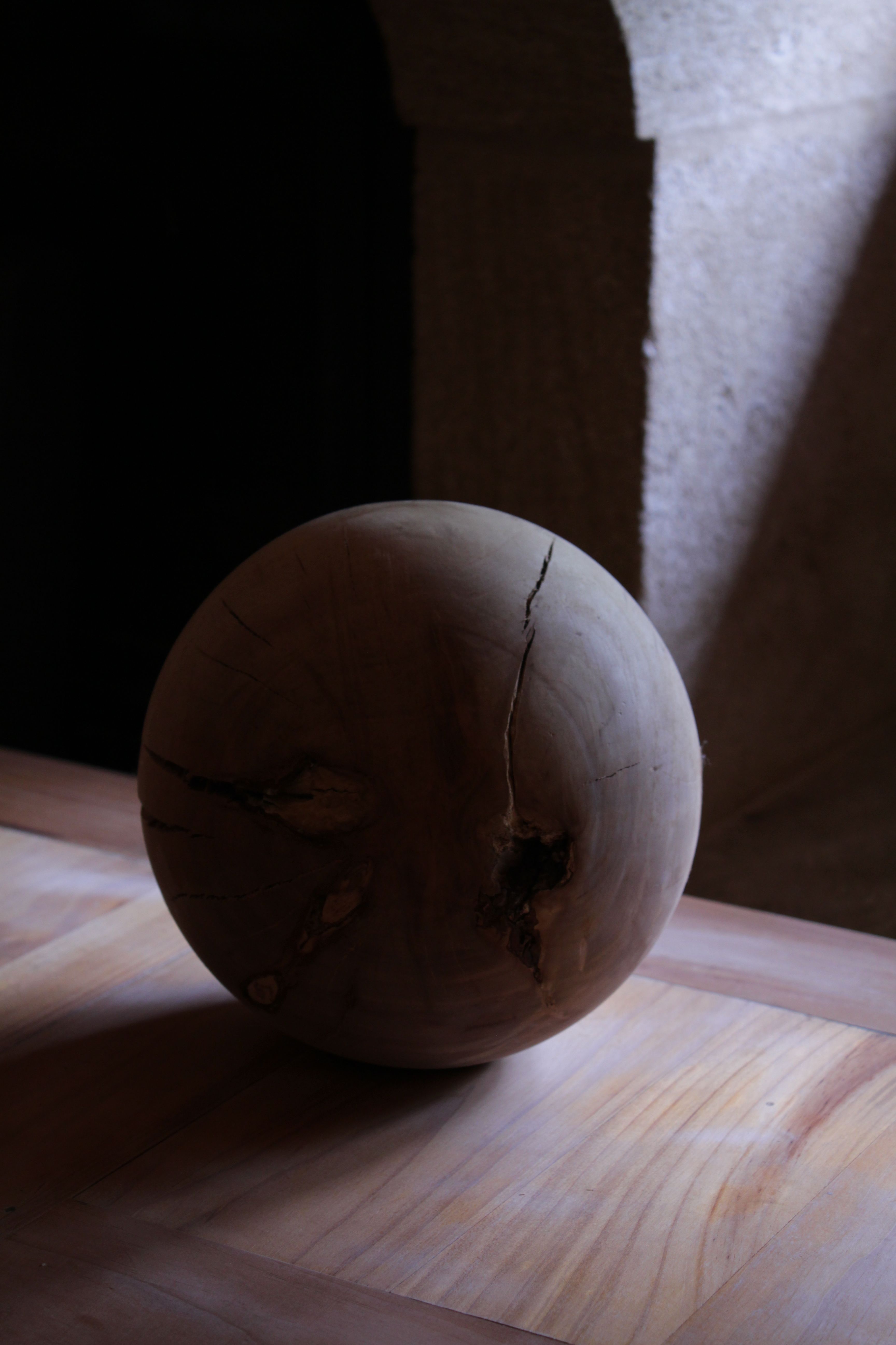
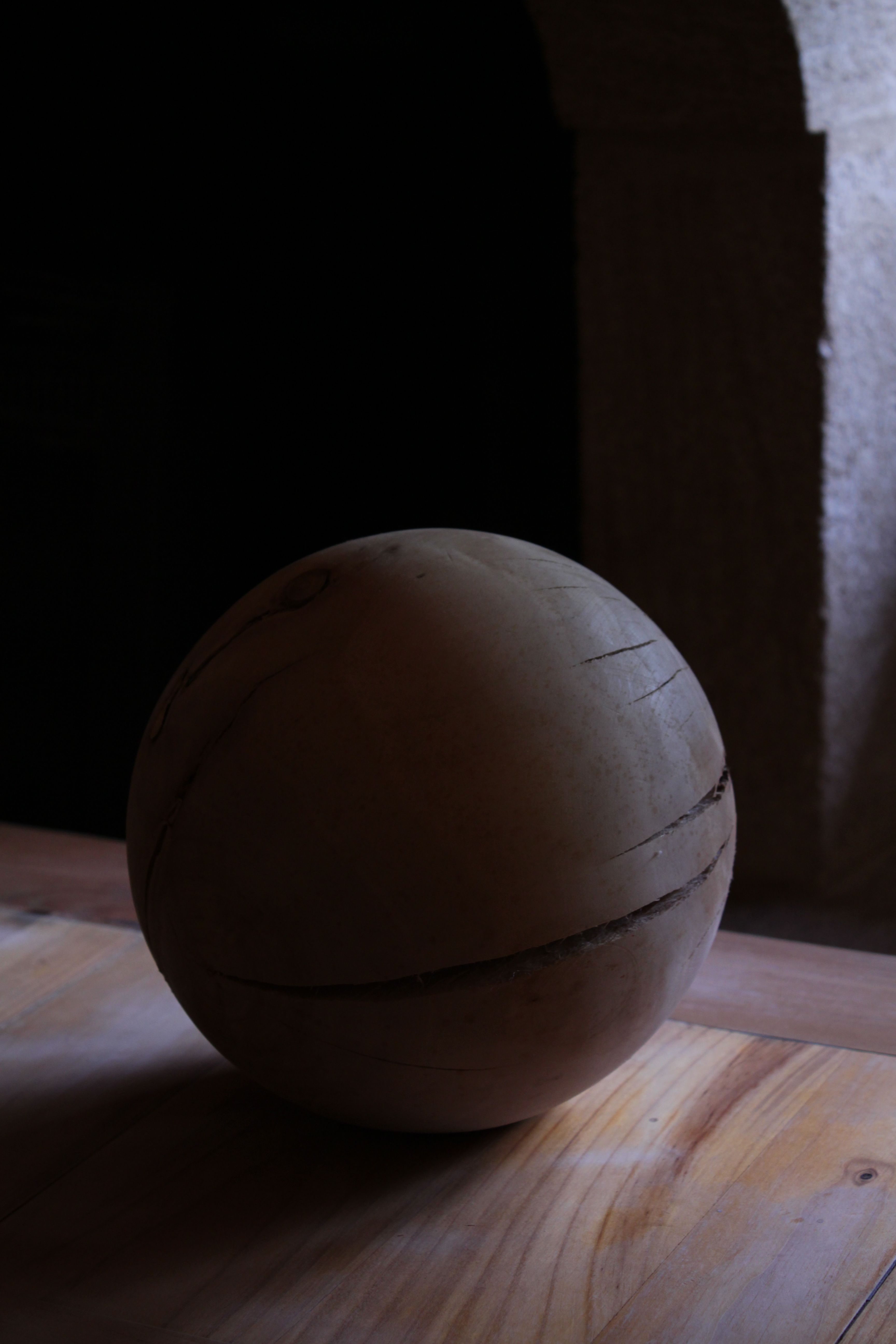
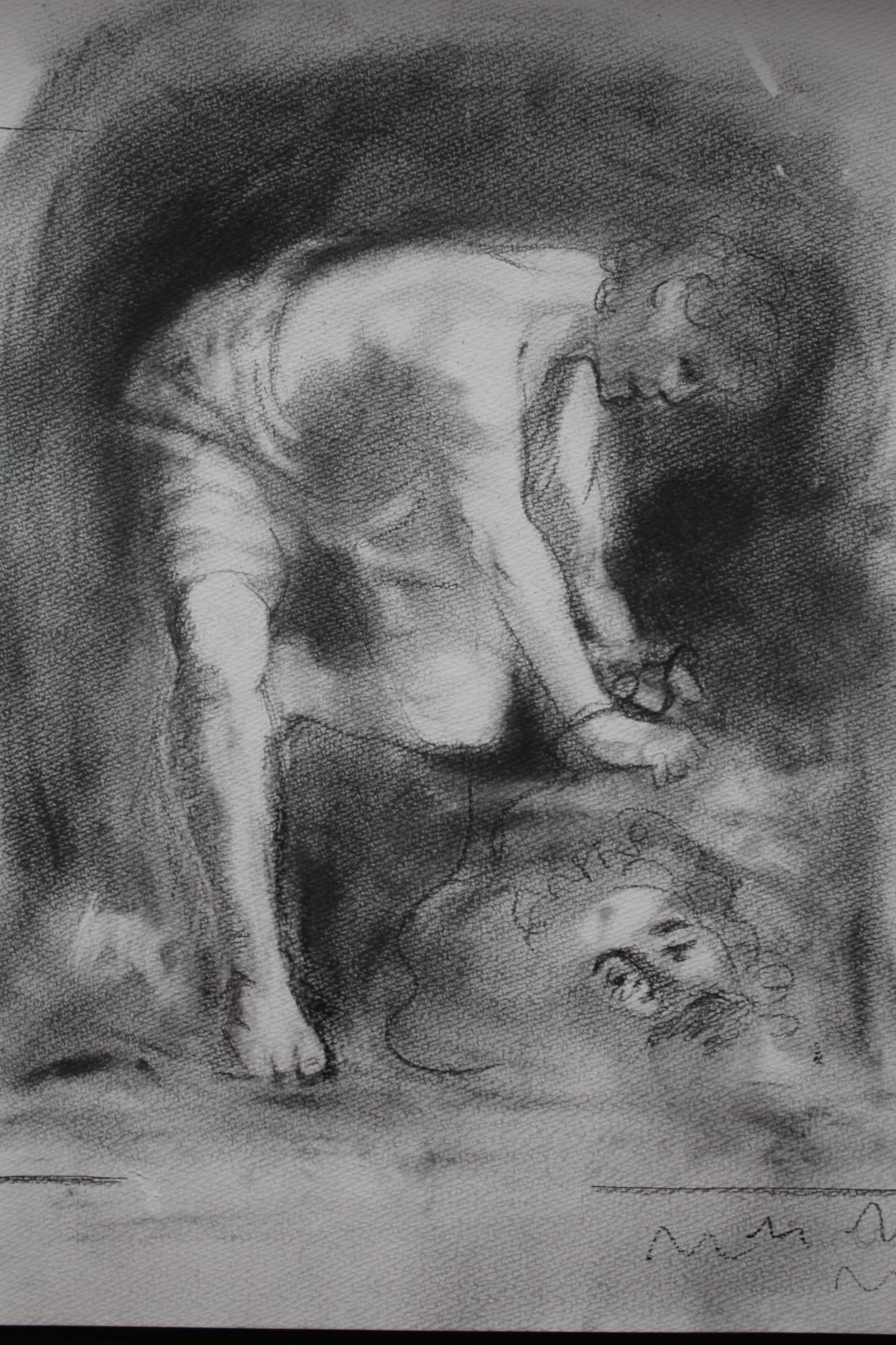
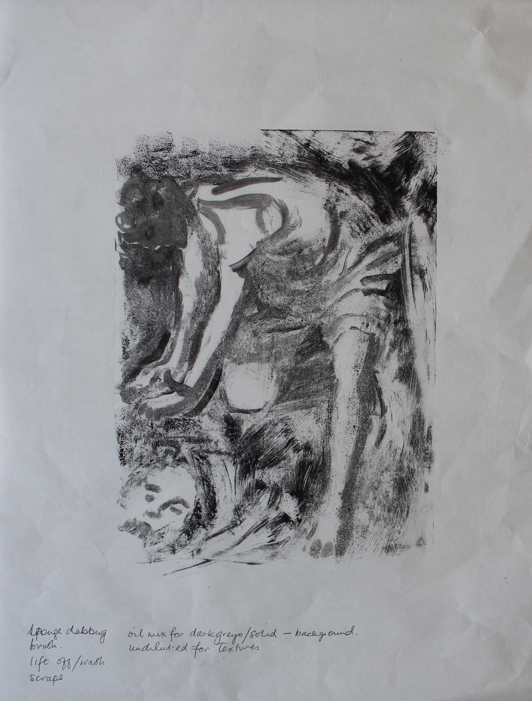
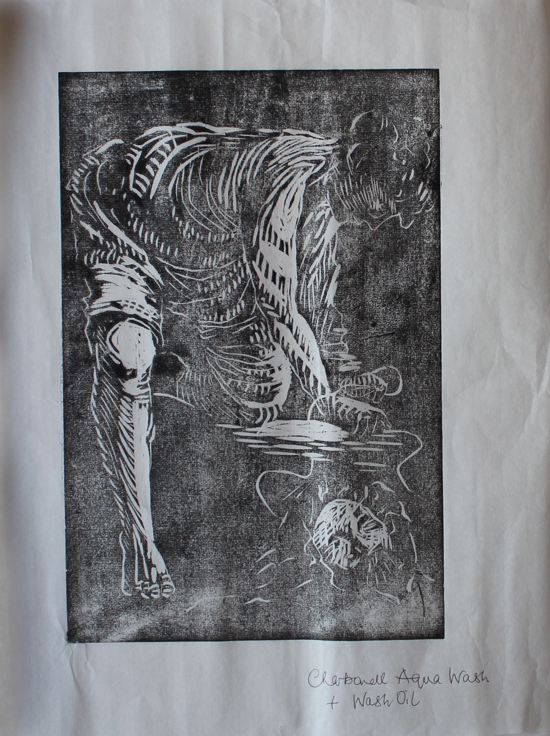
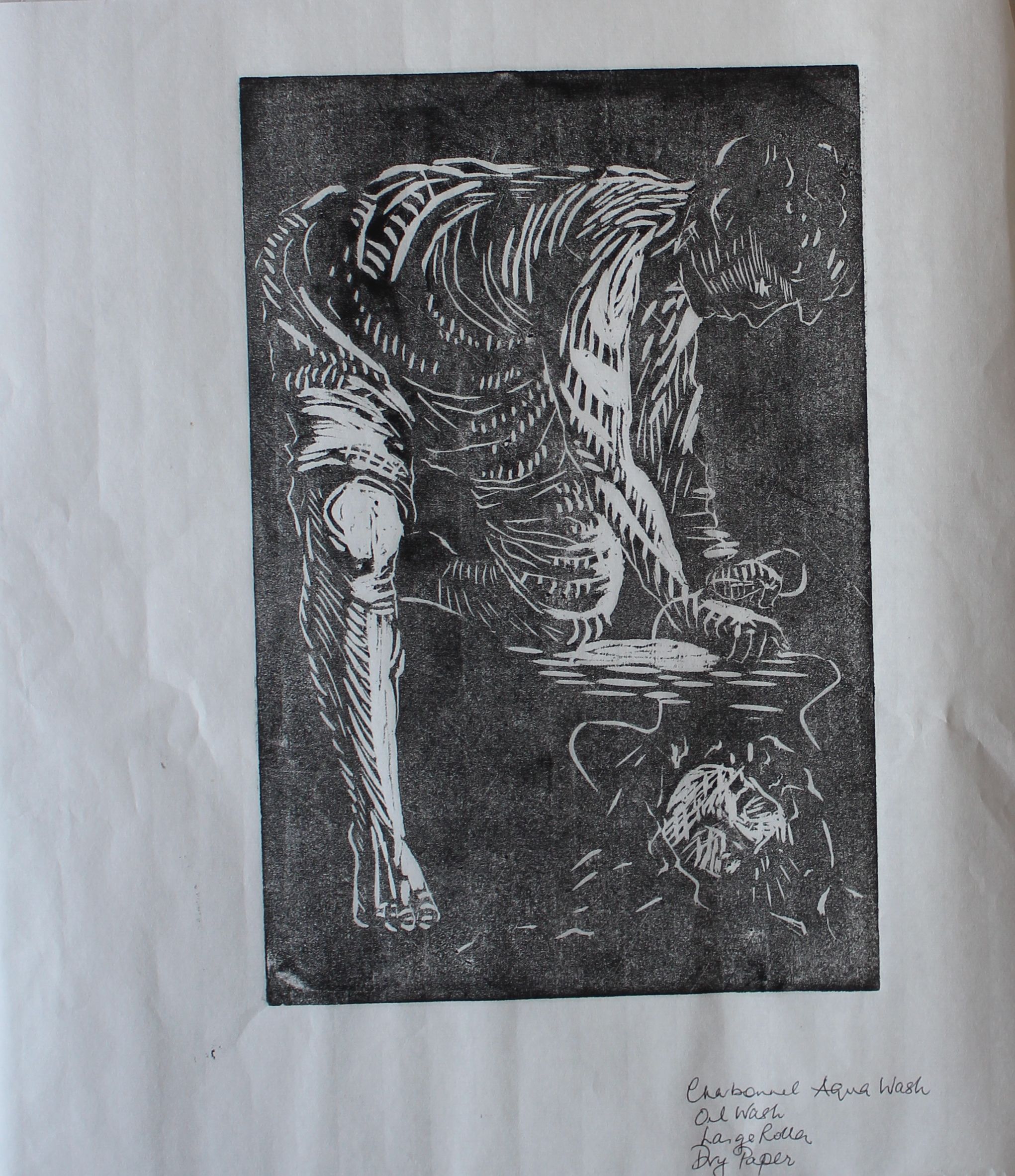
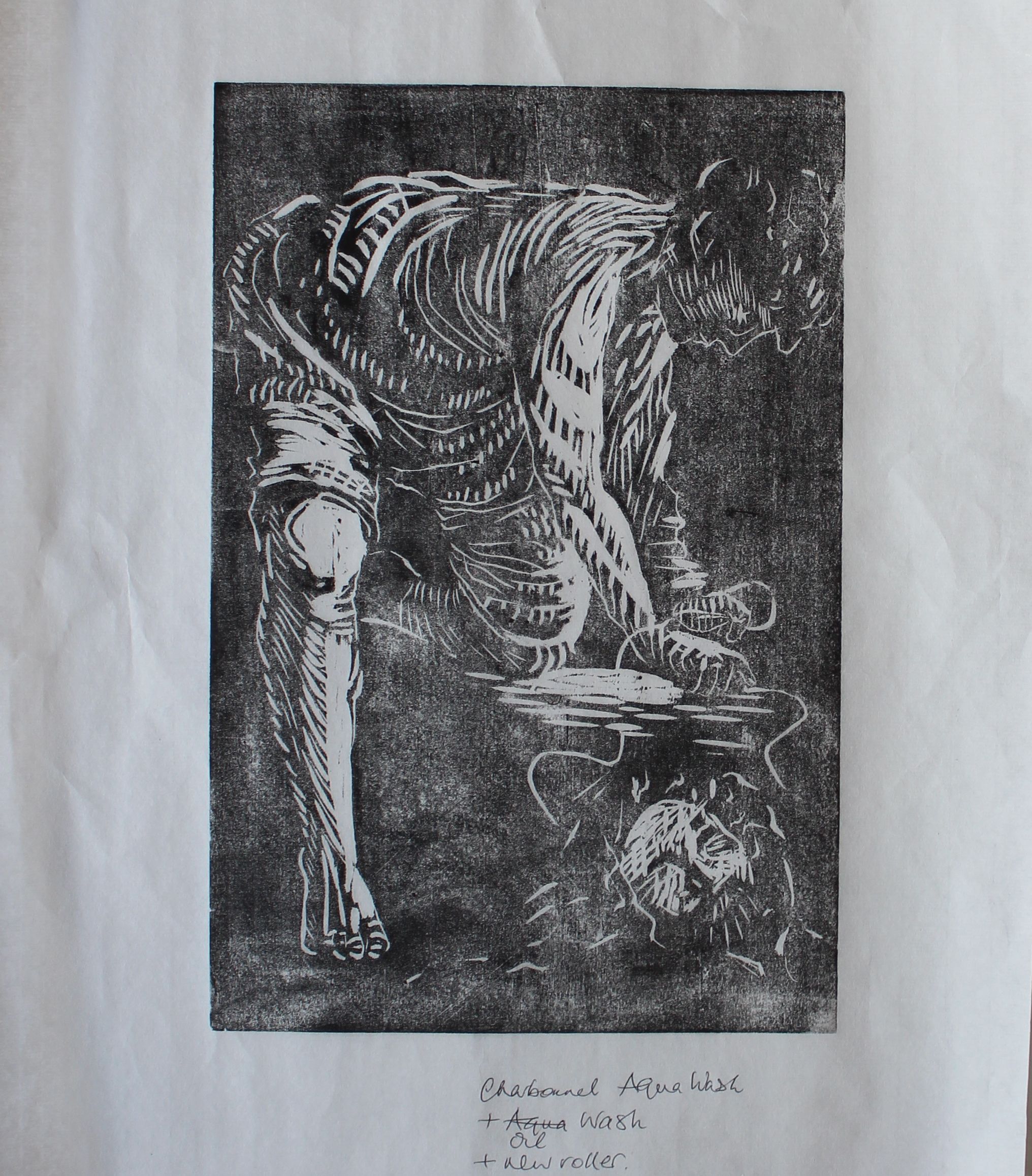
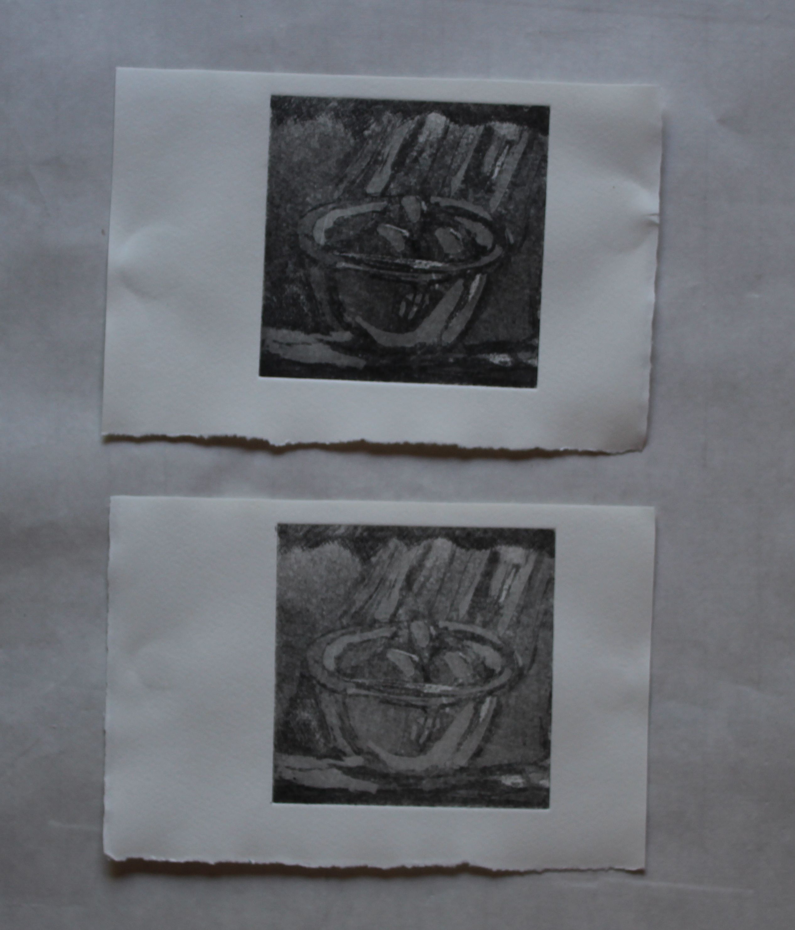
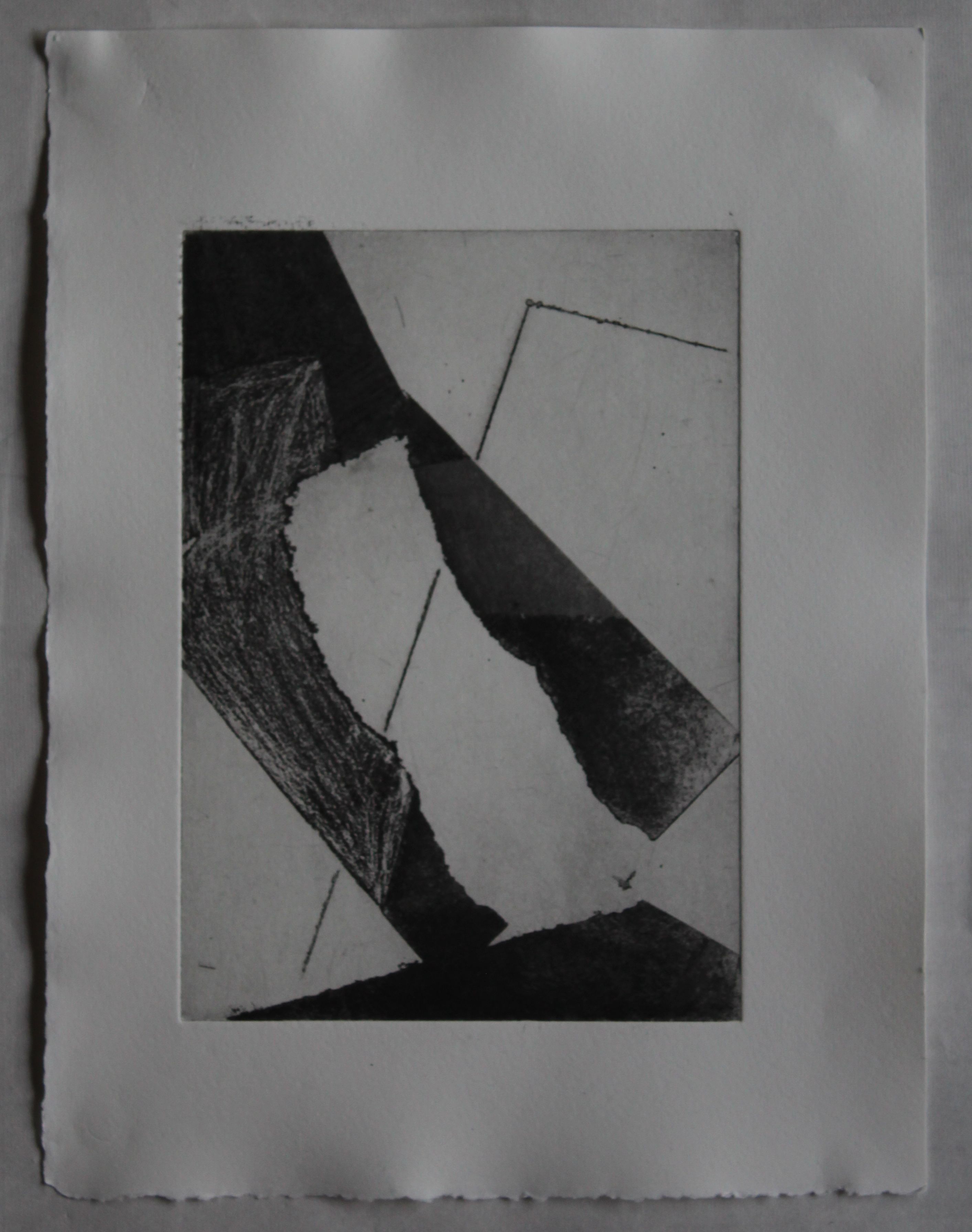
Secondly, I am going to produce a copper plate etching, now I have materials again. This is going to be using the same techniques as the “enquiring mind” piece, but will start with an image of the moon and degrade it to the point that it looks like a rock: this is using process to reflect the story of how those astronomers turned a mystical object into something more prosaic.
Sunday 11 October
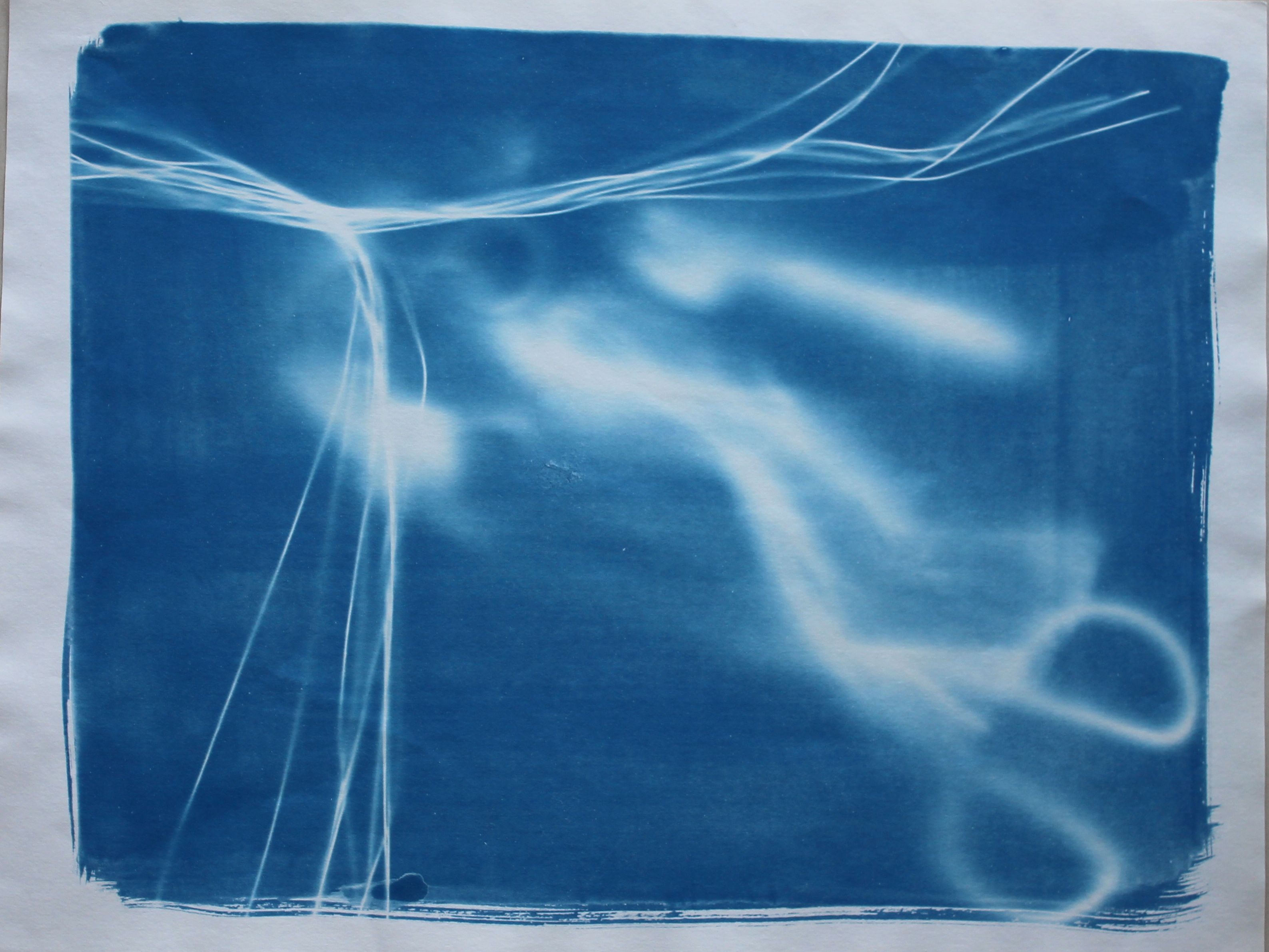
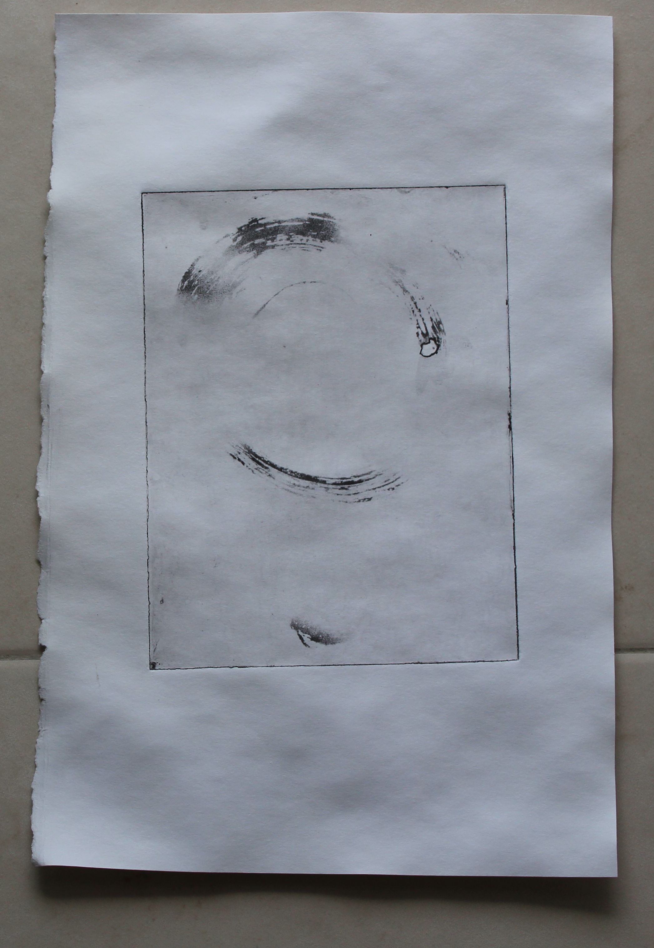
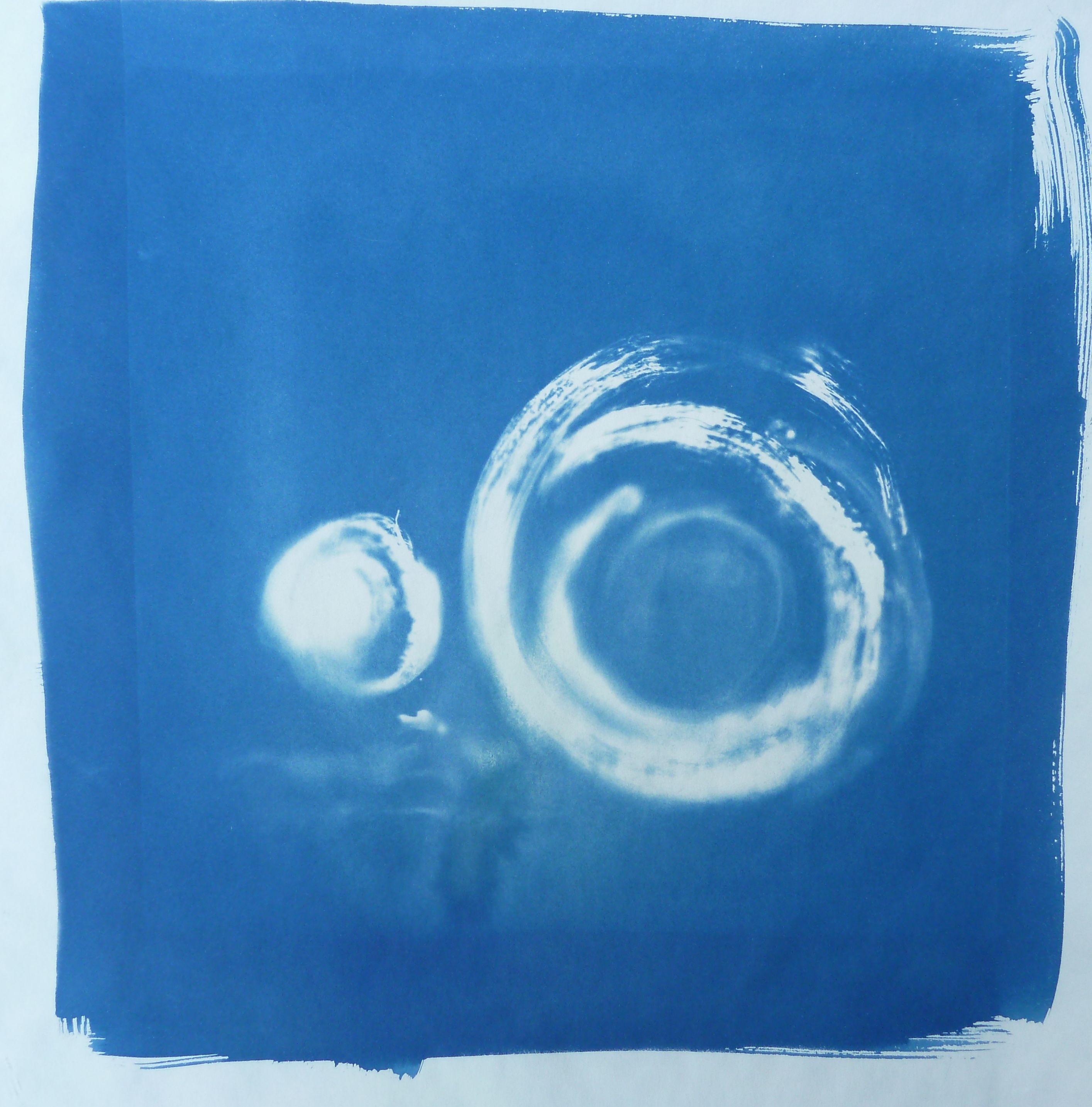
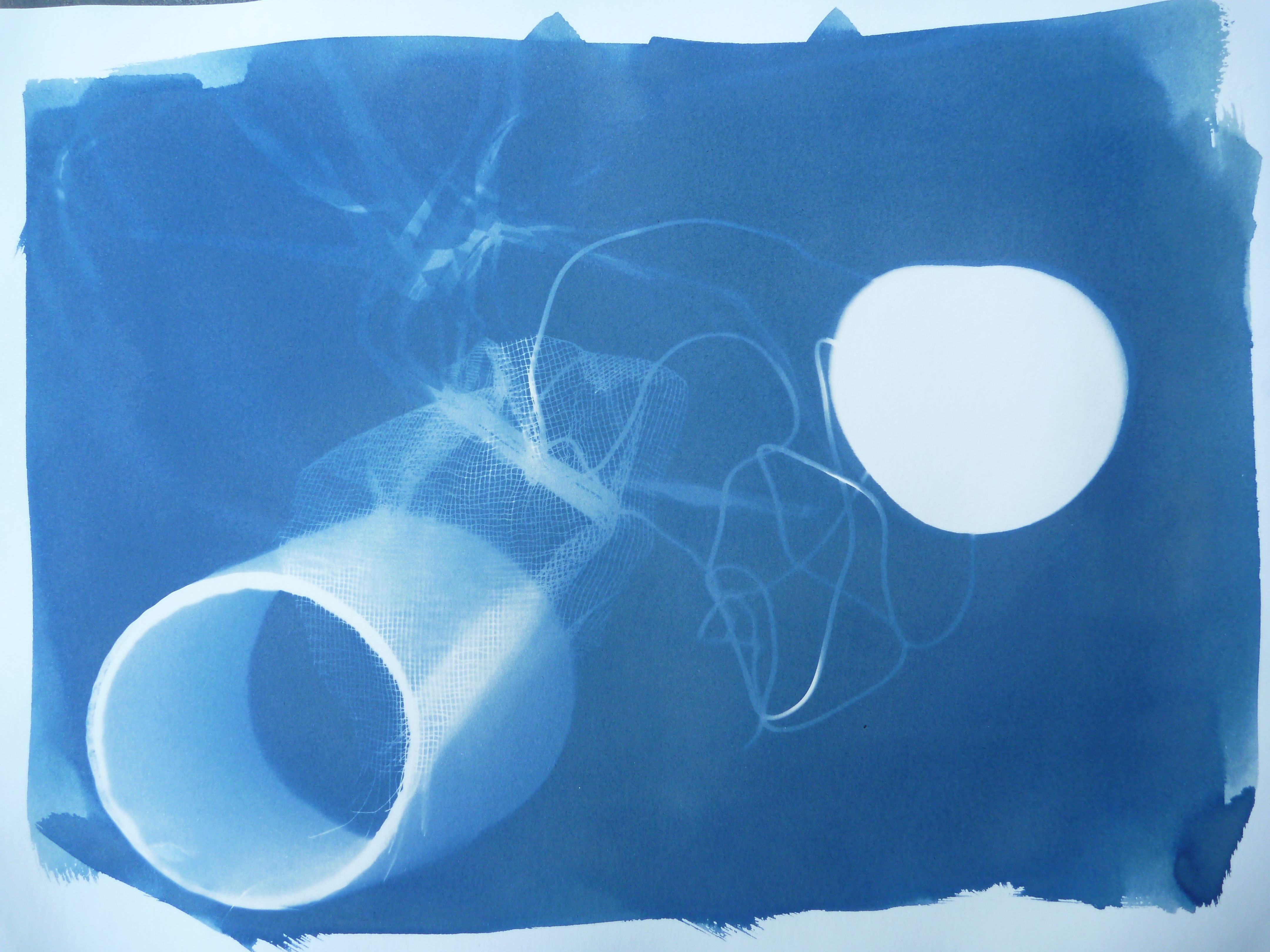
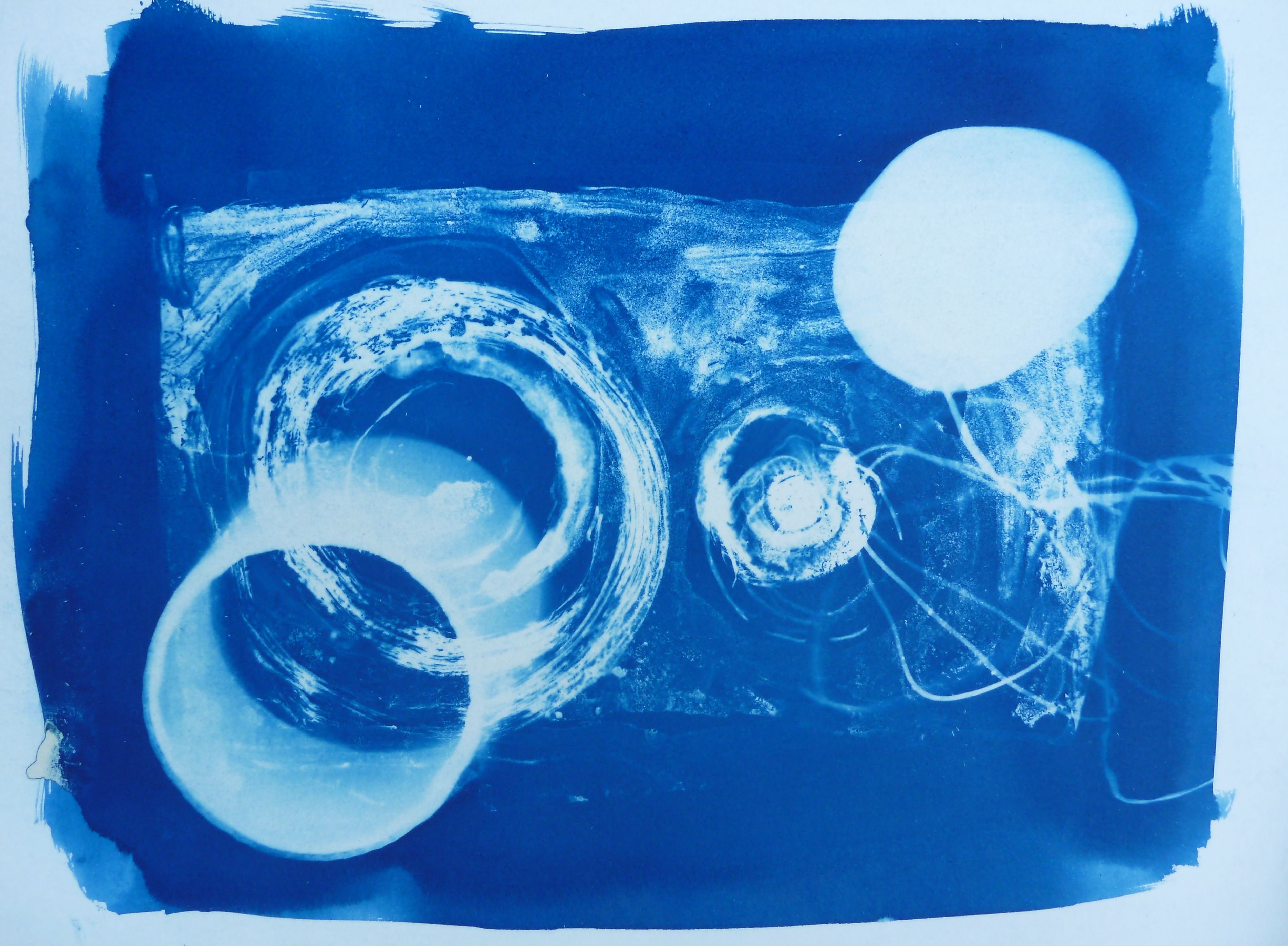
So today I used a UV lamp as the weather just isn’t cooperating. It’s not as fast as the sun, and the colours aren’t as bright. I’d like to do it again if the sun comes out. This is an ink wash and carborundum on cellophane mounted on a frame, with flat shapes and 3 D objects. I moved the flat circles to create different shades, and adjusted the angle of the lamp to keep the shadow of the cylinder soft and ambiguous. I am very pleased with the quality of the lines, with the textures and the shades.
The most striking part of the image is the way a “planet” shape has emerged in the bottom right corner, with blazing light around it. There is a diagonal movement, as if a comet is moving into the skies at the top left corner. This image is channeling for me the Keats’ sonnet “On looking into Chapman’s Homer”, which is about a moment of insight, related to the thrill of discovery of a new planet.
On First Looking into Chapman’s Homer
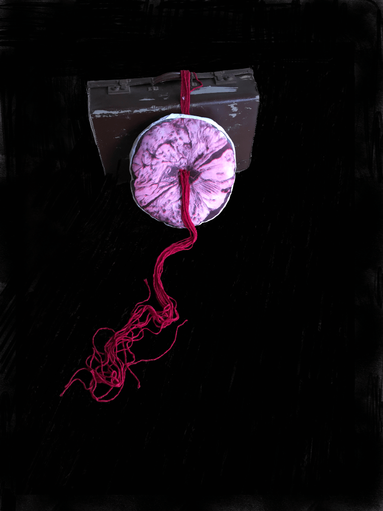
The “watcher of the skies” was William Herschel, who discovered Uranus after developing his own telescopes and setting up a grueling system of observation. Herschel was also the pioneer of this cyanotype technique.
Of course, as looking at the set-up shows, this is a case of the “deception of images”.
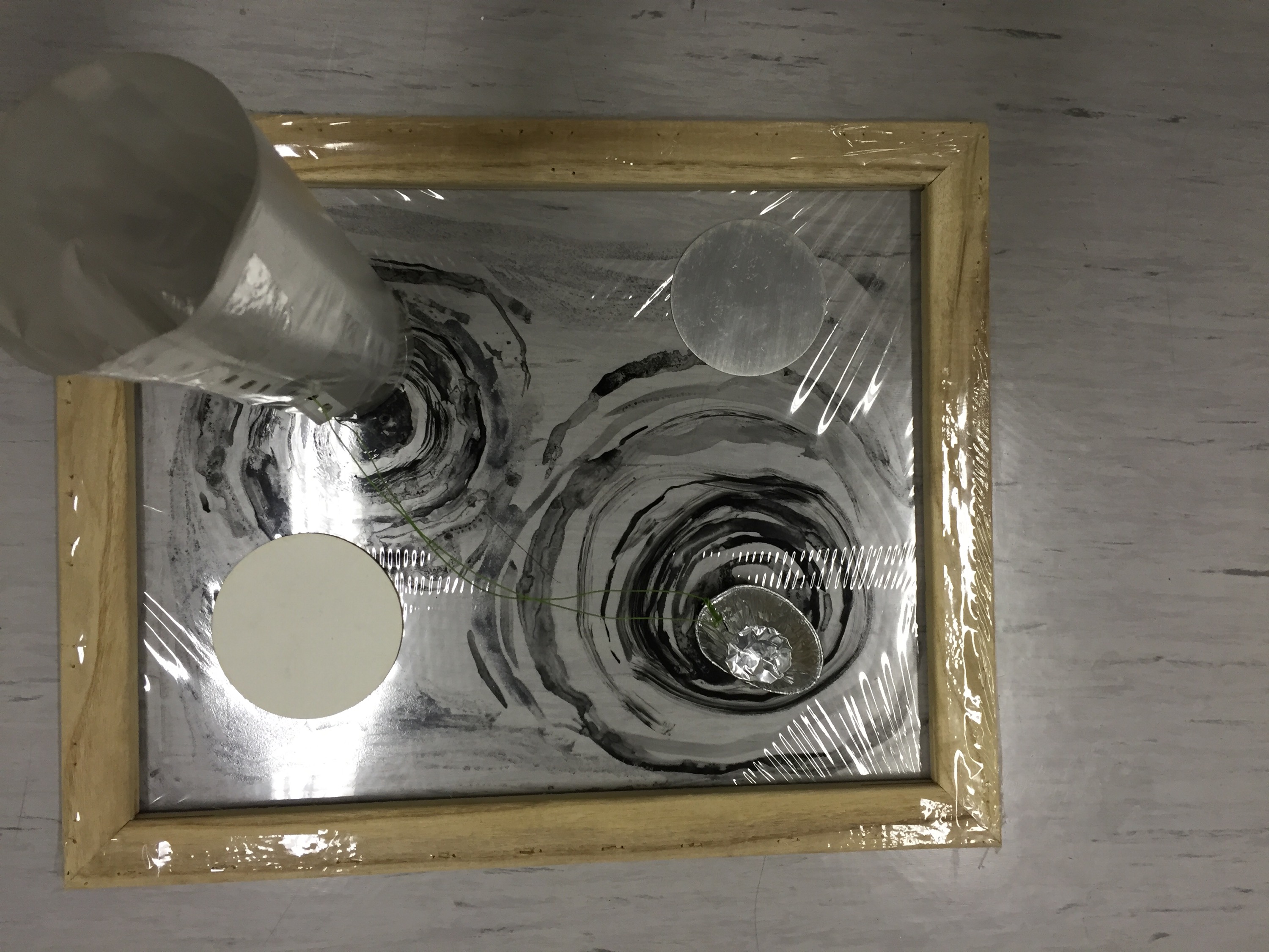
The set up: plastic cylinder semitransparent casting a soft shadow and moving circles

1Q84 Herschel Cyanotype A 2
Then the sun appeared again, and I was finally able to make sun exposures. I also added vinegar to bring out the cerulean blue colour. I think these are amazing in terms of their colour- it was really exciting developing them. This one doesn’t have the same trompe l’oeil effect of the one above and perhaps suggests a telescope shape instead.
Moons in the Sun 1
Moons in the sun 2
The speed of the exposure in these has created different effects, in some ways less complex. The colour is phenomenal though. The main interest in these is how the movement of the circles, with their different exposure times and the way they overlapped, has created a rolling movement of transparent circles in the image.
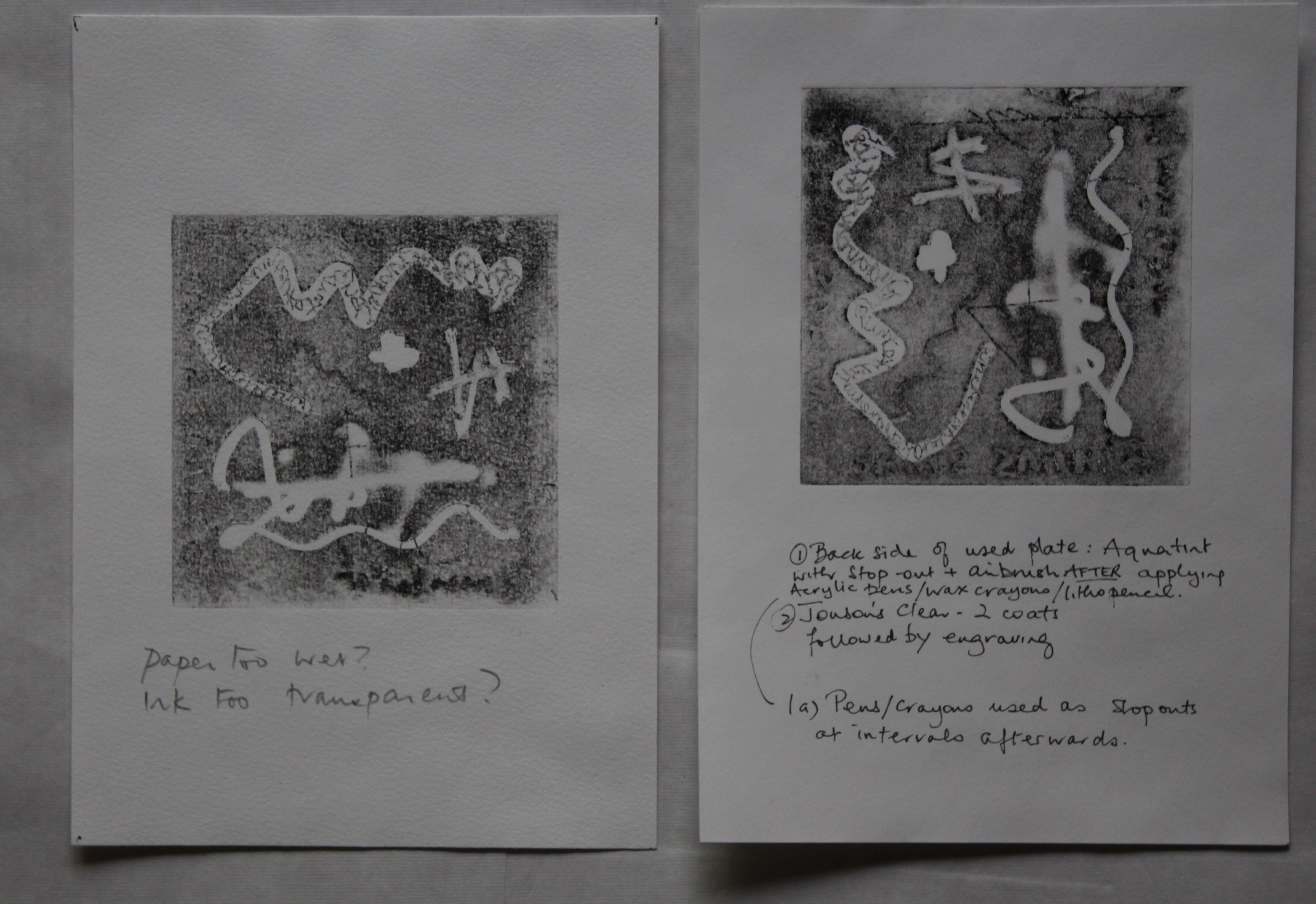
Photopolymer again
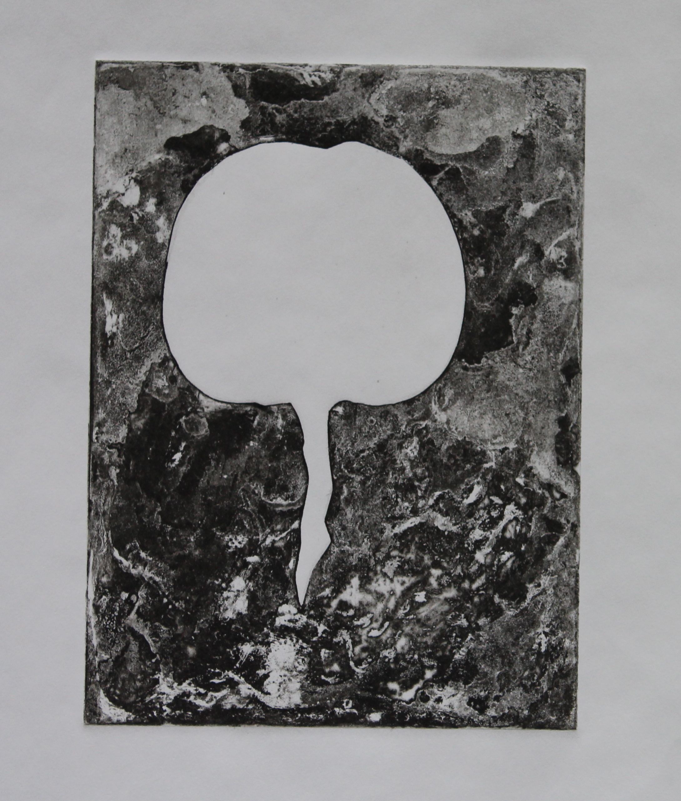
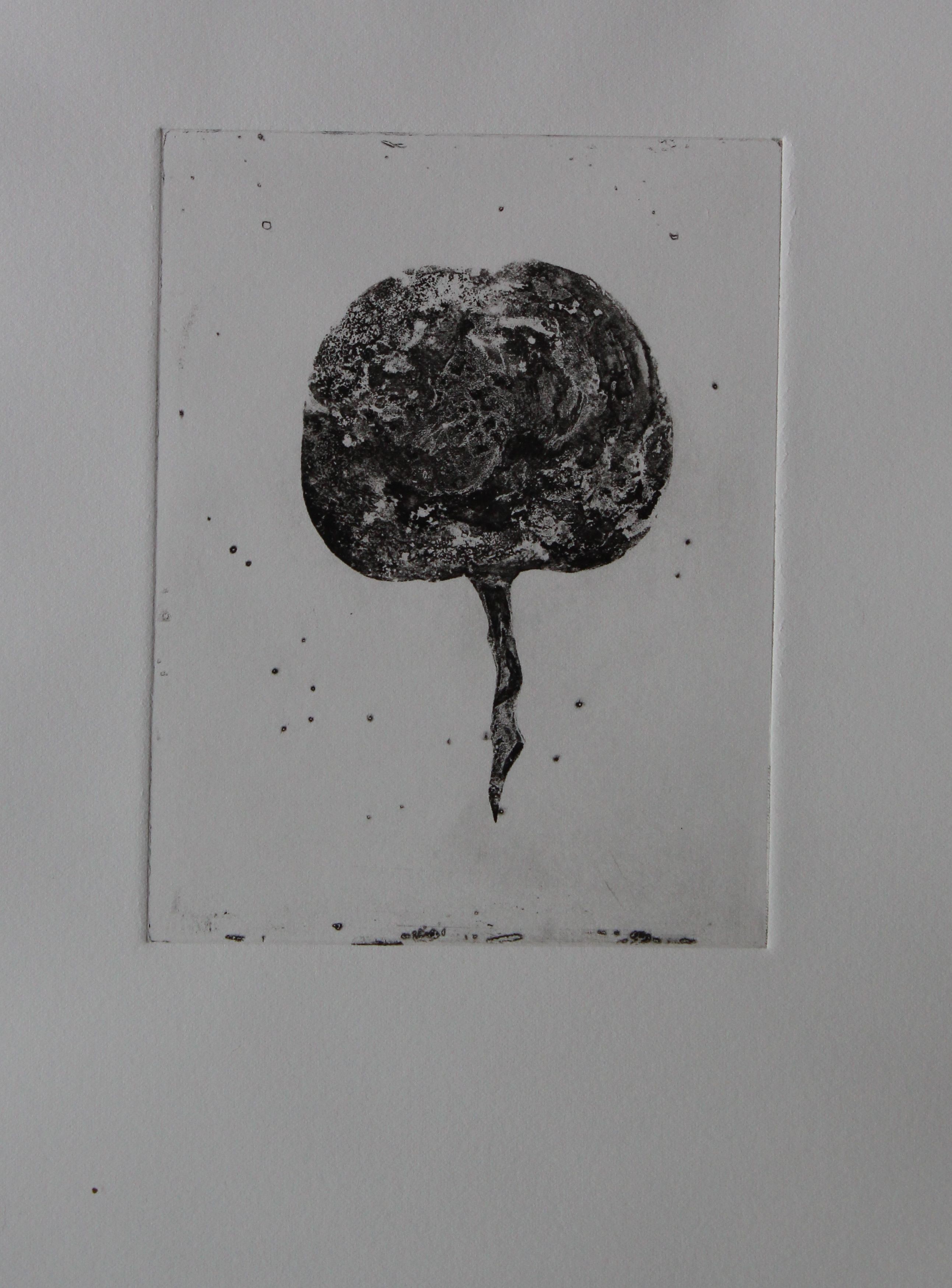
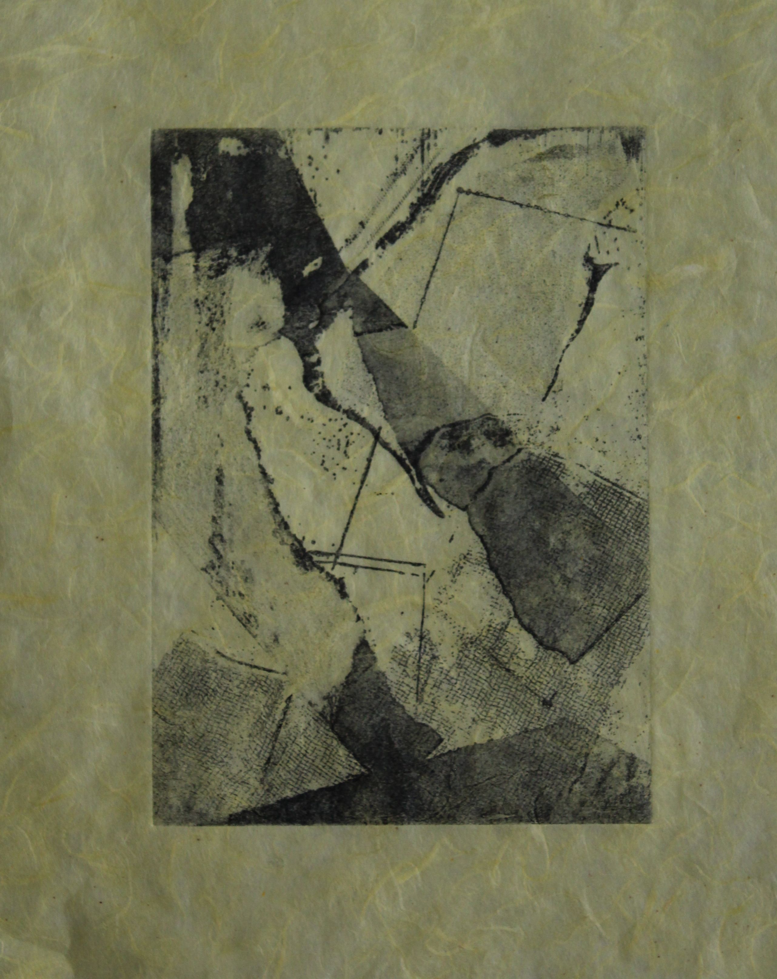
With a chance to use a UV lamp and the weather less humid I tried again, and it’s gone better. I tried dry lamination of the plates but that didn’t work, but with a bit of access to art rooms this week I managing to do more- the uv lamp is just guesswork as it has to be hand held but I have managed to make two versions of the “two moons” plate.
Calling it “two moons” is an indication that this isn’t abstract of course- but actually it’s a pattern- a gestural mixture of painterly marks, wash and carborundum texture.
These plates were made by mounting photopolymer onto copper plates, exposing them, first to an aquatint screen ( I gave them 40 seconds under a UV bulb, hand held- it was just a guess) and then, under a plate of glass, with a black and white positive exposure, a further 40 seconds. This was then developed in washing soda, and inked and printed.
This was using a basic high-pigment black ink on a sheet of plastic, making dry, painterly brushmarks. The exposure is not correctly times, or else the development is too short: I am guessing here, as the materials are not behaving in the same way as the ones I used in the summer did. I don’t have access to a proper exposure unit, so trials are impossible.
I tried rolling over this one in a colour, just to see how it looked. The brushmarks are there, but there are open-bitten areas where the ink was black. The effect is rather like rolled up Chinese character, and it’s not unpleasant to look at, but it isn’t what was intended.
The next one worked a lot better. Using the same timings, but two layers of negatives, creating a double spiral, and a greater range of texture. 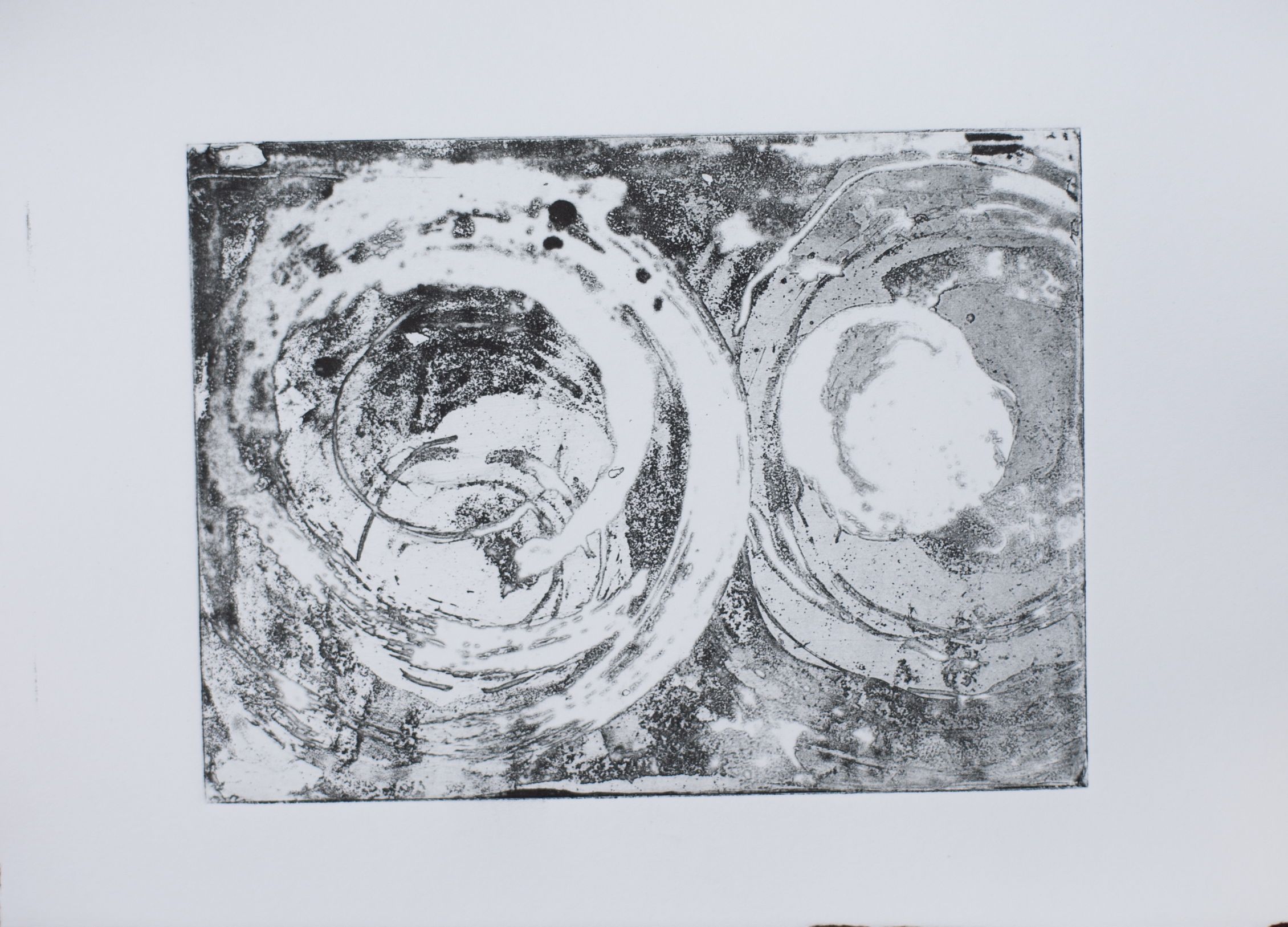

Again, what was supposed to be thick black areas have come out as open bite – but what is nice is the shades of grey, and the granulated textures.
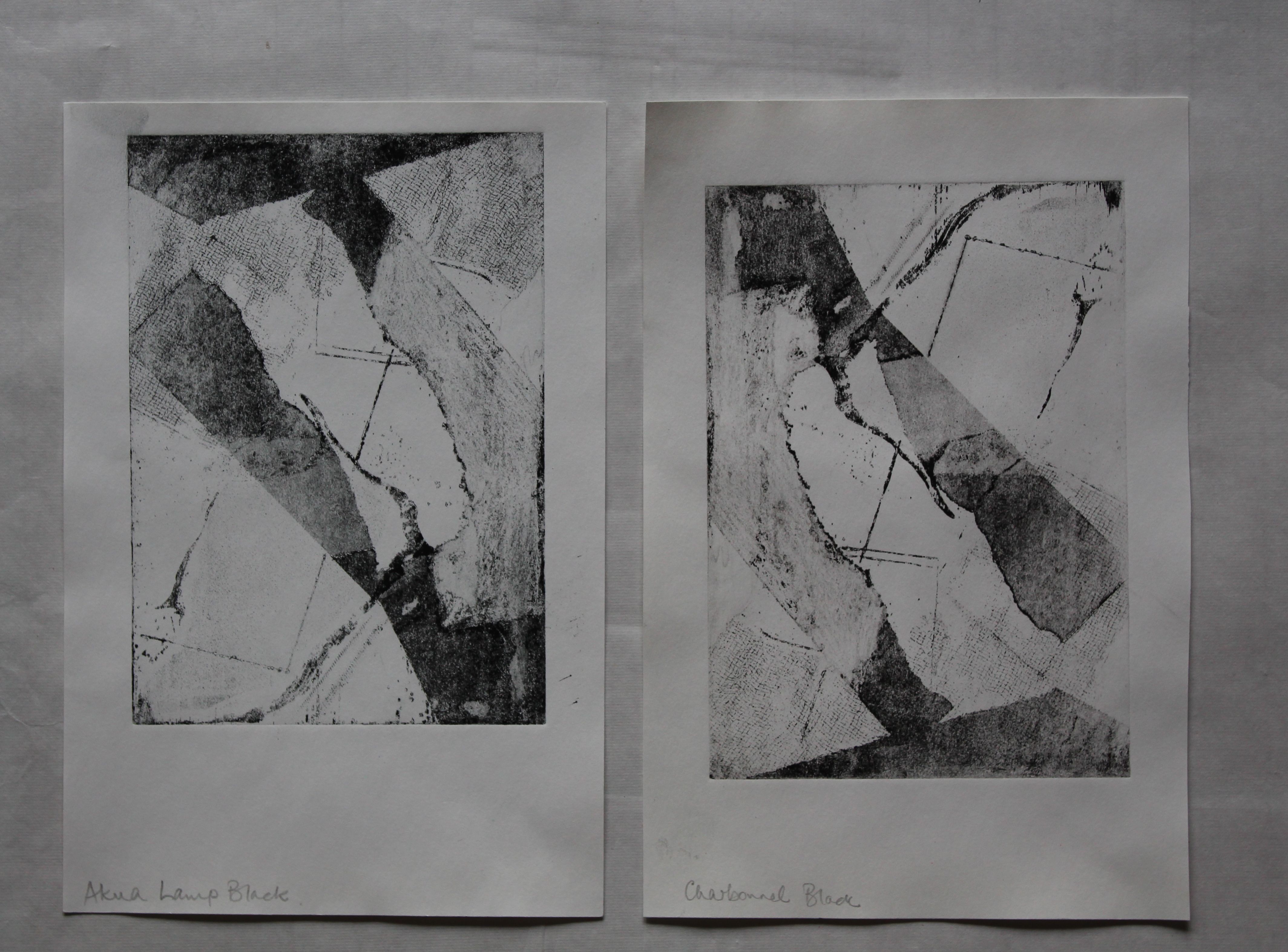
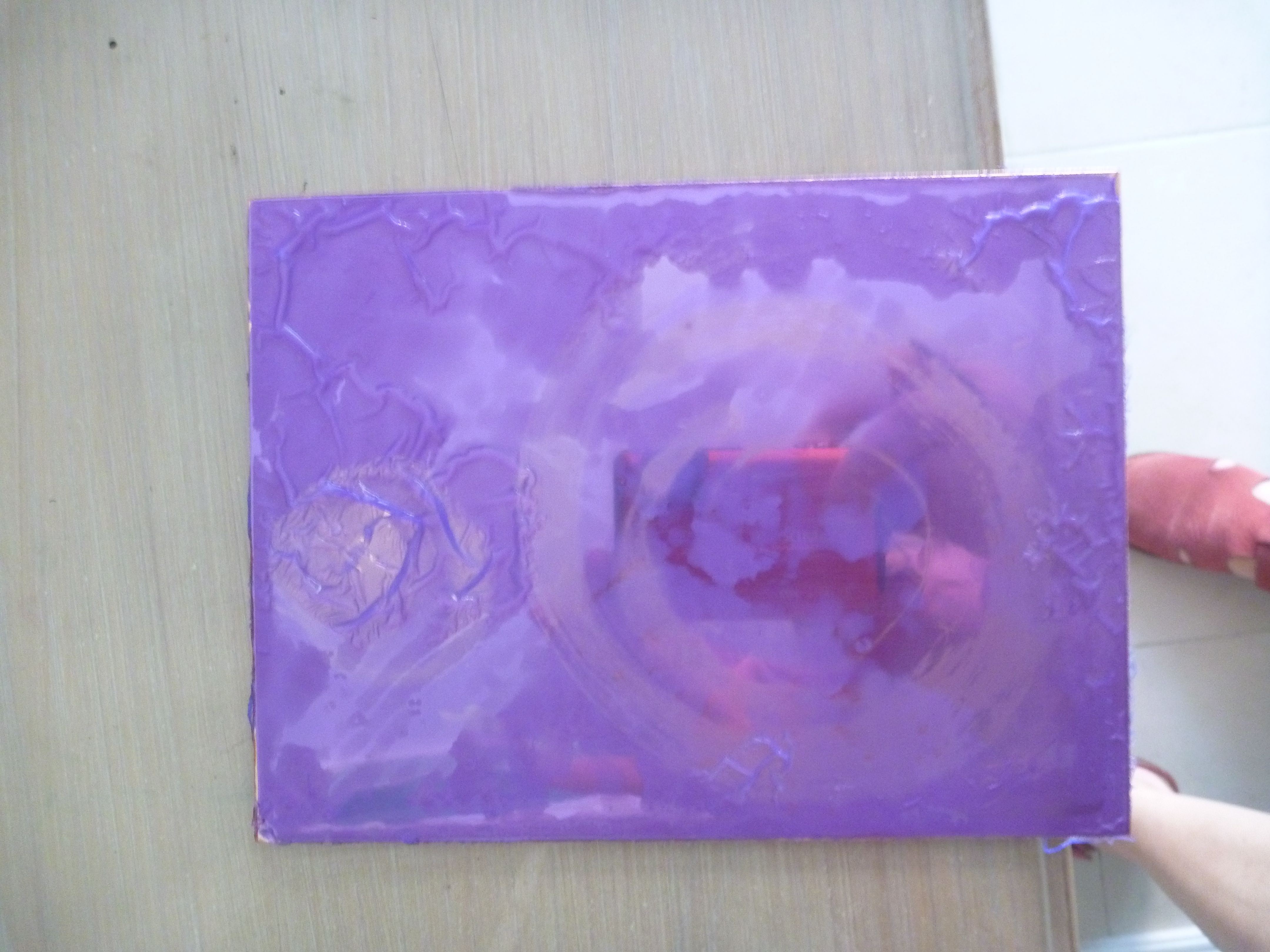
I tried this one in two colours, although “viscosity printing” is a bit of a mystery to me. I tried using AKUA intaglio inks for the black, then Charbonnel, with added oil for transparency, for the colour. Then I tried Charbonnel black too, as it is nice and thick compared with Akua.

I tried again, and thought at first that this one was better, in that I did succeed in getting some black where it should be, but it’s not evenly exposed- no doubt something to do with the lamp being being hand-held.
So when I compare them, the one on the right has the most successful variety of marks and tones.
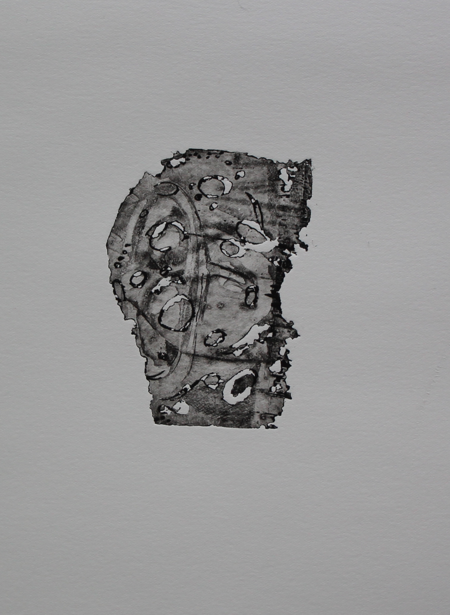
Intaglio and collograph on perspex
I said I would come back to this one and I have. This is the same plate as I used to explore gestural marks, and was quite destructive; I came back to it with some “healing” layers- acrylic (screenfiller) and gauze to act as plasters over some of the cracks, and to patch the surface, while also creating solidity- shape and texture- with some carborundum. I was after real solid blacks, and “monumental” shapes. Again they were just made intuitively, and any suggestion or symbolism is unconscious.
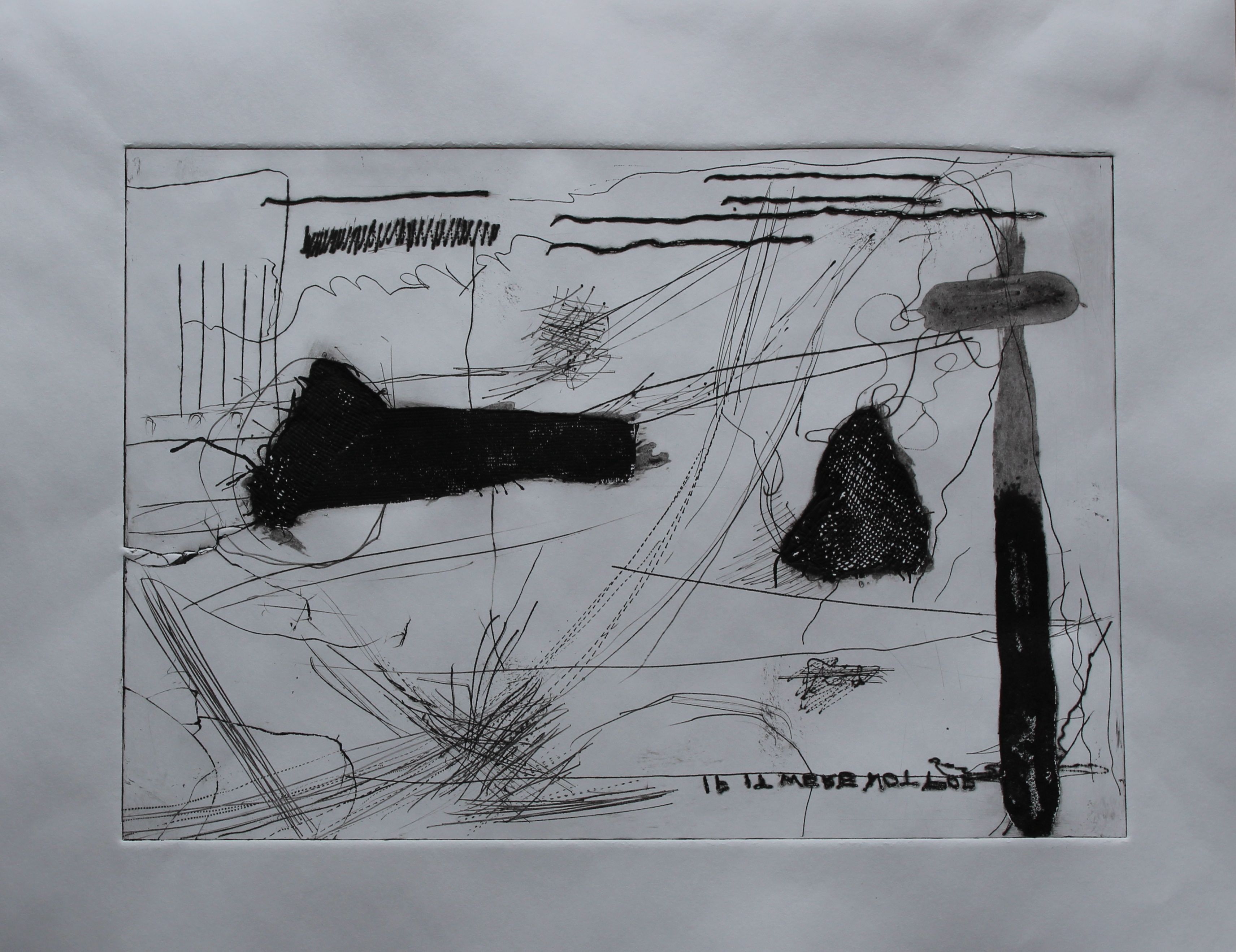
Gestural marks on perspex, with collograph
I like the textures of the gauze, and the watercolour effect of the acrylic. The black is really dense. I wonder if I could achieve something like lithographic effects using these materials?
The open bite is quite marked though, and there would be no way to avoid this on perspex I guess? Aquatint screen using spray paint? Or just not using the Dremel.
This is the second print from the same plate.
Interesting though that was, I then finally found a source of ferric chloride, which meant I could turn back to using copper etching.
Copper plate etching
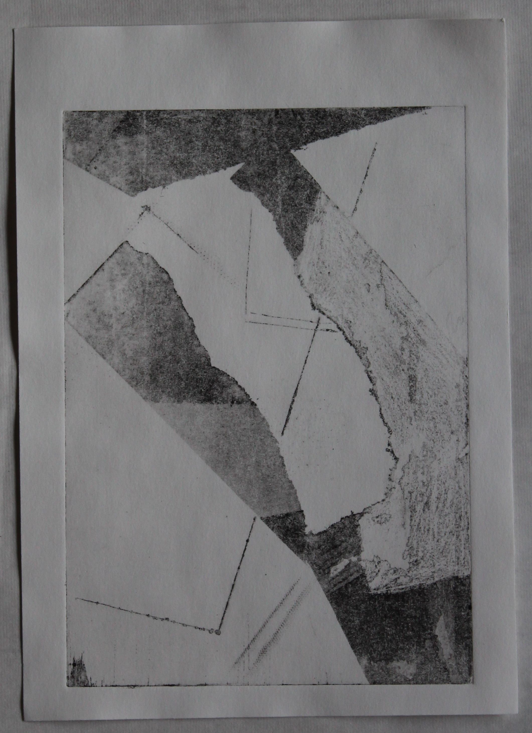
One issue this time was that the copper plates I have are significantly thicker than the one I degraded last time, so it would take more time.
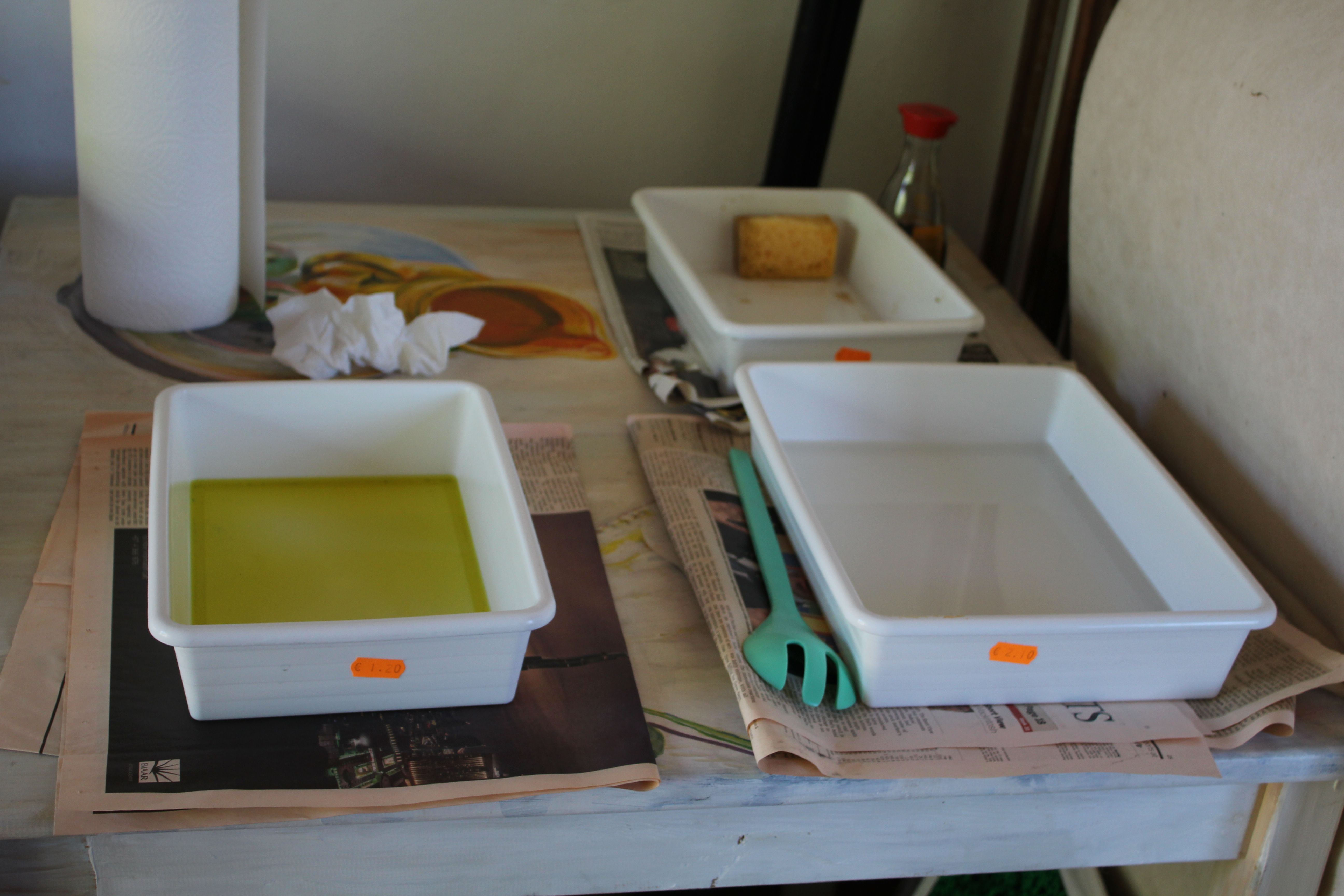
The first stage was to make a test plate to test the new ferric solution. That meant making an aquatint layer with acrylic ink and masking the plate in strips. Now, you would have thought that, having done this before, I would have got it right, but I managed to count backwards and fail to get an even spread of exposure times. However, the test was enough to let me know that the solution worked quite effectively and fast, and that 30 seconds, 1 minute 2 minutes, four minutes up to 20 minutes was probably the range I as after for aquatint etching.
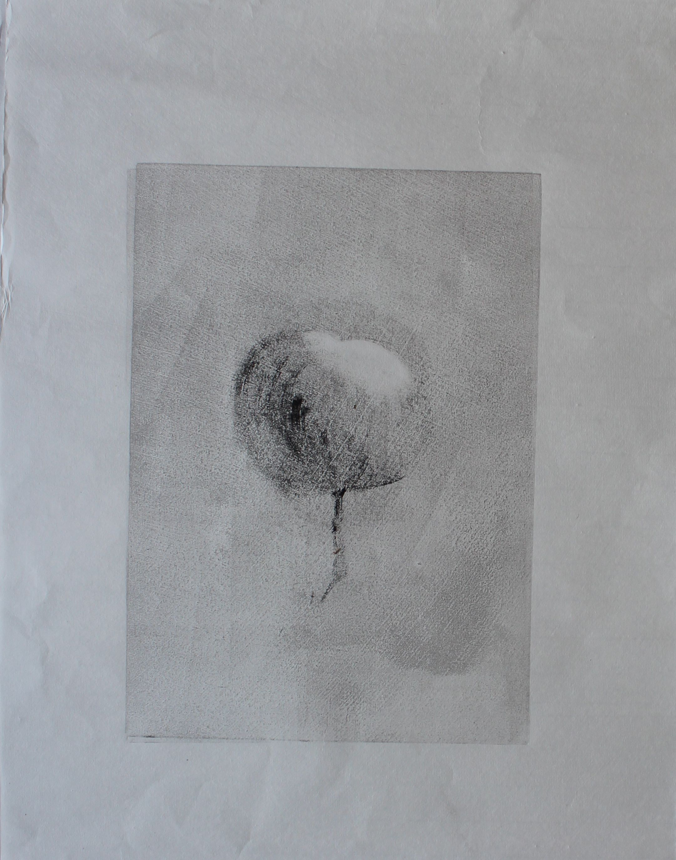
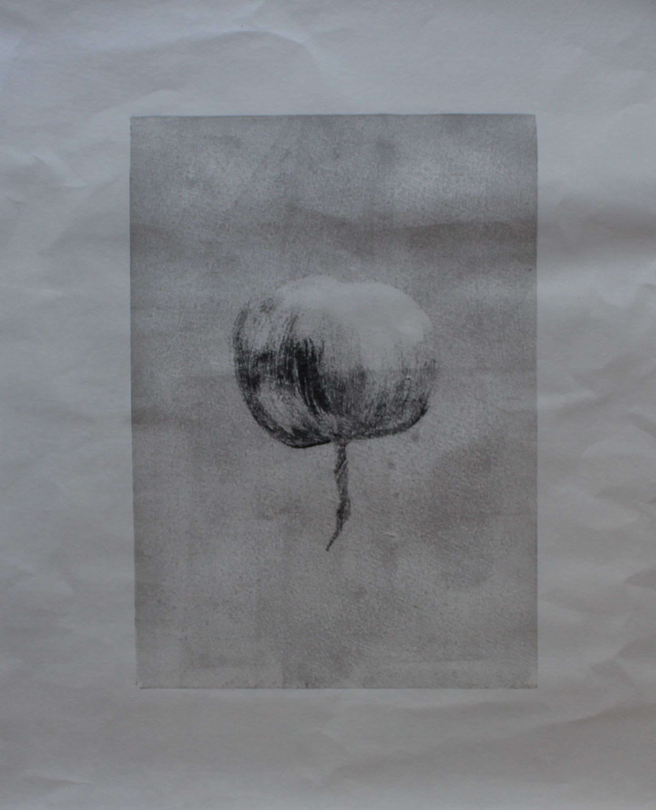
My plan was to degrade a plate down to a circular shape, but to create layers of different depth. The first thing I did was make an aquatint layer and then paint ink and water in the desired shape. You can see the fine mist of the aquatint layer in the picture. The black ink here would stop out the ferric, and the wash part would get eaten.
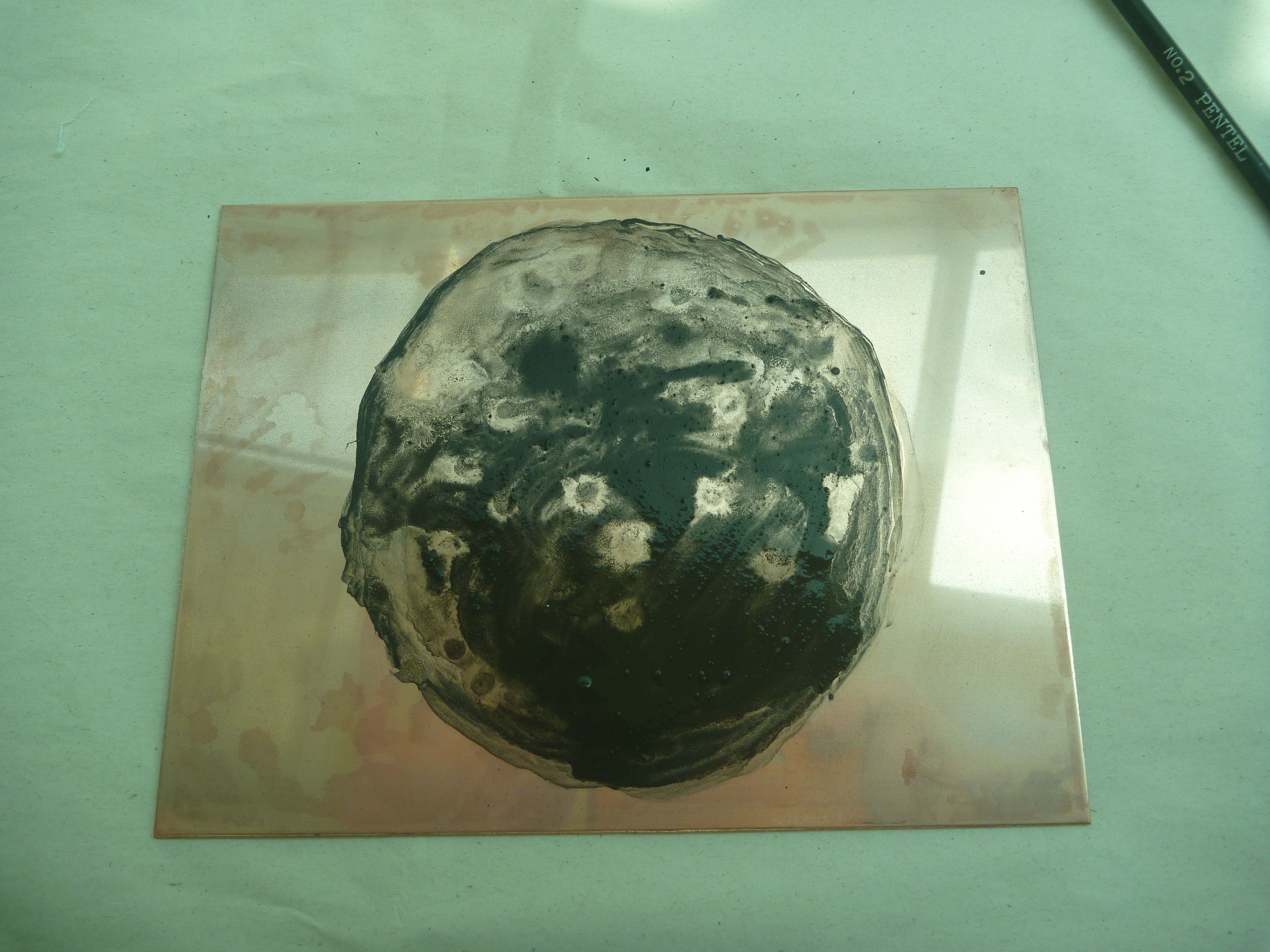
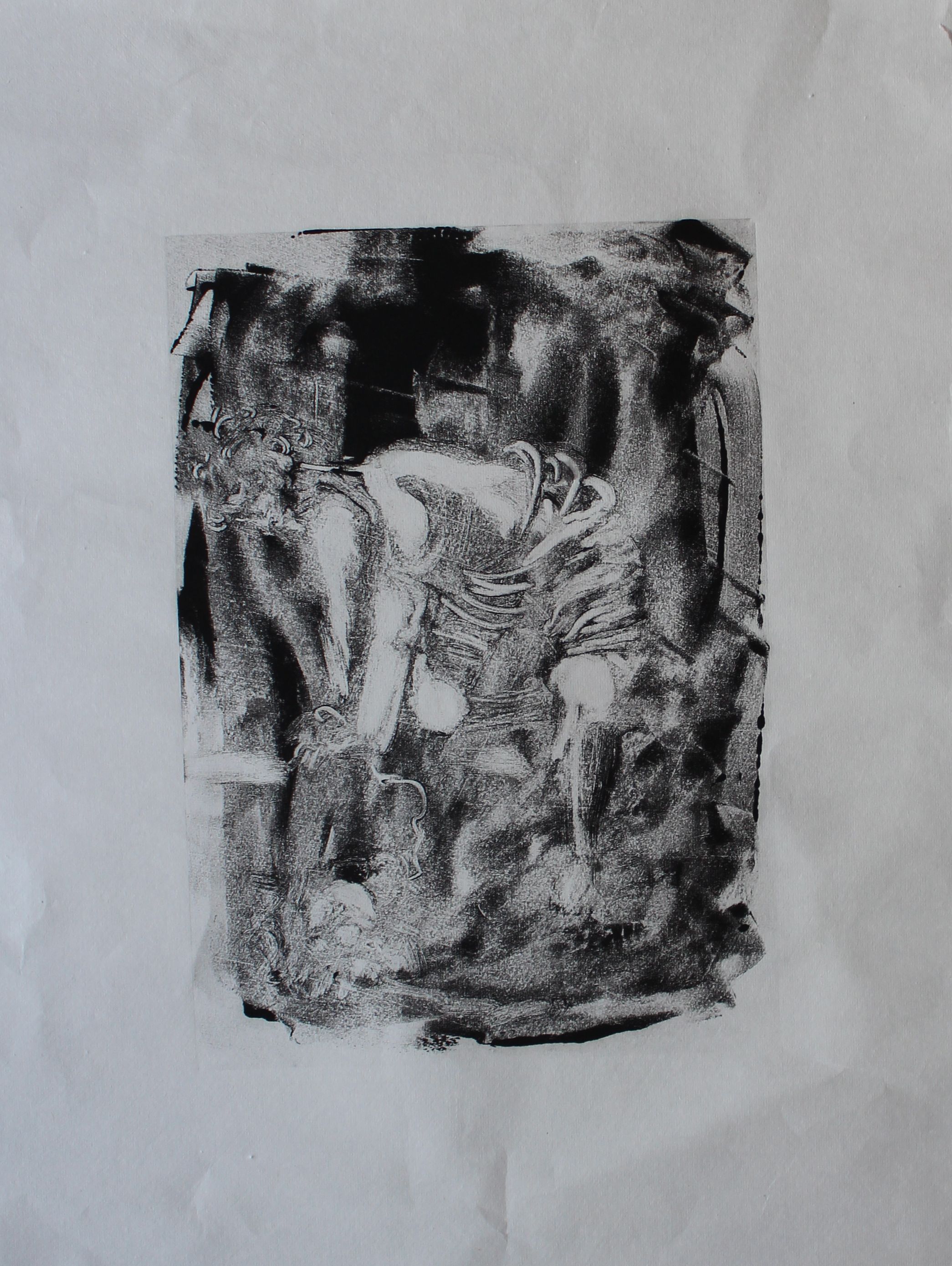
I put this in Ferric for 10 minutes, as a first layer, then cleaned it and printed it. The contrasts were not sharp yet. Then I made another layer using no aquatint layer this time, just using pigment from oil-based ink, mixed with water.
This time, when printed, the contrasts were sharp, and the background a lovely velvety black.
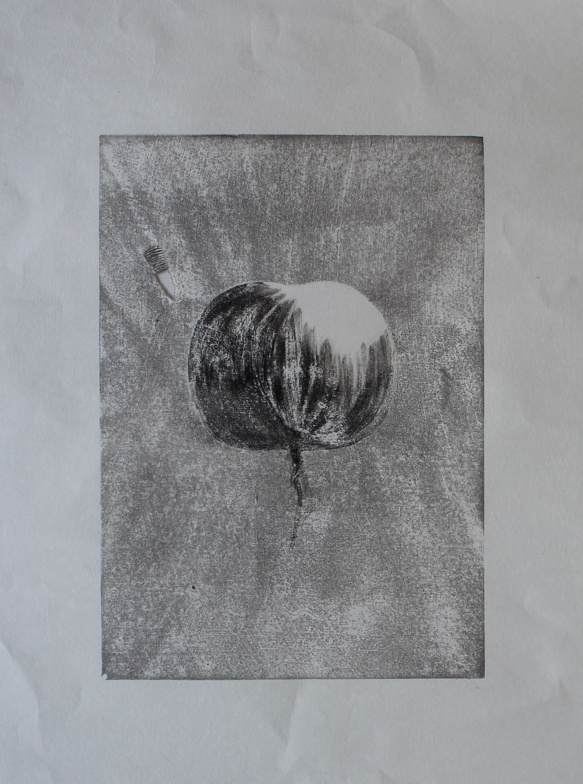
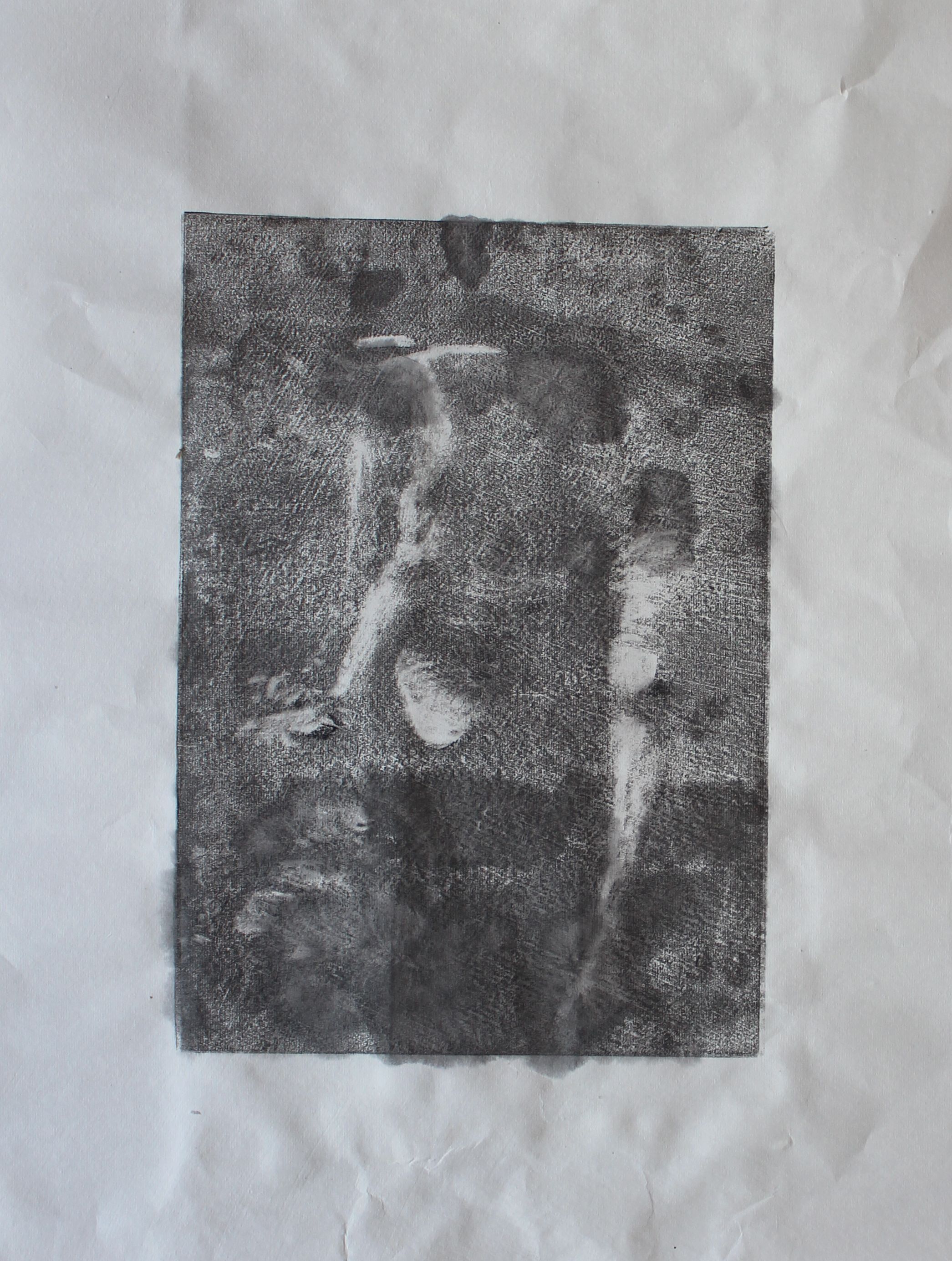
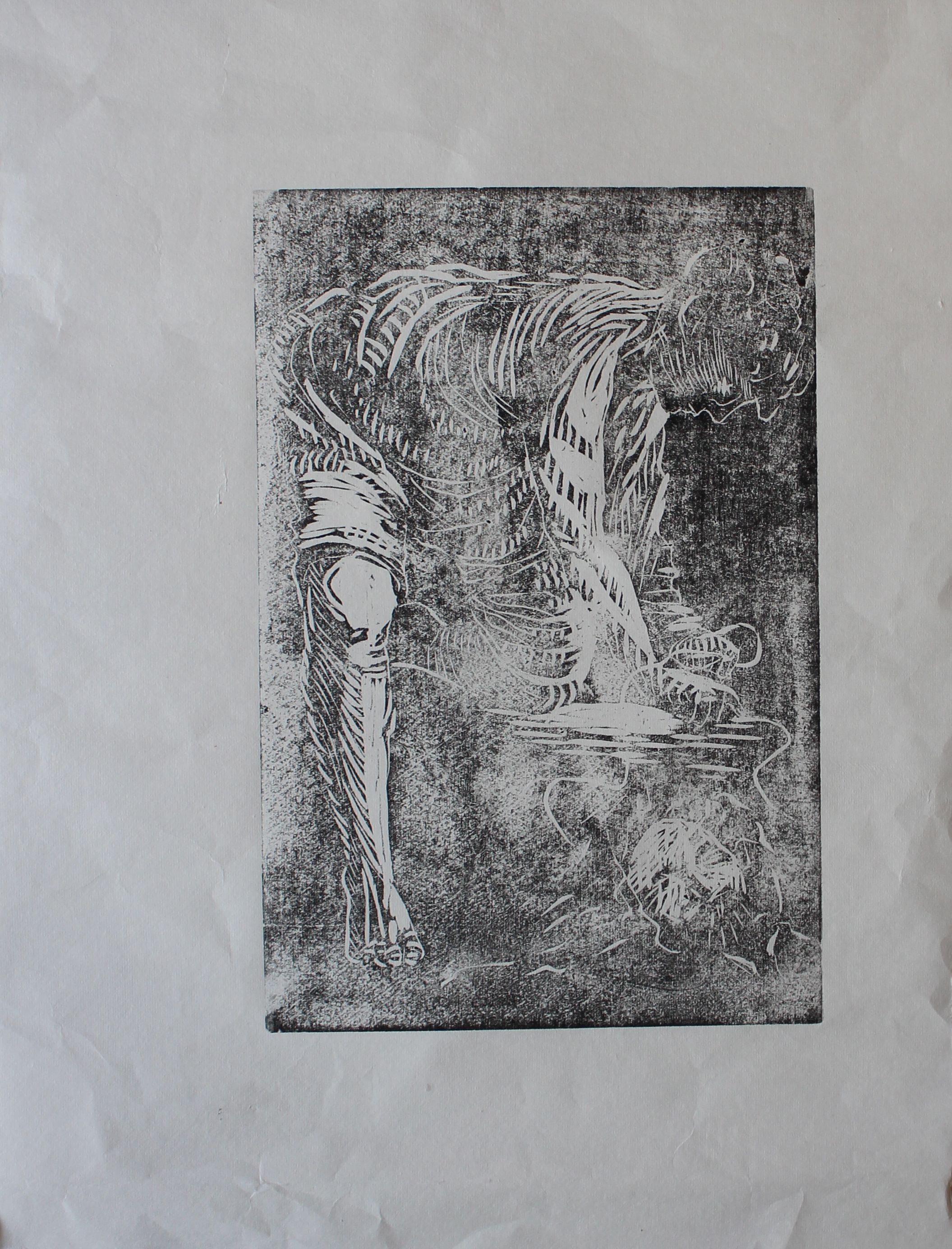
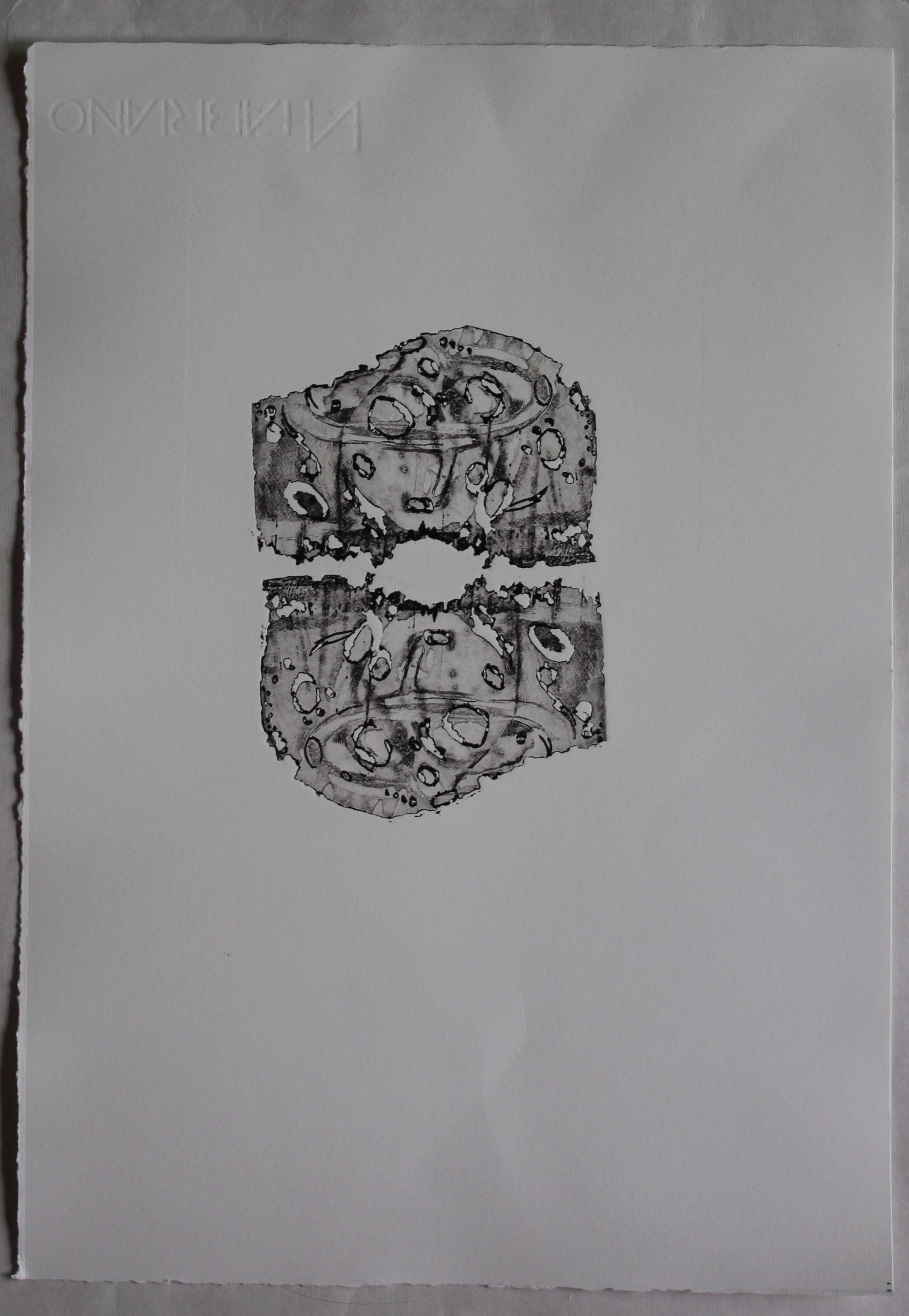
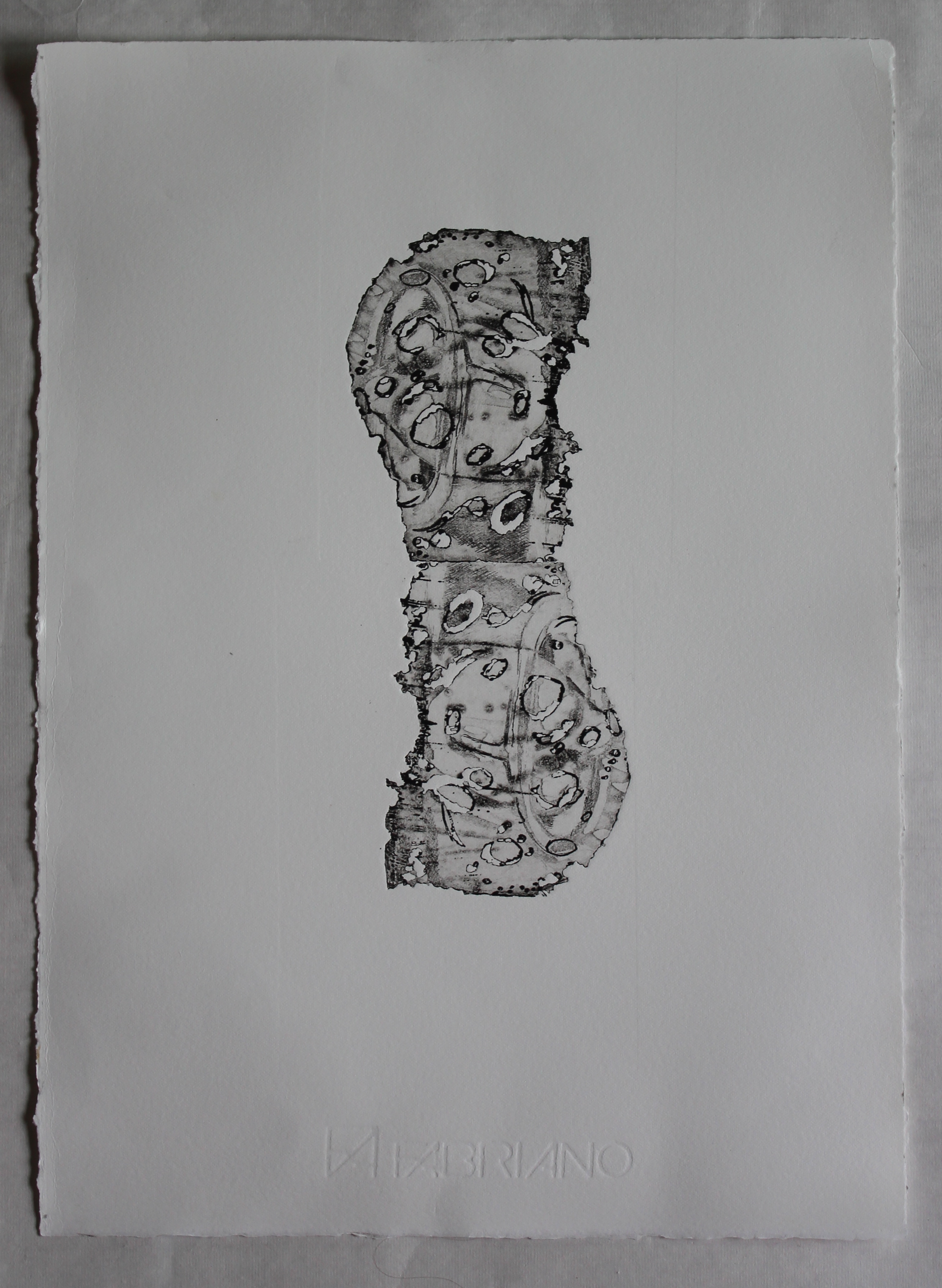
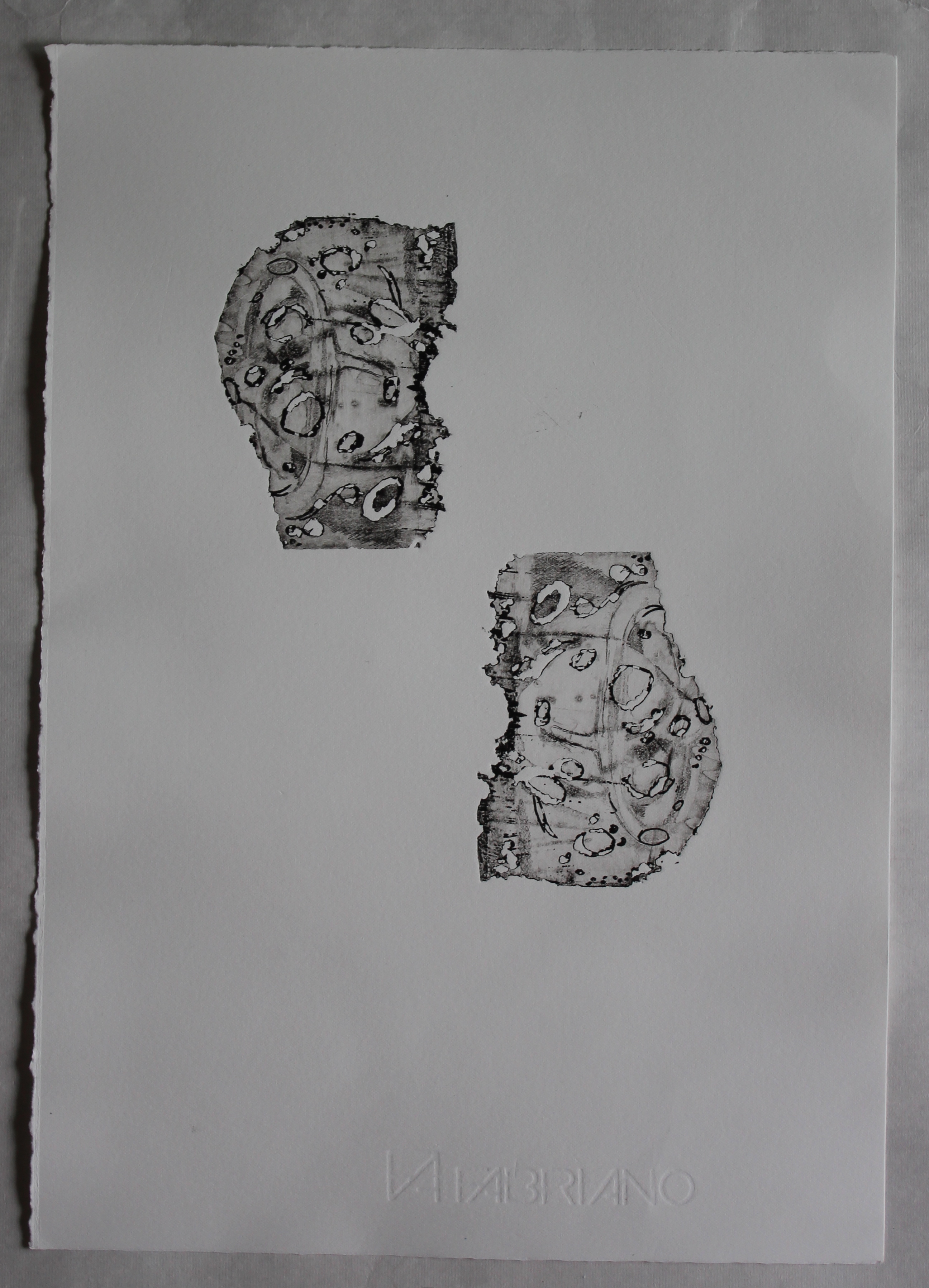
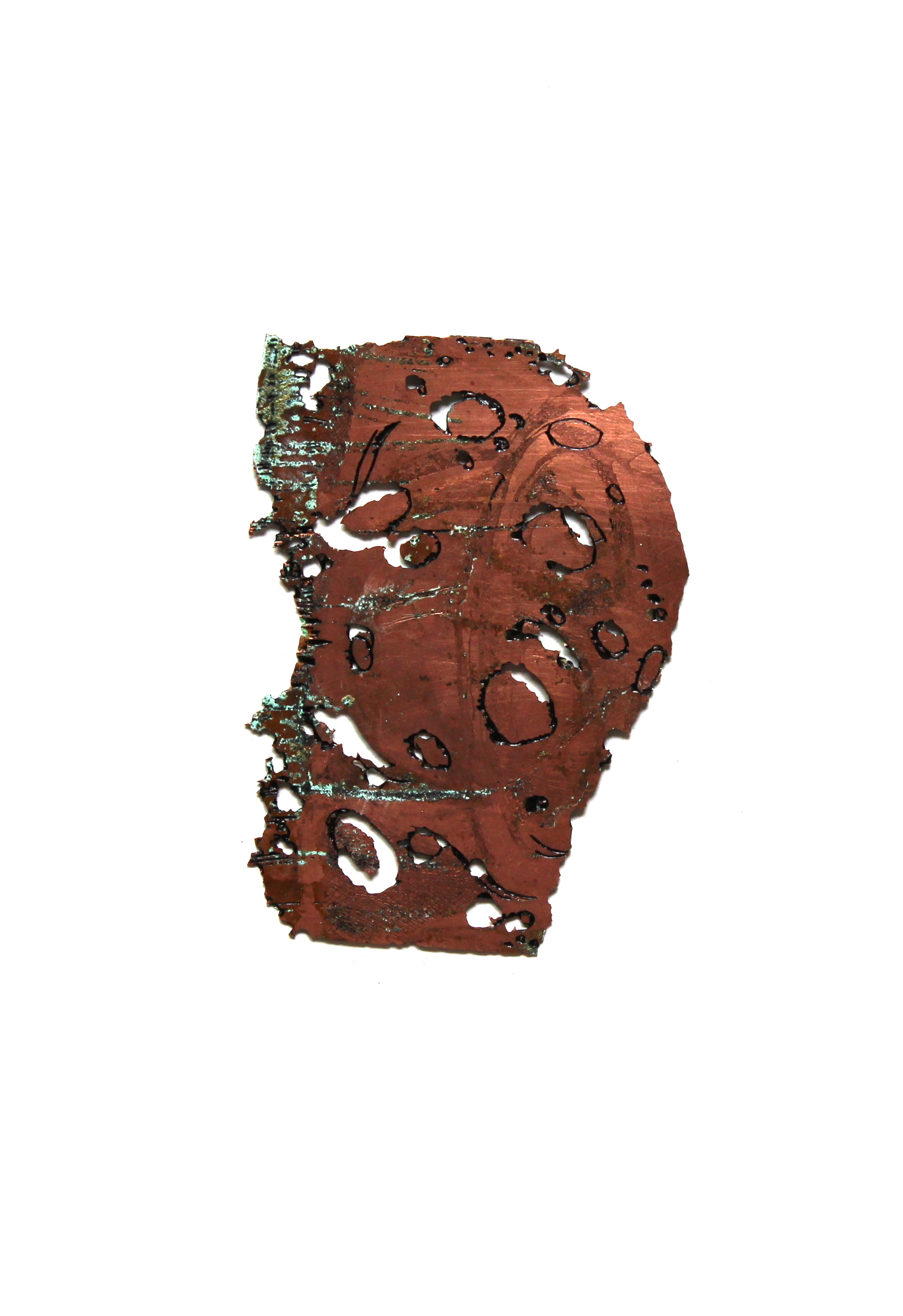
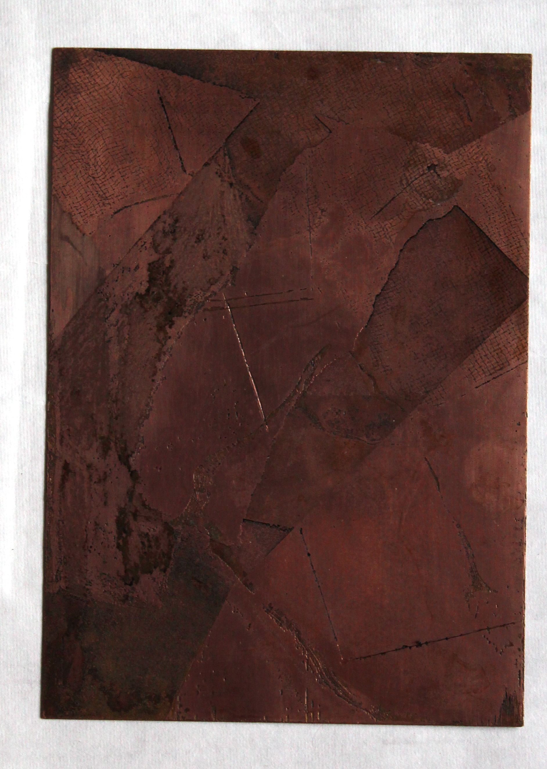
The next stage was to start really degrading the copper. Using Johnson’s floor polish as a hard ground/ stop out on both sides, I scratched into the exposed background with an etching needle to make the surface easier to attack with the salts. Then I scratched some lines through the hard ground so that holes would be created. This process took two days and one night. Finally I was left with the roughly textured circle of copper.
This shape was then inked in black, and set in a composition with a ruled circle- this was a ready made zinc circle which I ruled with an etching tool to make dotted lines – and another cardboard circle to make an embossed shape.
The thinking here was to contrast the materials, the shapes, the surfaces, and thereby the connotations-
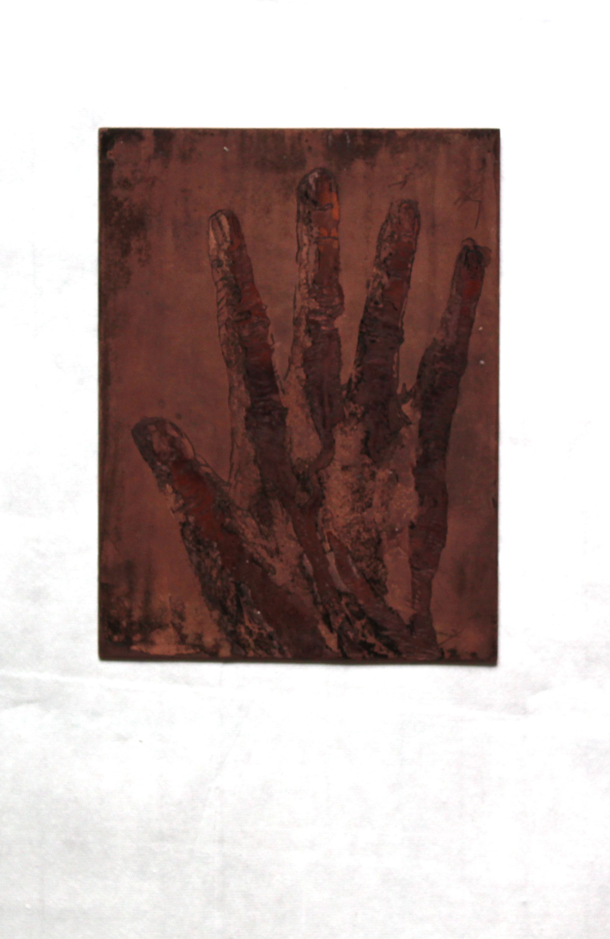
the etched copper, its plate warm golden red in colour, rough, accidental, degraded, the irrational, the experienced, the harvest moon, the real: the accidental uncorroded piece of copper giving it a “base” a bit like a crystal ball, so also connoting the supernatural
the scored zinc, silver grey, cold, precise, measured, the logical, rational, the plan, the abstraction, the plan, the analysis: the image is like a pie-chart, mathematical, but the lines also suggest a clock face, and the accidental cloud shapes on the surface, possibly caused by humidity, further connote the passage of time (and it also made me thing of the cloud passing the moon/ eye in the surrealist “Un Chien Andalou” in an inversion of the rational)
the cardboard circle- un-inked, untouched, the blank, the conceptual, the pure, the unreal, the non-existent, the Platonic form.
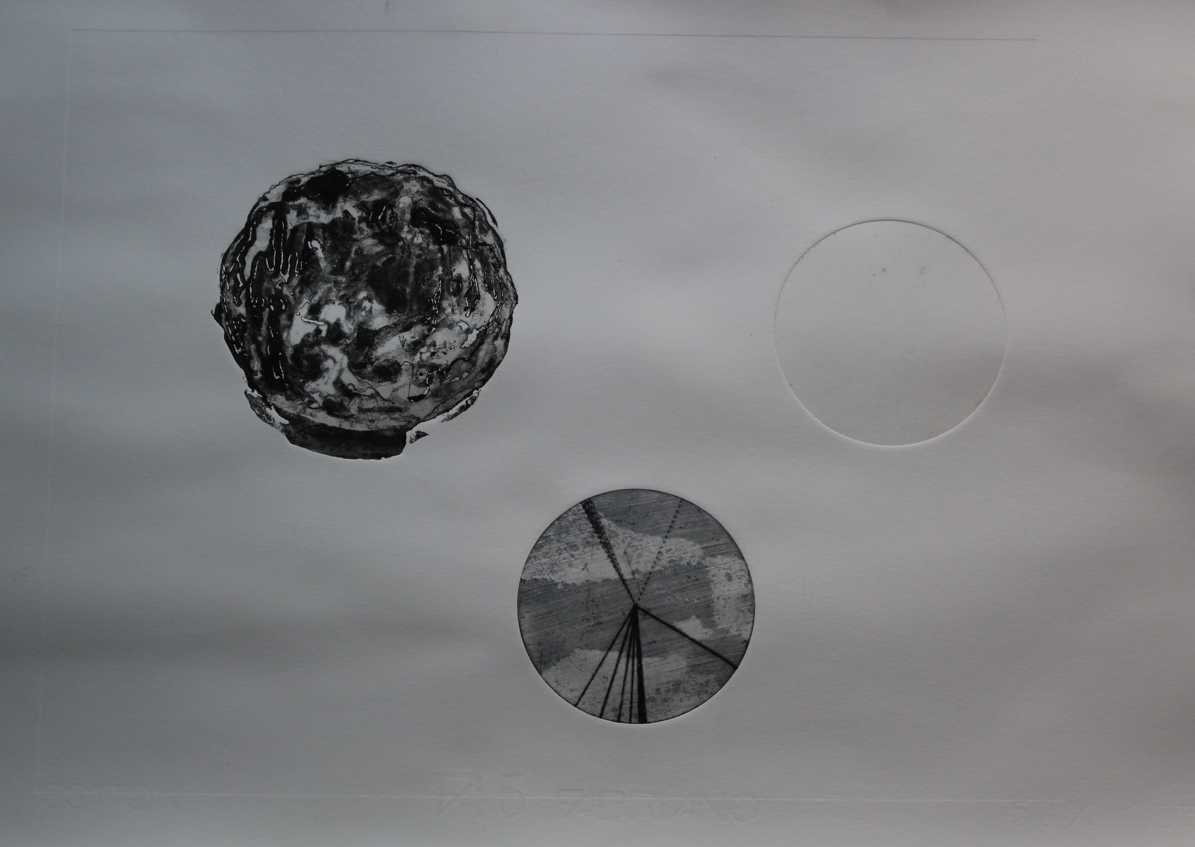
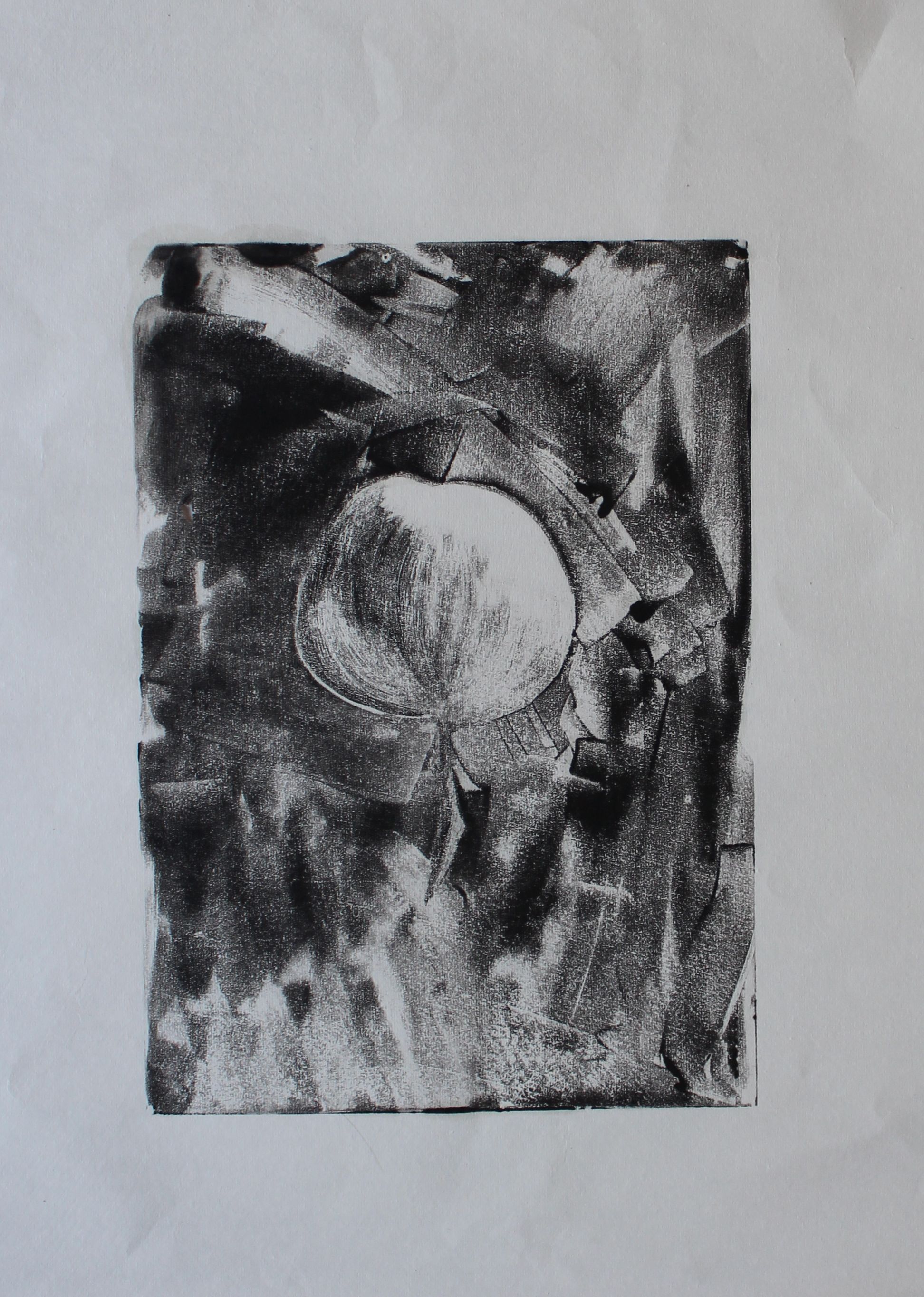
I was not satisfied with the composition. And time ran out for using the press, as a class of students arrived. So I will just reflect on what is wrong and what might be changed.
The juxtaposition reminded me of Joseph Kosuth, “Three chairs and one”, the forms of the same object, drawing attention to the relativism and constructed nature of all instantiations of a single concept.
There was something I didn’t like about this group of three- the way a group of three immediately suggests narrative progression- or is that just me?- there’s an immediate sense of before, now and then, or a suggestion of causation which didn’t please me at all with this. Would having just two items make a difference to that? Would an arrangement in a straight line be less annoying? Does the whole thing need more space?
I removed the embossed shape and quickly re-printed. The cloud formation on the zinc was gone, and possibly won’t be recreated.
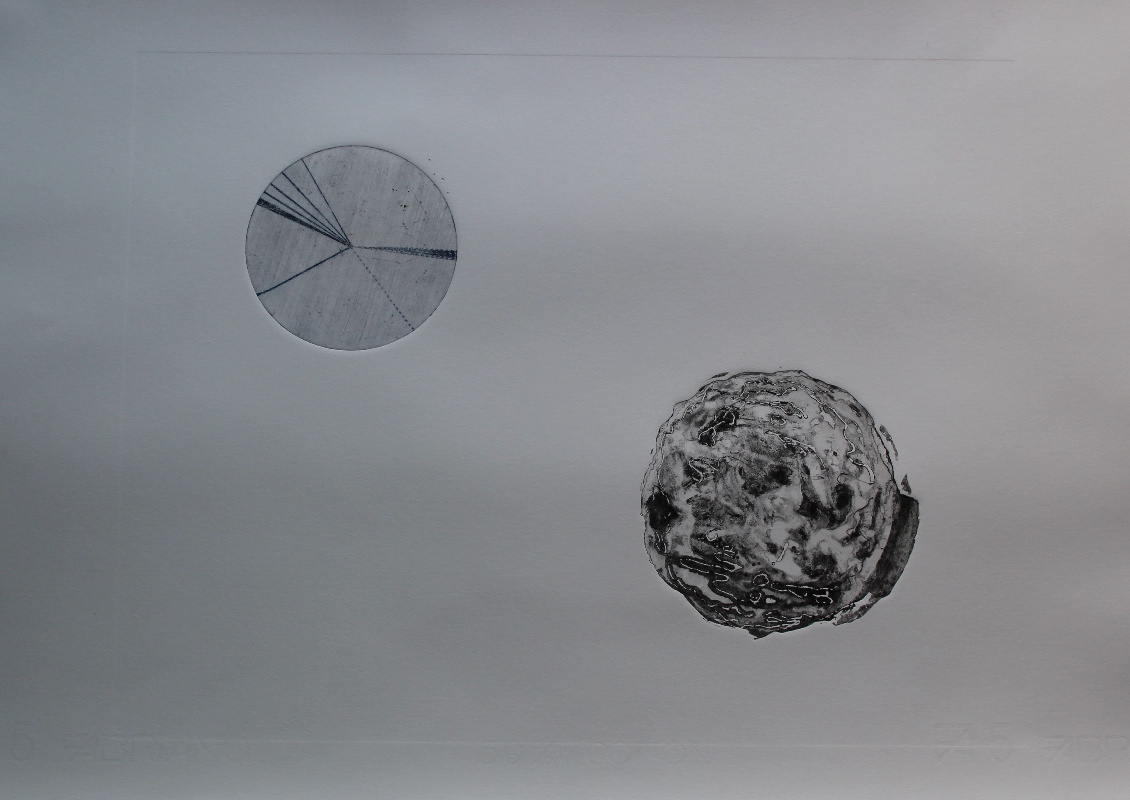
There’s still an inevitable balance between the two- or tension. The orientation makes a difference. Is it balanced in too obvious a way? There is a clear organic vs geometric opposition- order vs chaos, yin and yang.
The meaning of it is forming in my head and I think I know what has to be done.