Thoughts for moving on

Assignment 1, Assignment 2, Reflective Commentary

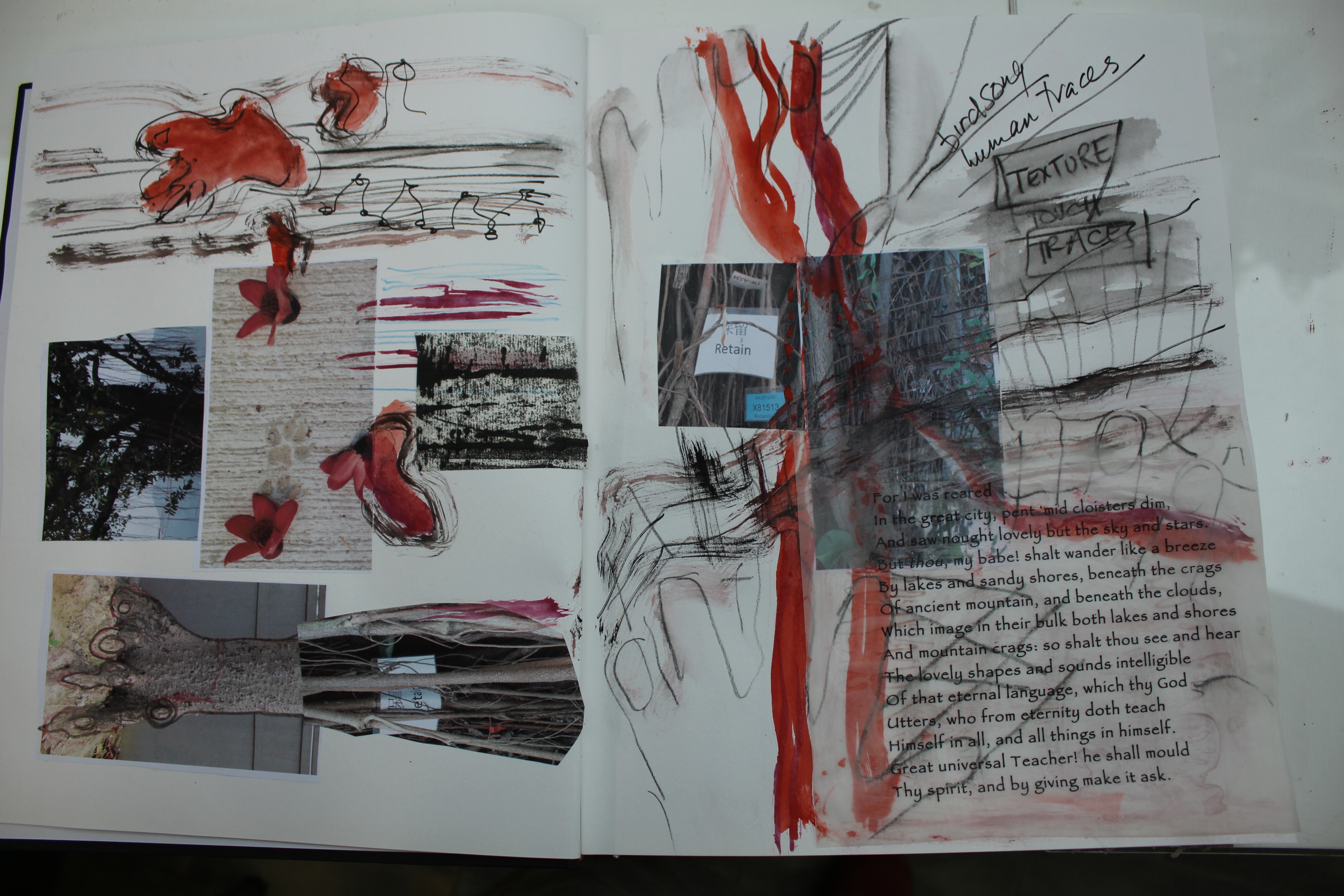
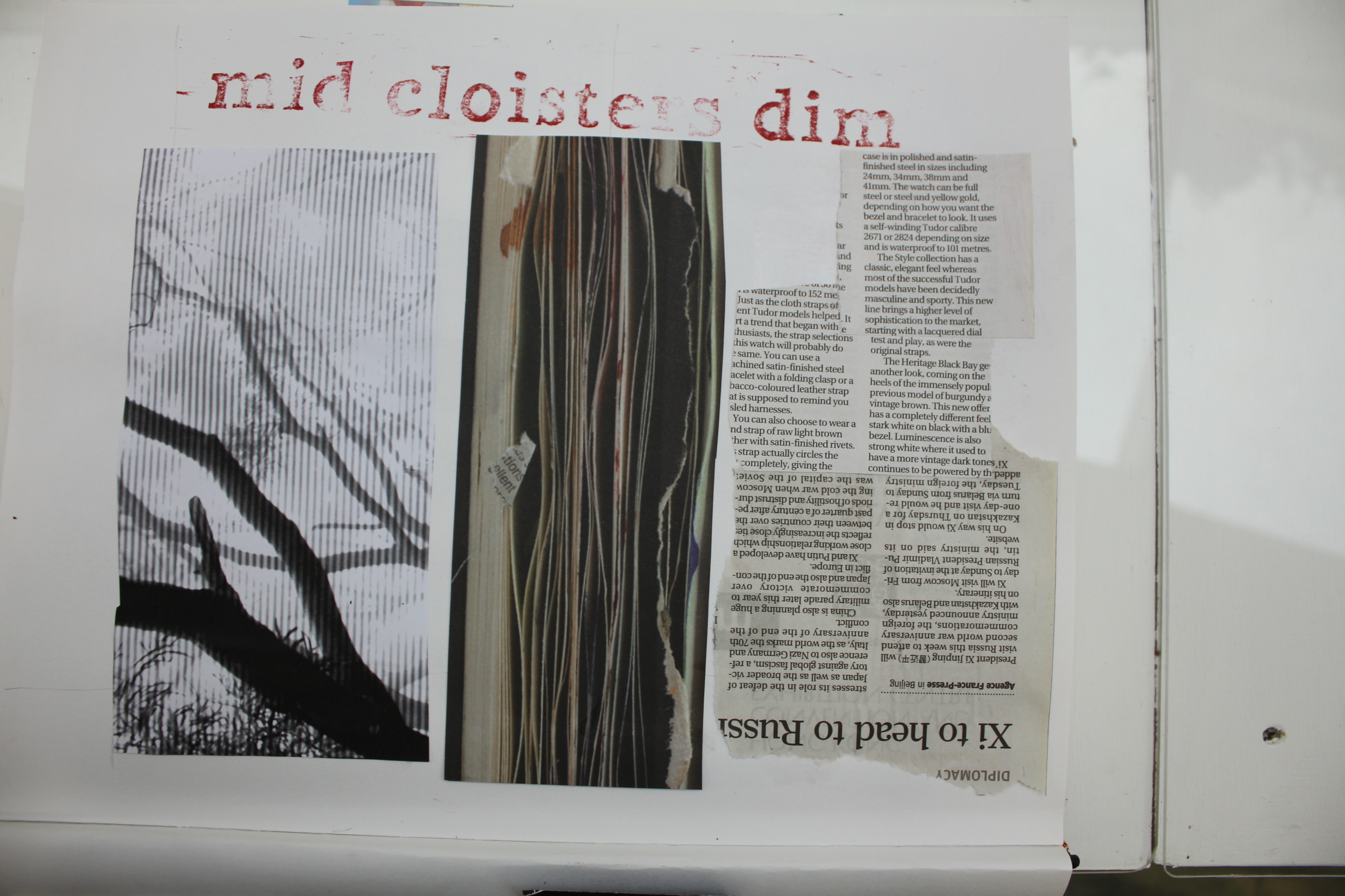
Looking back on the topics of the first assignment, and looking ahead to the next: what was the thinking behind this choice of subject matter?

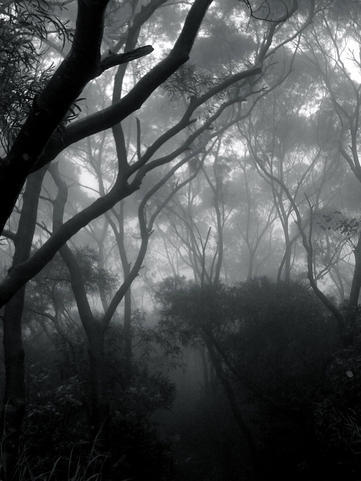
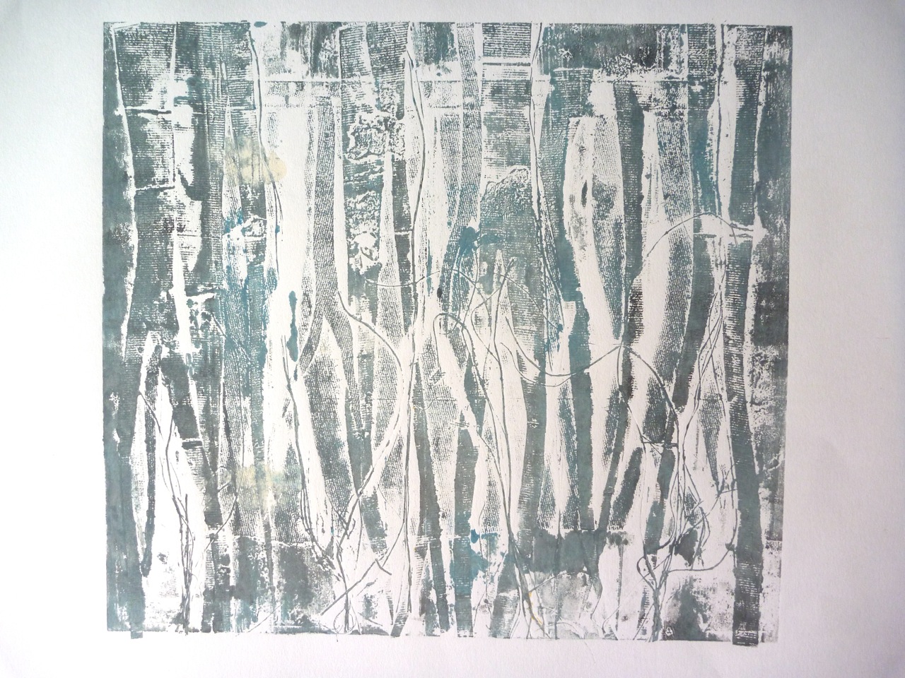
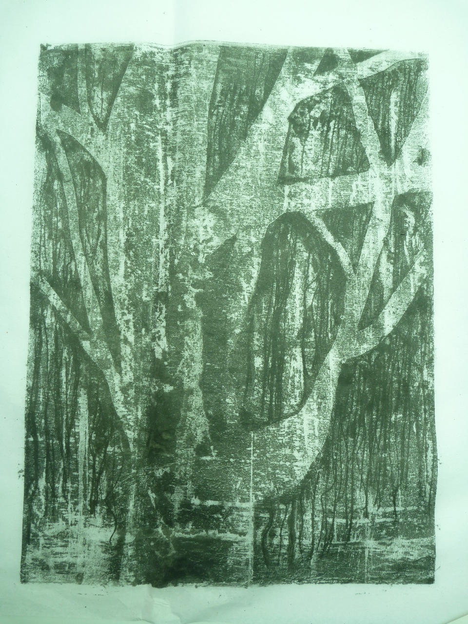
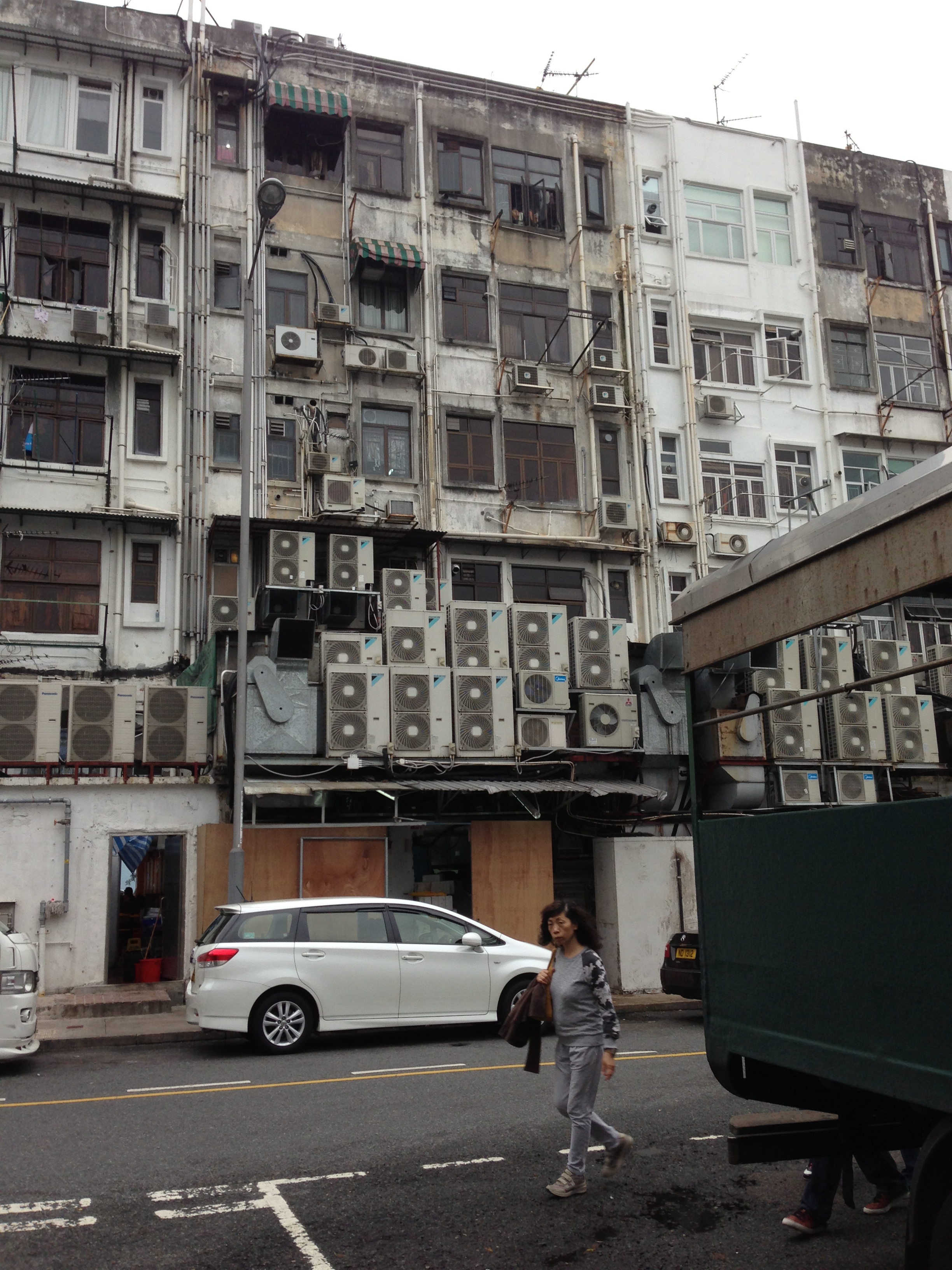
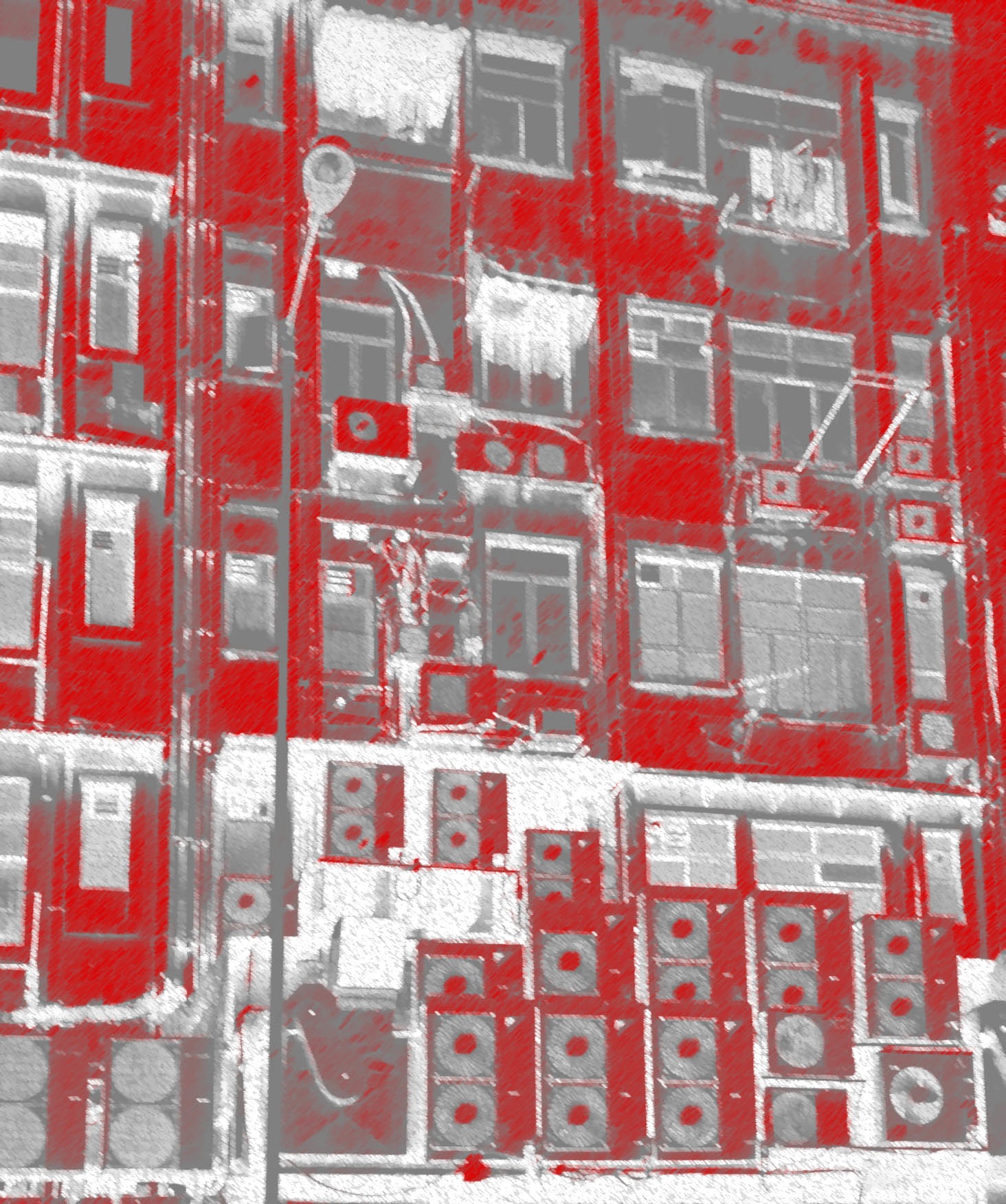
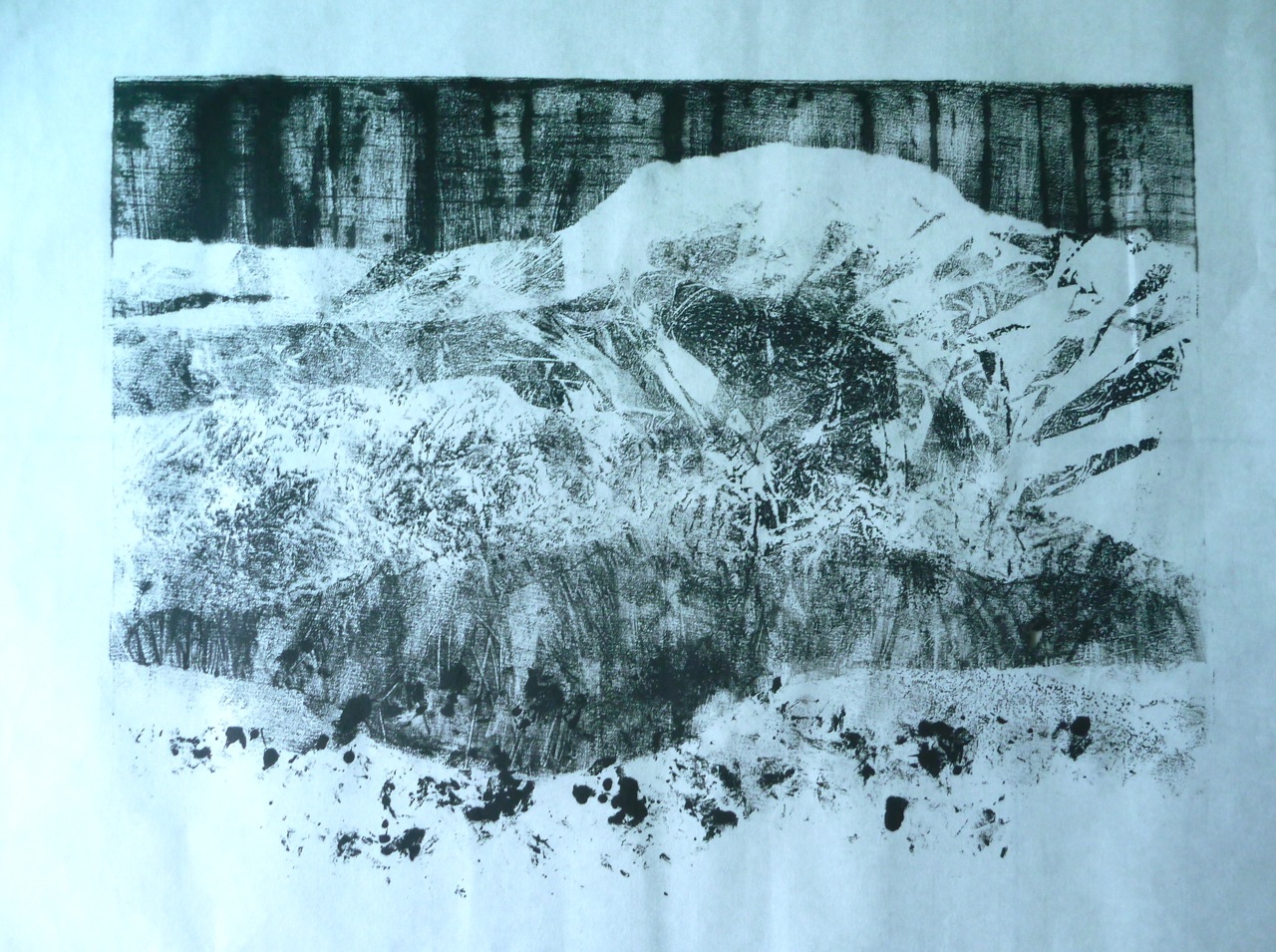
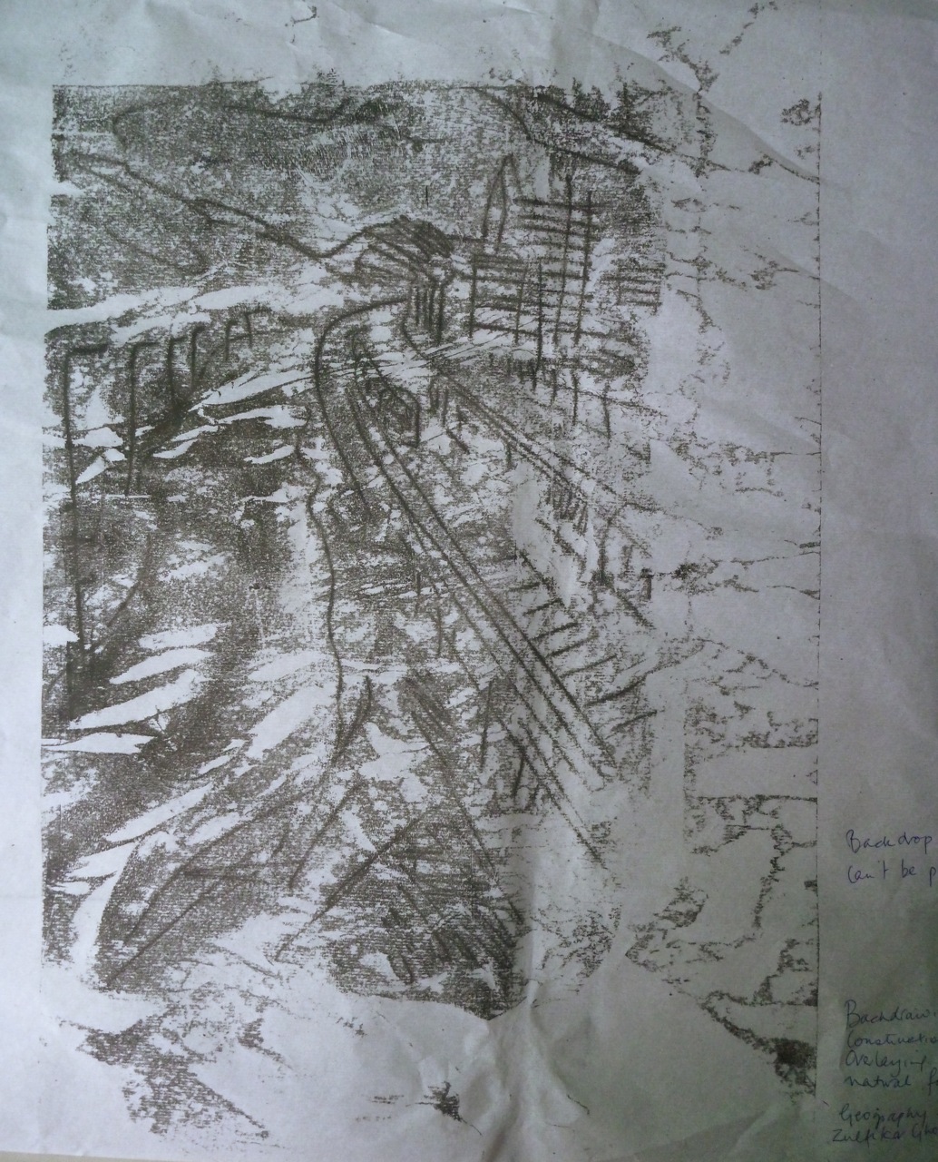
Starting with observation: nice to do, it makes you look carefully, if not “properly”: we see what we are disposed to see. The artistic heights of looking and seeing were probably achieved with Impressionism, whose painters gave us a visual language for seeing the landscape, all about the effects of light, the subtle depiction of perspective, the poetry of complementary colours. But you look at a landscape like this one below, and you think, the subject and the approach somehow don’t fit: even the romantic blur of Turner’s steam trains would be, well, romantic, when applied to trains which run past every three minutes on their network of lines. So, just as quickly, you are transported forwards into futurism, vorticism, attempts to combine geometry and angularity into the impression of movement and speed, the celebration of precision, hard metals and engineering, not the blur of trees and hills the trains slice through.

IMG_2949 IMG_1245 IMG_2947

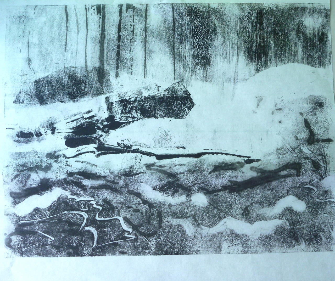
So how do we interpret this “scene” before us? Taking a picture, instead of looking and selecting, is a way of getting another point of view on it, one that doesn’t omit the untidy details, the clutter that distracts from what we have settled on as the “subject”, not always the same as the “focus” in a photograph. Soon you might want to discount the evidence of your own eye entirely, as being too particular, too partisan. I did this with this assignment. The word “landscape” itself conjured up a way of looking, and seeing, that didn’t gel with the evidence before my eyes.

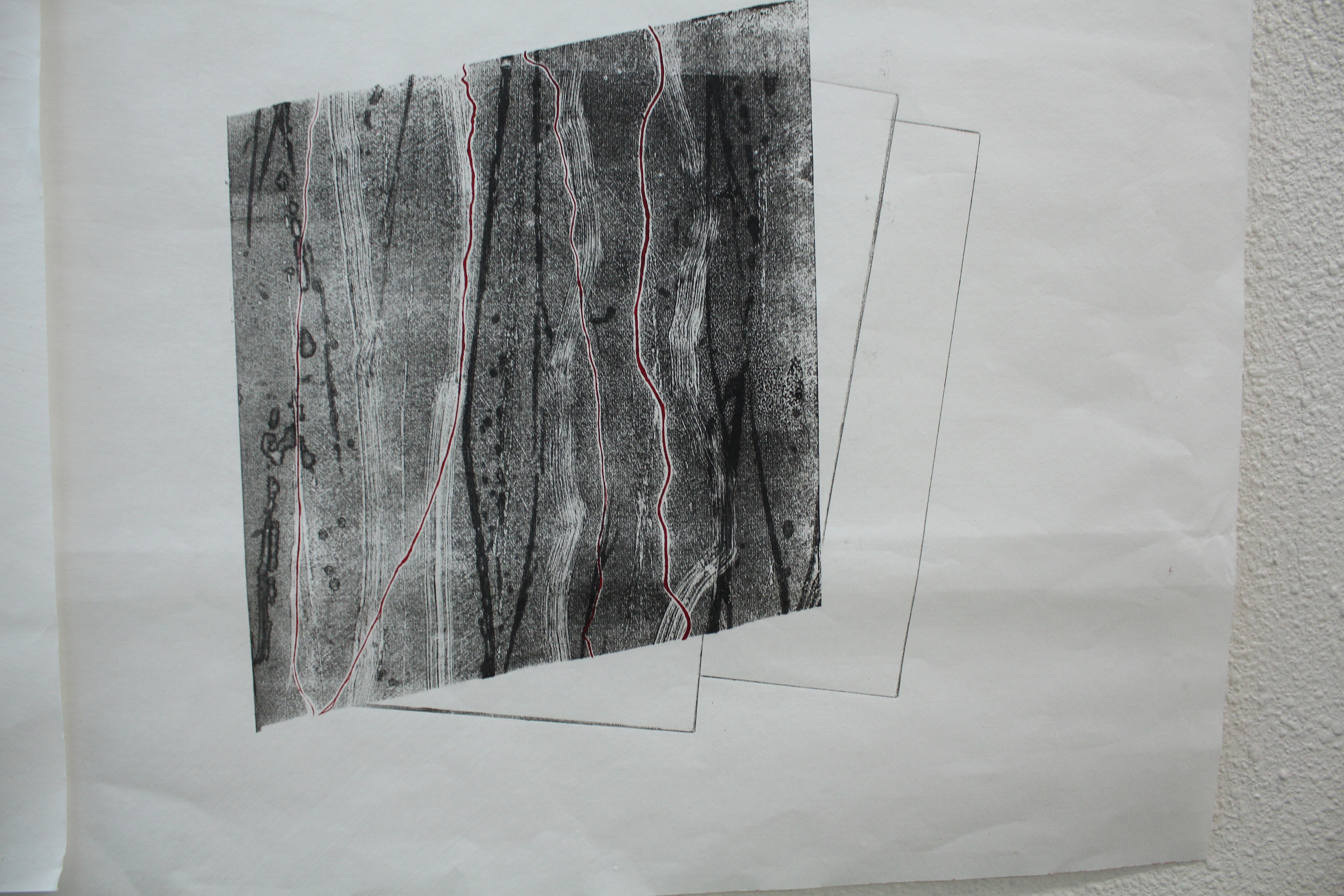
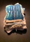
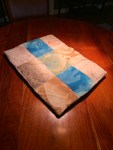
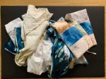
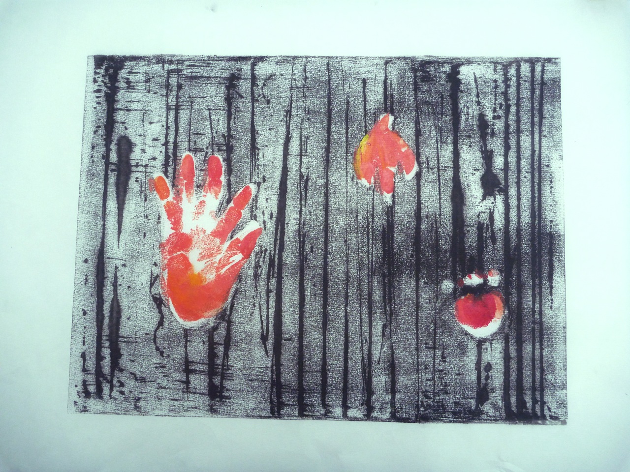
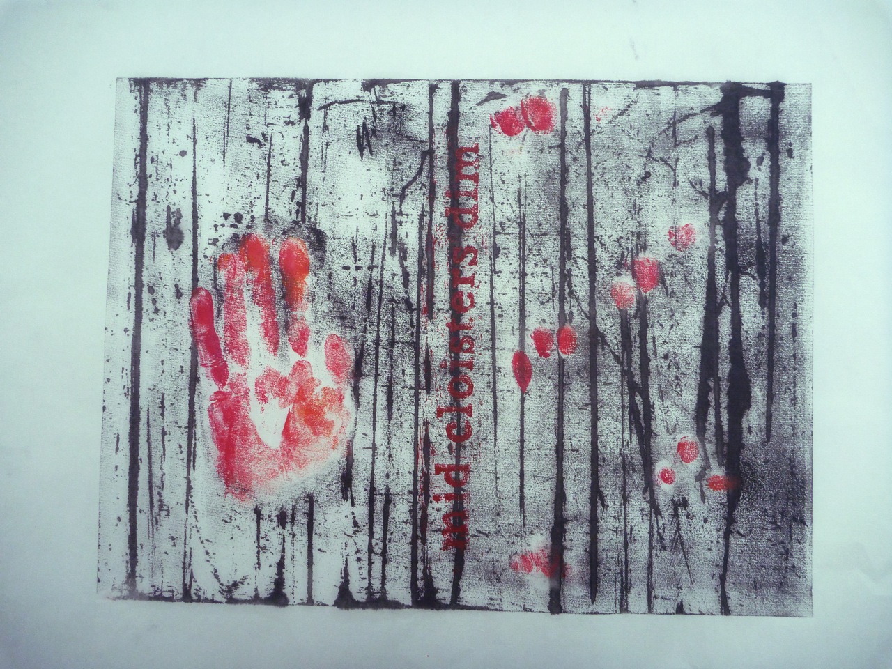
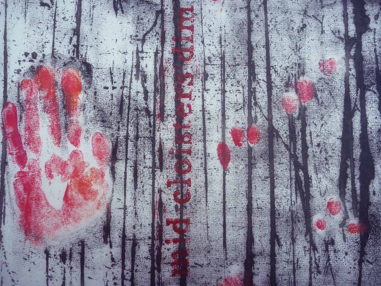
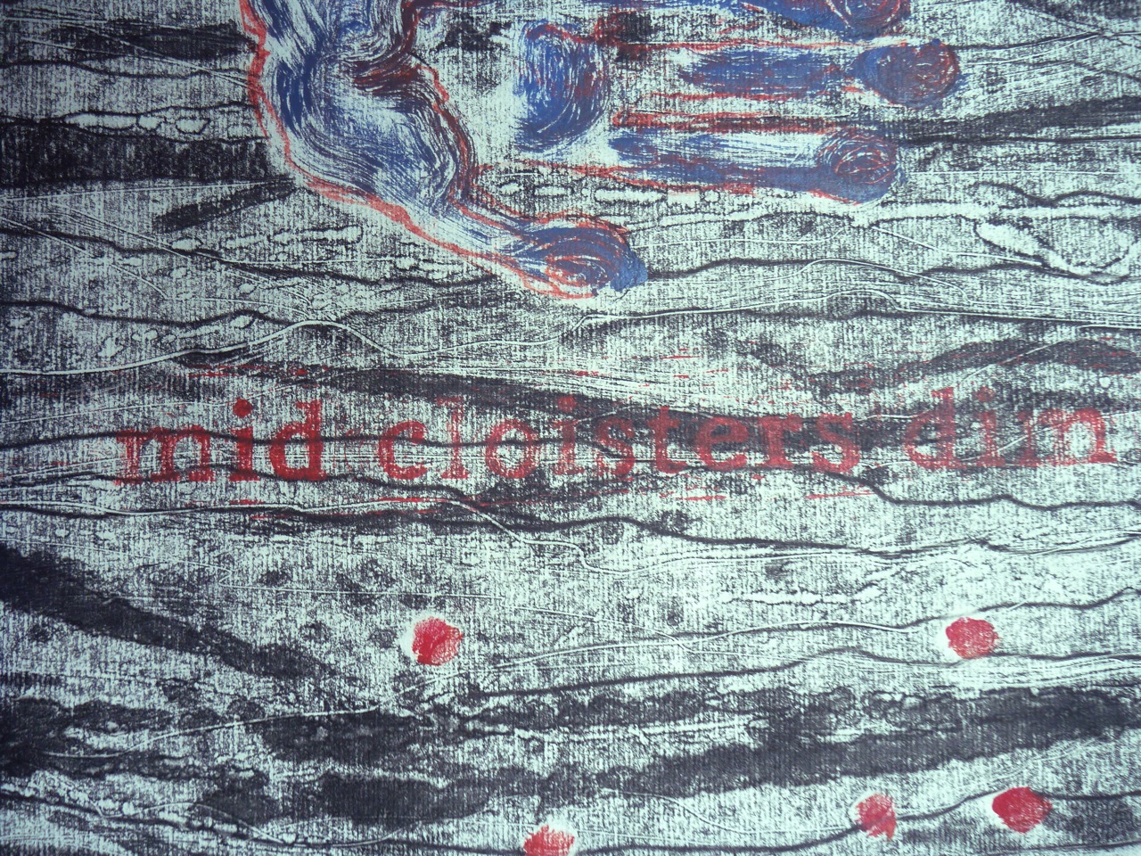
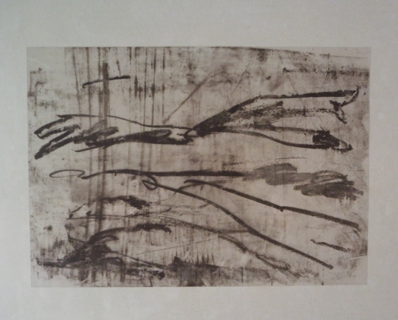
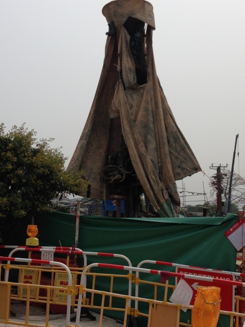
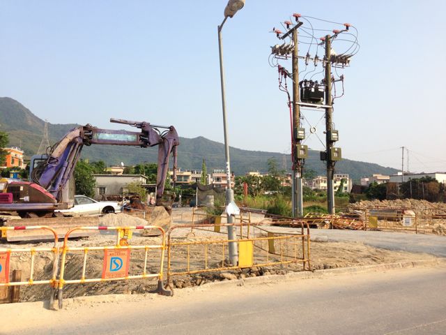
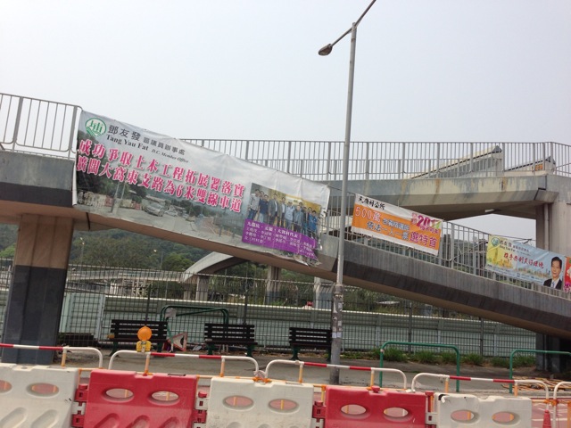
Ludwig Meiner (Art in Theory, p. 171) in the second decade of the 20th century pronounced that landscape was an unsuitable subject for painters, and exhorted artists to paint the metropolis “what is right there in front of us”, but describing its “roaring colours”, “singing electrical wires” in the language that romantic poets used about nature, a claim to beauty in the urban, somewhat the same point as Turner was making with his trains. By the same argument, if this is what “is right there in front of us”, it should be possible to make the same kind of claim for “ugly beauty” in this landscape of electrical transformers, trampled clay, concrete towers, steel mesh, plastic, tarpaulin, worker’s gloves, thrown away polystyrene lunch boxes, water bottles, cigarette butts. But how?

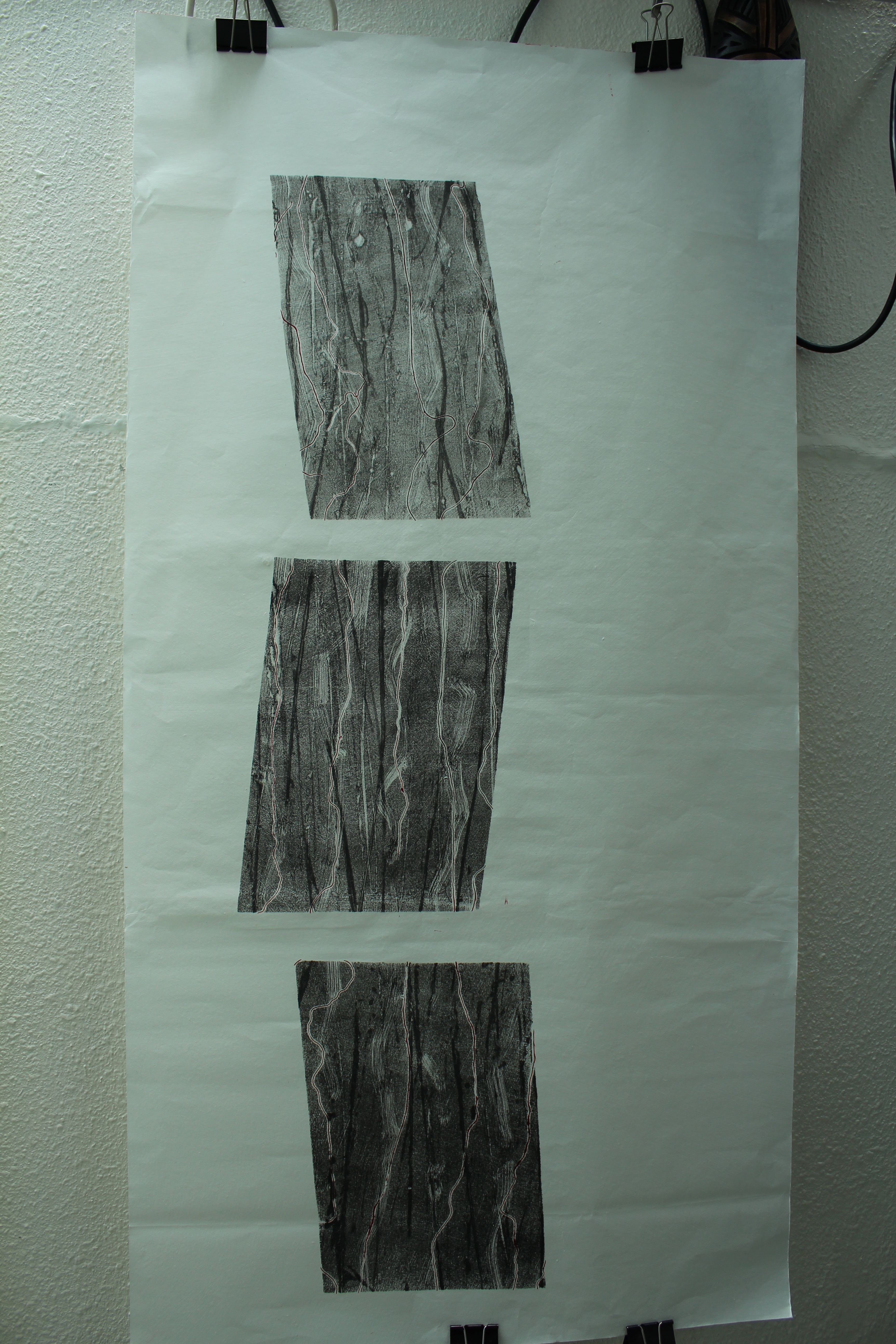
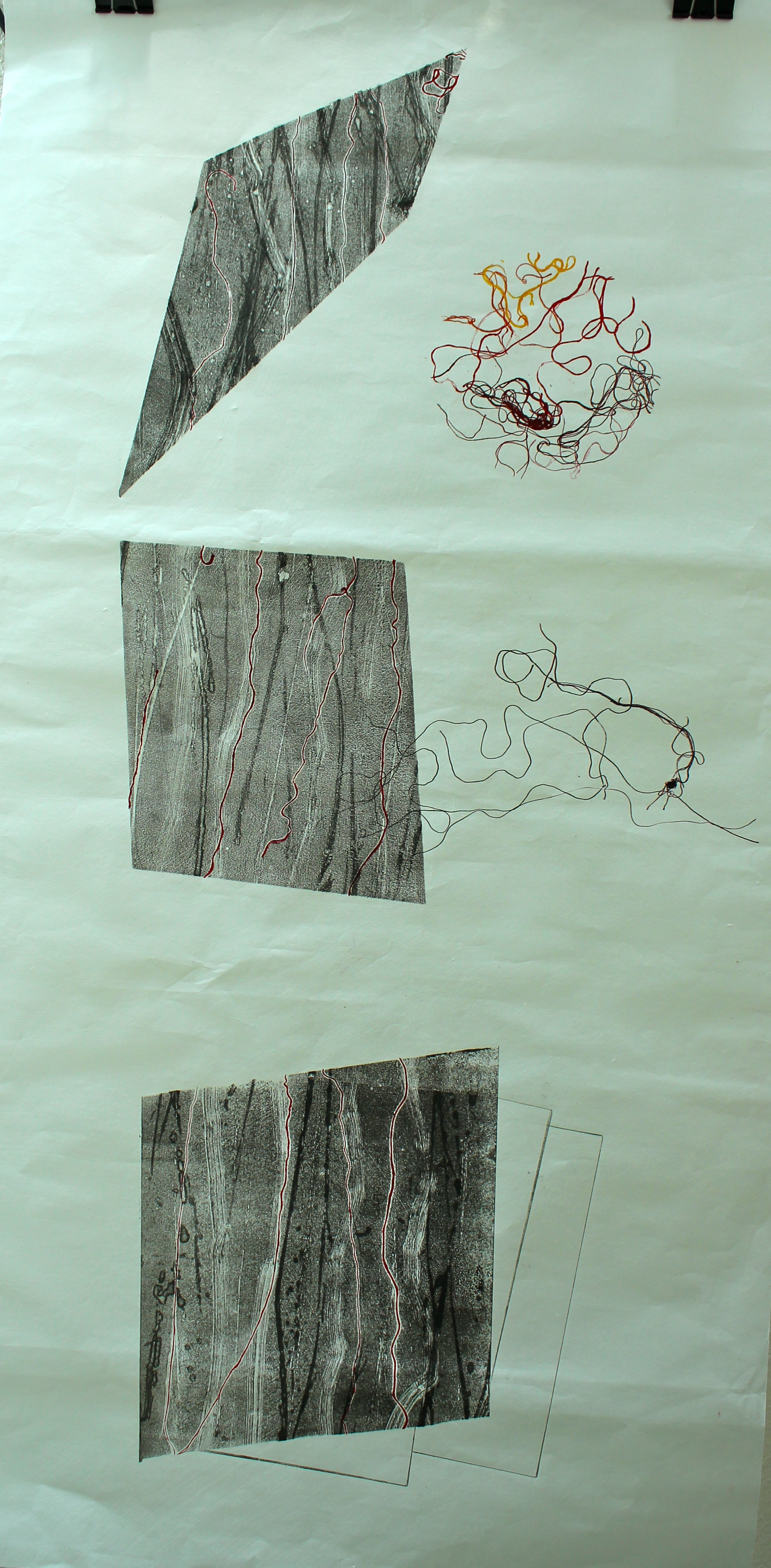
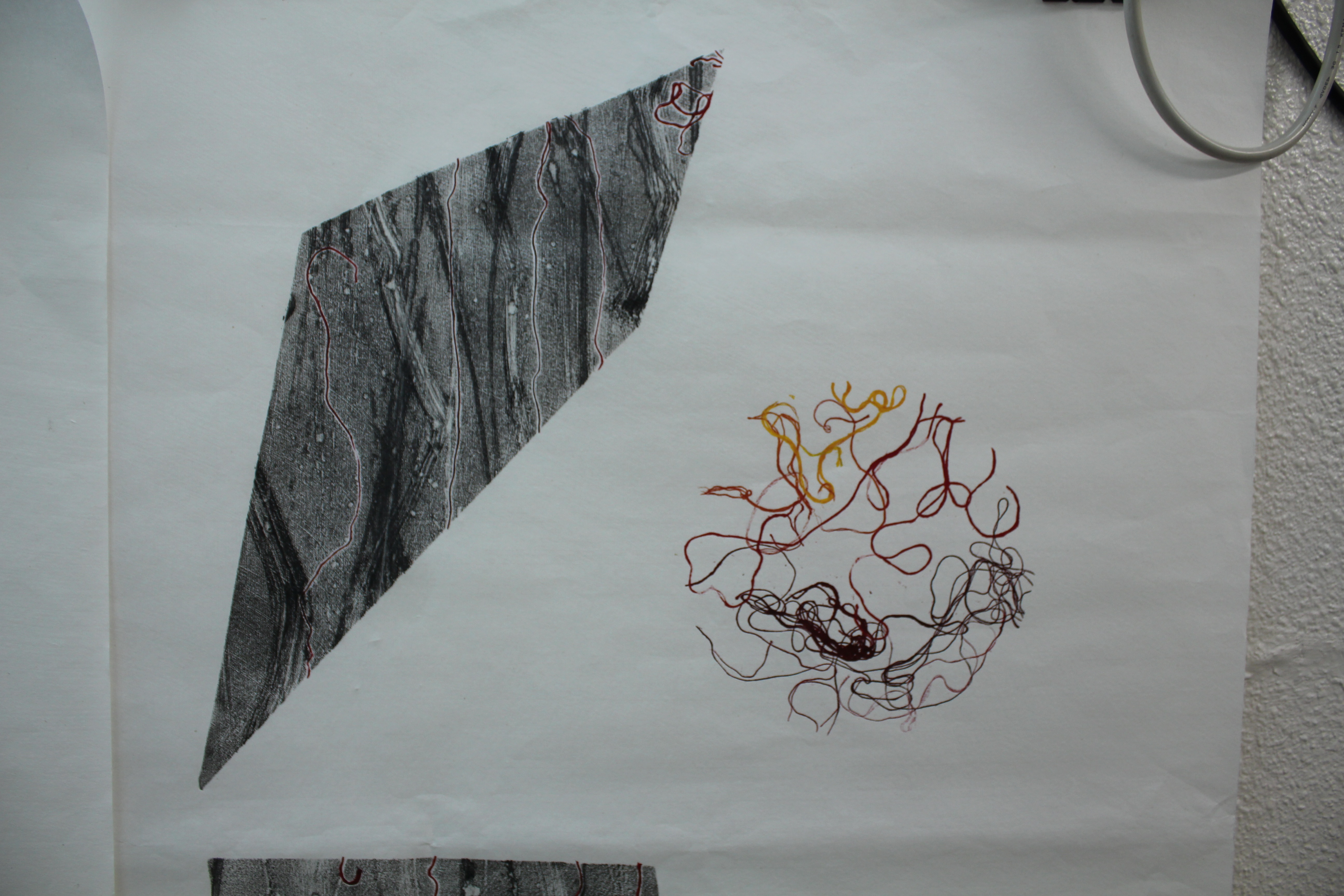
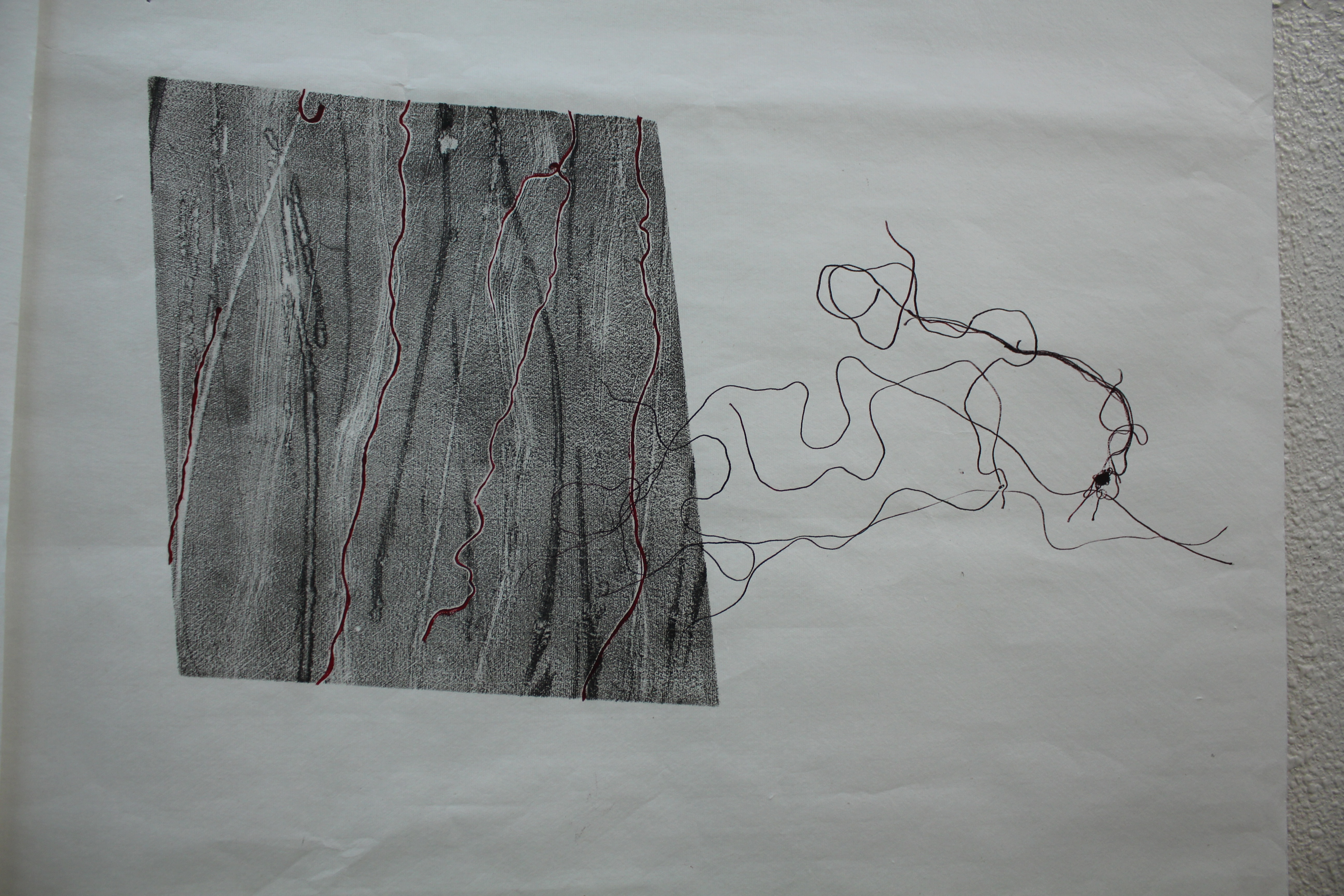
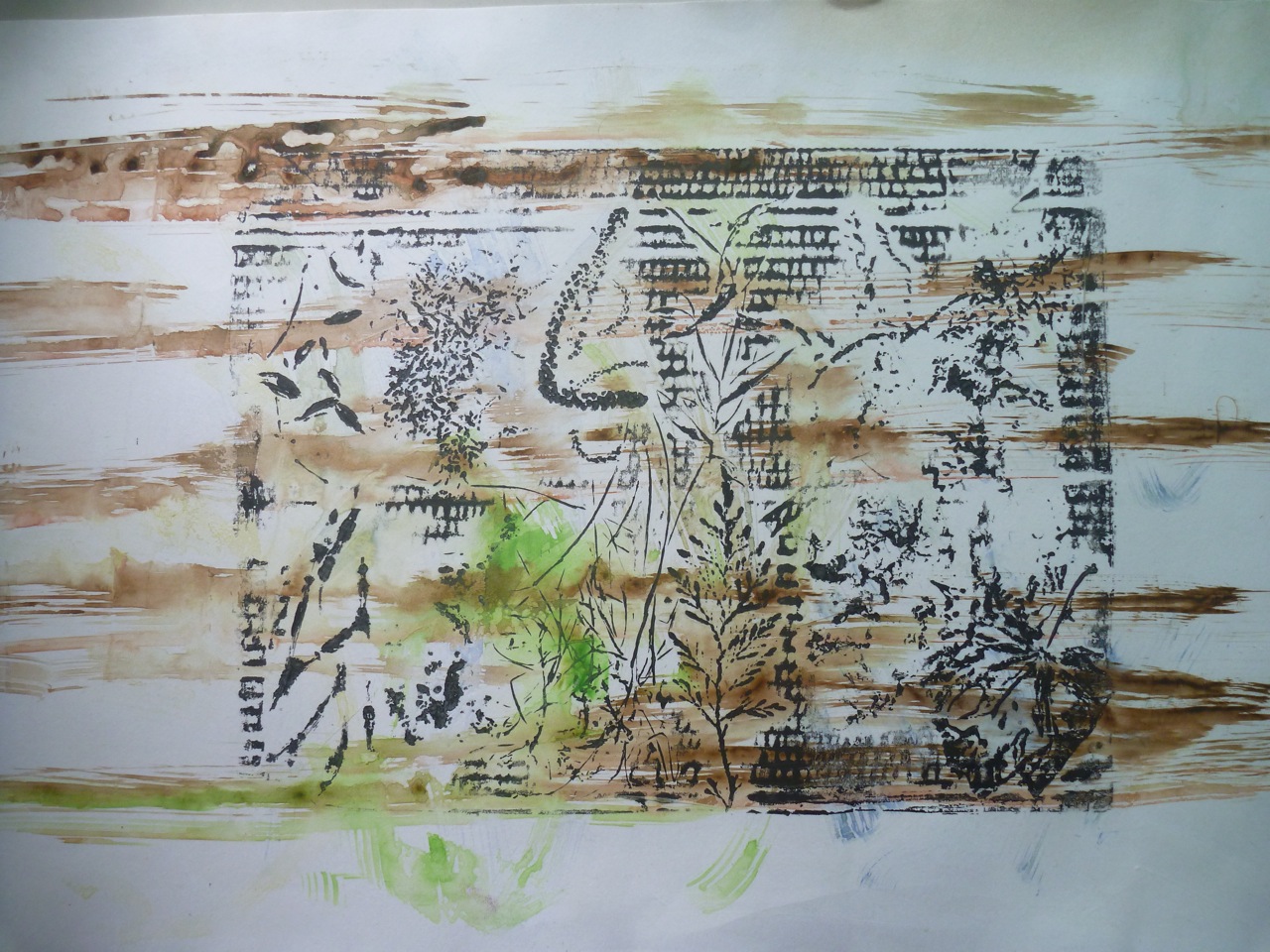
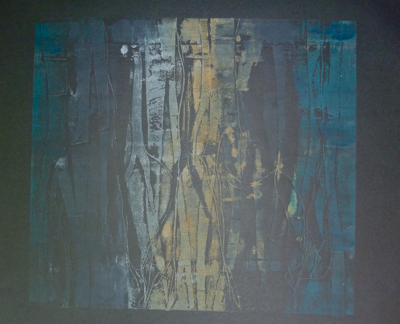
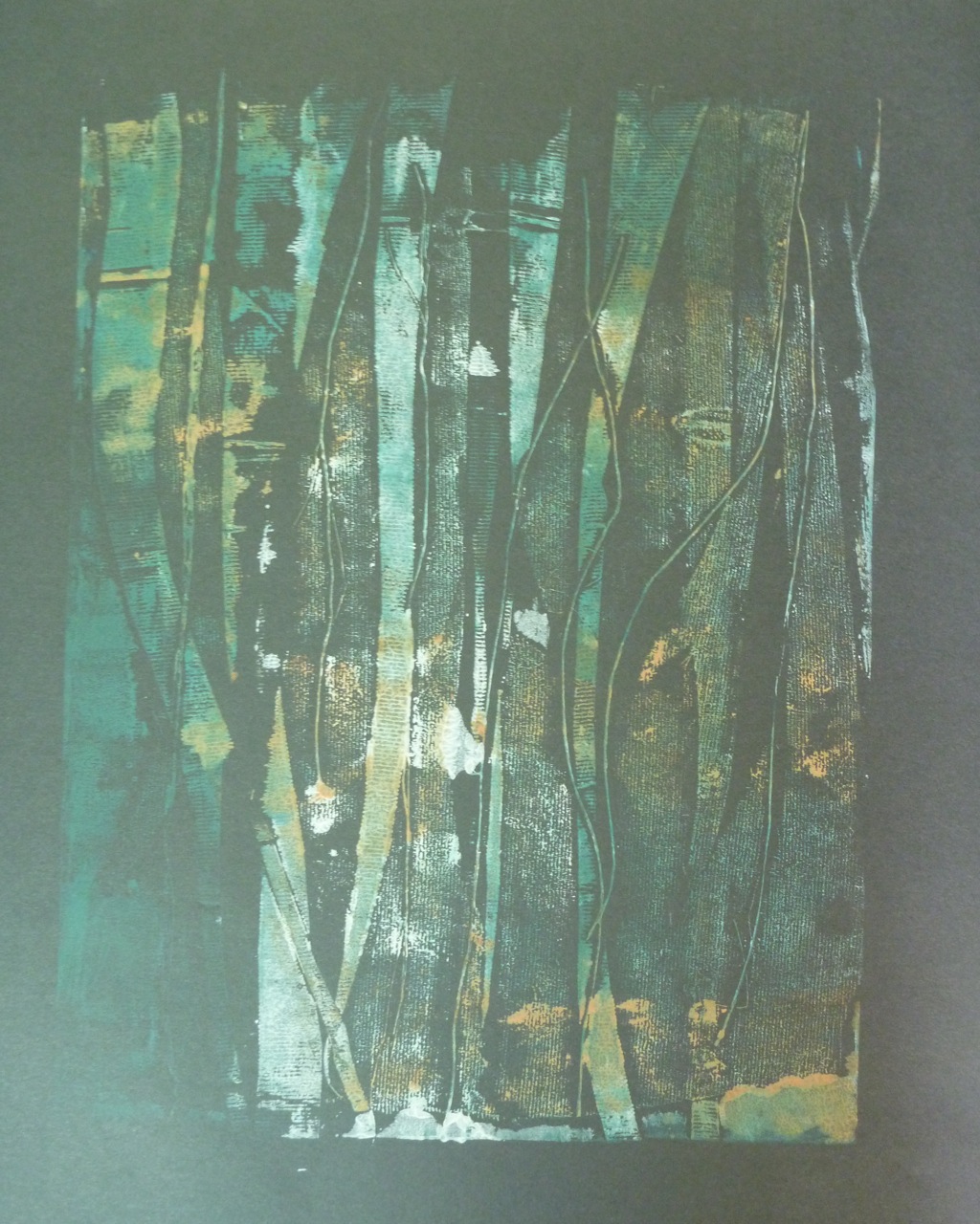
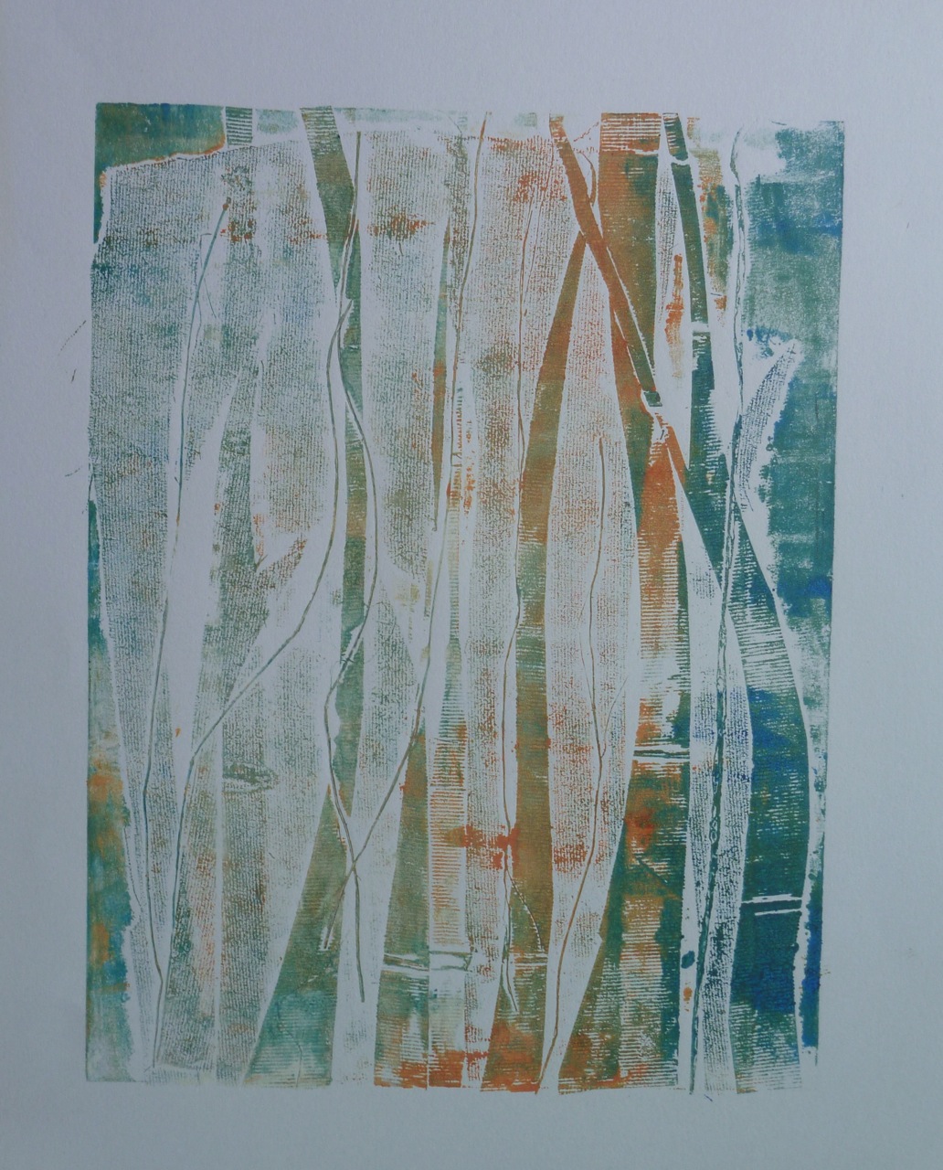
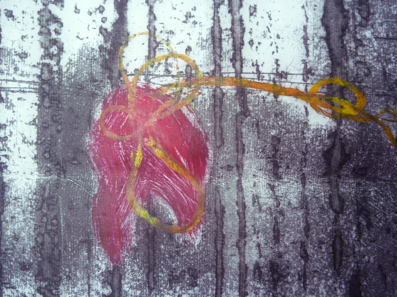
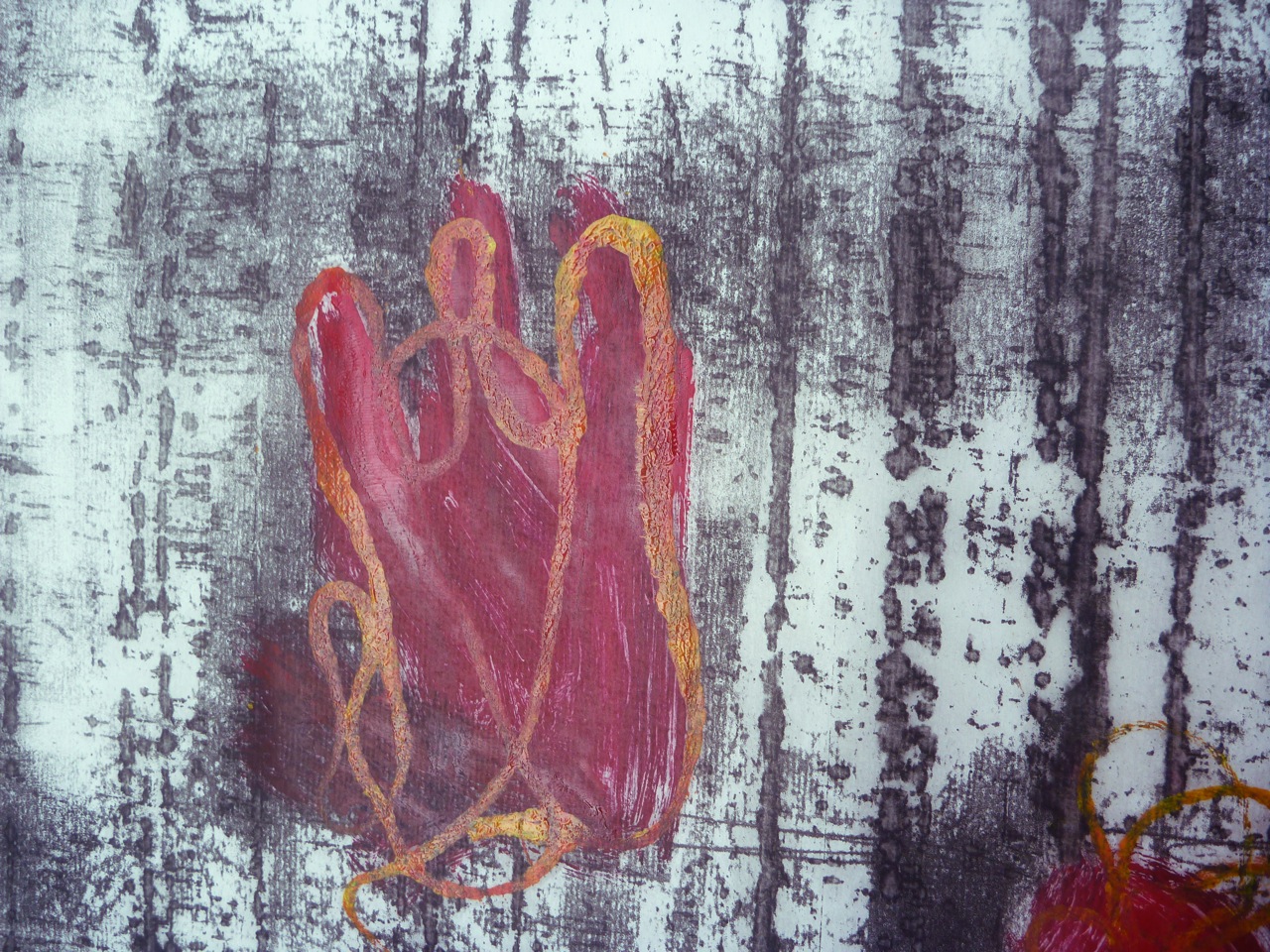
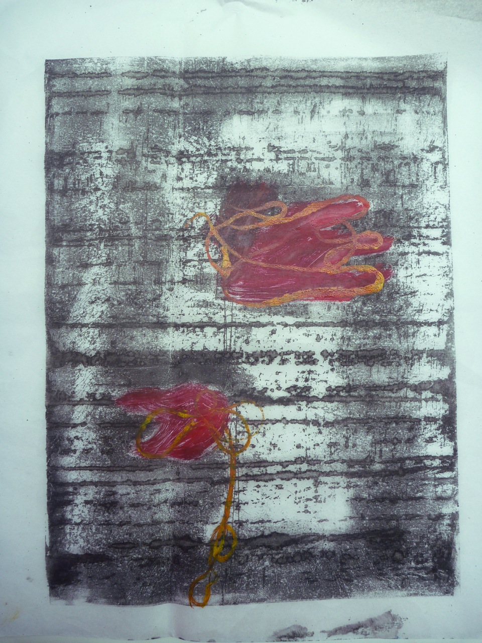
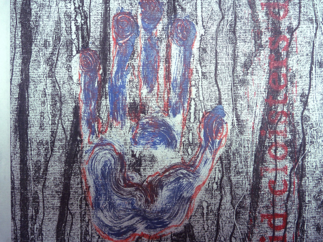
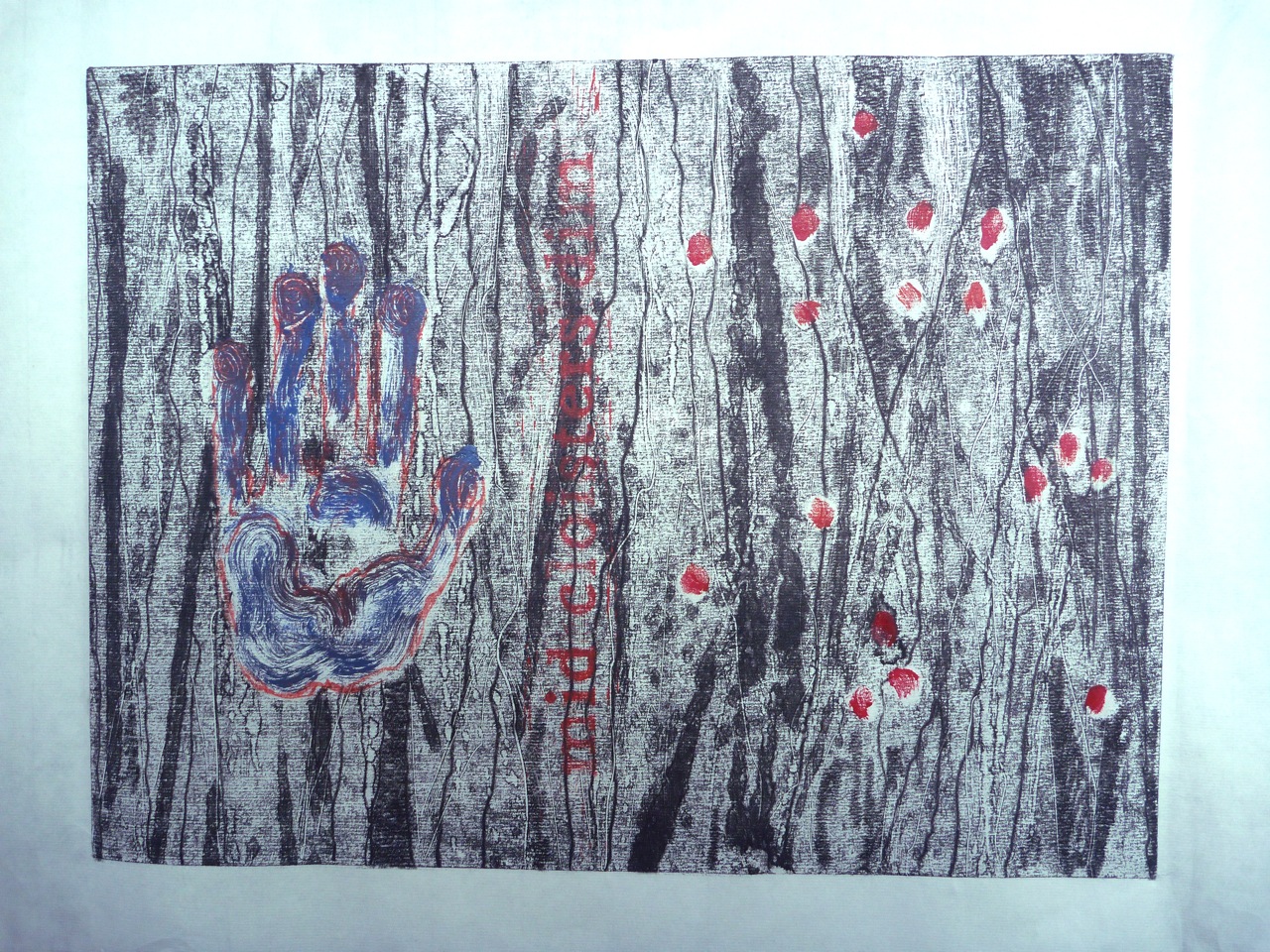
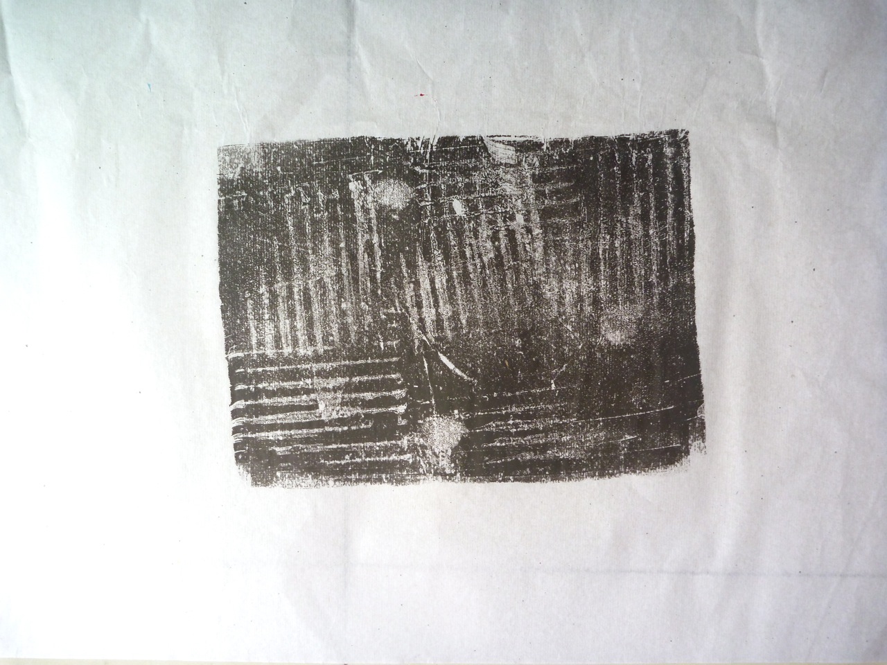
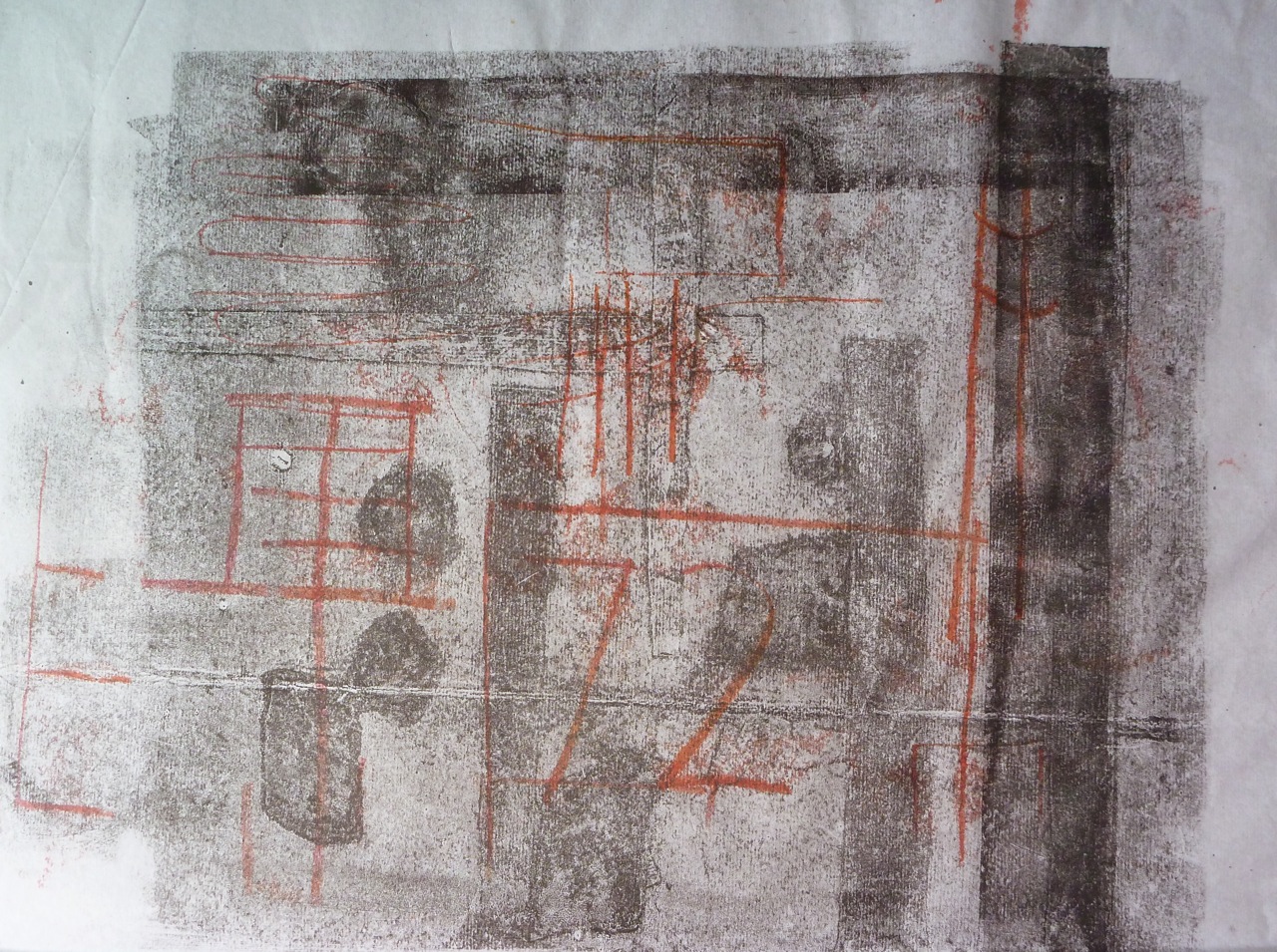
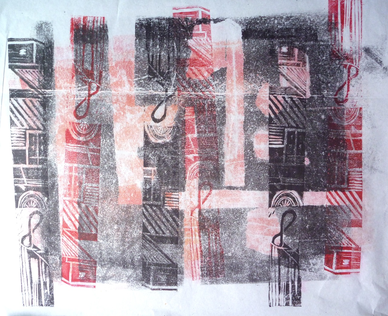
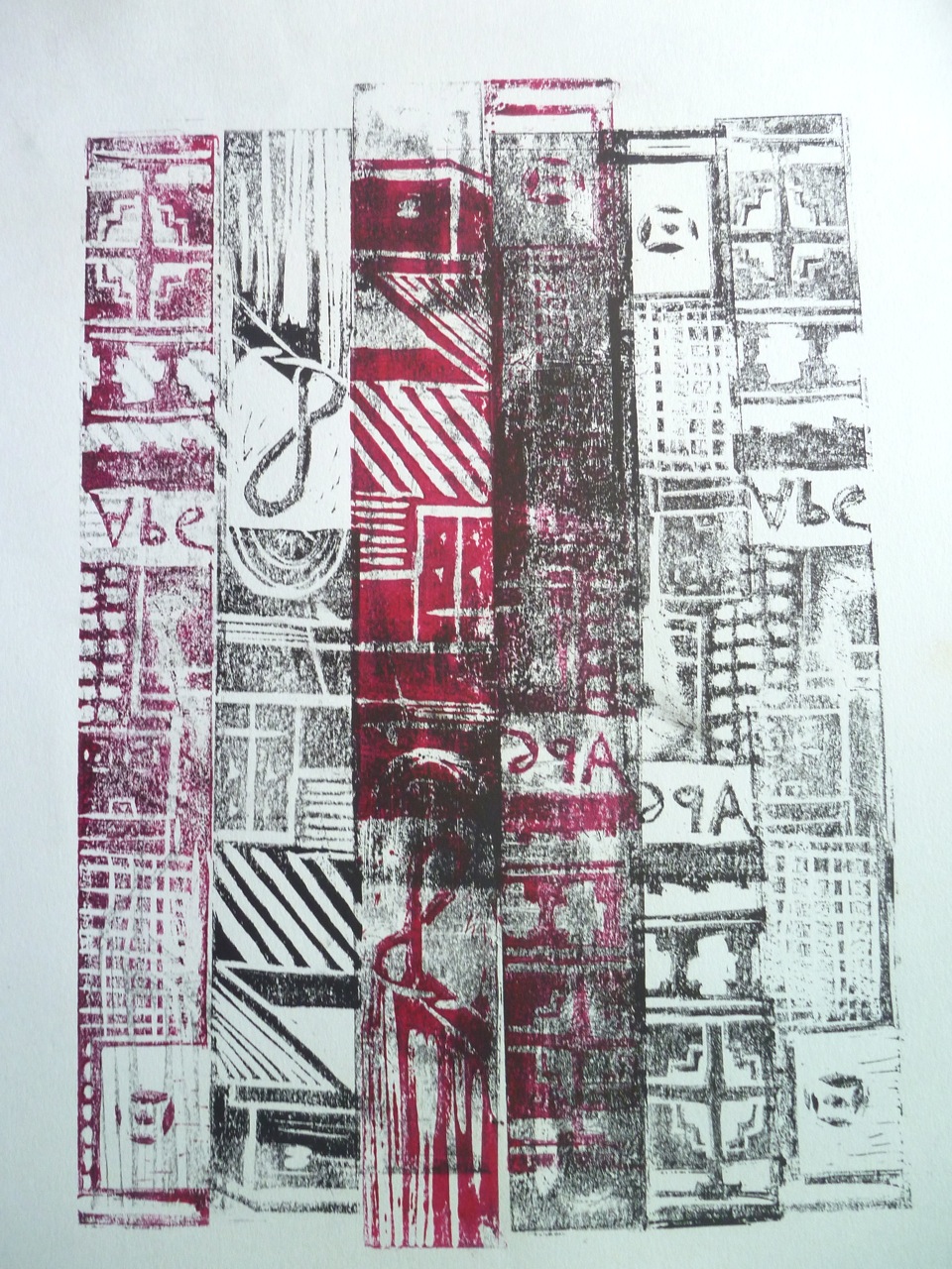
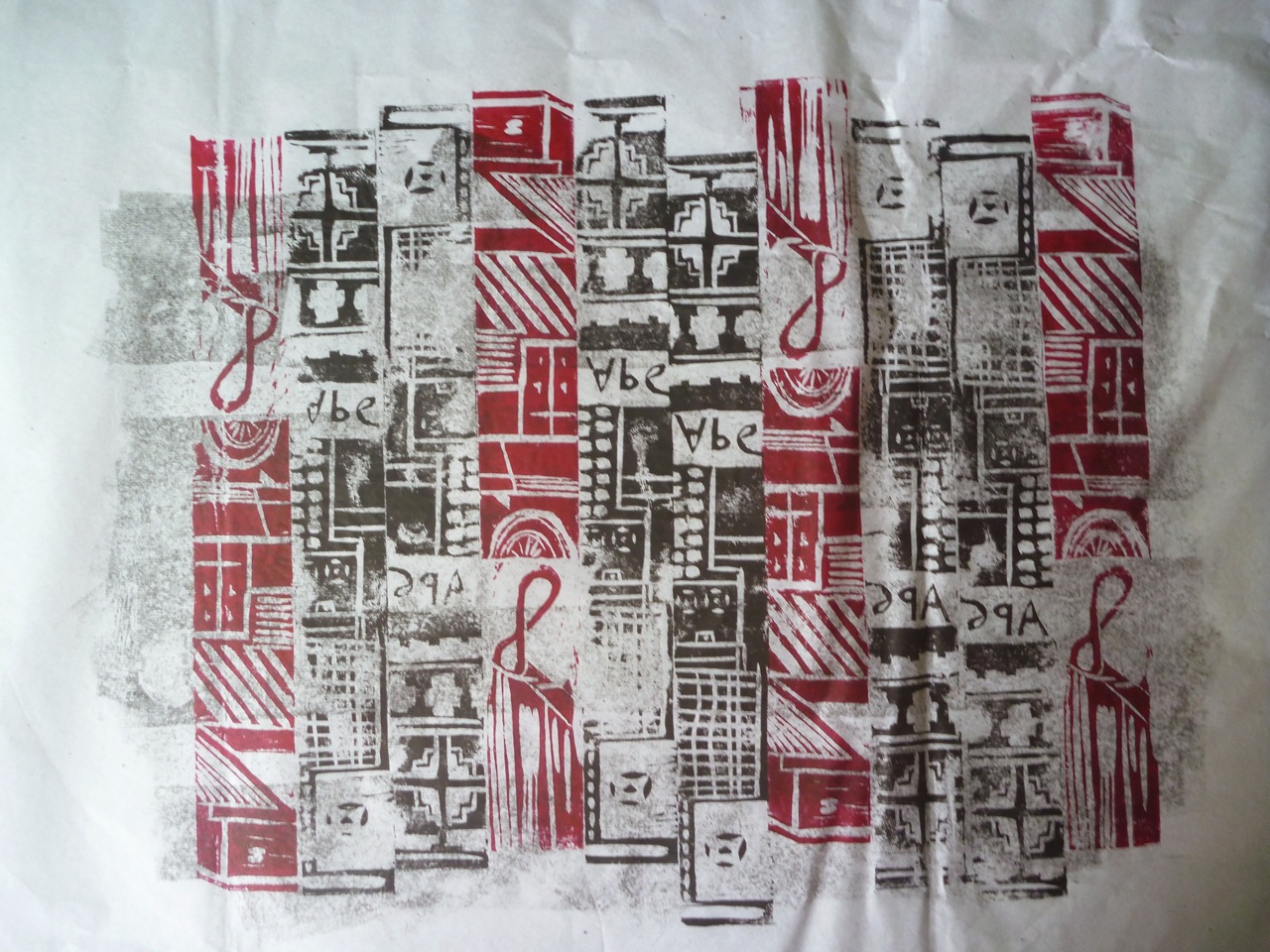
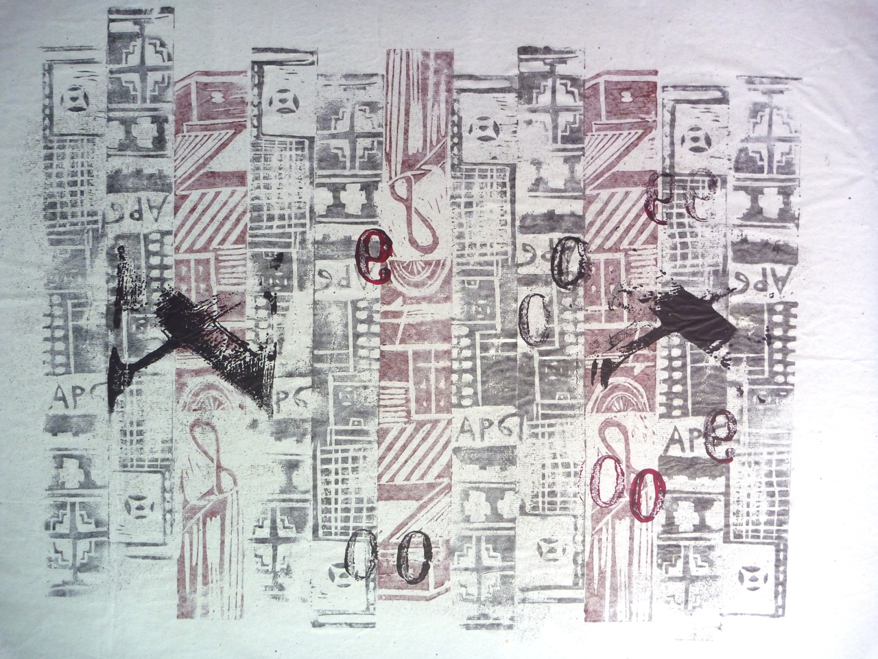
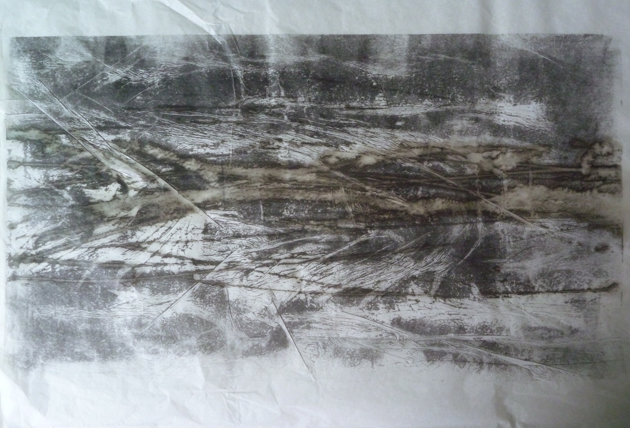
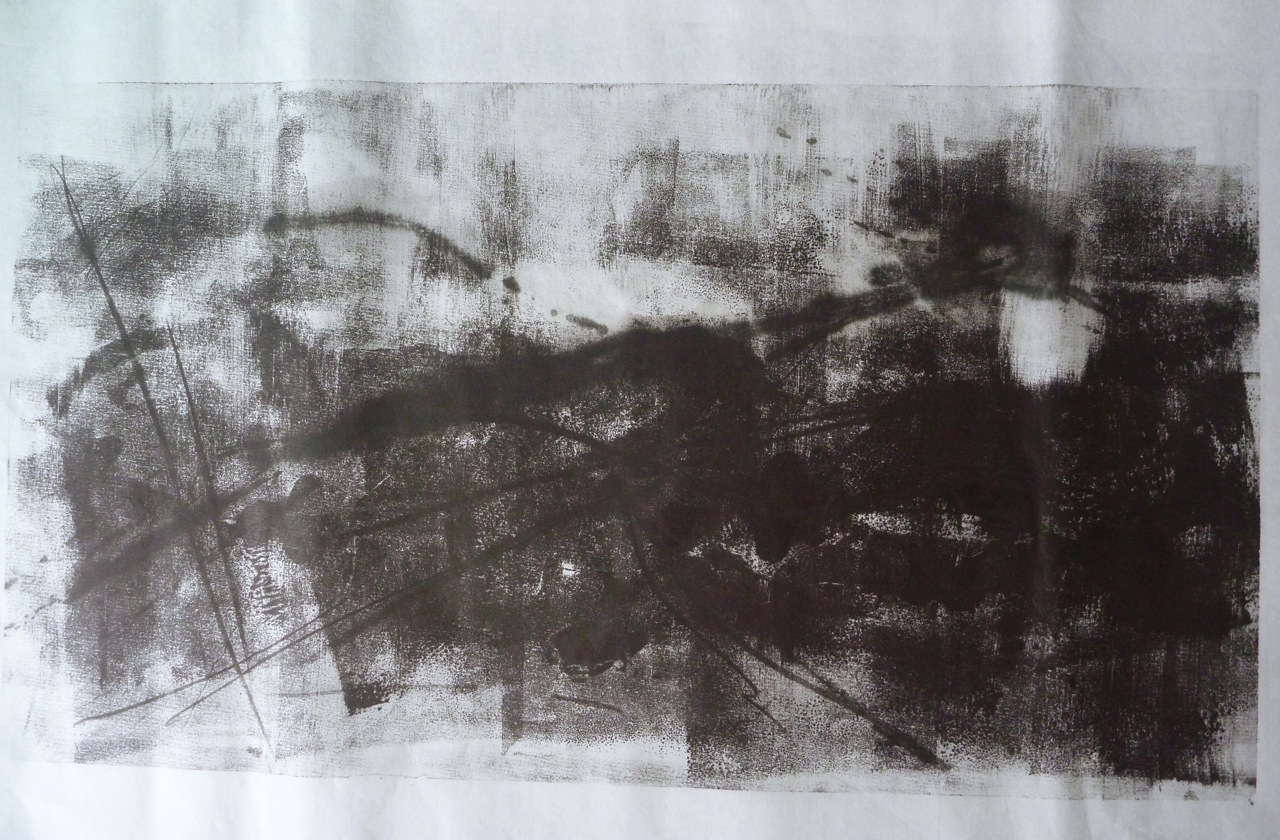
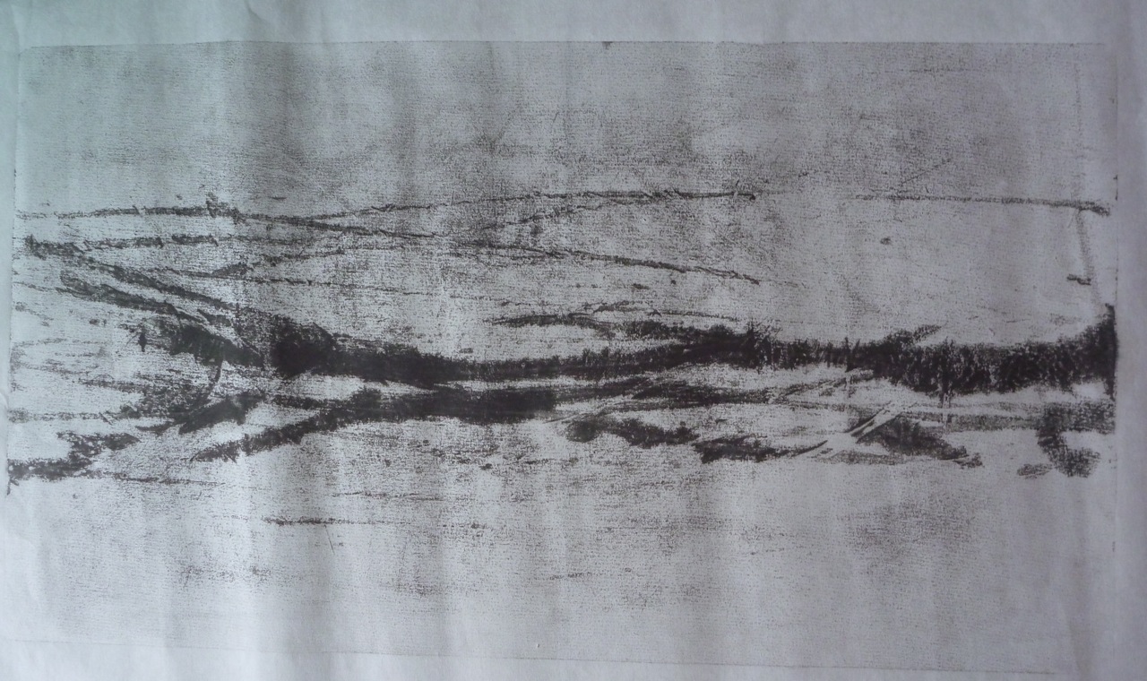
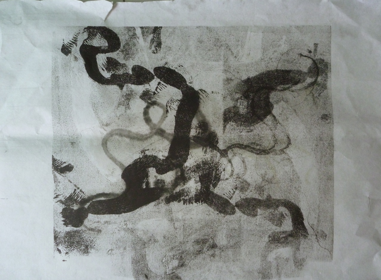
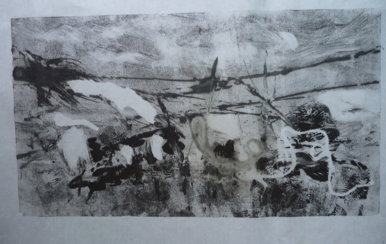
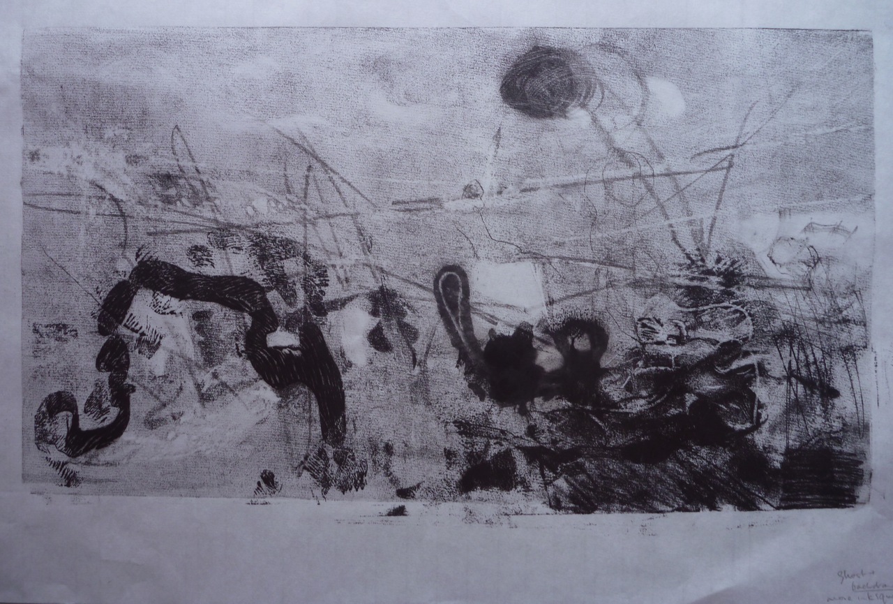
Malevich’s answer to the Vorticists was to denounce their adherence to “subject matter”, and advocated an art of  geometric floating shapes in relation to which the painted surface is the “life form” and contains no realism. This all becomes rather sterile though, positioning oneself on the very far reaches of the cline from “specific”, via “general” to way beyond abstract. Those who traditionally supported non-elitist forms of art have tended over the years, but particularly during the sharp bourgeois/ proletariat divisiveness of when communism was still viable, linked representational art with craft, honesty and other sons-of-the-soil virtues. But some element of abstraction is necessary, some way of selecting from all that information you see in the photograph, reducing it/ enhancing it in the process. By what process?

Am looking the the section of “Art and Theory” on the subject of “Abstraction and Form”. Still looking for some way of judging…

Hans Arp: “The works presented here are constructions of lines, planes, forms, colours….”

Man Ray: “The artist’s work is to be measured by its own vitality, the invention, and the definitiveness and conviction of purpose within its own medium.”

Viktor Schlovsky (p 279-): philosophical ideas about art, thought, language and poetry:

“Poetry is a special way of thinking…. ” “Art is thinking in images…” Art is poetry, and poetry is art. Art is the making of symbols. Language is the vehicle of thought. Art is about perception, the defamiliarisation of the object. Art and poetry share the same aim of making seeing, and making understanding language difficult, slowing down the process to stop it being automatic.

Theo van Doesburg

The work of art is an independent artistically alive organism in which everything counterbalances everything else. (Impressionists had done this earlier with colour relationships)

Piet Mondrian (1920) Neo-Plasticism: The general principle of plastic equivalence

Mondrian opposed Individual against Universal, descriptiveness against purity, changeable against immutable. An analogy with Plato’s cave suggests itself, of representational art tragically blind to the world of pure form.

Malevich:” Everything that we see arose from the colour mass transformed into plane and volume. Every machine, house, person and table, all are pictorial value systems intended for particular purposes.” (Could be a quote from The Matrix)

“The artist too must transform the colour masses and create an artistic system, but he must not paint pictures of little fragrant roses since all this would be dead representation pointing back to life.” (Ironic that that’s what he had to do eventually.)

This is all a highly rationalised view of art.  I will consider less rational approaches in the next post.


Research: Coldwell, P 2010

Research

Reference:

Coldwell, P. 2010 Printmaking: A Contemporary Perspective. London, UK. Black Dog.


Doing a bit of revision:

RELIEF PRINTMAKING

The milestones in the history of relief printmaking according to Coldwell:

Beginnings:

7th century Chinese woodblocks were printed as stamps, but later evolved into rubbed surfaces, and tended to focus on written text. In Europe, in the middle ages, early prints were crude black and white images to communicate religious stories to the illiterate. In Asia, the key development into an fine art form was via Japanese woodcuts: designed by artists and executed by craftsmen, these were delicately carved images with multiple layers of colour, and they reached their peak with “ukoyo-e” in the 17th century. In Europe, it is Albrecht Durer who is credited with developing the woodblock- his are single colour, using line to suggest depth and shade. This type of detailed woodcut (and even more so, engraving) is particularly suited to information-giving, and thus lends itself to scientific illustration. As for Japanese woodcut, Coldwell suggest that its legacy- particularly the graphic possibilities realised by Katsushika Hokusai in his “wave” series- is the modern day graphic novel. Meanwhile, in a political evolution from those crude early prints, the simple, folksy woodcut could a means of dissemination of posters and images inciting proletariat uprisings.

Practical considerations: end-grain or cross grain: end-grain is smooth, whereas cross grain adds wood texture to the print, and can be more expressive, if rougher-looking, which lends itself to expressionist images, for example by Gauguin, or Munch, or artists such as Kirchner working in the style of  “Die Brucke”.

Craft vs art: early woodcuts separated the work of the artist and the craftsmen, the woodcarvers. This is parallel to, today, the dilemma of whether to use e.g. laser cutting by machine.

20th century innovators:

Coldwell highlights Pablo Picasso, with his development of the “suicide” reduction lino print, Michel Rothenstein, who used all types of surfaces to create relief, Georg Baselitz, working in an expressionist style and a large format, Anselm Keifer, who made his prints into sculptures and Klipper, whose prints became installations, for example by being carved on a parquet floor.

INTAGLIO

Intaglio really lends itself to drawing, in detail, and thus historically is associated with book illustrations. Key distinctions:

Engraving: scratched lines on a metal plate: used for publications but the contours wear down easily, so has limited life.

Etching: originating in armour and jewellery design, using acid to eat into the engraved lines, thus creating deeper incisions and a wider range of tones. In the 16th century, Seghers brought this technique into the realm of fine art by varying the inking of the plate, so that they became painterly and unique. Rembrandt drew directly onto the plate and established a wide range of marks, raising this to new artistic heights, a combination of painterliness and drawing. At the same time, the technique still allowed the possibility of mass production. Hogarth’s Rake’s progress. (18th c)

Mezzotint: the use of many lines to roughen a large surface of the plate and thus create dark darks, and a tonal range. Useful for creating photorealistic images. Developed to assist in creating reproductions of oil paintings, and worked dark to light.

Aquatint is similar but worked light to dark, with the unworked areas stopped out by a medium impervious to acid. Developed to reproduce watercolor paintings.

Picasso again, 20th c master of the technique, innovating and mixing approaches. Morandi also- skillful use of crosshatching.

Potential for lively drawn lines, spontaneity, fluidity, as in work of Anthony Gross (e.g. Arab Horse Bath, 1954) See also Stanley Hayter, Jim Dine, Hockney, Tapies. Female artists using etching: Louise Bourgeois, Kiki Smith, Paula Rego.

LITHOGRAPHY

This is the one you can’t do at home… Associated with Parisian night club posters, and Toulouse Lautrec, they evoke painterliness, bright colours, hand-drawn script. But also associated with 20th century commercial posters, advertisements for trains and petrol, the GPO, The London Underground, in an abstract/ modernist/constructivist style, propaganda posters in communist Russia, China, Cuba, characterised by a strong graphic style. Transformed in USA in the 1960s to a technique used in gestural printmaking, it’s good for drawn lines- I’ve seen some Hockney lithographs that were beautiful, looking like fresh pencil drawings- brush marks, and colour overlays.

SCREENPRINTING

Associated with the 60s, Pop art, Andy Warhol and highly fitting for the age of mass production, garish colours and use of more mechanical means of image production. Characterised by flat colour- often matt- and in large unbroken areas, it is prized for looking plastic, unnatural, but can also be a way of reproducing photos in detail. Patrick Caulfield, Julian Opie, Gary Hume produce large works of apparent simplicity. Warhol’s often act as commentaries on the act of reproduction, in the manner of Dada, with appropriated images, and deliberate mis-registrations.


DIGITAL PRINTS

A whole new ballgame, blurring boundaries between photography and art-making by hand. Artistic prints seem to be distinguished by what they are printed ON, rather than the process. I find the use of terminology at art fairs disconcerting. “C-print” just means colour print, same as it ever did, but there seems to be a deliberate attempt to mystify, which makes me suspicious that it’s all rather less than it tries to appear.


CONTEMPORARY PRINTMAKING

Trends, according to Coldwell:

  • Hybridisation, multiple techniques
  • Scale – ever larger projects
  • Putting printed images on products
  • Technical ambition using professional support
  • Involvement in all parts of the process, such as making paper
  • Artists books: limited editions
  • Print series
  • Screen animations
  • Back to basics: backdrawing (Tracy Emin), stencils (Banksy)


The chapter I find most interesting in this book is the one entitled “Painterly approaches”, and looks at a number of ways artists have combined techniques.

I like Anselm Keifer’s collaged prints, such as “Der Rhein” 1983, a black and white collage of woodcuts painted over with acrylic and shellac. , and Prunella Clough’s “Untitled” of 1964, a monotype and collage. Antoni Tapies use of gestural marks in lithographs are beautiful, especially when juxtaposed with a very different set of imprints, such as a copy of an ID card and fingerprint. I am interested in the way Tapies works with Printmaking/ markmaking as both technique and subject matter, and the tactile nature of the work: they work on all levels.


A SENSE OF PLACE

Coldwell represents very much a Western perspective on printmaking, after citing eastern influences as progenitors of the tradition. However, another area of scholarship focuses on Asian traditions, and how they are being reinterpreted in the 20th century. Some interesting material here:

http://oursenseofplace.squarespace.com/exhibition/


Assignment 1 Landscape Reflective commentary

Reflective Commentary

This series of prints, “Land” and before it, the “Mid cloisters dim” prints, emerged from a response to my immediate environment, from my reaction to change being wrought on the natural environment, the mass destruction of trees and the imposition of large oppressive structures. It evolved through observations of textures, materials and the relations between them, into he creation of analogies with emotional overtones, trees clutching the earth, flowers like disembodied hands, signatures and stamps imprinted in concrete, which coalesced into a concept of “human traces” and mark-making in a brutal sense. This evoked a poem which has inspired me before, “Frost at Midnight”, by ST Coleridge, in which the poet celebrates nature and bemoans the spiritual loss when forced to live apart from it, “mid cloisters dim”. I’m conscious of this is a personal theme, visited before in prints on “The Dream of the Rood”, which related trees, violence and casual neglect through the Old English poem of that name, a mediation of the “rood” on which the crucifixion took place. This series developed as a more abstract exploration of shape, line, mark-making and texture, via the “mid cloisters dim” more pictorial/ verbal stage which included a recognisable image of trees and an intaglio print of the verse, from which the idea of a series of broken but related shapes emerged. The shapes were conceived as a series, rather than a group, and thus evoking the sense of narrative which was influenced by the prints of Xu Bing. I struggled for a while to understand the tutorial comment that the final prints, the “Land” series, had had too much added with the monoprinted threads, as at the time, I felt that the piece lacked balance, visually as well as semantically, and that the threads provided a counterpoint, resolving the image while the abstract shapes dissolved. I can see the minimalist argument however, and think of the works of David Nash, both prints and sculpture, which have a monumental feel.

This raises questions about the relationship to the audience and “direction”, in both senses. The use of a scroll might imply a certain way of viewing, as traditional Chinese landscapes were meant to be “read” from top to bottom, or bottom to top, with the perspective changing en route. By contrast, I’m thinking of some of Nash’s lithographs of monumental shapes, often groups of three, where the horizontal placement might suggest a scene rather than a narrative, more akin to traditional western paintings.

1. 5 Final Prints

Assignment 1

Landscape This is not a conventional landscape, but it has arisen from observation of the environment and is some kind of comment on it. The final prints use the same monoprint technique as the previous exercises, but I decided to make them sharply geometric, floating, as on constructivist images, and ironically ungrounded. The first idea I had was to create slices of bark, signifying the cut trees. This is done on a single rice paper scroll.

IMG_3450

Slices: Monoprints on a scroll Paper size: 70 X 140 cm

This, I thought further, reflected the way the natural environment is being treated, commodified and turned into geometric shapes for development, and I decided to make floating parallelograms that could be read as rectangles viewed from and angle as if floating above the white paper. Then I decided to “draw” out the threads/ veins of the bark/ trees, to create a narrative progression, suggesting to me that as the images move from bottom to top, there is a process of construction to  deconstruction, evolution to dissolution, closeness to distance, concrete to abstract. In the top image, there is a sense of resolution in the opposition/ separation of shape/ line/ forms, but a complete loss of perspective.

Land  Monoprint on scroll

Land
Paper size: 70 X 140 cm Monoprint on scroll

Detailed images     IMG_3483   IMG_3484 IMG_3485 IMG_3486 IMG_3487 IMG_3488   Evaluation I feel quite pleased with these last prints, and happy with the direction I took this, rather than making a three-colour representational linocut or similar, as seemed to be implied by the course materials. I like the minimalism of this. Skills? Registration and image placement was relatively easy because I could use the semi-transparency of the paper. The biggest challenge was handling the large pieces of paper. With a press I could get sharper edges. Technical questions: are the materials I used ok? I started with vegetable oil, which left yellowish stains, moved onto linseed oil, which also spread into the paper, and then finally baby oil, which seemed all-round kinder. Will it change colour? And the turps. Distilled, Winsor and Newton, not white spirit, but will it rot the paper? I could try this with water soluble inks, but right now, in this heat, they wouldn’t stay wet long enough.

Reflective Commentary Added post-tutorial, where it was suggested that this is an omission. This series of prints, “Land” and before it, the “Mid cloisters dim” prints, emerged from a response to my immediate environment, from my reaction to change being wrought on the natural environment, the mass destruction of trees and the imposition of large oppressive structures. It evolved through observations of textures, materials and the relations between them, into he creation of analogies with emotional overtones, trees clutching the earth, flowers like disembodied hands, signatures and stamps imprinted in concrete, which coalesced into a concept of “human traces” and mark-making in a brutal sense. This evoked a poem which has inspired me before, “Frost at Midnight”, by ST Coleridge, in which the poet celebrates nature and bemoans the spiritual loss when forced to live apart from it, “mid cloisters dim”. I’m conscious of this is a personal theme, visited before in prints on “The Dream of the Rood”, which related trees, violence and casual neglect through the Old English poem of that name, a mediation of the “rood” on which the crucifixion took place. This series developed as a more abstract exploration of shape, line, mark-making and texture, via the “mid cloisters dim” more pictorial/ verbal stage which included a recognisable image of trees and an intaglio print of the verse, from which the idea of a series of broken but related shapes emerged. The shapes were conceived as a series, rather than a group, and thus evoking the sense of narrative which was influenced by the prints of Xu Bing. I struggled for a while to understand the tutorial comment that the final prints, the “Land” series, had had too much added with the monoprinted threads, as at the time, I felt that the piece lacked balance, visually as well as semantically, and that the threads provided a counterpoint, resolving the image while the abstract shapes dissolved. I can see the minimalist argument however, and think of the works of David Nash, both prints and sculpture, which have a monumental feel.

This raises questions about the relationship to the audience and “direction”, in both senses. The use of a scroll might imply a certain way of viewing, as traditional Chinese landscapes were meant to be “read” from top to bottom, or bottom to top, with the perspective changing en route. By contrast, I’m thinking of some of Nash’s lithographs of monumental shapes, often groups of three, where the horizontal placement might suggest a scene rather than a narrative, more akin to traditional western paintings.

1. 4 Mid Cloisters Dim

Assignment 1

And so.. I finally came up with a couple of ideas that I liked. This one is the intaglio print of the poem, plus a panel created using thread, turpentine and oil, with a backdrawn roughly scribbled motif on the corner.  It’s printed on a piece of mulberry paper with visible fibres. The whole thing has become a meditation on trees- the shapes, the products (paper), the connotation in the poem, the reference to cloisters and monkish scribes…

Mid Cloisters Dim: Intaglio, monoprint on mulberry paper 32 x 45 cm

Mid Cloisters Dim: Intaglio, monoprint on mulberry paper 32 x 45 cm


And this one, on a scroll of “rice” paper has the intaglio print in the middle, with thread and ghost prints. The trees image on the right is done in three layers, using a kind of “pochoir” technique where I inked and turned lozenge shapes of paper as the negative shapes which became the patches of light. The panel on the right is using the same technique as before- oil, turpentine and this time, thread inked in red.


IMG_3429

Mid Cloisters Dim 2: Intaglio, monoprint on rice paper scroll 40 X 80 cm

I have to say I like these. I like the composition of longer panel especially, and the mixed techniques- intaglio for the text, masked monoprint and painting texture to create depth in the trees image,  contrasting with the flat textural abstract image on the left. The thread operates as a link on both a visual and a metaphorical level, and worked as a “cleaner” version of the scribble above. In both of these the white paper plays a big part, and the torn edge of the image on the right is important as a variant, which also links back to paper as a subject. I tend to enjoy this convoluted cross-referencing.


1. 3 Landscape with and without trees

Assignment 1

Observation

So, a couple of practice sessions. That felt a bit better. Meanwhile there was the fact of my village “landscape”, dirty, dug up, with nearly all the trees cut down. Those that were to be saved- a handful, with a laminated label reading “retain” on them.

These are the photos that inspired this series of prints. A rubber plant grown into a giant tree that is to be “retained”, iron mesh eating into its bark. Kapok flowers, heavy and fleshy, fallen on the road, look like hands, like the workman’s glove. These flowers decompose into a thick brown mush, like a dead animal. A trunk like a claw, clinging on, but it has no “retain”sign. Marks of dog’s paws in the scraped concrete, the marks in the cement the human traces. Rough, careless, like the dropped glove. Well, the whole series is a kind of horror story if you care about nature.


Scratching around

Collograph

I thought I’d revisit some old techniques, in fact revisited an old collagraph which was still lying around. This was my first collagraph plate, made on corrugated cardboard, as can be seen, and featuring plants and leaves picked up around the roadside in France. It was still in good nick, so I thought I’d add to it, a layer of colour, wet paint rolled on. This changed it from an encyclopedic entry type array of plant life, to a squashed flat, rolled over by trucks view of flattened nature, much more fitting to my landscape here.


P1040463

Painted collograph 30 X 40 cm


I had a quick go with the school press one day, and ran some real objects through on an inked plate: a piece of bandage, a feather, and a couple of sprigs of rosemary. Nice ghostly images from where the real objects block the ink, and then the ghost prints of the impressed sheet of perspex. I like the embossing it creates. Need to use better quality paper, and experiment with pressure of the press. What technique is this?? Just monoprint I guess.

Materials: Sakura water-based inks, perspex sheet (A5), cartridge paper

P1040452

Masked Monoprint Image size A5

P1040451

Ghost print Image size A5

P1040450

Ghost print Image size A5

P1040449

Masked Monoprint Image size A5


Ghost Trees

This is another picture that inspired me in this project- it was taken here, and is photoshopped to heighten the ghostly effect. Well, they are all ghosts now.

IMG_0338

Ghost trees Digital photo


A Romantic View of Nature

Another influence on me tends to be poetry. I couldn’t consider nature without referencing the Romantic poets, specially Coleridge, my personal favourite. Once more, I am referencing “Frost at Midnight” and in particular the passage where he talks about the beneficence of nature and how he missed it when he was growing up, as he lived in the city “mid cloisters dim”.

For I was reared
In the great city, pent ‘mid cloisters dim,
And saw nought lovely but the sky and stars.
But thou, my babe! shalt wander like a breeze
By lakes and sandy shores, beneath the crags
Of ancient mountain, and beneath the clouds,
Which image in their bulk both lakes and shores
And mountain crags: so shalt thou see and hear
The lovely shapes and sounds intelligible
Of that eternal language, which thy God
Utters, who from eternity doth teach
Himself in all, and all things in himself.
Great universal Teacher! he shall mould
Thy spirit, and by giving make it ask.


Trees: collograph

Evoking the romantic ghostly image of trees, this print also required the use of a press. Made from cut strips of a carrier bag with a ribbed texture, plus string, this was meant to evoke a forest of silver birch trees.   Blotches were caused by me rushing and inking too heavily to get into the ridges.

Materials: Sakura water-based inks (students quality), coloured sugar paper, cartridge paper.

P1040448

Trunks Collograph on coloured paper

P1040447

Trunks Collograph on coloured paper

P1040445

Trunks collograph on white paper

P1040466

Trunks collograph on white paper


Monoprints: Human Traces

I decided to go with monoprinting for this project, and to do it at home, without the press, so I could use oil inks and not worry about drying time or having to rush to let the janitors leave after work.

I started by monoprinting trees, focussing on lines and texture, and liking the smudged effects of ghost prints:

P1040482

Retain Backdrawing on monoprint 30 X 40 cm


P1040483

Trunk in barbed wire Monoprint and backdrawing on ghost print 30 X 40 cm


This was an attempt to use text, part of the poem, written backwards: less successful:

P1040485

the eternal language Masked monoprint and backwriting 30 X 40 cm


This was better, with a cement-like texture:


P1040484

Aerial roots Masked monoprint and backdrawing 30 X 40 cm


So, what I wanted to do was use the earlier techniques (1.1) of brushing and oil dipped string to create a bark-like texture, which would also echo the cement ridges left by construction. I was also keen on representing the fallen kapok flowers, which I did with inked thread and shapes painted into masked areas:

P1040489

Kapok on road Detail

P1040488

Kapok on road detail

P1040487

Kapok on Road Masked monoprint 30 X 40 cm

P1040486

Kapok on Road ghost print 30 X 40 cm


All images are 30 X 40 cm.

The thread and the oil made some good effects, although when using tissue, it did leave a very shiny residue.

P1040481

Abstract: Oil, thread, backdrawing, brushing, rolling, masked monoprint

P1040480

Thread and oil 30 X 40 cm

P1040479

Ghost Print 30 X 40 cm


I was starting to bring together ideas of flowers/ hands/ traces/ prints/ print… conceptual links:

Sketchbook:

IMG_3489

I decided to morph the flower into a hand, and to use an actual hand print to create a mask. I was thinking of Tapies’ prints, and of the exhibition I saw a while ago: Rupestres

tapies-preview-3

Antoni Tapies Ma Negra Lithograph


https://chrisocaprintingblog.wordpress.com/other-artists/antoni-tapies-and-rock-art/

I did this several times, starting with ambiguous hand/ flower/ paw/ claw shapes:

P1040496

Masked monoprint detail 30 X 40 cm

P1040495

Masked Monoprint 30 X 40 cm

P1040494

Masked monoprint 30 X 40 cm


These morphed into realistic hands and flowers, so there were two panels, suggesting both an imprint in cement and growth on a tree. I started using turpentine dropped onto the plate to life the ink off and create vein-like patterns, as well as backdrawn and scratched-off lines.  The masked parts were then printed into by using a ghost print as a template under the perspex printing plate. The Ingres pattern on the paper was effective too.

Masked monoprint

Masked monoprint

P1040502

Detail of hand and flower monoprint

P1040498

Hand and Flower Rice paper, oil and turpentine, backdrawing, masking, painting 30 X 40 cm


From this I started to have the idea of adding text. I carved the quotation “mid cloisters dim” in lino. (I liked the palindromic look of this, as well as thinking it fit the context of nature spoiled by human hand). The semi-transparent paper was a help in registering the hand and finger-prints: they were printed onto the plate then lifted off, using a ghost print in reverse as the template.

P1040492

Imprint Masked monoprint and linocut 30 X 40 cm

P1040493

Imprint: detail

P1040500

Hand and Flower: detail

P1040499

Hand and Flower Monoprint, lino print, with backdrawing 30 x 40 cm

P1040501

Hand and Flower: detail


This as all getting a bit dark though, with the hand shape losing distinction, even with the backdrawing in a contrasting colour, and so I thought of creating panels. I tried to create the effect of the hand pressing against the surface, as if trying to get out, or trying to stop something. The mesh is a good contrast to the more organic shapes on the right, and i could have created more drama by distorting the mesh to suggest pressure. I was quite pleased with this, apart from the accidentally large blob caused by dripping too much turps. I particularly like the ghost print of the lifted threads.

P1040507

Mesh and tree: Oil, turpentine and thread, masking and backdrawing 30 X 40 cm

P1040505

Mesh and Tree: Ghost print


The panel idea was interesting though- getting back to the idea of a “series” of prints, as inspired by Xu Bing’s Series of Repetitions. I liked the idea of three panels, each with a contrasting texture and style- from straight line text layout, to fluid, to linear/ organic. I made an intaglio print with the text of the extract from Frost at Midnight, as above.


Ideas in the sketchbook: to be continued in the next post…

IMG_3490 IMG_3491 IMG_3492 IMG_3493


1. 2 Urban Landscape

Assignment 1

Urban Landscape

Well, not the stereotypical Hong Kong skyline or the neon-lit streets, but this photo was snapped in the busy town of Sai Kung. It seemed to say a lot about the HK infrastructure.

IMG_0824

The photoshopped version on the right could be a nice screenprint.

aircons2


In fact I decided to use relief printing here as well as monoprinting, quite simply lino cut into strips with carvings on them to create a higgledy piggledy grid. The other technique used here is printing on the back of the semi-transparent paper to get a lighter print. I kept to the colour scheme of the photo, using red and black ink, but because of using both sides of the paper, get grey and light red too.

Again, I’ll just document the various prints:

I started with simple markmaking, using corrugated cardboard, which looks pretty representational of grey corrugated iron too:

P1040458


Then started playing around with the horizontals and verticals of doors and windows, building numbers, bars, printing on both sides of the semi-transparent paper, and backdrawing in a contrasting colour.

P1040456


I then decided to cut strips of lino, making assorted marks on them (aircons, letter boxes, pipes, windows, door frames, door numbers) which could be arranged in different colours and densities, to suggest the erratic grids of the buildings. Some were cut with lino-cutting tools, some carved with scissors, scrubbed with sandpaper.

P1040460


I  then made a collograph with corrugated card, plastic ties and mesh, and cut number shapes, keyholes, and stamped with cut-out wooden letters and numbers:

Doors: Collograph  A2 paper

Doors: Collograph
A2 paper

P1040467

Collograph with ghost print and stamping


More experiments with panels:

P1040459 P1040457


P1040461 P1040454

The one I liked best was the grid patterns printed on the back of the paper, then over stamped with numbers on the front:

P1040465

This kind of image is easy, as it involves stamping only, little in the way of registration. Like the places it is inspired by.

Overall though, these exercises are perhaps too much a matter of transposing images, patterns and motifs a bit too literally, so I think I’d like to get back to more abstract ideas and more organic shapes and patterns.


1. 1 Starting again

Assignment 1
P1040471

Snowy landscape Image 30 X 40 cm Ink and oil masked monoprint


It has been a struggle to get going. To be honest, I felt the assessment results from my last module were disappointing and the assessment comments rather different to the tutor comments I had received. It made me doubt everything,  and I lost the confidence I had been feeling. I still feel I have no way of judging quality.

But anyway, here goes.

The first topic: landscape.


I approached it by sketching, but wasn’t inspired. I thought, and planned and made notes. I eventually and worked though some imagined landscapes. I eventually played with textures, took photos, and just printed stuff. The final piece, to the extent it is one, evolved by just printing stuff. Otherwise I over-think and do nothing but produce words.

This set of experiments was mainly inspired by photos taken around the New Territories village where I live. Two things to observe here: first, it’s a complete mess, as there’s huge construction project going on, building a motorway extension, several flyovers and a tunnel. Second, all the trees, hundreds of them, beautiful flowering ones of many varieties, have been cut down. That’s the subject matter.

Another point is that I was inspired by the prints of Xu Bing, particularly his early set that show the serial loss of agricultural land: a reduction woodcut print becomes a series of images of loss.

I’ve already written a bit about this in my PM 1 blog.  https://chrisocaprintingblog.wordpress.com/other-artists/wasteblock-artists-reduction-prints/

I’ll now document the process of doing this first assignment.

P1040429

Chine colle and perspex layers

This is something I made last year, and liked: it’s made of layers, rough rollered ink, on different pieces of paper, some coloured, some creased, some back written text on creased paper, and a layer of thin perspex with ink on both sides. It’s all about contrasting textures, abstract shapes, transparency.

I decided to start with monoprints.

Materials: Sakura (student quality) oil-based ink

Printing Plate: Perspex plates  (40 x 30 cm, 25 x 50cm)

Paper: Chinese rice papers of different thickness and absorbency, tissue paper – large sheets, scrolls, from which I’m cutting sheets of around A2 size.

Just played about with tissue paper to try to get used to printing again, and stuck to black.

Back drawing village landscapes:


P1040421

Experimenting with creasing, folding, rubbing, pulling off the inked plate:


P1040433

Heavily inked plate, pulled

P1040432

Less ink

P1040434

creased paper

P1040435

ghost print after pulling creased paper

Experimented with using oil/ water to smudge lines, and liked the atmosphere created by soft, dark lines.


P1040424

Oil and creases, creating landscape

P1040426

Mountains, oiled brush backdrawing

P1040427

ghost print, picking up oil soaked ink: nice lines.

P1040428

soft lines form inking over oil pastel on perspex

P1040442

fine lines, back drawing over ghost print

P1040422

ink squeezed straight onto glass, pressed. String dipped in oil. Wiping.


Finally, I combined techniques to produce semi-abstract landscapes with texture and line, wet and dry, string masks, brush marks, backdrawing with hard and soft instruments.

This one has a sky  with brushed ink, lines made with wet ink (ink plus oil- vegetable oil at this point, probably not a good idea) and squeezed lines of inky straight on the plate, then leaving a pattern where it is lifted off. Torn paper masks. String as mask- clean string and oil-dipped.Some areas are wiped clean.Effect of gestural lines is movement- weather?

P1040443

Landscape with barbed wire 25 x 50 cm


P1040440

Landscape with dark sun 25 X 50 cm


Here the page was lifted a couple of times, and not put back carefully (Registration!) but there is a lightly textured background that was residue, i.e. the ghost print of the one above, and softish lines made by backdrawing using rubber, finger, brush handle, and pencil point.

From here I experimented with making multiple layers of different textures, using torn paper masks, to create an imagined (remembered) landscape.

This uses oil, brushing, scratching, wiping, masks, ghostprinting repetitions, and ink squeezed directly onto the plate, to create what I see as a woodland scene.

P1040468

Masked Monoprint 30 X 40 cm


Then, finally, this one I like:

P1040471

Snowy Landscape Masked Monoprint 30 X 40 cm


Using oil, and thread to drag it into a pattern for the sky, paper masks create the effect of receding hills. The textures are created by using clingfilm and other types of plastic to texture the ink on the plate prior to masking and printing. Backdrawing and scratching has been used for the darker layer, to suggest grasses, and finally ink pressed directly onto the plate for the close-up plants in the foreground.

Started.